Today, a good website navigation design has become more like the foundation of any house. If the foundation of your house fails, your building comes at the risk of collapse. Similarly, if your navigation design fails, your entire website comes at the risk of downfall.
Like website layouts, the navigation also varies from one website to another – there are no set how-tos or directions for organizing it. Read this article until the end to learn more about website navigation design, principles of design, navigation patters, and the best examples.

What Is Design Navigation?
Design navigation of a website is thinking and developing how users are going to navigate your website. It is like designing a road-sign system. The first and foremost design principle of website navigation is functionality, not style.
A website reader or visitor is more like a driver in a car – they move quickly. If you think the end objective of a reader is navigation, you’re wrong. Navigation is their pathway to land somewhere on your website. After all, you won’t see any individual standing on the road and admiring the road signs, right?
The key to successfully working navigation patterns is when people hardly realize it’s there. Thus, you should always keep the navigation design simple, unembellished, and straightforward, with the prioritized objective of assisting readers in landing where they need to go.
How Do You Prepare A Navigation Design For A Website?
Truth be told, website navigation empowers itself and retains the visitors on the site by keeping them engaged. If you miss one website navigation principle, you’ll lose a conversion. Take no worries, as here’s the cheat sheet on preparing a navigation design for your website in the most effective ways possible.
1. The Hypertext Should Be Obvious
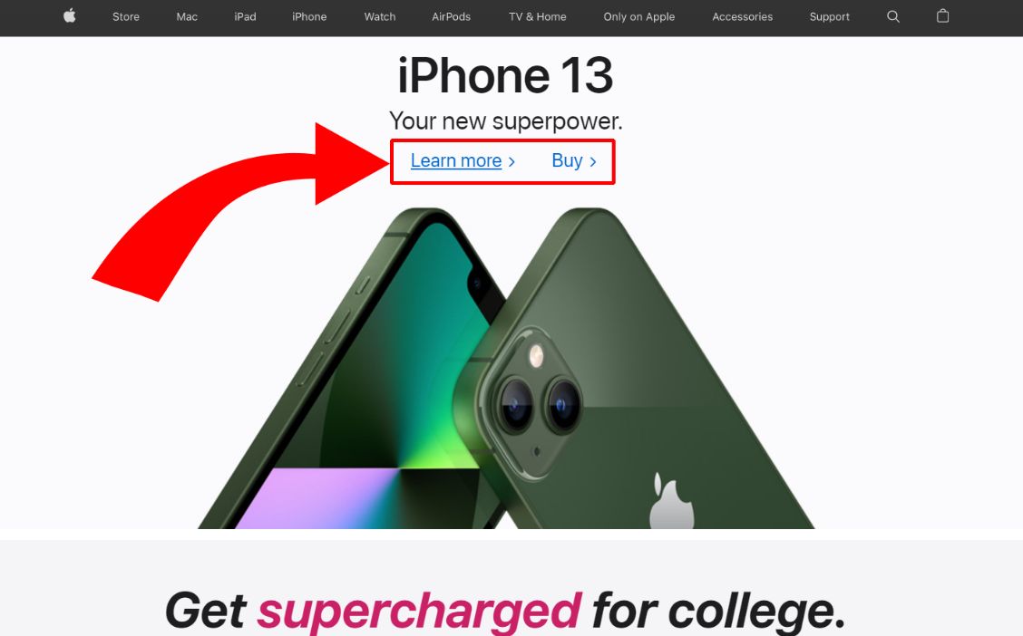
You can’t let the design become an obstacle to usability. There will be problems if your visitors can’t identify the hyperlink from the body content. Format the hypertext in a different color, make it bold or underline it. You can also convert the header navigation links into buttons if you want.
2. Streamline The Navigation Bar
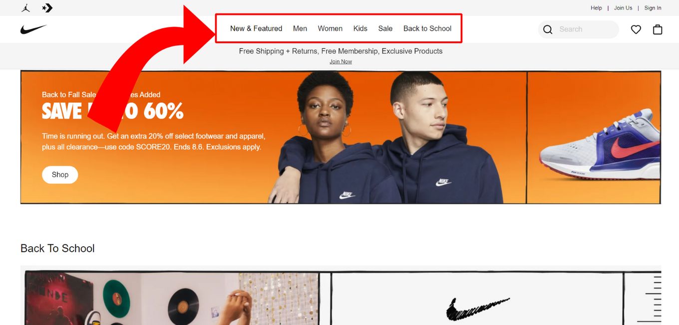
Several websites come with either too few or too many links in their header navigation bar. Besides considering what you want the visitors to do on your website, consider what they want.
For instance, you’ll want your visitors to convert, but they may want to learn more about your products or your company. Consider reorganizing your site if you find the design navigation menu to look clustered. The best solution is to use the main heading and incorporate a sub-menu (with links) below it.
3. Place The Navigation In a Standard Position
Creativity for website design is excellent, but not at the cost of user experience. You must place the navigation at a place where the visitors can easily find it.
These places include the sidebar, the header navigation bar, and the footer. Utilize these areas so that website user can easily find what they need. To add creative design navigation, if that’s what you want, use multimedia and make it clickable.
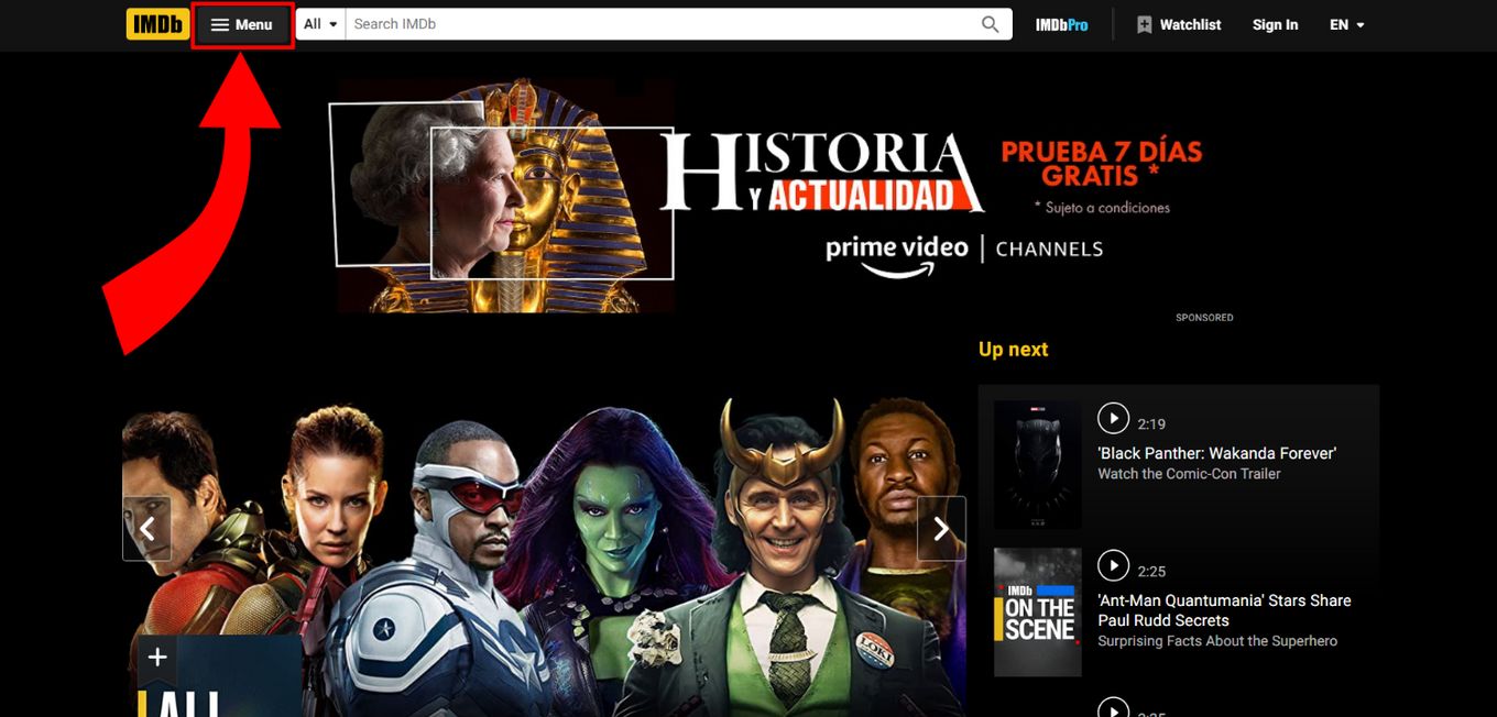
4. Ensure The Navigation To Be 100% Mobile Responsive
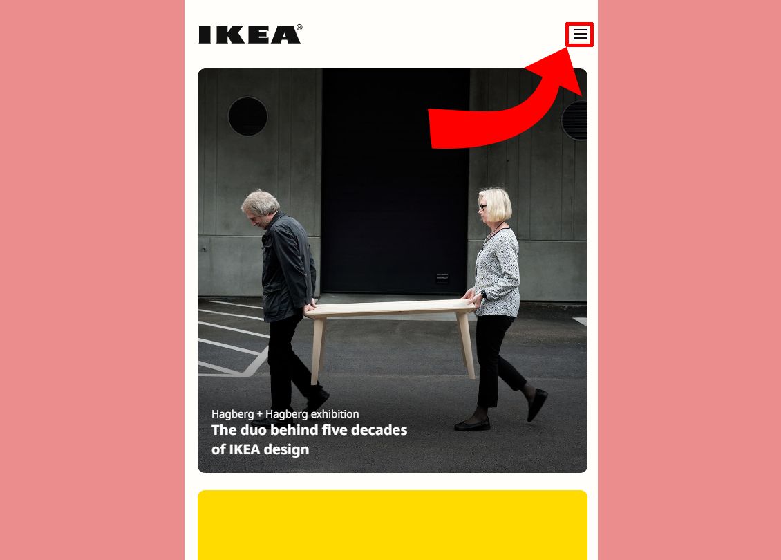
You may get in trouble if your website design navigation doesn’t function properly on mobile devices. Every primary content management system comes with responsive designs and themes, so ensure to access them.
In a few instances, the navigation menu is simply secured. In other cases, the below-mentioned hamburger menu appears. Ensure the links are big enough for human hands to click and access them easily on mobile.
6 Principles Of Design For You To Create Successful Navigation
Here are the 6 principles of design that will help you create the most effective, result-driven, and successful design navigation for your website:
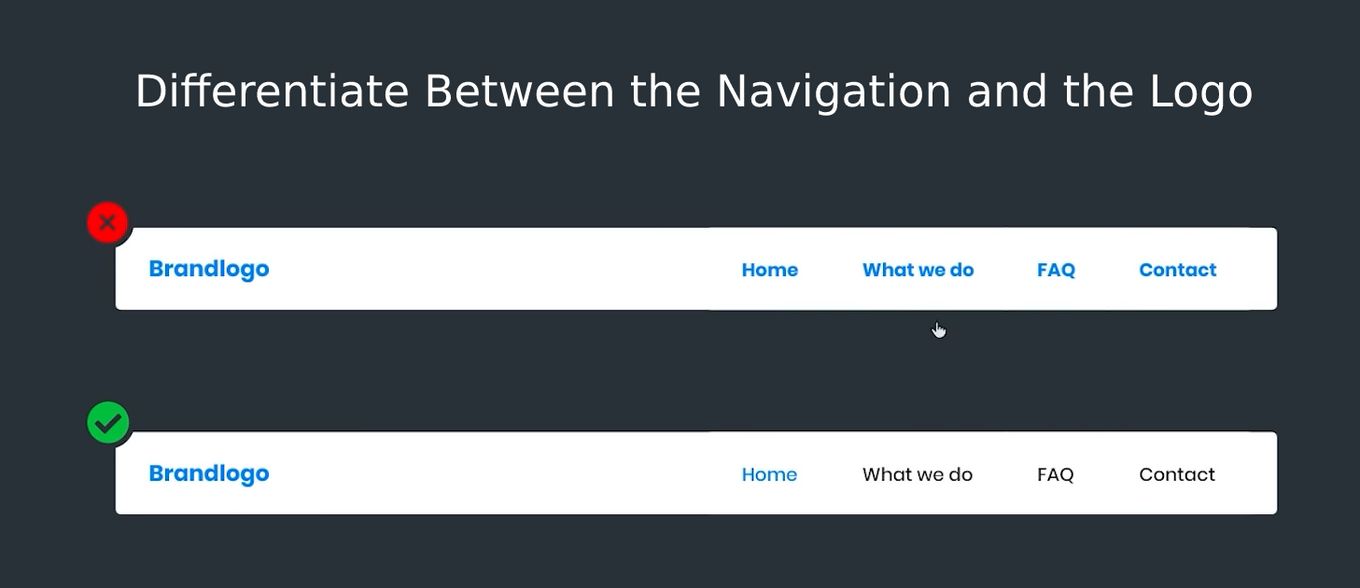
Principle 1: Differentiate Between the Navigation and the Logo
On certain occasions, you will find that many websites navigation area logo have styles that are pretty similar to each other. There should not be any similarities between the navigation section and logo, otherwise, users will not be able to distinguish between the two.
You can keep the logo as it is, but makes some changes to the font, color and size of the options in the navigation section. That way users will quickly figure out which is what.
Principle 2: Display an Active State Design
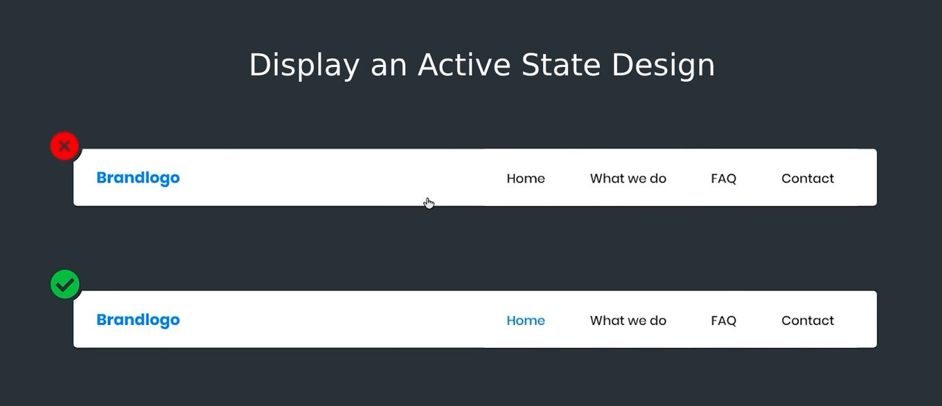
This is one of the most crucial design principles of all time. All the options present in the navigation area can only show, which page a user is currently on is where they are in an active state.
To make sure that all the navigation is displayed in the active state, you can change its color, make the fonts bold, or do both. Otherwise, you can also change the background color, add borders or provide icons.
There are several ways you can show the active state of the navigation options, so opt of the one according to your preferences.
Principle 3: Always Include a Home Button
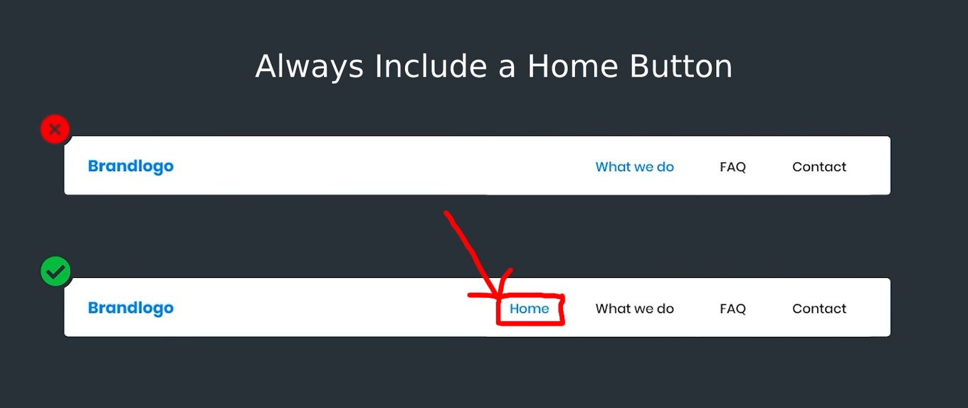
Experts have provided evidence that people can navigate a lot more easily when visiting a website, when there is an actual explicit home button. This means they don’t have to rely completely on the home button to get back to the main or home page.
So, apart from choosing the best navigation patterns UX, you must also include the “HOME” button in the navigation area. It’s mainly because there are some people who might not know that clicking on the website’s logo can take them to the main page.
Principle 4: Differentiate Between the Primary and Secondary Navigation
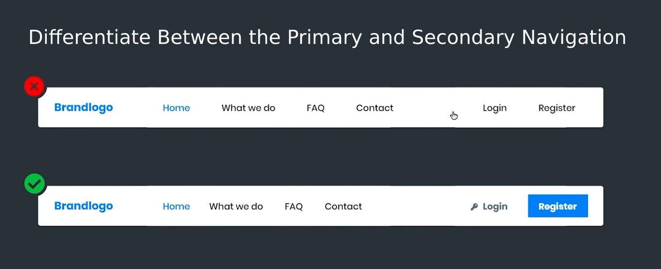
Out of the 8 principles of design for website navigation (we’re discussing only the six major ones), differentiating between the secondary and primary navigation is extremely important.
When you wish to create a “secondary navigation”, simply separating the primary navigation section from the secondary one will not do. You need to let users know, which is the primary and secondary navigation area. For that, you can change the font color or add some color at the background.
Principle 5: Style the Dropdown and Regular Navigation Differently
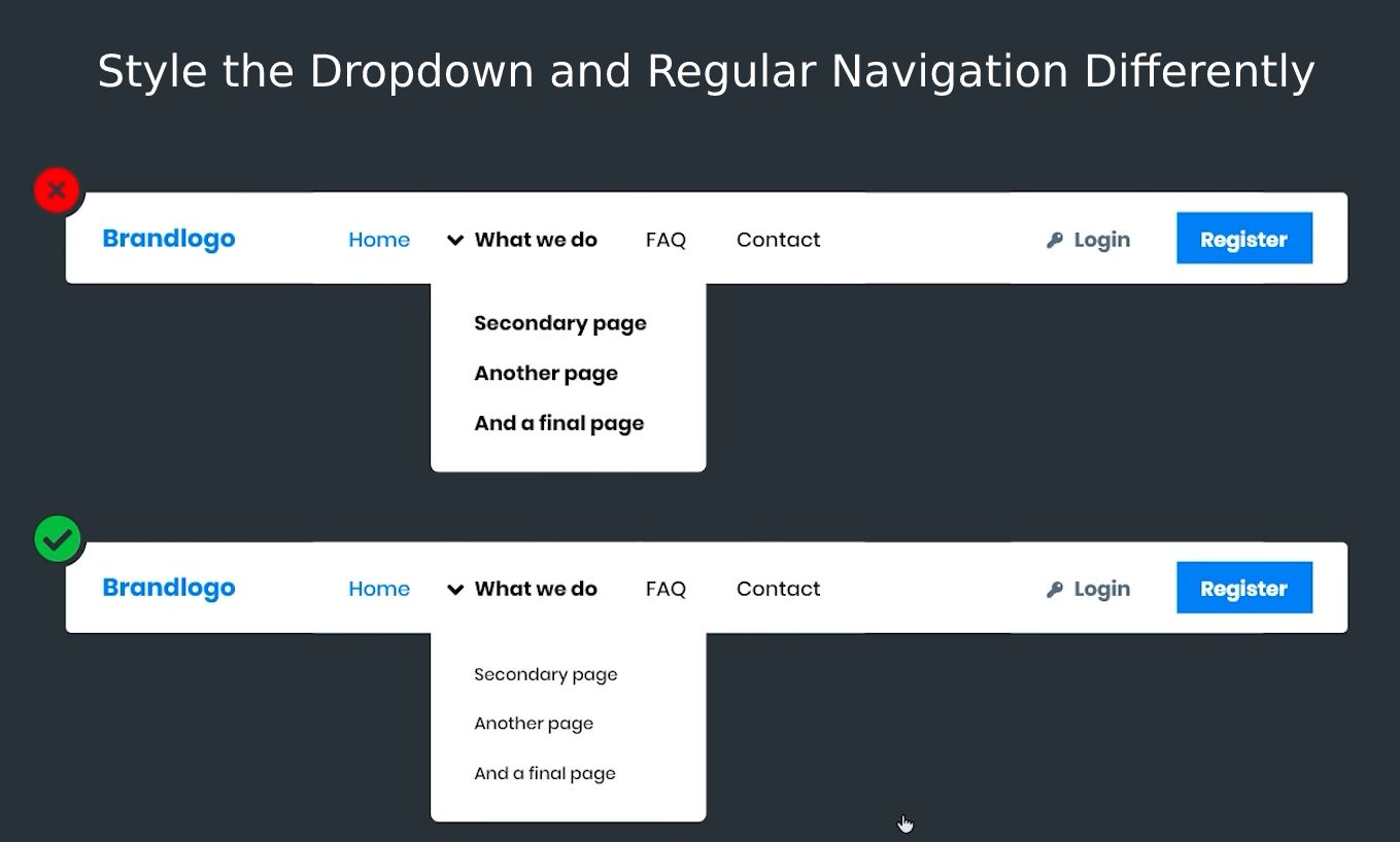
You will come across many websites that have both the normal navigation and the dropdown section styled in the same way. Don’t do that to your own website.
For instance, if the regular navigation area is displayed in bold or colored, try to make the fonts of the dropdown section smaller and don’t provide any color. This can surely separate all the things that take place in a contextual manner.
Principle 6: Be Sure to Provide Hover States
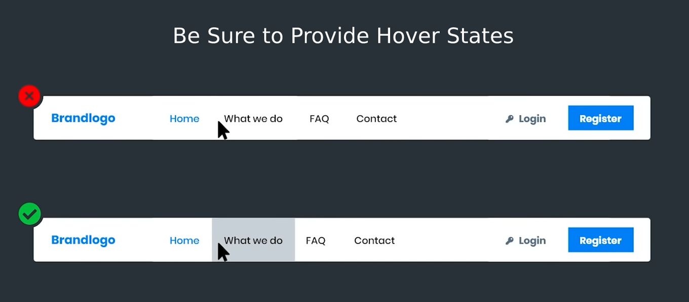
This principle is related to the “CURSOR” and when someone has a cursor it offers an excellent visual representation of the link they are currently at. To make that happen, you can do something like add a border, make it bold, underline it, add an icon or get to add borders at the top and bottom sections.
There are many ways you can create the hover states so that you can provide the user with the visual cue of the link, which he/she is currently hovering over.
5 Best Examples Of Navigation Patterns UX
1. The Most Impressive Navigation Design UX – Dropdown Menu
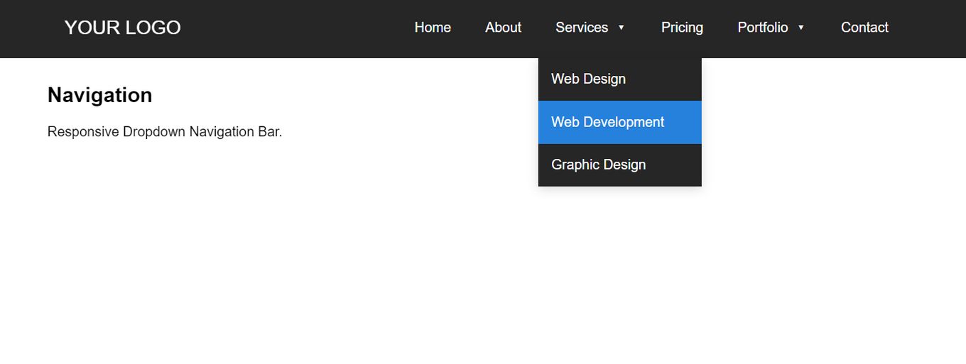
A drop-down menu is an expansible, intuitive, and user-friendly UI navigation. This impressive navigation design UX serves multiple values that the website visitors can select and, from there, move to another section of the website.
This web design navigation transports the users from one website location to another and directs menus that ensure an action built on the last option the user resorted to.
2. Navigation Design Inspiration – Custom Mega Menu
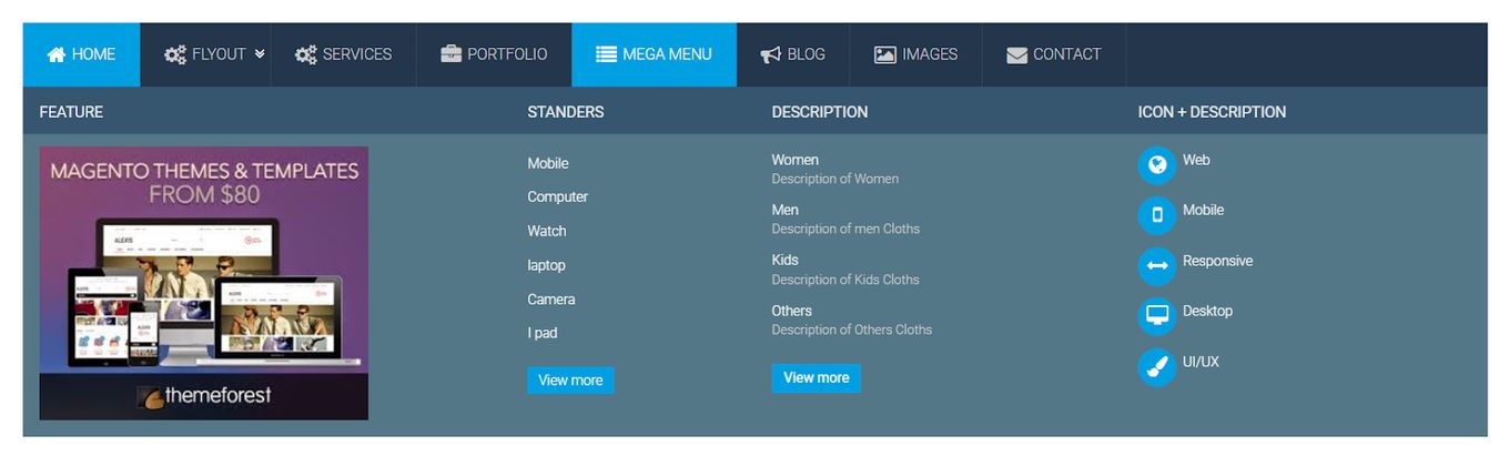
This multilevel, expandable mega menu option is excellent for navigating websites.
This menu comes with two-dimensional panels that are categorized into different groups of navigation tabs, and each link within the tab is accessible at instance – so no scrolling is required. To view the link contained by the tab, users can simply hover or click the tab.
3. Simple Design Navigation – Card Grid Menu
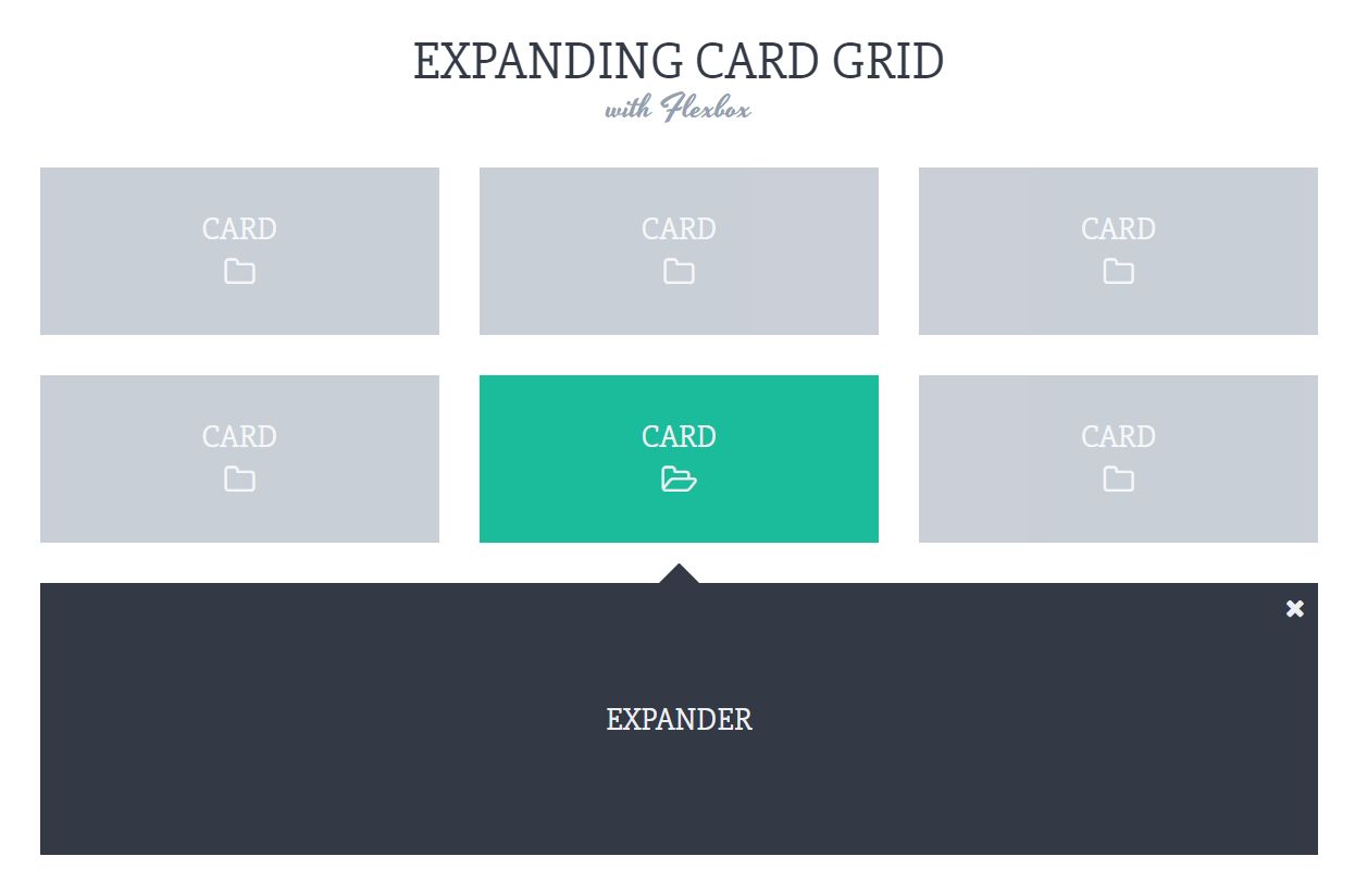
The card grid is one of the most popular design navigation patterns leveraged in both mobile and web navigation.
The card grid comprises a set of images split into different blocks that are both collapsible and expandable. It is a highly perceptible structure that enables you to cumulatively bring all the relevant elements together and envisage UX flows and themes.
4. Best Mobile Navigation Design – The Sliding Hamburger Menu
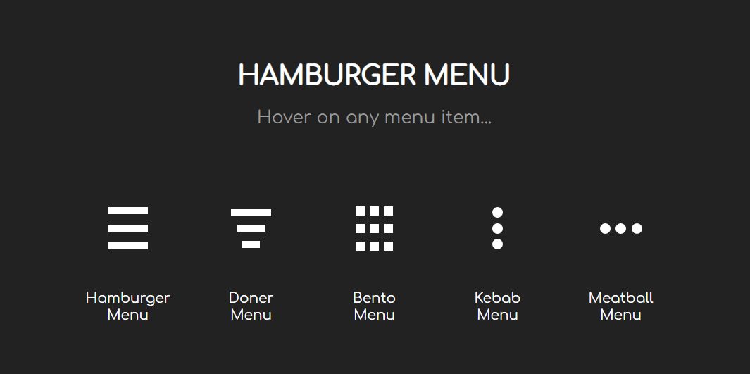
The sliding hamburger menu is also known as the slide menu and is commonly used for mobile navigation design. It is the best iOS and Android mobile menu that exhibits multiple links.
In the “standalone” position, this sliding menu stays hidden from the user’s screen. The user can access the uncovered navigation links by activating (clicking) a hamburger icon.
5. Navigation Menu Design – Fixed Position Menu

The fixed position menu is also known as the sticky menu. It is an excellent web UI pattern where the header portion (website title, menu, and logo) stays visible while the users scroll down the page, and the page’s content flows under it.
If you look at Dropbox and Google+, you’ll find that both have sticky menus. Today, sticky headers have emerged as the latest web UI pattern standard.
Conclusion: Check Out The Best Navigation Designs
You can implement a wide range of navigation types on your website. There’s indeed no definite way of making the ideal website navigation. Everything comes down to you and your customer’s needs.
The above principles are the cornerstones to building effective web navigation, and the examples are just a few droplets in the ocean. Hopefully, this article has given you the inspiration you deserved. So, best of luck with your website navigation design! Hope, it will be a BLAST!


