Over the years, the internet, social media, and other kinds of media have dramatically increased in both popularity and use. And now, if a business is looking to thrive and gain a new audience, it must put in some effort to increase its online presence, and the best way to do that is by creating a website.
Websites are particularly beneficial if you are running a Notary business because nowadays, the online notary has also become a popular concept. And even if you find a notary outside of your region, you can simply do business with them via courier services.
Do you already have a design in mind? Then check out these 15 Great Notary Website Templates and start your website right now!
So, if you are looking for samples of notary websites, here are 13 notary website ideas you can explore and implement on your website.
1. Notarize
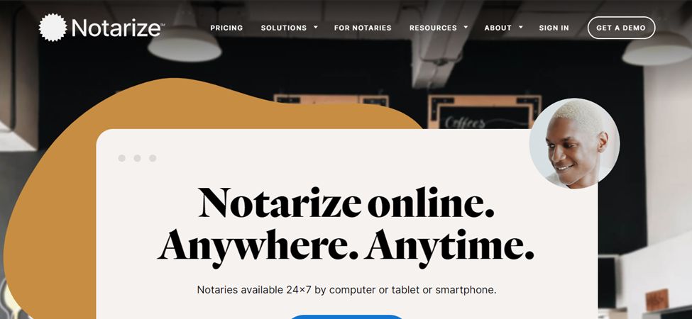
This notary website example is the most polished and professional-looking on this website. Not only is it expertly created, but it also uses fun colors and shapes, which adds to the authenticity of the website. And creating this authenticity is important, especially if you are planning on creating a legal website.
The website utilizes warm colors, which help create that warm and trustworthy feeling. At the bottom of the homepage, you can see reviews by previous clients, which again adds another level of believability. You can also find reasons with small vectors that tell you why to choose this specific notary website.
FAQs are also visible on the homepage, but they are presented like the FAQs on google, with just the question than a bar to further open the question and read the answer.
2. New York Mobile Notary Service
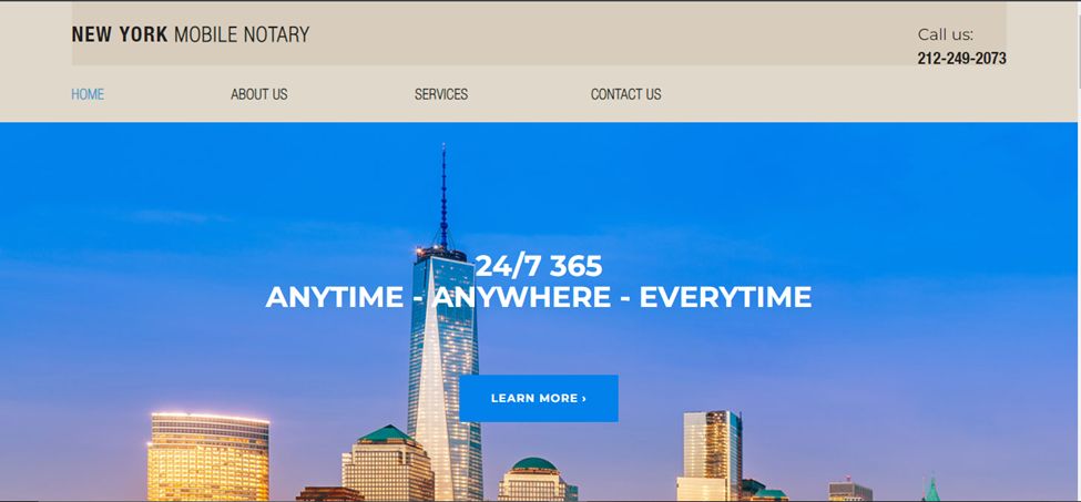
Even though this notary website is a very simple example, it packs quite a punch, and that is all because of how easy it is to explore.
The homepage features a picture, and immediately below that is a box that describes the company’s history and what they excel at. All the services are liked to separate service pages, and you can also see the brand message video. As you see, you can take some good ideas for your notary website.
3. Notary911
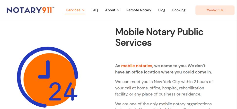
This notary website example has a simple white, blue, and orange theme, which adds that pop of color these types of websites need. Most people find law-related stuff to be incredibly difficult, and the makes of this website understood this because the whole website is filled with quirky animations which keep the readers interested.
The options on the menu bar are to the point, which is probably why people rarely have a hard time finding what they are looking for. The website is also slightly interactive, which keeps things interesting.
4. Jesus Benavides Notary Website
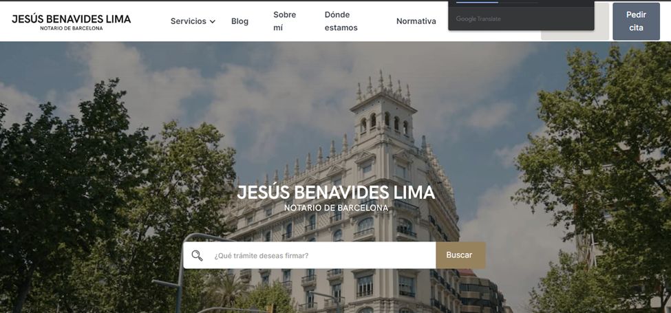
This notary website comes with new ideas: the homepage opens with a high-definition video of scenic shots of different sites. Below the video, you can see where the office is located, and all the services provided by this particular notary are elaborated into different categories underneath the address.
On the site, you can also see some information about the notary, and at the very bottom of the page, you can access the blog, which delves into some important information related to different aspects of the notary.
5. Notary Cam Website

If you are looking for more modern-looking notary website ideas, then this example is the one to take inspiration from. The blue and white color scheme makes the website look authentic. The website utilizes quite a few different illustrations that make the site interesting to explore. However, the one thing that makes the site rise above the rest is its interactive aspects.
The site is smooth, easy to navigate, and would pose no difficulty for a total noob which is probably why this type of simple design is preferred for legal websites. The font is easy to read, and the website isn’t too harsh on the eyes, which is also important if you wish to keep the visitors engaged for a longer period.
6. Notaio Angelina Rossi
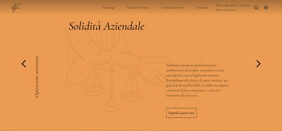
This notary website sample is subtle but, at the same time, has tons of features that may not be visible at first glance. The homepage has a slightly interactive gallery, and the things appear one by one every time you change the slide. The text on the gallery also overlays the illustrated pictures.
The color of the homepage also changes as you move to different parts. The site is also easy to figure out since there aren’t a lot of aspects to explore. All in all, the notary website example is smooth, polished, and professional-looking.
7. VP Notaries
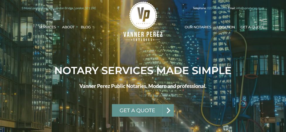
This is another example of a notary website that features a high definitely video instead of the traditional gallery or picture on the homepage.
The website is smooth and uses a bunch of small illustrations to add interest and distinguish different services. The teal, white, and blue theme adds interest, and the simple font makes all the text easy to read, which is great for people who struggle with smaller or cursive text.
8. Notary Public
This minimal-looking notary website sample proves that you don’t need to add a lot of features to make your website seem interesting or professional. In fact, the majority of the space on the home screen is taken up by text, but that doesn’t take away from how smooth and well-constructed the website is.
The homepage features a picture that has some changing text and buttons on top. But as you scroll down, the main picture turns into an added background, and the text moves on top of it. You can also find anything from what the company does to their costs on the homepage.
9. Notary Public London Website
Not all websites, especially legal ones, follow the same format. So, if you are looking for a notary website example that looks more authentic and doesn’t focus on design aesthetics, this is it. The whole website just has text explaining all the services, what a notary actually is, and why you need to get your documents legalized.
10. MSC Notaries
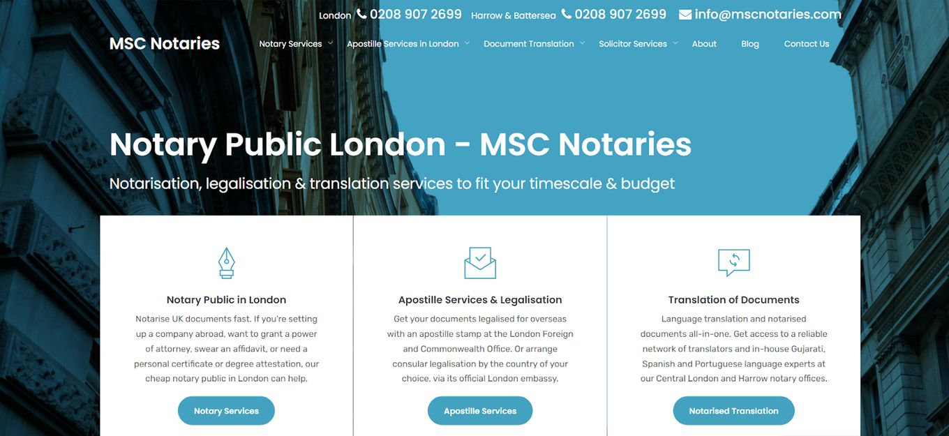
MSC notaries are a notary website example worth exploring because it follows that traditional blue and white color scheme, again adding a level of authenticity. There is a photo on the homepage, but you barely see it because it is covered with text boxes that take you to separate service pages.
On the homepage, you can learn about the agency and why you should choose them over their others. Despite having so many options, the site doesn’t pose any problems while navigation, and that is all because of the incredibly well-categorized everything is.
11. Peter H Baker

This is another site that features a very common blue and white theme, but the website itself is constructed in a very different way.
The first thing you notice is that instead of outlining the services on the homepage, the website talks about why the services provided by that particular company are superior. This makes people feel special and encourages them to do business with the company.
If you wish to access any of the services and learn about them, all you need to do is go directly to the menu bar because everything is painstakingly laid out on it. The homepage is small, to the point, and incredibly smooth.
12. Notary Co UK
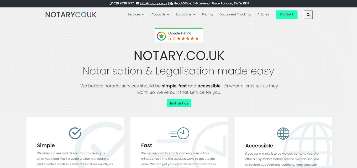
Instead of opening with a video or a picture, this notary website opens with a google rating. Directly below that are qualities that make the company special, reviews, services, and a document checker, among other things.
The homepage is without a doubt jam-packed with information which can be slightly difficult for some people. But because there is a clear distinction between the sections, whether it be the pictures or the color of the background, it works out perfectly.
13. VSH Law
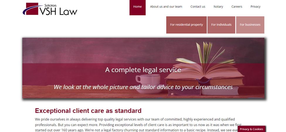
This notary website example is similar in construction to the rest, but it features a few elements that make it stand out, one of them being the amazing red and mauve color scheme. Another interesting thing is the gallery-style homepage, but instead of it being square and filling the screen, it takes up only a small amount of the homepage and is rectangular.
While these things may not seem important, they do make a difference and help set the website apart from the rest.


