Displaying a custom favicon on your Squarespace website is one of those details that can make a difference. So if you are wondering how to change the favicon on Squarespace, this is your place.
But first of all, if you still don’t know what a favicon is, don’t worry, we got you.
What Is a Favicon?
A favicon is a small image that shows up next to a page’s title on your browser’s tabs. It is also known as a browser icon. Here’s a visual to indicate which one is the favicon.
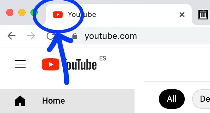
The indicated images, tiny as they are, are crucial to a website and make it easy for users with multiple tabs open on their browsers to find their way around with ease.
Favicons on Squarespace
In Squarespace websites, you’ll usually start off with the default Squarespace favicon that looks like a square cube.
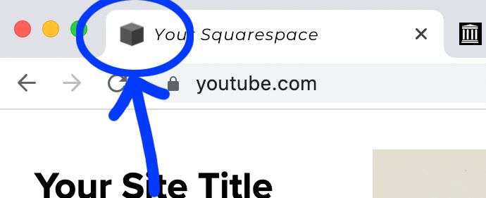
A lot of people who start their websites and DIY the template may sometimes forget to change the favicon to something else. They are easy to identify since their favicon always looks like the default Squarespace favicon: a simple cube.
However, there is a way to change the favicon on Squarespace so that you can put something to market your brand up there, in both Squarespace 7.0 and 7.1.
Depending on the version of Squarespace you’re on, the way you add a favicon on Squarespace varies. Let’s look at both of them. We will start with the newest version.
Change Favicon on Squarespace 7.1
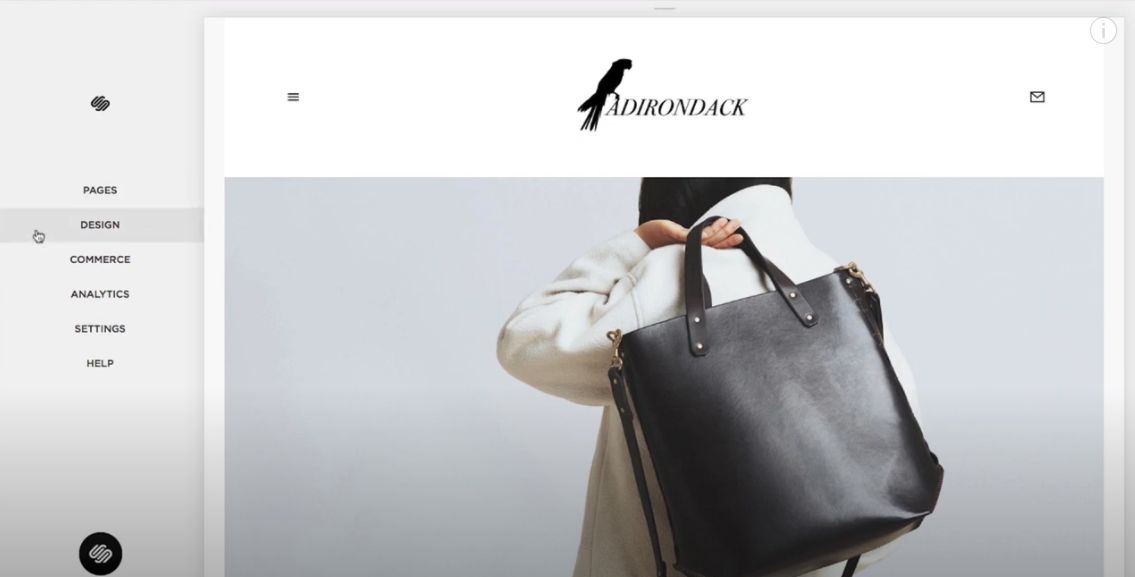
Step 1
Click “Design” in the Home menu.
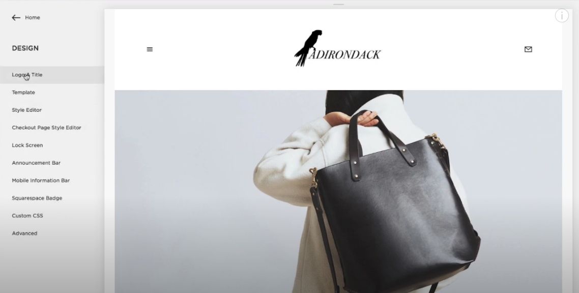
Step 2
Click “Logo & Title”.
Step 3
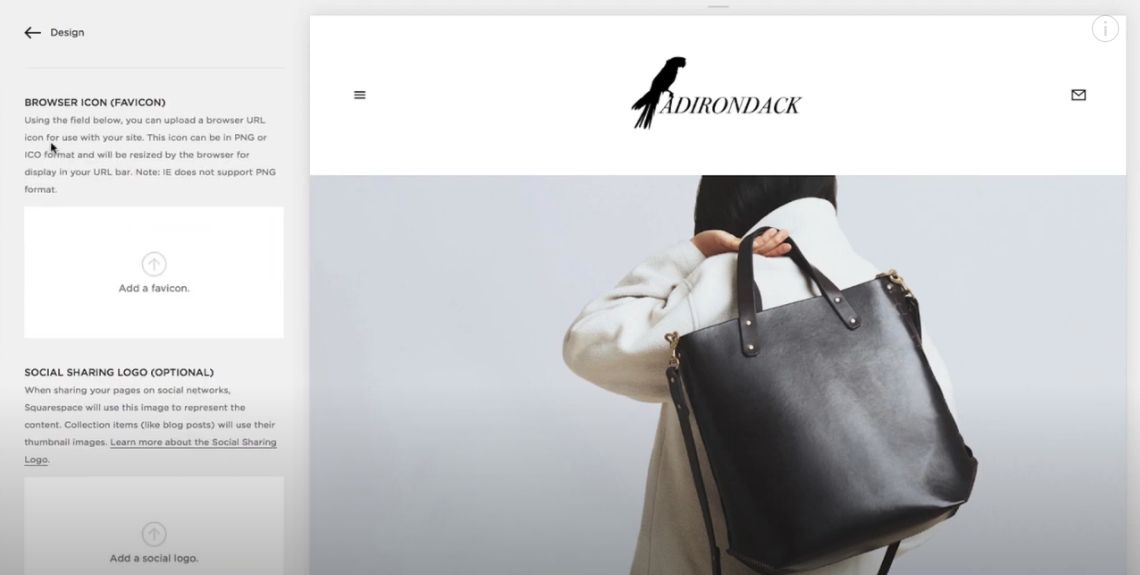
Scroll down to the “Browser Icon” (favicon) section.
Step 4
Drag your picture into the image uploader, or click the uploader to pick a file from your computer, by scrolling down to Browser Icon.
– Recommended Squarespace Favicon sizes: 100x100px, 300x300px.
– Recommended Squarespace Favicon format: .ico or .png file (Old Browsers may not support PNG)
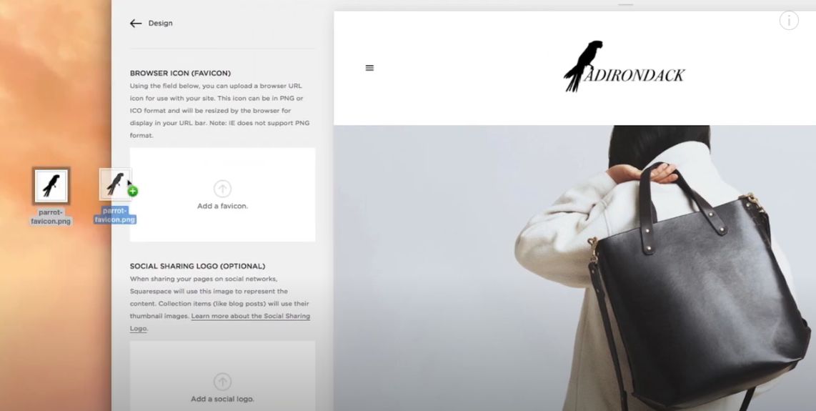
Step 5
Click “Save” when your favicon image has finished uploading
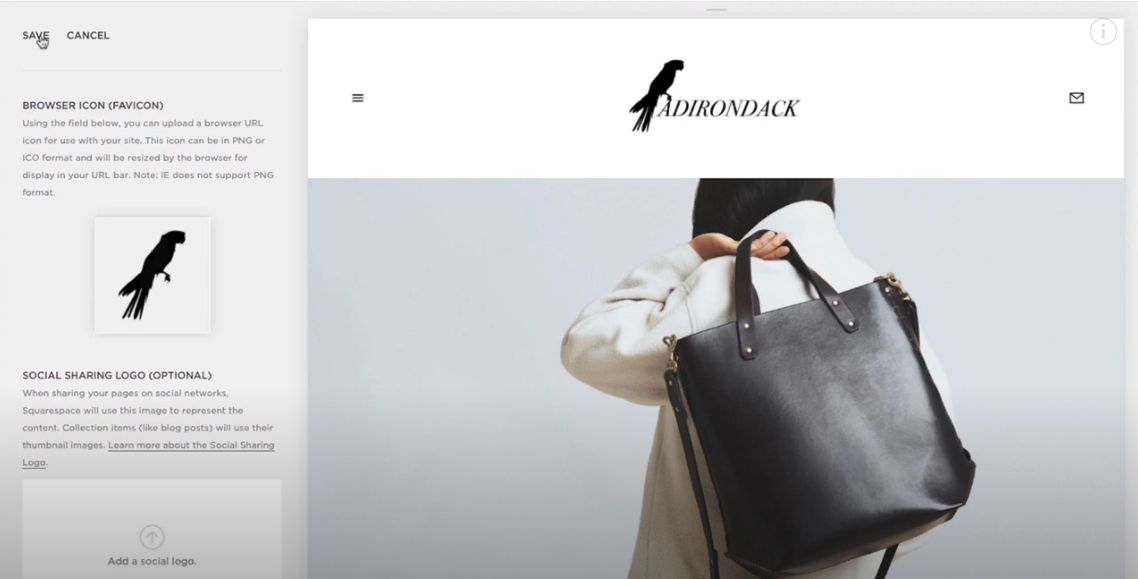
Change Favicon on Squarespace 7.0
Step 1
Click “Design” on the Home Menu.
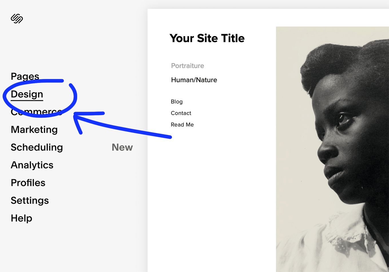
Step 2
Click on “Logo & Title”.
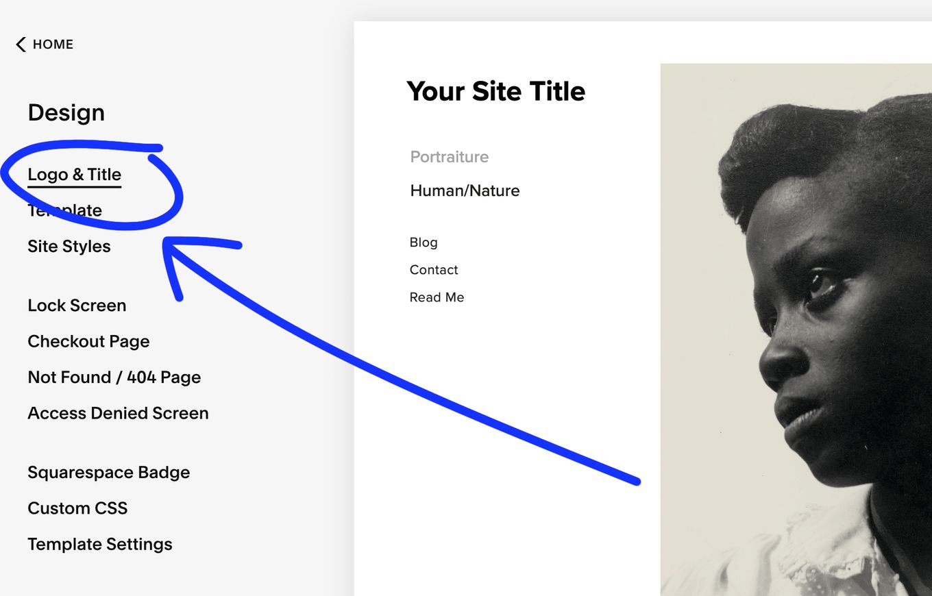
Step 3
Scroll down to the Browser Icon (favicon) section.
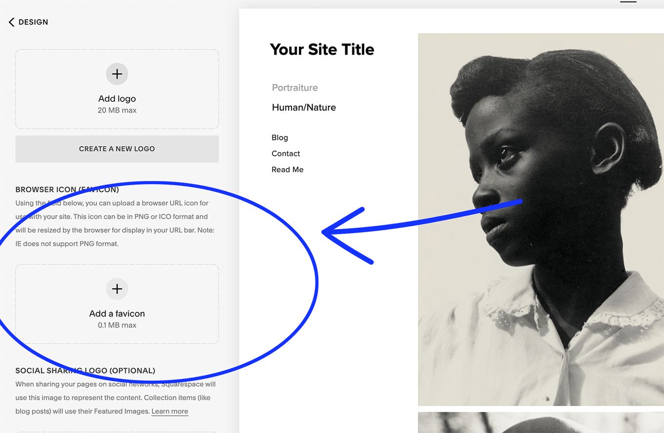
Step 4
Drag/drop your image to the image uploader or choose a file from your computer by clicking on the uploader.
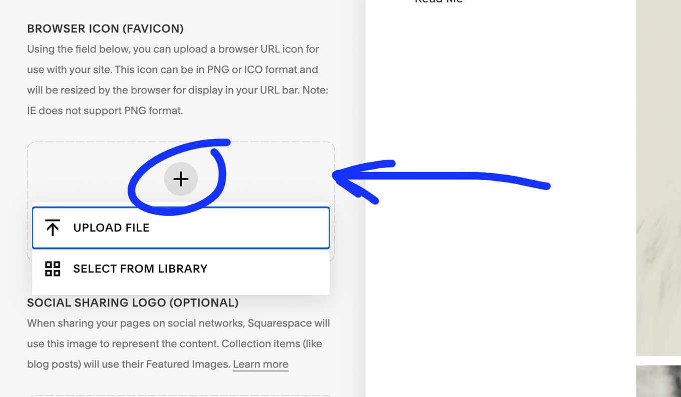
Step 5
Click “Save” once your image has finished uploading.
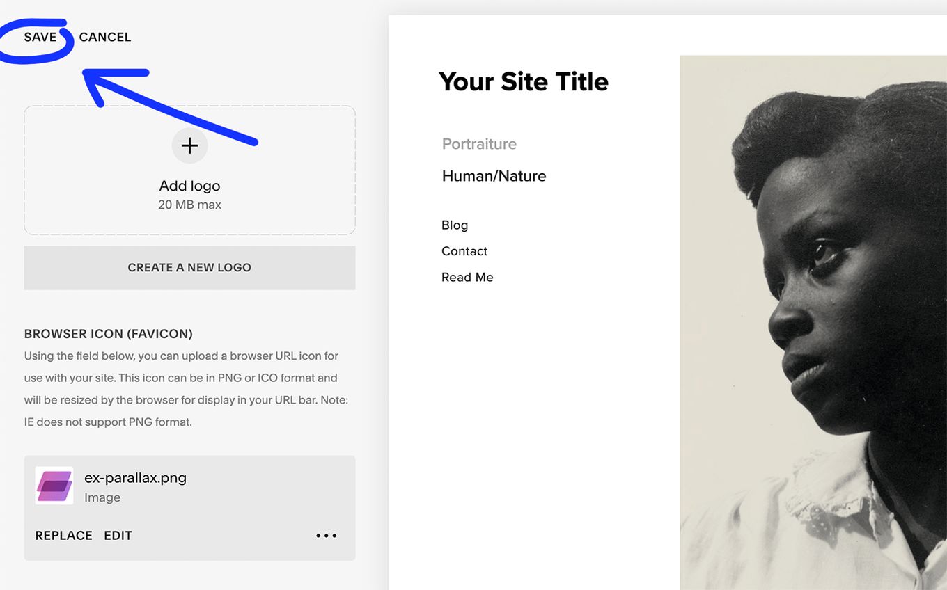
Squarespace Favicon Not Showing?
We recommend wiping your browser cache and restarting it if your favicon does not appear immediately. Browsers can sometimes retain the cached favicons until you clear the cache.
- Go to your webpage (http://www.yourdomain.com)
- Add / favicon.ico. (http://www.yourdomain.com/favicon.ico)
- Refresh the page.
If that doesn’t work, try clearing the cache of your browser or open an incognito window.
What are the Recommended Sizes for Favicons on Each Browser?
16px is normally preferred since it is compatible with all browsers. However, here are some guidelines for the size across platforms.
- 16px: General purpose use for tabs, bookmarks, and the address bar.
- 195px: Opera Speed Dial
- 128px: Chrome Web Store
- 114px: iPhone 4+ home screen icon (double the size for the retina display)
- 96px: Google TV platform
- 72px: iPad home screen icon
- 57px: Standard iOS home screen (iPod Touch, iPhone 1st to 3rd Gen)
- 32px: Safari’s ”Read Later” sidebar, the new tab page in Internet Explorer, and the taskbar button in Windows 7 and higher.
- 24px: Internet Explorer 9 pinned pages
Recommended Formats for your Favicon
- SVG format. This format is supported by and used for Opera browsers.
- Windows ICO: The ICO file is by far the most popular. The ICO has the advantage of being able to include numerous resolutions levels and bit depths, which works well and is particularly beneficial for Windows.
- PNG: The PNG file format is helpful for a variety of reasons. A PNG file does not require any additional software to produce, making it incredibly user-friendly. It allows us to have the shortest file size possible while also allowing the use of alpha transparency. However, Internet Explorer does not accept PNG files and only allows ICO files, which is a significant drawback when designing one.
- GIF: This format has no advantages other than compatibility with older browsers. While they will attract more attention to users, they will also irritate them, and the overwhelming perception is that they are not the best choice for this use.
- JPG: The JPG format is not widely used and does not give the same level of resolution as PNG. Furthermore, the JPEG tends to lose all of its advantages due to the small size of the favicon.
- APNG: This is an animated variant of the PNG format that, while supported by Firefox and Opera, suffers from the same issues as animated GIFs in terms of diverting users from the site’s content.
It is always better to use an option that is high-resolution, non-distracting, and decently sized for the best visibility of your favicon.
The Advantages of Having your Own Favicon
If you have a website, chances are that you are trying to get the word out about something online. It could be a shop, person, event, platform, or anything people can access on their browsers over the internet on a web page.
Here’s why having a custom favicon is a great idea:
1. A Favicon Provides Brand Awareness and Exposure
The favicon functions similarly to logos for physical items or locations, which is why logos or versions of logos are frequently used as favicons. A favicon is a distinctive and appealing feature that helps a visitor locate or recognize a digital product, such as a website among many.
Furthermore, if a website’s identifying features are well-designed and tested for readability in tiny sizes or resolutions, visitors instinctively recall the picture progressively better as time passes. This component contributes to the overall promotion strategy by increasing brand recognition across a wide range of media.
2. Favicons Improve Usability
The majority of users are visual beings who process images faster than text. It suggests that favicons save time while looking for a certain tab or link: the little picture acts as an anchor or a visual tag, allowing the user to identify the desired content in a matter of seconds by just browsing through the collection of images rather than reading the copy of each link or tab.
3. Favicon Helps With SEO
Having a favicon impacts your website search rankings directly. That is why it should be displayed on your browser tabs, bookmarks, history archives, and other places to not only aid users find your site easily, but also boost the possibility of user engagement.
This will increase the amount of time people spend on your website and the number of interactions they have with it, resulting in more eyeballs on your site for extended periods of time, which will enhance your SEO.
Best Practices To Design The Perfect Favicon
When designing a favicon for your website, there are several factors to consider. It should make a huge impact, despite its tiny size and simplicity. It’s critical to create the finest favicon possible because this is how people will recognize your brand. When building your favicon, follow these best practices.
1. Use space well
A favicon isn’t usually just a tiny replica of your corporate logo. The entire size of your favicon should be taken into account. You should choose 16px because it is supported by all browsers but have other choices as we have discussed, in case you want to go a different route.
2. Keep it simple
Even if your favicon is a visual representation of your company, you should make it simple. The simplest favicons are the most effective. Colors are essential for capturing the eye of potential customers and standing out due to the tiny size of the favicon and the simplicity of the shapes employed. A Favicon with too much detailing can appear crowded and disorganized.
3. Make it a brand identifier
Your favicon is the visual emblem for your brand, thus it should clearly communicate to users what your company stands for. This immediately shows them what your brand does. Try to be creative, even if it’s difficult with that little and simple design.
Some examples include YouTube, Twitter, and Whatsapp favicons.
4. Use abbreviations
Using abbreviations Using the initial letter of your company’s name or abbreviations is a frequently used method. You may also use an acronym for your business name. Experiment with a few multiple choices to find one that best represents your business.
5. Coordinate the colors
Color coordination The eye can easily detect designs and shapes when highly contrasting colors are used. Because favicons are so little, you must truly represent your organization to the user, and the color is crucial. Please keep in mind that every browser is a little different, necessitating research to know what to use.
Final thoughts
A favicon gives your brand a professional, well-put-together appearance. It is much better than using the Squarespace cube shape favicon since everyone is using it.
Experiment with variations to see what works and implement the best iteration to achieve the visibility your brand needs.
![20 Cool HTML & CSS Tabs [Examples] html css tabs share](https://alvarotrigo.com/blog/wp-content/uploads/2023/08/html-css-tabs-share-300x150.png)
![20 Best Squarespace Blog Templates in 2024 [Free & Premium] squarespace blog templates share](https://alvarotrigo.com/blog/wp-content/uploads/2023/08/squarespace-blog-templates-share-300x150.png)
![10 Amazing Squarespace Templates For Musicians [2024] squarespace musicians templates share](https://alvarotrigo.com/blog/wp-content/uploads/2023/08/squarespace-musicians-templates-share-300x150.png)
![Squarespace Block Identifier - How to Find & Use it [Easy Way] squarespace block identifier share](https://alvarotrigo.com/blog/wp-content/uploads/2023/08/squarespace-block-identifier-share-300x150.png)
![9 Best Squarespace Portfolio Templates [You can't miss] squarespace portfolio templates share](https://alvarotrigo.com/blog/wp-content/uploads/2023/08/squarespace-portfolio-templates-share-300x150.png)
![10 Great Squarespace Landing Page Templates [Must See] squarespace langing page templates share](https://alvarotrigo.com/blog/wp-content/uploads/2023/08/squarespace-langing-page-templates-share-300x150.png)