Fashion is about expressing yourself in a way that promotes who you are and what you like. So fashion websites tend to use fancy website layouts and designs to show off their products. They want people to feel inspired by what they see.
Fashion website design examples are a great place to look for design inspiration and that is what this article aims to do. We will go through some examples of great fashion website design and then move on to some actual fashion website design templates you can use yourself.
The fashion market is one of the biggest in the world, with lots of eyes on new trends and projects, so you’ll want any fashion website to be top-notch – your digital look has never been more important.
How To Create An Amazing Fashion Website
If you are going to want to stand out from competitors, you will need a fantastic balance of UI and UX design with some stunning photos and engaging text.
Your site cannot be boring. You will need to grab the users’ attention, but… how do you do that? How do we create a great fashion website? Here are some key points you should focus on:
1. Create a Beautiful Homepage With a Hero Section
The landing page will be the first thing that users will most likely see, so you will want this to be a successful page to guide users to other pages.
You will need to keep the hero section interesting with a stunning photo, video, or impressive design. This is where you will want to show off your best content or fashion. You can consider using a hero slider design.
Don’t be too spammy in this area, just introduce your website intrigue the user first, and don’t overcrowd it.
2. Make Navigation Easy
We all know that any well-designed website needs to have good navigation, but a fashion website needs to be user-friendly: not every visitor will be tech-savvy, so you need to be sure your navigation layout is simple.
Don’t confuse users with too many buttons or menus, only provide them with clear paths to where they might want to go.
For example, a lot of fashion websites split between Men and Women and don’t display any additional links until a user has made their first selection, keeping the initial navigation very simple and easy to understand.
3. Add CTA (Call To Action) Buttons
On a fashion website design, you will majorly benefit from CTA buttons and fashion sites have multiple different ones.
For example, you may write a blog post about a particular fashion trend and you can place this in your landing page hero section in the form of a button saying “See Story” or “Learn More” – There are many ways to phrase it, but just keep CTA buttons short and snappy.
The goal of a CTA button is to get the user to do something, click to read a blog, click to add an item to the chart or click to register. These can be really powerful but don’t overuse them.
4. Use Large Images And Videos
Fashion is visual. Remember that. You want to sell clothes that people find beautiful, so the best way to do this is by using beautiful visuals that can impress your visitors.
Not only the visitors will see more details of the different fashion products in a larger picture, but they’ll also get an immersive and a much more impressive experience.
5. Add Social Media And Sharing Buttons
A fashion website is all about different trends, right? People come to the site because they like what they see or have seen. So it makes sense to make it easy for people to share your content.
No matter if you are selling clothes or writing a blog post, have easy to reach social media buttons ready to go. Have them in view no matter where you are on the page.
Quick sharing options for popular social media sites are vital to improving the growth of your fashion website. Nowadays many plugins can help with this as well.
Great Fashion Website Design Examples
Here’s a list of inspiring fashion design examples that can help you understand how real fashion websites look like and what techniques they use:
1. Ehcier Collections
Using a full-screen design, the first page we see is a powerful full-screen video being displayed as the background. We have a title and a snappy CTA button overlaid, this works really well because the video engages the user and the navigation is very simple: just one button.
In terms of main site navigation, the whole site is a scrollable layout, so you just start scrolling to view another page. This is great because the user doesn’t even have to read anything, the dots on the right side automatically indicate we can scroll down. It is just second nature to pretty much all users.
On the left side, we have a simple hamburger menu that doesn’t get in the way but is still easily visible, it brings down the rest of the site navigation for us.
Loving this fashion website design? This website pulls off its layout thanks to an amazing JavaScript library called fullPage.js – With it, you can create astonishing full-screen scrollable fashion websites that work well with editors like Gutenberg, Divi, and Elementor. Check it out!
2. Zara – Fashion Website
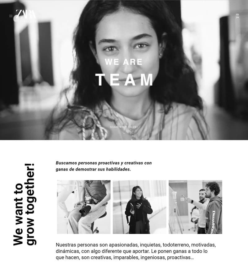
The Zara fashion website does a lot of things very well. It includes many things we have already discussed what makes a good fashion website.
The Zara site is using a great landing page. It is simple and not overcrowded. We have a powerful and large photo showing off their clothing. The best thing about this is it is surrounded by lots of white space and this focuses the user’s attention on one area. There are many reasons to choose white backgrounds on your website.
As mentioned before, the navigation is really simple. We only have a few essential buttons. The website is split between Woman and Man sections that use a full-screen experience to differentiate them.
The black and white theme is a great natural choice for fashion website design. It gives a simple and elegant feel which will appeal to pretty much everyone.
3. BooHoo
Something a little different now. Here we have a fashion website with many features and it does a lot very well, let’s explore that.
First off, as we can see, we have a lot of CTA actions and information to encourage the user. They have used a good amount of “sale” tactics and clear buttons to shop the new season and what’s new.
The goal with these CTA buttons is that the user doesn’t have to think much, they give the user a path to choose right away.
We have an auto-play slideshow as well, which helps to showcase different fashion and clothing. The navigation is simple enough as well, we have a clear link between woman and man, then just a simple row of different categories we can visit.
As we scroll down, the main page for men shows us large images and just simple CTA buttons. They let the user know the kind of clothing each category is and how much something might cost in just a few words, letting the pictures speak for themselves – something which you will see a lot of in fashion website design.
4. Misela
Misela is an online fashion shop that applies quite well some of the tips we recommended above to create a fashion website design.
It has a simple navigation system right on the hero section that contains a large image showing one of their products and social sharing buttons.
The rest of the page is designed using large images too and the burger menu navigation is super simple too.
5. Gucci
Gucci is a pretty well-known fashion brand. In fact, it’s one of the largest fashion brands in the world.
Looking at their website we can notice they use a big hero section with a big image and video backgrounds within a horizontal slider. A simple navigation on the top and the use of white space all around the page to emphasize the call to action buttons.
6. ErrorNogo
This fashion design example is very unique to a specific audience but it is great for us to learn from.
As you may have guessed, this fashion website design is based around 90’s nostalgia, using pixelated text and graphics. We have a custom slideshow that displays clothing through the use of an old Windows 95 theme.
We have lots of white space which gives us a very minimal and flat feel to it, keeping the layout easy to follow.
The navigation is all centered and surrounded by a good amount of whitespace. Even though there are a lot of links, the whitespace helps simplify them, so it doesn’t feel overcrowded.
As we scroll down we are greeted with actual products. This is something that is great for unisex fashion websites, they don’t need to guide users to additional pages, so displaying products straight away is a bonus.
7. Louis Vuitton
We had to name Louis Vuitton. Being one of the top fashion brands their website is subject to study and great inspiration from the design point of view.
Louis Vuitton’s website design puts special emphasis on the use of large background videos and full-screen images on all the websites.
Check out how to create full-screen videos with CSS and HTML and how to use a youtube video as a background.
They use simple navigation on the top and multiple calls to action in each of the full-screen sections.
It’s a minimalist design that makes use of beautiful large visuals to catch our attention. It then uses the top navigation menu to allow us to go exactly where we want to with just a couple of clicks and without having to leave the landing page.
So, How Fashion Websites Should Look Like?
Most fashion websites make use of large images or videos, simple navigations, multiple calls to action, and large white space between elements. However, there are many more ways to design a fashion website.
The goal of this article was to take you through the fashion industry and show you some of the successful website designs that real websites use. You can take ideas from them so you can use a design that helps you stand out and promote your brand in a meaningful way.
Previously, we have looked at some fashion website design templates that you can actually use if you are open to use templates. They all tick off the best practices that we have discussed and can be used to create a successful design.
Overall be prepared to choose a design that suits your brand and identity, make yourself stand out with specific brand colors and structure. Test your design with your audience and ask for feedback, changing along the way isn’t a bad thing.
If you are looking to create something unique and bold, you should consider fullPage.js – A fully-featured JavaScript library that you can use to create beautiful full-screen scrollable websites. Check it out!
With fullPage.js you’ll quickly be building highly-polished sites that are up there with the most impressive websites. Use a component that is already used by reputable companies like EA, Sony, and eBay!
Compatible with the latest software and website editors for WordPress like Gutenberg and Elementor, you will surely be able to create something unique.