How can a real estate agent explain their services or experience to their clients without talking to them one-on-one in this era of technological advancements? The answer is: through a fun, forward, and clear real estate website design.
Real estate website designs have become extremely popular. In part, thanks to marketers who find innovative ways to attract potential clients to their site and to their business.
If you are a real estate website designer or a real estate agent looking for inspirations to build a real estate website for your business, here are a carefully compiled list of the top ten real estate website designs to get your creative juices flowing:
1. Anesis Estate
Update: The website doesn’t seem to be available anymore.
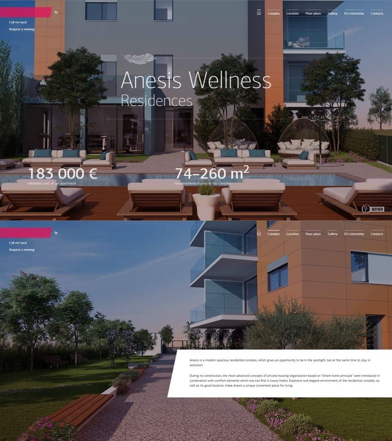
Anesis is a stunning real estate website that stands out because of its unique navigation experience. A full-screen navigation that will not only impress visitors but will also make images take protagonism and create easy-to-digest content.
When the user lands on the page a beautiful full-screen image immediately catches the attention of the visitor. A quick way to showcase the quality of their properties.
The rest of the page contains everything a real estate website should contain. A gallery, a map, a way of contact, floor plans… and everything put together through some beautiful smooth scrolling animations.
The whole website cleverly makes use of the full-screen for every important aspect of the page. From floor plans to gallery images and maps. It’s a great way to provide a top experience to the visitors.
The scrolling effect of this page is using fullPage.js full-screen snap component. A extremely easy-to-use JavaScript library also available for WordPress builders such as Elementor, Divi, and Gutenberg.
2. SteelWave
From top to bottom, the real estate website design of SteelWave is simply flawless. From bold, eccentric, and colorful photographs to clean, modern design, the website is curated stunningly.
The core incentive of the real estate company has been stated in a clear black and white typography, which ties the entire look of the website together. The website is easy to interact with, attractive, and user-friendly.
The one great thing about this scrolling animation website is the excellent use of photographs along with the text. A mix of media and texts not only keeps the user engaged but also explains your work and services in a better manner.
3. Ginger, Martin + Co
The real estate website design for Ginger, Martin, and Co in-one-word is effective. When you first click on the site, you are immediately taken to a gorgeous montage of spaces curated by the company with a background video.
Learn how to create a full-screen video background with CSS. You can even set a YouTube Video as the background!
The website follows a simple format and categorizes the services of the company under different folders, which makes it easy for the user to peruse the website.
Further down the page, you will find a list of different homes available for listing. Each listing is provided with a gorgeous photo which not only attracts the user but also makes it easier for them to make a decision.
When you build a real estate website, it is important to keep the user interface as striking, simple, and beautiful as you can.
4. Berdan Real Estate
The real estate website design for Berdan Real Estate is bright, colorful, and fun. It exemplifies their ideology and the idea behind their company.
The crucial thing to consider and ensure when you build a real estate website is that your website must speak to the clients about the services you provide. This can be done in organized information and listing, but it is better when it is done creatively, like Berdan Real Estate’s website.
When you open the site for Berdan Real Estate, you are immediately directed towards two categories: info for sellers and buyers, which makes it easier to direct the visitors. There is a great use of minimalism in the website design of Berdan Real Estate, and it is experientially quite fun.
If you like minimalism, you can also get inspiration from these top 10 minimalistic websites.
5. The Capvest Group
If you want to build a real estate website that is straightforward and practical, the real estate website design of The Capvest Group is a very good example.
It has all the core information that is needed for the visitors to understand and maneuver themselves on the website. The images are clear, and the text is self-explanatory. There is no fuss when it comes to their website design.
The amazing thing about the website design here is that you get the entire history plus all the different branches of this real estate corporation on the same page as you scroll down.
This is a very good example of a clean and user-friendly website design that helps the company pull in potential customers without having to communicate with them at all.
If you are considering using a template for your design, check out our list of great real estate templates.
6. LA Bailey
When you initially come across the website of LA Bailey, you are instantly blown away by the stunning photographs of homes under this real estate company. From the lush green landscape to the modern look of the homes, everything is phenomenal.
Related article: Great Interior Design Websites
This website design instantly wants you to look for a similar home and move in tomorrow. In this real estate website design, the options are clearly broken down into categories for users to choose from. Then, whether they want to buy a home or sell one, the website provides clean-cut instructions on how to do that.
When you move further down the site, you see all the detailed videos of homes available for listing. This website design almost makes you want to buy a home for yourself even if you aren’t looking for one. If you are a real estate company looking for tips to build your real estate website, LA Bailey’s website is a decent place to start.
7. The Jills Zeder Group
The website design of the real estate company The Jills Zeder Group portrays a very strong visual with bold green brand colors that dominate the website. The website design is snazzy yet very practical in use.
After the striking visuals, the first thing you see is a list of featured listings that the visitor might be interested in.
The website only includes a quick search engine where the user can customize the search for a home. This makes it easy for potential clients to browse through available listings and choose the best one for themselves without any additional hassle.
To build a good real estate website, you must provide appropriate visuals of the listings, just like The Jills Zeder Group website does.
8. DeLeon Realty
A real estate website design that is straightforward and minimal does not necessarily mean bad design. The website design of DeLeon’s website is simple yet engaging.
The feed welcomes you with attractive photos of real estate properties and a little description of the company. The logo and navigation at the top of the homepage are clear and easy to follow, and the featured listings pop off the web page.
Ultimately, the true goal to build a great real estate website is to understand what the general population is looking for and work on those principles. Therefore, the website design of DeLeon Realty is minimalism at its finest.
9. Kendall Harper
Just like the website design of DeLeon’s, Kendall Harper is the epitome of minimalism. From the photos and listings to the information of the company, everything is to the point. The website contains listing information along with the prices to make it easier for the users to make an informed decision.
Looking at websites like Kendall Harper will help you build a real estate website because you will not only learn the good things from these websites, but you will also get a sense of things that you would want to avoid.
10. Houlihan Lawrence
One of the best things about the website design of Houlihan Lawrence is that it has an elegant and pristine layout.
The top of the website of this real estate company shows all of the available listings and the areas they are located in. Moreover, simple typography is used to present the history of the real estate agency, which makes the whole format simple yet striking.
Related article: Beautiful Corporate Web Designs
The scrolling slideshow allows the visitors to have a thorough look through all of the gorgeous properties on sale. The website also provides infographics to explain the median sale price of properties depending upon the average household income.
Overall, the website makes the experience of buying/renting a house quite special and enjoyable. It is an exemplary website design and a great inspiration to look into before you build a real estate website of your own.
11. SquareFoot
The website design for SquareFoot is an excellent example of a modern real estate website designed for modern needs. The website portrays the key incentive of the real estate company by adding a clear, simple tagline, “The new way to find office space.” (Check out more examples of great taglines and tips on how to create the perfect tagline for your page.)
The real estate website design of SquareFeet also uses the white space pretty effectively. Leaving most of the page white can make it easier on the eyes and makes your brand colors pop more.
From the get-go, the website gives you an idea for the kind of real estate this company excels in, and their website design reflects the roominess in their spaces. The important things on the website are highlighted in red which draws the visitor’s eye towards them. It is the best representation of simple and effective.
Another essential thing to see here is the use of clever names and logos to attract a diverse clientele and express the creativity of the real estate company.
What Should a Real Estate Website Include?
A good real estate website design should include:
-
Gallery of images. Provide as many images as you can of each property. Make it really easy for the visitors to get an idea of how it really looks.
-
High-quality property photos and videos. Good-looking photos, renders or videos are a must. We like seeing beautiful properties so we must make sure to showcase our properties in the best possible way. Visuals matter.
-
A way to contact the real estate firm. It can be a form, a phone number, or a chat. Make it easy for potential customers to contact you.
-
An about us page. Visitors want to know who they are dealing with, especially when making probably the most important purchase in their lives. Make sure to provide them the security they seek and to be as human as possible.
-
A Modern look. Make the website attractive by using beautiful subtle animation, transitions, a modern website layout, a branded color palette, etc.
-
Organized categories. Photos and videos must be organized and arranged according to area/state/county/number of rooms/prices etc.
-
Elaborated descriptions. Don’t estimate with data. Provide visitors with as much data as you can so they can be confident to make the right decision and save themselves some time. Location, square meters, commodities around, distance to well-known places nearby, etc.
-
Floor plans: This is vital information for anyone who wants to purchase any property. They need to know what they are going to buy, its dimensions, and the distribution of the rooms and the building.
-
Brand colors. It is always great if the website of the real estate company reflects the aesthetic of the company for which a company’s color palette is crucial.
-
Map with properties. When having multiple properties having a map where we can display them all makes it easier for the visitor. This way they’ll be able to examine other properties by location.
Why Do I Need A Real Estate Website?
You need a real estate website for the following reasons:
- It is the best way to connect with multiple potential clients.
- It will help you build awareness.
- It will increase the credibility of your brand.
- It will give you visibility in the world of real estate companies.
- It is the easiest and more scalable way of showcasing properties.
A real estate website is ideal for realtors to connect with clients and educate them on available listings and other resources.
And since the entire world has moved online, especially after the pandemic, a business needs to have a digital presence, whether it is a website of their own or other social media platforms.
The Importance of Aesthetics in Real Estate Websites
All of these real estate website designs can be an incredible source of inspiration while designing a website for your own real estate business. Still, the important thing to remember is to bring your aesthetic forward.
Showing off your technical abilities, relatability, and detailed view of your listings can go a long way toward procuring valuable clients for your business.
Designing good and interactive websites can make the users feel like they know the agents before they get a chance to meet them.
Always remember that people are more likely to hire you to find them a home if they trust you, and a good real estate website design can do that for you.