The number of people traveling around the world is rapidly increasing due to various reasons. With a higher search volume of travel-related inquiries, if you want people to fall in love with your site, you’ll need a great travel website design. Worry no more! We’ll be showing you some great travel related design examples in this post.
Typically**, you need a technologically advanced, simple, yet aesthetically appealing website to grab the attention of intending travelers and make them engage your web pages for a longer period**. Honestly, this may be somewhat challenging, especially with the era of fast-paced technological advancements the world is in, plus the saturation of the travel industry.
Nonetheless, drawing inspiration from already-existing travel website examples is a brilliant way of ensuring your site is also perfectly positioned to enjoy considerably fair traction of the available user traffic.
This article comprehensively reviews the best travel website design examples to draw inspiration when designing your own site. Without any further ado, let’s get straight into the list!
14 Best Travel Website Design Examples
Below is a detailed compilation of the best travel website examples featuring excellent imagery, design, clean user experience, etc.
1. Tourists Paradise
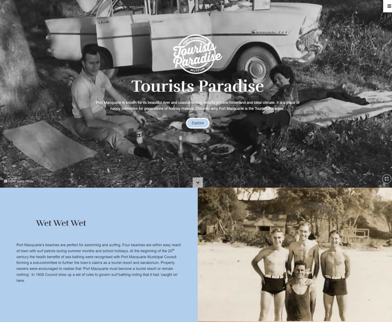
Tourists Paradise website is a travel museum. The website design uses a beautiful full-screen scrolling navigation to create a quite unique experience for its visitors.
As you scroll down with the page will snap to a different section, both vertically and horizontally. Images get displayed in full-height so if you are planning to use beautiful visusals, this design might be for you!
This website is using the fullPage.js component, which allows you to create the same full screen scrolling navigation. Available also for WordPress builders like Elementor, Divi, and Gutenberg. (For the horizontal sliding, it’s using the Scroll Horizontally extension for fullPage.js).
2. Bosco Alto
Second on the list is the Bosco Alto accomodations for travellers. Featuring a Fullscreen background image throughout the website, Bosco Alto includes a brilliant and attention-grabbing transitioning between each section of the website known as parallax effect.
If you like this effect, you might find useful our article on how to create a Parallax Effect just with only CSS. And if you prefer to avoid any coding, you can always make use of the Parallax extension of the fullPage.js library that we have just mentioned in the previous example.
3. Breckenridge
Breckenrdge is a very simple, modern, and exquisitely elegant travel website design example. It features a blend of bold typography, natural color tones and interactive background video that matches the website’s overall theme.
This can easily be done on your website with some CSS coding. Check this article on how to create a background video with CSS. You can even set a Youtube video as the background.
The brilliant use of white space and easy navigation for visitors also makes this website an excellent source of inspiration for travel agencies.
4. Y.CO
Y.CO’s travel website design is ideal for travel agencies who want to prioritize ease of navigation. The use of organized grid layouts helps users find whatever they need very quickly. The website layout also significantly contributes to its aesthetics, inviting visitors to dig even deeper into their website.
You’ll notice that on travel website designs the use of background videos is quite a common technique. An easy way to beautify any page and catch the visitors attention.
5. Pitch Luxury Tents
This website employs brilliant illustrations, which makes it stand out amongst several other travel website examples on the net. These illustrations seamlessly blend with the multiple solid color backgrounds and simple animation effects included in the website’s design. Pitch Luxury Tent’s travel website design is ideal if you have more textual content than media content.
6. UTAH
Utah is another travel agency website that features a simple yet modern design. The website includes a blend of solid background photos and images, plus a brilliant transition into the use of whitespace for its textual content. Other elements that make the UVE travel website design example stand out are their brilliant pagination, ease of navigation, and amazing use of bold typography.
7. Knai Bang Chatt
Knai Bang Chatt is a luxuriously designed website, featuring elegant typography, impressive video, sophisticated imagery, and other brilliant UI components.
Other impressive features included in this travel website design example include the weather element at the bottom right of the welcome screen, testimonials sliders, brilliant use of white space, subtle scrolling animation effects and scroll-triggered text animations.
8. Fiji
Fiji travel website design example includes a compilation of amusing photos that can easily capture the attention of visitors. More like a documentary, the welcome screen also features attention-grabbing photography followed by compelling, well-written content that ensures easy navigation throughout the website. It is a good example of an aesthetic travel agency website design.
9. Casa Angelina
This travel website example features a blend of white space, simple animation effects, and amusing photography. It’s a perfect way to tell a story with your website, taking your users through your world until they take action.
The “Book Now” button is prominent throughout the website, easily accessible to any user. Easy navigation, interactive videos, and a sticky sidebar menu are other UI elements that make this travel website design example stand out.
10. Nira Alpina
This travel website design example features an extraordinary mountainous view, including stunning photography, immersive video, and easy-to-understand textual content. Nira Alpina also includes compelling CTAs carefully arranged in prominent parts of the website.
11. Telluride
Telluride champions user-friendliness amongst the travel agency website design examples included on this list. The homepage includes a prominent gallery filled with large images to capture the attention of visitors as quickly as possible. This website design example is ideal if you want to be maximally detailed without risking boredom or bombarding your visitors excessively. Telluride’s travel agency website design portrays simplicity: a hamburger menu is used to avoid an over-crowded navigation menu.
12. Visit Baltimore
You will find an interactive video immediately when you land on this travel agency website, grabbing your attention and inviting you to continue browsing the site. Visit Baltimore also features an immersive layout, easy navigation, and subtle scroll animation effects that keep users more immersed.
13. On the Grid
On the Grid is also a travel blog. This travel website design example features an intriguing organized layout that ensures users’ ease of navigation. The website’s homepage also includes an alphabetical list of city guides, from Zurich to Aberdeen.
14. Wheeling
The last on our list of the best travel website design examples is the Wheeling website. Wheeling’s homepage features multiple top-quality images and multiple grid layouts to help visitors navigate easily. Although simple, Wheeling’s website is ultra-modern, including colorful and vibrant solid backgrounds and a blend of properly-managed whitespace.
Conclusion
Having explored our top 14 travel agency website designs, now is the best time to create one for your travel agency. Your prospective client expects luxury, great layout and ease of navigation, amazing user experience, top-quality images, etc., with your website. You should keep all of these in mind when designing yours.
Related Articles