User flow is a concept that has been developed to increase the efficiency of a website by giving the user a clear path through the website. The user flow example represents user flow through each page of your site and their interactions with different elements on each page.
Designers use this method to align the user’s goals and ensure they accomplish them within a reasonable period.
UX User flow examples are used to design a site or mobile app with multiple steps users need to take to complete the task. For example, one of the most common user flow examples is signing up, filling out a form, or finding a product or service.
Great Examples Of UX User Flow
Here are some of the most common user flow examples:
1. User Flow Scouts Mobile App
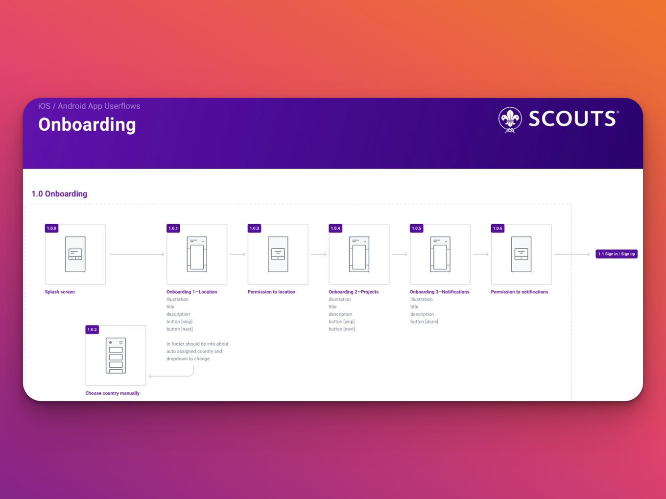
The User Flow Scouts mobile app is an excellent example of one of the most common user flow examples. The mobile app is designed to help companies in the scouting industry find new employees. It allows employers to easily search for potential employees and contact them directly through the app.
The app also offers many other features, including tools for creating job descriptions and a tool for managing your existing employees’ profiles.
2. Music Player UX User Flow Example
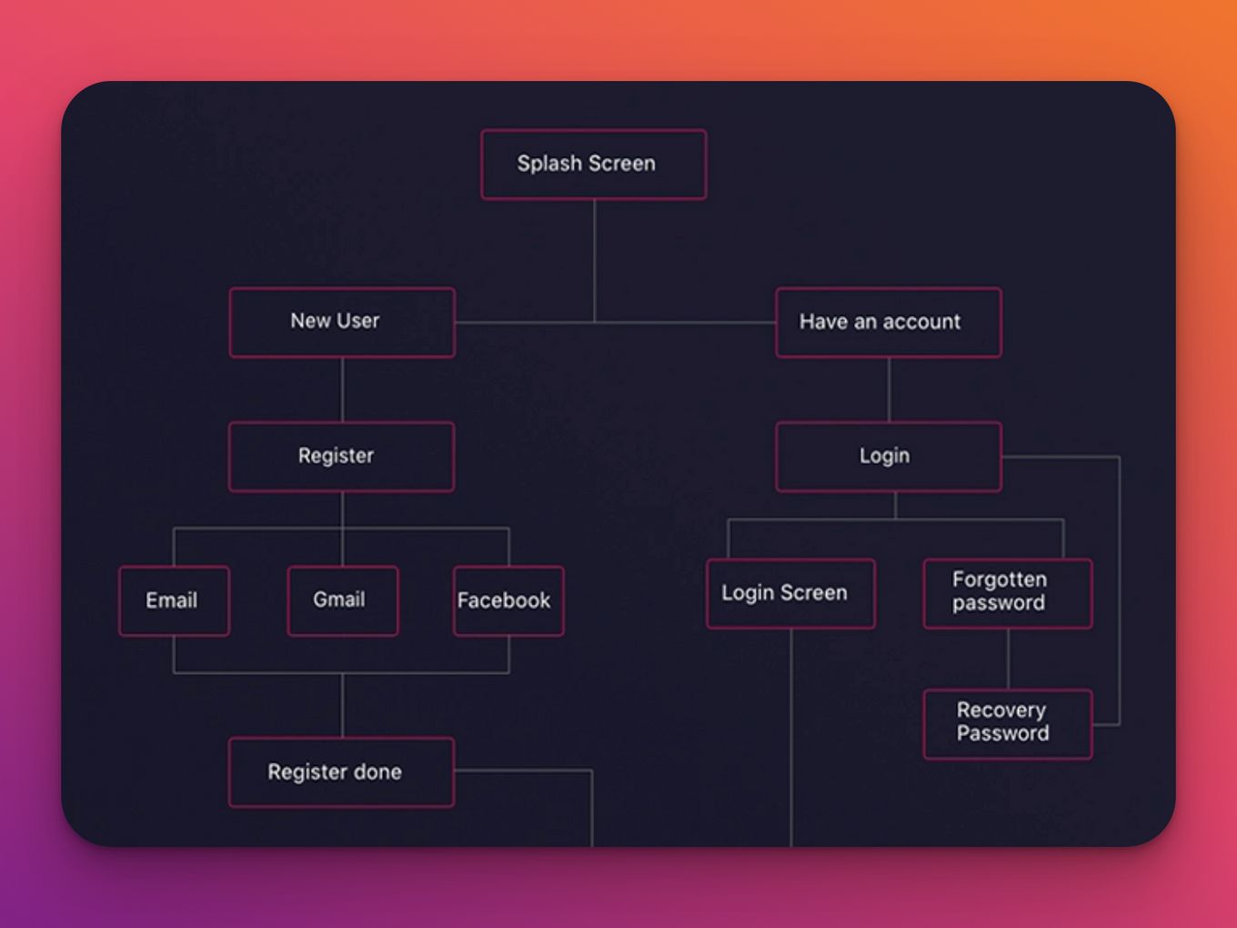
Another famous user flow example is the Music Player UX Flow. Its main objective is to allow users to listen to and play music on their devices.
The first step involves selecting a music player app from a list. Users can choose any app they wish by tapping it or clicking on it in the list. The chosen music player app opens up with an audio player screen where the user can play music by tapping on tracks or artists.
Once finished, the user can press Back to go back to previous screens such as albums or playlists or press Done to save changes made during playback and return to the home screen.
3. E-Commerce User Flow Example
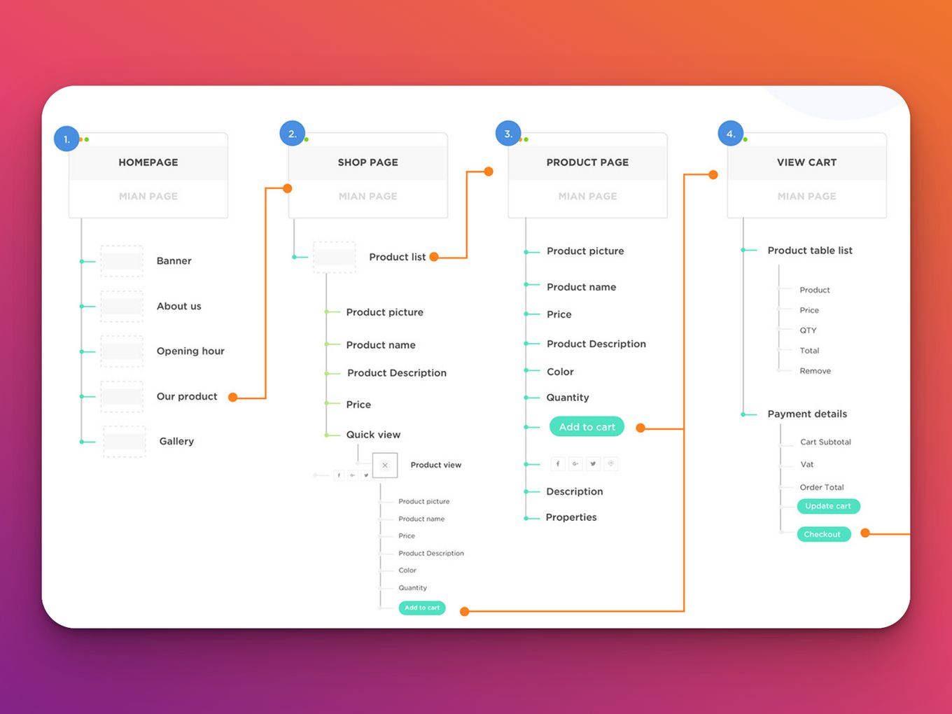
In the modern world, where shopping occurs almost entirely online, e-commerce has become one of the most common global user flow examples. In this UX user flow example, a customer enters the website, finds what they are looking for, and then buys it. The process can be broken down into several steps:
- The customer types their search query into a search bar on the website, which matches them with a database of product names or descriptions stored in the database, and displays the search on the screen, as well as other similar products (if available).
- The customer clicks on one of the results to see more information regarding the product, price, and availability from the store/brand (if available).
- The customer clicks on one of these results to buy that item from one of their chosen stores/brands.
4. Sitemap For Student Guide
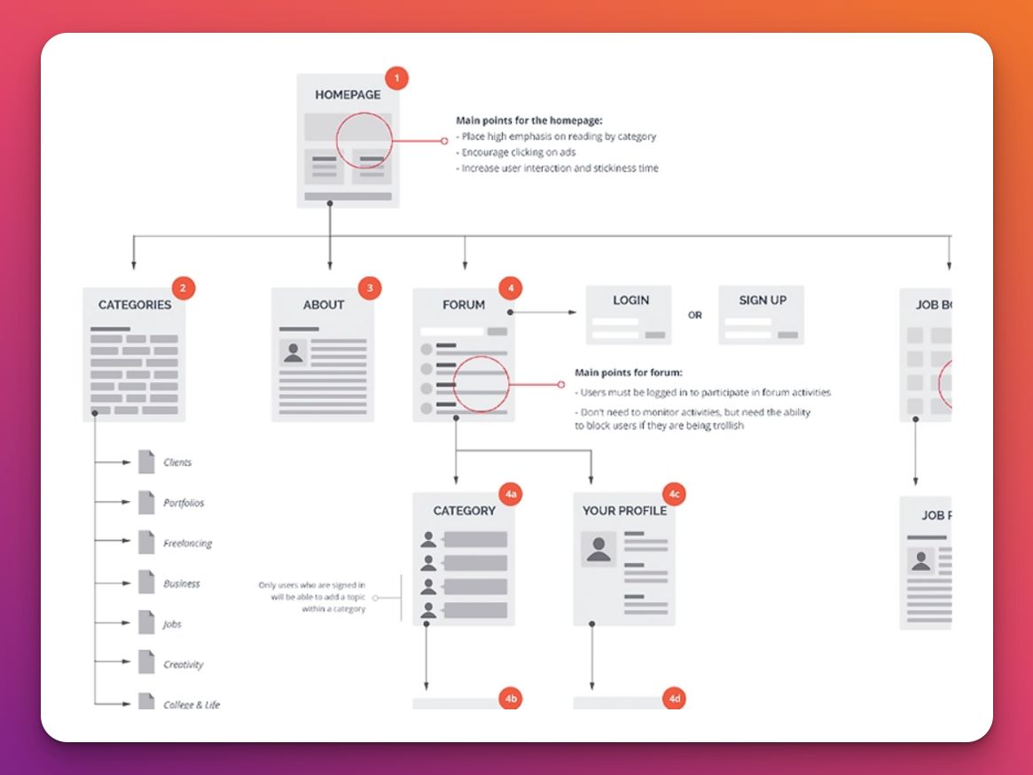
The Sitemap For Student Guide is one of the most popular user flow examples that provide a step-by-step guide on how to get into college and what courses you should take to get accepted.
The site starts with a list of the most important things to do before you apply, then goes into the application process itself. It includes everything from essay questions to deadlines, so students can ensure they’re prepared for each stage of the college application process.
The site also offers tips on ensuring your application is accepted, so you don’t waste time or money applying again if it doesn’t work out the first time!
5. User Flow Diagram For Apple Watch App
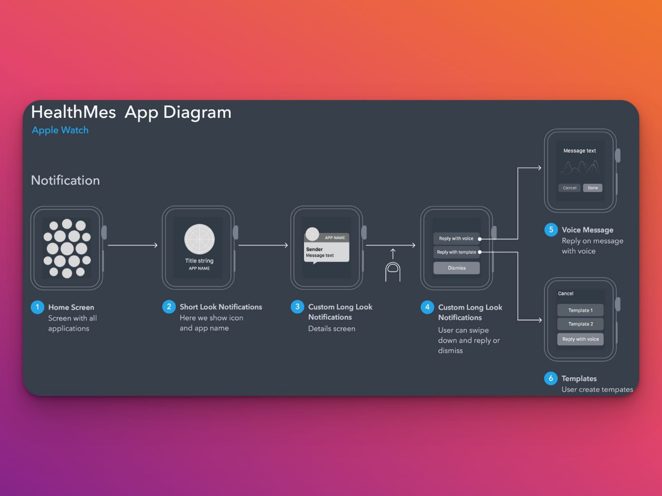
This is a typical example of a user flow diagram for an Apple Watch app, which shows the purpose and actions of the user through each screen. It is an interactive diagram that depicts the user’s path through your app as they interact with it.
6. QuickFrames For Figma
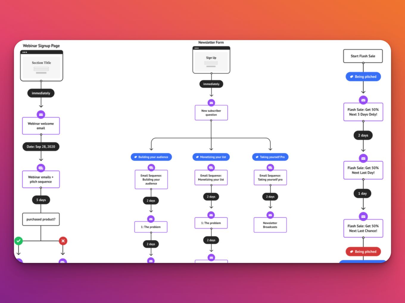
User Flow Quick Frames is a tool that allows you to create a user flow for your Figma project. It makes it easy to add, remove, and rearrange pages in your flow, making it simple for you to replicate the same flow in future projects.
The tool can be used for any app or website, but it’s best suited for those building apps and websites focusing on user experience (UX). The interface is simple and easy to use, so even if you’ve never created user flows, it shouldn’t take more than 15 minutes to get started.
7. User Flow Login
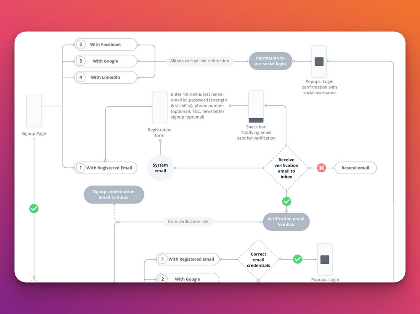
A login interface is a means to access an app, website, or service. It aids users in establishing their identity. A login flow often comprises a primary login page and a rather extensive recovery flow that incorporates ‘forgot password,’ password resetting, and alternate login options.
The login’s primary goal is to help users sign in to their accounts. This flow here incorporates not just that but is also presented in a familiar way that won’t have users struggling to find their way around.
It is also minimal, to ensure users do not spend too much time logging in. If the users find themselves lost, they can find their way around using helpful information from the error message.
It is also kept simple, with linearity and accounts for everything you need for a login interface.
8. Fancy Kitchen Tools
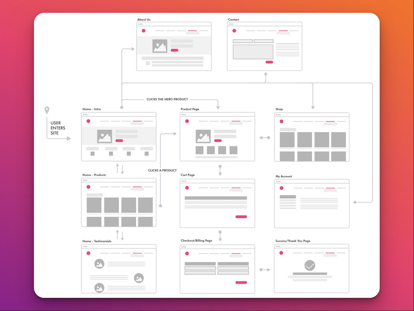
User flow tracking tracks the user’s journey on a website. User flow can be tracked by looking at different levels of the site and how they are navigated through the site. Doing so allows you to see how users interact with your website and what they do when they visit.
Companies need to understand their users’ journeys through their website so that they can improve it or make changes that will benefit their customers. This is how it works;
- User visits a website.
- The user is directed to a page with a product or service to buy.
- The user clicks on the item they want to buy and then goes through their checkout process.
- After they’ve completed their purchase, they’re sent back to the site where they found the product or service.
9. Fan Club User Flow
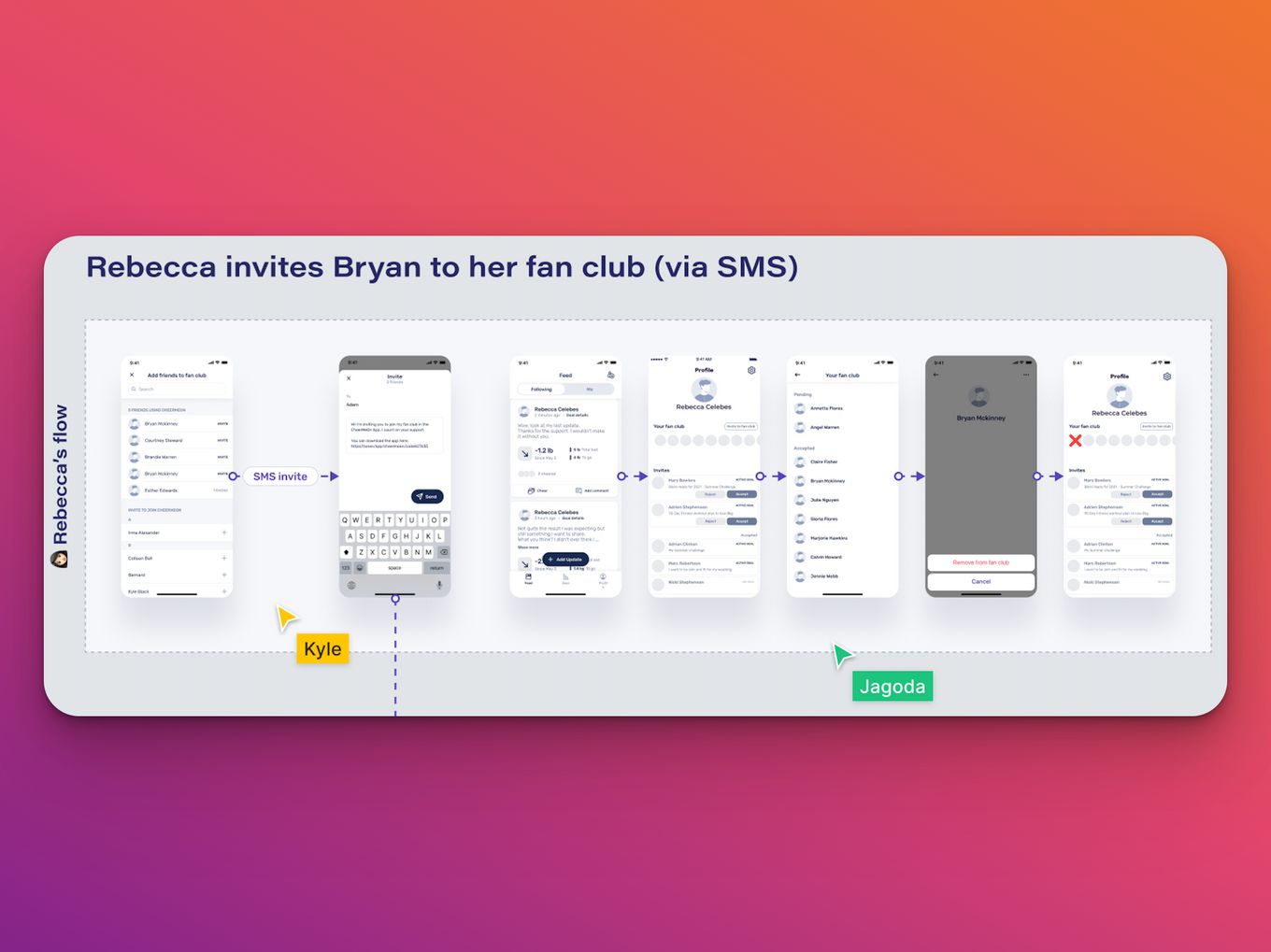
This fan club user flow design by CheerMeOn encompasses what you would need to create a fan club. In this example, you get the opportunity to privately share, track, and achieve weight loss goals with a fan club that includes friends or family.
The map shows how the users would navigate the app and makes a list of the screens that will be incorporated into the design. It covers:
- Onboarding
- Verification
- Setting Goals
- Friends Invite
- Goal Status
- Feed…and more
The user flow also looks into other facts like the logo and app icon, the color palette, illustrations and icons, and so much more, to stay fresh, vivid, relevant, and appealing to the core base. The user flow incorporates comments to make sure all team members working on the app can understand how it should work.
Why Do You Need a UX User Flow for Your Website?
Because when you are designing a website you must consider how users will move through it. Here are some specific reasons why you need a UX user flow for your website:
- It Helps Users Navigate Your Site. It ensures users can quickly and easily move from one page part to another.
- Users Won’t Get Lost On Your Site. They will move on if they can’t find the place they need to go to easily.
- Users Will know What Kind Of Information Is Ahead Of Them. This way they can mentally prepare themselves for what’s coming next.
- You Organize How Users Interact With Your Product. The user flow will help you direct the users to where you want. This information can help you improve the experience of using your product or service in the future.
User flow is a crucial element of user experience, and it’s essential to getting a website to work the way you want it to. When users come to your website and get stuck in a dead-end loop, they’ll often give up on figuring out how to use it.
How Do You Create The Best UX User Flow Design?
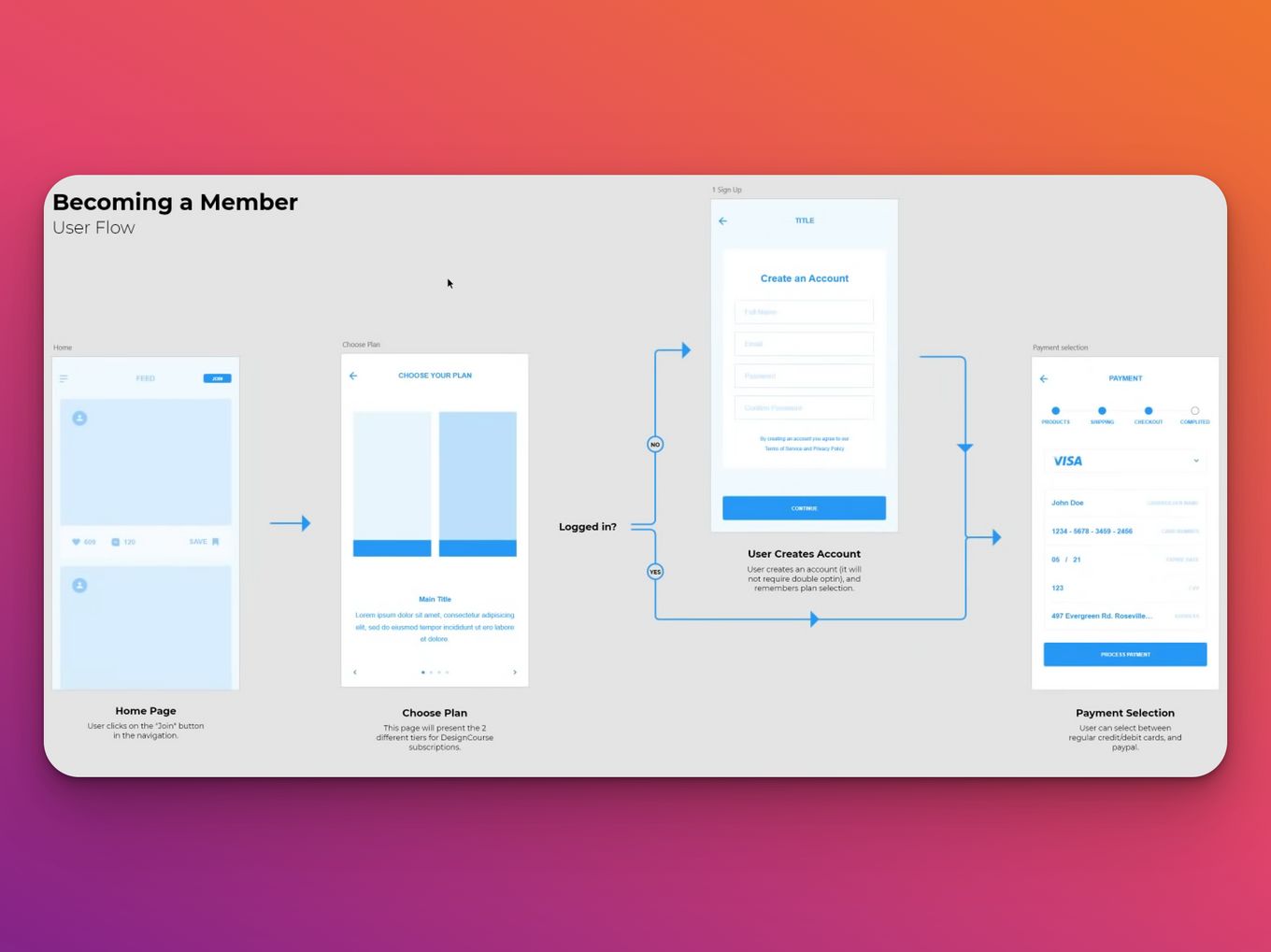
Creating a UX user flow can be a daunting task. It requires a lot of work, planning, and iteration to get it right. But when you get it right, the benefits are tremendous.
It is worth mentioning that you need to learn how to use a UX design or software, which may take some time if you try to teach yourself. A course would be helpful to get you started.
Here’s how to go about it:
Step 1: Start With The Outline
When it comes to design, you always have to start with the outline, which will give you time to refine it before you start creating your final draft.
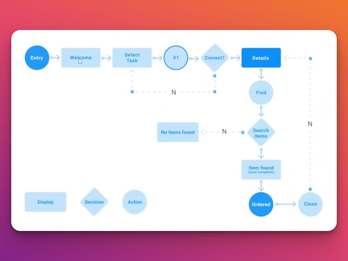
Step 2: Define The User Flow’s Elements
Define the shapes used, the lines, and where they point, as well as any other explainer graphics and other labels. Everything needs to have meaning and be easy to follow.
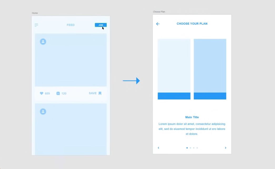
Step 3: Give Unity and Clarity to Your UX User Flow
Use color properly to help the person looking at it identify the resources and group them well. They are a way to code the flow and know where everything is and what it does.
User Flow Is Key For Every Website
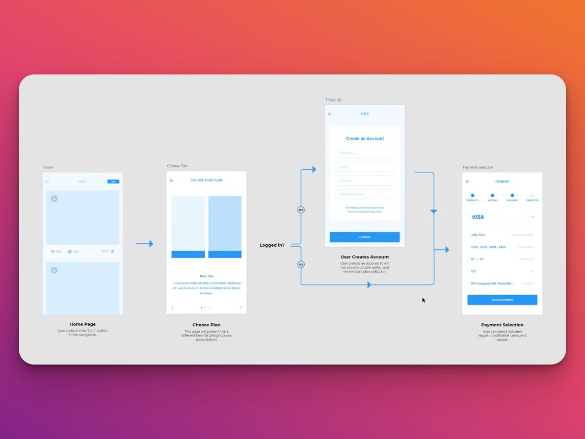
It would be best if you were thinking about your website’s user flow. It doesn’t matter how beautiful your design is if none of your visitors can find what they want. Always keep an eye out for ways to improve your site’s flow, and you will likely see a positive change in your visitor engagement.
![What is a Wireflow in UX Design? [Examples] wireflows share](https://alvarotrigo.com/blog/wp-content/uploads/2023/08/wireflows-share-300x150.png)
![10+ Amazing Flat Design Websites [for Inspiration] flat design website share](https://alvarotrigo.com/blog/wp-content/uploads/2023/08/flat-design-website-share-300x150.png)
![15 Portfolio Websites For Graphic Designers [Build Yours Now] websites graphic design portfolios share](https://alvarotrigo.com/blog/wp-content/uploads/2023/08/websites-graphic-design-portfolios-share-300x150.png)
![6 Steps of Web Design Process [All You Need For Good Designs] web design process share](https://alvarotrigo.com/blog/wp-content/uploads/2023/08/web-design-process-share-300x150.png)
![17 Website Wireframe Examples [Web Design Inspiration] wireframe examples share](https://alvarotrigo.com/blog/wp-content/uploads/2023/08/wireframe-examples-share-300x150.png)
![7 Bad Website Designs [Examples & Tips To Fix Them] bad website design share](https://alvarotrigo.com/blog/wp-content/uploads/2023/08/bad-website-design-share-300x150.png)