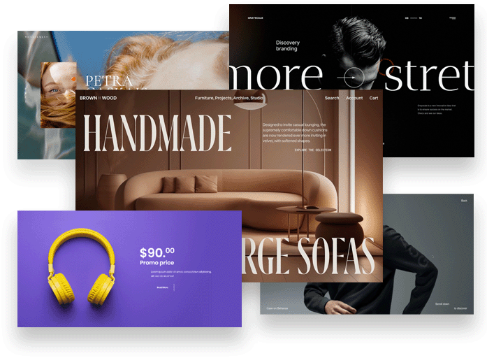
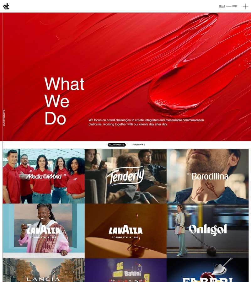
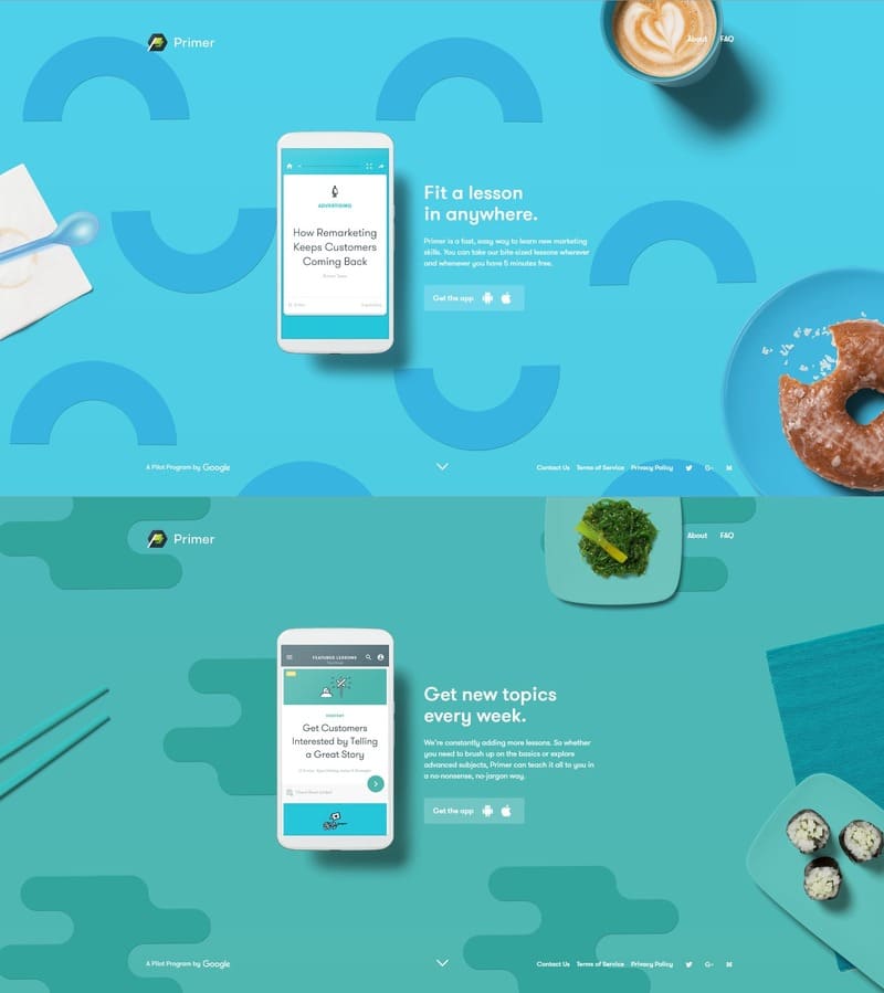
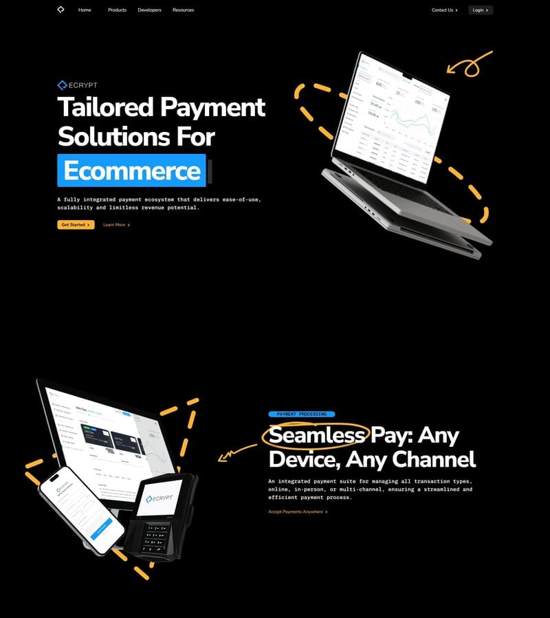
In this day and age, it is impossible to have a successful business without having a digital presence. Whether you are a clothing brand, skincare brand, a pet store, a vet, or any business, it is pertinent for you to have a website, and a good website at that.
It is important to have a digital presence so that your client or your audience has a way of keeping up with you, new clients can find you, old satisfied clients can leave reviews, and new clients can judge your credibility from your website.
Therefore if you are looking to improve your company website design or just looking for corporate web design inspiration, you have come to the right place!
In this article, we will discuss the top 10 best corporate website designs for you to look at, but before that, we must dive into what a corporate webpage design is and how it can help your business.
What is Corporate Web Design?
A corporate web design is a business website design that focuses, not just on promoting a single product but instead to promote the company and the work they do. They reflect the company’s success, fortify its reputation, build a clientele, and inform the visitors of their services, products, and achievements.
In the corporate world, the website is used as a pillar of the company’s online presence for their clients, both old and new.
Top 10 Company Website Designs
Some companies have created such powerful website designs that it has become a huge part of their success as businesses. Here is a detailed list of the top 10 corporate web designs for you to use as inspiration for your website design:
1. Tecnam
Flying is probably the most fun and exhilarating way of traveling, but the opposite can be said about booking a flight. But Tecnam’s excellent website design makes the whole experience of booking a flight so much easier!
The unique horizontal scrolling of the website page creates a very interesting user journey and encourages the user to keep scrolling. The gorgeous photographs and design make the website beautiful and intriguing. Moreover, the website guides the user through the narrative of the brand’s story and timeline while informing them about all the factual, and technical data.
Your website should convey everything that your brand stands for and promotes. For example, in Tecnam’s website design, you see that they are a green brand and take sustainability as a core ideology for their business. If there is one website that you need to look at for inspiration, it is Tecnam’s website design!
2. Document Solutions
The website for Document Solutions is proof that your website design doesn’t have to be too fancy or over the top for it to look good and work. Instead, it could be as simple as their website design and still make it to the top of the list.
Some of the most notable features of the website design are the simple, modern, and dynamic web page, more photos and less text, and the strategic use of color.
This easy website design is excellent for a company that deals with managed office solutions and technology because of how easy it is to find whatever you are looking for within seconds. The web page is fast loading, the directions are simple, and the layout is efficient and aesthetic.
3. Fresh Gear
Have you ever visited a website and scrolled through it multiple times without actually knowing what business it is for? If yes, then you have experienced firsthand the effects of a bad website design. But here at Fresh Gear, the name might confuse you for a bit until you scroll down, and instantly all becomes clear.
This is the effect of a good website design. The users must not feel confused and disoriented when they approach your website; instead, the layout, photographs, and text should be explanatory but not too cluttered.
The website for Fresh Gear uses powerful images to get its intentions across and even has a ‘see how it works tab for first-time customers.
4. Geneva House
There is no one way to design a website and all the great websites in the world are great because they find a medium, layout, and design that works for their brand and business. But some things can make your website design go from meek to aesthetic, and one of those things is high-definition photography.
Whether you are a beauty brand, a clothing brand, a jewelry business, or a jewelry auction site like Geneva House, you must photograph your commodities well enough to attract customers.
The website design for Geneva House is good because it chooses to showcase their most valuable asset: their diamond jewelry, as soon as the webpage loads. And because their business needs more information than just pictures, there is a part of the website dedicated to the process, history, and intention of the business.
5. Prezzo
If there was ever a website that made mouths water, it’s Prezzo’s. From the stunning photographs to the simple layout and minimum typography, the website design works perfectly. The user interface is engaging yet simple and doesn’t require a lot of time to work. It is one of the most straightforward website designs, and we are here for it!
6. M&Ms
It is not enough for you to design your company website that is devoid of any character, ideology, or feels that your business represents.
For example, this website design for M&Ms is simple, cute, colorful, and goes with the image of the brand. But if this same website was made to look frigid, clean, and with no color whatsoever, it wouldn’t have looked the same.
This simple and cheerful website design is a perfect example of why it is important to think about brand image and your target audience before you design a corporate website.
7. Martin Building
This website design for an architectural design firm is great because it corresponds to the type of architecture the firm practices: contemporary modern. The stunning photographs, clean font, and smooth user interface all combine to form a great corporate web design.
The font, layout, and colors used in this website design are the right amount of playful and sophisticated. Anyone that intends to hire them will immediately want to look at photographs of the firm’s old work, all of which are easily available on the main page.
8. Create Better
a good website design should be fun, intriguing, eye-catching, and explanatory. The website design for Create Better ticks all of those boxes and more. The simple user interface is easy on the eyes and extremely easy to maneuver. It is the perfect blend of simple and functional.
9. Avemex
Talk about images being more powerful than words. The website design for Avemex is so strong and straightforward that despite being in a completely different language, it is extremely easy for anyone to understand what the business stands for.
The high-resolution pictures of the planes, the people, and their staff gives a dynamic image to the business, making the website a unique experience for the users.
10. Apple
You would think that Apple, being one of the most successful businesses in the world would have an over-the-top website, but instead, like always, the Apple website is insanely simple and basic.
With the white background, minimal typography, and standard photos of their products, the website has nothing extraordinary and yet it works. This is what good website design is, the curating of the layout, the consideration of the user interface, and simplicity altogether.
What Should You Include In A Corporate Web Design?
Looking through all of these great corporate web designs, we have narrowed down a few things that you should include in a corporate website design. They are:
- Contact information. Make it easy for your clients to contact you for booking, quotes, and any other details
- About Us page. It is an important part of a corporate website design because the visitors like to know more about the company they are thinking to hire for their work
- Lists of products and services. They must be mentioned beforehand to avoid unnecessary questions and confusion. When everything is already laid out on the website, it becomes easy for the customer to make their decisions
- Terms of use. A necessary addition to any website design so that your clients go into the contract with all information
- Old projects. They are a nice touch and showcasing them makes your company look real and credible
- Clear CTAs. They must be added to direct the customers to your company’s services.
- Social media links. These links are also a good addition as people would want to follow you, leave reviews, and even mention you in the work you have done for them
- Well-written content. Mandatory, because nothing says unprofessional faster than grammatical errors and long, confusing text.
- Good photos. They are the only way for your customer to view your products, services, and even your work. They also make the website look clean, aesthetic, and professional
Key Considerations For Your Successful Company Website Design
All of these things will only work if you work on your business intention first. It is important to determine the website’s purpose, your target audience, a good workable layout, and your website usability. Only then can you create a website that is powerful, inspiring, and functional!