Home page. Landing page. Squeeze page. Are they all the same? Quite confusing? Yeah, I got you. They can be the same in some aspects but all three of them are different from each other. Let’s see what makes a squeeze page different from the rest and what characterizes and defines it. Let’s start by defining what is a squeeze page.
What Is a Squeeze Page?
A squeeze page is a website that is intentionally and artistically designed to exchange something valuable to collect information from your visitors. A Squeeze Page goal is to obtain information from potential consumers (email, phone, name…) using an appealing offer and copy.
The term “squeeze” comes from the concept of trying to squeeze information from your visitors in a strategic and creative way. A squeeze page may come out as a pop-out on your website, can be a landing page or a page on its own.
Why Do You Need a Squeeze Page?
A squeeze page effectively collects what most marketers still consider one of the most powerful marketing tools— email addresses. Customers voluntarily provide their information creating an opportunity to convert leads into sales later. Through email, you can even build long-lasting relationships with your leads.
It is effective in all kinds of businesses and industries. Whether you are in tech, food, education, beauty, and fashion, or whatever else, you can make a squeeze page work for you! Visiting your website already shows that a visitor is interested in what you have to offer, you can take advantage of that to push lead further into your sales funnel— into regular customers.
Through a squeeze page, you can showcase your brand. You can use it to provide different offers and promotions, a great way to build your online presence and drive more referrals to your website.
It can be simply and easily done. You don’t have to beat around the bush (or maybe you can, if that is your strategy to get attention). Think of it like if you were given 5 minutes to convince someone to take your free sample. You will be direct to the point, telling what you think your reader needs and how your offer can help them.
Basic Elements of a Squeeze Page
-
Attractive Heading: A headline that is attractive and timely. Choose a headline that captures and retains attention making your visitors want to read more of your copy. Just from the headline, your visitor is already trying to determine if it’s worth it to let you squeeze out information from them. Strive to make it unique, and steer away from the usual.
-
Product or service to offer: this is one of the pillars to make your squeeze page stand out above the others. You must have a tempting, irresistible offer, and a unique one, one that they can’t (or hard) to find somewhere else. Don’t bore your visitor with what they already know or have.
-
Simple form: asking for the information you are trying to get (phone, email, name…). It is very important to ask as little info as possible to avoid causing your visitors to overthink.
-
Attractive CTA button: to have an effective squeeze page, there should only be two buttons— the CTA button, and an exit page button. Since you want your visitor to be converted into a lead, you are aiming to have your CTA look more inviting than the close button. Two things you better take advantage of: a color that stands out, and a compelling phrase best suitable to your offer. You can utilize using visual cues such as arrows to direct visitor’s gaze to the form and CTA.
-
Privacy policy or terms of service: including a link to your terms of service can build trust in your prospective customers, providing assurance that their data won’t be sold to someone else. It will also be great to add some reassurance that you will send only quality or topic-related content.
Types of Squeeze Pages
1. Popup
These are the forms that pops-up when visitors visit your website. Technically, they are not squeeze pages, but it does the purpose of gently extracting email addresses from your visitors. Although it has a negative reputation as many find pop-up ads as a nuisance, it can still be used strategically to generate new leads. Some tactics include using appropriate size and design, and the right timing and frequency.
2. Video Squeeze Page
Visuals had been and are still a huge part of marketing, and videos are being used more and more on different channels and platforms. Embedding a video into your squeeze page can help capture and keep an engagement to your website. With videos, you can promote your product, offer or content more creatively by engaging both sight and hearing, and even convey emotions. Video squeeze pages do not have to be limited to a single video, though. You can mix it up with other media and graphic elements to make it more appealing.
3. Long Pages or One-Page Websites
Having a single webpage that is focused on your offer, a brief description, your form, and CTA. You can add more character to go well with your branding by adding transitions and animations to your squeeze page (like these scroll text animations)
Best Uses of Squeeze Pages
Here are some scenarios when you could use a squeeze page:
1. Starting a new business
If you recently started a business, a squeeze page can help you gather more contacts that can be converted into customers in the future. It is also a great opportunity to promote what your new company offers and how it should benefit your prospects. When executed successfully, this can be the start of building strong connections with your customers.
2. Promoting a new product
You can effectively utilize a squeeze page to promote your new product to your visitors. It can be a great strategy to generate emails by offering discounts, or limited offers and bonuses. Depending on the type or kind of what you are trying to sell, you can also include special or early access to those who will subscribe to your email list (example: early access and first-hand information to a new book or ebook).
3. Data gathering for market research
Market research is also important in improving and growing your business. Having an email list already provides you with possible participants for a survey.
How To Get a High Converting Squeeze Page
-
Visualize your offer. Include an image of your product, or better yet, visualize the incredible advantages they will gain if they accept the offer. It would also help to be straightforward with what (and what else) they will receive if they agree to provide their information.
-
Company Branding. This helps in building your online presence. Effectively and strategically use your color palette, logo, and other branding elements.
-
Offering “Limited Time” promotions. You can use languages such as “hurry! few slots left” or even attaching a countdown timer to emphasize the limited time and thus compels visitors to do something NOW.
-
Include testimonials and social statistics such as number of downloads, number of subscribers, reviews, and testimonials of those who availed your product and services.
-
Optimize your squeeze page using a/b testing. There are lots of ways you can think of how you want to make your squeeze page. One way to know which one is effective is through a/b testing. Here, you just need to variations of your squeeze page, maybe a different layout, copy, design and CTA button. You will show half of your viewers one design, and the variation to the other half. Based on the leads, you may know which squeeze page is more effective.
Squeeze Page Examples
1. Tops Online Shopping
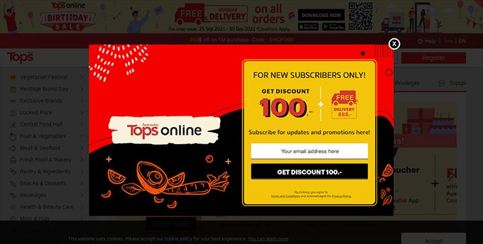
Creative sketch drawing, colors red and yellow that are highly visible and catchy, a simple form asking for email address, and a “get discount” CTA.
2. Pave
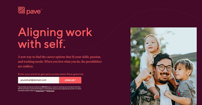
Joinpave is a beautiful single page website that carefully and neatly presents what the company is about. They also strategically bordered the site content with email forms on both top and bottom of the page. Plus point on setting expectations on the Privacy Policy disclaimer.
3. Wayfair
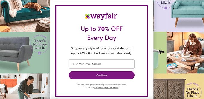
Up to 70% off every day is indeed a good deal! If you will come to think of it, a visitor who is really interested in buying décor and furniture will not see this as a nuisance. It is actually a win-win situation. A really cool deal.
4. Photobook
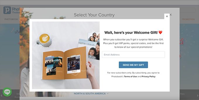
Send me my gift. I might as well as click that CTA Button even before actually putting my email in. Well, this is really something that their customers and visitors would like to have— VIP Perks, special codes and promotions —especially those who frequents their online shop.
5. Go Diaper Free
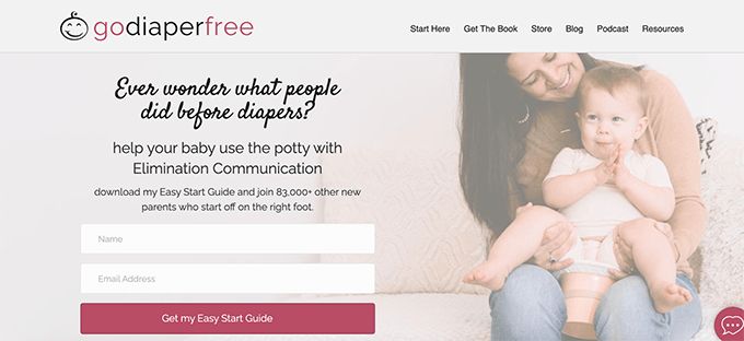
This squeeze page not only has a well-contrasted CTA button, but they are offering valuable content — Easy Start Guide — something that their target audience is really interested in having. They also included a catchy picture that clearly describes what the offer will be about.
What Can You Offer in a Squeeze Page?
Make sure to offer something with value, so that your prospective leads would not feel that your offer is not a mere bait or marketing strategy. This way you can build trust in your brand or company.
Here is some stuff that can be offered:
- Subscription to a newsletter
- Free e-book
- White paper or Infographics
- Coupon or discount
- Free templates
- Guides
- Complimentary Worksheets
- Free webinar or online course
What is NOT a Squeeze Page?
Ok! So now that we know what are squeeze pages, let’s stop for a moment to analyze what isn’t.
Squeeze Page VS Homepage
Although a squeeze page can be placed strategically on a homepage, they are not the same.
A homepage is an introduction to your website. It contains the menu the visitors can use to navigate your website. It has all the information about your product or service.
A squeeze page, in comparison to a homepage, provides relatively little but direct information, keeping visitors from overthinking.
Squeeze Page VS Landing Page
You may be asking yourself what is the difference between landing pages and squeeze pages.
Well, a landing page is a page “outside” of your website, to which prospects were led after clicking an ad or a marketing link. It has a specific call-to-action, which will either lead your visitor to your main website, purchase your product or avail of your service.
A squeeze page is more than a landing page. It is true that some landing pages can be a squeeze page if their goal is to capture names and email addresses, but it’s not always the case because some landing pages can have a different goal.
Conclusion
- A homepage, landing page, and squeeze page may have things in common but they are still technically different from each other.
- A squeeze page is a page that is intentionally and artistically designed to exchange something valuable aiming to collect your visitors’ email. Emphasis on valuable— unique and appealing
- A squeeze page is one of the best ways to collect email address, what’s considered to be one of the most powerful marketing tools.
- You can use a squeeze page for whatever industry you or your business belongs to.
- A squeeze page should not be too complicated. The short page should be utilized to capture and retain the visitor’s attention, leading them to provide their email in return for a valuable offer.
- Help promote your brand using a squeeze page. You can have one in a few minutes using fullPage.js library. fullPage helps you make gorgeous one-page sites quickly and easily, and it works like a charm alongside WordPress, React, and Vue. Perfect for your squeeze page.
![9 Beautiful Mailchimp Landing Page Examples [You'll Love] mailchimp landing pages share](https://alvarotrigo.com/blog/wp-content/uploads/2023/08/mailchimp-landing-pages-share-300x150.png)
![15 Best Portfolio Website Builders in 2024 [Reviewed & Ranked] portfolio website builders share](https://alvarotrigo.com/blog/wp-content/uploads/2023/08/portfolio-website-builders-share-300x150.png)
![21+ Best Artist Portfolio Examples [Get Inspired!] artist portfolio websites share](https://alvarotrigo.com/blog/wp-content/uploads/2023/08/artist-portfolio-websites-share-300x150.png)
![15 Great Storybrand Website Examples [For Inspiration] storybrand website examples share](https://alvarotrigo.com/blog/wp-content/uploads/2023/08/storybrand-website-examples-share-300x150.png)
![20 Beautiful Squarespace Website Examples 2024 [Get Inspired] squarespace website examples share](https://alvarotrigo.com/blog/wp-content/uploads/2023/08/squarespace-website-examples-share-300x150.png)
![15 Amazing Daycare Websites 2024 [Get Ideas & Inspiration] daycare websites share](https://alvarotrigo.com/blog/wp-content/uploads/2023/08/daycare-websites-share-300x150.png)