Beautiful Modern Websites
with Full-Page Layouts
Browse a Curated Collection of 15 Stunning Modern Websites Built with fullPage.js.
Get Ideas and Inspiration for your website.


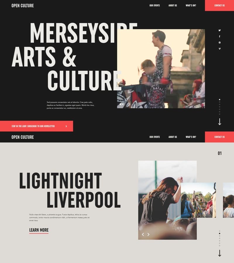
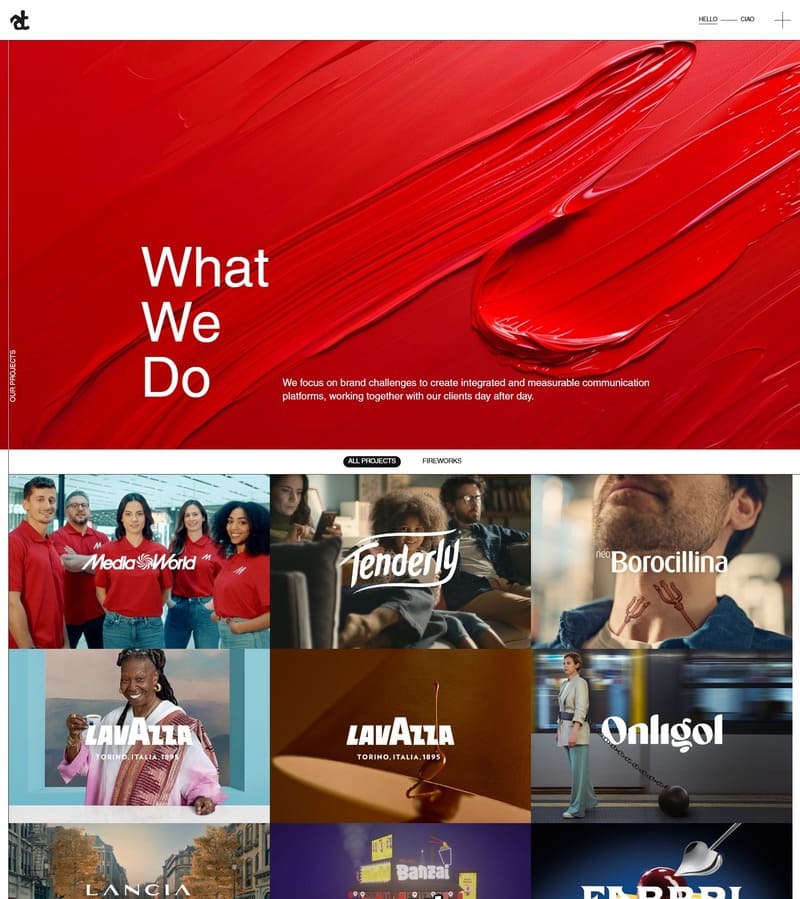
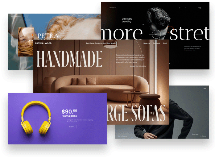
This gallery features hand-picked Modern website examples built with smooth fullPage.js layouts and immersive scrolling experiences.
Browse these designs for inspiration on your next landing page, portfolio, or marketing site. See how different brands use visuals, storytelling, and structure to guide visitors step by step.
What makes a great Modern website?
Modern websites feel current in both visuals and interaction patterns.
- Bold typography, contemporary color choices, and confident layout grids.
- Subtle animations and micro-interactions that add polish without slowing things down.
- Responsive, fast experiences that feel at home on any device.