Are you searching for the best consulting website designs? Or are you looking for some inspiring templates to use when designing yours? Whatsoever the case is, you are in the right place.
Every consultant should have a website. A well-designed, well-written consulting webpage instills confidence in yourself and your customers. The best consulting websites tell customers they have found what they have always wanted.

If you’re looking for website ideas and design inspiration to help you get started, take a look at this list of 13 consulting website examples you can use as an inspiration to set up your website from scratch.
What Is A Consulting Website?
A consulting website is an important marketing and advertisement tool that consultants use when building their digital presence. It will position you and your consulting business brilliantly on the internet, ensuring your potential clients find you as quickly as possible.
Having understood what a consulting site is, let’s dive deeper into a few top consulting website examples to help you find inspiration when designing yours, too!
Best Consulting Websites for Inspiration
1. Syl

The first on this list of best consultant websites to draw inspiration is Syl. Syl features a hero interactive video at the top of the website, encouraging visitors and potential clients to continue scrolling down the site and discovering what they have to offer. In addition, the animated sections in the lower part bring life to the site.
Other inspiring design elements about this consulting website example worth considering when creating yours include incredible background audiovisuals, great site layout, and enough use of whitespace. These make browsing appealing for your visitors while helping you achieve your ultimate business goal.
2. Kea
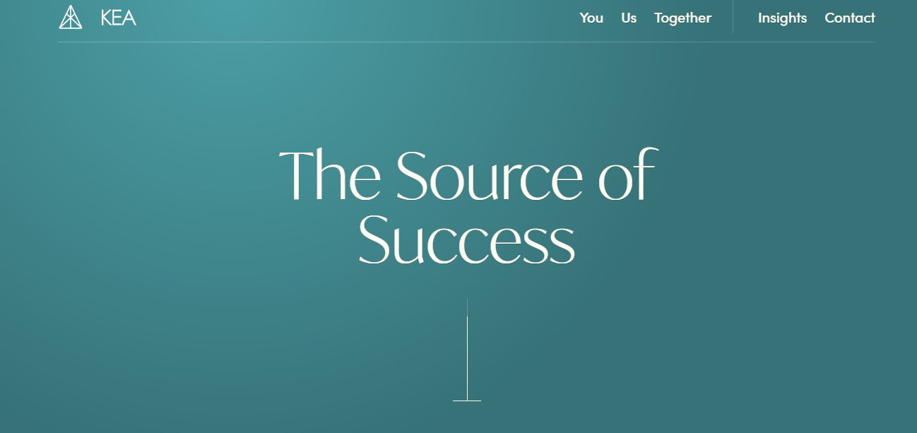
Kea website presents a welcoming and reliable impression to their visitors via images of their management team on their homepage. Their website explores an interactive background and font size capable of catching users’ attention immediately after landing on the page. And thanks to the sticky menu bar included at the top of the page, navigation has never been easier!
3. HeronCode
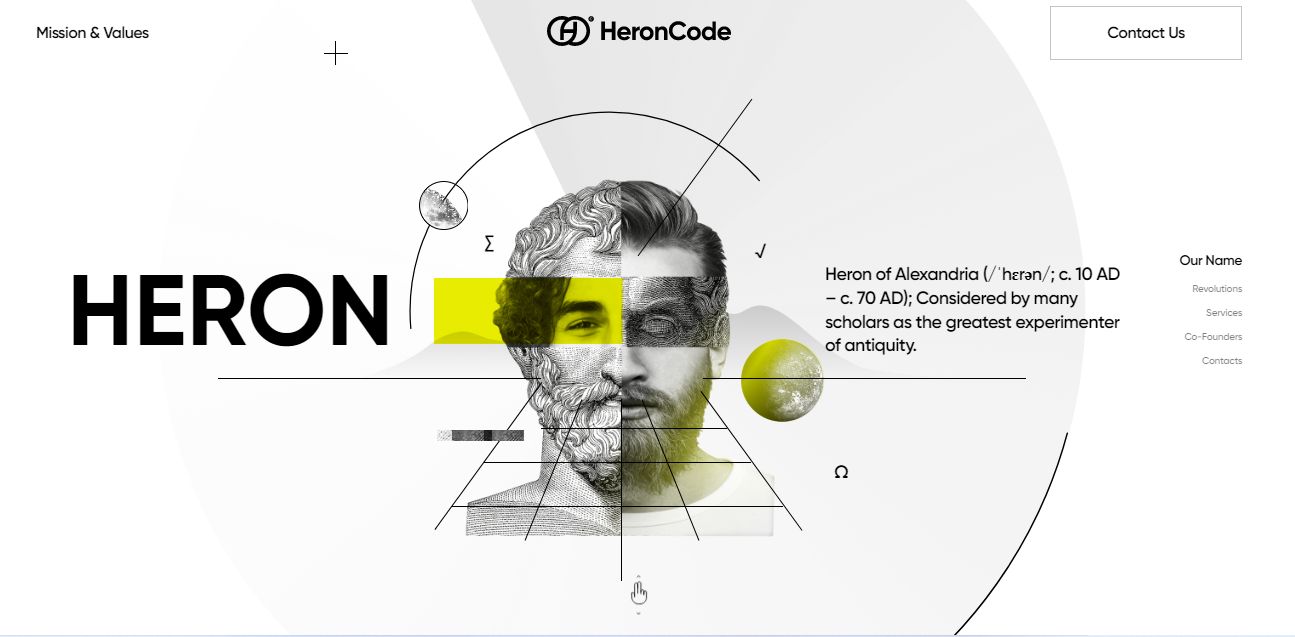
HeronCode website makes use of a simple yet incredible design. The lovely color scheme alongside the interactive, mind-blowing animation showcases how unique the website is for negotiating a high value of purchases and transactions.
This consulting website also includes a brilliant menu bar on the right-hand side of the page, allowing users to find what they want quickly.
4. Launchpad
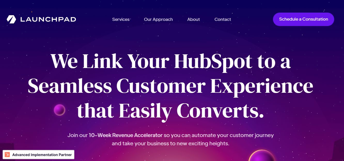
The most prominent feature of this website is the way it walks every visitor seamlessly from the top of the page to the bottom, ultimately creating the best user experience possible.
Launchpad consulting website uses bright color schemes alongside subtle animation effects, aiding user engagement and ensuring the site’s bounce rate is as low as possible. In addition, the menu bar at the top of the website aids easy navigation.
5. YMC AG
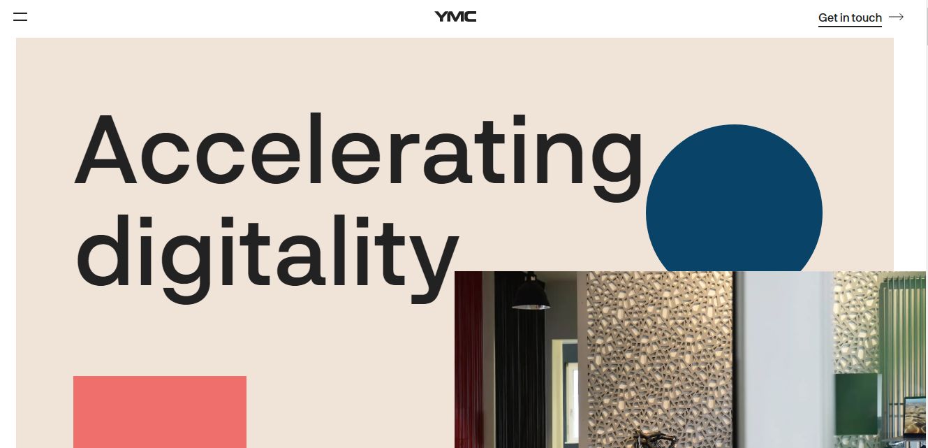
The abundant use of whitespace on this site strategically ensures visitors focus on the essential parts of their site. This website explores the use of shapes and animation to display a high level of creativity, alongside an incredible choice of font to induce user engagement and reduce bounce rate.
The hamburger menu included at the top left corner of the page also aids easy navigation, while the Get In Touch CTA at the top right corner of the site allows potential clients to reach out to them effortlessly and very quickly.
6. Feels Agency
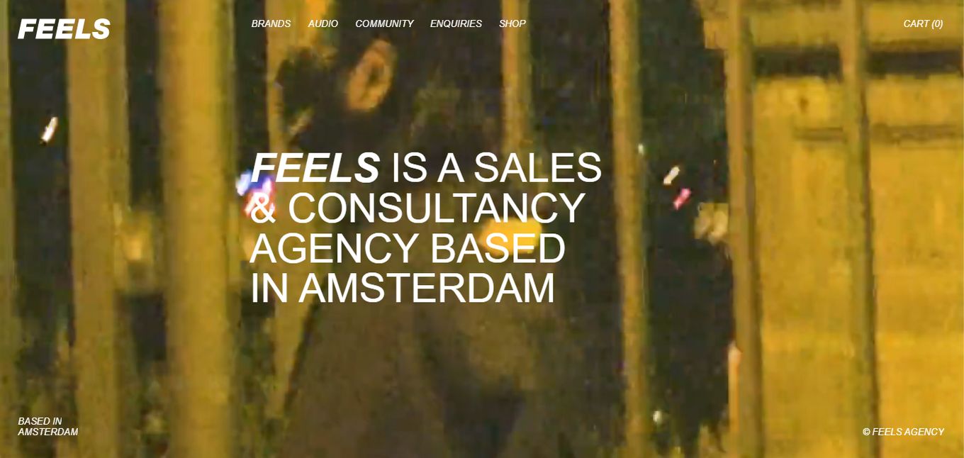
The interactive hero video employed at the top of this website jumps right at visitors immediately after landing on the page. The amusing effect creates a welcoming feeling, encouraging users to navigate even deeper into the site.
The abundant use of whitespace on other pages allows their visitors to focus on what matters the most. More importantly, their contact information is strategically placed in different locations on the site, allowing potential clients to find them.
7. Dierks Company
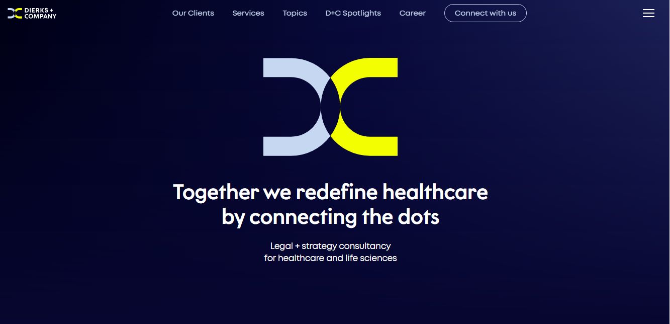
The outstanding high-tech design video slide explored at the top of this website is a brilliant way to welcome users to your consulting website. The brilliant scrolling animation effects explored also help engage your visitors throughout their stay on your site while allowing them to find what they seek very quickly.
Dierks Company also includes proof of competence on their website, creating a sense of trust and reliability in the minds of their potential clients. The comprehensive sticky hamburger menu included at the top right corner of the website also aids in easy navigation.
8. BKC Consulting
This website introduces the company’s value proposition using an interactive 3D video, letting its prospects know what to expect from them.
BKC Consulting also uses a simple content block alongside a solid background, eliminating possible distractions. The subtle scrolling animation effects also contribute to the overall user experience. In addition, the site’s footer section contains multiple Contact Us CTAs, so potential clients won’t find it challenging to reach out to them.
9. MR Consulting
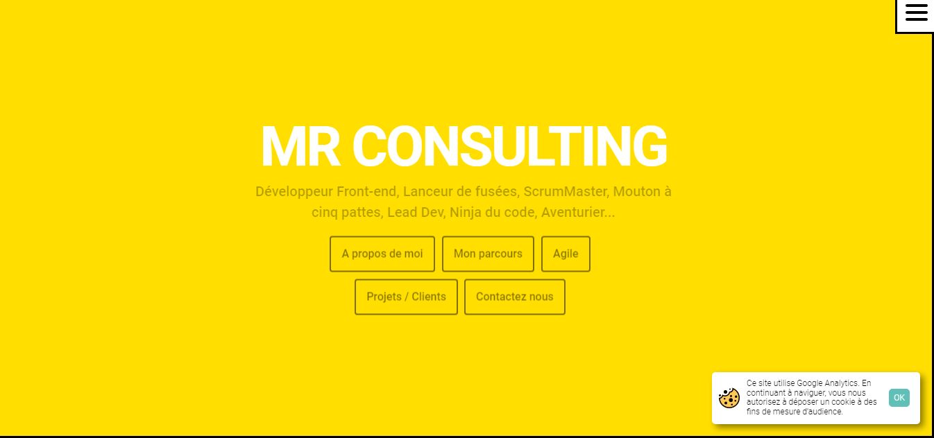
MR Consulting’s Website uses a simple yet incredible background design with abundant yellow space, creating a positive feeling for visitors and making the website attractive to navigate.
The simple yet modern design explored on the homepage allows visitors to focus more on the powerful textual content rather than getting overwhelmed or distracted. The site layout explored is also brilliant for lead generation.
10. EVP Consulting
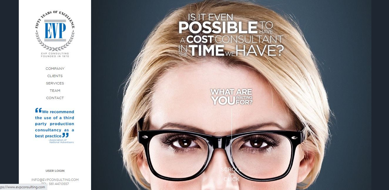
If you want to build a well-detailed website for your consulting business, consider getting inspiration from EVP Consulting Website design. With the help of a “Scroll Or Click” arrow placed strategically on the first homepage, navigation is easy for visitors. On the right side of the website is a sticky menu bar that also aids in easy navigation.
11. GCR Marketing Solutions
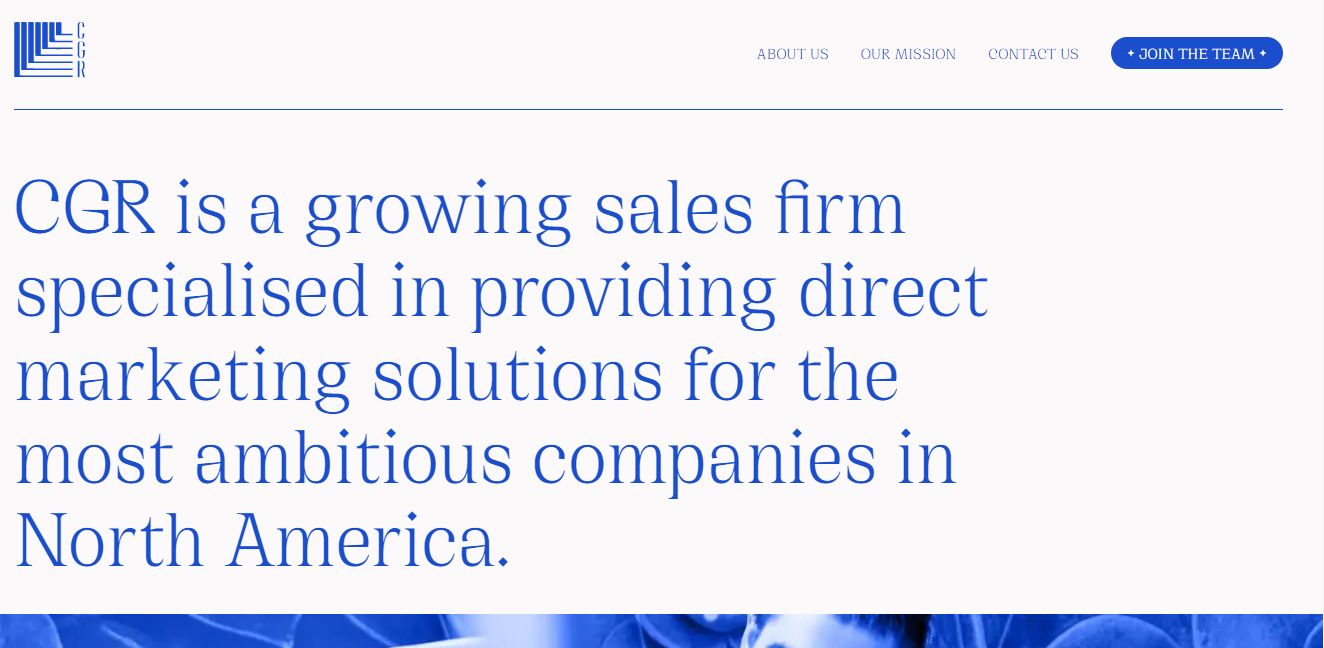
GCR Website is super clean. Its soothing, refreshing, and attractive for visitors, aiding better engagement and user experience, thanks to the blue shades implored throughout the website design.
Also, the excellent use of white space background to compliment the blue shades makes visitors feel calm to stick to the website and not want to leave, possibly converting visitors to leads.
The large font size used allows visitors to focus on the most important content, while the detailed menu bar at the top of the site aids easy navigation.
12. The Green Consulting Group
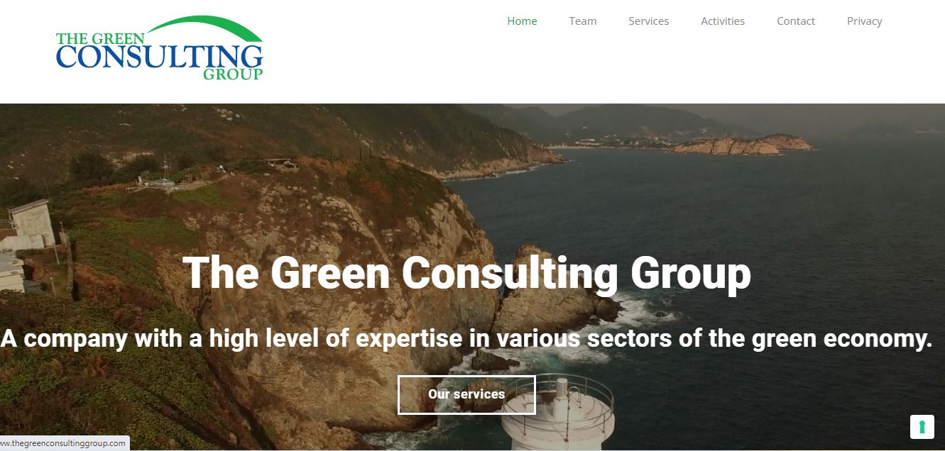
The Green Consulting Group Website features a minimalistic yet modern design. The interactive background video, alongside a consistent color scheme, helps grab the attention of their visitors, ultimately converting them to paying clients.
This Consulting Website also emphasizes its core value on its homepage, instantly clarifying what first-time visitors can expect from them. Also, with the help of the sticky Menubar, navigation is simple and effective.
13. Fourfold Consulting
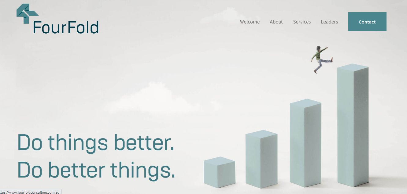
The last on our list of the best consulting website examples for inspiration is the FoulFold website. The site explores a layout, color scheme, and incredible 3D illustrations, all contributing to ensuring visitors enjoy an amazing user experience and, most importantly, focus on their offerings.
The comprehensive menu bar at the top helps users find what they seek pretty quickly, while the contact us form included at the bottom of the page allows prospects to reach out to them effortlessly.
What Should a Consulting Website Include?
-
Consulting Company’s Services: What consultancy services do you offer? Site visitors cannot become prospects if they do not know what you’re offering. Therefore, dedicate a section on your consulting webpage to explain your services and how your potential clients can benefit from them.
-
Your Consultant Credentials: While you may not find posting your entire resume on your homepage exciting, consider including credentials and accreditations. It helps legitimize your business while letting your prospects know they are in the hands of an accredited expert.
-
Render Social Proof. You would want your prospects to know you’re a credible consultant. One of the best ways to achieve this is by showing them social proof from your past and current clients.
-
A Call-to-Action Button: After providing all the information on your site, what do you want your prospect to do with them? This is why you need CTA buttons on your consulting site. It helps you lead your visitors to take desirable actions without sounding salesy.
Time to Re-design Your Own Consulting Website!
All the consulting companies on this list have invested time and energy to develop their website with professional website design.
Check out the ultimate project plan for a website re-design
In addition, they work to establish credibility and trust and stimulate interaction with current and potential clients.
Hopefully, these 13 examples of consultant web design gave you the inspiration you need to improve your consulting website!


