You can build reusable CSS alerts with plain HTML and a small set of CSS classes. Below you will find copy-paste starter code first, then a library of examples you can preview and adapt for success, info, warning, and error messages.
How do you build a CSS alert you can copy and reuse?
You build a reusable CSS alert by using a single base class (.alert) plus small modifier classes for color and style.
- Add semantic HTML for the message and an optional title.
- Apply a base
.alertstyle (padding, border radius, layout). - Add variant classes like
.alert--successor.alert--error. - Add
role="status"orrole="alert"based on urgency. - Add an optional close button, CSS-only or JS-enhanced.
Copy-paste HTML (base alert)
<div class="alert alert--info" role="status" aria-live="polite">
  <div class="alert__content">
    <p class="alert__title">Heads up</p>
    <p>Your changes were saved.</p>
  </div>
</div>
Code language: HTML, XML (xml)
Copy-paste CSS (base + tokens)
:root{
  --alert-radius: 12px;
  --alert-border: 1px;
  --alert-shadow: 0 10px 25px rgba(0,0,0,.08);
  --alert-gap: .75rem;

  --info-bg: #eff6ff;   --info-bd: #93c5fd;   --info-tx: #0b3a75;
  --success-bg:#ecfdf5; --success-bd:#6ee7b7; --success-tx:#065f46;
  --warning-bg:#fffbeb; --warning-bd:#fcd34d; --warning-tx:#7a4c00;
  --error-bg:  #fef2f2; --error-bd:  #fca5a5; --error-tx:  #7f1d1d;
}

.alert{
  border-radius: var(--alert-radius);
  border: var(--alert-border) solid transparent;
  box-shadow: var(--alert-shadow);
  padding: 1rem;
  display: flex;
  gap: var(--alert-gap);
  align-items: flex-start;
}

.alert__title{
  margin: 0 0 .25rem;
  font-weight: 700;
}

.alert__content > :last-child{ margin-bottom: 0; }

.alert--info   { background: var(--info-bg);    border-color: var(--info-bd);    color: var(--info-tx); }
.alert--success{ background: var(--success-bg); border-color: var(--success-bd); color: var(--success-tx); }
.alert--warning{ background: var(--warning-bg); border-color: var(--warning-bd); color: var(--warning-tx); }
.alert--error  { background: var(--error-bg);   border-color: var(--error-bd);   color: var(--error-tx); }

@media (prefers-reduced-motion: reduce){
  *{ animation-duration: .01ms !important; animation-iteration-count: 1 !important; transition-duration: .01ms !important; }
}
Code language: CSS (css)
Quick customization
Start by changing the CSS variables in :root for radius, shadow, and colors. Keep text contrast readable, especially for light warning backgrounds. If you animate alerts (slide in, fade out), make sure prefers-reduced-motion disables it.
What CSS alert variants should you offer (success, info, warning, error)?
Most sites need four variants, success, info, warning, and error, because they match common outcomes and expected colors. The error variant also covers the classic css error message after a failed form submit or validation issue.
Example markup for each variant
<div class="alert alert--success" role="status" aria-live="polite">Payment received.</div>

<div class="alert alert--info" role="status" aria-live="polite">New version available.</div>

<div class="alert alert--warning" role="status" aria-live="polite">Your session will expire soon.</div>

<div class="alert alert--error" role="alert" aria-live="assertive">Error: email or password is incorrect.</div>
Code language: HTML, XML (xml)
How do you make CSS alerts accessible?
Accessible CSS alerts use the right ARIA live behavior, readable contrast, and keyboard-friendly dismissal. Use ARIA live regions when the message appears dynamically after an action.
Choose the right role and live region
role="alert"for urgent errors that must be announced right away (failed payment, form submission failed).role="status"(oraria-live="polite") for non-blocking updates like “Saved”.- Avoid spamming screen readers with repeated alerts. Update the text instead of injecting lots of nodes.
Close button requirements
- Use a real button,
<button type="button">, not a clickable<div>. - Add
aria-label="Dismiss alert"if the button is icon-only. - Keep focus styles visible, and do not make click-to-dismiss the only way to clear an error.
How do you make a dismissible alert (CSS-only and with JavaScript)?
You can dismiss alerts with CSS-only patterns using a checkbox, but JavaScript is more robust and accessible.
CSS-only dismiss pattern (checkbox)
<input class="alert-toggle" type="checkbox" id="a1" hidden>
<div class="alert alert--info">
  <div class="alert__content">Newsletter preferences updated.</div>
  <label class="alert__close" for="a1">×</label>
</div>
Code language: HTML, XML (xml).alert__close{ margin-left: auto; cursor: pointer; font-size: 1.25rem; line-height: 1; }
.alert-toggle:checked + .alert{ display:none; }
Code language: CSS (css)Limitation: the close control is a label, not a button, and state handling is awkward. Use it for simple demos or static pages.
Progressive enhancement JS (recommended)
<div class="alert alert--warning" role="status" aria-live="polite">
  <div class="alert__content">Your trial ends in 2 days.</div>
  <button class="alert__close" type="button" aria-label="Dismiss alert">×</button>
</div>
Code language: HTML, XML (xml)document.addEventListener('click', (e) => {
const btn = e.target.closest('.alert__close');
if (!btn) return;
const alert = btn.closest('.alert');
if (alert) alert.remove();
});
Code language: JavaScript (javascript)How do you style links, icons, and actions inside an alert?
Use a flex layout with a gap, define link colors per variant, and keep actions aligned to the right on wider screens.
.alert__icon{ flex: 0 0 auto; width: 1.25rem; height: 1.25rem; margin-top: .15rem; }
.alert a{ color: inherit; text-decoration: underline; text-underline-offset: .15em; }
.alert__actions{ margin-left: auto; display: flex; gap: .5rem; align-items: center; }
@media (min-width: 640px){ .alert{ align-items: center; } }
Code language: CSS (css)
How do you style inline form error messages with CSS?
Form errors work best as field-level messages plus an optional error summary at the top. A field-level css error message should tell the user what to fix, and it should be linked to the input with ARIA.
Field-level css error message pattern
<label for="email">Email</label>
<input id="email" name="email" aria-describedby="email-error" aria-invalid="true">
<p class="field-error" id="email-error">Enter a valid email address, like [email protected].</p>
Code language: HTML, XML (xml).field-error{ margin: .25rem 0 0; color: var(--error-tx); font-size: .95rem; }
input[aria-invalid="true"]{ border-color: var(--error-bd); outline-color: var(--error-bd); }
Code language: CSS (css)Error summary pattern
<div class="alert alert--error" role="alert" aria-live="assertive">
  <p class="alert__title">Fix 2 errors</p>
  <ul>
    <li><a href="#email">Email is invalid</a></li>
    <li><a href="#password">Password is too short</a></li>
  </ul>
</div>
Code language: HTML, XML (xml)
What Are CSS Alerts?
CSS alerts are styled HTML messages that communicate feedback, like success, info, warning, or error states. You can render them inline in a page, pin them as a banner, or show them as a toast. Alerts are not the same as modals, which block the page, or toasts, which usually auto-dismiss. Use ARIA live regions when the message appears dynamically.
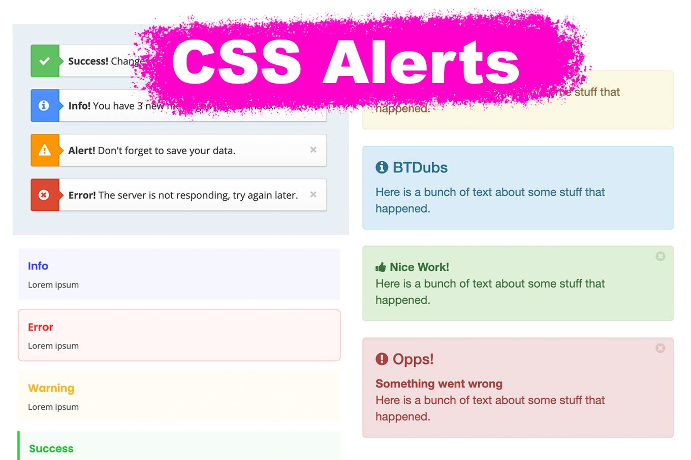
CSS alerts are classified into 4 main categories:
- Danger/Error (Red)
- Warning (Yellow/orange)
- Information (Blue)
- Success (Green)
Best 28 CSS Alerts
Whether you are looking for CSS-only alerts, JavaScript-animated ones, or just some beautiful styles, check our list below:
CSS alerts examples you can copy
Choose an alert pattern based on where it appears and how urgent it is. Inline alerts work best near the content they refer to, banners are good for site-wide notices, and toasts fit non-blocking updates like “Saved”. Modal-style patterns are better for confirmations, but they are not a drop-in replacement for alerts.
1. Closable Pure CSS Alerts
These light-themed alerts are using only CSS. Dismissal is done by clicking the alert area or the “x” icon, which is fine for demos, but do not make click-to-dismiss the only way to clear a critical message.
Copy idea: pair a visible close <button> with a small JS handler (see the dismissible section above), or use a checkbox pattern if you need CSS-only.
<div class="alert alert--success" role="status" aria-live="polite">
  <div class="alert__content">Profile updated.</div>
  <button class="alert__close" type="button" aria-label="Dismiss alert">×</button>
</div>
Code language: HTML, XML (xml)
2. Beautiful & Basic CSS Only Alert
This is a modal-style pattern built with CSS and no JavaScript. It uses :target to toggle the popup, so the URL hash changes, and the back button can close it.
Limitation: you do not get a real focus trap or ESC-to-close without JavaScript. Best for demos and simple content, not critical flows like payments or authentication.
3. Modal Alert Overlay In Pure CSS
This is a checkbox-hack modal dialog, not a standard inline CSS alert. It uses a checkbox input and :checked to show and hide the overlay.
If you use it, make sure the open and close controls are keyboard reachable, and consider adding JavaScript for focus management and ESC-to-close.
It’s a technique used for many CSS elements with 2 states, such as hamburger menus or CSS toggles switches.
4. Material Design Multi-color CSS Alerts
Modern, colorful CSS alerts inspired by Material UI.
- Variants: multi-color status styles (success, info, warning, error).
- Dependencies: Material Design Icons.
- Best for: inline notifications and banners where icons help scanning.
5. Basic Pure CSS Alerts
If you are looking for simplicity, then these alerts are for you. They don’t make use of any external vendor, no framework, no JS, and no icons.
If you want a reusable version, map these styles to the starter kit idea: one .alert plus .alert--success/.alert--info/.alert--warning/.alert--error.
/* Base + modifiers, see the starter kit above */
.alert{ padding: 1rem; border-radius: 12px; border: 1px solid transparent; }
.alert--success{ background:#ecfdf5; border-color:#6ee7b7; color:#065f46; }
.alert--error{ background:#fef2f2; border-color:#fca5a5; color:#7f1d1d; }
Code language: CSS (css)
6. Light Alerts In Pure CSS
Light, minimal CSS alerts that work well on bright UIs. Compared to item 5, these lean more on subtle borders and softer fills.
Quick check: keep link styling obvious (underline or higher contrast color), and verify contrast for warning backgrounds where yellow can get hard to read.
7. Tailwind CSS Alerts
This is a TailwindCSS example, so it depends on Tailwind utility classes. If you want vanilla CSS alerts, use the starter kit above and copy the base .alert styles.
This example shows how to display multiple alerts at the bottom of the page, with different colors and icons for error, success, info, and warning.
8. Modal Dialog Alert Message With CSS
Another CSS only solution to create a stylish alert modal.
The modals show a box with some content and a closing button.
To close the modal you can click on the dark overlay or the closing button.
This example uses the same technique as other two-state components. It uses a checkbox to track the state with CSS.
9. Timed Vanilla JS and CSS Alert
A truly modern alert that displays a notification on the top right corner of the page.
The alert times out and displays an animated progress bar to show the remaining time.
Talking about progress bars… check out these amazing CSS progress bars.
The design looks super modern and, best of all, it doesn’t use any external components! Pure CSS and Vanilla JS make the magic.
10. Multiple Simple CSS Only Modals
These alert modal dialogs make intelligent use of the :target pseudoelement to control the status of the modal.
The alerts get displayed when clicking (and focusing) the texts.
11. Large CSS Alert Notification
These alerts are a bit more original than others.
If you are looking for a big notification with some personality, these might be for you.
They don’t use any external vendor library and make use of SVG icons.
jQuery is fully optional. It only adds the closing feature, but that can be replaced if necessary for plain JS or even pure CSS.
12. Timed jQuery Text Alerts
If you are ok with using a bit of JS (or jQuery), these are some beautiful alerts.
Unlike others, these alerts get stacked underneath each other at the very top of the page.
I personally think it looks great and I like it more than the side notifications, especially for important messages or errors.
There’s a bit of jQuery involved, but you can easily turn it into Vanilla JS.
13. Colored CSS Only Alerts with TailwindCSS
For those who are into flat design and make use of TailwindCSS, these alerts can be for you.
I personally like the selection of colors, the modern feel, and the simplicity of their design.
14. Gaming CSS Closable Alert
For a less serious look and feel this alert is a great candidate.
It’s big, it’s very original and it’s done entirely with CSS.
15. Bottom Right Tailwind + Alpine Alerts
For those who like using the latest trends and make use of TailwindCSS and Alpine.js.
Simple use of alert notifications that get displayed on the bottom right.
Each type of alert has its icon and they replace each other when clicked continuously.
16. Bootstrap 5 Alert Message
Example of a simple alert using Bootstrap 5.
The alert message accepts a title and a body, so it comes in handy for that kind of alert that requires a bit more context.
17. Bootstrap 4 Alerts (CSS Only)
A great solution for developers using Bootstrap 4.
In this case, there’s no JavaScript involved and the alerts only get animated on page load.
This can come in handy when displaying them server-side after form submission, for example.
18. Alerts With Icons & Text Messages
A very simple implementation of an alert component.
They are made with CSS and the only external component they use is FontAwesome for the icons.
They use a white background for the alert message and add a touch of color on the icon background to define the type of alert it is.
19. Foundation Framework Alert Message
If you are working with the Foundation framework, then you might want to consider these alerts.
They time out after some time and can get stacked on top of each other when triggered continuously.
They enter from the bottom right with fast slide animation.
20. Bootstrap 3.3 Alerts
For those who are still using Bootstrap 3.
These alerts will stack on top of each other with a small and cute animation.
21. Colored Gradient Tailwind CSS Alert
A lovely collection of CSS alert examples.
They use Tailwind CSS framework and some beautiful and subtle gradients and shadows.
Whether you use Tailwind CSS or not, you can take the alert styles and apply them to any other alert to step up their design.
22. Basic Alert on Vanilla JS & CSS
Simple alert with no frameworks and vanilla JS.
Nothing too fancy about it, but gets the job done with practically just CSS.
23. Status Alerts
Example of some status alerts that you can use on your website.
They use a bit of JavaScript and FontAwesome for the icons.
24. Scale Effect Alert
This alert component makes use of an elastic zoom effect to display the notification.
The notification alert will timeout after some time.
It also uses a progress indicator to show when the alert will disappear.
Learn more about how to create a 1-second timeout in JavaScript.
25. Large Modern CSS Alert Components
Use this CSS code to create some modern alert messages.
It uses FontAwesome to display icons for each kind of alert message.
26. Information CSS Only Alert
Information kind of alert.
It gets closed when clicking on the X and uses an SVG image for the information icon.
27. Warning CSS Alert Message
Warning type of alert.
It gets closed when clicking on the X and uses an SVG image for the warning icon.
28. Model Alert Via :target In CSS
A very basic modal alert built entirely on CSS.
The dialog uses the bare minimum style but it still looks modern and totally usable.
The modal comes with a heading and text content and its wrapper uses some box shadow.
It uses a dark overlay when opened that closes the modal when it gets clicked.
FAQ
Are CSS alerts the same as JavaScript alerts?
No. CSS alerts are styled HTML elements that look like notifications, while JavaScript alert() is a browser dialog controlled by the browser UI. CSS alerts are more customizable and can be inline, banners, or toasts, but they need HTML and sometimes JavaScript for dismissal.
Should I use role="alert" on every alert?
No. Use role="alert" for urgent, time-sensitive messages like form submission failures. For non-critical updates like “Saved”, use role="status" or aria-live="polite". Overusing role="alert" can annoy screen reader users because it interrupts reading.
Can a dismissible CSS alert work without JavaScript?
Yes. You can use a CSS-only pattern like a checkbox toggle to hide the alert when a close label is clicked. It works for simple cases, but it has limitations for accessibility and state management. JavaScript dismissal is usually more reliable for real apps.
How do I style a CSS error message for a form field?
A good field error includes clear styling plus an accessible relationship between the input and message. Use aria-describedby on the input pointing to the error text ID, and style the message with spacing and readable contrast. Write specific copy like “Password must be 8+ characters”.
How do I show an alert in HTML?
HTML doesn’t provide a way to show alerts. But you can make use of the alert function in JavaScript to do so.
For more information on alerts, check how to use JavaScript alerts.
Here’s a quick example:
<button onclick="alert('Test');">Click here</button>
Code language: JavaScript (javascript)
 10+ Examples + Code")


