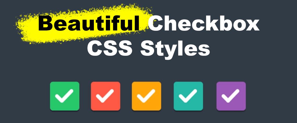
On most websites, checkboxes are left untouched — plain, standard, and frankly, a little boring. But it doesn’t have to be that way. With just a bit of CSS, you can turn those dull form elements into something that actually matches your site’s design.
This guide will walk you through the process of styling a checkbox using CSS. And once you’re done, you’ll also get access to over 17 ready-made examples you can copy, tweak, and use in your projects instantly—no need to be an expert developer

Looking for Toggle elements? Then check out our list of 20+ CSS Toggle Switches
How to Create a Custom CSS Checkbox Style
Here is how to style a checkbox using CSS:
Step 1: Set Up the HTML
Start with a basic HTML structure. We’ll wrap the checkmark box in a <label> so it’s easier to click.
<label class="custom-checkbox">
  <input type="checkbox">
  <span class="checkmark"></span>
  Subscribe to newsletter
</label>Code language: HTML, XML (xml)- The
<input type="checkbox">is the actual checkbox. - The
<span class="checkmark">will be the custom visual checkbox. - The label text (“Subscribe to newsletter”) can be anything you like.
Step 2: Style with CSS
Now let’s hide the default checkbox and style the .checkmark.
/* Hide default checkbox */
.custom-checkbox input[type="checkbox"] {
  display: none;
}

/* Create custom box */
.custom-checkbox .checkmark {
  display: inline-block;
  width: 20px;
  height: 20px;
  background-color: #eee;
  border: 2px solid #ccc;
  border-radius: 4px;
  margin-right: 8px;
  vertical-align: middle;
  position: relative;
  cursor: pointer;
}

/* Show checkmark when checked */
.custom-checkbox input:checked + .checkmark::after {
  content: "";
  position: absolute;
  left: 5px;
  top: 1px;
  width: 6px;
  height: 12px;
  border: solid #333;
  border-width: 0 2px 2px 0;
  transform: rotate(45deg);
}Code language: CSS (css)
This code does the following:
- Hides the native checkbox input (
display: none). - Style a square box (
.checkmark) to look like a checkbox. - Adds a checkmark using the
::afterpseudo-element when the selection box is checked.
Step 3: Add Hover or Focus Styles (Optional)
Make it interactive, adding a property to include a mouseover effect:
.custom-checkbox:hover .checkmark {
  background-color: #ddd;
}Code language: CSS (css)
Step 4: Paste the Solution Example on Your Site
Here’s everything together in one block so you can test it:
<style>
  .custom-checkbox input[type="checkbox"] {
    display: none;
  }

  .custom-checkbox .checkmark {
    display: inline-block;
    width: 20px;
    height: 20px;
    background-color: #eee;
    border: 2px solid #ccc;
    border-radius: 4px;
    margin-right: 8px;
    vertical-align: middle;
    position: relative;
    cursor: pointer;
  }

  .custom-checkbox input:checked + .checkmark::after {
    content: "";
    position: absolute;
    left: 5px;
    top: 1px;
    width: 6px;
    height: 12px;
    border: solid #333;
    border-width: 0 2px 2px 0;
    transform: rotate(45deg);
  }

  .custom-checkbox:hover .checkmark {
    background-color: #ddd;
  }
</style>

<label class="custom-checkbox">
  <input type="checkbox">
  <span class="checkmark"></span>
  Subscribe to newsletter
</label>
Code language: HTML, XML (xml)
With just a few lines of CSS and HTML, you’ve created your stylish checkmark that looks great on any modern site!
17 Amazing CSS Checkbox Styles to Copy
Now that you know how to build a tailor-made checkbox with CSS, it’s time to explore some creative possibilities. Below, you’ll find over 15 unique checkmark box pens, ranging from minimal and contemporary to fun and bouncy.
These checkbox CSS styles are ready to copy and paste into your project, making it easy to upgrade your forms with a fresh look in seconds.
1. Gradient Styles
Gradients can be a great solution to make certain elements or backgrounds stand out, and here we have a personalized gradient as the background of the selection square area – very catchy and appealing.
The checkmark styles here are interactive, and there are two types. Click them and check them out! Very unique, and the animation is smooth, without taking too long to complete.
2. Neumorphism Style
A flat-themed checkmark style with interactive states in the appearance of a toggle. The animation is very snappy and feels clean, you can easily change the colour of the different on and off states yourself.
Great for a Neumorphism-themed web, if that’s what you’re going for.
3. Fancy Background Image Checkbox
The default design for checkboxes in popular browsers, such as Chrome or Safari, is functional, but it lacks visual appeal. This checkbox style takes it to a whole new level, as they are interactive through its various states.
The animation is smooth, catchy, and looks incredible. In this example, there is even a fancy moving background to complement it, which might inspire you to use that as well.
4. Custom Checkbox Switch Styles
Here is another collection of CSS checkbox styles, featuring three sets of unique checkmark buttons that you can use and edit to suit your brand colors.
The first set features mouseover effects to make them more engaging. The second set consists of more traditional slider toggles, and the third set uses a different pattern.
5. CSS3 Checkbox Inputs
Try these styles out for yourself; just CSS is used to create these unique designs, so it will be easy to copy over the style for yourself.
There are nine different styles altogether in this one CodePen, and they all follow a similar colour and look, so you could easily use them for your webpage if you like the look.
6. Multiple Simple Button CSS Checkboxes
A fantastic total of 30 simple CSS checkbox styles with all different animations and types. They are generally minimal and straightforward, making them suitable for a flat-themed website. Of course, you can tweak and style the checkboxes as you want.
7. Interactive Form Boxes
A set of interactive CSS checkmark styles, where the name of each checkmark reveals the different types of animation it has.
Very fashionable and minimalist; you can change the color yourself in the CSS to match your site’s color and branding.
8. Radio Button Styles
Radio buttons are closely related to checkmarks; however, we have styles for both radio buttons and square boxes.
It uses a custom CSS checkbox style and a smooth animation that fades and slides in the checkbox mark.
9. Hidden SVG Custom Checkboxes
If you are looking for a more cartoony look and style for a checkmark, these SVG-based dynamic checkboxes will do the trick.
They use SVGs to display the square area, which is aimed to look and feel a certain way, and there are over five types to choose from. Additionally, no JavaScript is required, making them very lightweight.
10. Quick CSS Checkmarks Without Label
There are three different types, each with three examples, so you can try out what it looks like with multiple items displayed on the screen.
It’s good to have the same style but different animations; you could even change the color from white to your own brand’s design to make these even more unique. But overall, the animations are smooth, and everything is lightweight.
11. Animated Slider Toggle Check
Custom checkboxes are commonly represented as a toggle, with options for either “on” or “off,” and these dynamic toggle buttons are just that.
Learn How to Detect When the Checkbox Is Checked With jQuery.
They look great, the colours can be changed, and the sizes can be altered very easily, as you can see from the example. Try one out and click one!
12. Windows 10-Inspired Checkmark Menu
A basic layout for a Windows 10-inspired menu with these styles that you can use – great if you are a user who enjoys the Windows 10 look.
This example is handy because, despite featuring up-to-date and sleek-looking CSS checkbox styles, it also illustrates what they might look like in a minimal menu.
13. Smooth Toggle Switches
You typically see checkmarks used to confirm that you have read and understood the terms and conditions of a website during account creation. This example shows you what they look like in that form.
Once clicked, the slide moves smoothly, and the color changes from red to green, indicating that this option is selected.
14. Basic Styles With Custom Colours
A more basic example, but these CSS checkbox styles look super fashionable and minimal, kind of like the Bootstrap checkmarks you see, but everything is ready for you to copy over.
The text is also part of the checkbox item, making it much easier to click. Here, there are three different colours: green, blue, and red (the last one prevalent for “error” styles). However, you can easily edit the CSS to use any color that matches your brand’s pattern.
15. VueJS Based
VueJS is a progressive JavaScript framework that web developers can use to build event-driven UI elements. However, here we have an exquisite example of how you can combine VueJS and CSS to create unique User Interface objects – specifically, checkmarks, but there are other items as well.
This is a very comprehensive example, and the JavaScript is also straightforward to understand. However, as you can see, many selection box styles are included in this..
16. Toogle and Square Style
Two CSS checkbox styles are presented here. The first one is a traditional toggle that utilizes a smooth animation to transition between stages, and it also features an on/off symbol in the element’s background.
Then we have a standard square-shaped checkbox, but instead of a tick, it fills up the square area using a smooth animation.
17. Grid Checkboxes With Icon Elements
Something a little different compared to the traditional checkmarks or toggles, here we can see how useful a checkbox can be when paired with a background and a large icon for selection purposes.
In this example, we also have radio buttons, with the same style, which is an excellent example of how a selection area can be extended and used in different ways.
![9+ Best Contact Pages To Get Inspired [+ 15 Free Contact Forms] contact page examples share](https://alvarotrigo.com/blog/wp-content/uploads/2023/08/contact-page-examples-share-300x150.png)


![20 Best Toggle Switches For Your Site [Pure CSS Examples] toggle switch css share](https://alvarotrigo.com/blog/wp-content/uploads/2023/08/toggle-switch-css-share-300x150.png)
![11 Must-Have Skills If You Want to Be a Web Developer [2024] web developer required skills share](https://alvarotrigo.com/blog/wp-content/uploads/2023/08/web-developer-required-skills-share-300x150.png)
![10+ Amazing Flat Design Websites [for Inspiration] flat design website share](https://alvarotrigo.com/blog/wp-content/uploads/2023/08/flat-design-website-share-300x150.png)