This is part 2 of the complete guide to CSS transitions. In this post, you’ll learn the advanced Jedi skills of CSS transition-timing-function, and transition-delay!
If you missed part 1, click here to learn about CSS transition-duration and transition-property.
CSS Transition-timing-function
This is where things get really cool.
While transition-duration controls how long it takes to transition from one state to the next, transition-timing-function controls the rate of the transition within that time.
For example, if you’re moving a box from one side of the screen to another, do you want it to move at a constant pace? Or do you want it to move quickly at first, but then slow down as it nestles into its finishing position?
That’s what CSS transition-timing-function can do for you. There are five commonly used pre-set options:
- linear: The transition happens at a constant speed.
- ease: Starts off fast, but slows down just before the end. This is the default value.
- ease-in: Start off slow, and gradually builds up speed.
- ease-out: Starts off fast, but slows down early.
- ease-in-out: Starts off slow, slows down early, but fast in the middle section.
This is easier to understand visually – hover over the image below to trigger the boxes to move:
As you can see, they all reach the finish line at the same time, but they move at different speeds along the way.
To do this, I absolutely positioned each box, gave each one a unique class, and then used that class to set the transition on the left property:
.linear {
  transition: left 2s linear;
}

.ease {
  transition: left 2s ease;
}

.ease-in {
  transition: left 2s ease-in;
}

.ease-out {
  transition: left 2s ease-out;
}

.ease-in-out {
  transition: left 2s ease-in-out;
}
Code language: CSS (css)
As we discussed in part 1, CSS Transition Duration & Property, you can assign these three values separately, for example, you could use this:
.ease-in-out {
  transition-property: left;
  transition-duration: 2s;
  transition-timing-function: ease-in-out;
}
Code language: CSS (css)
However you’ll run into the same issues regarding readability and maintainability that we talked about before – so it’s best to set them all together with transition.
Setting Customised Timing Functions With cubic-bezier()
For most situations, these five default CSS transition-timing-function values will probably have you covered.
However if needed, you can customise the acceleration and deceleration of your transition by using the cubic-bezier() function.
A cubic Bézier is a type of curve, named after French engineer Pierre Bézier, who used it to create the curves on Renault cars in the 1960s. The function takes four arguments, and from these, calculates a curve which determines the timing of the transition.
OK, that’s a mouthful!
What does it all mean? Well, let’s first think about linear timing. If you plotted that on a chart it’d look like this:
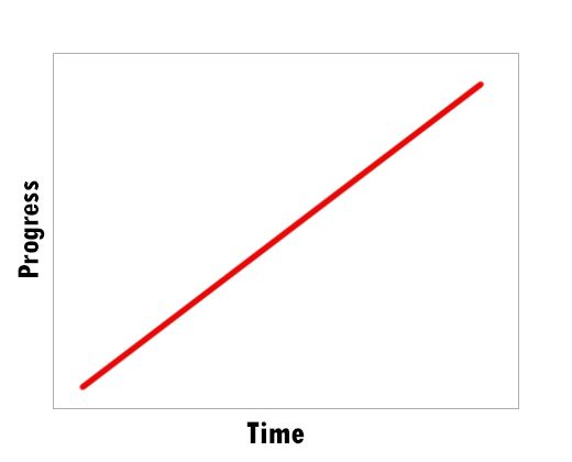
The time the transition takes is along the x axis, and the progress of the transition (e.g. how far the box moves) is up the y axis. We see a straight line with linear, because the transition happens at a constant rate.
Now let’s look at another one, ease:
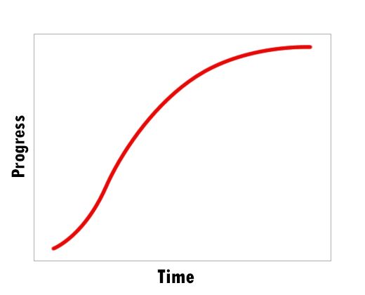
As you can see here, most of the progress of an ease transition happens quite early. Halfway through the duration, 80% of the animation has already been completed. The final 20% of the animation takes the same amount of time, which gives that deceleration effect.
Each of the five ‘pre-set’ transition timings has their own curve, and you could re-create them using cubic-bezier() if you really wanted:
- linear = cubic-bezier(0.0, 0.0, 1.0, 1.0)
- ease = cubic-bezier(0.25, 0.1, 0.25, 1.0)
- ease-in = cubic-bezier(0.42, 0, 1.0, 1.0)
- ease-out = cubic-bezier(0, 0, 0.58, 1.0)
- ease-in-out = cubic-bezier(0.42, 0, 0.58, 1.0)
And of course, you are completely free to create your own curve! Lea Verou has an excellent cubic bezier tool that you can play around with.
I’ll say one more thing on this before we move on – in general, and especially with movement, you’ll want to avoid linear.
In the real world around us, objects rarely move at a constant, linear speed – they accelerate and decelerate. And it’s not just movement – even the amount of daylight we get per day doesn’t change at a linear rate through the year.
If we replicate that in our transitions, they’ll feel more natural.
CSS transitions with steps()
Each of the above options creates a nice, smooth transition from one state to the next. But what if you don’t want a smooth transition? What if you want to change state in a number of distinct stages? Well, CSS transition-timing-function has a steps() function which can do exactly that:
  transition-timing-function: steps(10);
Code language: CSS (css)
Again, you can combine this into the transition property:
  transition: left 2s steps(10);
Code language: CSS (css)
Here we’re transitioning the left property, setting a transition-duration of 2 seconds, and we want it to happen in 10 discrete stages rather than one smooth movement.
The pen below shows what a few different steps() values look like in action – and I’ve put a linear timing function at the top for comparison:
Note that all CSS transition-timing-function values technically use steps. It’s just that when we use ease or one of the other options, the browser is using so many steps that it appears smooth to the human eye. If you use a really high value with steps, like steps(240), it should be indistinguishable from the linear version.
CSS steps – do you need a jump start?
You might be thinking, if the transition takes five steps, does that include the starting point? For example, if we use steps(5), is the initial position of the element included in those 5 steps? Or does it make 5 steps from that point?
For that matter, is the final state included? Or does it mean there are 5 intermediate steps between the beginning state and the ending state?
This is something you can choose for yourself, by passing a second argument, a jumpterm, to steps() – along with the number of steps. You have a few options here (these examples each assume you want 5 steps):
jump-start: The element will make five steps from the starting state to the end state. So there will be 6 stages in total. As soon as the transition begins, the element will immediately jump to the first step – a jump start!jump-end: The element will make the exact same steps asjump-start, but it will reach the final stage exactly when the transition ends. This is a bit likeease-in– it will feel like a slow start. This is the default setting.jump-none: The initial state and the end state are included in the 5 steps. So there will be 3 intermediate steps, between them, and the element will technically make 4 changes in total.jump-both: The initial state and the end state are not included in the 5 steps. So there will be 5 intermediate steps between them, and the element will technically make 6 changes in total.
(note that you can also use start instead of jump-start and end instead of jump-end).
Let’s see how these look! Using the same boxes as above, I’ve added a different class to each box, and applied a different jumpterm to each one, asking for 5 steps each time:
.no-jump-setting {
  transition: left 2s steps(5);
}

.jump-start {
  transition: left 2s steps(5, jump-start);
}

.jump-end {
  transition: left 2s steps(5, jump-end);
}

.jump-none {
  transition: left 2s steps(5, jump-none);
}

.jump-both {
  transition: left 2s steps(5, jump-both);
}
Code language: CSS (css)
And here’s the result:
It’s Not Just About Movement!
I’ve used moving boxes in all the examples here, because that makes it easier to see what the different values are actually doing.
But remember that these transition-timing-function settings apply to all transitions. Here’s how they affect colour change transitions, for example:
CSS transition-delay
The final transition property is CSS transition-delay. As the name implies, this enables you to set a delay between when the transition is triggered, and when the animation actually begins.
You use it like this:
transition-delay: 1s;
Code language: CSS (css)
To combine it with every else in transition, you just add the delay to the end:
  transition: left 2s ease 1s;
Code language: CSS (css)
Hover over the boxes to see a few different delays:
Note that the delay time is not included in the transition-duration. So a transition with a 2s duration and a 1s delay will take 3s in total.
Another thing to note – try hovering over the boxes, but then move your mouse away before they have reached the finish line. You’ll see that the delay also applies when the transition is reversing itself.
Accessibility with transitions and animations
While many people will love all the awesome animations you’re going to create, many others would rather do without them. In fact, on-screen movement can cause sickness and even seizures in some folk.
But you may have noticed that animations are all over the web now. So what do these people do? Do they just not use the internet?
No they do, but they change a setting in their OS to indicate that they would prefer reduced movement. Browsers detect this setting, and pass it to your site. You can then detect what their preference is, and use a prefers-reduced-motion media query to turn off your transitions:
@media (prefers-reduced-motion: reduce) {
  .box {
    transition: none;
  }
}
Code language: CSS (css)
You can simply list all elements with transitions in this query, and set transition to none as you see above. To be on the safe side though, you can approach this from the opposite angle:
@media (prefers-reduced-motion: no-preference) {
  .box {
    transition: background 2s ease-in-out 1s;
  }
}
Code language: CSS (css)
The no-preference value is the default for prefers-reduced-motion. So if you put all of your transitions in this query, your site will turn transitions on unless told not to. It’s a safer option, just in case you or your colleagues forget to turn a transition off in the reduce query.
What will you create?
Congratulations! You now have the tools to create all manner of transitions for your website. Once you get to grips with this, you’ll be amazed at what you’re able to create.
If you want some inspiration, to see what’s really possible, have a look at fullPage.js. fullPage enables you to create beautiful, fully-responsive, full page sites that run smoothly and provide an awesome experience for your visitors.
Check out these fullPage examples to see the different transitions, animations, and effects you can apply to your own site. There are different scroll effects, fades, parallax effects, and a range of different sliders. Give it a try!


")


