Large full-screen sections are quite a common element on nowadays websites, especially on landing pages acting as a hero slider. They take the full height and full width of the viewport with the intent of bringing the focus in a single portion of the page. Here we will be explaining how to achieve just that.
Defining our sections in HTML
Let’s start by adding a couple of section elements inside a the <main> wrapper:
    <main>
      <section>
        <h1>Hello!</h1>
      </section>
      <section>
        <h1>Toodles~</h1>
      </section>
    </main>
Code language: HTML, XML (xml)
Making sections become full-screen
Making sections full-height and full-width can be done in two ways:
- Using viewport units (
vhandvw) – May feel the most intuitive out of the two. In fact, the viewport units were introduced to do just these kinds of things. - Using implicit units like percentages. (
%). They used to be used more in the past when viewport units were not a thing or were not widely supported.
Using viewport units
First, we will style our sections so that they scale to the height of the viewable area. We will use the vh unit, which stands for “viewport height”. The vh unit is roughly 1% of the viewport’s height. And what is the “viewport”? It is the visible area of your website in the browser. To make it take 100% of the vertical space, we will set min-height to 100vh, meaning, the section will take a minimum height of 100% of the viewport height.
We set min-height instead of height because this way each section can, if required, have a bigger height, while if you used just height any content that scales beyond the viewport height would be overflowing the container.
body {
margin: 0;
}
section {
font-family: sans-serif;
min-height: 100vh;
}
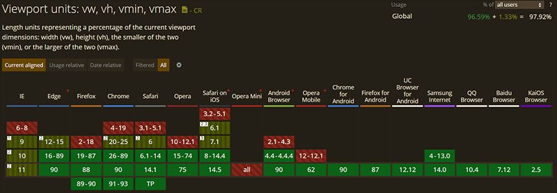
Code language: CSS (css)It is important to note that if you intend to support legacy browsers, then you might want to use percentage units instead. Take a look at the following chart to verify if the browsers you intend to support are listed in green:
Using percentage units
The main difference between the percentage unit and the viewport units is that the percentage units rely on the height and width values of the parent. This means that all the parent elements must also scale to the full height and width if the children underneath wish to. This is why the html, body and main tags have height and width set to 100%. This will force each parent in the hierarchy to take up the full available height and width of the viewport.
html,
body {
  margin: 0;
  height: 100%;
  width: 100%;
}

main {
  height: 100%;
  width: 100%;
}

section {
  font-family: sans-serif;
  height: 100%;
  width: 100%;
}
Code language: CSS (css)
Centering content vertically and horizontally
You will very probably want to have some centered content on your section. If not text or images, probably a container element.
We will be using the align-items property to vertically center whatever content we have. Then, to center them horizontally we’ll be using justify-content: center.
And to make those two properties work, we’ll display: flex in order to turn each section into a flex container.
section {
  font-size: 120px;
  display: flex;
  justify-content: center;
  align-items: center;
}
Code language: CSS (css)
Styling sections individually
To make each section distinguishable from the other, we will use the nth-child selector to set a background and a color. You can achieve the same thing by using a class for each section too if you prefer so.
section:nth-child(1) {
  background: orange;
  color: white;
}

section:nth-child(2) {
  background: cyan;
  color: white;
}
Code language: CSS (css)
With that, you should now be able to confidently create fullscreen sections with HTML and CSS. If you want to see how it looks like, take a look at the following CodePen and while you’re at it play around with it:
And here we have the same but using a percentage instead of vh units.
Conclusion
If you’re interested in creating fullscreen websites, then you can take a look at fullPage.js. As the name suggests, fullPage.js revolves around the idea of using full-screen sections, but on top of that, it allows you to add some nifty effects like snap scrolling or horizontal scrolling with little to no effort on your part. Easy to configure and with tends of options that will make your page look quite unique.
And if you want to keep on improving your fullscreen website, adding a sticky or fixed navbar is definetely the way to go. And if you want to consider adding videos, check out how to create a fullscreen video with CSS and HTML or how to add Youtube videos as a background with CSS.


")