For every marketer who is getting started with a blog, he has got to ask this question: “What are the standard webpage dimensions?” The size of your site will determine how beautiful your site looks, and it will also influence the user experience, page speed, and much more.
So, you have got to optimize all these variables to activate them beyond perfection, but first, you have to know the standard webpage size.
Which Is The Standard Webpage Size?
The standard webpage size uses a maximum width of 1440 pixels for Desktops. This is because most desktop resolutions use a wider resolution nowadays (1920×1080). However, most websites are fully responsive nowadays, which means they won’t use fixed dimensions.
No matter what the standard webpage size is, nowadays websites will not use a single fixed dimension.
They will adapt to the screen of the visitor or even to the size of the window if the user resizes the page.
This technique is known as “Responsive Design” and it’s a common practice that ensures the visitor will get the best experience no matter what device or screen uses to access a website.
Why Does a Webpage Size Matter?
It’s important to know the standard web page width because many other factors depend on it:
-
Screen Resolutions. Most screens have a resolution of 1920×1080 pixels or higher (as pointed out on Statcounter), so if you design for 800×600, you’re limiting yourself to only half of all potential customers.
-
Text Readability. If your text doesn’t fit into one line on a 1024×768 screen and instead has to break into two lines (or more), it will be hard for people with poor eyesight to read.
-
Accessibility. If your site uses tables to lay out its content, then the standard website header size and footer areas must remain static even when resized by screen resolution or browser zoom level.
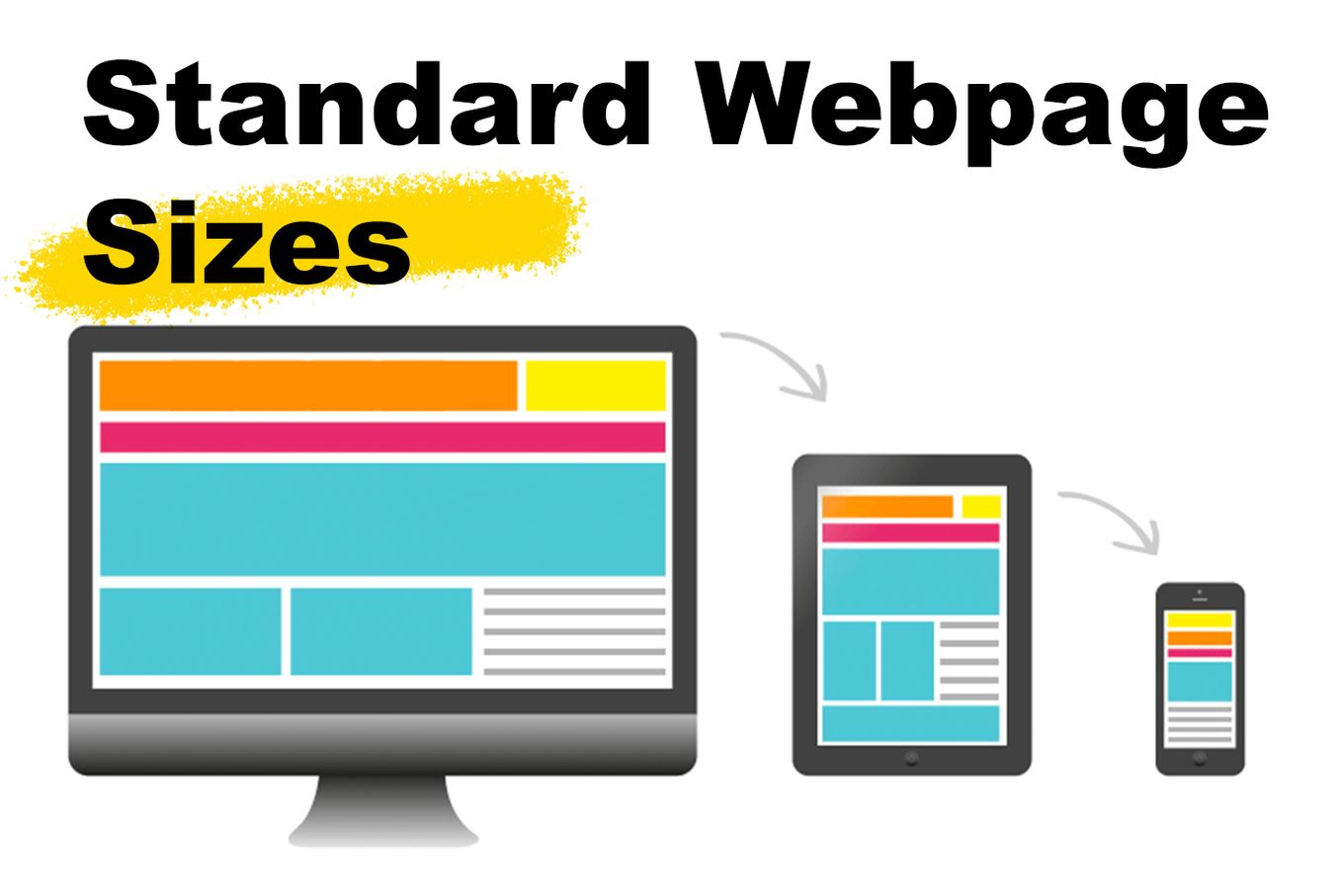
Standard Website Dimensions
Here are the different standard webpage dimensions on different devices:
Standard Webpage Size for Desktop Screens
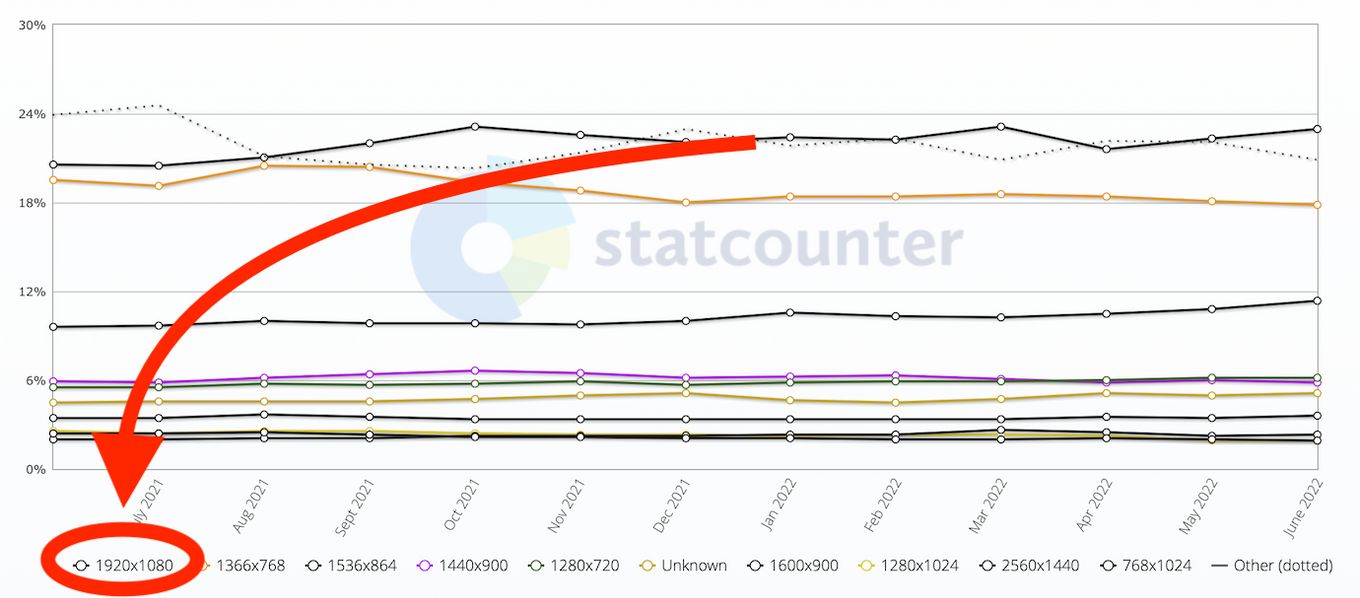
The standard webpage maximum width dimensions for desktop screens are 1440 pixels. It’s a common practice restrict the maxium width dimension for your site. This way the page will still look good even on wide or super wide monitors.
If you want your website to look good on all types of devices, then it’s important that you abide by this standard.
Check out the breaking point recommendations by Microsoft.
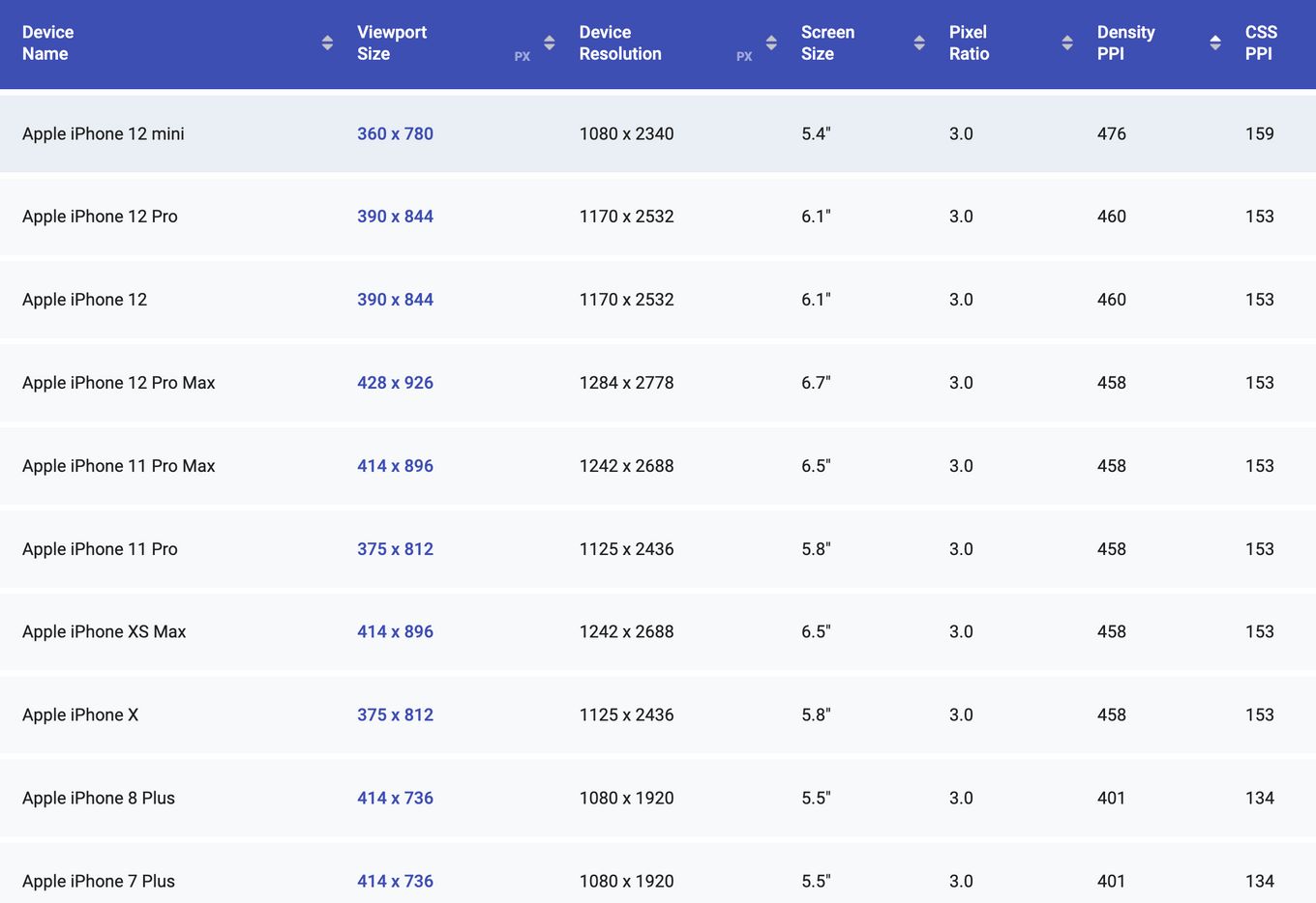
Standard Webpage Dimensions for Mobile Phones
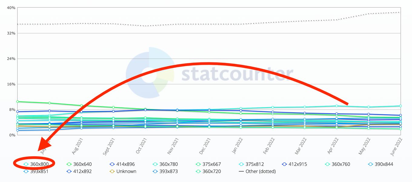
The most common viewport dimension used in Mobile phones is 360×800 pixels. However, most websites use flexible layouts and will be able to adapt to different resolutions.
You should also ensure that any text is large enough to be readable on screens with resolutions lower than 360px width.
Standard Webpage Size for Tablets/iPads
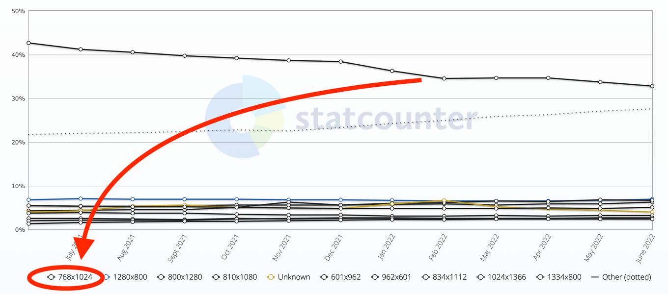
The dimensions of a standard website for an iPad or tablet should be optimised for a resolution of 768×1024 pixels, as this is the most common resolution for Tablet devices”.
If you have an iPad or tablet, you’ll know how annoying it is to have to constantly resize your website so the text on the screen is legible.
The good news is that there are standard webpage dimensions for these devices, so if you can get your website to fit within those limits, it will automatically scale down to fit in the small space without having to do anything extra.
Things to Consider When Deciding on Your Website Size
Here are some things you should consider when deciding on your web page size:
1. What Type of Content do You Want?
Choosing the right type of content for your site is essential. You need to know what it is that you want to communicate to make sure that the message you’re sending is clear and that you know who your audience is.
If you have a lot of text, you’ll probably want a bigger screen to make it easy for people to read. On the other hand, if your site has video content, then a smaller screen might be better because it will allow people to see more easily.
2. How Often Will New Content Be Added?
If you’re going to be creating new content on a regular basis, it’s important to choose a page size that allows you to quickly add new content without having to worry about whether or not the reader will have to scroll.
It can also be helpful to decide on a maximum number of characters for each post so that you don’t find yourself writing excessively long posts.
If you’re planning on adding new content only once a week or less often, then it’s probably best to use a larger page size and leave some space for the reader’s comments.
3. How Many Pages Do You Need?
When deciding on the size of your website, it’s important to consider the number of pages you’ll need and what types of content will be included.
Your site should be easy for visitors to navigate and find the information they want. A good rule of thumb is to limit your site to no more than 20 pages.
4. How Much Information Can Each Page Hold?
It’s essential to consider the amount of information your visitor will want to digest at one time. If they don’t have enough time or interest to read all the content on your page, they may leave before getting to the bottom. A good rule of thumb is to allow around 20 words per line for optimal readability.
5. Do You Have Enough Content?
If the answer is yes, then consider how many pages each page needs to have. There are many different types of pages that can be created on your site, including blog posts, landing pages, and e-commerce pages.
Each type of page has its own purpose and should be designed differently according to what it needs to accomplish.
What Is a Responsive Web Design?
Responsive Web Design (RWD) is an approach to web development that aims to create mobile-friendly designs by creating fluid layouts and flexible media queries. This allows a website’s layout to adapt to the device it’s being viewed on, whether it’s a desktop PC, tablet, or smartphone, without requiring multiple versions of the site.
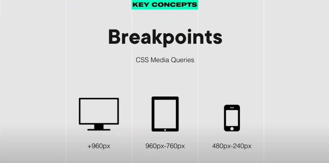
The key concept of RWD is to make sure that content fits into the available space rather than stretching out of control or disappearing altogether.
Why Use Responsive Design?
There are many benefits of using a responsive design. These include:
1. Increased Usability
A user interface that responds well to different screen sizes is much easier to use than one that doesn’t. If your site doesn’t adjust properly, it could become frustrating for users with small screens (such as those using mobile phones).
2. Increased Search Engine Visibility
Search engines such as Google are starting to favor websites with responsive designs over those that don’t support different screen sizes. Unfortunately, this means that if your site isn’t responsive, you may lose traffic from Google (and other search engines).
3. Less Coding Required
Many developers think that responsive design requires more time and effort than traditional web development techniques. However, this isn’t true at all! The responsive design actually requires less coding because you only need to make changes in one place instead of multiple places.
This makes it much easier for developers to maintain websites built with responsive design techniques in the long run compared to traditional websites.
4. Google Recommends It
Google has been recommending responsive design since 2010 when it introduced its “Mobile-Friendly” algorithm update to reward websites with an extra boost in search rankings if they were built responsively or at least had a mobile version that was separate from the desktop one (and thus more likely to be accessible to mobile searchers).
The company updated that algorithm last year to place more emphasis on page speed as well as mobile-friendliness but it still recommends responsive design over “mobilizing” your existing site by simply redirecting people from their desktop browser to a mobile app when they’re browsing on their smartphone or tablet device.
5. Consistent User Experience
When people access your website from their desktop computer or mobile phone, they should have an experience that is similar across all devices. This means that the layout and functionality will be consistent, even if the screen size is smaller or bigger than the original design.
6. Decrease in Maintenance/ Cost
One of the most important aspects of responsive design is that it reduces maintenance costs and time spent on updating content. Let’s take a look at an example:
A company has two websites, one for desktop users and one for mobile users. In order to make changes or updates to the website, they need to make sure both versions are up-to-date with each other.
This can be quite time-consuming and costly if there are multiple pages or sections on the website that needs urgent updating.
With responsive design all you need is one website that will automatically adjust itself based on the device viewing it, so no matter what device someone is viewing your site on they will always see the latest version without having to worry about updating multiple versions of it.
7. Increased Traffic and Conversions
When you have a responsive site, it’s easier for people to find your website when searching on Google or other search engines. They’ll also be more likely to convert into paying customers because they can shop easily, no matter where they are or what device they use.
Conclusion
In the end, a good rule of thumb is to stick with the specifications that your closest search engine optimization (SEO) guru has recommended for your site.
Even if your website does not often change, having a clear idea about its optimal dimensions will likely prove useful for running maintenance checks and diagnosing any problems you may encounter. It’s far better to over-prepare than to regret that you’ve done too little.


