Web design techniques exist in many forms in today’s world, trends move fast and change all the time. The same goes for web design patterns, some people love certain trends and some people hate certain trends. Some can really engage users and others can end up distracting users and annoying them, pushing them away.
One web design technique is sliders.
They allow for content to be displayed in a way that maximizes the space on the screen. A lot of information can be shown with the use of a great slider website.
However, it’s best to understand what they are and when they are useful, they can easily become annoying and poorly timed.
What is a Website Slider?
It is an element on a web page that slides left or right (or even any other direction!) It’s a way to display content on a page in one area where the content can fly into place, displaying huge amounts of content in one area.
Sliders are basically a slideshow of information that can be a combination of images, text, icons, and links, etc. One famous slider example is a website carousel which can be used to display multiple images across the width of a screen in one area.
An example might be a carousel of products with a text description or a showcase of a portfolio:
Check out what is a slider? if you still need some more clarification on this.
Eye-Catching Slider Website Examples
We’ve seen an example of one of the most famous types of slider websites, that is a carousel of images and text but there are many more slider types to learn.
Let’s go through some inspiring examples you can use yourself in your own design and get ideas from.
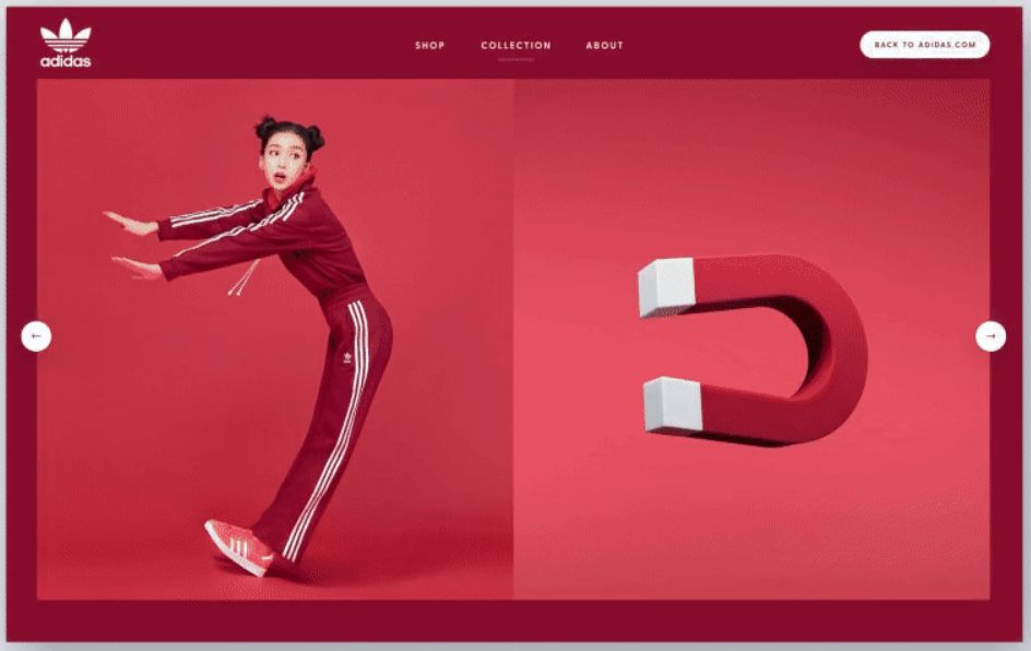
1. Zara Website Slider
Zara is a worldwide well-known clothes brand that has decided to make their whole website a full screen slider. This can be a powerful tool from the marketing perspective and, at the same time, provide a modern user experience that will for sure create an impact on their visitors and potential clients.
This kind of website sliders got popular after Apple used the same website layout for their iPhone 5C and the same sliding technique. (Also used by the BBC website, The Telegraph, Dreamworks and many other big brands)
If you are interested in this kind of design, you can replicate it by using the fullPage.js JavaScript component. If you use WordPress, check out the Elementor and Gutenberg plugins for it.
2. Split Sliding Website
Unlike traditional sliders that have one single sliding element, Split Theme splits the screen in two and slides each of them in opposite directions. This ends up creating an interesting effect that some websites can benefit from.
You can get this effect by using multiScroll.js component for JavaScript or the Split Theme from Themify.
3. Squarespace Website Slider
This lovely design from Squarespace really shows how good it looks when you combine great photos with the slider design. The large stunning images are easy to navigate and this design is a great way to show off a portfolio that could look as awesome as these 9 unbeatable online portfolio examples.
If you want to achieve something similar you’ll find many possible components on our curated list of jQuery carousel plugins
4. Dreamworks Website Slider
A great example with how lots of sliders and carousels can be used to make a really effective website that is extremely interactive.
Using sliders and carousels can enable you to include a lot of images in one place, users can slide through interactive content and decide what they want to click.
Unlike the previous slider, this one will slide 3 items at once, making it faster to navigate.
Check out our curated list of jQuery carousel plugins if you want you are interested in building something similar.
5. Xiaomi Website Slider
Unlike other traditional sliding carousels, Xiami uses a website slider that fades between slides. This creates a simple, fast, and less distracting slider that serves the same purpose.
If you are into full screen pages, you can get something similar by using fullPage.js together with the Fading Effect extension.
6. Diagonal Website Slider
This is a much less conventional slider yet a beautiful one. This diagonal slider adds a different touch and will certainly create an impression on any visitor.
7. WebGl Slider
WebGL Sliders usually mean one thing: beautiful animations. And this case won’t be different. The WebGL slider for Webflow provides multiple effects on each of the clonable demos and they are all quite impressive!
8. LookBack Slider Website Design
Slider website design is all about having that perfect animation and impressive transitions without being annoying. One area of business that gets this right is the fashion industry, they have used this LookBack design to show off their products.
A LookBack design is where the images are auto-played vertically in opposite directions.
If you are looking for amazing slider effects you can get inspired by these 20 animated sliders.
9. Interactive Text and Image Slider
This slider website example shows how well a slider works with text and buttons that the user can interact with. The image can engage the user with the text and act as a Call To Action (CTA) as well. You can use these CSS Button hover effects to animate your buttons.
10. Full Screen Scrollable Slider Design
This website uses a full screen slider design, has multiple pages or steps, and allows the user to navigate by simply scrolling.
If you are looking for a website slider solution to do something similar, you may be interested in fullPage.js as mentioned before. This would allow you to easily create full screen scrollable pages.
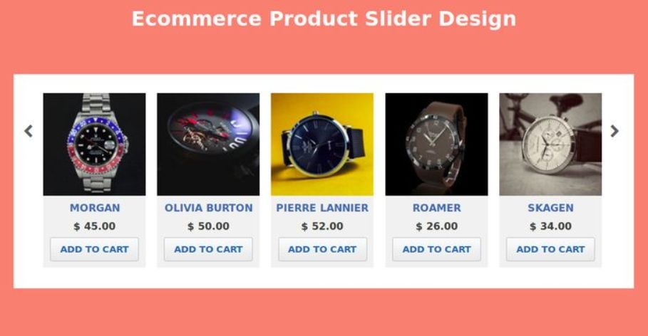
11. Amazon eCommerce Image Slider Design
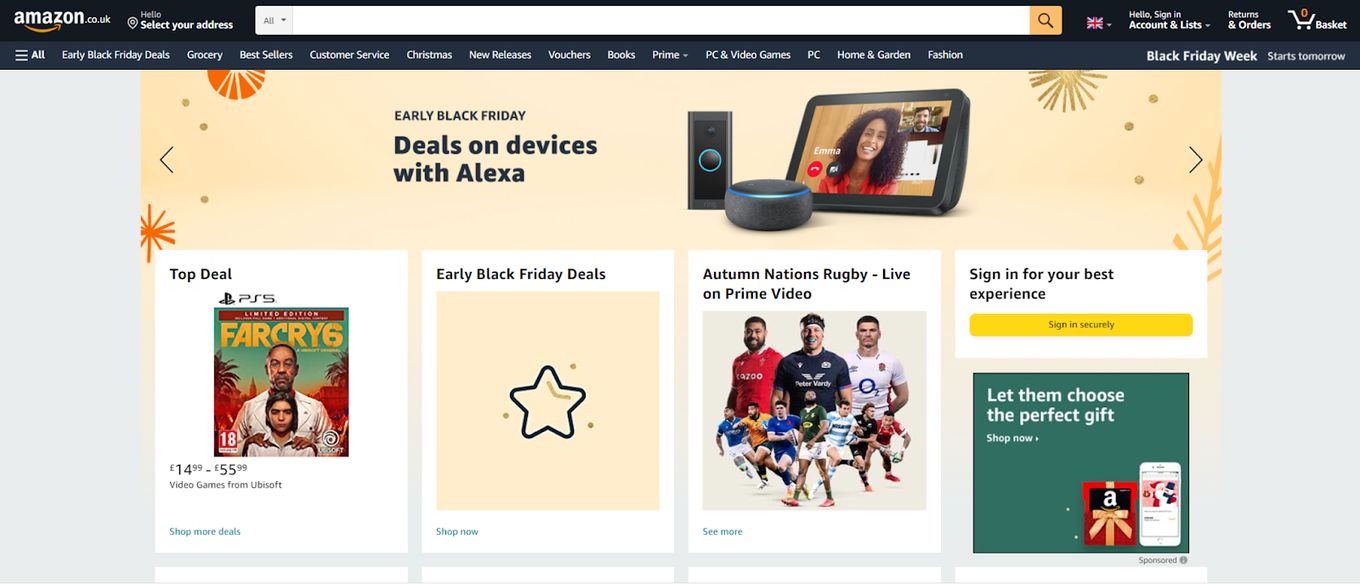
Both Amazon and other online retailers use an image slider, they are effective and a great way to quickly make a website interactive. Illustrations combined with large images allow a reader to understand what the product is all about with little text, which is what eCommerce is all about. User conversations and sliders can help you do that.
12. Full Width Slider Website Design
This is a more traditional kind of slider. It’s a basic carousel of items with a small zoom/scale effect combined with an opacity/fading one.
It’s the combination of these two effects that makes it look a bit more modern than the average carousel.
Disadvantages Using Website Sliders
Website sliders can be a useful tool to engage users and keep them interested in the content being displayed but sliders get their fair share of hate and there is a good reason for that. They must be used properly and with the right content.
Some arguments against website sliders are that they can be confusing, they present users with multiple options at once and users might not be sure how to navigate the web page. Leading to a poor user experience (UX) and degraded user retention. Each slider option is seen as equal because the content can not always be seen right away, making the user feel like they don’t know which way to go. Sometimes it can be unclear.
If sliders are not used correctly, some users end up viewing them as adverts or popups and end up trying to skip them and get passed to the “real” content of the website.
Website Sliders can slow down a web page as well, lots of sliding images and text can be heavy on the browser can cause performance issues, this will often impact SEO and user conversion rates very quickly. Most of the time users will click away if they don’t understand or get what they want within seconds of your website loading.
Most users hate auto-playing videos because they are annoying and get in the way, the same can be said for website sliders. Sometimes static images and text copy are just easier to navigate and scroll through, the user can understand the information straight away.
However just because there are some negatives against website sliders, it doesn’t mean they have positives or that they can’t be used in an effective way. It’s about using them at the right time with the best content that suits them.
When to use Website Sliders
We’ve learned about the negative impacts of sliders and we’ve learned about the positives of sliders, so when should you use them? Let’s go through some more examples of good use cases for sliders.
Before we go onto some good examples of website sliders, let’s understand the basics are how to use them correctly
-
Website sliders should be used at the right time, in the right place. Sliders can be good when used to save space, if you have a lot of information to display, a slider is a simple, responsive way to get content displayed across multiple devices, efficiently.
-
Website Sliders help consolidate web content into one location, saving time on scrolling or height bloated pages when there is a lot of content to show.
-
Animation and transition effects help engage users and keep them interested. Visuals between slides keep users viewing only the content they need while they consume it, once they have finished they can easily move on to focus on new content, without previous content getting in the way.
-
Slider websites take full advantage of the entire screen space, this is good for mobile devices as small screens benefit from content that utilizes the full browser viewport. Images and text can be bigger and easier for viewing, especially for accessibility reasons.
How to use website correctly
When used correctly, website sliders prevent users from being distracted, content is kept in view for what they need at that time, so it is easier to digest subjects, videos or images.
Now we can see some great examples of how and when to use website sliders
1. Use Easy-To-Navigate Sliders
They are not right for every design or structure, think of sliders as a way to enhance content or engage users into a particular topic, not as a way to display the content you didn’t have a plan for.
Make sure sliders don’t distract or annoy users by restricting information or reducing how quickly users can access information. The navigation path for sliders must be clear and easy to navigate, not confusing.
You want the animations and transitions to be quick, smooth, and lag-free, so don’t go too crazy with these, remember every device needs to handle each animation as well. A simple fade and short transition will be enough to get the effect across, otherwise, it might look tacky.

Take the above example, we can clearly see that a slider is being used. At the bottom left we can see circles which quickly indicate it is content to slide to, on the bottom right we have a numbered system to see where we are, it’s quick to understand what is going on.
It’s important to make sure you have a clear indicator with arrows or numbers for easy navigation. Mobile devices should be able to swipe and navigate that way. It is probably best to turn on auto-play, this can make users feel on edge because the timer effect gets annoying when reading content and it just moves without warning. Auto-playing is only useful for smaller content or when moving through images or logos.
2. Use Website Sliders to Tell a Story
A visitor who sees a large amount of information, lists, images or steps, etc. It can be overwhelming for a user and it is hard for them to follow along, whereas a slider website design can help tell a story.
For example, a slider like fullPage.js can be used to help showcase product or service features to a user, especially something that is already engaging like a video game. A slider can offer an easy-to-navigate set of steps to follow, keeping only the required information in view for the user.
A good use for telling a story is onboarding new users or employees, a slider is interactive and easy to navigate without overwhelming the user with information.
3. Use Sliders to Help Viewers Understand Quicker
As I’ve said before, a slider is a great way to consolidate and display large amounts of information into one place and split up large chunks of text or diagrams. A slider can easily be used as a hero header for a website, helping the user understand much quicker what the website has to offer.
Often a user that comes onto a website wants to know straight away what the website does and what benefits it gives them. A slider can be a quicker way to reassure a user what they came for. It provides a brief overview of content or features in a consumable manner, it allows visitors to make a quicker decision on the information they have been given.
Sliders are great on websites that get updated often. Sliders can be used as focus points for new information or content. Allowing users to get the latest updates without navigating to a lengthy article at first.
Advantages of a Well Designed Slider Example
Mentioned throughout this article is a slider project called fullPage.js and it contains multiple features which help it stand out from many slider projects. With all the negative points about sliders, fullPage.js is only positive, it doesn’t break any of the rules of a good slider.
The example below shows how fullPage.js makes it easy to navigate, nothing is confusing to us at a glance. We have big easy to use arrows and we can quickly understand where we are in the slider navigation with the dots on the right side of the page.
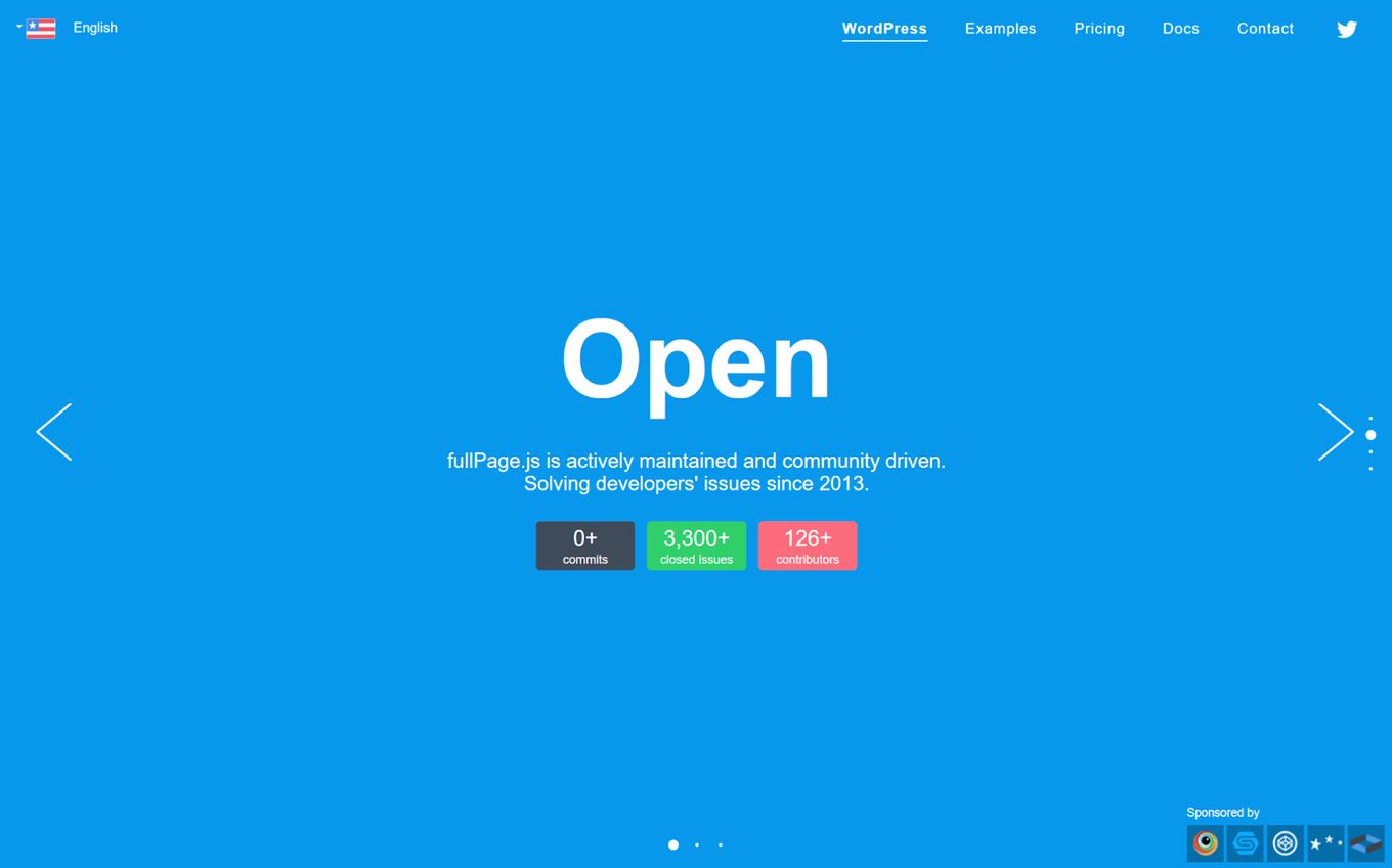
Again, the animations and transitions are simple, smooth, and not crazy. They don’t distract from the content and help create a focal point for the user.
And best of all the whole thing is responsive and touch-ready for mobile devices. It works as well as it does on the desktop as it does on mobiles.
We can easily add content to the slider website page and we have multiple ways of expanding so the design doesn’t become cluttered as we can continue up, down, or left and right.
Conclusion
Not every website will benefit from using a slider-based design, you need the right content and use cases so that you don’t misuse the slider design. It can be a powerful and engaging element when used correctly, which we covered in this article.
Don’t rely on the user’s instincts: make sure any slider has clear navigation and layouts, otherwise, they will get confused and click away. It is important for sliders to fit within your brand and design, otherwise, they will look tacky and like you just didn’t know what to do for a specific page.
Delays are problematic and should probably be disabled, let the user navigate through in their own time, don’t annoy or rush them through information.
Use website sliders to tell a story and help the user navigate through large amounts of information and images. Sliders are a great way to create a focal point that is dynamic and interactive.
Related articles
More articles which you may find interesting.


