Beautiful Minimalist Websites
with Full-Page Layouts
Browse a Curated Collection of 28 Stunning Minimalist Websites Built with fullPage.js.
Get Ideas and Inspiration for your website.


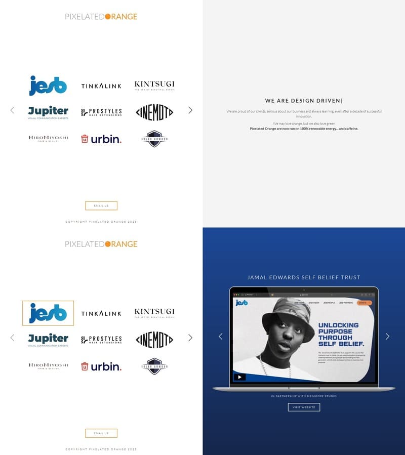
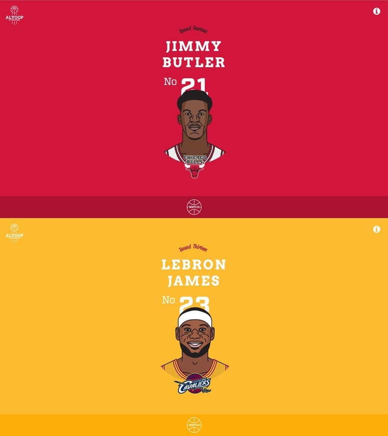
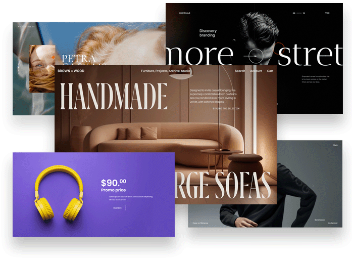
This gallery features hand-picked Minimalist website examples built with smooth fullPage.js layouts and immersive scrolling experiences.
Browse these designs for inspiration on your next landing page, portfolio, or marketing site. See how different brands use visuals, storytelling, and structure to guide visitors step by step.
What makes a great Minimalist website?
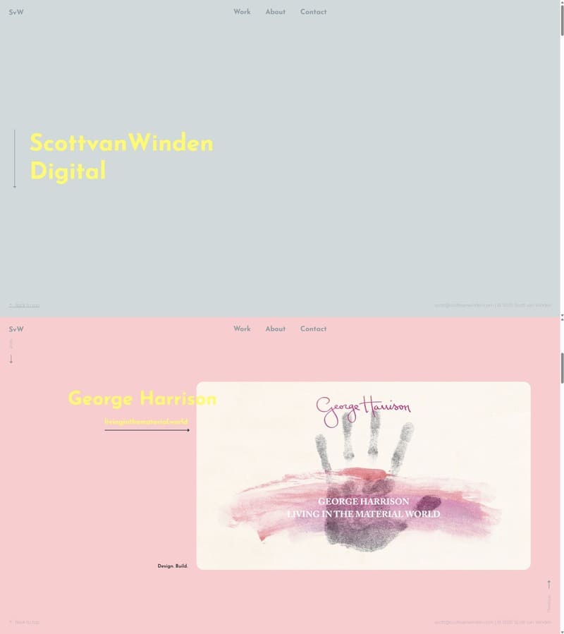
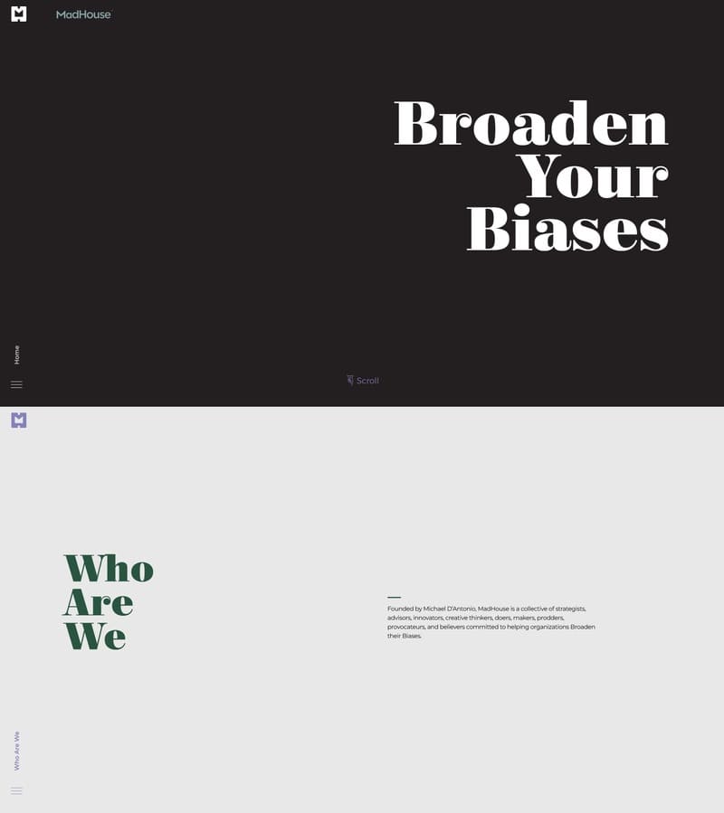
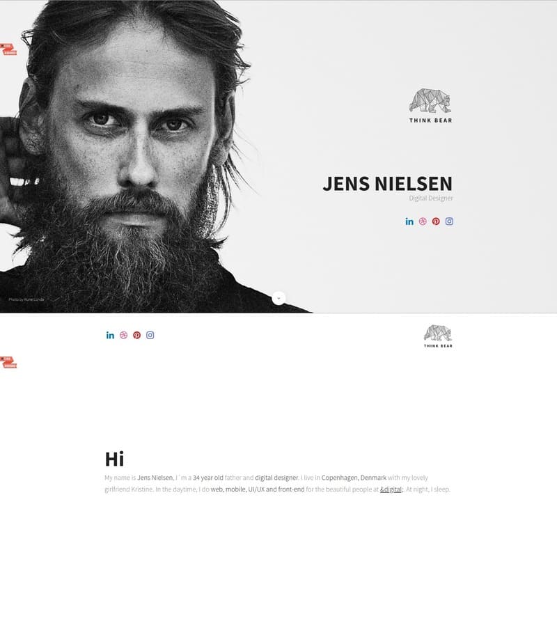
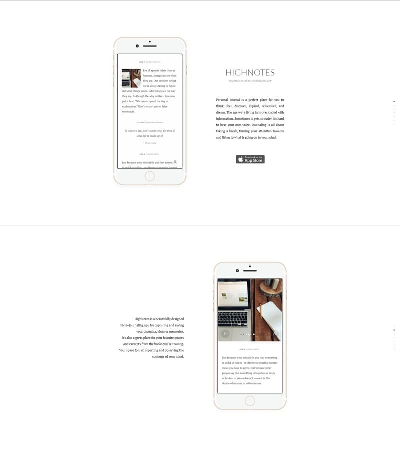
Minimalist designs rely on restraint and hierarchy instead of decoration.
- Plenty of whitespace and a limited, consistent color palette.
- Careful typography that guides attention and keeps content readable.
- Only the essential elements: clear navigation, focused copy, and strong CTAs.