If you are looking for footers for your website, you are in the right place.
In this article, we have included a curated list with some of the best footer examples out there. From plain and simple footers made with pure HTML and CSS, to more complex footers using some fancy animations.
What is a website footer?
A website footer is the element at the very bottom of a webpage. It usually contains useful and quickly accessible information for visitors, such as contact information, privacy policies, newsletter sign-ups, or help links.

Because there’s not a single type of footer, there’s no way to describe what a footer looks like. The design for footers is different from one website to another.
Generally speaking, many contain multiple columns with links, as that’s what most visitors would expect the footer to look like.
20 Amazing Footer Design Examples
Here are some examples of footer snippets and templates you can copy and reuse on your website:
1. Simple Footer Website
Here’s an example of one of the most common footers for websites.
A simple – yet beautiful – footer made of 4 columns containing basic information and social sharing buttons.
In this case, each column contains a title with an original underline, but you can customize this to your needs.
2. Animated Footer Design (HTML & CSS)
This beautiful website footer will for sure catch your visitor’s attention.
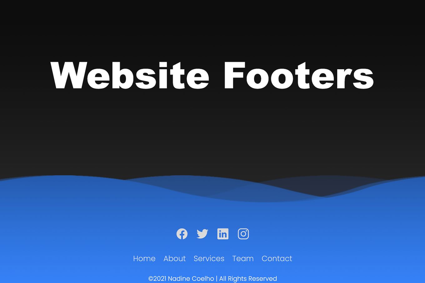
The footer is made of animated waves that move horizontally, creating that feeling of water.
You can speed up or down the footer animation by adjusting the transition property directly on the CSS code on the menu__link style.
3. Minimalist CSS Website Design Footer
Here’s a super simple and beautiful footer.
It uses a white background and maintains its minimalistic look by removing all the unnecessary. There are no underlines, colors, or images.
The footer uses flat fonts for social media icons and payment options. It’s divided into three columns and contains useful links, a newsletter form to subscribe to, and a few icons.
It’s fully responsive.
4. Simple Website Footer Example
This footer is a great example of how to keep things simple.
The footer itself won’t take much space on the page and it contains the bare minimum. Some links, social buttons, and a copyright notice. It’s a simple footer, but a practical one.
Of course, you can always modify its colors, so you can apply it to practically any website and it will still look natural to visitors.
5. Bootstrap 5 Footer Template
Here’s a footer template for those using Bootstrap, specifically the latest Bootstrap 5.
It’s nothing fancy, but it does the job. It’s fully responsive and makes sure you have a place to put all the main links your visitors might be looking for.
6. Dark Tailwind Footer
This Tailwind footer is one of my favorites. It looks like a standard footer that can be integrated into almost any site.
It does a great job. It adapts to the screen size and contains everything I need to add in my footers.
You can always remove the parts you don’t need by just removing the HTML. That’s what I love about using Tailwind.
7. An Engaging Footer Example
A great footer design for websites that like to keep things simple and clean.
The footer is made up of 4 columns. It makes good use of whitespace, and it contains a newsletter subscription form.
I love how modern and clean it looks to the eye. Fully responsive too!
8. Footer With Gallery Slider
Here’s a less traditional footer for your website.
What makes this footer stand out is that it contains an animated slider with a gallery of Instagram images.
The footer also displays social media icons and simple copyright notices at the bottom.
Ideal for photographers, designers, and anyone who wants to showcase their work at the very bottom of their website.
9. Wavey Footer For Websites
This animated footer design is for those who want to stand out from the crowd.
It contains a colored canvas animation mimicking the movement of waves.
This footer is making use of the Twgl library to get this effect.
10. Dark Bootstrap 4 Footer
I personally like to use dark themes for some websites, and this footer template fits well with most of them.
This footer template uses Bootstrap 4 to create a perfect layout containing all the most important information for any visitor: a description of the site, useful links, a subscribe form, social media icons, and a copyright note.
11. Minimalist Tailwind Footer
For some simple websites, we don’t need extra complications. If you are launching a fast landing page, a prototype, an MVP, or just want to keep things clean, this footer can be ideal.
I personally love to use this kind of footer when I launch very simple websites where I don’t have much content or many sections.
This is a footer using Tailwind and as expected, it’s a fully adaptable layout. It contains social media sharing buttons and some useful links.
12. Website Copyright Footer Example
If all you want on your website is a footer with a copyright notice, then this is the ideal footer for you.
It’s just that. A copyright message with a background color. Nothing more, nothing less.
13. Big Website Footer
If you are those who like big things or who want to add as many things as possible in a footer, then this footer is for you.
This is a two-row footer that will allow you to add everything you need to it: address, phone number, email, logo, description, useful links, social buttons, newsletter subscription, and copyright notice.
All in one big and responsive footer.
14. CSS Footer Template With Animations
Here’s a genuinely amazing footer for any website.
The footer contains a picture of a city at the very bottom and a couple of animations that make it so original.
The whole footer design is made in pure CSS and there’s no JavaScript involved at all.
This footer template can be customized by just playing with the CSS and the HTML code. Things like the animated GIF images, their transition times, and the colors can all be changed to your needs.
Besides all this, the combination of colors looks great, and the footer contains everything you would expect.
15. Levis Website Footer Design
This footer design uses an image with the company brand in the left corner, making it ideal for those who want to display their logo.
It contains everything a good website footer should have. A logo, links, social network links, and contact information.
It also contains copyright at the bottom of the footer. Fully responsive.
16. Bootstrap 4 Elegant Footer
Gorgeous white and minimalist footer snippet using Bootstrap 4.
If you don’t need anything fancy but still want an elegant and modern footer, this one is for you. It is fully responsible and makes great use of whitespace to create an aesthetically pleasant footer.
17. Black and White Footer Design
Here’s a footer design for those who like to keep things simple.
It’s a four column footer that, despite looking plain, looks quite modern.
I like the fact that it only uses two main colors and that it allows you to attach a logo to it.
Warning: not responsive!
18. Tailwind CSS footer
This footer is made using Tailwind CSS framework.
It’s a good example of how to add some touch of color to a white background website.
I like the rounded corners and the simplicity of it all.
Ideal for those who want to add a newsletter form in their footer.
19. Brutalism Footer Design
If you are the kind of person who likes breaking the norms or just playing risky with designs, this footer might be for you.
This example of a footer is not typical. It’s a big footer made of 2 vast and responsive columns.
The one on the left contains the subscription form and the links of interest, and the one on the right contains some text describing the company. It also contains social buttons on the right side.
Not for all tastes!
20. White and blue footer example
This footer example shows a less common structure.
It’s made of three columns, one of which has two rows. It also contains a contact form that can be super handy for some use cases.
Warning: this footer is NOT responsive.
What to put on the website footer?
Usually, footers contain the following elements:
-
Links of interest. Anything that might be relevant to your visitors. For example: contact us, about us, help center, our products, etc.
-
Privacy Policy. Sometimes it’s compulsory by law to add certain legal information on how the page treats users’ data, so it’s common for companies to link it on the footer.
-
Copyright notice. if the content is copyrighted the footer is usually the best place to state this. That’s what people will tend to look for when trying to find out about copyrighted content.
-
Newsletter form. If your site has any kind of newsletter, adding the sign-up on the footer is another way to make it easier for visitors to find out about it.
-
Social Media Icons. It’s common to add links to social networks on the footer (Facebook, Twitter, TikTok, Instagram…). It can be done via icons or directly with text links.
-
Contact information. when visitors want to find something about the company or author of a website, they’ll very likely scroll down to the footer. Having any kind of contact information is a must. It can be email, phone number, the good old fax, or just the address. It can also contain a link to a contact form.
-
Address. Sometimes included next to the contact information, adding the address in the footer is a very common practice as well.
-
Logo. Adding a logo to the footer can be a great way to add a bit of color or to emphasize your brand’s design.
-
Help links. Anything that can help your visitors should be present in the footer. Links to help centers, FAQs or support are expected to be found in the footer of a website.
-
Sitemap. If visitors want to have a quick look at the structure or content of a website, having sitemaps is a great way to do so. On top of that, they’ll be good for the SEO of a website too!
What is a website footer used for?
The website footer displays basic information about the company or website. It improves the user experience by making it easier for visitors to find specific things on the page, such as contact information, copyright, help links, social media, or newsletter forms.
Footers typically use a simple design and look very similar to web pages.
This is to try to make it as easy as possible for visitors to find the information they are looking for.
Conclusion
The footer is an essential part of any website. A website without a footer is like a person without shoes.
There are plenty of footer designs out there. Each of them has its unique style and features.
In the list of footer examples above we’ve included different kinds of footers so you can have an idea of what’s out there. Now, is up to you to choose the one you like the most and use it on your page.
![34 Animated Backgrounds Examples [With Pure CSS] animated backgrounds css share](https://alvarotrigo.com/blog/wp-content/uploads/2023/08/animated-backgrounds-css-share-300x150.png)
![9+ Best Contact Pages To Get Inspired [+ 15 Free Contact Forms] contact page examples share](https://alvarotrigo.com/blog/wp-content/uploads/2023/08/contact-page-examples-share-300x150.png)
![20+ Amazing Pure CSS Accordions [CSS Accordion Explained] css accordion share](https://alvarotrigo.com/blog/wp-content/uploads/2023/08/css-accordion-share-300x150.png)
![20 Cool HTML & CSS Tabs [Examples] html css tabs share](https://alvarotrigo.com/blog/wp-content/uploads/2023/08/html-css-tabs-share-300x150.png)

