Based on research done by KOMarketing, 54% of consumers believe that a lack of contact information on a website lowers a brand’s credibility, and 44% of website visitors will leave a company’s website if there is no contact information.
However, website owners rarely prioritize their contact pages, which are often characterized by poor User Experience and outdated User Interfaces.
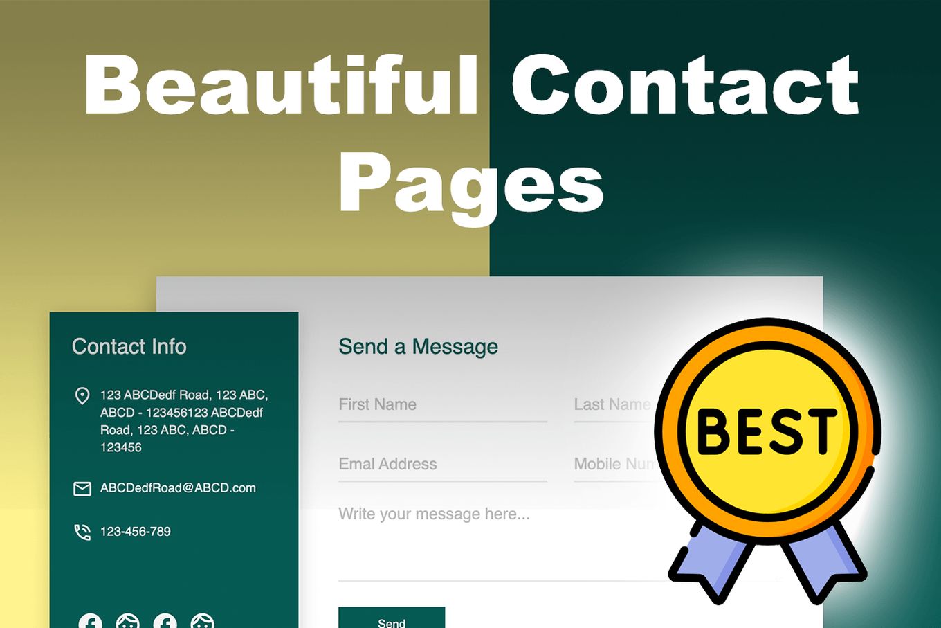
This article aims to examine the best Contact Us page examples, showcasing the features and practices you can use to improve yours.
We’ll also provide you with a list of contact page templates you can re-use or use as inspiration for your website.
What Is A Contact Page On A Website?
A contact page is a web page that contains information on how a website visitor can get in touch with the business or site owner. Just as contact information is to a business card, so is the Contact Us page to a website.
If you take a look at various contact page examples, you will see that there are a few things that ideally should be present on every Contact Us webpage, and these are:
- An Email Address.
- A Contact Form For Visitors To Fill Out.
- Phone Number.
- A Physical Address.
The best contact pages are more than just slapping contact information on web pages in contact forms. In addition to avoiding the numerous bad website design practices, there are strategies for creating successful contact pages.
15 Contact Form Templates You Can Re-Use
Let us dive into the world of web design through codePen and look at all the wonderful contact us page examples that can be used by you for inspiration or reference!
1. Minimal Contact Page Example
Are you a developer or web designer that loves a minimal color scheme to keep everything coherent in your design? If yes, this is the best contact page example for you. From the basic typography, font, and layout, the two complementary colors (and white) make the design stand out without making it feel like too much.
2. HTML Contact Form Example
Here’s a beautiful and simple “contact us” form template.
It contains only the basic fields such as Name, Email, and Message, and a few icons linking to the social media accounts.
3. Minimal Contact Page Form
Super simple and minimalist contact form for your website.
The design of the contact form mimics a “card” and the style of forms that you might find on mobile devices.
If you are not planning to have very long texts, this might be a great contact form for your site.
4. Sliding Contact Form
If your idea is to have a very simple contact form, then this sliding form might be a good option for you.
The form will only slide in once you click on the mail icon that is displayed on the left side of the screen.
This makes the form quite subtle as it won’t impact the rest of the webpage design.
5. Modal Contact Form
This form will show up when clicking on the pencil icon, which uses a fixed position.
A beautiful sliding animation will then show the form which provides all the basic fields and a dropdown menu that allows visitors to select a reason.
I’d say that it’s really the animation that makes me feel in love with this form.
6. Full-width Contact Form
This contact form stands out from the rest because it uses a sliding element that allows visitors to specify an estimated budget.
It’s probably a great form to use for companies or individuals dealing with clients.
The form displays in full width which makes it bigger than others. This also makes it a better option for those who want more space for longer pieces of text.
7. Pop-up Contact Form
This contact form follows a similar approach to other sliding contact forms, but in this case, the animation comes from the bottom of the screen.
The “contact us” form pops up from the very bottom of the page in a similar manner to the website chats we are already used to.
A great way to have a small form always accessible to the users no matter where on the page they are at.
8. Standard Contact Form Page
A full-width contact form that includes the very basic fields. Perfect for those who want a clear form and space for long texts.
There’s nothing fancy about it, but sometimes less can be more!
It’s what most people would expect from a standard contact form.
9. Black & Responsive Contact Page Example
This contact page example is the perfect template for a website that is modern, neutral, and sleek while still being playful. Everything from the width, height, and color can be customized according to your brand or company website.
There are so many changes that can be made to personalize this contact page because the template is so classy. It makes the contact page look aesthetic yet functional, which is the main point of web design.
10. Contact Us Page Example For Retro Websites
This beautiful example of a contact page website design is perfect for design lovers and skincare, beauty, and aesthetic brands. This is because the design is animated, and vivid and bold colors and shapes are used to bring attention to the main parts of the page.
With the help of this contact us page codePen many changes can be made instantly to elevate the design even further.
11. Elegant Contact Page Example
This contacts us page example is excellent for businesses that want to drive their customers to their contact immediately. The bold call to action, “Let’s get in touch,” is informative, directional, and welcoming.
Therefore, if you are looking for a simple, creative, and straightforward contact us page, this one can be yours within a few clicks!
12. Responsive Contact Page Example
This is one of the best contact page examples for a website. This webpage design is proof that simple and functional doesn’t always have to be boring. There are so many interesting ways for you to give out your contact information to your visitors, and this design shows you quite a few.
Anything from the color to the placement, width, and height of the objects and text can be changed to alter it more to your liking. Get inspired by the contact us page example and design one for your website now!
13. Minimalist Contact Us Page Design
This contact page design gives you all the information slots that a brand or company might need while simultaneously attracting the user’s eye to it. Everything from the phone number to the address and the message box has been designed with infographics which keeps the template clean and intriguing. This is a great example to take as inspiration for your contact page design!
14. Responsive Contact Page with Dark Mode
This gorgeous website design stands out from the rest because of its unique template and intriguing use of images and text. This is a great contact page example to use, learn from, or alter for your website.
You can edit this contact page so easily that anything from the picture, text, and font to placement and size can be changed. If you want, you can keep one and discard or alter the rest of the elements to your liking.
15. Contact US Page CSS3 Transition
Most times, when there are websites for public landmarks or locations, it becomes hard for people to get in contact with the business for queries and quotes. But also, the directions to the location are often unclear to follow. Such places usually attract a lot of tourists, and as a must, the contact information should be as detailed and clear as possible.
In this contact page design, the maps are included with the incentive of providing a bus, car, and bicycle route for the visitors. This becomes not only functional but also extremely helpful for the visitors. Everything else can be altered by you per your own choice.
10 Real Examples of Contact Page
The following Contact page examples will undoubtedly teach you a thing or two:
1. Impact
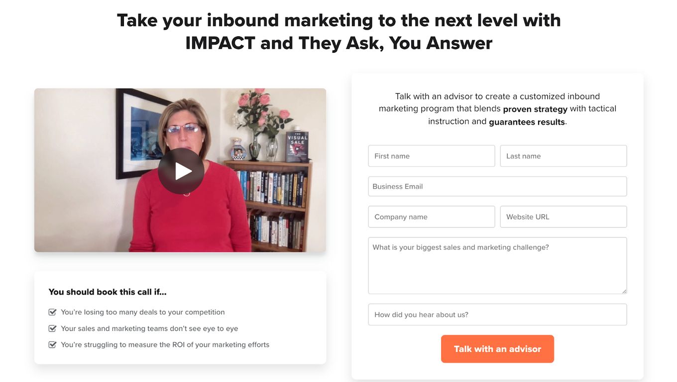
After reviewing various contact page examples, Impact’s contact page made an impression. The layout and absence of color would have left the Contact Us page looking plain and boring, but the inclusion of the video on their Contact page added a unique twist.
Including a video on your contact page is not required, but it is highly recommended given what Impact has done with the video and its human effect.
Impact also took a step further by outlining the benefits of contacting them. Lastly, there weren’t many questions on the form that needed to be filled out on the contact page, increasing the chances of completion.
2. Notion Contact Page
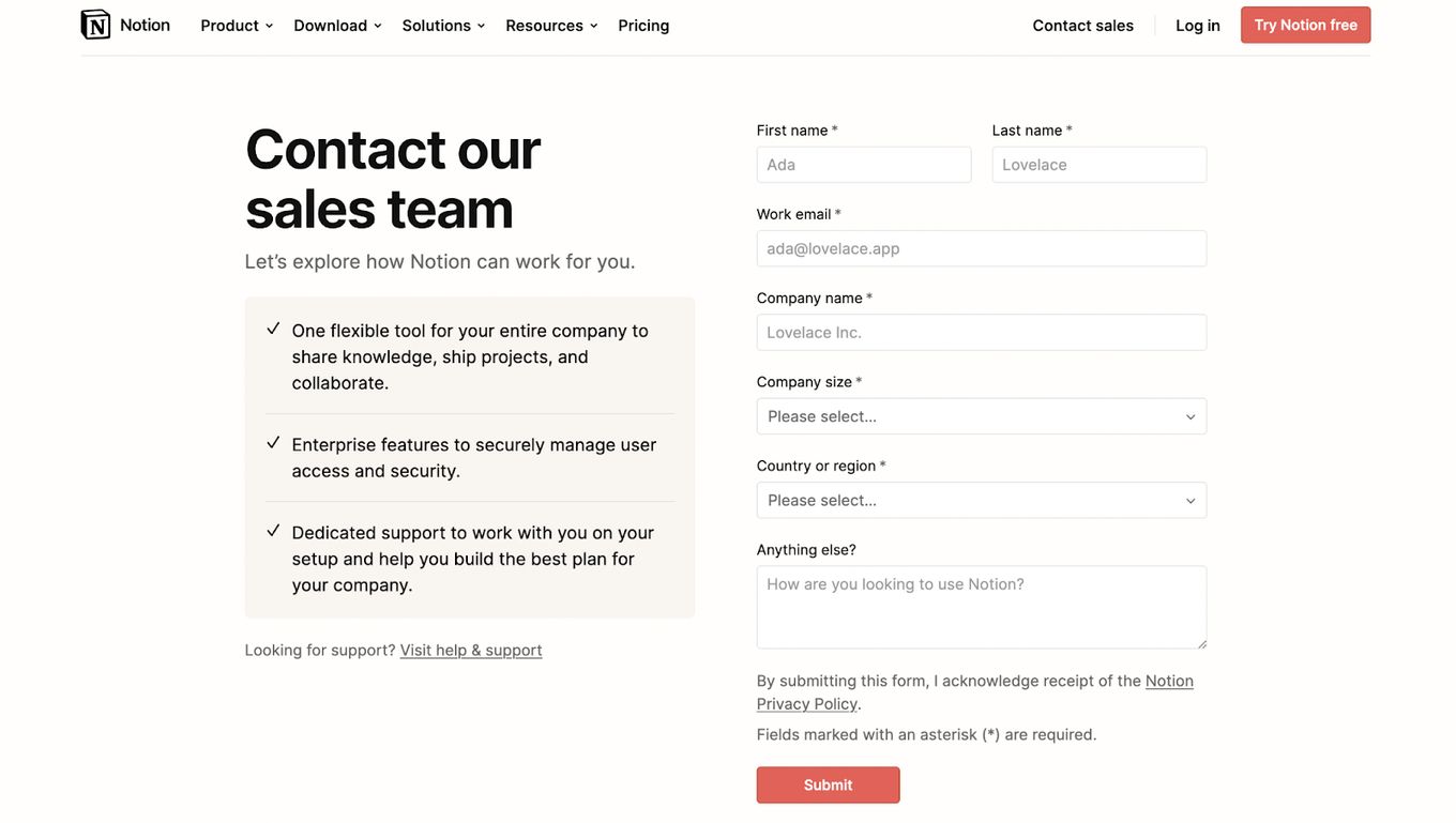
Notion also ranks high as one of the best among the contact page examples online. This can be attributed to its simple but elegant design, numerous calls-to-action, and ability to provide users with the information and support they need upfront.
Although the form on the contact page is lengthy, the fields are all necessary and straight to the point. Notion also included a field in the form that allows visitors to enter whatever information they need, giving the visitor enough flexibility.
3. Sleeknote
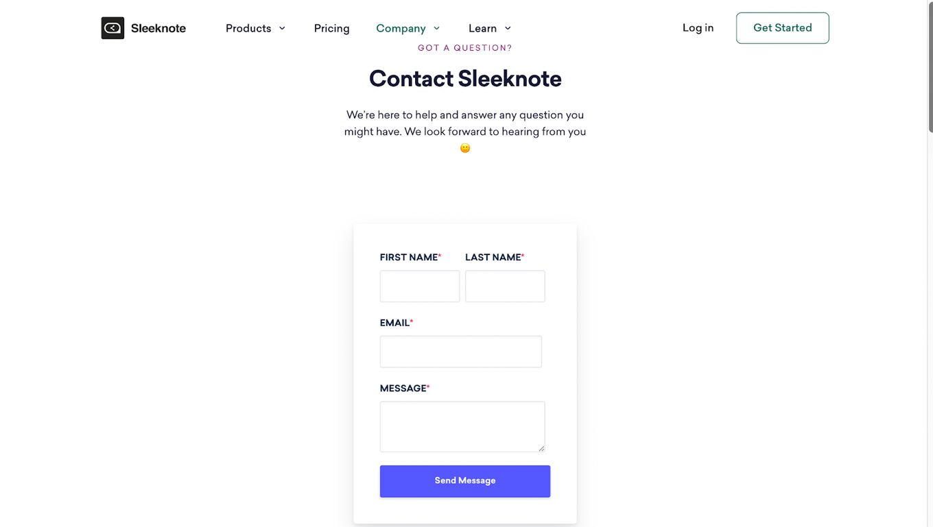
Right from the top of the page, the Sleeknote Contact page header is sleek, stylish, and detailed. The personal note at the top of the page ending with an emoji humanizes the page and gives a friendly feel. Also, similar to Notion, the Contact page layout isn’t overloaded.
There are several Contact Us pages examples that are reluctant to include a contact phone number on their contact page, but Sleeknote didn’t just include one; they made it conspicuous.
Another thing worth mentioning is how the page is sprinkled with call-to-actions, a move that is sure to reduce the bounce rate. The contact page layout, similar to Notion, isn’t crowded.
4. PeopleMetrics Contact US Page
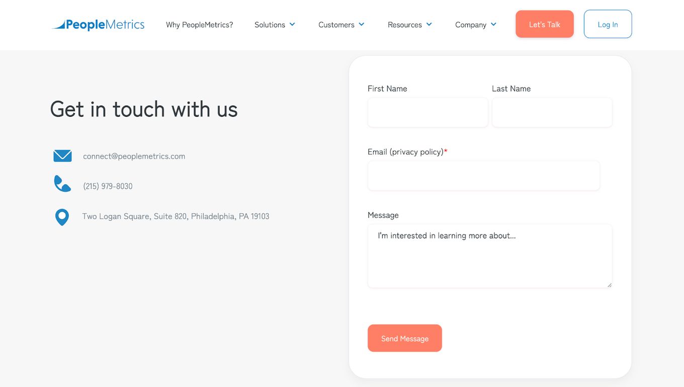
As with Impact’s contact page, PeopleMetric’s page is uncluttered. However, they added an informative header without any heavy designs that might have gotten in the way of the visitor’s ease of getting in touch.
PeopleMetric’s Contact page, like Sleeknote’s page, included a phone number and other communication platforms, giving website visitors options. The form on the page for visitors to fill out is brief and to the point.
5. Zendesk
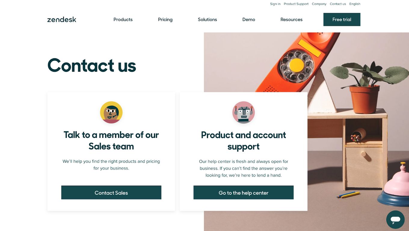
Among the best Contact pages, Zendesk stands out because it integrates many different elements to create a truly outstanding page.
Zendesk’s color-coordinated and straightforward contact page meets all the major requirements of a Contact page, including detail and specificity, which helps users find what they need. Various contact options, including links to social media platforms and easy-to-follow calls-to-action.
A list of Zendesk’s physical locations with links to maps can also be found on the company’s contact page.
6. Marvel App
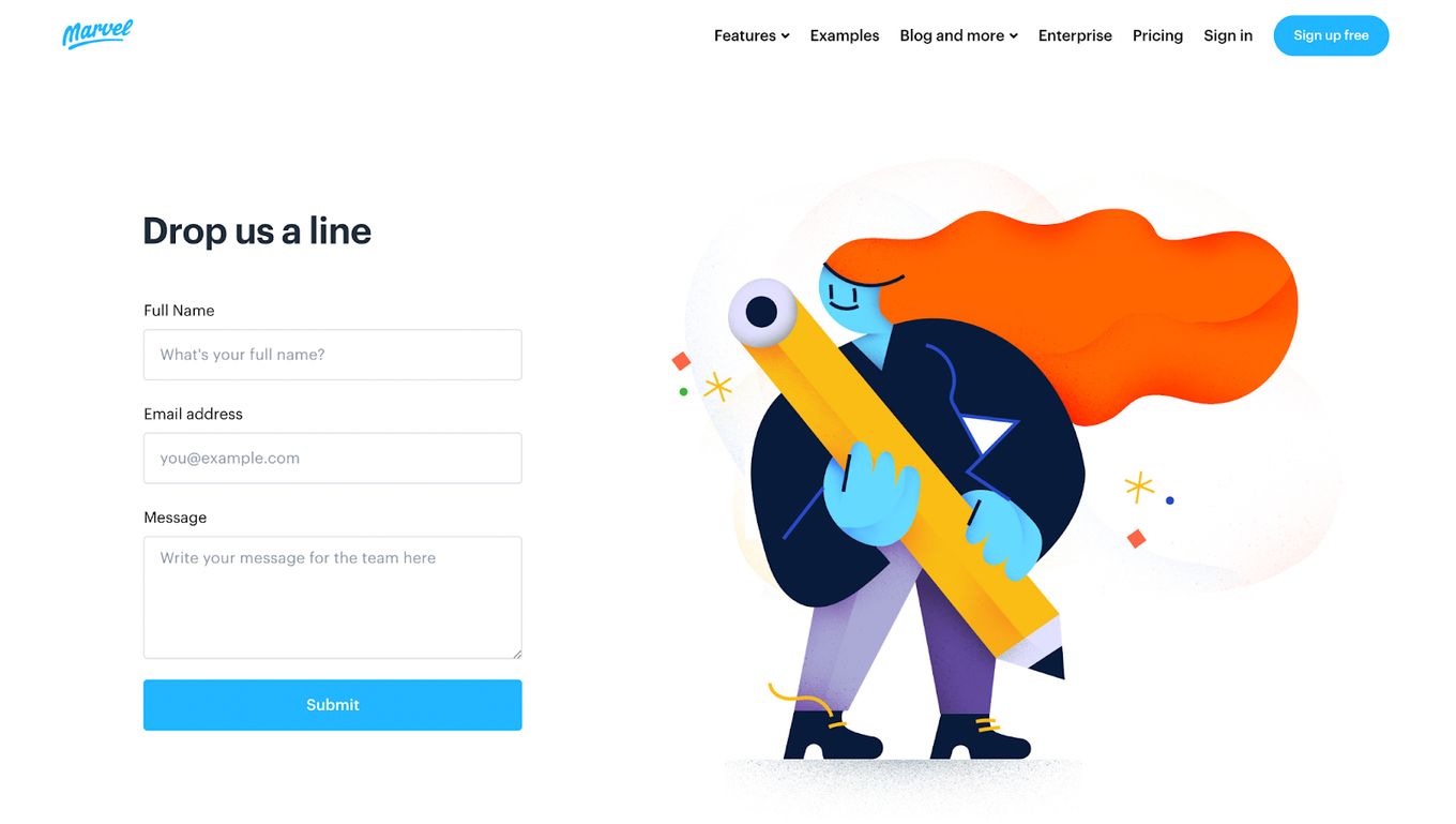
Marvel App is the most interesting among all the best contact page examples. Marvel created a functional Contact page with a playful vibe. The contact page does not necessarily need to have a strictly formal tone. If playful and relaxed work better for you, then why not?
The form on the webpage, expected to be filled by the users, is very straightforward and concise. Marvel included a link to an interactive map as a way of making it easy for visitors to locate them online.
7. The Crabby Shack
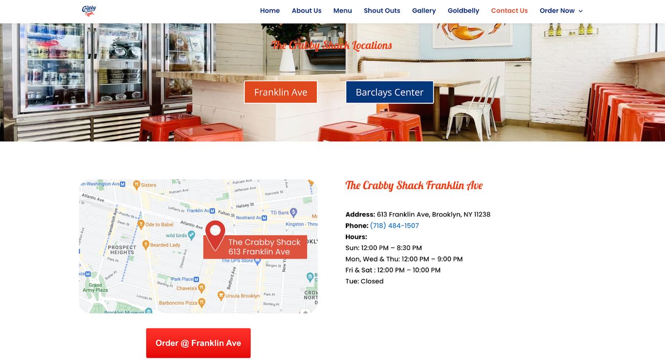
The Crabby Shack’s contact page is both practical and engaging, with only relevant information. Knowing your target audience will help you create and adopt a style your visitors will appreciate.
The Crabby Shack, unlike most websites, didn’t put its call-to-action near the bottom of the page. Instead, it published it near the top of the page in an attention-grabbing manner.
8. Bright local
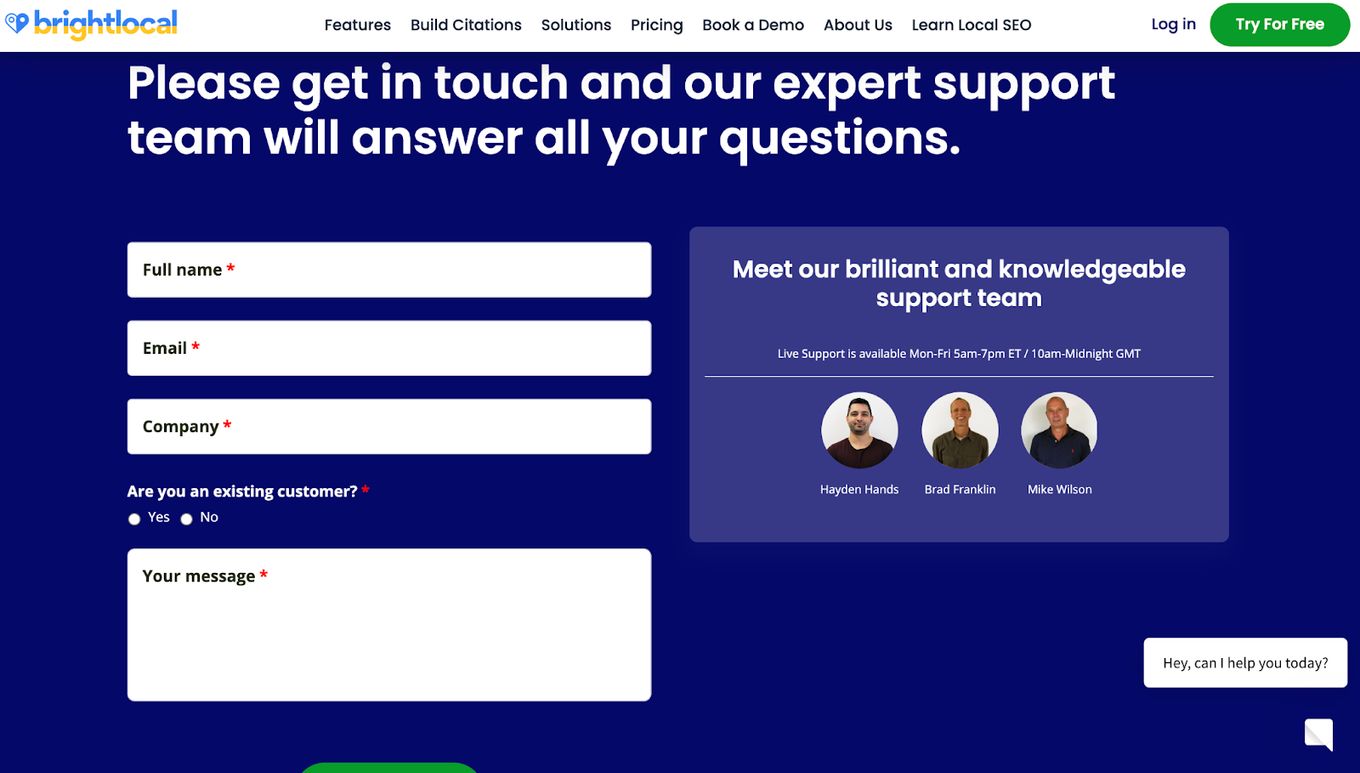
Unlike some websites, Bright local understands the impact of adding testimonials to contact pages as testimonials build confidence and trust in the brand.
Bright local also used the often overlooked effect of putting a face to a business brand. Like Impact, Bright local humanized the brand by putting a face to it and allowing the page to reflect its brand personality.
Including the picture and names of the customer support team on the contact page showed personality on the page and humanized the brand.
9. Yeti
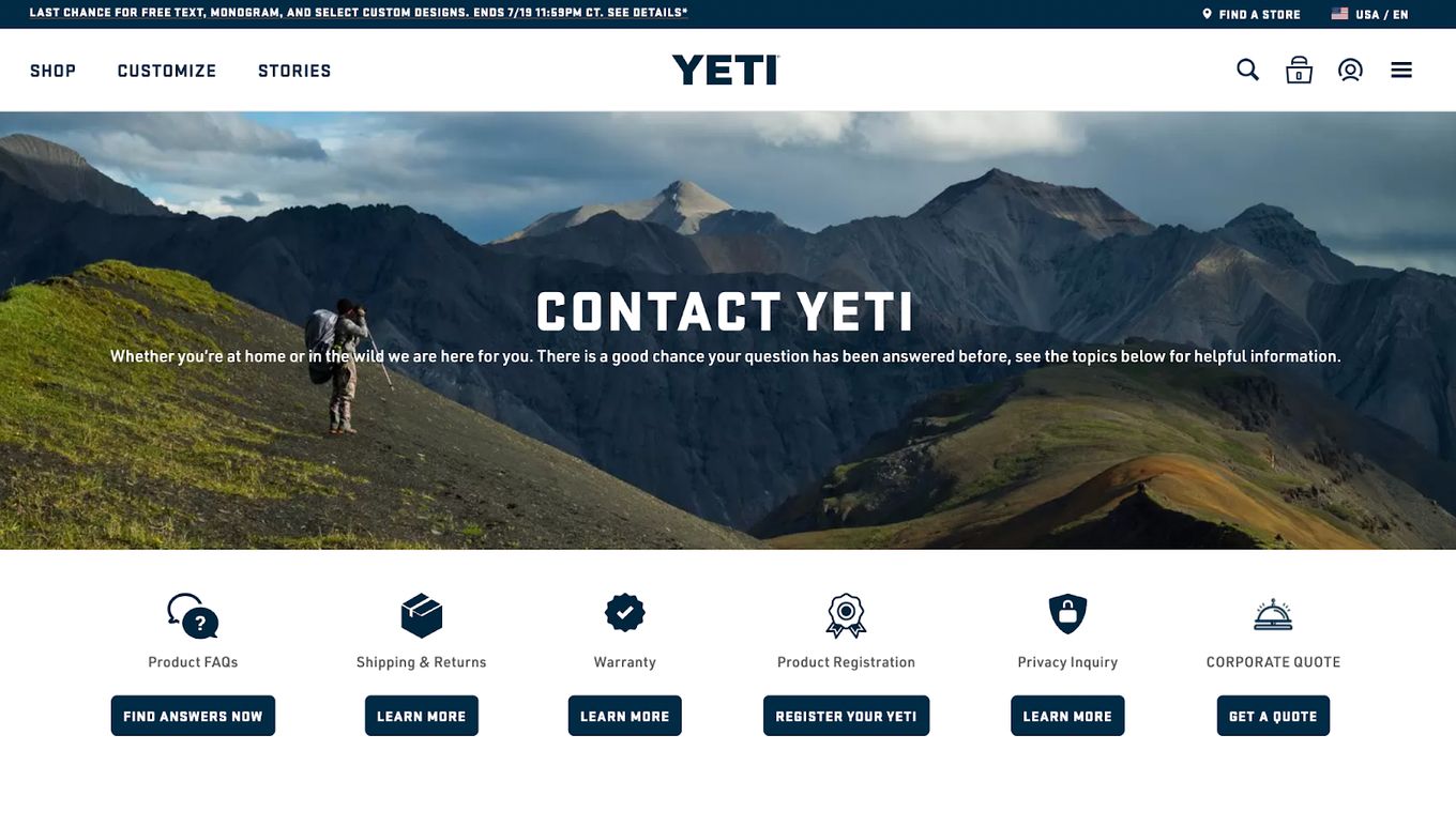
Yeti carried its brand name and voice onto the contact page, maintaining consistency across the website. Including brand stories, pictures, and profiles of their ambassadors is also a way of Yeti building their visitor’s trust in their brand, and when they trust Yeti, they will be willing to become customers.
Another thing to note on the Contact Us web page for Yeti is the active voice of the page and how the page is sprinkled with calls-to-action, which, if you remember, is just like that of Sleeknote.
10. Hootsuite
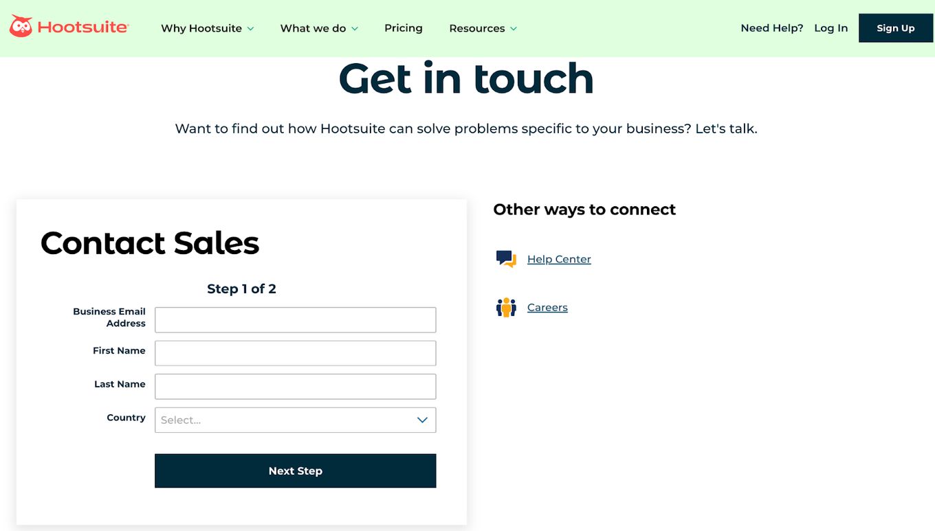
Hootsuite makes a call-to-action right after the header, then asks a question to help users understand why they should have acted on the last call to action, and then issues another call to action.
When you tell a user visiting your website to do something, it is only natural for them to ask why. If you answer that question before they ask it, they will be more willing to follow subsequent instructions from you. Nothing fosters a sense of community and trust like understanding.
Hootsuite also provides a concise form and links to their social media handles, with the social media icons functioning as pseudo designs.
Tips You Must Follow While Creating Contact Pages
- Write A Few Words About Why A Person Should Contact You And Add Value.
- Offer More Than One Way To Contact You.
- Set Expectations.
- Don’t Ask For Unnecessary Information To Make A Contact.
- Personalize Your Contact Page.
- Add A Video If Possible.
How Do You Create A Winning Contact Page?
You can create a winning contact page by putting the following suggestions into practice:
- Use An Active Voice. The Contact page is already a call-to-action page in itself, so treat it accordingly.
- Incorporate Creativity Into Functionality. Functionality is the first and most important aspect of a Contact Us page. Winning contact page examples scattered all over the internet have shown that the Contact page’s functionality should be balanced with its visual and creative appeal.
- Make Use Of A Contact Form. Contact forms are a great way for website visitors to get in touch, as it saves them time from having to send an email manually. This lends an air of efficiency to your Contact page and overall brand.
- Put A Face To Customer Support. Show real people from your customer support team as this encourages visitors that there are real people on the other side of the screen. This will help build trust and encourage a visitor to take the step to become a customer.
- Include Your Social Media Links. In addition to the essential details on the Contact Us page, you should also give details about other online platforms on which visitors or customers can reach your business.
- Keep It Consistent. You shouldn’t design your contact page in isolation. It is noteworthy that you design your Contact page in the same style as the rest of your website.
Using Your Contact Page To Convert Visitors
Your contact page is sometimes what stands between you and converting a visitor. Of what use is the interest of a user in a business relationship if they can’t get in touch with you?
You can revamp your contact page and increase your conversion rate by applying the tips and best practices outlined above.
Finally, always resist the urge to ask too many questions in your contact forms, so it doesn’t become a chore for the visitor or add unnecessary details to your contact page. Need more inspiration on designing other aspects of your site? Check out some of our related articles.


