It’s no longer just about having the best wines, but also the best wine website, for a business to make it. Even though the visitors who show up on your website may not think about it, the site has an impression to make, which is why businesses have to make sure it is the right one.
Vineyard websites offer the wine business a way to display what is on offer, build a community, impress visitors, encourage them to buy, and even introduce people to a unique experience. As such, it should reflect what people expect to see, while delightfully surprising them with moments of uniqueness, functionality, and artistic vision.
Here, we have a selection of some of the best wine websites we could find to inspire your vision for your own.
10 Best Vineyard Websites
1. Italian Wine Brands
Italian Wine Brands is a beautiful wine-themed website that distinguishes itself through flawless navigation. For these kinds of video portfolios, the fullscreen style is really effective. It’s an excellent method to display videos and graphics while also creating an immersive experience unparalleled by other website styles.
Italian Wine Brands is a full-screen website with fantastic on-scroll animations and entertaining segues that fully engages users.
It’s an efficient and quick way for any wine website to set itself apart through complete immersion. The website resembles a PowerPoint presentation, with full-screen parts that make the information easier to absorb.
The scrolling effect of this page uses the fullPage.js full-screen snap component. It is an easy-to-use JavaScript library that comes with WordPress plugins for Elementor, Divi, and Gutenberg editors to craft one of the best wine websites.
2. Ferro13
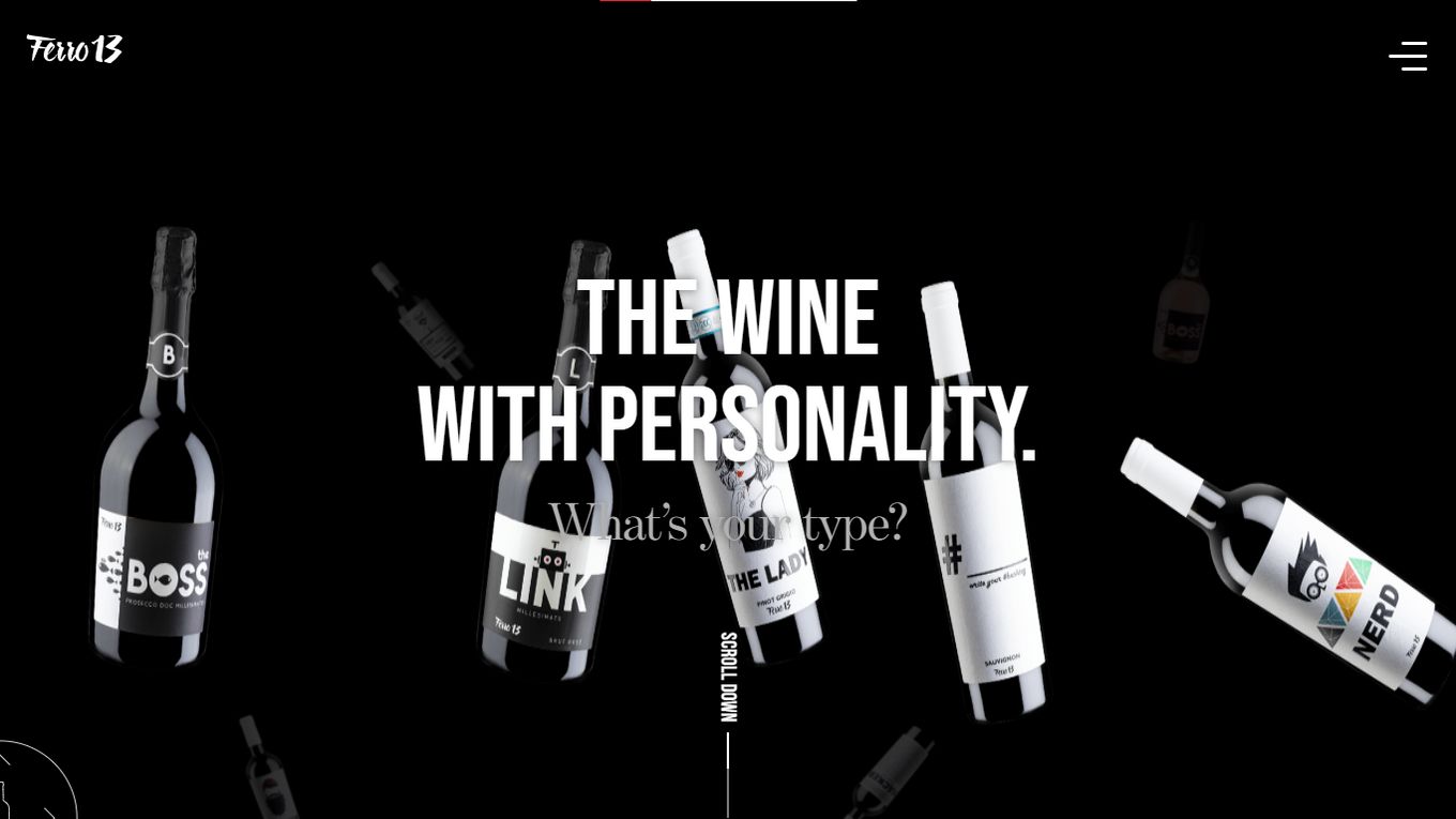
Ferro13 is what happens when the latest in website design meets a clear vision of what the new generations want. The website is a curation experience that takes a visitor through selections in categories like The Boss, The Boss Rosé, The Lady, Gentleman, hacker, Hipster, and Nerd.
Because of the heavy lean on curating the experience for its target audience, Ferro13’s wines truly end up having a personality that makes it easy to categorize them and appeal to major demographics and beliefs.
The choice to go all black lends the site an aura of wine noir, which works because of site-wide consistency.
3. Jordan Winery
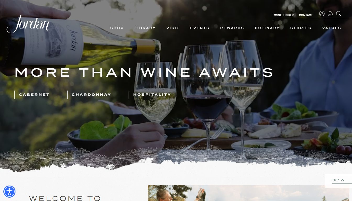
Right when you land on the page, it greets you with a fully animated background lit ambiently in every frame. The typeface chosen varies in terms of fonts (different for the brand name and different for the CTA) but never becomes illegible even with the moving video behind it.
Learn how to replicate this background video design with just CSS.
At the top are buttons to take you through experiences and information like the library, visit, events, rewards, culinary, stories, values, a wine finder, and the contact page.
Scrolling through, we see a delicate use of white space as text is in blocks that draw attention to the main message, interspersed among professionally shot and edited photos of landscapes and locations.
4. San Leonardo 1724
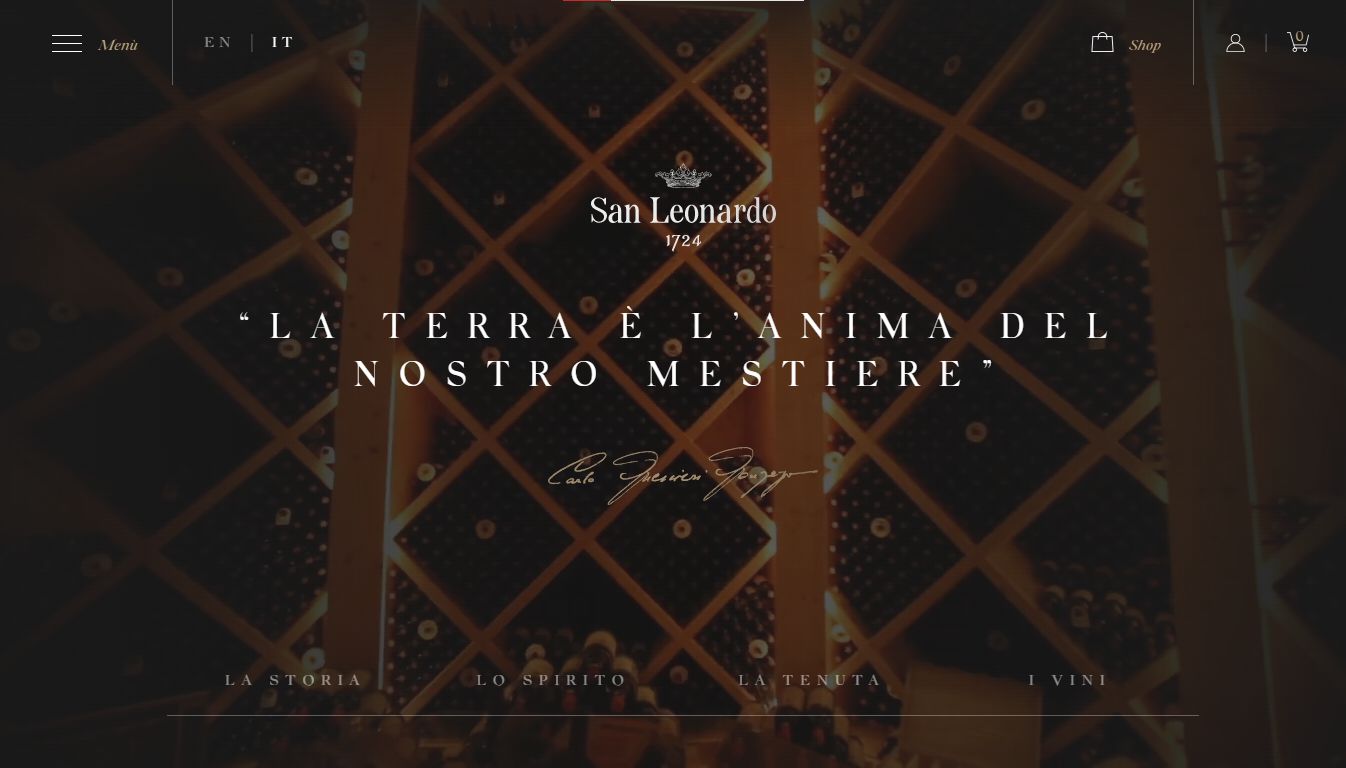
This winery website is a stunning piece that manages to bring the magic of a 300-year-old winery website design with a rich background and no-doubt mesmerizing history to a modern world supported by e-commerce.
The project exemplifies the venue’s beauty and dedication to excellence.
The winery website design is developed in Iaravel, jQuery, Gsap, Bodymovin, and other resources.
The result is a one-page introduction to a brand that has to be brimming with history, communicated to site visitors with incredible photographs of the physical location, coupled with well-placed navigation buttons.
5. Paradou Wines
Le Paradou, as it is seen in the website demo, is a masterclass in leading a website visitor through a simple and vibrant journey. The typography appears plain but pairs brilliantly with the full-screen display format chosen for this winery website design.
The Paradou scrolling animation website exudes both freshness and clarity in its visual design alone. The transition and imagery reflect the crisp, flowery, and sweet notes its wines must possess.
Any visitor landing on this page will feel compelled to look around using the accessible navigation provided by a fully responsive design.
6. Cantine Bertani
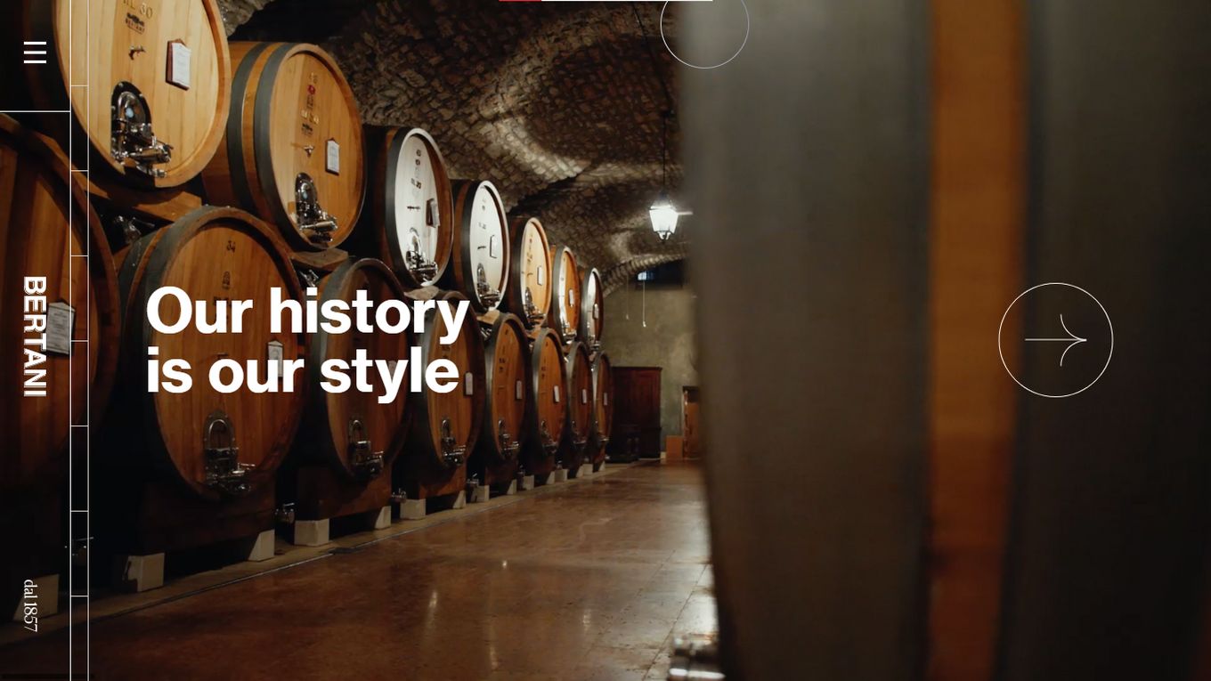
Bertani is a masterclass in presenting the history of a winery. When a visitor lands on the page, they first see the current year displayed on a field of a pink hue with a sigil in watermark style behind it.
Then, the years start to race back in reverse, telling the visitors, right off the bat, just how delightfully old the brand is.
Navigating is easy since they have a circle around where your cursor is, showing the incredible responsiveness of the site. Navigating may feel funny at first but once a visitor hits the menu button, things become much clearer. It uses a horizontal scroll to show the information.
Learn how to create a scroll horizontally website with mouse wheel
7. Napa Valley
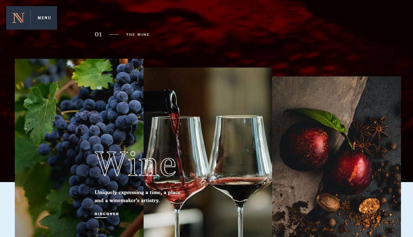
At glance, making out what all the red stuff on the homepage is maybe a bit tricky but once a visitor looks long enough, they realize it is a rich-looking wine sloshing around in a glass.
But why does it stop sometimes? Well, that’s because clicking on the moving graphic stops the video, and clicking again plays it.
Further down, the website showcases its wine, the region it’s grown in, the makers, the experience of the Napa Valley bottle, and a way to visit the place to experience the vistas and the selections for yourself.
The chosen color scheme caps off the elegant design choices present throughout the website.
8. Wine Palace
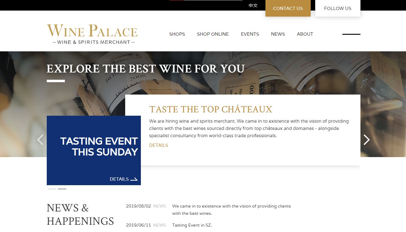
Wine palace takes its inspiration from the quiet strength of polished wood and the understated elegance of positive white space use.
There is no full-screen display to marvel at here. Instead, the landing page feels like walking into a quiet, unassuming wine store that lets its shelves speak for themselves.
From the top, a visitor can access details on upcoming tasting events, recent news, dates of when the events happened, and directions to the rest of the news bulletin before the wine palace says something about itself.
With a powerful builder, this winery website design can lend its magic to any business that wants to make one of the best wine websites.
9. Covides
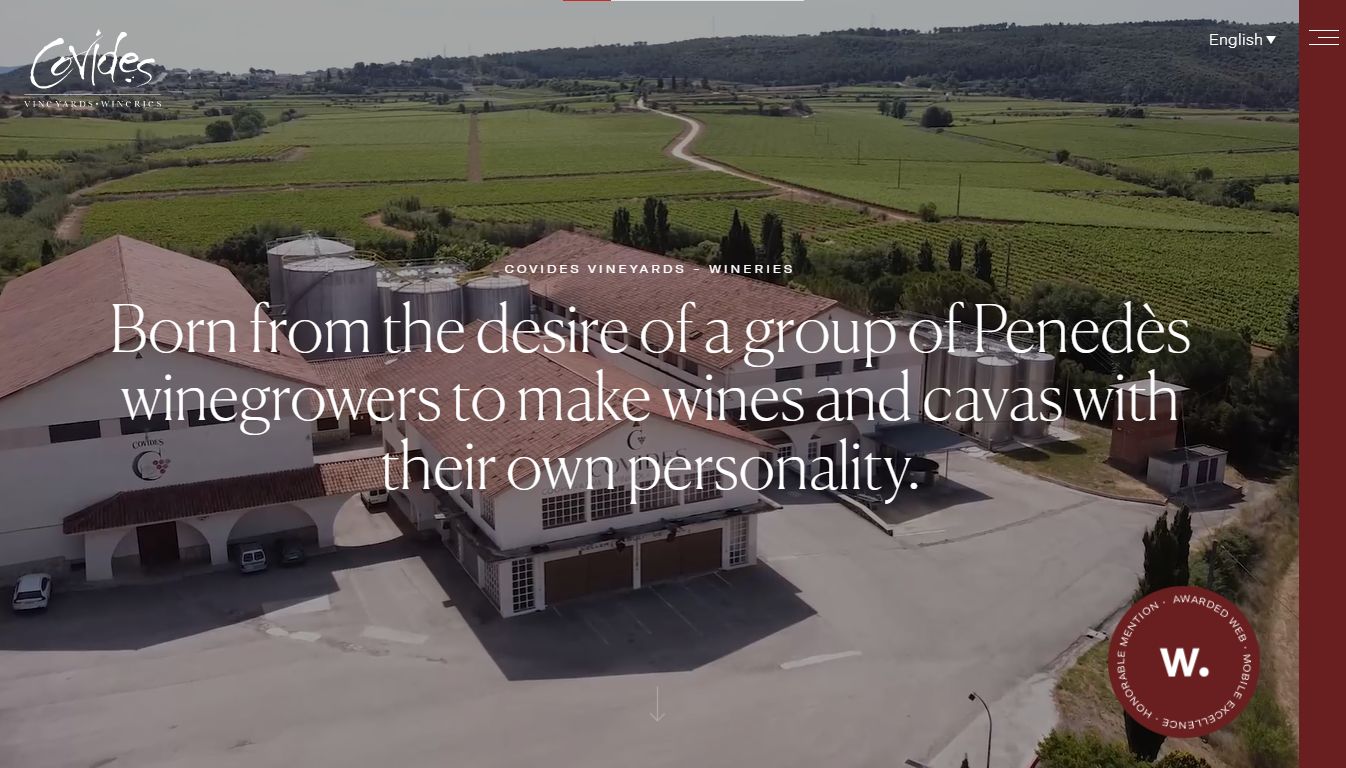
With half a century of experience to draw from, the Covides website manages to communicate the rich history of the winery, what it cares about, the commitments it has made to both customers and society, and more.
The color scheme goes from a light maroon hue to a very tame green hue, mirroring the colors we associate with the grapes and wines made from them.
Navigation is simplified, with the menu always insight to access information about Covides, the wine, organic offerings, cava, vineyards, wineries, and wine tourism. There are also pages for commercial use, contact, and news.
It’s all very well put together for a cohesive journey throughout the site.
10. Lightfoot & Wolfville
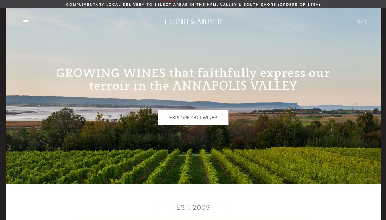
The Lightfoot and Wolfville wineries created a responsive landing page with the famous off-canvas navigation menu. The One Pager’s extended parallax scrolling feature displays some great graphics and a nice mix of fonts.
It is especially a delight to see the tastefully integrated audio that any site can use to introduce their brand, founder, or make a statement about something they’re proud of.
Hopping on over to the operational area, we see the owner display some of the best wines in the collection in a stunning display of elegant white space on what is one of the best wine websites we have documented.
How Do I Make A Wine Website?
- Select a Web Host. Look for hosting (free or paid) to host all your files.
- Choose a suitable and memorable name for your website. If you are not tied to the name of the vineyard, think carefully about the domain of your site. The name of your website can make a difference and make you stand out from the competitors.
- Select a CMS (Content Management System). This will ensure you can manage everything posted and market yourself effectively.
- Choose a theme suitable or create your own. Tweak it for unique value and to communicate your message clearly.
- Search Engine Optimize Your Website. You have to ensure that your marketing takes advantage of the value that comes from.
- Engage a copywriter freelancer. You will need a content expert to write articles and other material for you to go to the blog.
What makes a good wine website?
A good wine website should include the following:
- An about us page.
- Beautiful images or videos of wine, the winery, or its founders.
- Lists of wines available.
- Explanations on the wines.
- Explanations on the way the wine is made.
- A way of contact.
- Press notes (if any)
- Information on the Vineyards.
- Sale information
- Links to social networks. (Twitter, Facebook, Youtube…)
- Be multilingual. Local language and English.
Apart from those, it should follow the same design rules as any other good design. It should use consistent margins, a limited number of colors matching the brand, beautiful visuals, good use of whitespace, etc.
Conclusion on Wine Websites
Looking at this selection of some of the best wine websites, one can tell right away that they do not have to be the same or even extreme in their approach. It’s all about making an impact right off the bat.
Sites continue to leverage the stunning full-page display, carefully selected typography, videos, and professional photography work to market their wines.
![30+ Best Church Website Templates [WordPress & HTML] church website templates share](https://alvarotrigo.com/blog/wp-content/uploads/2023/08/church-website-templates-share-300x150.png)
![20 Beautiful Squarespace Website Examples 2024 [Get Inspired] squarespace website examples share](https://alvarotrigo.com/blog/wp-content/uploads/2023/08/squarespace-website-examples-share-300x150.png)

![21+ Best Artist Portfolio Examples [Get Inspired!] artist portfolio websites share](https://alvarotrigo.com/blog/wp-content/uploads/2023/08/artist-portfolio-websites-share-300x150.png)
![9+ Best Contact Pages To Get Inspired [+ 15 Free Contact Forms] contact page examples share](https://alvarotrigo.com/blog/wp-content/uploads/2023/08/contact-page-examples-share-300x150.png)
![15 Beautiful Spa Website Design [Examples To Get Inspired] spa website designs share](https://alvarotrigo.com/blog/wp-content/uploads/2023/08/spa-website-designs-share-300x150.png)