When it comes to building an amazing CrossFit website design, image is everything. How you perceived impacts how many people engage with the site on the first visit. To be clear, there is no one right way to be perceived by your potential audience.
There are several approaches you can take to make an impact, as you will see in the CrossFit website designs below. These designs are intended for inspiration and to show the many ways one can approach a CrossFit website development process. They are the best CrossFit Websites that we have found on the net.
1. Amplify
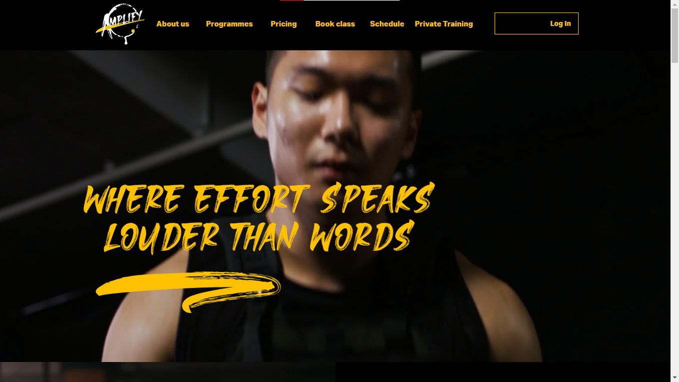
Amplify’s landing page utilizes full-screen animation to hook in the visitor. It flashes images of individuals in the middle of workouts with great lighting to convey a CrossFit establishment’s tough but urbanized image. It is definitely one of the best CrossFit website designs we have seen.
The background is mostly black, with liberal use of contrasting white typeface (for text blocks) and colorful but edgy fonts reminiscent of an energy drink logo (for the slogans, beliefs, and pillars Amplify wants to communicate).
2. CrossFit Queens
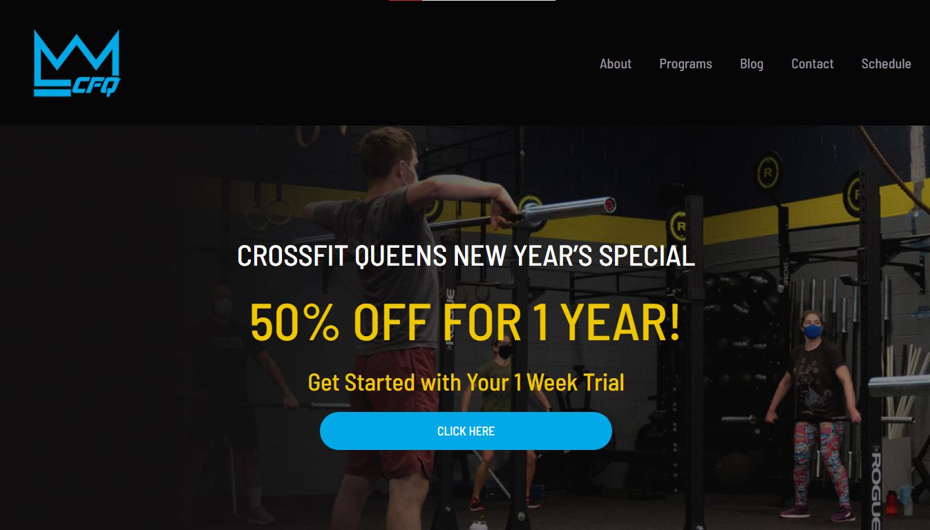
CrossFit Queens does a great job of giving a visitor everything they need to know on one page. That’s why this website ranks second in our list of the best CrossFit websites. A navigation menu at the top (or three lines to the side in smaller screens) takes visitors to the about, programs, blog, contact, and schedule pages.
Scrolling down, we see a conservative use of just one image but impactful text blocks demarcated by icons and sometimes written inside shapes. Suffice to say; one can tell right away if this is the place for them, without leaving the home page.
3. CrossFit DB
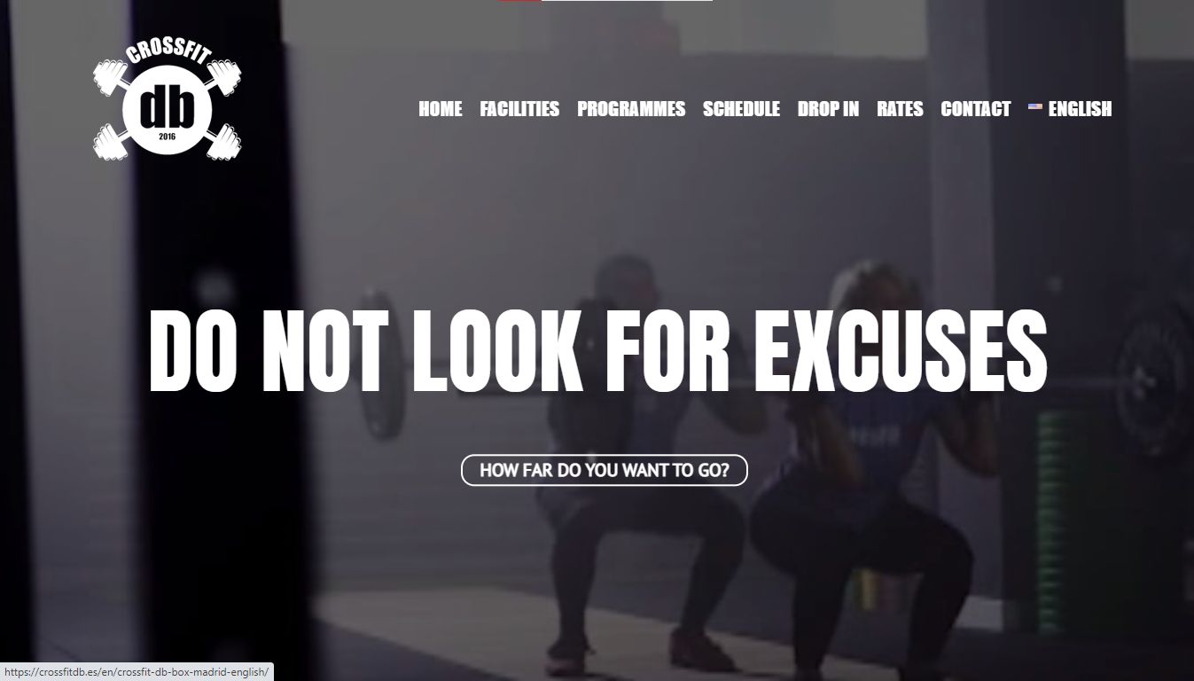
CrossFit DB ranks third in our list of the best CrossFit websites. To make an impact, CrossFit DB begins with a full screen, slightly darkened video in the background, with large, bold, white typeface in the front saying ‘DO NOT LOOK FOR EXCUSES’ and in a less aggressive but still serious tone asks ‘how far do you want to go?’
You can replicate this background video style by learning how to create a full-screen video with CSS and HTML.
The clever use of typeface, a dark color scheme, and powerful graphics conveys the message that CrossFit DB knows what it can offer you. Scrolling down, the establishment shows off impressive workout gear with a highlight on its professional trainers and free trial.
4. Fifth Ave CrossFit Website
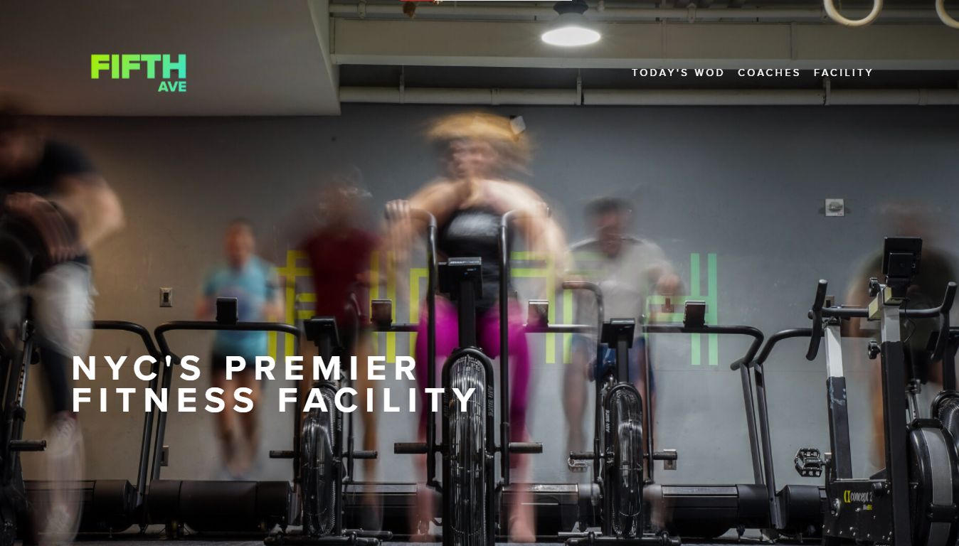
This CrossFit website design does not go into long tirades about what is so cool about it. Instead, it leans back and lets the one-page website design do the talking. The image on the homepage conveys to a visitor that they’re in an active place with fast-moving participants.
Right after that, the days and hours it is open are shown clearly, after which a customer is introduced to the coaching team, which is shown in a collage utilizing contrast to keep the consistent dark theme going. Memberships are explained and facilities are shown in a tour to complete the journey.
5. BK Fit
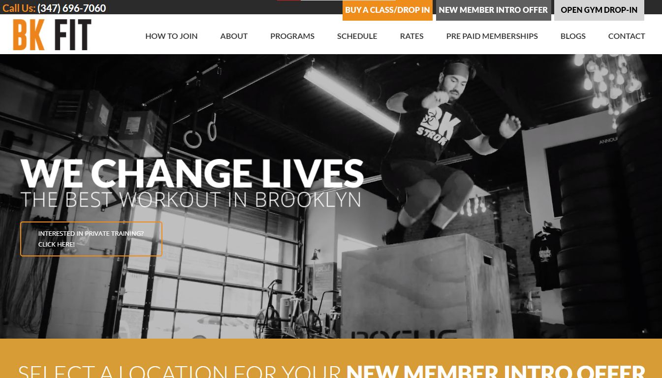
The BK Fit website ranks fifth in our list of the best CrossFit websites. This CrossFit website design feels more like a well-designed mobile app than a website. Utilizing fullscreen video backgrounds and images of participants in various CrossFit form positions, it showcases what it can offer visitors.
It also puts the control in the visitor’s hands by asking them what they would like to achieve (covering everything from weight loss to private training), allowing people to choose their goals, and informing them what their choices entail right away. The menu, pages, and design collaborate to deliver a powerful website experience that provides everything. One of the best CrossFit websites on the net.
6. Third Space
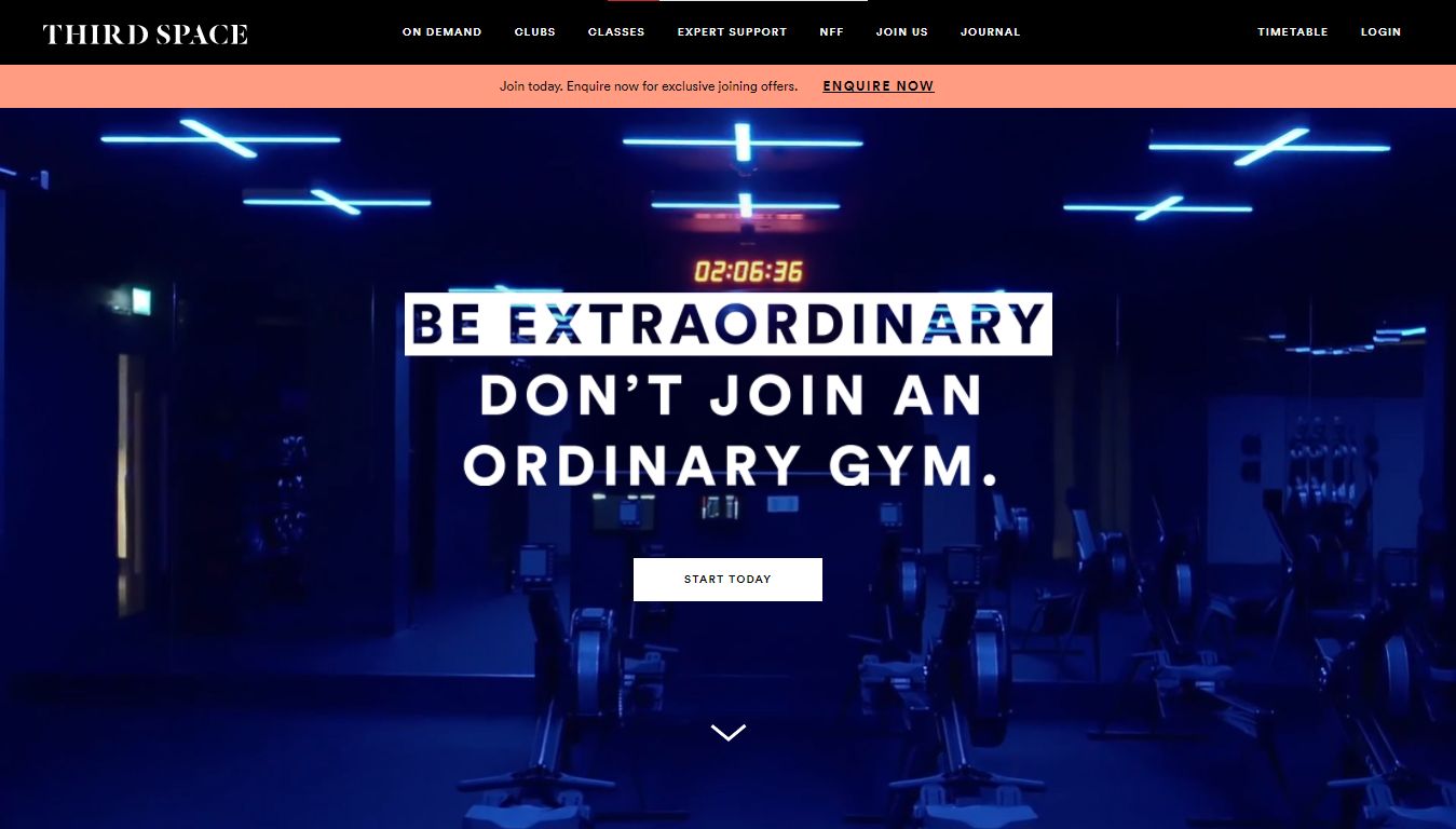
Third Space bills itself as an extraordinary gym, something it showcases extensively by displaying its state-of-the-art facilities, advanced equipment, and incredible location. It is aimed at the most technologically connected people in its audience who can also afford luxuries.
Third Space CrossFit website design sets itself apart by going for an image of the very best, reflected in the displayed décor, its staff, the color palettes chosen, healthy dieting support, and provides an app to keep its members connected when on the go.
7. Body To Burn
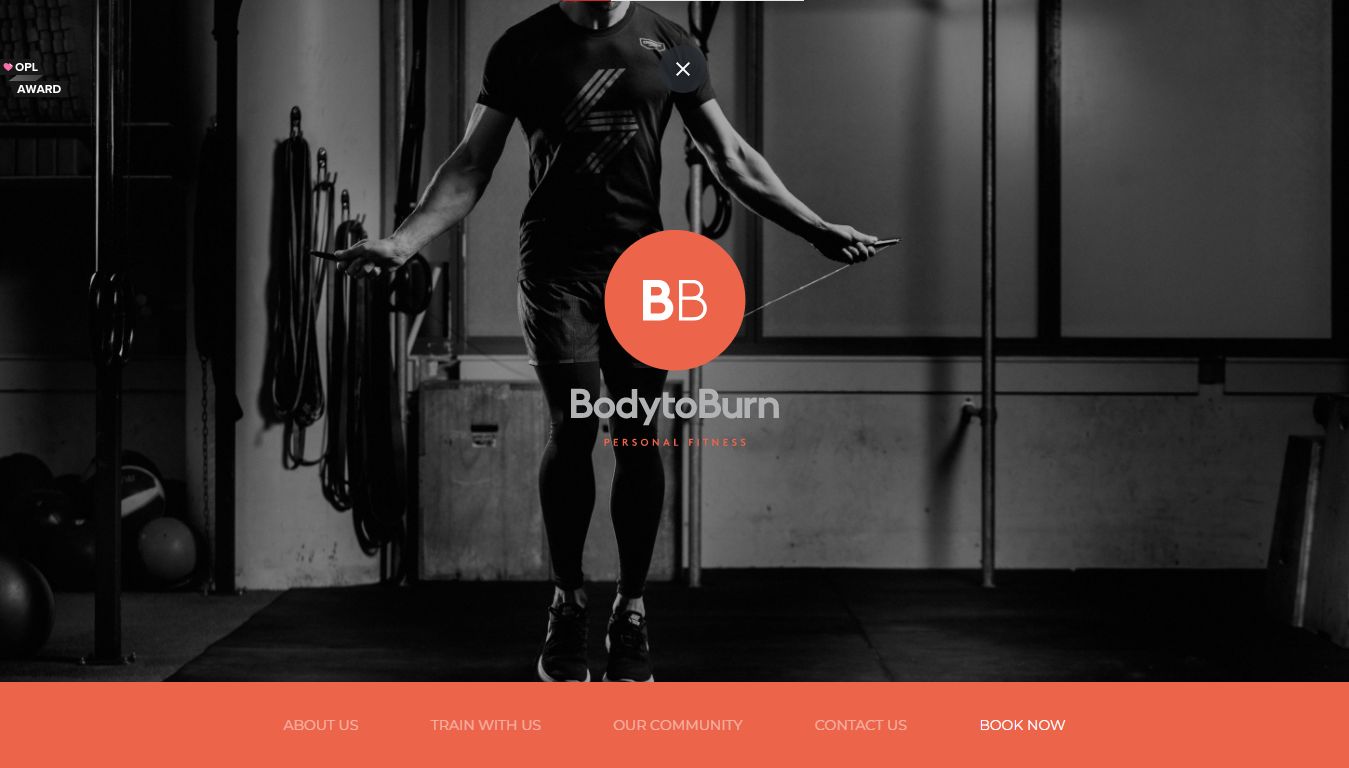
Though the website may be focused on personal fitness, its design works for the CrossFit community too (something the gym offers). The color scheme used, the separation of workouts into neatly displayed milestones, the succinct menu, and overall typography would work for any fitness website.
If you are looking to aim at a quiet, dignified, corporate, or high-powered audience, this site captures the elegance of greys and blacks that speak well to such a crowd. The CrossFit website design approach utilizes a responsive design to showcase its packages, community, contacts, and call-to-action. The sticky navBar also makes the navigation very easy.
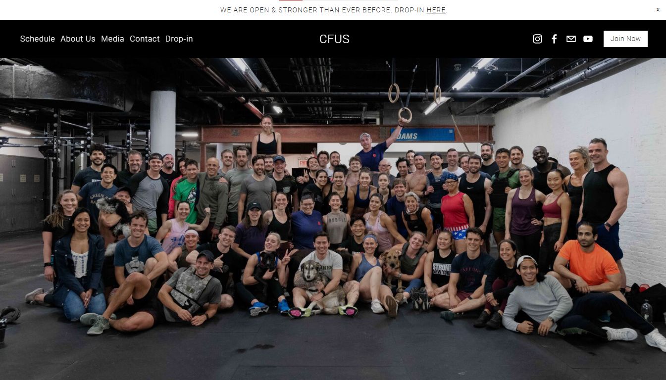
8. CFUS CrossFit Website
This CrossFit website’s design is intended to fit everything into the homepage. There, a visitor finds an image of what looks like a significant portion of CFUS members, with a community vibe. Below that,
This CrossFit website’s design is intended to fit everything into the homepage. There, a visitor finds an image of what looks like a significant portion of CFUS members, with a community vibe. Below that, a visitor finds announcements, a call-to-action button for membership, encouragement to ask questions by email, and a blog introduction.
Further down, it continues to showcase some things while promising more using buttons to ‘see all classes’ or ‘read more,’ encouraging site visitors to stay longer on the site, which has been shown by some of the best CrossFit websites to directly improve the conversion rate.
9. Madrid CrossFit Challenger Series
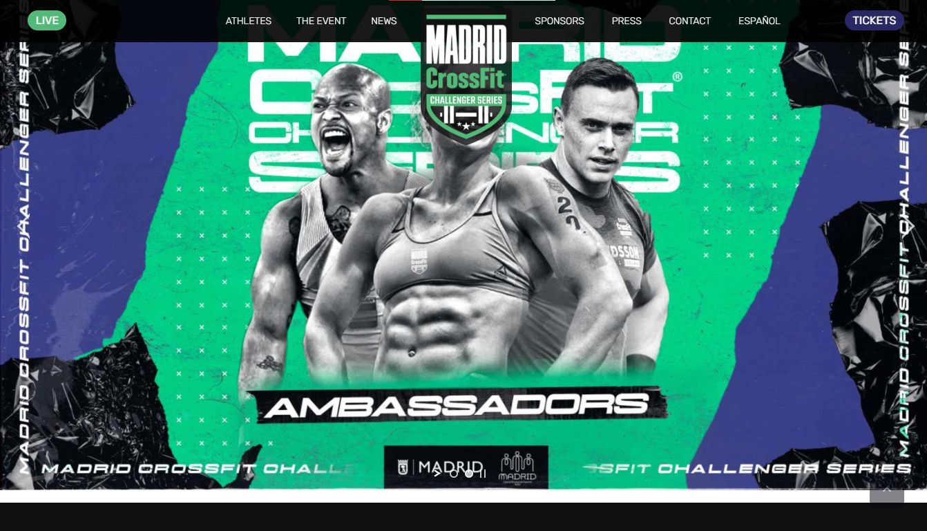
This CrossFit website has a huge product to sell. The bold logo, the use of dark themes interspersed with white blocks display text and images, all serve to enhance the text and visual messages. The partners it works with are displayed prominently, lending it more credibility.
There is a very handy map at the bottom, just above the social media buttons and its logo. Navigation is simple, including a button that takes you to the top of the page in one click. The facilities are displayed prominently alongside text providing more details to a site visitor.
10. CrossFit Unit
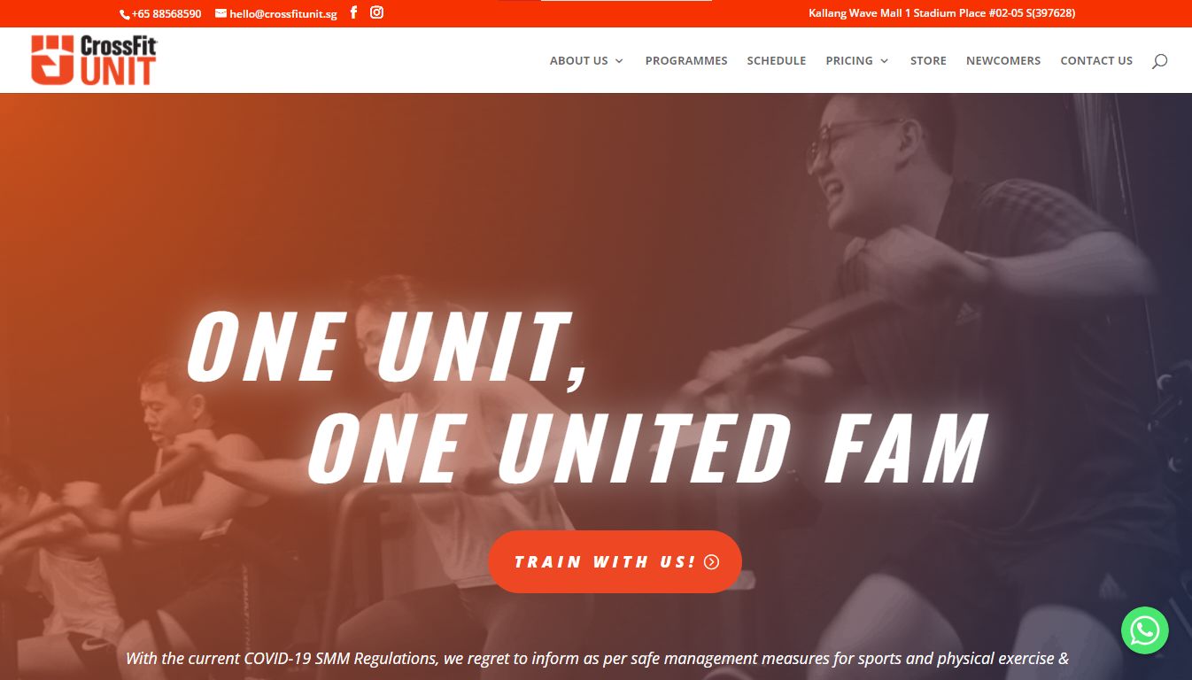
While most CrossFit website designs take an edgy tone with plenty of blacks, CrossFit Unit goes the other way and approaches this from a softer, more inviting feeling. The color is not intimidating, the font is not edgy, but none of that takes away from the brilliant use of white space.
The message, about vaccination, classes, call-to-action, testimonials, comes through clearly using legible white fonts and a glowing orange color interspersed through to draw attention to its trial and welcome buttons. The menu is simple and takes the visitor from page to page with one click.
11. Spot
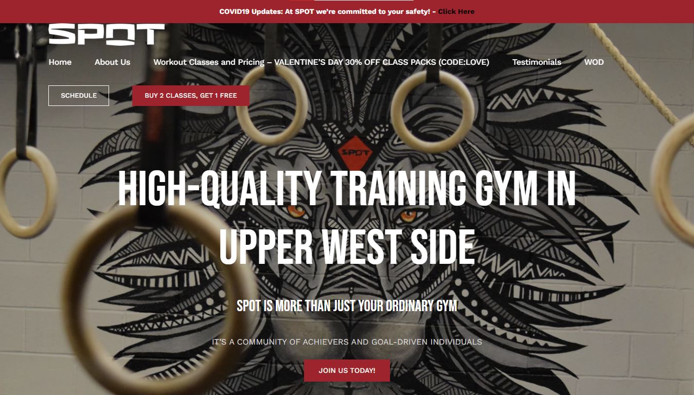
Spot’s CrossFit website design stands out, not because it is edgy, but because it is stunning. It makes good use of the full-screen display to showcase an interior shot of the location’s interior. On the wall is a whimsical lion figure interrupted by what looks like a series of still or flying rings.
The message is conveyed right away, before giving way to a call to action, some words about tips & workouts, and a call to action below where one can sign up in 4 simple steps without leaving the homepage. Right below that is another display of equipment with the address, social media buttons, and contact buttons.
12. Dog Town
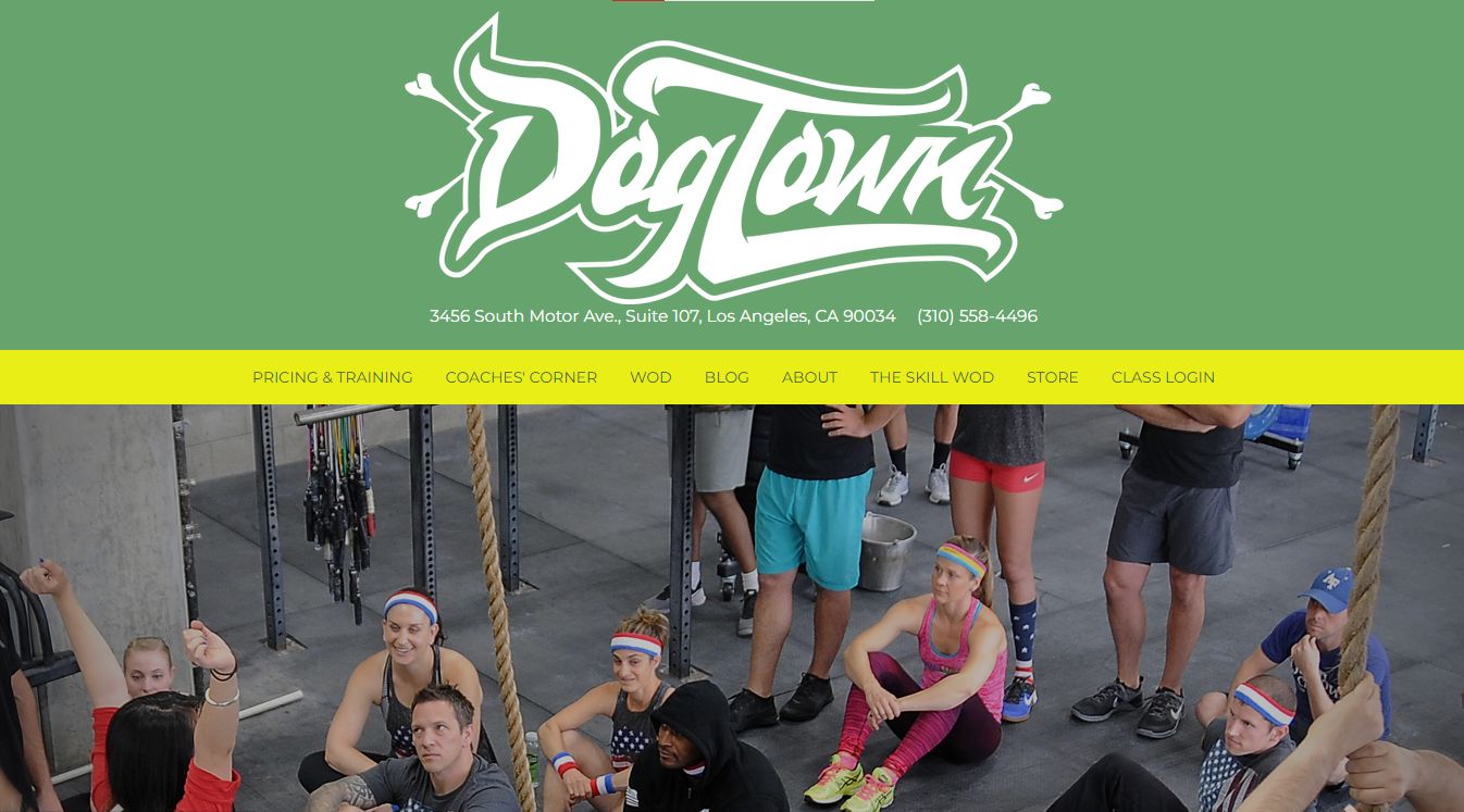
Dog Town’s message is simple- they have a cause, they love fitness and yes, they love dogs. This is conveyed using simple but impactful messages that get straight to the point. On this one page, you get to meet the group in a photo montage, learn about their ‘Crush Cancer’ campaign, and sign up to train (if you’d like).
At the very bottom, there is a map, address, social media page links, buttons for pricing, the contact page, and a phone number for a direct call. It’s one of the best CrossFit website design cases that diverges off the norm without losing its identity.
13. CrossFit Gold Rush
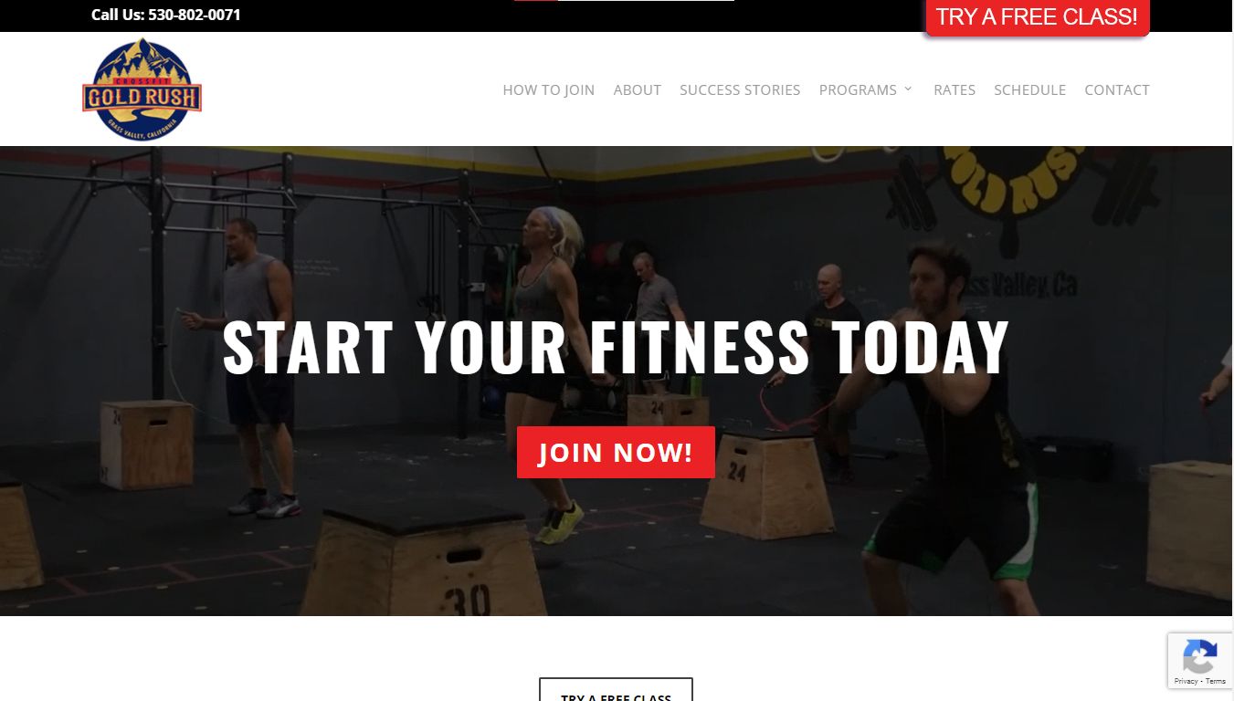
The website of this establishment goes the simple way. However, the message presented is not plain. Utilizing the full-screen video background, the website captures attention while presenting its call-to-action and displaying its more rugged approach to CrossFit website design.
However, rugged does not mean poorly equipped as the establishment seems to have all the amenities needed, but presented, like its logo, with a twist emphasizing themes of the open country. Carefully placed videos, success story blogs, a map, and text blocks containing additional information work cohesively to deliver a complete CrossFit website.
14. Resident CrossFit
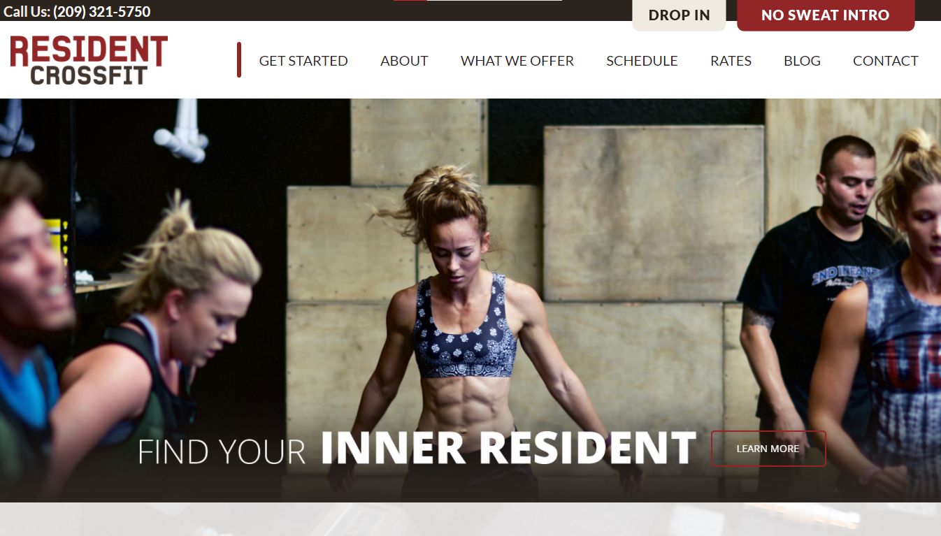
Resident CrossFit website design takes full advantage of its responsive design to elicit interesting animations of functions and buttons across the site. The same format is used for its training modules which one can click on individually to see what interests them.
There’s a video linked to YouTube showcasing their training, testimonials, a sign-up link, and a map. The menu, which doesn’t float, leads to the about, what we offer, schedule, rates, blog, and contact pages for interested visitors who see the message and respond to it.
15. Studio CrossFit
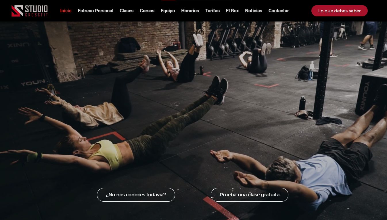
Studio CrossFit’s intensity comes through in the introductory full-screen video that greets every visitor on the homepage. In several quick and well-shot cuts, the message is clear, the studio is a serious place. The use of color is inspired too, alternating between maroon and off-white hues.
The colors appear on every button a person hovers on and are used in tandem with the informative and beautifully designed CrossFit training modules provided. The website gives a look at the facility and the team running it. Right below, there is an emphasis on its social media buttons and a link to The CrossFit Journal.
16. LAX CrossFit
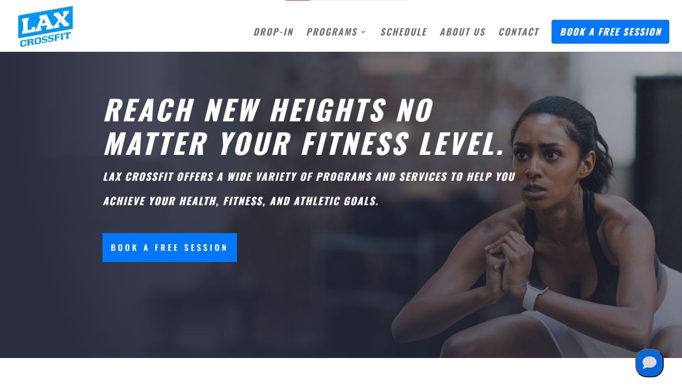
LAX CrossFit doesn’t have quite the same feel to it as the other edgier or even obvious CrossFit website designs. It takes a cleaner approach with an emphasis on generous white space usage. Using icons and short text, the contrasting black fonts on white draw attention to the CTAs.
In this one-pager, LAX CrossFit introduces us to what it offers, its competitive edge, a way to get started (by booking a free session), testimonials, the location details, a map, and contact details. All are presented succinctly, taking up as little space as possible.
17. CrossFit London UK
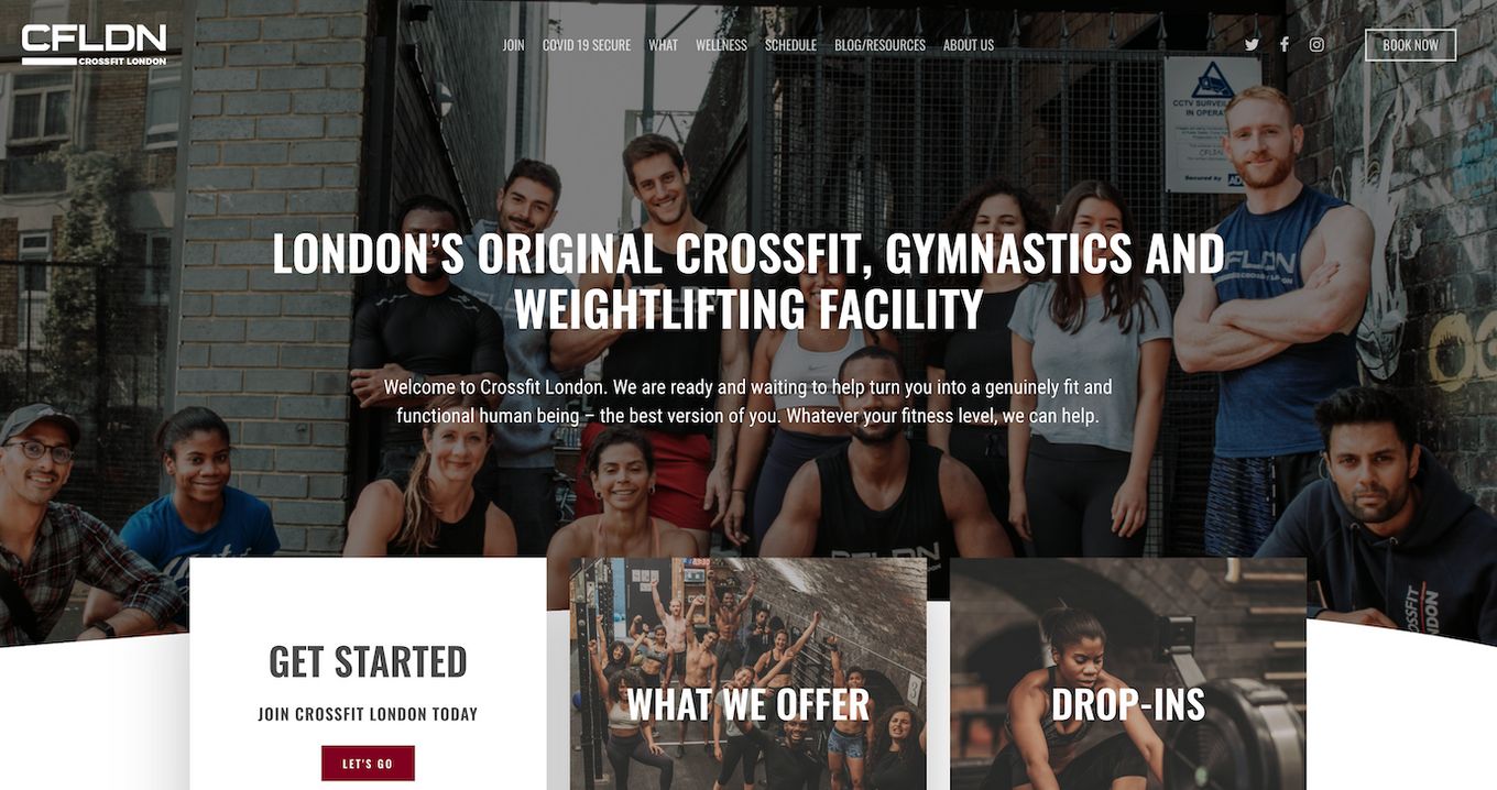
A simple but straightforward page design that makes use of square images as buttons to navigate the website.
It contains all the basic elements for a good website. Testimonials, about us page, pictures of the coaches, a big “Get started” button on the landing page, and even a blog.
18. Ritual GYM
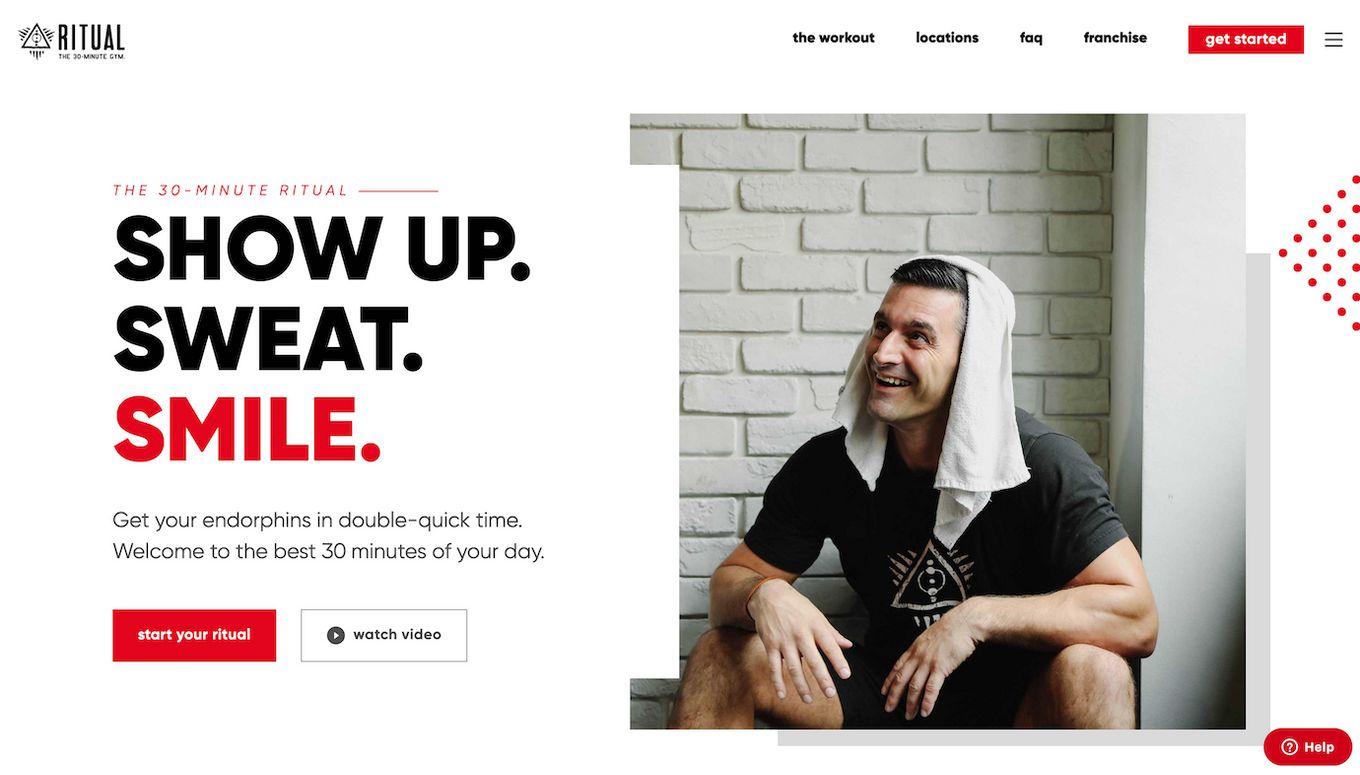
This website design looks quite modern compared to many of its competitors. Unlike many other CrossFit pages, it uses white and light colors making it look very clean and giving it a totally different vibe.
It uses a big call to action on the hero section, comes with high-quality images, FAQs, testimonials, and a very easy way to contact them through a chat kind of contact form.
It uses a casual and fun tone for the whole page.
19. Crossfit Urban Edge
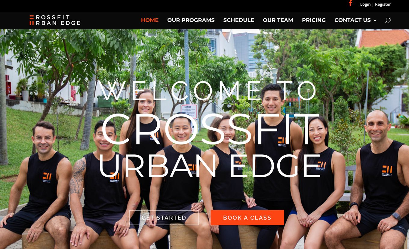
Urban Edge website uses a design that won’t make you wow but that will definetely provide you with all the information you need.
It includes things like the gym schedule, coaches details, the list of offered programs, the pricing page, and even their rules!
The design uses mainly a dark theme in combination with the red color used in their brand logo.
20. Crossfit Mill Town
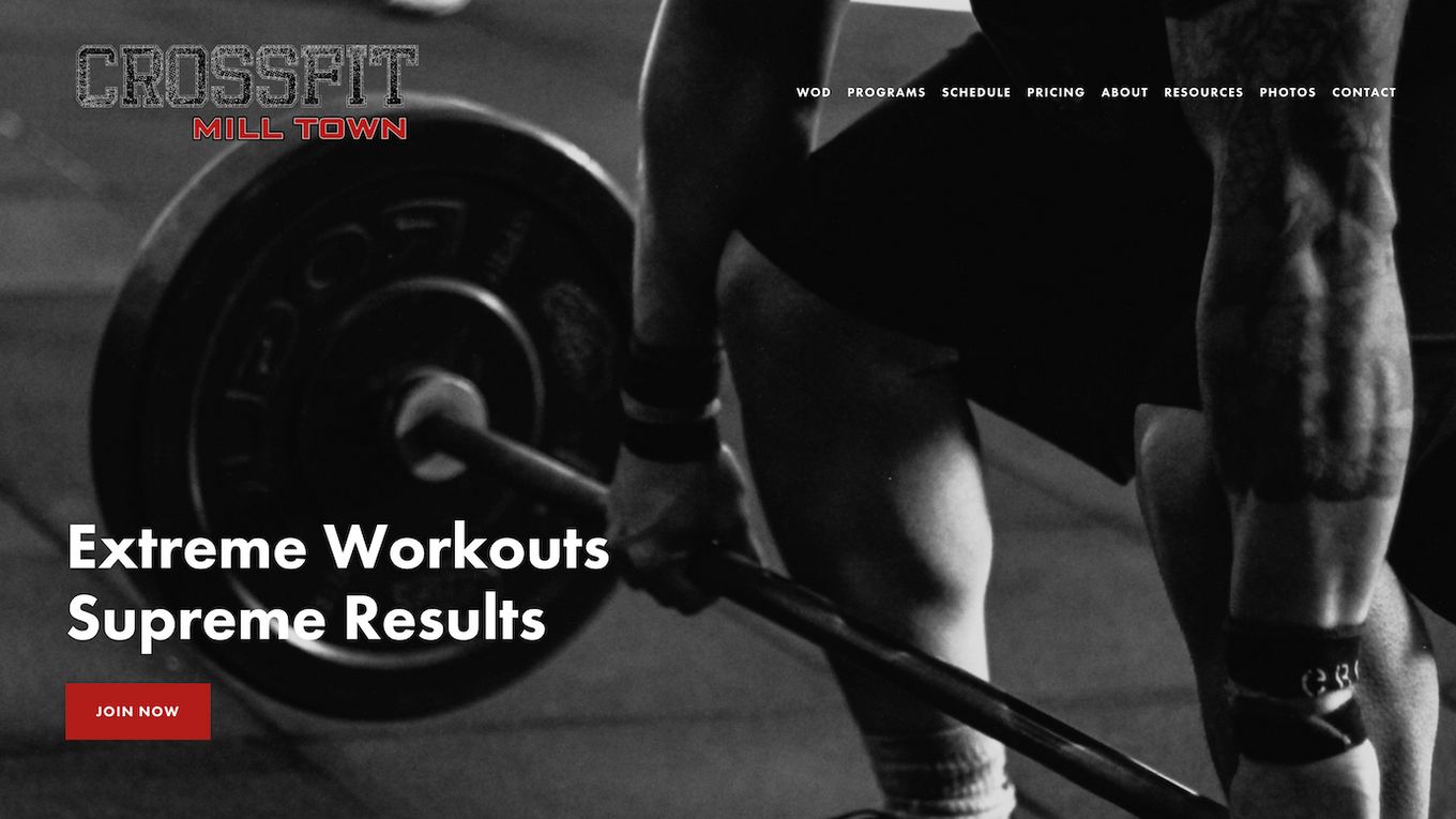
A very simple yet effective design. The landing page shows a few images with parallax effects and adds a few call-to-action buttons to join, get the price, or contact.
It uses very little text and big fonts as a way to invite us to learn more by clicking on the call-to-action buttons.
Once you get into their menu they provide much more information but use the same kind of vertical format. They also provide a nice gallery where they show off some nice CrossFit pictures.


