When it comes to creative design agency websites, creativity is a must. It’s not just the website, but also the portfolio showcasing past works. In the following list, we are going to look at some of the best creative agency websites on the internet, to gain some inspiration and spark our imagination. Let’s dive in!
1. Juliet Creative
Juliet Creative inspires intrigue the moment a visitor lands on the homepage. Using a video made with cutouts and animation elements, the site introduces its image in an engaging way that draws visitors into looking at the portfolio. Using the full-screen effect to its advantage, Juliet Creative sends an impactful message that sticks with the target audience.
If you like this page, you can achieve the same effect by making use of this JavaScript scrolling component. It’s called fullPage.js and it’s also available for WordPress editors like Elementor and Gutenberg.
2. Or Halevi
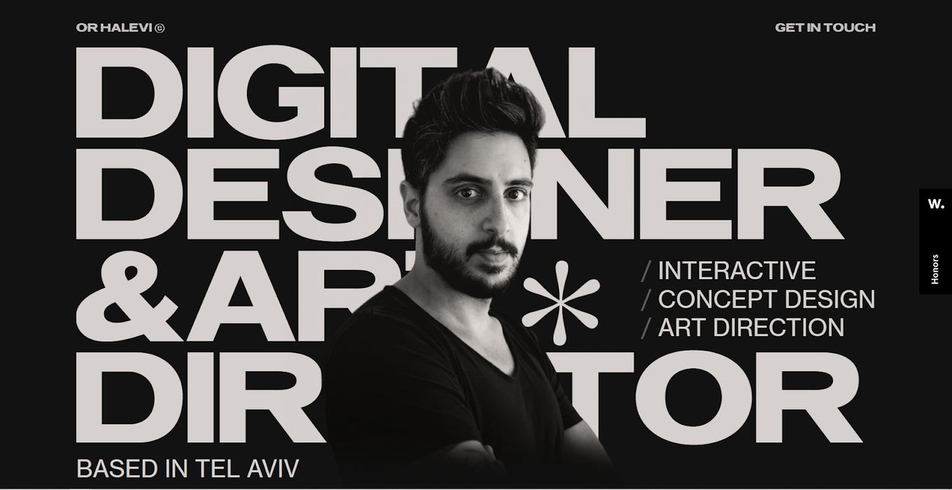
Is it edgy, dark, bold? Yes, it is. Of the many creative design agency websites we’ve seen, this introduction is one of the best. In a few short words, we are introduced to the work, the person behind it, and a promise that the end product won’t disappoint.
3. Elespacio
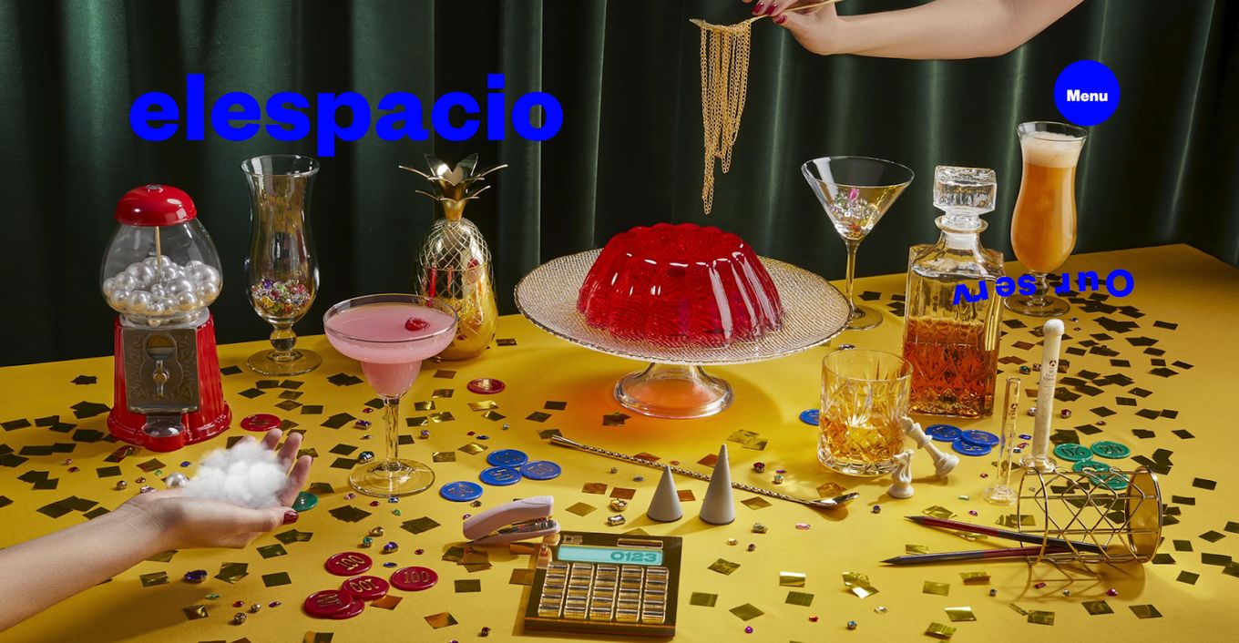
Elespacio blends animated and video elements to show off its ability to tweak designs to fit the function. Scrolling down, we see Elespacio confirm its expertise in crafting visual designs for marketing, social media, and content creation, as well as success stories confirming that it can deliver.
4. Squat
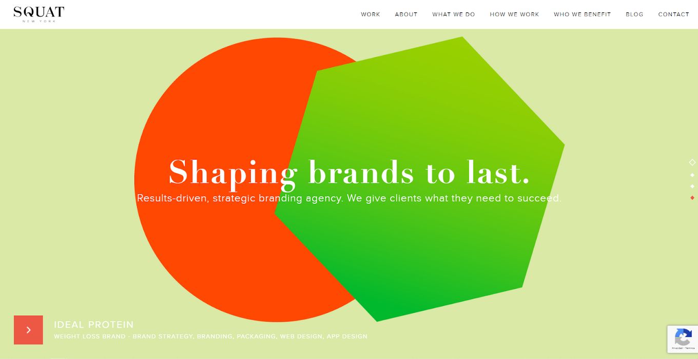
Borrowing from minimalist creative agency websites, Squat embodies its own name in its soft and subtle transition from panel to panel. Each one showcases a different idea, aspect of the business, or simply the services offered. In one breath, we are introduced to the website and the work we can expect from the team behind it.
5. Monopo
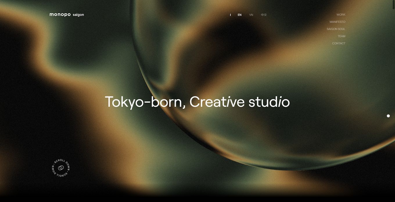
Monopo takes a monolithic but interesting approach on its homepage where every movement of the cursor evokes a reaction, the menu is short but accessible, the portfolio feels like an art show and the transitions take visitors from one portfolio to the next with a graceful fluidity. It leverages various elements like incredible typography and video backgrounds to immerse visitors into each showcase.
6. Vertical
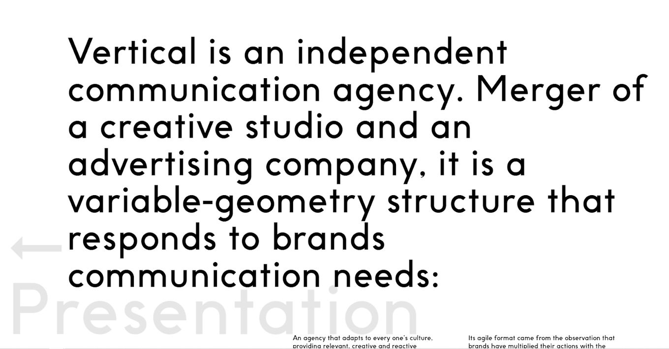
Vertical has to be one of the best creative agency websites we have seen in a while. It opens up on a completely white space populated by a menu. However, the menu is a half helix of some kind that seems to descend and ascend with each scroll. It has to be seen to be believed because it seems to be entirely made of white space and words.
7. YouTooCanWoo
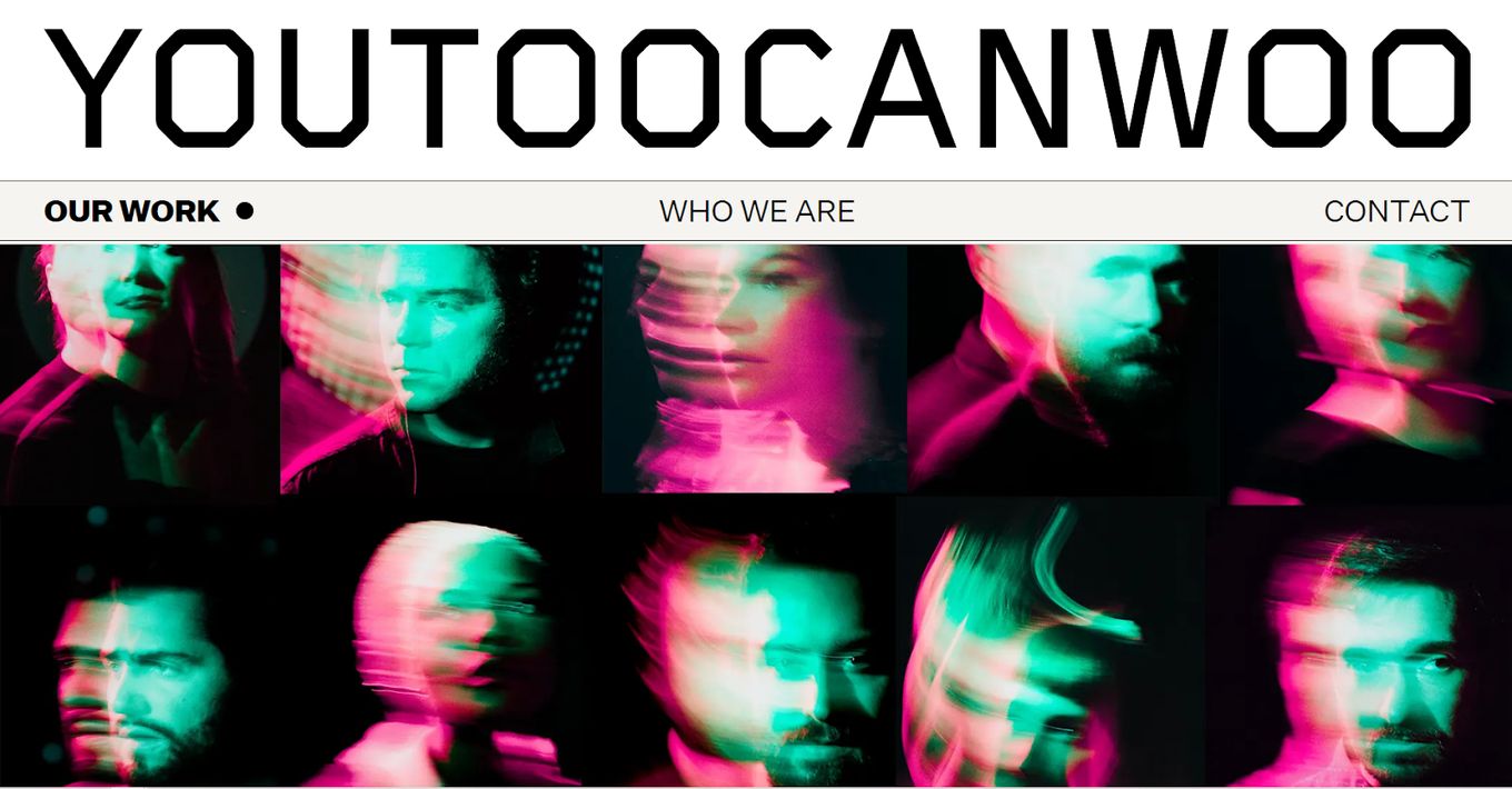
YouTooCanWoo is a masterclass in showcasing your work and setting yourself apart from other design agencies’ websites. In one long page, a visitor is introduced to an impeccable custom cursor, a showcase of all the work the company has done, the team behind, and a neat menu that pops up when scrolling up for easy access.
8. Moniker
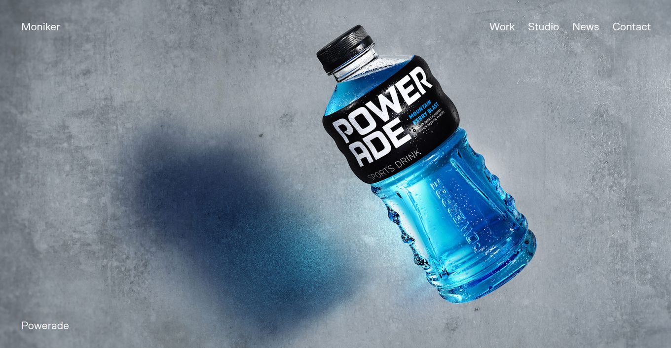
It seems custom cursors are in style among creative agency websites, but that’s not all moniker has. Fullscreen visuals, transitions that never require scrolling when on the homepage, and an always-in-sight menu aid navigation and tell a story of what Moniker can do. It’s well-colored, tastefully partitioned, and kept simple.
9. Favorit Studio
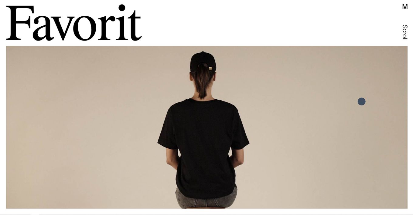
Favorit Studio is a stunningly constructed creative agency website. From the menu, which is a simple floating M in the top right corner, to the fact that every scroll is a transition, the design makes full use of every inch. The theme contrasts black and white and color to make an impact.
If you like scrolling effects, you can get inspired by these 15 scrolling animation websites.
10. BLVR
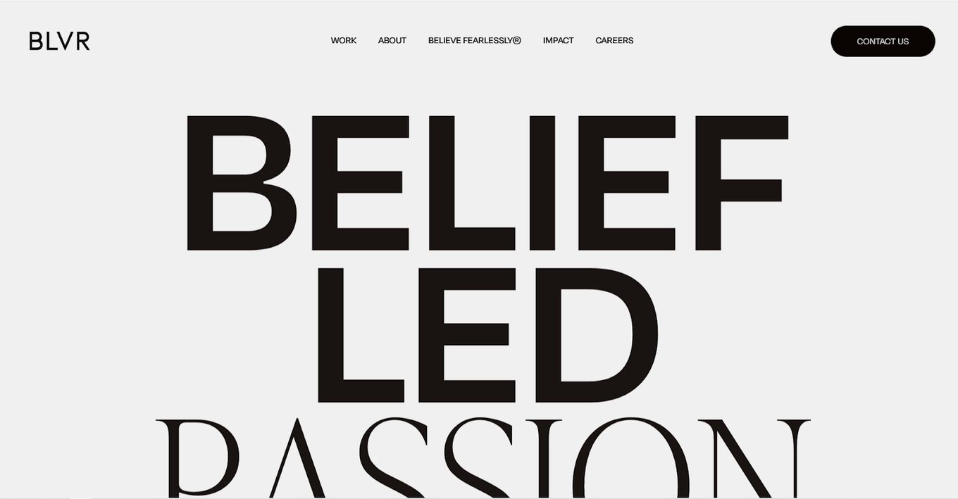
Utilizing animated land video panels that transition between each other smoothly like disappearing cards, BLVR communicates its message, accolade, and a worthy cause, all in one page. The menu leads to the about page, impact, careers, and contact, to cap off a short but memorable journey of one of the best creative agency websites.
11. Kota
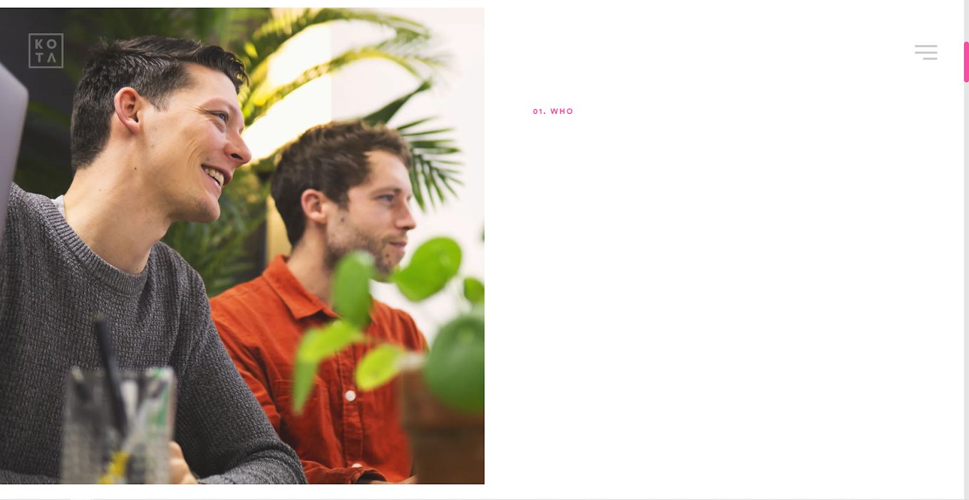
KOTA seems to be a big fan of brevity, giving visitors on its homepage immediate access to the portfolio of work done, services offered, the studio, blog, and contact page. Its portfolio of work feels complete and shows how the team approaches everything with uniqueness to fit a client’s requirements.
12. Vrrb
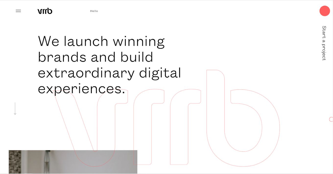
Vrrb went the minimalist route, which may at first feel like one of the stark creative design agency websites that say too little. However, scrolling down showcases a host of brands the agency has worked with, followed by powerful calls to action, a journal, an introduction to what Vrrb does, and a floating menu for page hopping.
13. SYZYGY
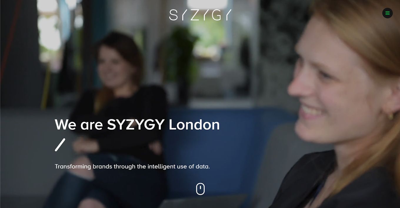
Using a powerful video introduction for its background, SYZYGY tells its story in a few frames showing the team at work, at conferences, discussing ideas, and more. It is a charming introduction that immediately forces a visitor to take a closer look to discover more. The website sells the professionalism and expertise of the team behind it.
Learn how to create a YouTube video background with just CSS and add it to your creative agency website.
14. Kairos Media
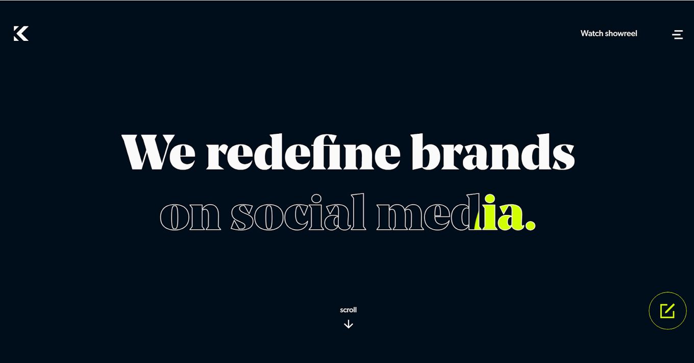
Many of the creative agencies’ websites have made use of a custom cursor and Kairos Media does too. On the home page, we meet the team, learn the mission, and are finally confronted with a ‘Time to stop scrolling’ message at the bottom and a call to action bound to get clicks.
This creative agency website uses a lot of text effects. Check our list of 15 gorgeous CSS text animations or these 7 scrolling text animations.
15. Hommu Studio
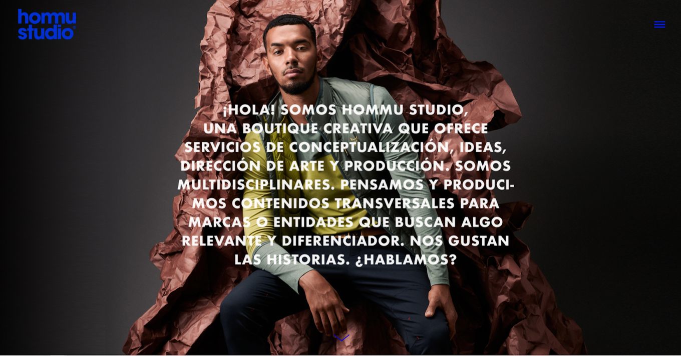
With clever color usage, the typography lays on top of a fullscreen image, introducing us to the site. Scrolling lower, we are treated to a gallery of the creative agency website’s best work, which invites us to check out more, right before we learn about the customers the brand has worked with. In a word: succinct.
16. Nomon
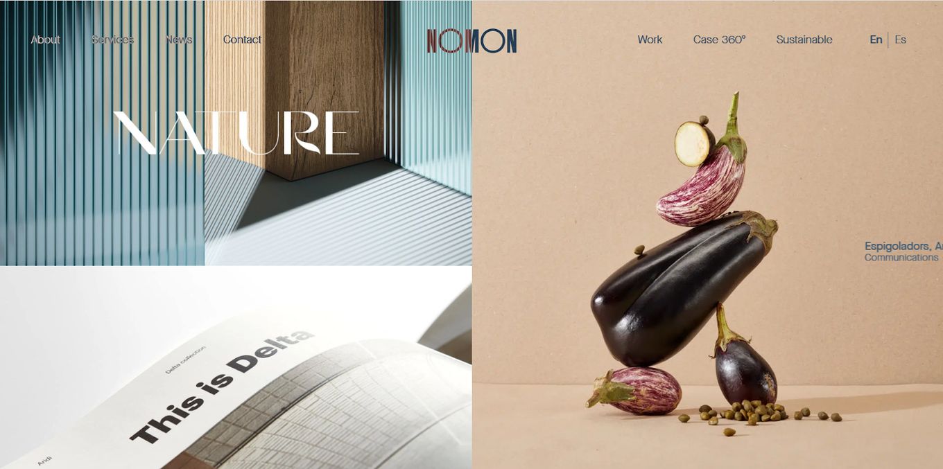
Nomon Design is minimalist in a different visual language. Favoring stark panels with patterns that draw the eye or sleek photographs of bare frames and stoic facades, Nomon continues to wow with an unbroken pattern all the way down for portfolio viewing, an introduction to the work it does, and an introduction to the staff. A floating menu helps visitors hop between pages with ease.
17. Vasava
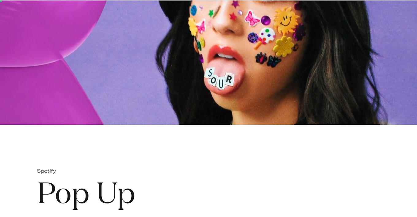
With sweeping video, image, and text transitions, Vasava succeeds in topping many websites for creative agencies. It not only places its promise to its customers front and center but also its past customers and all the great work done for them. Vasava’s website aspires to inspire confidence, which it does successfully.
18. Social Club Paris
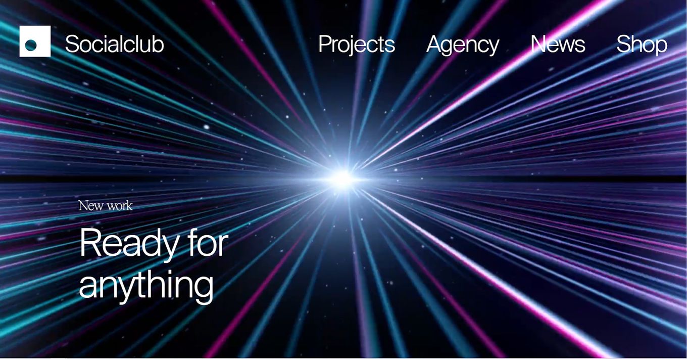
We’ve seen video backgrounds in other agency websites but Social Club takes it to a new level. The video doesn’t just sit in the background doing its thing but engages with the viewer as he stares directly into the eyes of amusing faces that promise to introduce some wackiness into the mix.
19. Dragon Rogue
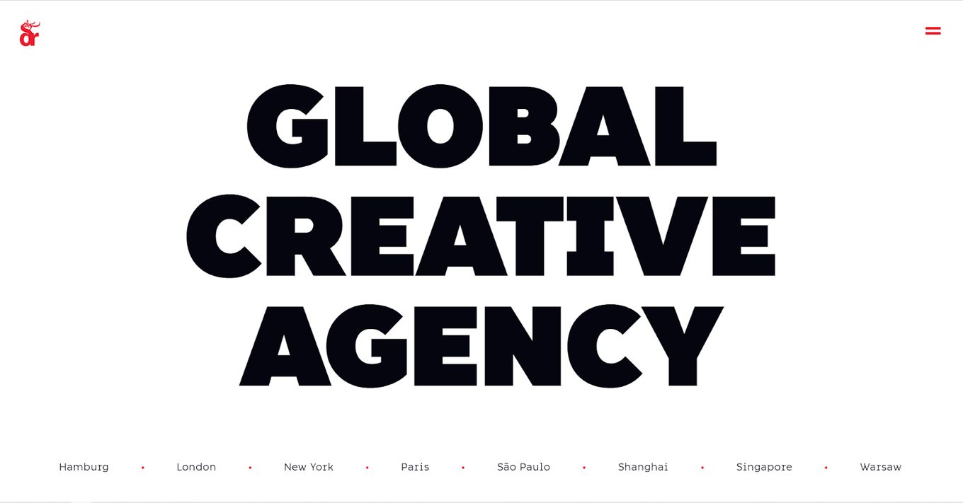
The entire website feels like the world’s most well-executed billboard. Responsive elements scattered throughout the site for the portfolio reveal new things with every touch and click. The cursor shifts between different shapes to fit each panel you reach, with a background that responds whenever someone hovers over the locations.
20. Bonjour
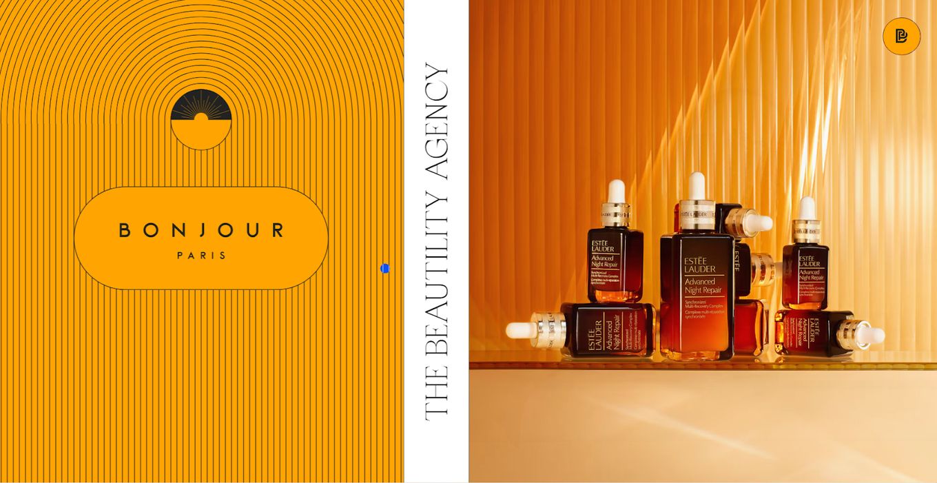
Tired of websites that scroll from the top down? How about a site that moves sideways when you scroll? Well, that’s what Bonjour has gone with. It is known as snap scrolling.
This website uses colors and geometry to its advantage, displaying its portfolio of projects, clients, and areas of expertise. Want to be surprised? Just hover on elements and watch them change.
21. Division of Labor
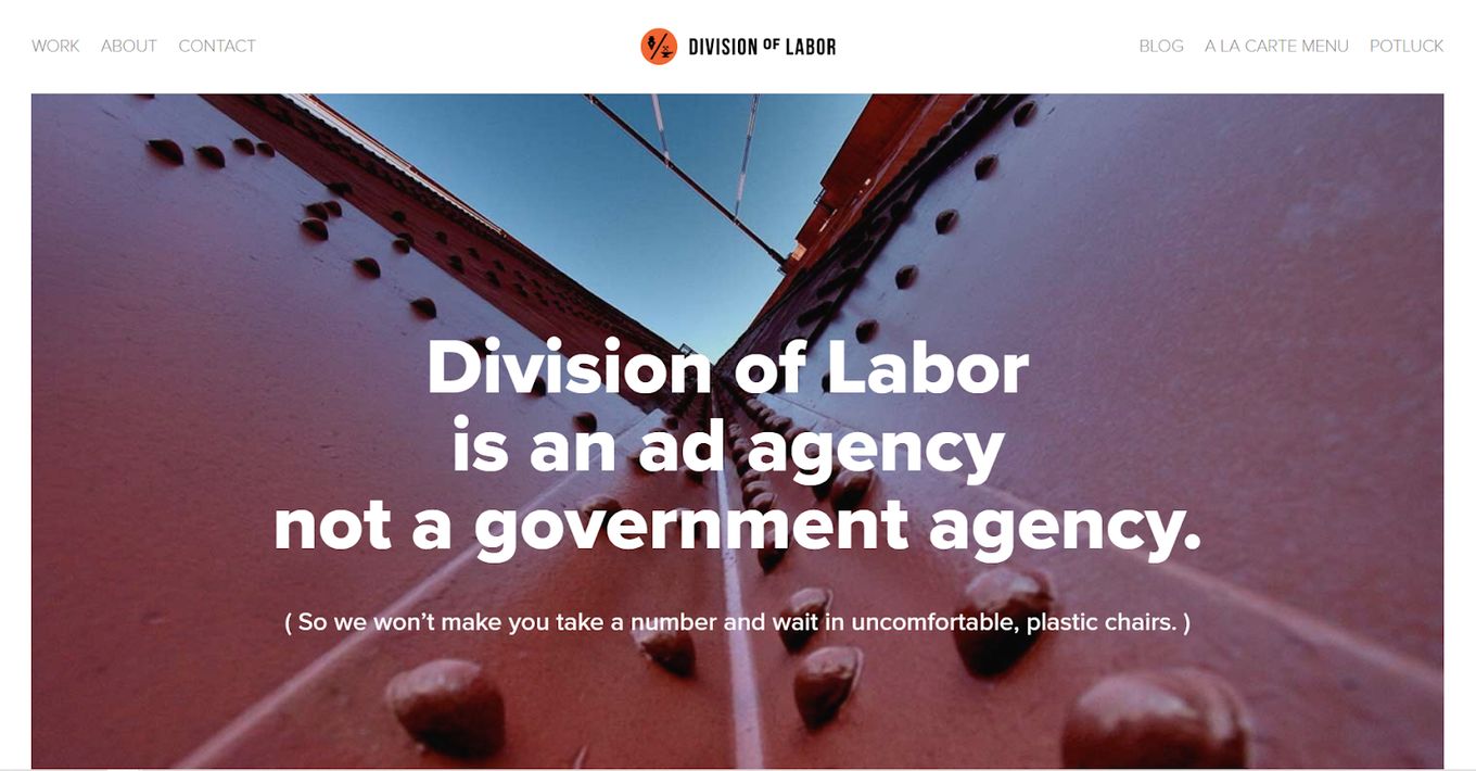
From the name to the taglines, to the videos, we have to admit, the people behind this ad agency sure do have a good sense of humor. It feels organic, without losing that pristine quality all carefully thought-out creative agency websites tend to have. It’s awesome to see a blend of design and humor.
22. Cutwater agency
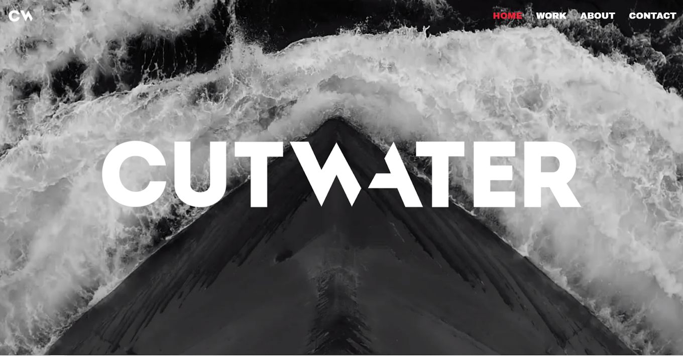
Is the design subtle and understated? Yes. However, it is effective. Using banners to show off its past projects and lovely tiles linking to social media, Cutwater sure is doing something different. Each displayed brand has a video playing in its specific banner, demarcating everything into clear sections that are easy to follow throughout the site.
23. Clay
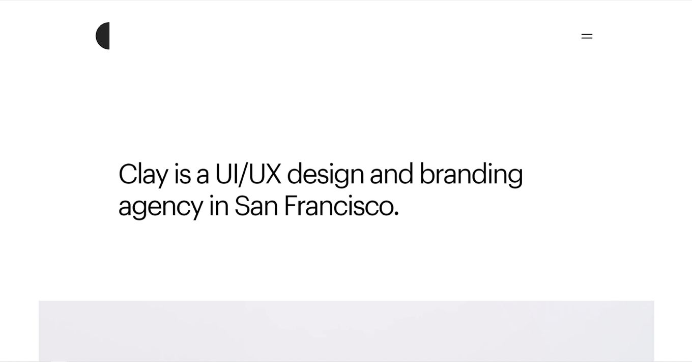
Specializing in UI/UX design branding, Clay’s website has to not only be enticing but showcase some of that branding experience. It does, in the form of neat, clean videos of user interfaces falling into place or responding to interaction. Making use of plenty of white space, Clay feels reminiscent of a lab where everything goes right.
24. Most Likely To
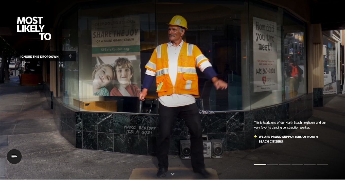
Of all the creative design agency websites on this list, this one feels the coziest and most welcoming. The focus is on the team behind it and what they aim to do. It breaks down the stiff walls of a corporate setting and makes a visitor feel at ease, enough to engage with what’s presented. It uses a hero slider design to show off its work.
25. Zero Studios
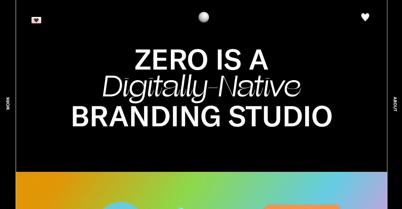
The Zero website is a fully responsive design that uses every element to make a statement, inform visitors and entice them to look at what else is on the site. Instead of a menu, it uses thin bars on the edges to bring up what it’s about, the work it does, the team behind it, and other pages on the site.
26. Yard NYC
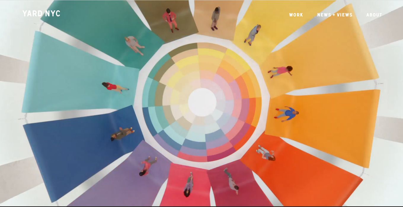
Using impeccably shot videos highlighting products, personalities (plenty of familiar celebrities), events, and more, Yard NYC feels like one of the most complete websites for a creative design agency. It plays to its strength, which does more than enough to convince a viewer scrolling through to stop, take a look and even get in touch.
Conclusion
The digital designs we have seen are fresh, imaginative, original, and minimalist, with an aim to catch the eye. To demonstrate their expertise and capabilities to potential clients, digital marketing agencies typically prefer dynamic, interactive, and informative websites.
A digital agency website must be fully accessible and mobile-friendly in addition to its visual look, which many of these have done.
![15+ Scrolling Animation [Websites for Inspiration] scrolling animation share](https://alvarotrigo.com/blog/wp-content/uploads/2023/08/scrolling-animation-share-300x150.png)
![15 Portfolio Websites For Graphic Designers [Build Yours Now] websites graphic design portfolios share](https://alvarotrigo.com/blog/wp-content/uploads/2023/08/websites-graphic-design-portfolios-share-300x150.png)
![21+ Best Artist Portfolio Examples [Get Inspired!] artist portfolio websites share](https://alvarotrigo.com/blog/wp-content/uploads/2023/08/artist-portfolio-websites-share-300x150.png)
![20 Beautiful Squarespace Website Examples 2024 [Get Inspired] squarespace website examples share](https://alvarotrigo.com/blog/wp-content/uploads/2023/08/squarespace-website-examples-share-300x150.png)
![15+ Best Architecture Portfolio Websites [For Inspiration] architecture portfolio website share](https://alvarotrigo.com/blog/wp-content/uploads/2023/08/architecture-portfolio-website-share-300x150.png)