Each font has a different personality and gives off a certain emotion when used in the right way. A font can make or break your design or headline, which is why we have shortlisted some of the oldest classic fonts that are still relevant even after so many years.
Classic fonts, due to their versatility and simple aspect, are used more than any other type of font. This is because they are easy to use and can work in a design, newspaper, artwork, or school report without losing the true essence of your words.
Fonts have the power to make a logo, business card, brand identity, or even packaging stand out in a crowd. Therefore, in this article, we have compiled a comprehensive classic font list of some of the best classical font styles found that will never go out of style!
11 Best Classic Fonts List for Creating Beautiful Sites
1. Lara – Classic Typeface
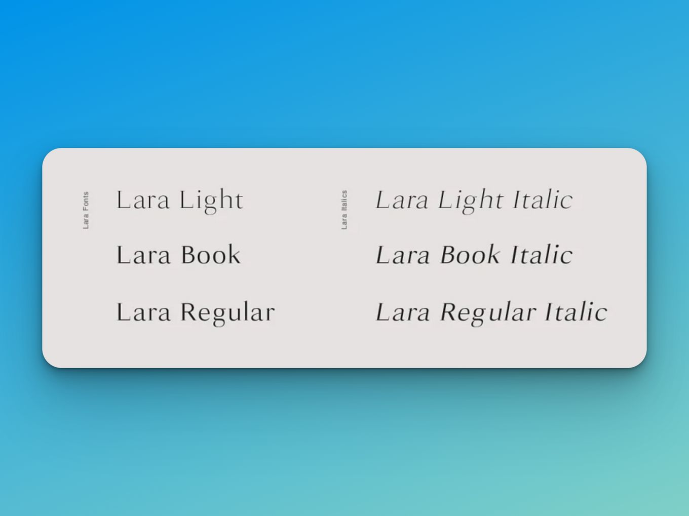
Lara – classic typeface is a font that is placed at the top of the list because it is one of the most beautiful of the classical fonts. The font style is so versatile that it can be used in branding or any design-related typography that exudes modernity, grace, and elegance.
It is a classic, timeless, and slightly curved serif typeface with a striking yet minimalistic look which makes it excellent for headers of brand logos.
This font family includes each one of the Latin characters (including accents), numbers, special characters, and punctuation marks. Moreover, it includes six font styles, three weights, and three italics.
2. Joliet
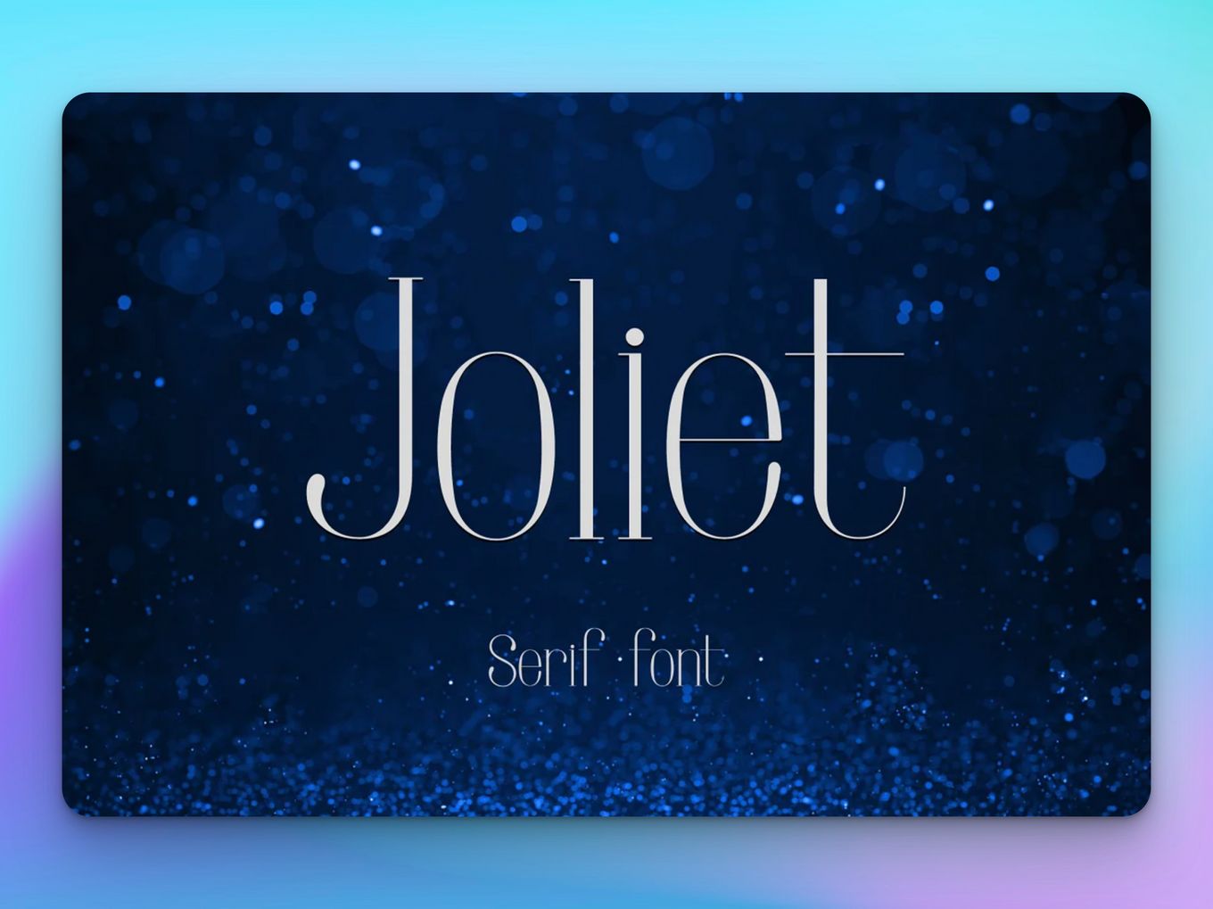
Joliet is another traditional classical font that is elegant, modern, and yet looks timeless. It is great to use in logos, brand identity, and brand packaging, along with website design and magazine headlines.
Looking for fonts for your website? Check out these sites to find fonts Inspiration.
The slim, tall, and minimalistic serif typeface is extremely elegant and gives off a very luxurious feeling. It pairs great with other classic fonts such as script and sans serif. Moreover, it comes with two sets, uppercase and lowercase Jolie, and supports English, Portuguese, Spanish and French languages.
3. Open Sans
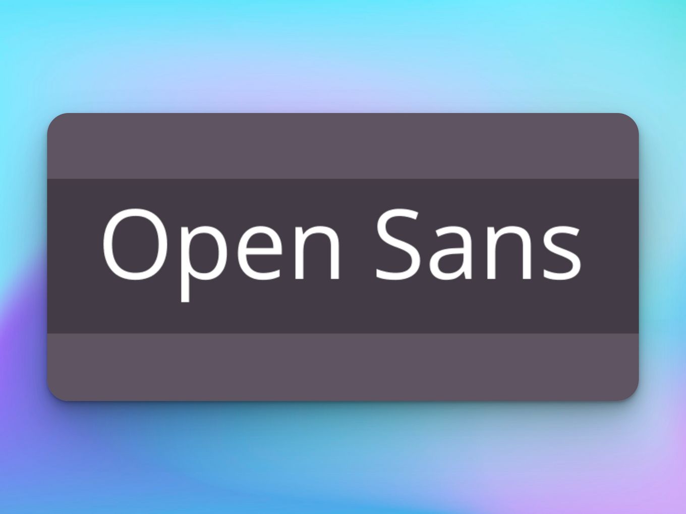
Open Sans is a very clean, modern, and versatile sans-serif typeface that can be used as a general font for essays, interviews, designs, and descriptions. It doesn’t have a very strong and distinctive personality and goes well with any other font.
It was designed especially for increased legibility of text across multiple different modes of interfaces like print, web, and mobile. It works great in any genre and is very readable even in small sizes.
Plus, it works great in printed form as well. So if you are looking for a mellow classical font, Open Sans is the one for you.
4. Gill Sans
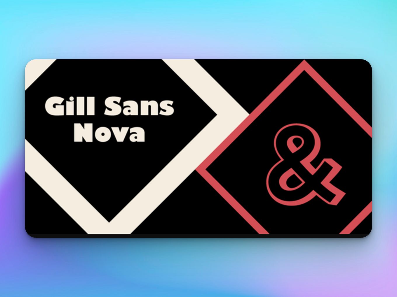
Gill Sans is one of the largest collections of humanist sans serif fonts that give you a font type for every possible use. From light and minimalistic to bold and edgy, every format is available in Gills Sans Classical Font.
The overall appearance of the font is very light, elegant, and traditional, and it is used to increase legibility across print and media.
The lighter weights of Gills Sans are great for magazines, books, and brochures, while the heavier weights are great for graphic design, packaging, and labels.
5. Fester
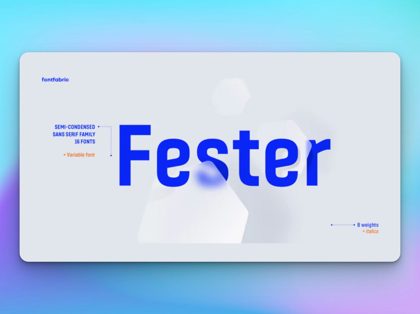
Fester is another one of the classical fonts that have a huge family within one font. It consists of 16 different iterations of one font that can be used in a multitude of different ways.
This classic font is clear, bold, and has a certain presence and hence is great for design, logos, and call-to-actions on websites.
Do you know about the different font types categories? Learn more about them by reading all about typeface classification.
Fester ranges from thin to heavy and consists of 8 weights and italics, one variable style, more than 760 glyphs, and extended Latin characters. This font is great for making lasting first impressions and can be very powerful if used in the right way.
6. Minion
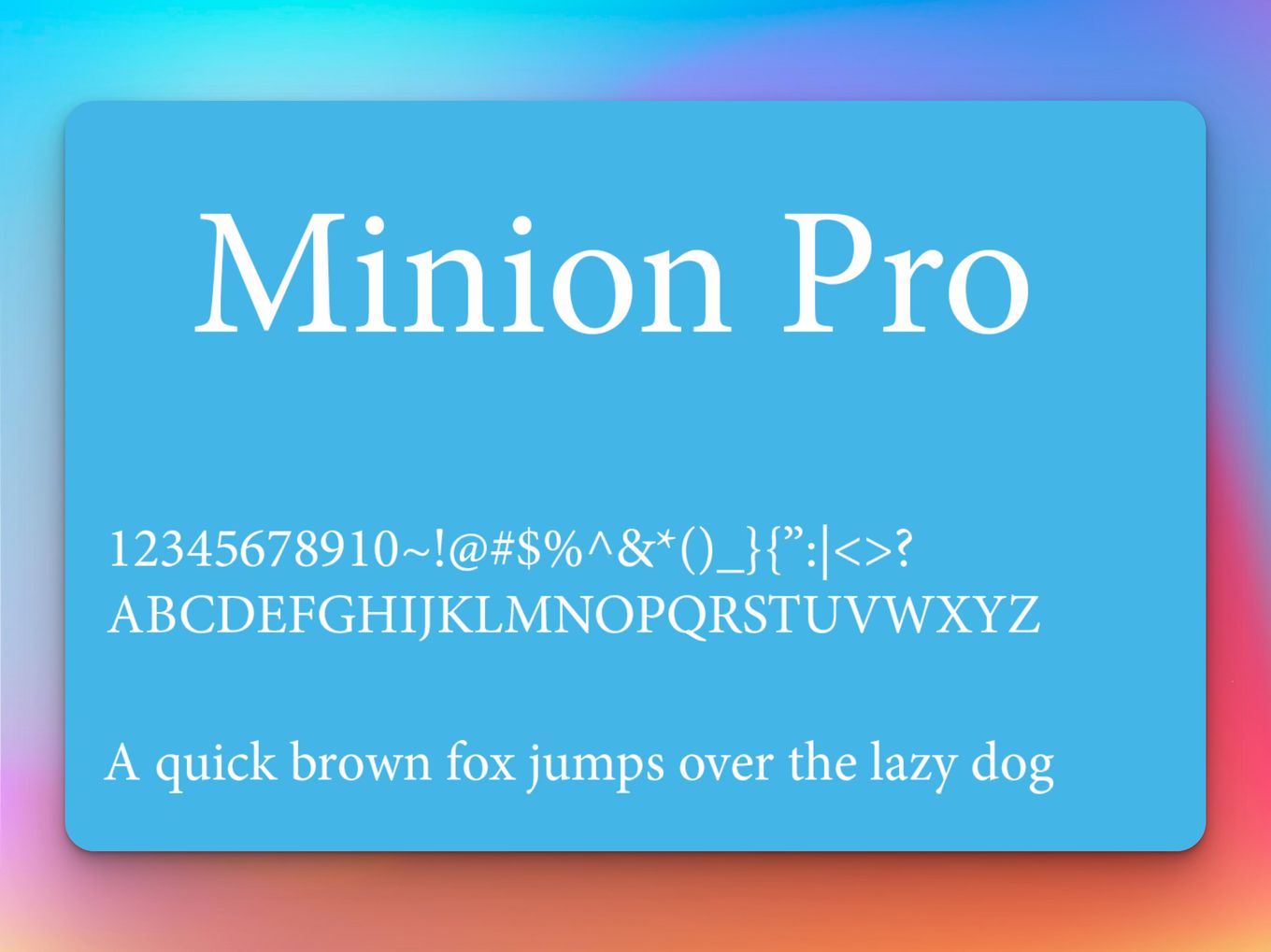
Minion is a classical typeface that is original to Adobe software and was released in 1992. This is one of the classical typefaces that is inspired by the old-style classic fonts of the late Renaissance, which was a period of elegance, beauty, and grace.
This typeface is excellent for print and media use both because of the enhanced legibility and unprecedented flexibility the font provides.
Whether it is for lengthy text or minimal display settings, this font is excellent. It contains two widths and three weights and is an ideal font to use in books, newsletters, and even packaging.
7. Trade Gothic
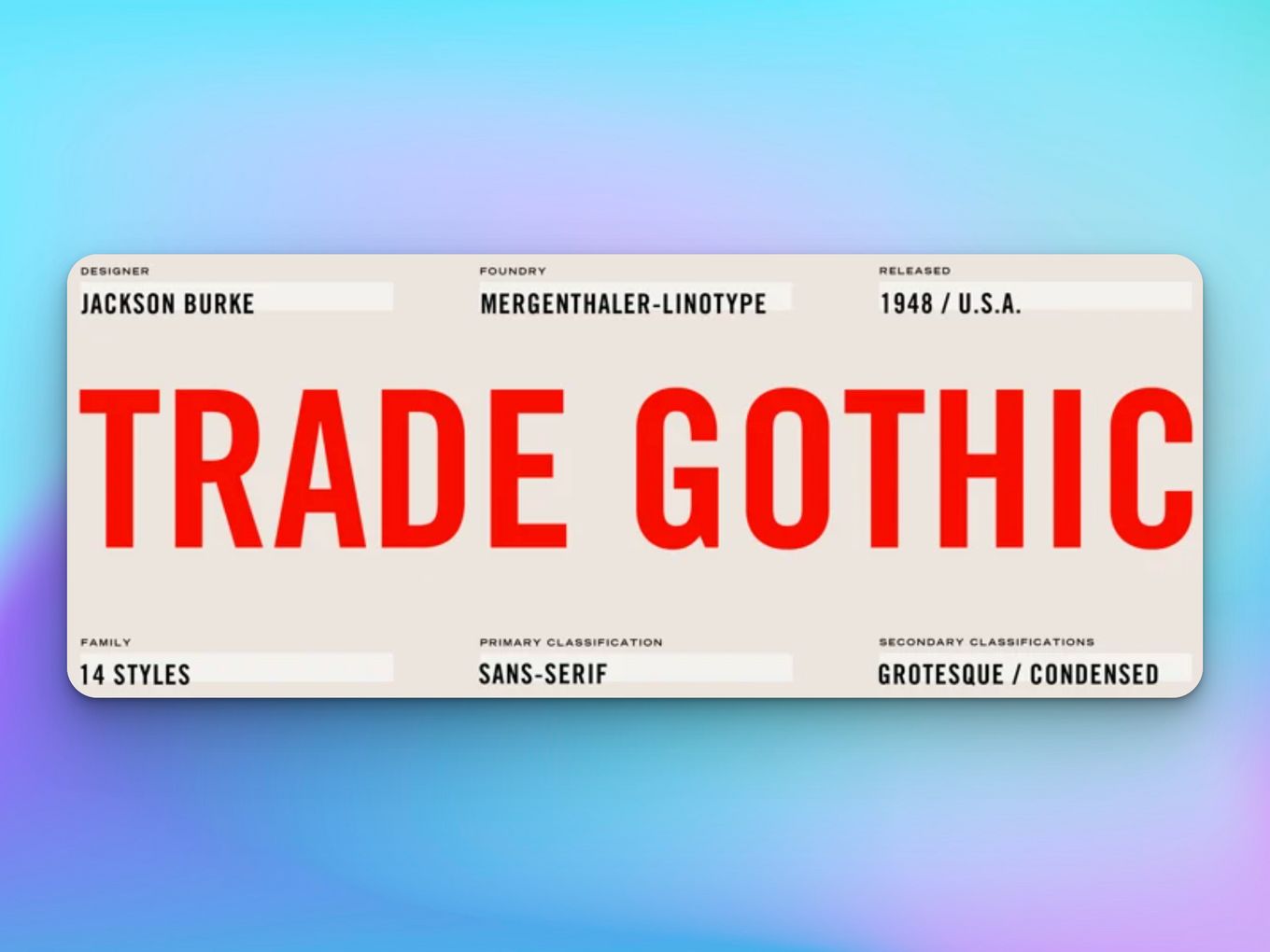
Just like the name suggests, Trade Gothic is a bold typeface that is excellent for use in headlines, branding, and logos. The display of this font is not as unifying as the other ones in the sans serif family, but the thick, strong lines give it an earthy appeal.
This font is often seen in advertising or multimedia because of its strong presence on a page. It can also be used in graphic design to create a visual hierarchy in a layout.
8. Futura
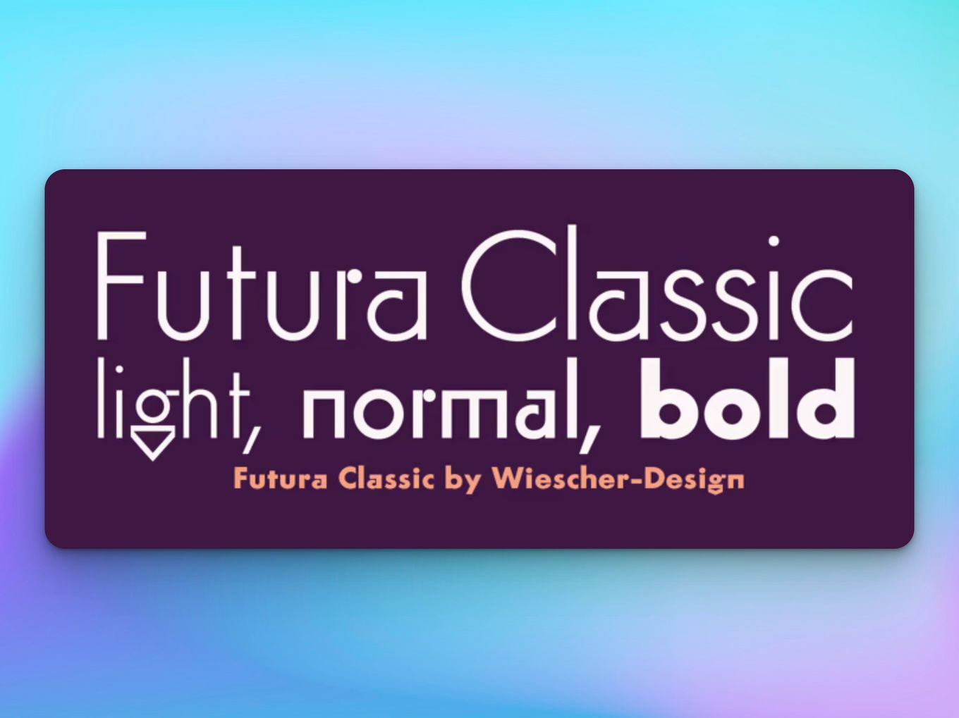
The typeface Futura has a very interesting history behind it which explains why it is the way it is today. The creator of the font based the original drawings on the simple forms of circles, squares, and triangles, which he had to modify later to create a more humanistic and pleasing typeface.
The font Futura is a classical font but has a timeless feel to it. It is playful, bold, and legible and can be used in a variety of different methods in magazines, design, art, and even logos and packaging.
9. Storm Sans – Traditional Fonts
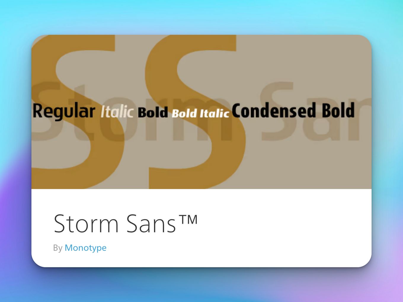
Storm Sans is one of the classic fonts that have been used for various purposes over the years. The font is versatile and dynamic and fits in well in magazines, designs, packaging, logos, and even as headlines or call-to-actions on web pages.
The classical font style has a distinct appearance, and it can be said that it has a certain presence on a page. Nevertheless, Storm Sans is a gorgeous font and is bound to be a fine addition to your typographic arsenal!
10. Avenir
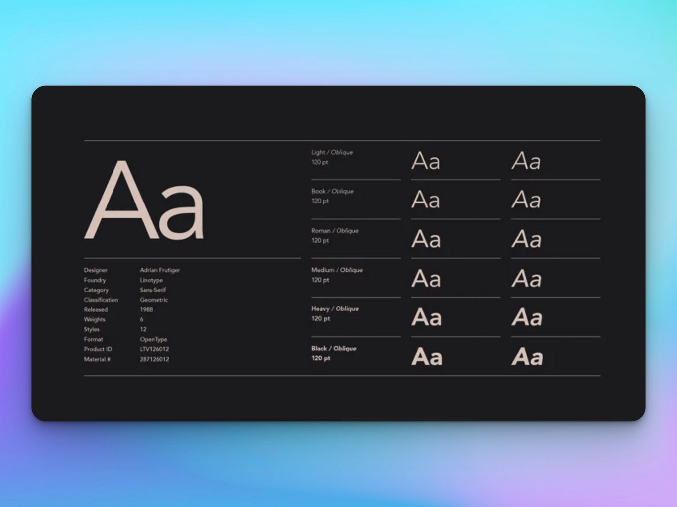
The Avenir font is another member of the Sans Serif family and has a distinguished fine, and neat appearance. This font is famous for its easy legibility and is compatible with both small and huge displays.
Avenir is a crisp, clean, and elegant font that can be used in a variety of different places. Most often, it is used to make creative designs and is commonly found in design software like Canva and CSS.
11. Helvetica
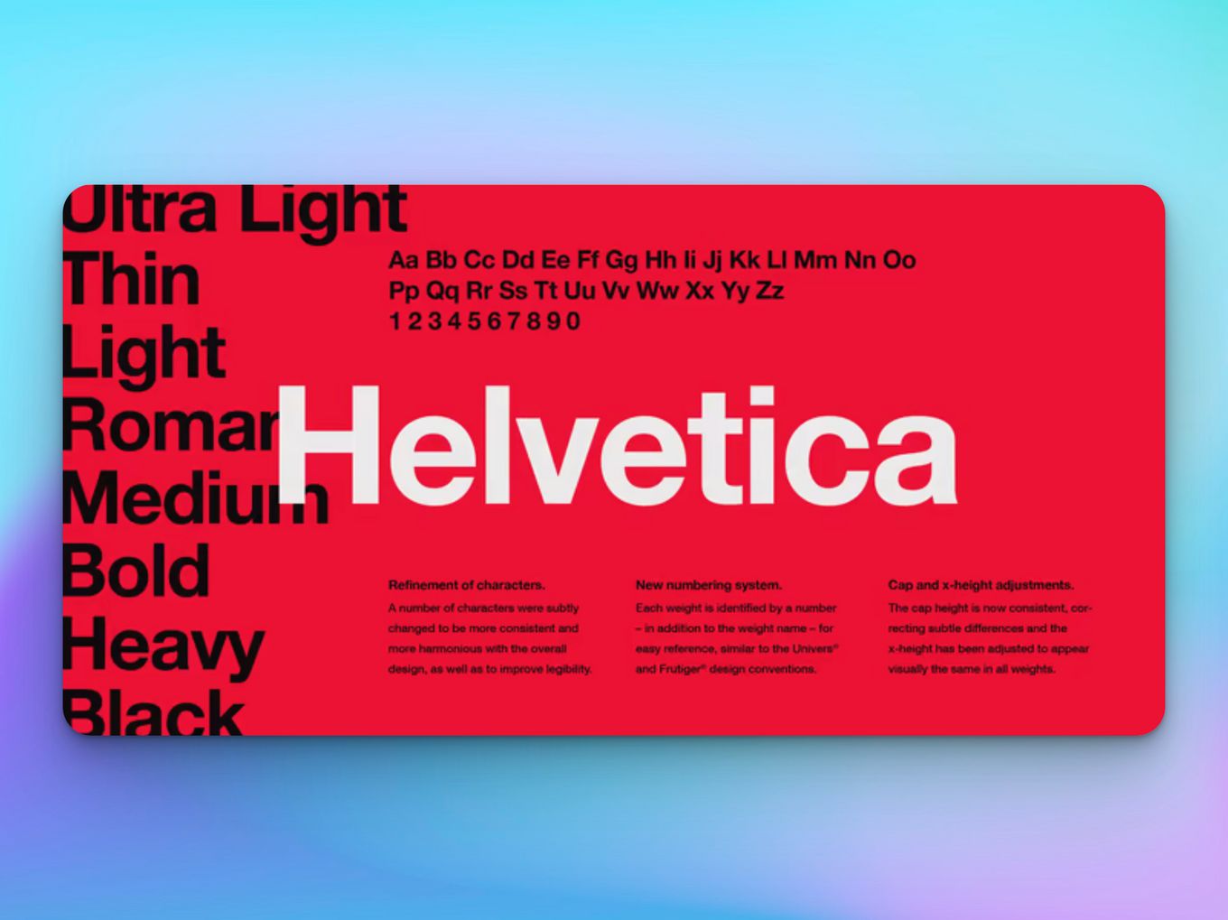
Out of all the classical and traditional fonts, Helvetica has to be the most famous among them all. It is such a widely used typeface that everybody from a professional writer to a high school student is aware of this font and has used it in one or more ways.
This typeface contains a total of 36 styles and is in the top 10 most used fonts. It has a very antique yet modern look to it, and the language of the font is so flexible that it can be used as headings, announcements, call-to-actions, and even titles of books and magazines.
Pros and Cons of Using Classical Font Styles
Have you ever wondered why we spend hours and hours choosing the right font for our design, essay, logo, or website?
This is because the right kind of font can make or break your design, and it is very important to know the personality and mood of the font before you use it in your work.
There are no right or wrong fonts, but there are fonts that are better suited for essay writing, magazines, and books, while others may be better for headings and logo designs. There are pros and cons to using classical font styles in your work, like:
Pros
- Cleanness. All of the Sans-serif fonts are perfect when you are opting for a sleek, minimal layout.
- Casualness. Because the fonts are timeless and have been used for years in different areas of work, they have a certain casualness about them. They are great if you want your design to read ‘simple and casual.
- Legibility. One thing about the sans-serif font family that remains unmatched by all the other typefaces is their legibility. This is because these typefaces were designed with readability and accessibility in mind.
Cons
- Old Fashioned. Some people may consider classical fonts to be old-fashioned and can make your design or layout have mixed reviews from the audience.
- Redundant. Because these fonts have been around for so long, they have been used in almost every field of work and hence may be considered a little redundant.
- Pretentious. The Sans serif fonts are known for their quiet, subdued presence, but some people call them pretentious.
Fonts Can Make or Break Your Layout
Whether it is a paper you’re writing for school, a logo you’re designing, or a newspaper you’re editing, using the right kind of font perfect for your target demographic is very important.
There are no right or wrong fonts, but there some fonts are better suited for a specific design than others.
Some people may think of fonts as going to an animal shelter and picking out an animal to adopt. There is no right or wrong animal, just choose the one that calls out to you the most.
![7+ Awesome Designs for Schools Websites [Get Inspired!] schools websites design share](https://alvarotrigo.com/blog/wp-content/uploads/2023/08/schools-websites-design-share-300x150.png)

![Best Carrd Fonts To use in Carrd.co Websites [2024] best carrd fonts share](https://alvarotrigo.com/blog/wp-content/uploads/2023/08/best-carrd-fonts-share-300x150.png)
![Type Categories in Web Design [+ How To Use Them Wisely] type categories share](https://alvarotrigo.com/blog/wp-content/uploads/2023/08/type-categories-share-300x150.png)
![9 Stunning Website Layouts [Examples For Inspiration] website layouts share](https://alvarotrigo.com/blog/wp-content/uploads/2023/08/website-layouts-share-300x150.png)
![21 Top Examples of Digital Storytelling [Make Powerful Stories] examples digital storytelling share](https://alvarotrigo.com/blog/wp-content/uploads/2023/08/examples-digital-storytelling-share-300x150.png)