Every website you visit consists of a layout within a square box viewed from a browser of your choice. All the layouts you see try to catch your attention and hopefully impress you enough to stay.
Websites are best when they provide useful content, a selection of images and solve a problem. There are a lot of elements to web pages but when you strip everything off, you are left with the basic structure of a website, its layout.
What Is A Website Layout?
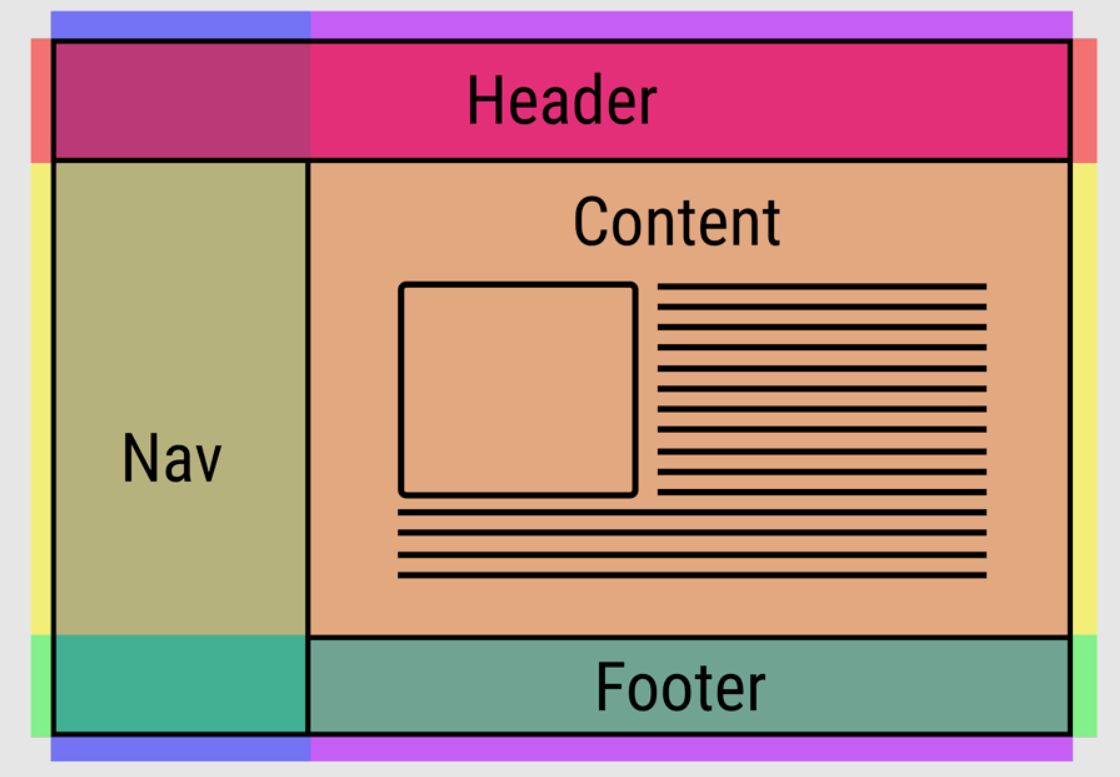
The layout of a website is like its skeleton, it is the basic structure of a page. If you remove all the fancy colors, images, and text, then you can see how the website is built.
A website layout is just a way to structurally present a user with information. You may already know some layout terms like header, main body, sidebar, and footer, etc.
Think of a layout as a template used to display content on the page, the content and layout should then guide the user around the page.
What Is The Goal Of A Website Layout?
The goal of a layout is to provide a basic structure for where content should go: you want a website to have a house style. It is important to define brand colors, brand structure, and patterns.
Your layout should provide clear paths to the user. A website layout should define a content hierarchy that follows a master template, users must feel at home with the design and not be lost or confused.
Website Layout Key Success Points
There are many different website design techniques and layouts to choose from. Some are good for different use cases but layouts can easily be incorrectly used, leading to poor engagement and bounce rates (users leaving your website).
Before we take a look at some layout examples, we should understand the key points to what makes a decent structure amazing:
- By choosing the correct layout, it will keep users on your site longer, layouts help users navigate information and content.
- A layout should make the website accessible and information should be easy to consume.
- The purpose of a good layout is to not frustrate the user, which will push them away.
- A well-designed website layout is key to user engagement.
- Make sure your layout tells a story and that the content flows well.
8 Amazing Website Layouts
1. Full Screen Hero Image Layout
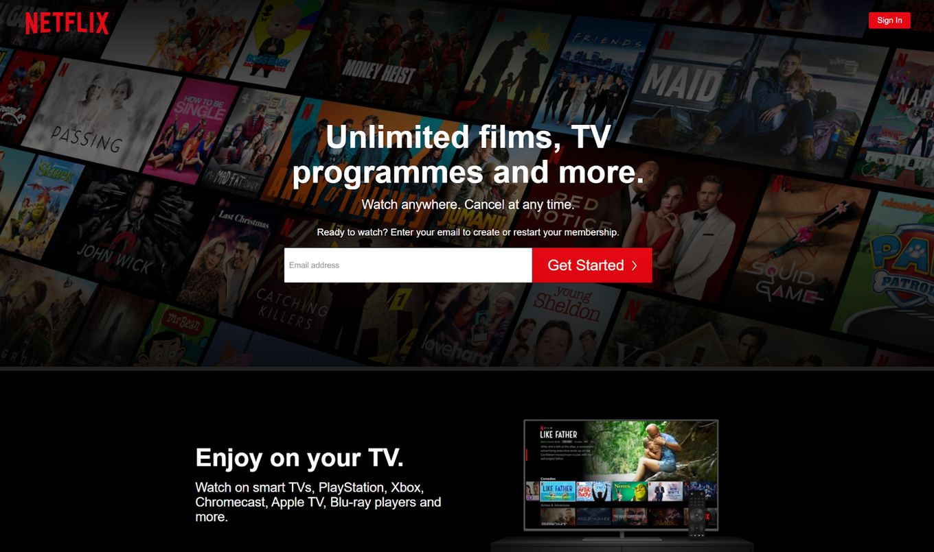
Netflix pulls this off well, they utilize the full screen hero image layout to take advantage of an eye-catching background with powerful text titles.
You can see in the example that they have included a direct call to action (CTA) which uses the hero image to promote this action.
This layout is good for websites that want to make a powerful and bold statement right away. This works well when you state the main benefits of the site with a powerful image background, keep it simple and clean for full effect.
2. Full screen sections layout
Similar to the previous layout, this kind of layout uses full screen sections for the whole page and not just for the visible part of the viewport while landing on the page for the first time.
It’s a layout relatively new and that started around 2013 when Apple used it for the landing page of their iPhone 5C.
The whole page behaves like a full screen slider that snaps to each section. This way, it creates a unique scrolling experience that will be beneficial in many use cases.
Ideal for one-page designs, storytelling, storybranding, marketing pages, and images with beautiful graphics and videos.
If you are interested in this layout, fullPage.js is the way to go. It’s a full-screen JavaScript library that is also available for WordPress builders like Elementor and Gutenerg.
3. eCommerce Scanning Website Layout
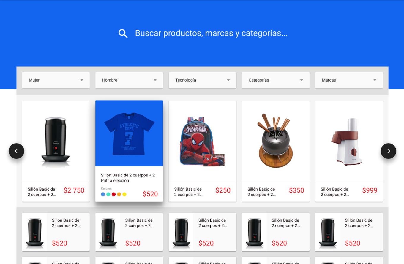
Sometimes referred to as the F-shape website layout, this is where the user will follow along with the page in the shape of an F letter. The user will scan across the webpage where for example a list of products is shown, each card or element usually follows the same pattern – They have an image, title, price, and maybe a subtitle.
This layout is great for eCommerce or portfolio websites, by sticking to a grid of images with text in the same place, it makes it easy for the user to consume lots of information quickly.
4. Newspaper Layout
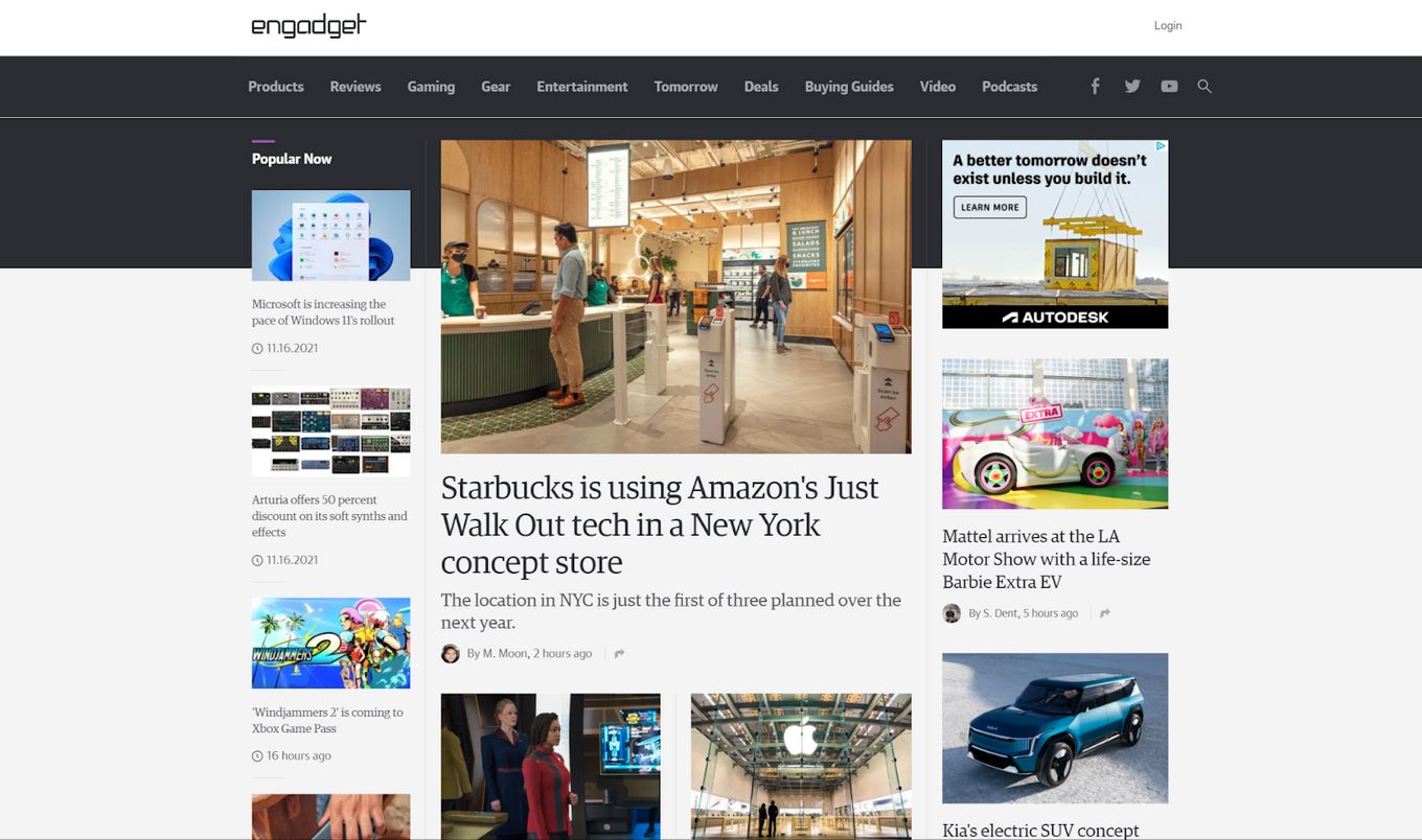
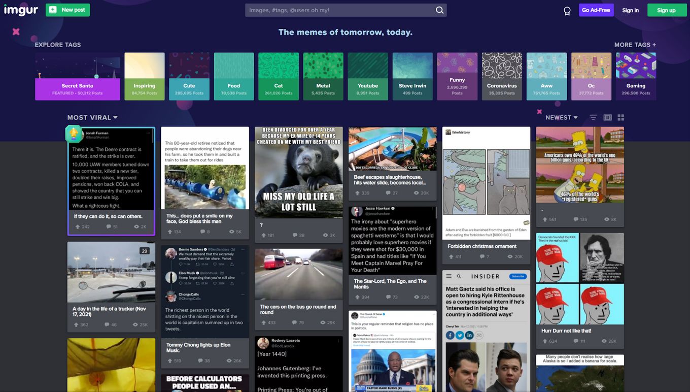
Just like a newspaper, this design layout can be used on a website. Mostly seen within a grid-like structure that contains multiple images with text and a catchy title. It usually includes some kind of news slider too.
Media platforms use these layouts a lot, it is a great way to showcase a range of articles to their users, they have to make sure each title is interesting and clickable.
Grid layouts like these are best used with different sized images and boxes. This helps to keep the grid interesting and less boring, it breaks up too many lines.
With the example above you can see how some of the most important articles can be enlarged around smaller ones, making the content stand out more, creating a focal point.
5. Grid Pattern Website Layout
The grid layout is great for displaying content across the screen and maximizing the space available. Each card or element is evenly distributed with its image and text, organizing all the cards on the screen. This effect can be very pleasing to the eye and a great way for the user to stop and focus on specific sections.
A user can quickly browse content and decide what they want to click on, it’s easy to navigate and keep track of how far you have gone.
It’s also great for product pages, categories, and testimonials. Adding a slider like in these 8 testimonial sliders will even “enlarge” the content that you can show on the screen.
6. Vertical Scrolling Layout
This type of layout design is based on vertical scrolling, it puts everything into a centered position and relies on scrolling to fit more content in.
A vertical layout helps create a focal point and is great for long-form articles, blogs, or research papers. A user can easily navigate this layout when lots of text or graphs are involved.
This layout is simple but effective when the audience just wants to consume the content without any fancy additions.
7. Left-to-Right Layout
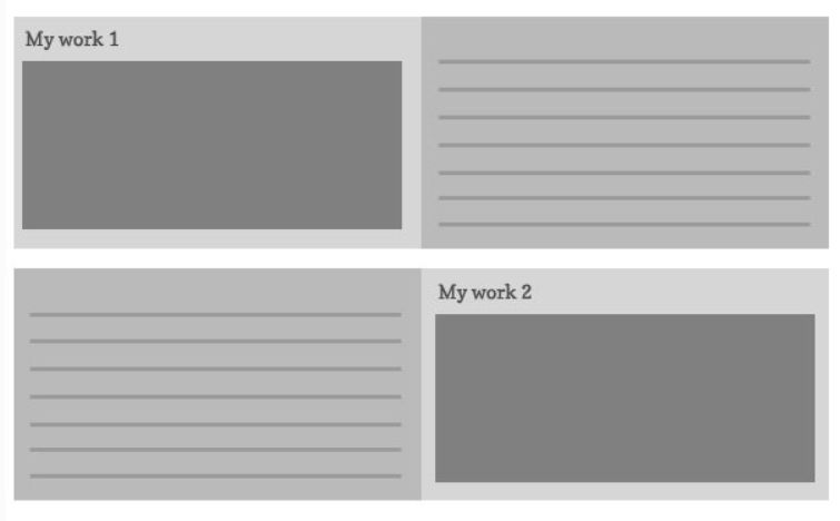
Research has confirmed that users tend to start by reading from left to right on a website. Eyes move from left to right in a zig-zag fashion, once the user has moved all the way to the right, as a user scrolls down they reset their eye back to the left and start again.
A great way to use this layout is when you have lots of text to show: you can pair up the text with an exciting image to keep the user interested. As long as the image is related to the text, the better the engagement is.
8. Balanced Website Layout
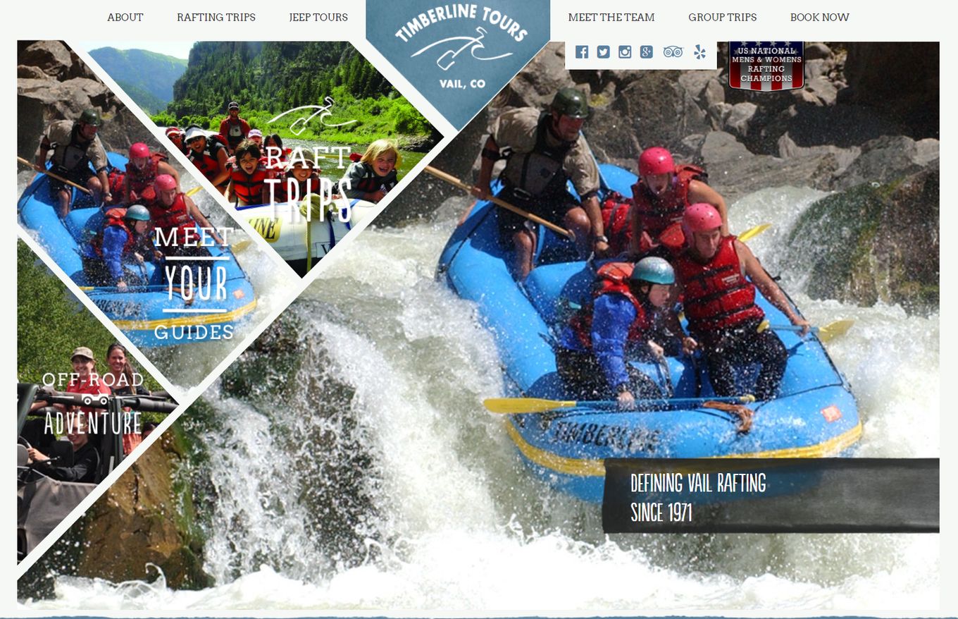
Websites that want to convey a lot of information before a user scrolls should use a balanced layout, creating asymmetrical content and lines which play into each other.
This layout works best when angles are used. The example above shows us how these angles make the page interesting and visually appealing. It helps create depth on the page and highlight specific content.
A balanced asymmetrical layout creates a unique perspective and works best with images and minimal text. For full effect, you should use whitespace to your advantage, and the more lines and angles the better.
9. Vertical Split Layout
For a minimal effect, you can present large images both left and right of the screen with interactive elements like buttons on each side.
A vertical split layout is useful for taking advantage of the entire screen. Images are usually used for this layout and large titles play a huge part in navigation. The purpose is to present the user with two options that they can quickly decide on.
Sometimes this effect and layout can be matched with full screen scrollable web pages. If you are interested in this layout and want something that works with WordPress, consider looking at Split Theme from Themify. If you are into JavaScript you can use multiScroll.js for it.
Use Layouts Which Promote Action
As you can see from all the examples we have shown, they are effective because they match the purpose and content that the site is showing. An online media platform uses the newspaper layout to promote its articles and it promotes the user to click on something they might find interesting.
Other websites keep it simple like a fashion website or online portfolio, they might use the vertical split layout because it makes things look minimal and elegant: it can quickly create a focal point on their content without text getting in the way.
The idea is to match content with a layout and design the structure so it promotes users’ actions. This action could be a sign-up, article click, product purchase, or user retention on them scrolling. You just have to make the structure engaging and navigation clear.
Take away
We have seen some great examples of different layouts that websites around the world use. Big companies and even small companies use these layouts and you can easily introduce such designs yourself, you can use libraries like fullPage.js to build immersive layouts and present unique content to users.
The idea here is to make sure you are using the correct layout for the content you have. Images and small amounts of text work well with a grid-style layout but it wouldn’t work well without the images, a wall of text would be too overwhelming to the user. Whereas, a vertical layout is better for long-form articles and research papers. So you can understand that it is about matching the right content to the correct layout.
After choosing your layout be prepared to measure things like user behavior, their needs, and expectations, etc. You can then use this to better understand if your layout is working for your target audience. It is perfectly ok for your layout to change over time.
Related articles:
You can see different website layouts in these articles:


