One of the most important elements in web designing is typography and the right choice of typeface and types of fonts can make all the difference in the world between a good web design and a bad web design.
Before going into type categories and choosing fonts in web design, first, you need to understand the basic elements of typography—Typefaces and Fonts.
Typefaces Vs. Fonts
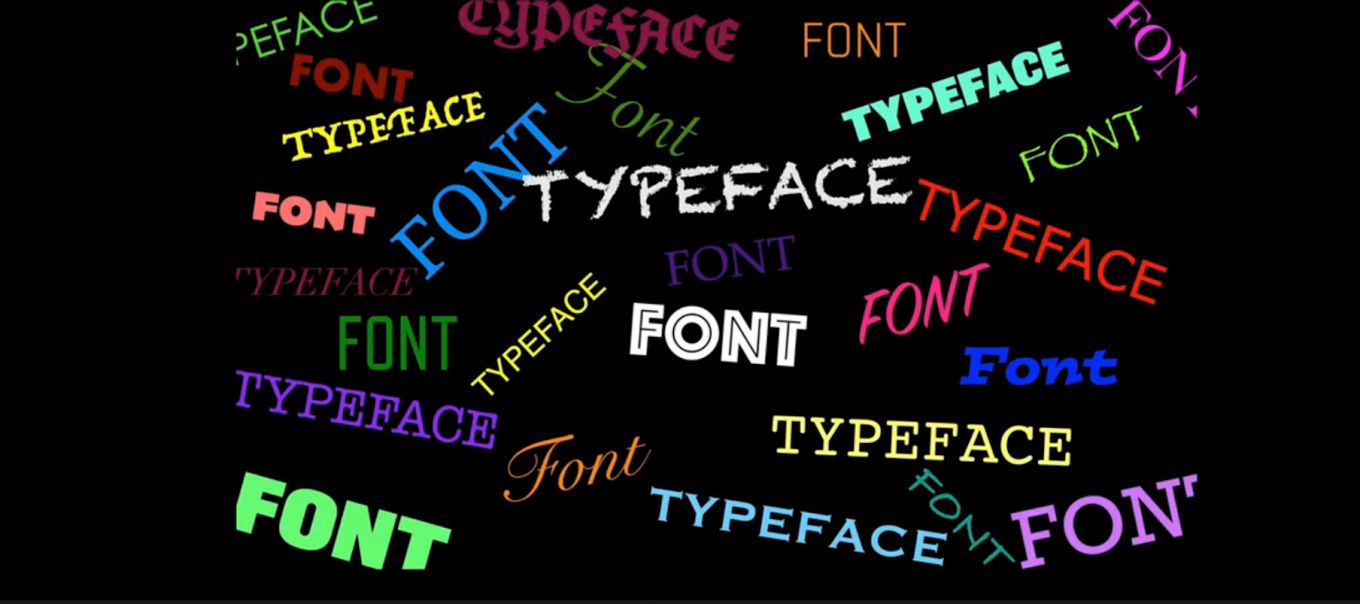
If you think that typefaces and fonts are one and the same, then you are wrong; albeit, you are not alone. A lot of people consider typefaces and fonts to be synonymous, they are however both different.
A typeface or type family is the classification of a design style while a font is the different varieties of the design style.
Okay, let’s try this: How do you like your steak cooked? Rare, medium, medium rare, medium well, or well done?
Now imagine that your typeface is the steak and the different ways you choose to cook it is the font. Simply put, a typeface is a family unit made up of fonts and fonts are different individual members of the family.
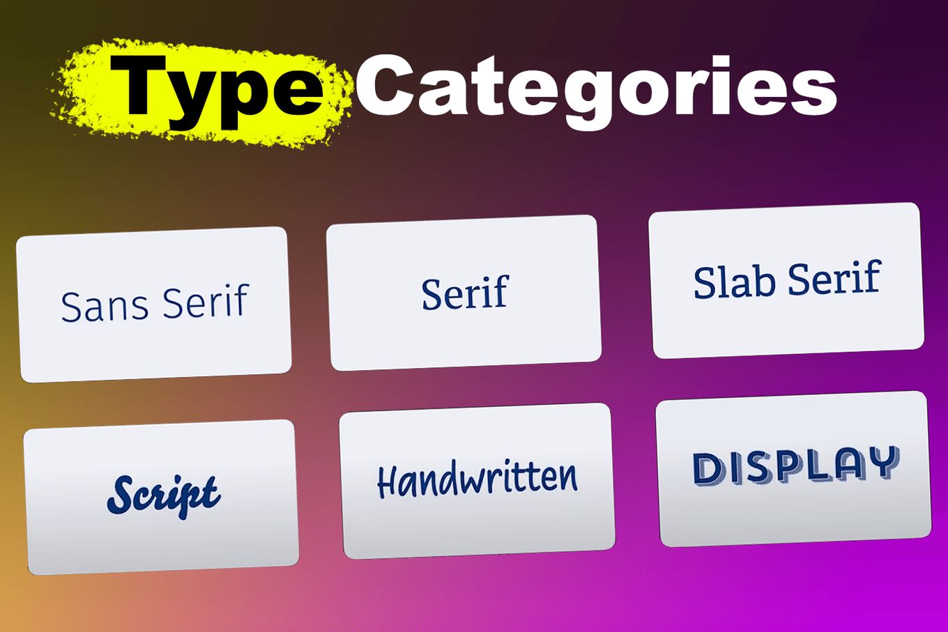
What Are Type Categories?
Type Categories consist of a group of different typefaces. Considering that there are thousands of fonts available, type categorization is a basic system that allows us to categorize and subcategorize typefaces for easy identification.
Typefaces usually belong to recognized traditions and type categorization is often based on historical context, style, mood, tone, and effect of the typefaces.
What Are Types Of Fonts In Web Design?
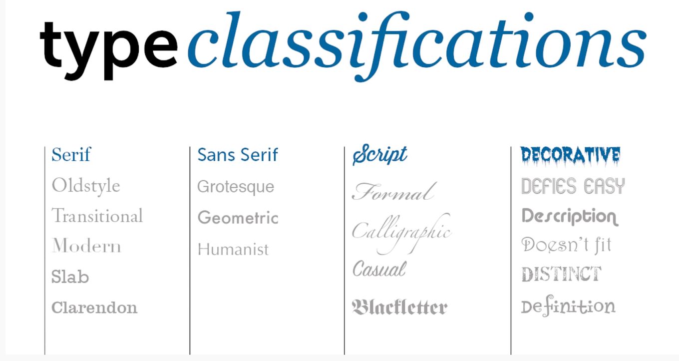
While there is no one universal system of categorization, common classifications or types of fonts in web design are:
1. Serif

Serif typeface is a family of fonts with little strokes or extra marks at the end of letters.
Serif fonts are often used in formal situations and because serif fonts have an air of tradition, history, sophistication, authority, and integrity, this font family is ideal for companies that want to build brand awareness and brand trust.
Examples Of Serif Fonts:
2. Sans Serif
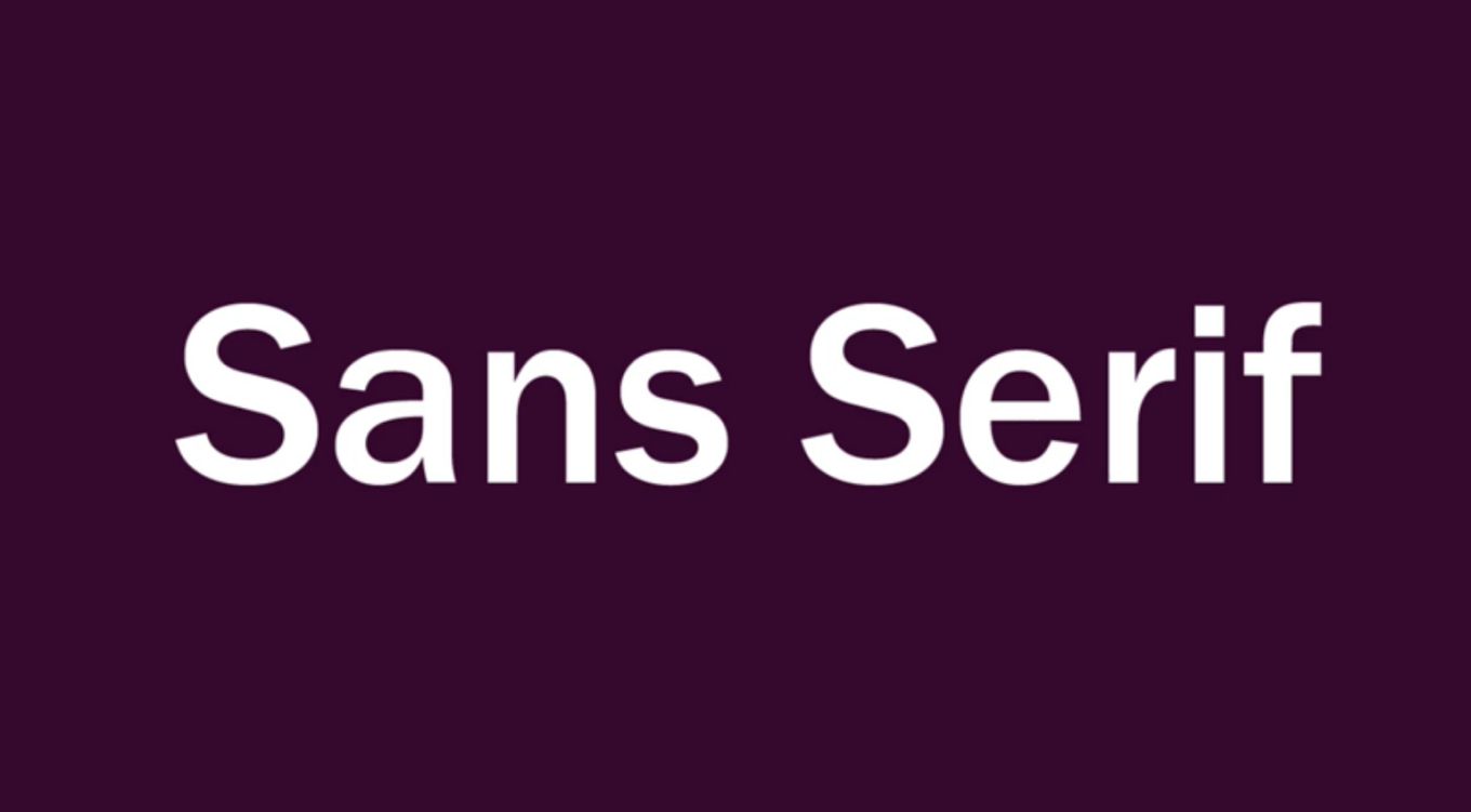
Sans serif, meaning ‘without serif’ is a font family without the Serif strokes.
Sans serif typeface gives a more modern feel, unlike the serif typeface.
The Sans serif font family is simple, clean, and engaging. It is ideal for brands that want to appear youthful and approachable. This font family focuses more on clarity.
Examples Of Sans Serif Fonts:
3. Script
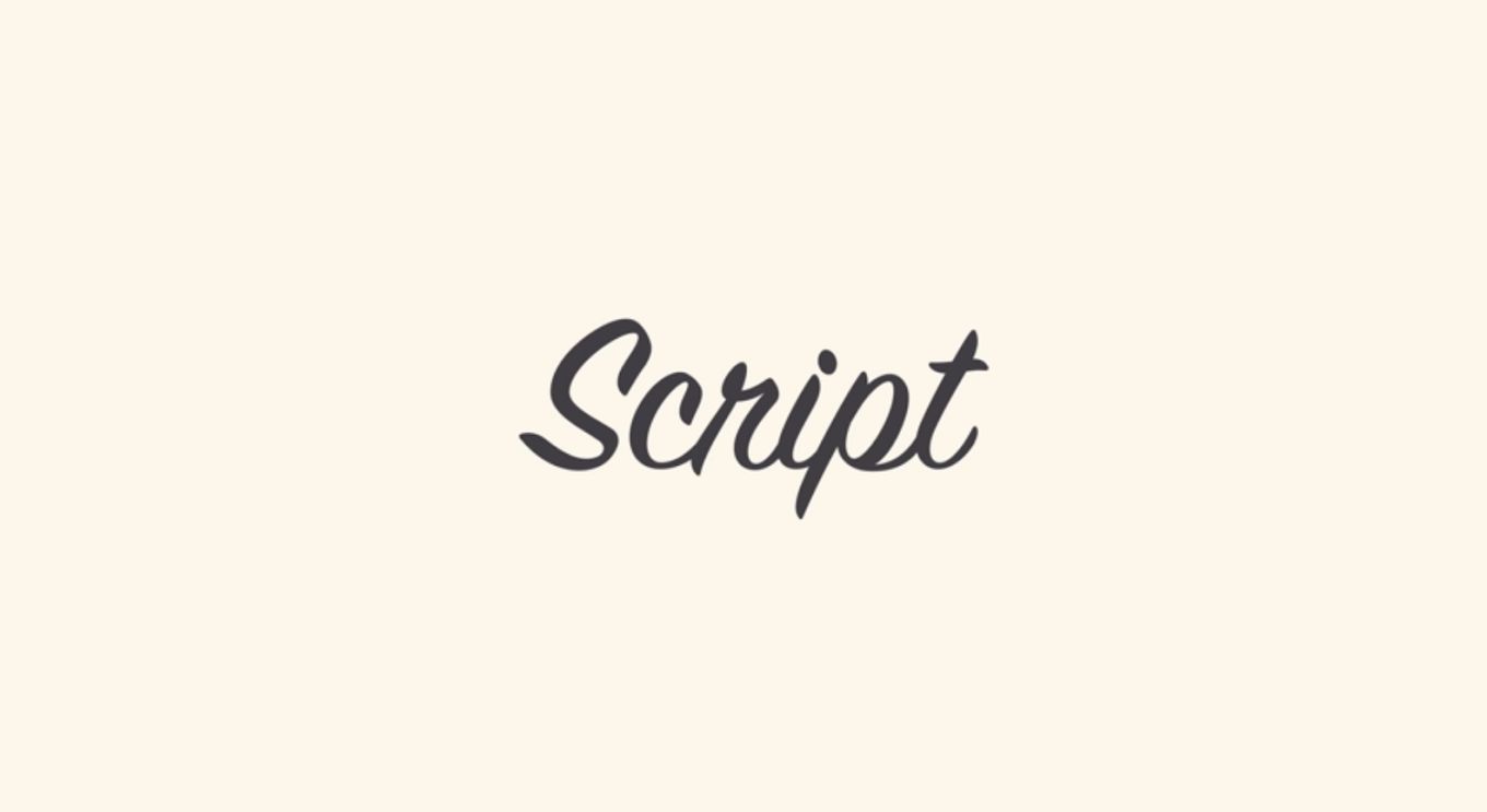
Script typeface is the family of letter shapes developed and intended to represent penmanship.
Script typeface is flexible and has varied strokes reminiscent of human handwriting which can be flowing loops, rhythmic strokes, connected scrawl, or quirky or bouncy strokes. This font family is most popular among brands that aim to achieve distinct, friendly, and handcrafted aesthetics.
Examples Of Script Fonts:
4. Monospace
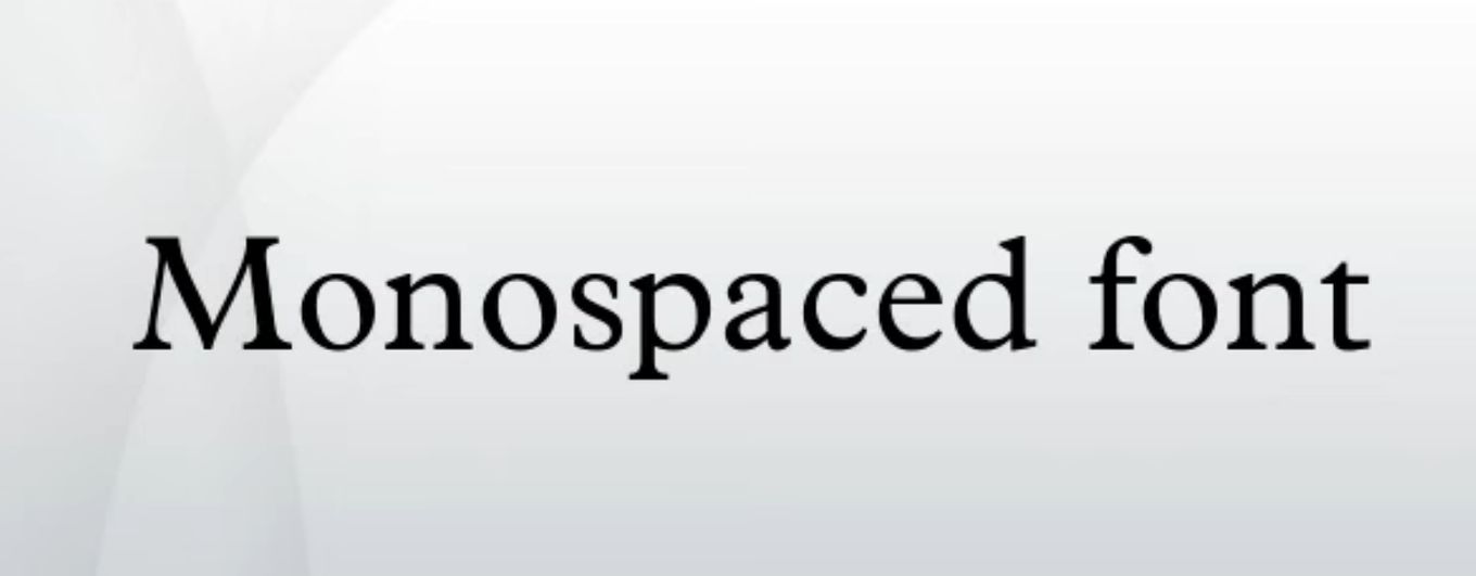
Monospace typeface is a font family whose letters and characters each occupy the same amount of horizontal space. This typeface displays all its characters in the same width.
The appearance of a monospace typeface is similar to that of a serif font, but the key difference is how much actual space the characters of the monospace fonts take up.
Monospace fonts are ideal for brands interested in minimalistic designs.
Examples Of Monospace:
5. Display
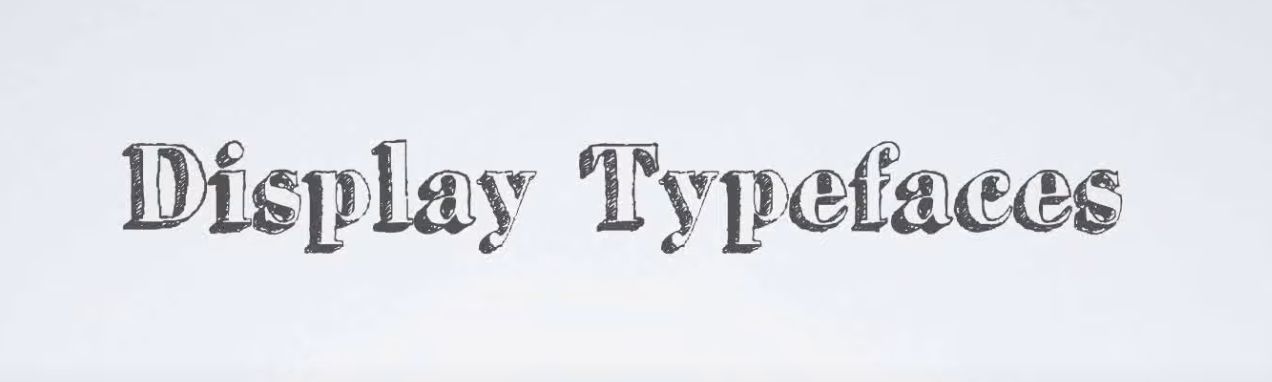
Display typeface, also referred to as Decorative typeface, are thematic in nature. This typeface is designed to be used at a large scale to convey a particular feeling.
Because display fonts are designed to be used at large point sizes, they are ideal for logos, headlines, and advertising.
Display fonts can incorporate graphic elements and are used to convey a personality that fits a brand.
Examples Of Display Fonts:
How Should You Choose The Right Type Categories?
Understand What Your Brand Identity Is All About
Ultimately, whatever type category you choose has to reflect your brand identity. If words such as modern or innovative best describe your brand, then you can select the Sans Serif type category.
However, if your brand is best described as traditional, authoritative, or educational, then you should look at the Serif typeface.
Determine Who Your Target Audience Is
The typeface you use in your web design should be expected by your audience as the wrong choice of typeface category can be a huge turnoff for your target audience.
If your target audience is corporate professionals, then the Display typeface should not be your choice of typeface. However, if your target audience is techies or creatives, then the Display typeface can be considered.
Determine The Emotion You Want To Evoke
Every typeface has its own mood and the typeface you choose can enhance the mood you want to create, the message you want to convey, and the impact or effect you want to have on your audience.
If the tone of the message you want to convey is playful, friendly, or romantic, then you should consider the Script font category.
Consider Legibility
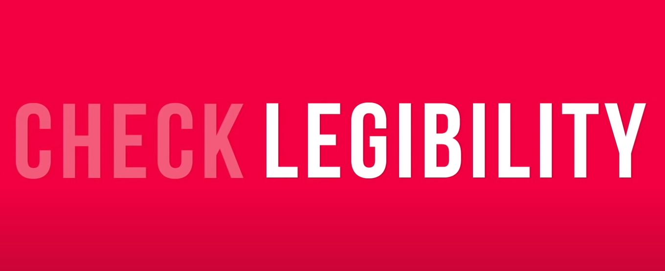
While some typefaces are terrific for headings, they are terrible for texts. For instance, the Display typeface is legible and readable when scaled up but unreadable when scaled down.
Therefore, to enhance the readability of your web page, some typefaces should not be used in the body of your text.
Ensure There Is A Synergy Between The Background & The Font.
The content should complement the typeface. There should be a harmonious flow between the images and the fonts used in web design.
Do’s And Don’ts Of Pairing Typeface Types In Your Design

Fonts have the power to evoke emotions and designers have to be intentional about the emotions they want to evoke in their readers and viewers. Pairing different typefaces or different type categories goes beyond aesthetics. It involves the psychology behind different types of typefaces and how they complement one another.
The following is a list of what to do and what to avoid when pairing different typefaces in web design:
- Avoid Using Too Many Fonts. When pairing different typefaces in your web design, do not use too many fonts.
- Contrast The Header And The Body Of The Text. It is best to use the typeface that is more readable for the body of the text, while the typeface that is less readable is enlarged for the heading.
- Contrast Paragraphs In The Body Of The Text. Using font style, size and weight, you can emphasize or highlight a block of text in the body of your text.
- You Must Be Consistent. Text structure can also be used in web designing and you can assign a role to each of the fonts you use. Therefore, there should be consistency in the structure and in the different fonts used in the design.
- Mix Complementary Typefaces. Make sure the tone and mood of the typefaces you are pairing complement each other.
- Use Different Font Weights. Create visual hierarchy and visual harmony between headings and subheadings by using distinct font weights.
- Avoid Using Multiple Typefaces. When in doubt and a single typeface seems to be the best option, you can use a single typeface while applying its different variations.
Font And Its Family
Typography can make or break your web design and at the heart of typography are fonts and font families.
The difference between a good web design and a bad web design is knowing how and when to use a particular font family or type category and what to avoid when using different fonts while designing.
As extensively explained above, the choice of your font should be reminiscent of your brand identity, resonate with your audience and enhance the mood you aim to create.
Also, choosing and pairing fonts is a handy skill that is crucial for web designs, as whatever font family you choose or pair will communicate a personality to your audience.


