In web development, there are actually several ways to make your fonts bold. But which are the best ways, and what CSS code should you use?
The reality is, different approaches are suitable for different situations, and there is actually a lot of confusion around the various HTML tags and CSS properties available for emboldening your fonts.
But don’t worry – by the end of this post, you’ll know everything you need to know! Let’s begin…
The Semantics of HTML bold text
Before we dive into the CSS, we need to take a short detour into the world of HTML semantics. After all, you must apply your CSS code to something.
When making fonts bold, there are two specialist elements available –<b> and<strong>. They have slightly different uses:
<b>is used to indicate visual style. You use<b>to draw the readers attention to something that doesn’t have any greater importance to the other text around it. For instance, to highlight names of products or people in an article. Another example would be those sites that always put the first sentence of an article in bold – that’d be another use forb.<strong>is used to indicate meaning. You use<strong>to highlight part of the text that has higher importance or urgency, than the rest. This could be a warning, or a crucial part of a message.
Here’s an example. Take the following message:
“We have discovered two targets of interest on the ice world Hoth: Han Solo, who is wanted for smuggling stolen goods, and for various other serious offences, and Luke Skywalker, who is a priority 1 target of the Empire. Both targets are considered highly dangerous – approach with extreme caution.”
The names “Han Solo” and “Luke Skywalker” would be good candidates for the b tag. Any Stormtrooper scanning this message could then pick out the names of their targets quickly and easily.
The final sentence, however, would be a case for strong, strong – it is important that Stormtroopers take heed of this warning.
Your final markup could look like this:
“We have discovered two targets of interest on the ice world Hoth: Han Solo, who is wanted for smuggling stolen goods, and for various other serious offences, and Luke Skywalker, who is a priority 1 target of the Empire. Both targets are considered highly dangerous – approach with extreme caution.“
An important thing to remember here is that while both of these tags make text bold by default, strong doesn’t have to be bold. You can indicate importance in any way – it’s just that making the text bold is most often the best way.
Why have these two approaches to making fonts bold?
The main reason is accessibility. Visually impaired people often use screen readers to read content on the web. If you’ve never seen someone use one of these, check this out:
By using strong you tell the screen reader that this part of the text is important. The idea is that the screen reader can then indicate this importance in an auditory way – perhaps by reading it in a different tone, or at a different speed.
As far as I can tell by using my Google Fu, screen readers don’t yet do this well or consistently. Many of them simply read b and strong sections like any other text. However, the technology is getting better and better.
OK, now that you know which tags to use and the best ways to use them, let’s get onto the CSS side of the equation.
Making your fonts bold in CSS
The CSS property you use is font-weight, which accepts the following values:
boldnormalbolderlighter<number>– we’ll get into what numbers you can use below
The default value is normal, which is the font-weight of the text you’re reading right now. If you want to make your font bold in CSS, you simply give font-weight a value of bold:
.keyword {
    font-weight: bold;
}
Code language: CSS (css)
In many cases, that’s all you’ll need. In fact, if you’re using b or strong you won’t even have to do that, because they both have font-weight: bold applied by default!
However, as you may imagine, you have a bit more flexibility than that. Instead of bold and normal, you can provide a number, and more finely control the level of boldness your text displays.
With most fonts, you have somewhere between 1 and 9 different weights to play with, which are labelled in increments of 100, from 100 to 900. These map on to the OpenType specifications developed by Microsoft and Adobe – you may be familiar with some of these terms:
As you can see here, font-weight: 400; is the same as font-weight: normal;, and font-weight: 700; is the same as font-weight: bold;.
Note also the @import line at the top:
@import url('https://fonts.googleapis.com/css2?family=Montserrat:wght@100;200;300;400;500;600;700;800;900&display=swap');
Code language: CSS (css)
Each of these different font weights is technically a separate font, and you’ll need to import them separately, either from a service like Google Fonts (as I have done here), or by downloading the font files and serving them directly from your own site.
Wondering what font to use on your website? Check out these sites to find font inspirations.
Font weight fallbacks
But you might be wondering, what will happen if you set font-weight to a value that you haven’t imported? Will it break your site or produce an error?
Nope – the browser will simply fall back to a font weight that you do have. Many fonts don’t have weights covering the whole 100 to 900 range. Say you’re using Arial, for instance, which by default only has 400 (normal) and 700 (bold). Here’s what happens with these font weights:
The browser just moves to the closest available weight.
Relative font weights in CSS
As well as setting an explicit weight for the font, you can set a font-weight that’s relative to the element’s parent:
.bolder {
    font-weight: bolder;
}
.lighter {
    font-weight: lighter;
}
Code language: CSS (css)
Only 4 values are considered when applying a relative weight: 100, 400, 700, and 900. Here’s what you get when you apply lighter and bolder to different parent font-weights:
Inherited font-weight value |
font-weight: lighter returns… |
font-weight: bolder returns… |
|---|---|---|
| 100 | 100 | 400 |
| 200 | 100 | 400 |
| 300 | 100 | 400 |
| 400 | 100 | 700 |
| 500 | 100 | 700 |
| 600 | 400 | 900 |
| 700 | 400 | 900 |
| 800 | 700 | 900 |
| 900 | 700 | 900 |
So, if you have 100 on your parent element, you’ll reach maximum boldness in just three nested children. This is something to keep an eye out for if you have nested elements that auto-generate, such as blog comments or forum posts.
Which is best – an explicit font weight, or a relative weight?
In my experience, I haven’t yet found a use-case for bolder and lighter. I’ve always managed perfectly fine just choosing the weight I think looks best.
Some people think bolder is a safer option. For example, imagine you have your p font weight set to 400 and your b set to font-weight: 700;. What happens if another dev comes along and changes the p font-weight to, say, 600? Now you won’t see much difference between your normal and bolded text. However, if you had set b to font-weight: bolder;, your bold text would automatically bump itself up to font-weight: 900;.
While this is technically true, I don’t find it a strong argument. If you change the font weight so dramatically, you’d be expected to also do some visual checks on the site, and see how that change affects the surrounding elements.
Have you ever found a great use-case for bolder and lighter? Or can you think of one? If so let me know, because I’d be curious to hear about it. Until then, I recommend you experiment with specific font weights, and choose the ones that look best, rather than using bolder and lighter.
Variable font weights in CSS
Some of you may be thinking, “Hey, 9 different font weights isn’t enough for me. I want 1000!”
Well, you’re in luck, my friend! A special kind of fonts, known as variable fonts, actually do support weights between 1 and 1000. So you could do something like this:
font-weight: 371;
Code language: CSS (css)
So how do they work? Well, variable fonts are generated programmatically, in a similar way to SVG images. This means that they can be scaled up or down in weight without losing quality – at least when within the weight ranges supported by the font.
As well as giving you more fine-grained control over the weight, variable fonts also enable you to customise other style aspects, such as width, and slant, although, much of this is in the experimental stages as I write this.
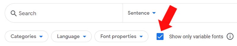
The key advantage of this is that you can just import one font file rather than a separate one for each weight you need. The key disadvantage (at the time of writing) is that not all fonts are variable! The selection is more limited. If you go to Google fonts, there’s a checkbox you can use to show only the variable fonts.
Another disadvantage, is that the file size of variable fonts is much larger too – but if you want to use more than 3 font-weights, it will usually be smaller than importing three separate fonts. If you’re only using 2 or 3 font weights, you’ll usually get smaller font files (and therefore faster a faster site) by simply importing the specific ones you need.
Also, note that variable fonts aren’t fully supported by all browsers and operating systems – however, they are quite well supported..
What’s the best way to pick a font-weight?
Whenever you’re designing a site, think about the impact you want to have. What key values, principles, emotions, impressions, or vibes do you want to convey? Then whenever you have a design decision to make, you can ask yourself, which of my options does this best?
For example, take a look at this example with Montserrat (the text is just filler from JeffSum, it doesn’t mean anything). This uses 400 and 700, the default values:
Pretty standard bold text. Now look what happens if we change this to ‘100’ and ‘800’, a more extreme difference:
The first one is completely conventional, it looks like most text you’ll see in normal life. What does that convey? Maybe tradition, following the rules, conforming to agreed standards, things like that. If you’re designing a site for a law firm, that’s probably the vibe you’re going for. No need for anything too creative or outrageous.
The second conveys that there are just a couple of key points to learn here, and everything else is much less important. If you were designing a magazine cover, or a landing page, this might be worth considering.
Keep in mind also, that font weights aren’t equivalent from one font to another. Using 400 for normal and 700 for bold might look great on one font, but terrible on another. If you change a font, always check how the bold text looks, too.
Finally, make sure you check your font weights across multiple browsers, especially if you’re using a less common font, or a weight other than the standard 400 and 700 values, as they sometimes don’t display in exactly the same ways.
Accessibility
As a conscientious developer, I’m sure you’ll try to use b and strong tags as described above to help out visually impaired people. But here’s another thing you can do to help – be wary of very thin fonts. Font weights of 100 and 200 can be hard to read for some partially-sighted people, and generally speaking, they are best avoided. If you do want to use them, make sure you at least have a strong contrast between your font colour and your background colour (this Contrast Checker can help you with that).
You are now a master of CSS bold fonts!
Wow, bet you didn’t know there was so much involved in making fonts bold, did you? It’s true that there’s a lot to keep in mind – but understanding these nuances is what separates the good from the great – so nice work on taking the next step in your learning journey!
Still, there are times when your client needs a website that is expertly polished, perfectly functional, and blazing fast (and as usual, they want it yesterday!). For that, you’ll want to consider using fullpage.js.
fullPage is a JS library that turns your site into a fancy, fully-functional full-page site that works seamlessly with JS libraries like React, and CMSs like WordPress. You get a whole host of awesome effects to use (I’m a big fan of the water effect), and it’s really easy to set up and get working. Have a look and see what you think!


