As the world is becoming digitalized, more and more people are using the internet to find pretty much anything, and this includes finding trustworthy daycares to take care of their children or elders.
The problem is that daycare websites need to be constructed impeccably because they need to showcase the fun and imaginative learning environment the daycare provides. In addition, the website needs to be interactive and interesting enough to capture the attention of the parents or guardians.
So, if you are planning on creating a website, you don’t need to worry! Here are 15 daycare website ideas you can take inspiration from.
1. Dare 2 Dream Childcare
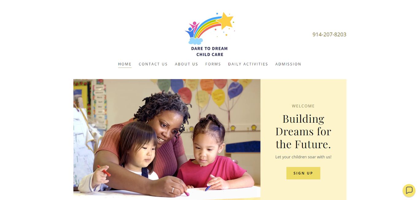
Dare 2 Dream makes sure to provide a home for your kids away from home. It’s kind of like home childcare but outside your house.
Even though this daycare website is simple, it conveys a lot of information. The whole website is incredibly colorful, which is without a doubt the best choice because it shows that the daycare is fun and interactive.
Despite the pictures having a high situation of colors, the colors on the website are much softer, which contrasts well and brings out the important text on the website.
On the homepage, you get information about the daycare itself, which is essential since you have to convince the parents to leave their child in your care.
Another important section is the review section because nowadays, no one buys a product or service without checking out reviews. The website is fairly easy to navigate because there aren’t too many sections or service pages.
2. Stap Voor Stap
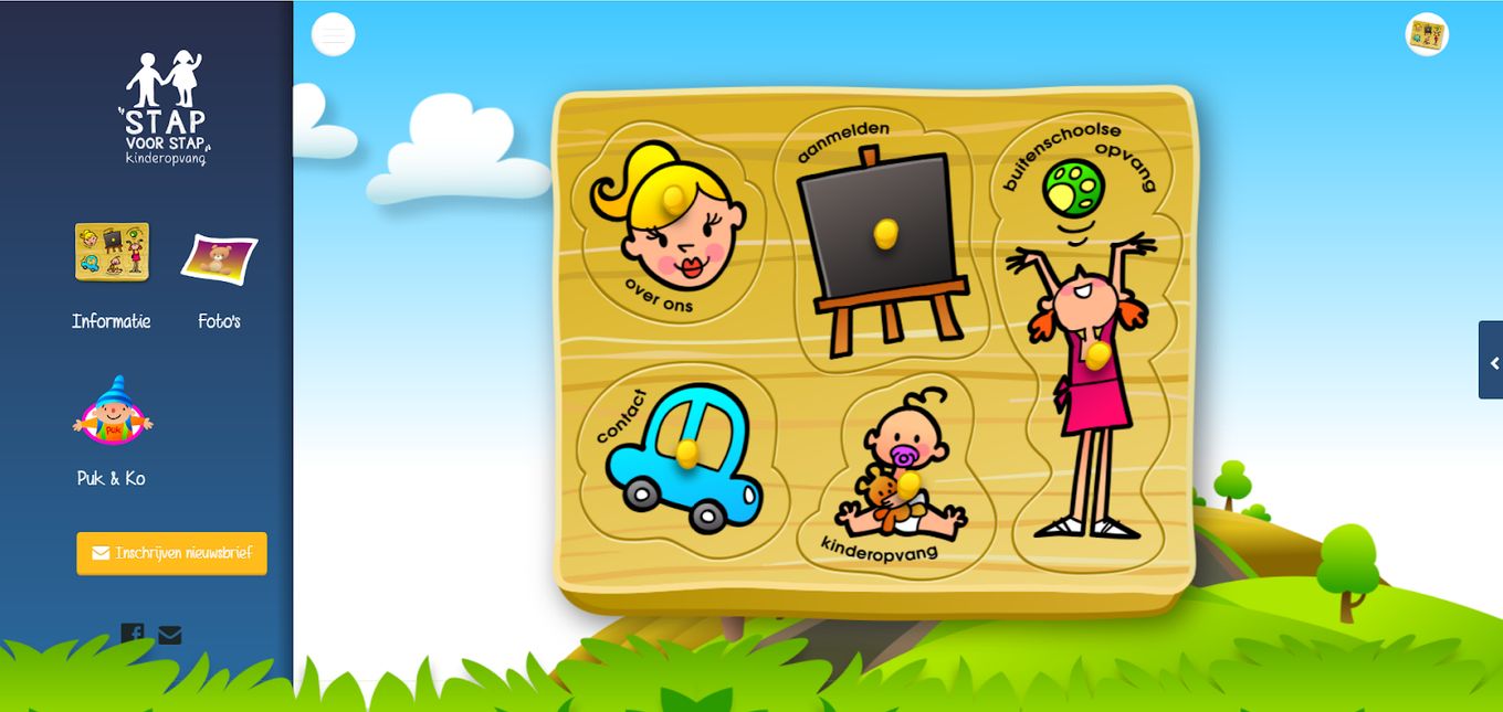
This daycare website is an incredibly interactive and very creative idea, but at the same time, it can be very confusing, especially for new visitors.
The homepage is just one animated screen that moves as you move the mouse, and except for the two icons on either side of the screen, there isn’t much on the website.
When you open the burger menu, you can see a couple of items, such as pictures and information. The other icon features an animated menu with pictures of different items cut out and placed inside a puzzle.
Even though the website is incredibly interesting, it can be confusing to navigate, especially because children are most likely not going to be using it, and adults might have a hard time grasping how to reach important information.
3. Little Scholars NYC
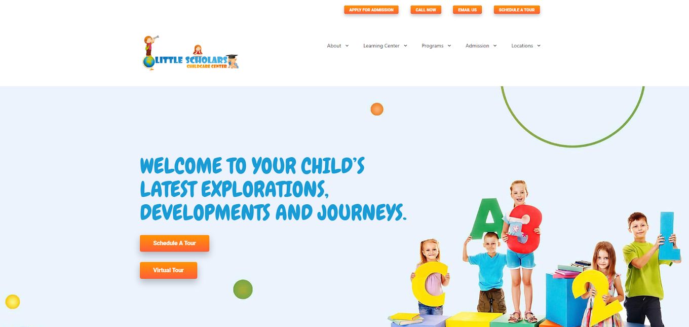
Little Scholars is a daycare center where your kids can feel at home.
Their daycare website is very well constructed. The home page is jam-packed with information, but despite it being so busy, it is neither confusing nor overwhelming.
The font is easy to read, the bubbly headings go perfectly with the daycare theme in mind, and so do the bright, saturated colors used on the site.
In addition, the website features a section that tells the visitors what is different about this particular daycare, and each item is denoted with a separate heading and a vector image.
4. Sunshine House Childcare Website
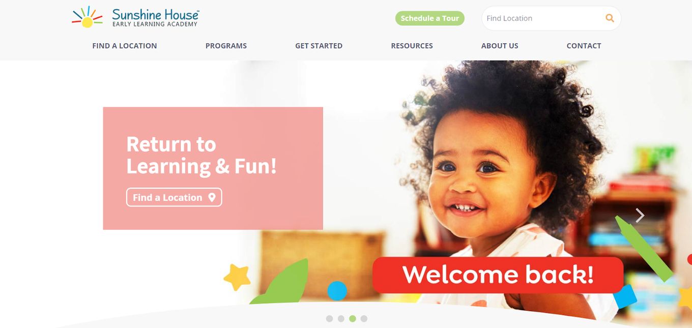
This website is incredibly clean-looking and professional. It has a gallery-style homepage, and all the categories are set up in different text boxes and are color-coded.
You can also learn about their curriculum, virtual learning, health and safety rules, and security on the homepage.
Even though the website is full of color, it never feels out of place and overwhelming. So, if you want to learn how to correctly use color, then this daycare website idea is worth the visit.
5. Briarcliff Child Care Centers
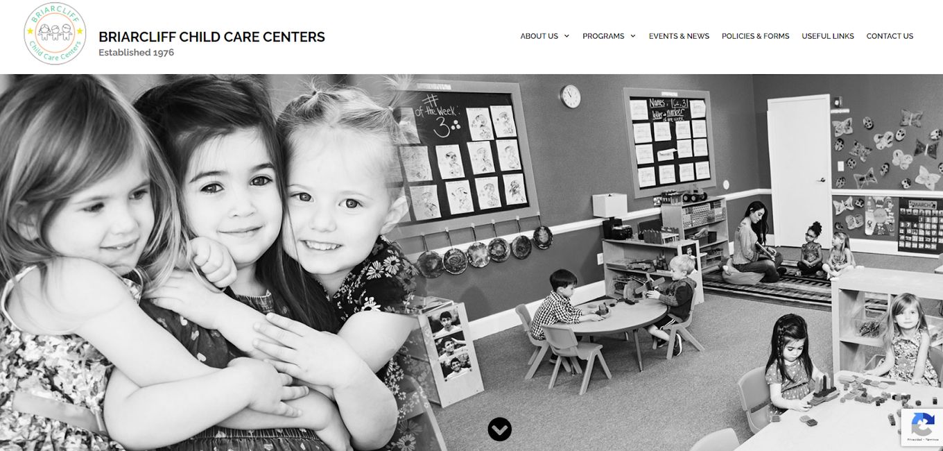
If you are looking for a daycare website that doesn’t use a lot of colors, then you need to visit this completely black and white website.
The homepage has a bunch of categories, and each of them is neatly divided into different sections.
The homepage also has an interesting feature since the text slides on top of the main picture. The website also seems pretty easy to navigate since it doesn’t bombard the visitors with a bunch of information.
6. ABC Learning Center – Home Page
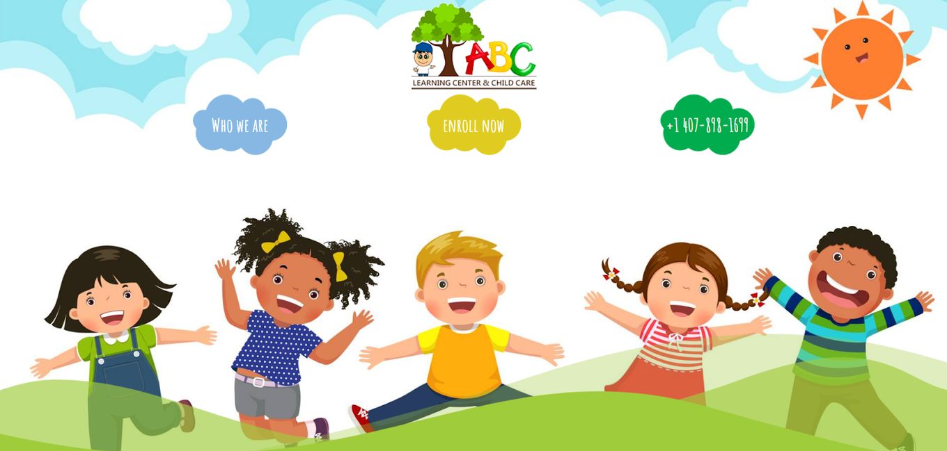
This daycare website is different from its counterparts because it utilizes both color and illustration to suck in the visitors. It has a very untraditional menu bar, and instead of having a full far, there are only three options which are all separate clouds.
The main illustration of the homepage becomes the background as the rest of the website rolls on top of it. The website also utilizes a lot of real-life pictures, which adds to its authenticity.
7. Le Petit Bebe Daycare
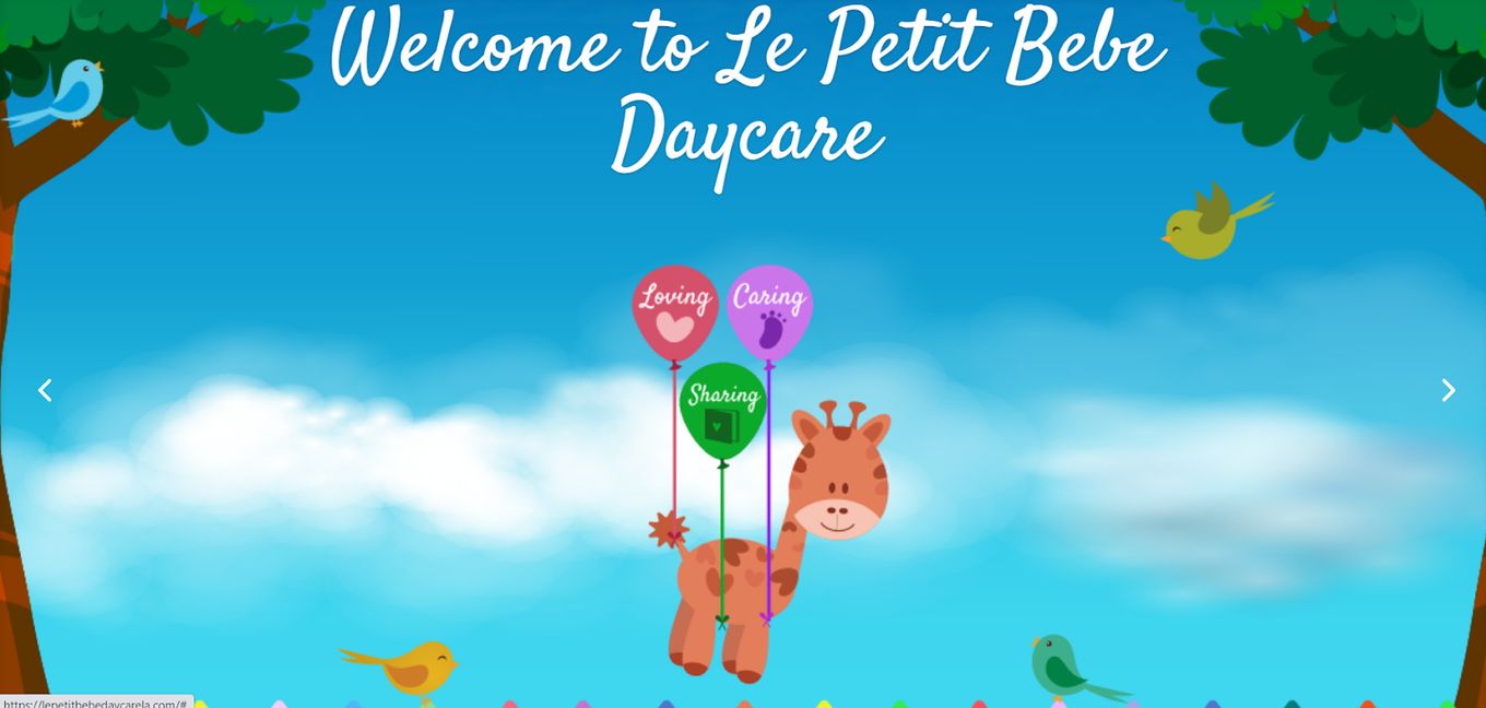
Le Petit Bebe Daycare is like a home daycare where kids can have a great time while being taken care of.
In this list of daycare website design examples and ideas, this website is one of the best out there, and that is all because of its fusion elements.
The website mixes art with real-life pictures, which makes it interesting. Throughout the website, you find many colorful illustrated pictures that have textboxes or text placed on top of it.
All the pictures on the site are taken on normal days, which makes the website seem more realistic and trustworthy. And almost all pictures are followed by some sort of text that explains or adds to the pictures.
The website is also easy to navigate.
8. Little Blessings Academy
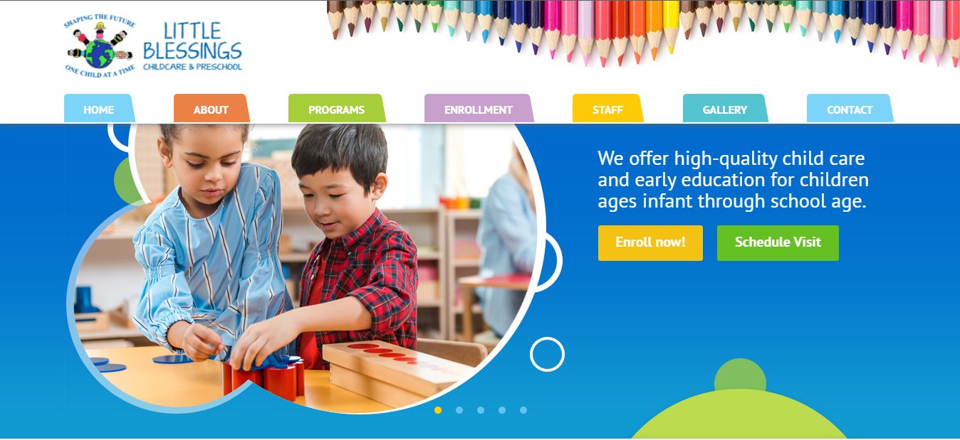
Featuring a gallery-style homepage, this daycare website idea is bright and colorful, which is exactly what a daycare website should look like.
Despite how many colors are being used on the website, it isn’t overwhelming, which is a definite sign of a well-constructed website.
On the website, you can also find the benefits of choosing this particular preschool over others, and you will also learn about their mission and some quick facts about them.
9. Red Lynch Daycare Centre
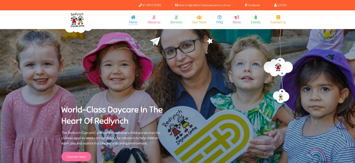
If you are looking for a daycare website that has a couple of unique elements, then you might want to take a look at this one. Instead of having harsh lines that separate the main picture from the rest of the website, this site utilizes a cloud-like scalloped edge to blend in with the website.
This scalloped edge detail also works to pull the site together since a lot of the illustrations are surrounded by similar sort of shapes. You can also look at the daycare’s two different packages, look at their age groups, and meet their team.
10. Kinder Care
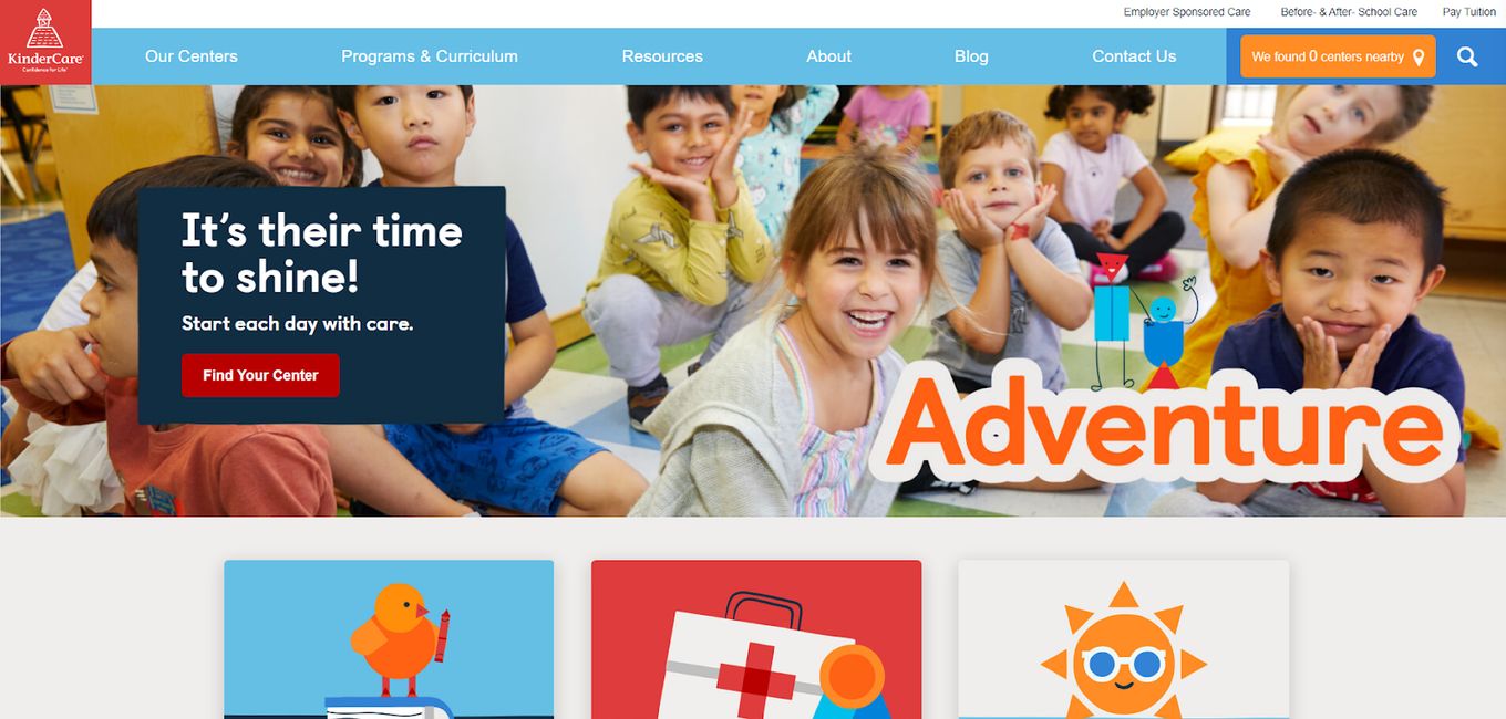
This daycare website is probably one of the best ones on this list, especially if you are looking for a more professional-looking website.
At first glance, you might not be able to point out what exactly makes it special, but it is probably a bunch of things that coincide to make the website seem more credible.
The homepage is simple, and everything is neatly separated into different categories, and all of them have their separate illustration.
11. Building Blocks
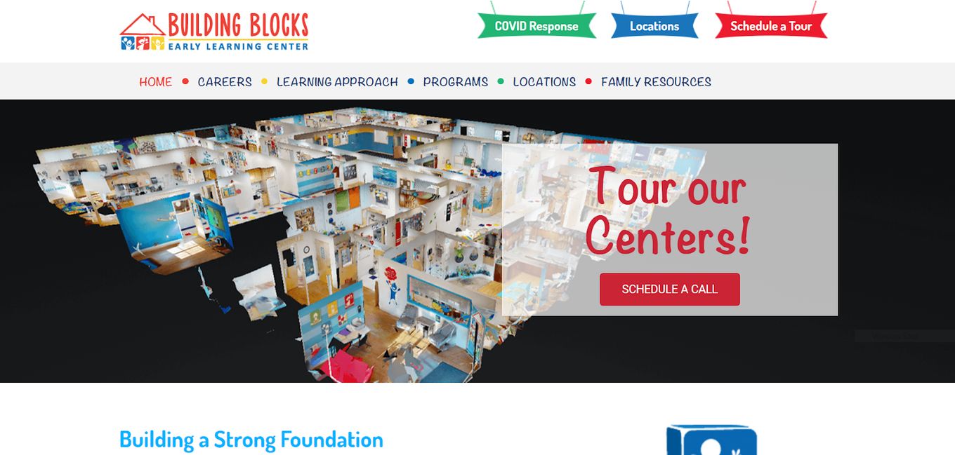
Building blocks’ is like a home daycare. It’s website is incredibly simple in a sense because there are no interactive elements or striking color combinations.
But at the same time, the website is incredibly effective because of how easy it is to navigate and how mature it looks.
The site still uses fun pops of color to add interest to the website, and a lot of colors are even a permanent part of its logo.
However, the best part of the site is that they get right to business and describe what they do and how they plan to keep your children safe, especially regarding Covid.
12. Castle Oaks School

This is another daycare website that also functions as a school, and it is constructed much better than our last website. The homepage opens with a gallery that flashes photos of different kids interacting with each other and their teacher.
The website uses a bunch of colors that don’t really go along with each other and can be quite jarring. So, this is something you can keep in mind and improve. But, aside from that, the website is smooth and fairly well constructed.
13. Sunkissed Acorns
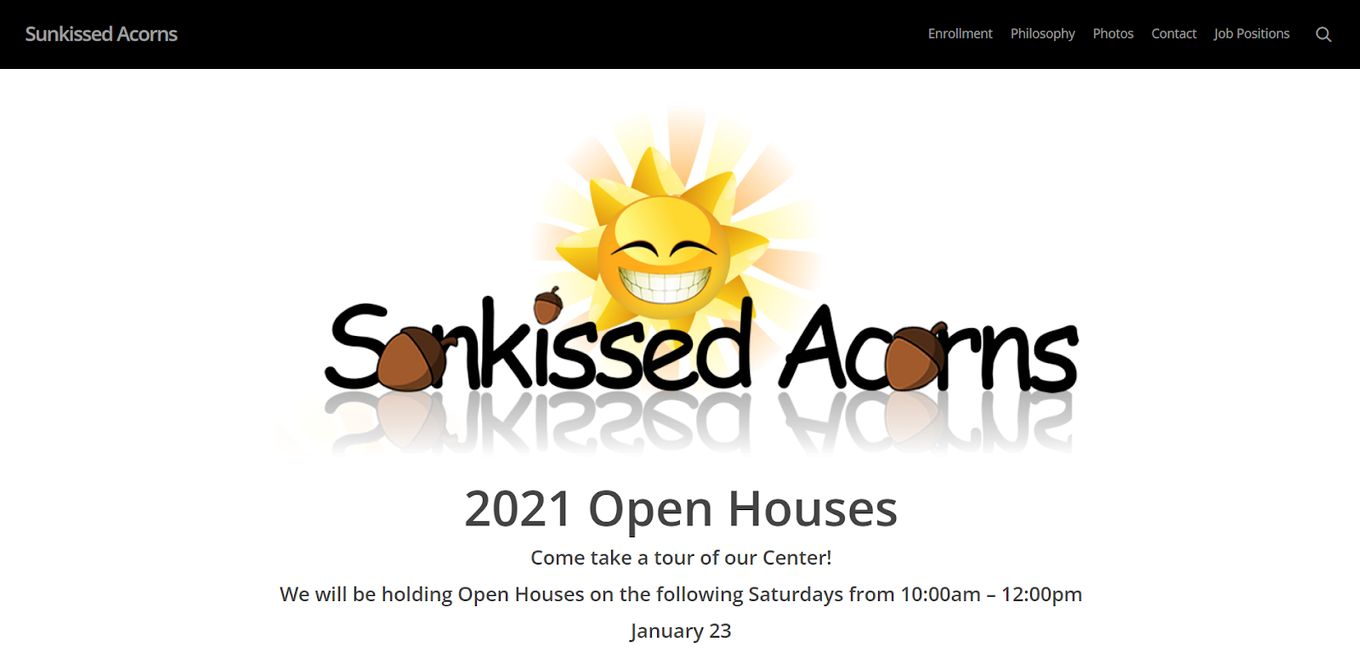
If you are looking for a daycare website that is incredibly simple and doesn’t utilize a lot of overwhelming colors, then this might be the best site to visit.
The homepage is almost empty and only features one main illustration followed by a bunch of open house dates.
And at the bottom of the homepage, two buttons take you to pages explaining more about the website. The website uses simple black and white colors with an occasional pop of color.
14. Tiny Tot Daycare
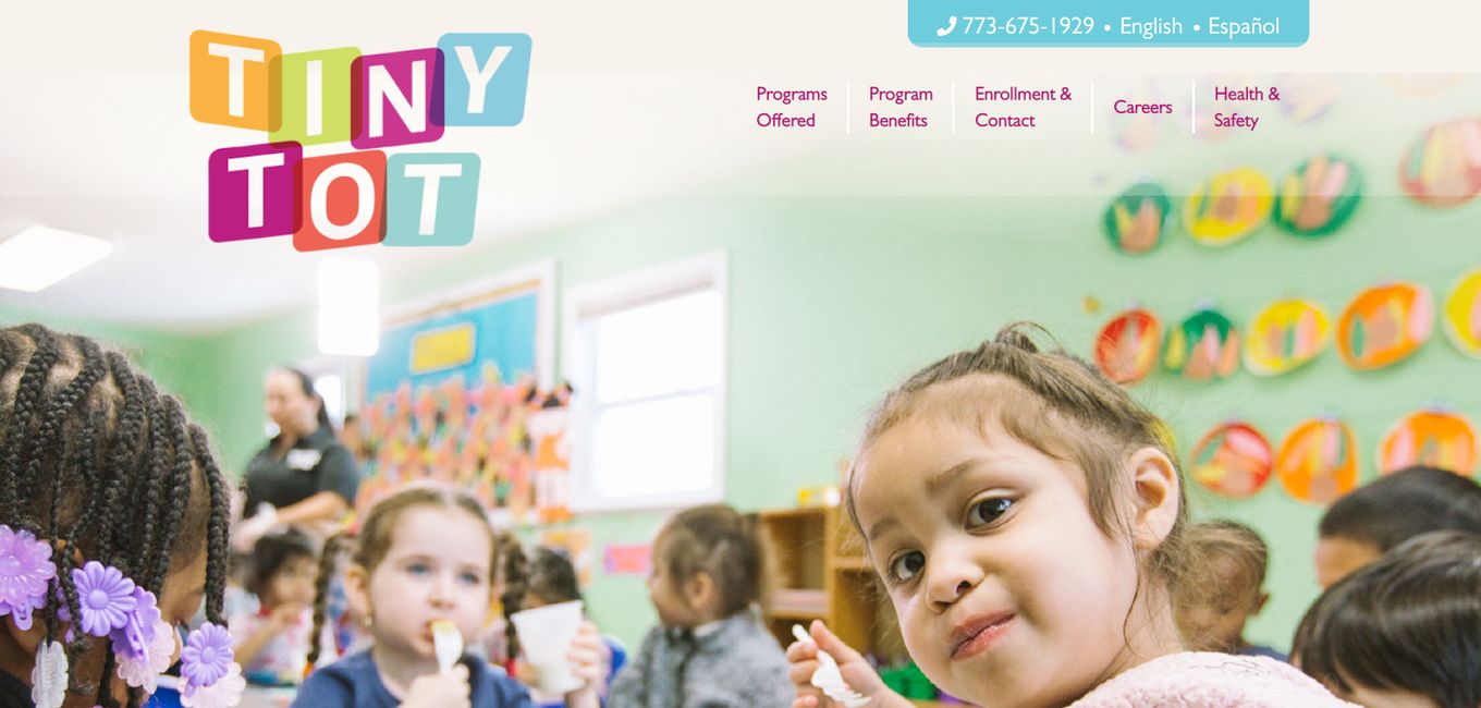
If you are looking for a daycare website that utilizes high-quality pictures, unique shapes, and a bunch of colors, then this is a site you must visit. On the site, you can see different sections dedicated to different aspects, but despite there being a clear distinction, the website doesn’t seem disjointed or broken.
15. Destiny Star
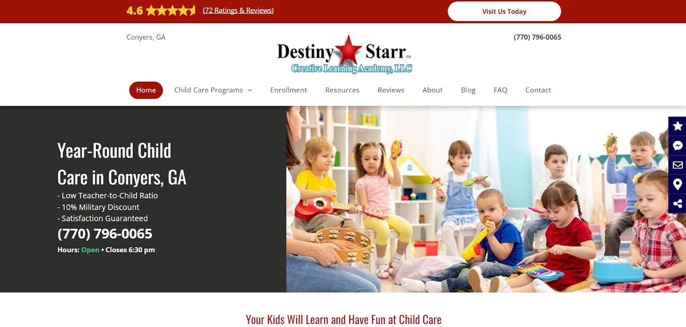
Destiny star is a daycare website that is very simple in its construction. It uses a main picture on the homepage, and below are different pictures that are accompanied by complementary text.
You can also read about their camp and before and after school activities on the homepage.
![9+ Beautiful Boutique Website Designs [Get Good Ideas] boutique website designs share](https://alvarotrigo.com/blog/wp-content/uploads/2023/08/boutique-website-designs-share-300x150.png)
![11 Must-Have Skills If You Want to Be a Web Developer [2024] web developer required skills share](https://alvarotrigo.com/blog/wp-content/uploads/2023/08/web-developer-required-skills-share-300x150.png)
![7+ Awesome Designs for Schools Websites [Get Inspired!] schools websites design share](https://alvarotrigo.com/blog/wp-content/uploads/2023/08/schools-websites-design-share-300x150.png)
![15 Best Portfolio Website Builders in 2024 [Reviewed & Ranked] portfolio website builders share](https://alvarotrigo.com/blog/wp-content/uploads/2023/08/portfolio-website-builders-share-300x150.png)

![30+ Best Church Website Templates [WordPress & HTML] church website templates share](https://alvarotrigo.com/blog/wp-content/uploads/2023/08/church-website-templates-share-300x150.png)