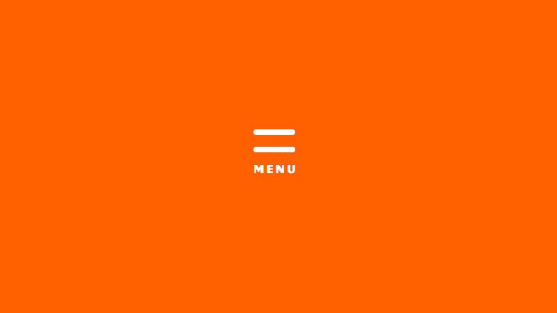
A CSS hamburger menu (responsive) is one of those cool slide-out navigation menus that appears when you click those three-line menu icons.
(It’s also a convenient way to buy fast food – but that’s not important right now)
Looking for ready-to-use hamburger menus examples? Check these 10 CodePens of CSS Hamburger Menus.
In this post, you’ll learn how to create a responsive hamburger menu (CSS only – no JS needed!). But you might be wondering, why bother? Why hide your beautiful navigation behind a hamburger icon?
Advantages of a Responsive CSS Hamburger Menu
- According to Oberlo, over 56% of web traffic comes through mobile devices.
- Full-width navigation menus are often unusable on small screens.
- Positioning menu items vertically solves this problem – but then the user has to scroll past the menu to get to the content – not ideal.
- By using fixed positioning on the hamburger icon, your visitors can access the nav no matter where they are on your page.
OK enough talk, let’s make one! First, we’ll start with the structure…
Structure of a Responsive Hamburger Menu (HTML)
If we were using JavaScript to do this, we’d set up an event listener to detect when the user clicks on the icon, then trigger the menu to appear.
Since we’re making this responsive hamburger menu CSS-style, we have to use a different approach.
We need two elements, a button for the icon, and a nav for the menu itself. The nav element needs to be nested inside the button:
<button id="hamburger-menu">
  <nav id="sidebar-menu">
  </nav>
</button>
Code language: HTML, XML (xml)
You can fill your nav menu with anything you want. We’ll just use some common top-level pages for this example (don’t forget to replace # with your actual page urls!):
<label id="hamburger-menu">
  <nav id="sidebar-menu">
    <h3>Menu</h3>
    <ul>
      <li><a href="#">Home</a></li>
      <li><a href="#">Store</a></li>
      <li><a href="#">Blog</a></li>
      <li><a href="#">About</a></li>
      <li><a href="#">Contact</a></li>
    </ul>
  </nav>
</label>

<div class="overlay"></div>
Code language: HTML, XML (xml)OK, we have the structure sorted… but it doesn’t look how we want, and it doesn’t do anything. Let’s solve that with some CSS…
Check out these examples of great side menus for your webpage!
Styling the Responsive Hamburger Menu (CSS)
There are many ways to get the three lines of the hamburger icon itself – we’ll use a linear gradient as Chris Coyier over at CSS tricks explains:
#hamburger-menu {
    width: 50px;
    height: 50px;
    display: block;
    border: none;
    background: linear-gradient(
      to bottom,
      #3D0E61, #3D0E61 20%,
      white 20%, white 40%,
      #3D0E61 40%, #3D0E61 60%,
      white 60%, white 80%,
      #3D0E61 80%, #3D0E61 100%
    );
}
Code language: CSS (css)
Now, because the menu is nested inside the hamburger icon, we need to set its position to absolute. This takes it out of the flow and enables us to position it manually.
We’ll set the responsive hamburger menu’s top to 0, left to -250px, and width to 200px. This will position it off-screen.
Technically we only need to set left to -200px, since that’s how wide the element is. But I like to add a bit more, just for insurance. We’ll also set visibility to hidden for good measure.
#hamburger-menu #sidebar-menu {
    visibilty: hidden;
    position: fixed;
    top: 0;
    left: -250px;
    width: 200px;
    height: 100%;
    transition: 0.3s;
}
Code language: CSS (css)
Now we have a hamburger menu icon, and we can’t see the menu – yet. So far so good:
Adding Functionality to the Hamburger Menu with CSS
So, how do you make the responsive hamburger menu actually work, without using JavaScript? How do we get a real Hamburger Menu CSS-styled?
We will use a hidden checkbox together with the :checked pseudo-class. It’s a small hack to make sure our checkbox not only works on desktop computers but also on touch screen devices, where focusing elements is not a thing.
But… how do make a checkbox change its :checked status whene it’s not visible? By using a label element for that checkbox and showing that label element instead.
<!-- We add the checkbox -->
<input type="checkbox" id="hamburger-input" class="burger-shower" />

<!--
  We use a `label` element with the `for` attribute
  with the same value as  our label `id` attribute
-->
<label id="hamburger-menu" for="hamburger-input">
  <nav id="sidebar-menu">
    <h3>Menu</h3>
    <ul>
      <li><a href="#">Home</a></li>
      <li><a href="#">Store</a></li>
      <li><a href="#">Blog</a></li>
      <li><a href="#">About</a></li>
      <li><a href="#">Contact</a></li>
    </ul>
  </nav>
</label>

<!--
  Adding an overlay to show a dark
  background when the menu appears
-->
<div class="overlay"></div>
Code language: HTML, XML (xml)
We will style the label in a way that it looks like a burger menu, so when someone clicks on it, the hidden checkbox status will also change.
This way, we are able to conditioanlly trigger CSS changes in other elements by using the :checked pseudo-class.
#hamburger-input:checked + #hamburger-menu #sidebar-menu {
    visibility: visible;
    left: 0;
}
#hamburger-input:checked ~ .overlay{
   visibility: visible;
  opacity: 0.4;
}
Code language: CSS (css)
Two things to note here:
- Notice how we are using the combinator
+symbol in our CSS. This is a combinator symbol that allows us to select inmediate siblings to the first element. - We are also using the
~symbol. This allows us to select non inmediate siblings. And we need to use it because.overlayis not inmediately after#hamburger-input. - Notice the styles we’ve applied. We set
visibilitytovisible(always a good idea if you want people to see things!), and set theleftproperty to0– this will bring it into view (remember it was-250pxpreviously).
Using Transition to Slide the Menu into View
As it stands, this would make the CSS Hamburger menu appear instantly on the screen. But it’s much cooler to have it slide in from the left. To do that, we apply a transition to the #sidebar-menu element:
transition: 0.3s;
Code language: CSS (css)
This means it’ll take 0.3 seconds to slide in – you can change this to fit your preferences.
OK, now let’s see how it looks! I’ve added a little extra styling to the menu too:
If the user wants to close the menu, they just need to click or tap on anything outside the menu itself – a common and intuitive way to do it.
Add the Main Navbar
If the CSS hamburger menu is all you need, you’re good to go – enjoy!
But if you’re also interested in setting up a responsive CSS hamburger menu, then stick around!
Here’s the plan:
- If the visitor has a wide enough screen, we’ll show them a full-width nav bar.
- If they have a smaller screen, we’ll show them the CSS hamburger menu.
So first, let’s set up horizontal nav bar. The HTML:
<nav id="main-menu">
  <ul>
    <li><a href="#">Home</a></li>
    <li><a href="#">Store</a></li>
    <li><a href="#">Blog</a></li>
    <li><a href="#">About</a></li>
    <li><a href="#">Contact</a></li>
  </ul>
</nav>
Code language: HTML, XML (xml)
…and the CSS:
#main-menu {
  display: block;
  height: 100px;
  width: 100%;
  background: #3D0E61;
  margin: 0px;
}

#main-menu ul {
  max-width: 800px;
  width: 100%;
  height: 100%;
  margin: 0px auto;
  display: flex;
  justify-content: space-evenly;
  align-items: center;
}

#main-menu li {
  list-style-type: none;
  font-size: 2rem;
}

#main-menu a {
  color: #B9FAF8;
  font-size: 1.5rem;
  text-decoration: none;
}

#main-menu a:hover {
  text-decoration: underline;
}
Code language: CSS (css)
Because the hamburger icon is a block element, this navbar will push it out of position – so let’s make sure it stays in the top left of the screen by adding the following code to #hamburger-menu:
position: fixed;
top: 20px;
left: 20px;
Code language: CSS (css)
Now for the ‘responsive’ part…
Making the Hamburger Menu Responsive with CSS
We’ll use a media query for this.
We need to choose a breakpoint – a screen width that will cause the display to switch between the full-width menu and the responsive CSS hamburger menu.
The width you choose will be unique to you – if you have lots of menu items, it’ll need to be wider. For this example, I’ll go with 750px:
@media screen and (max-width: 750px) {
  #main-menu {
    display: none;
  }
  #hamburger-menu {
    display: inline;
  }
}
Code language: CSS (css)
When the screen is smaller than 750px, these styles will be applied.
And we also need to hide the responsive hamburger menu (CSS) when the screen is wider than 750px. To do that, we just change display: block; to display: none in #hamburger-menu`. So it will be hidden by default.
Final Result
That’s it! Here’s the final CSS Hamburger menu (responsive):
Hope that was useful to you! You can take this as a template, and change the colors and styles to suit your needs.
Personally, I love how a CSS Hamburger Menu looks on full-screen websites. If you do not believe me, just check it for yourself:
Cool, right? If you like this fancy style, I recommend that you check out fullPage.js. It’s a JS library that enables you to create professional-looking responsive full-page websites really easily. Then you just have to add your CSS Responsive Hamburger Menu and… voilá! Your website is ready!
FullPage.js also offers some cool navigation options you might like, whether you want a scroll bar, navigation dots, anchor links, or continuous scrolling, you’re covered. And there are some great animations to take people from page to page – the drop effect is one of my favorites.
 10+ Examples + Code")


