Due to the advancement of technology in web development, many web designers are veering away from the traditional white and are choosing colored backgrounds for their websites. While this may look appealing and creative, choosing your website’s background depends hugely on your goal, context and content.
White backgrounds are still preferred (and are repeatedly becoming a hit) by many, in creating websites. If you are building a business website, it is widely accepted that choosing a white background would be highly beneficial. Let me share some reasons why choosing white backgrounds for your business web is important nowadays.
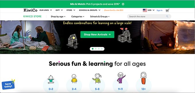
1. Is the default background for HTML and CSS
Traditionally, books and printouts are usually white backgrounds and there are reasons why it is more efficient to be using a white background. Since white is the default background for HTML and CSS, keeping the background this way makes the job easier for web developers, so that they can focus more of their time on the other parts of the website. Using white backgrounds can be more efficient.

2. Easier Readability of Dark Fonts
Readability is something to be considered a priority in web design. It is one factor that contributes to a great user experience. Using white backgrounds enhances content legibility.
Contrast plays a huge part in legibility, and a dark font against a white background is the easiest way to create one. Also, light fonts on a dark background can be uncomfortable for the eyes. For most people, dark fonts on a white background are easier to read. It is also better to look at white background websites especially if you are browsing during the day.
Furthermore, reaching a wider age range may be a goal of your business website. Using a dark font against a white background is more readable for both young and old, and even people with astigmatism. Even though it provides good contrast, white fonts on dark background tend to blur the text, making it harder to read (Take it from someone like me who has been visually impaired since childhood). Astigmatism affects a diverse variety of people, regardless of age. The more accessible the website is, the more audience would likely to stay or re-visit.
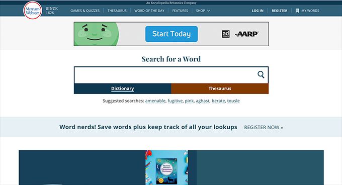
3. Images Standout
Images look better on white. There is a reason why most e-commerce websites are encouraging the use of white backgrounds when posting products: white is neutral and can bring out the colors of your photos without causing eyestrain. When shopping for products, we understand, and are often provided a disclaimer, that colors may differ depending on device screens. But when using a white background, the real color of the product is more likely represented. Just imagine a pink object on a red background. I think you get what I mean. Well, it is not totally bad, but a white background just makes better sense. Another thing is using white background promotes consistency in all of your pages, especially for e-commerce websites
White backgrounds promote focus on content. Less visual clutter can be quite helpful in today’s fast-paced society. Yes, colored backgrounds can be creative, but you want to divert your visitor’s probably short attention into what your website is trying to convey. I have read someone comparing white backgrounds to be more of a supporting cast member, making your content stand out.
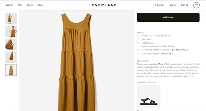
4. Is Neutral And Safe
Simple, minimalist and aesthetic designs are classic and are, again, becoming a trend. White is always seen as clean, timeless and elegant, signifying peace and calm. The neutrality of a white background helps with your website branding. Since all colors match with white, you don’t have to worry much about the background creating eyestrain against your branding.
White backgrounds are also the usual go-to if you want your business to appear professional and corporate. But it is not limited to that. You can still be hip, modern and contemporary. Aside from playing with colors, you can take advantage of typography as your design, which again, works best with a white background.

5. Reduces Clutter And Brings Focus To CTA
We’ve talked about content, now let us do CTA (Call-To-Action) I’ve said it repeatedly that using white as your background promotes focus on the crucial aspects of your website. It helps to draw attention exactly where it should be. Your Call-to-Action is a crucial aspect of your website.
Your CTA portion or button should be striking and very distinct. How else could you make it more obvious, but to use a prominent color against a white background? Even a simple step like that can bring a lot of change, you got to try it.

Conclusion
In a plethora of design options and constantly changing style trends, white has always been the safest go-to for any artist. Its simplicity, neutrality, and elegance are timeless and can blend in with whatever we creatively place on it.
This is something we can bring into web design. Make your business website stand out not just in terms of design, but also in terms of functionality and accesibility.
So, what are your goals for your business website? It could be efficiency, or content readability and accessibility. You may want to increase your product sales; more interaction with your CTA’s. Now, you might want to start considering using white background for your business website.
What about starting with a white background full-page website? You can easily start it using a JS library like fullPage.js. It is easy-to-use and it integrates perfectly with WordPress. It’s your time to get your business off the ground!
![11 Must-Have Skills If You Want to Be a Web Developer [2024] web developer required skills share](https://alvarotrigo.com/blog/wp-content/uploads/2023/08/web-developer-required-skills-share-300x150.png)
![How to Become A Web Designer in 2024 [With No Degree] become web designer share](https://alvarotrigo.com/blog/wp-content/uploads/2023/08/become-web-designer-share-300x150.png)
![15 Best Portfolio Website Builders in 2024 [Reviewed & Ranked] portfolio website builders share](https://alvarotrigo.com/blog/wp-content/uploads/2023/08/portfolio-website-builders-share-300x150.png)
![7 Bad Website Designs [Examples & Tips To Fix Them] bad website design share](https://alvarotrigo.com/blog/wp-content/uploads/2023/08/bad-website-design-share-300x150.png)
![What Is a Squeeze Page [Full Explanation + Examples] what is a squeeze page and why you need one now share](https://alvarotrigo.com/blog/wp-content/uploads/2023/08/what-is-a-squeeze-page-and-why-you-need-one-now-share-300x150.png)
![21+ Best Artist Portfolio Examples [Get Inspired!] artist portfolio websites share](https://alvarotrigo.com/blog/wp-content/uploads/2023/08/artist-portfolio-websites-share-300x150.png)