Website design is so important if you want to attract the right users and grow whatever site it is that you are running. Design is so important that most users will click away in seconds if they feel like they cannot navigate your site properly or if the design is not appealing.
Bad website design can cost you a lot of money if users keep clicking away, so in this article, we will go through some real-world examples of bad websites and check out how we can improve on bad design choices.
In our bad website design examples, we will clearly see what makes a website poorly designed and go through what can be done to improve it, sometimes it isn’t that obvious though.
Before we look at some bad website examples, let’s understand some of the main mistakes that they all make and what you should look out for. It’s best to discuss these mistakes beforehand, as a lot of the examples share the same design problems.
Let’s tackle the problems first, then look at the examples, and then understand things we can do to fix these bad choices.
How Can You Tell If A Website Is Bad?
- Poor Navigation, no clear path of direction. When a website first loads, the user needs to understand the structure and have clear Call To Action elements, so they understand where to go. Without clear navigation, the user will feel lost and feel like the site is disorganised. Users want to find information quickly: if they can’t find what they are looking for, they will leave quickly.
- Bad or overwhelming colour choice. One of the main things a user will notice first is the choice of colour. Your website’s colour palette is extremely important, it is what sets the tone and gives a sense of brand identity. Too many colours, overwhelming selection or no sense of purpose with colours and your visitors will be thrown off.
- Unoptimised website for smaller or larger screens. It seems silly to mention this one because it’s such a given in today’s world. But you would be surprised how many websites claim to be optimised for every device but they don’t realise that their website doesn’t display properly on a certain device or screen size. Once that happens, a user is more than likely to click away because they know the website isn’t professional enough to get their responsive design right, it impacts the brand and the reputation of the information.
- Slow website loading time. Users expect a website to load pretty much instantly, if it doesn’t then they will just click away and find another site that loads quicker. No one wants to wait around for websites to load up, it should be less than or near a second to load. Users want to access information fast without any blocks in the way.
- Being too cluttered with elements or text. While it’s good to have a variety of information on your website, you want it to have a clear focus, you need to guide users to the right information. Being too cluttered with elements or text will deter users away and make them feel confused. Too many elements will make users feel too overwhelmed with the information they need to process.
- No flow or Call To Action (CTA) buttons. The structure of your website needs to flow well. No matter the objective, you need to provide direct flow to what you want from your users, that could be a subscription, signup, email or for them to just stay on your site longer. You have to design the website to push users towards an action.
- Incomplete website design. If you want a professional look and feel, your website needs to be 100% complete, don’t leave placeholder text, broken links or pages and missing images – your users won’t feel confident in your service if it is not looked after.
- Outdated content. Make sure your website is always kept up-to-date, outdated information, events, posts or anything that doesn’t match current trends will deter users away, and they will go find a website that is more up-to-date instead.
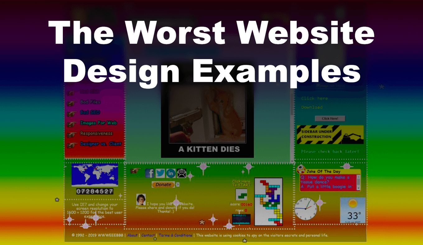
Bad Website Design Examples
Now that we know more about some general bad website design choices… What are some bad examples of web design? We can look at some real-world examples and discuss why they are bad, plus, we will give you some tips on how to fix them.
1. Outdated Website Design
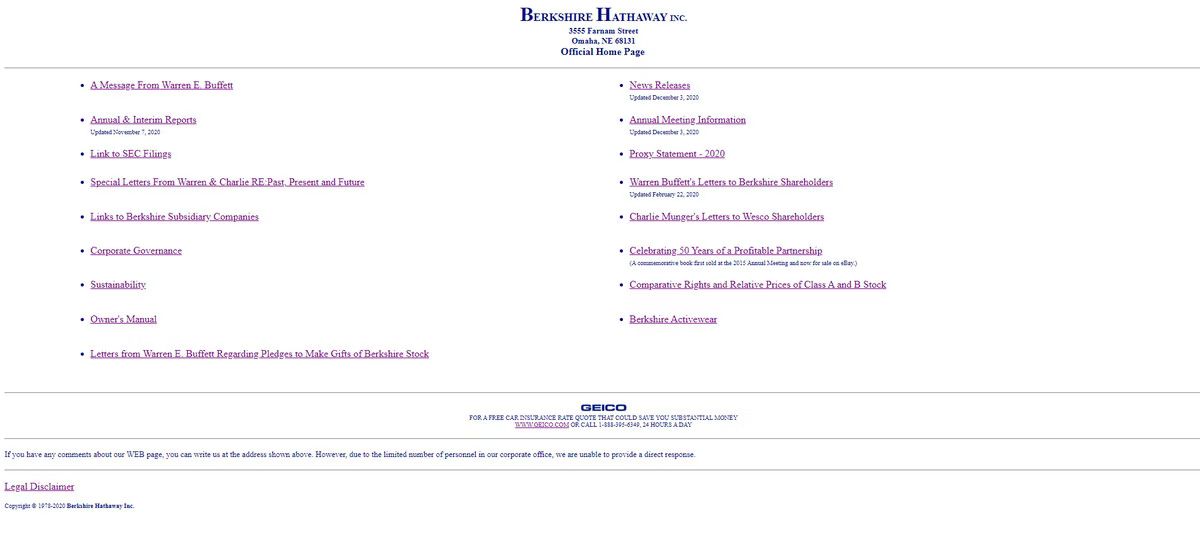
This is an extreme example but here we can clearly see that the design is just purely HTML, basically no styling, just pure structure.
While this type of website might be easy to read, it has no functionality and the lack of styling make it harder to understand any direction, branding or clear path. Users cannot connect with the design because it is so bland.
Your website needs to live up to your user’s expectations, so even if your website doesn’t look like this extreme example, remember that’s styling is important and vital to keeping users engaged in your content or service.
2. Over Cluttered Design

This bad website design example is cluttered and the structure is very poor. It hurts the eyes to look at it, it is overwhelming at first glance with the excessive amount of images.
And have you ever noticed where the main navigation is? The left side with the car background and bold red text… This is hard to spot and makes the navigation menu horrible to look at and understand the text.
Overall, it is very hard to concentrate on the information, the colours are all too extreme and don’t blend well at all.
3. Incomplete and Bad Choice of Content
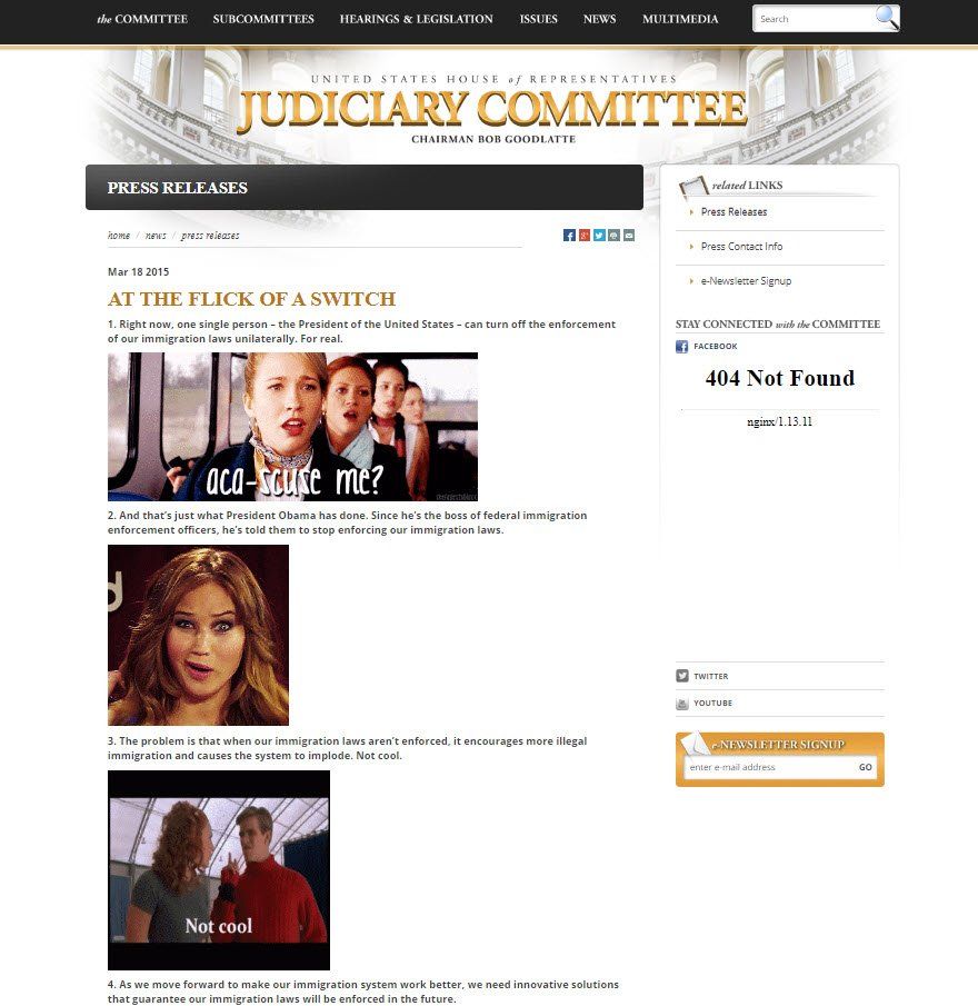
At first, this website design doesn’t seem that bad, but once you look closer, you can see it has some issues. The first major problem is the “404 Not Found” error on the right side, this makes the site feel incomplete and as if there are bugs – not great for the user.
Then we move on to the content itself. Content is king and this website is actually full of GIFs – those are not still images, while GIFs can add value, a limit does exist. The content is full of animated images, this is distracting and makes the content feel immature and hard to focus on.
Plus, the text is actually way too small and there is no structure to the article that the website is showing. Each numbered point should be its own heading and be structured correctly.
4. Bad Colour Choice and Background
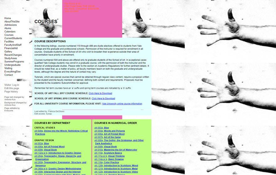
The navigation on the left is not very appealing but it is functional and easy to spot, but the colour choice here is conflicting and there is no sense of brand.
The background image doesn’t scale correctly across the browser viewport, so the image just repeats itself and it looks ugly and the main website body is not centred and so the whole layout looks half done.
And if we look at the top where the pink background is, we can’t read the text very easily because red doesn’t go well with the hot pink colour as the background.
5. Poor Website Aesthetic Design
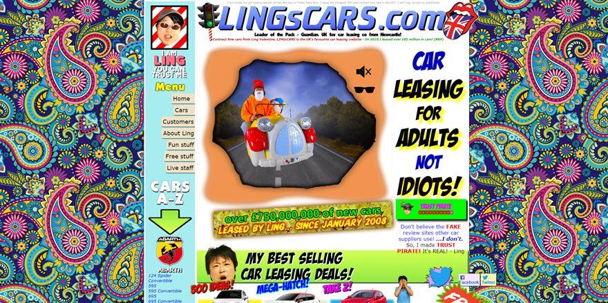
If we take away the colour, the crazy fonts and the background and just focus on the website structure, it isn’t all that bad. The content is centred, we have a nice menu on the left and an area for a logo and brand name.
It just gets worse when we bring the website aesthetic into focus… The website is supposed to be about leasing cars and this design would deter a lot of people about as it is very immature – it makes it feel like the website is designed for young children.
This design is supposed to be about cars but we don’t really see any! It’s just poorly designed based on the target audience that this website is supposed to be for. This website makes us realise that it is so important to get both the structure and target audience design right.
If you want to get inspired by good website designs, check out these examples of 10 great aesthetic website designs or lean more about the web design process.
6. Unexpected Website Design Interactions
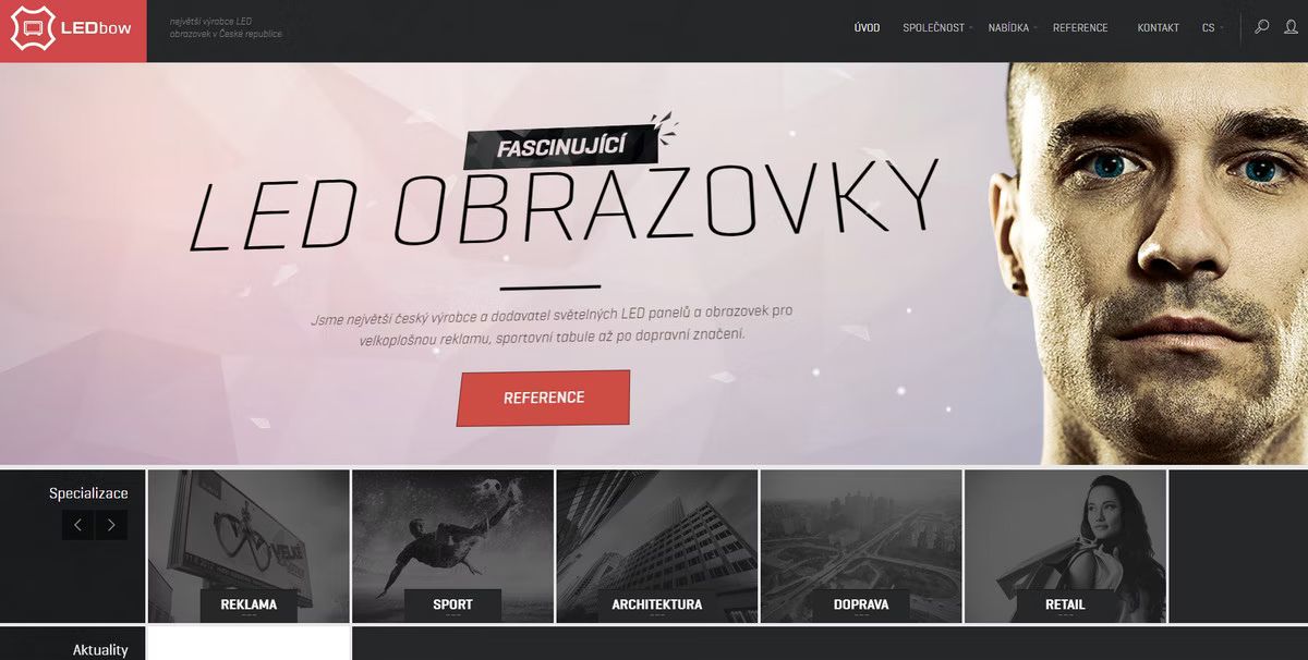
This website actually looks quite appealing but it has made it into our bad website design examples list because it is way too interactive and full of too many moving elements.
Everything is triggered by the mouse cursor, this gets very distracting and it all happens when you hover – again the target audience is not children, it’s for people or companies interested in purchasing LED lights, so they will just want well-organised content instead of all these elements.
It also has a parallax feature which is overdone and looks very clunky and immature as if the design is compensating.
7. Bad Website Content Design

Here we have another website that looks fairly modern: its layout is easy to follow, the header navigation is a great, very minimal and good use of white space so it does not feel cluttered, etc.
However, if we look closer, the content within is what makes this part of our bad website design examples list.
The company is focused on building apps for clients but in the hero section, they have used outdated and old-style designs in their UI mock-ups for the phones.
This is such a bad design practice. Users will notice this and it will feel as if the company hasn’t done any recent work for someone.
Even the Apple and Google App store logos are outdated. As a company, you cannot afford to run with such outdated content and styles.
What Are The Signs Of Good Web Design?
We’ve seen some bad website examples, now let’s focus a bit on how we can improve and fix certain issues that you may face when designing a website.
- Right Use Of Navigation. Define your navigation hierarchy clearly, only show the core pages where most of your visitors will go, use drop-down menus to define deeper navigation links and make sure your users can get back to your home page easily. Double-check that your navigation is easy to find and that all links work and lead to the right places.
- A balanced colour palette. Choose 3 colours, one as the main colour, another as a secondary colour and a third one used for backgrounds or deeper elements or headings. Stick to this structure on all pages. Don’t use more than 4 colours max. Link all colour choices to your brand and research the psychology behind colours and their effect on users and design.
- Fully Responsive Website. Pretty much all websites are responsive now, there is no excuse not to be. However, make sure all your content actually fits on all devices and screen sizes, you’d be surprised that some websites are responsive but certain content doesn’t scale well, double-check, otherwise users will find this out and they will be deterred away.
- Use Whitespaces. Don’t be afraid of adding whitespace between elements on your page. Whitespace will create a more clean and modern look for your website. As a result, it will help visitors to spot things faster.
- Make good use of CTA buttons. You want to guide your users through your website, make sure your layout flows well and that you use CTA buttons to prompt your users to take action. This can be done by using high resolution images, a catchy title and with the use of a button to persuade them to take action on something.
- Keep the design modern, minimal and fresh. Don’t clutter the design, keep elements on the page minimal, and have a balance of white space. Prioritise the content over design.
If you think you need some more knowledge on web design, consider starting some online degree on web design.


