Having a website has become an essential part of marketing, especially when you are in an incredibly dense industry such as fashion. Many boutique websites are found over the internet; some sell fresh clothing, while others choose to revamp old clothing to reduce waste.
The problem with boutique websites is that it is pretty hard to figure out how you should construct the website. And this is an important part because user experience often decides whether visitors will turn into paying customers or not.
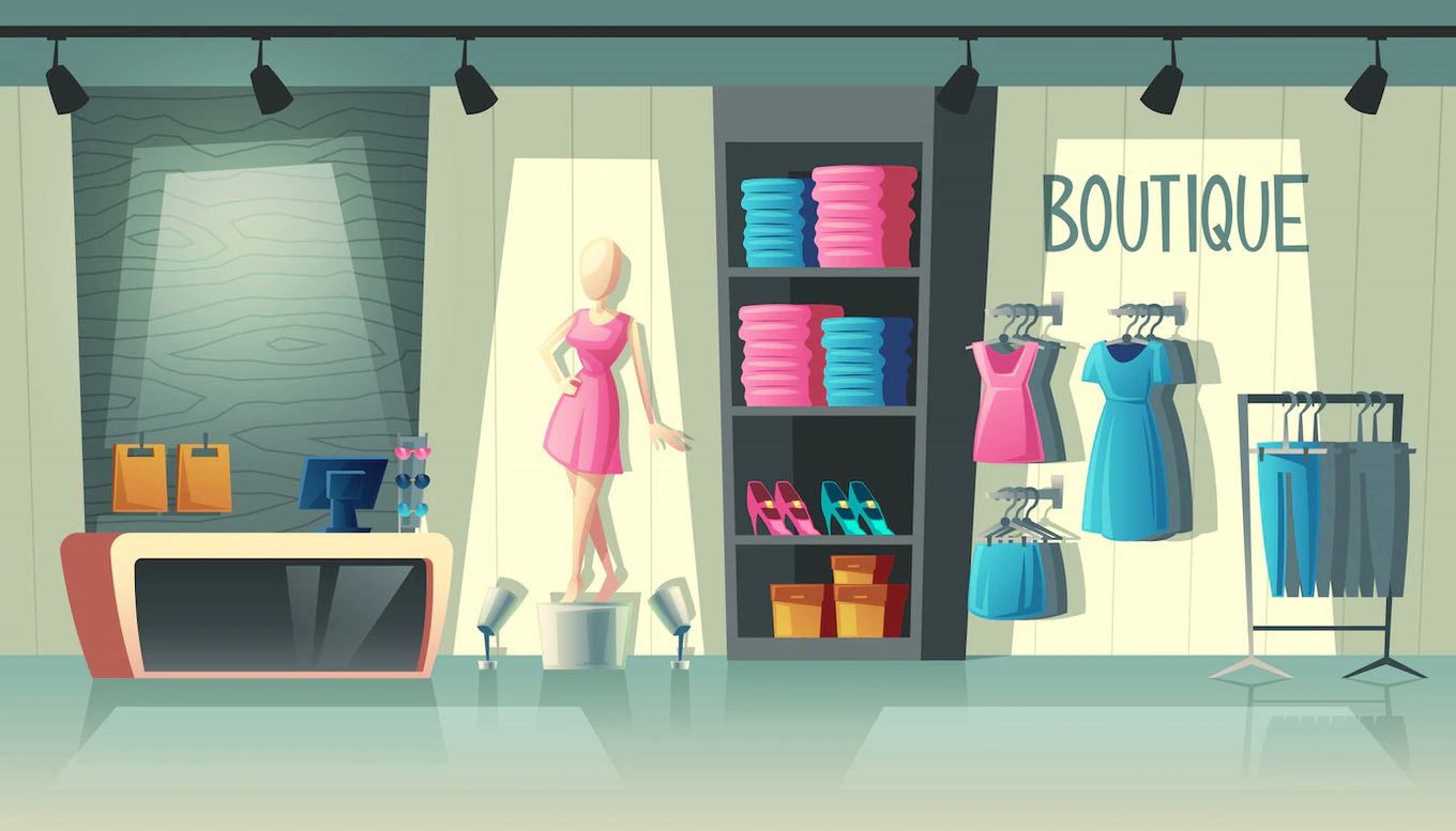
But if you are struggling to figure out how you should set up the website, there is no need to worry! In this article, we will discuss 10 boutique website ideas so that you can take some inspiration from them.
1. LA Boutique
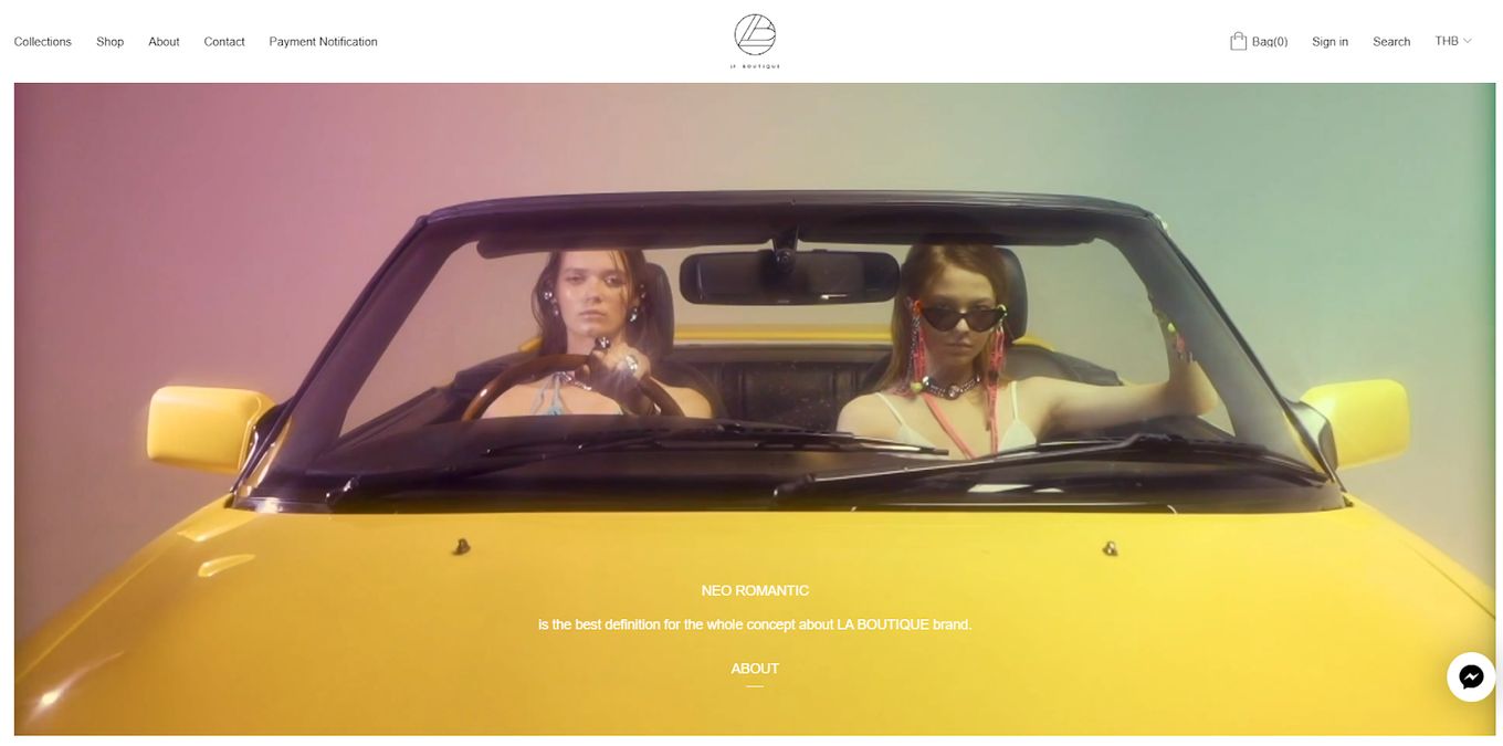
If you need some boutique website ideas, then this unique design is the one to check out. There is only one word needed to describe the homepage, and that is stunning. The video replaces the popular homepage pictures and provides visitors with a high definition and an incredibly color-graded video that immediately sucks them in.
Learn How To Create a Background Video like this website With Just CSS
The rest of the website is also interesting because, unlike any other website out there, this boutique website design includes a lime green or neon green as the background of all its pictures, and all the pictures almost seem like collages or cutouts placed on one single background.
The menu bar might be a little hard to read since it uses really small text. Plus, there is no scroll bar on the side, but all in all, this website provides a unique and striking experience.
2. Otteny
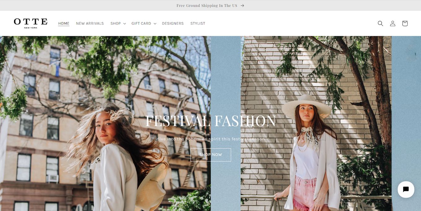
Looking for a cleaner and more professional-looking boutique website design idea? Then perhaps you should check out this website. The clean white background and the simple feature picture almost make it feel like a magazine website.
You get different sections for feature products and other special items on their website. You get a customer pick sections that display pictures of products on one side, and the other side features an animation of cursive writing.
The last but most interesting part of the website is the color collection section which features a huge collage of pictures of different models and clothes. This section almost feels as if someone was scrapbooking, and this was the result of it. It adds the pop of color this otherwise colorless website desperately needed.
3. Mystique Boutique NYC
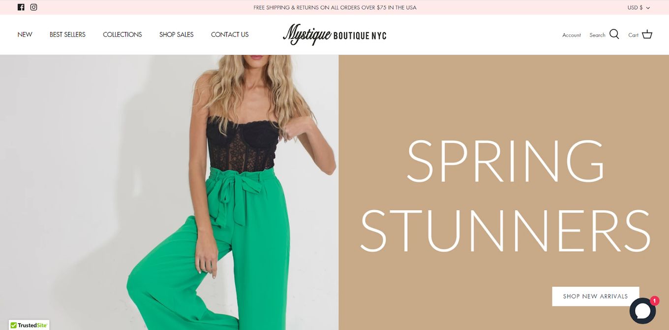
This boutique website design is an interactive one and can give you a few ideas on how to construct your website. The interference is simple but effective since it poses no difficulty while navigating. In addition to that, the mild color scheme highlights the products on the website.
The menu bar is simple and to the point, making it even easier for people to navigate. The interactive user interference means that products come into view as you go down (scrolling animation effect), and this captures the attention of the customers.
The desktop view of the shop section is divided into two parts: one side has products, while the other side comes equipped with a whole bar of filtering options.
4. Glamour Couture
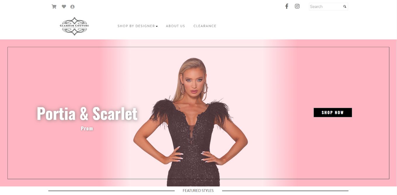
If you want to check out a more interactive website, then perhaps you can take inspiration from this boutique website idea.
The homepage features an impressive moving gallery which is so smooth and could also be a video. The change from one designer to the other can be jarring at times, but it doesn’t take away from the professional feel of the website.
Navigating the website poses no problem because you can search by designer. And if you are looking for a particular item, all you need to do is use the search bar.
5. Beginning Boutique
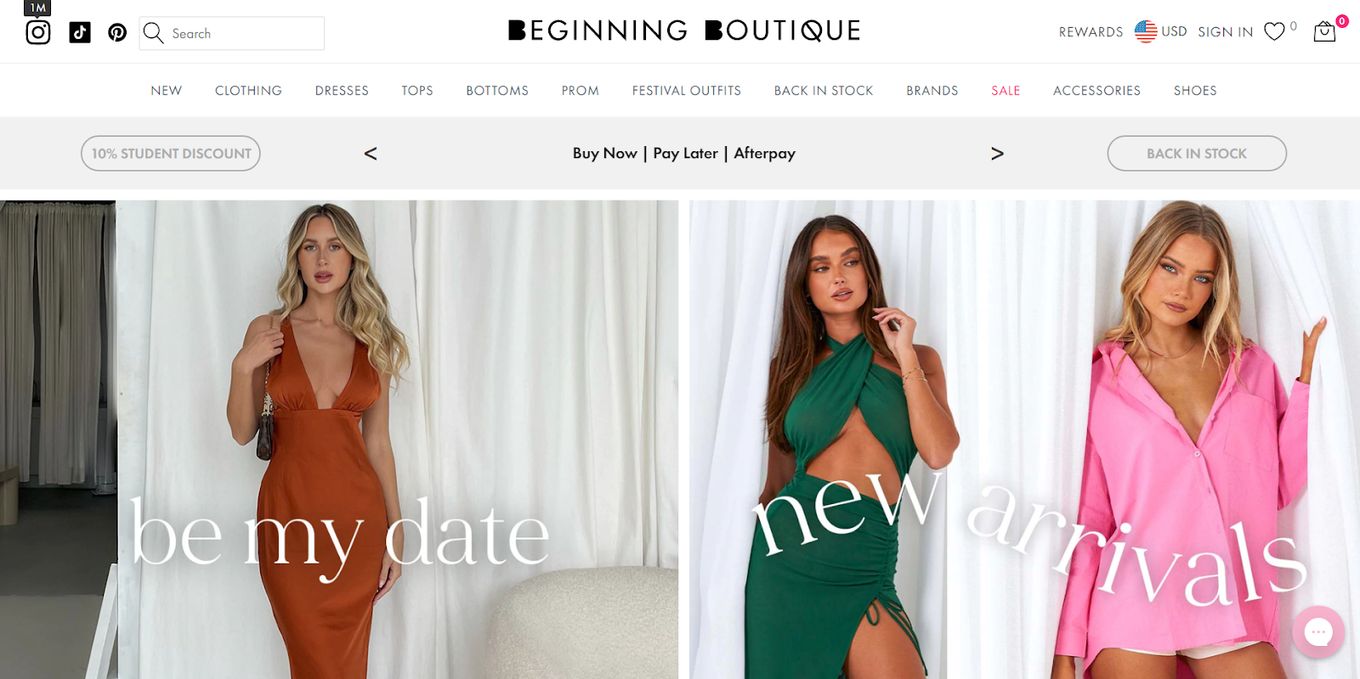
As far as Boutique website ideas go, this is pretty simple but that doesn’t mean that it’s not worth being on this list. Unlike the traditional menu bar, this website has three ribbons at the top of the page.
The topmost one has the boutique name, search bar, login, and other similar options. The middle ribbon has all the customization options so that you can search with ease. And lastly, the third option has a discount code and pay later options.
The website itself isn’t overly professional, but it does feel well constructed and that is because it is divided into sections. You can see customer favorites, new additions, and collections all on the homepage.
At the bottom of the homepage, there are pictures by different accounts who have used and bought from this website which adds a layer of authenticity to the website.
6. Lake Boutique
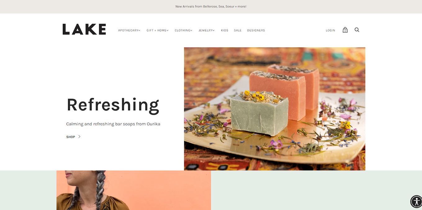
If there is one word that can be used to describe this boutique website design, it’s minimalistic. There isn’t anything too flashing on the website, and all the products also seem to be color graded to look subtle. The homepage features one long section of categories with pictures and text on the opposite sides.
The whole website design has a color scheme of peaches and bright blues, which also resonates in the products, thus bringing everything together. Navigating the website seems fairly simple because everything is already distributed into categories.
7. Shop the Boutique
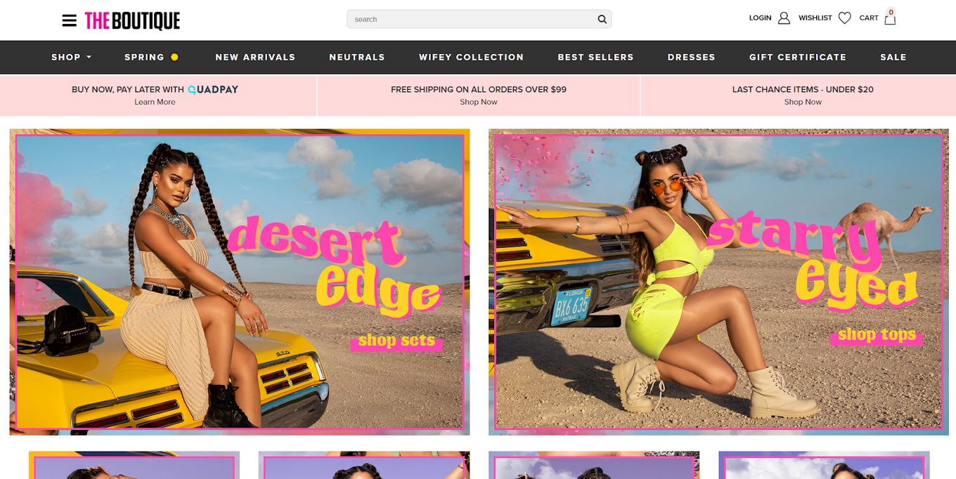
When you open this website, the colors are what instantly stand out. The whole website design is filled with bubbly and colorful text that reminds us of the ’70s and brings back that sense of nostalgia. The bright pink and yellow color scheme pulls the whole website together.
The menu bar is again divided into three, with the logo, discounts, and the categories being separate bars. But if for some reason, you got confused with all these options on the main page, the left side of the screen also has a burger menu that has the same categories inside. This boutique website idea is striking and has a magazine-like feel.
8. Hazel and Olive
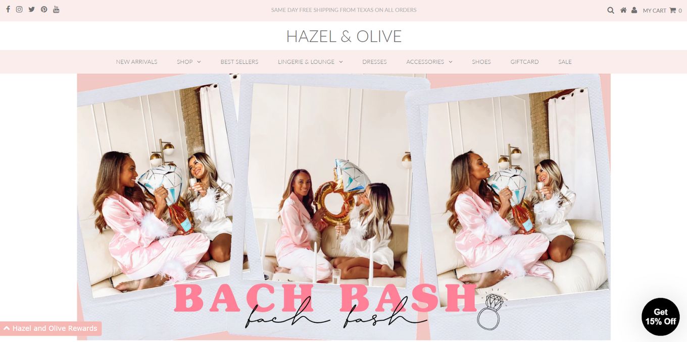
The baby pink and white color scheme gives this boutique website design a very feminine feel. The homepage features a gallery-style slideshow that changes seamlessly.
You can see new arrivals and customer favorites, as well as how many products are left in stock. There is also a section on the website that explains what the website is about section and the shipping information section, both of which are pretty unique for a clothing website.
Everything is divided into categories, and then sub-categories, so finding stuff you want to buy isn’t a difficult task. So, if you are looking for a softer and more delicate-looking boutique website design, then you can take a few ideas from here.
9. Switch Boutique
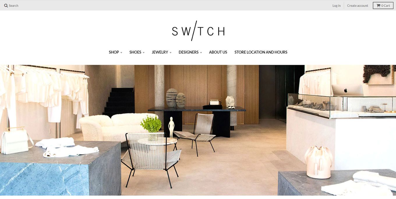
At first glance, this doesn’t seem like a boutique website because the site neither features any products nor does it has different categories. Instead, it features a photo of a home, and the text and other things that fall on the homepage glide over this picture.
You see an about us section on the home page, followed by the designers that they sell on their page. While the website design is incredibly well constructed, the problem is that there are no products on the website, and it is a boutique…
10. Re-Garb
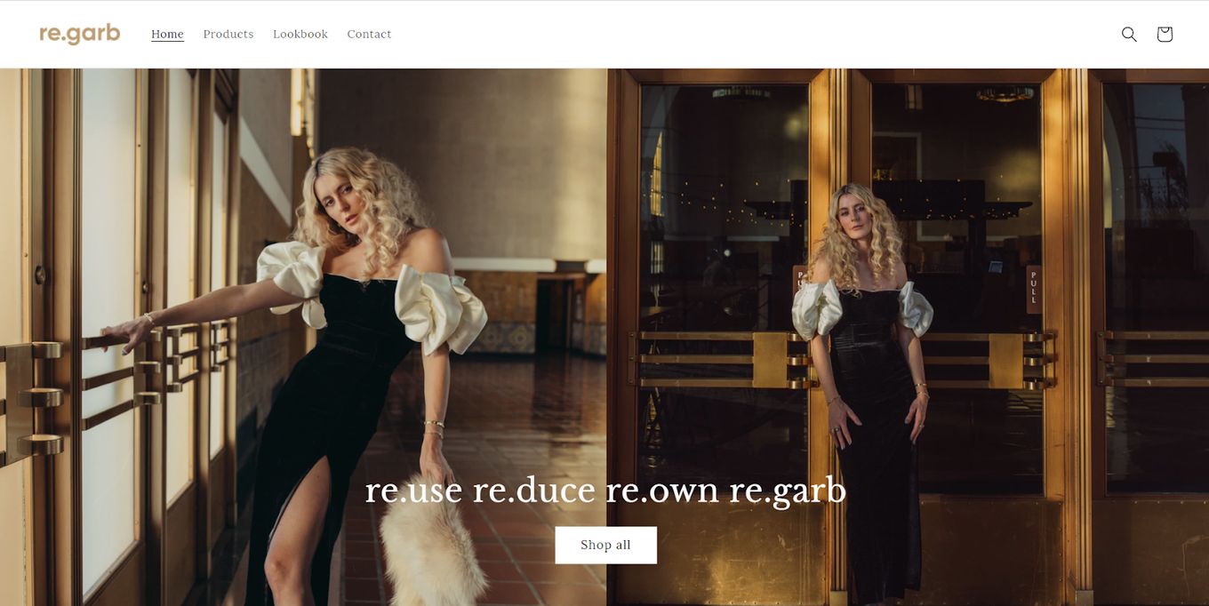
This boutique website sells refurbished, revamped, or upcycled clothing so that they can reduce waste. And the whole website design can be described in one singular word, theatrical. The extravagant gold detailing coupled with the structured font adds to that theatre aesthetic.
Related article: Beautiful Shopping Center Website Designs
You can see featured products as well as the latest arrivals, and when you put your cursor on top of any of the products, you see a couple of different pictures flashing of the same product from different angles. You can also see their mission statement and also a section called dresses with a story that details different aspects.
The rest of this boutique website design is simple, but there is one unique addition to the site, the lookbook. This lets the customers see unique ways of different styling dresses, increasing customer interaction.
What Should Be Included in a Boutique Website?
- Home. The homepage is a must on every site because it serves to capture the attention of the visitor, and if your homepage isn’t well constructed, it can make people feel as if you aren’t trustworthy.
- Featured products. People are generally curious and they what to know that they are making the right decision. Adding featured products or customer favorite sections to your website, even if it isn’t the most sold product, can help boost sales.
- New Collections. This section will help frequent buyers check out newer products on the website without having to scroll through the whole clothing section. Plus, many clients like buying in-season clothes so that they can stay up to date with fashion.
- Boutique Cart. People want the option of buying a bunch of products at the same time so that they don’t have to pay the shipping separately. So, adding a cart section on your website is a must.
- Gift Card. If your frequent customers love the clothes on your site, then they probably want their loved ones to buy from your site too. So, you can add a gift card section on your website where customers can buy gift cards or redeem gift cards.
- Search bar. While this may seem pretty obvious, you will be surprised to find out how many websites don’t have a search option. Not having one ruins the user experience and makes it much more difficult for the customers to find what they are looking for.
- About us. The about us section can make the site feel personalized and helps build customer trust. You can especially take advantage of the about us section if your website is eco-friendly or does some kind of humanitarian work. Because once people find out about it, they will be more likely to buy from you.
![15 Best Portfolio Website Builders in 2024 [Reviewed & Ranked] portfolio website builders share](https://alvarotrigo.com/blog/wp-content/uploads/2023/08/portfolio-website-builders-share-300x150.png)
![9+ Delicious Bakery Website Ideas And Examples [Get Inspired!] bakery websites share](https://alvarotrigo.com/blog/wp-content/uploads/2023/08/bakery-websites-share-300x150.png)
![9+ Beautiful Lash Websites Ideas [Get inspiration] lash website ideas share](https://alvarotrigo.com/blog/wp-content/uploads/2023/08/lash-website-ideas-share-300x150.png)
![9+ Amazing Massage Websites You'll Love [Ideas & inspiration] massage websites share](https://alvarotrigo.com/blog/wp-content/uploads/2023/08/massage-websites-share-300x150.png)
![15 Beautiful Hair Salon Websites [Ideas & Inspiration] hair salon websites share](https://alvarotrigo.com/blog/wp-content/uploads/2023/08/hair-salon-websites-share-300x150.png)
