The move of our world online has life both easy and efficient, but when you are selling or buying something online, you have to place a lot of trust in the pictures and website that represent the brand and what they sell.
If you are a seller, you have to curate your website in such a way that you make a strong first impression on your audience, especially if you are designing a shopping center website.
The most important part of designing the best shopping center website is curating an experience for your user. It is the first thing they see, the only thing they will remember, and the one thing that will ensure the success of your business.
This is why, when you start a shopping mall website design, it is important to pay attention to the specifics of the website design and learn from your predecessors what works.
What is a Shopping Centre Website Design?
A shopping center website design is the design of an online store with the purpose to sell commodities to its customers. It is an efficient way to bring more customers to your brand and make a name for yourself in the business world.
A good website design for a shopping center needs a concrete plan, a conception of the website, and good quality content to drive the audience to their products on the internet and in stores.
It gives the brand a chance to double its sales by displaying each commodity clearly and aesthetically on its website.
Therefore, if you are a business person looking for inspiration to create a beautiful, and attractive website for your shopping mall, here are some of the best mall website designs to choose from!
7+ Shopping Mall Website Designs for your Business
Mentioned below are some of the most exciting, beautiful, and functional website designs for you to get inspired from for your eCommerce website:
1. Tortuga’s Open
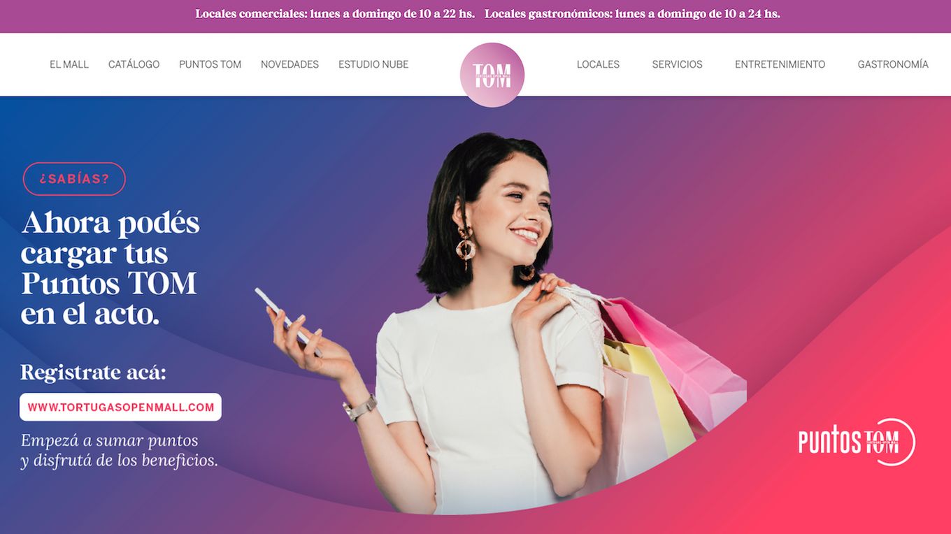
One of the things to keep in mind while designing a shopping mall website is that people will look at the photos and determine the worth through those alone.
For this reason, the photography, lighting, and curation of these photographs must be done in a beautiful, clean, and professional manner.
This Ecommerce website for Tortuga Open mall is one of the best shopping center website designs. ****The high-quality photos on TOM prove that a website that sells commodities must have beautiful, aesthetic, and composed photographs.
While the photograph dominates the main page, the bold text stands out against the aesthetic photos, and overall, the composition looks beautiful, balanced, and attractive. There are many things to be learned from this website design, and the more you look, the better you will understand.
2. The Village Bacchus Marsh
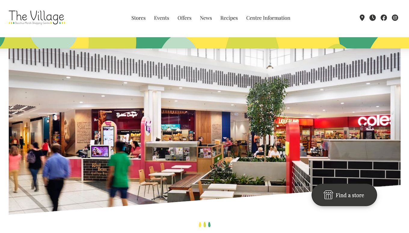
The best thing to look at in this website design is how easily the information is being conveyed to the audience/client/user.
Everything is laid out on the home page, which makes the shopping experience even better for the masses.
The visitors of this website can easily move between different shops based on different categories like latest arrivals, occasions, brands, grocery, or on-sale items.
3. Capitua Shopping Center Website Design
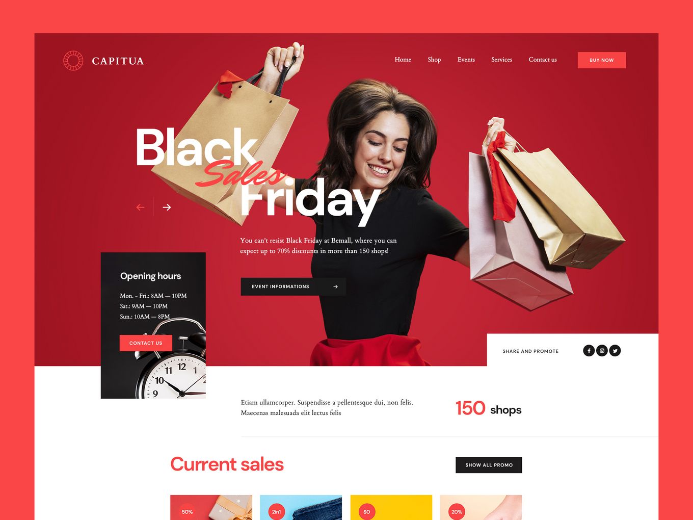
One thing you can never go wrong with while designing a shopping center website is good photos and bold colors. If your brand/shopping center has a logo or a theme, design the website around that theme for cohesiveness and balance.
In this website design for Capitua mall, the web designer has focused on the colors of the mall logo and used them to their advantage.
The main photo depicting the Black Friday sale has been placed in red so the user’s gaze is automatically directed towards it.
This makes the website user-friendly, attractive, and with more pictures than words, which is always a plus when dealing with such websites.
4. Park Meadows
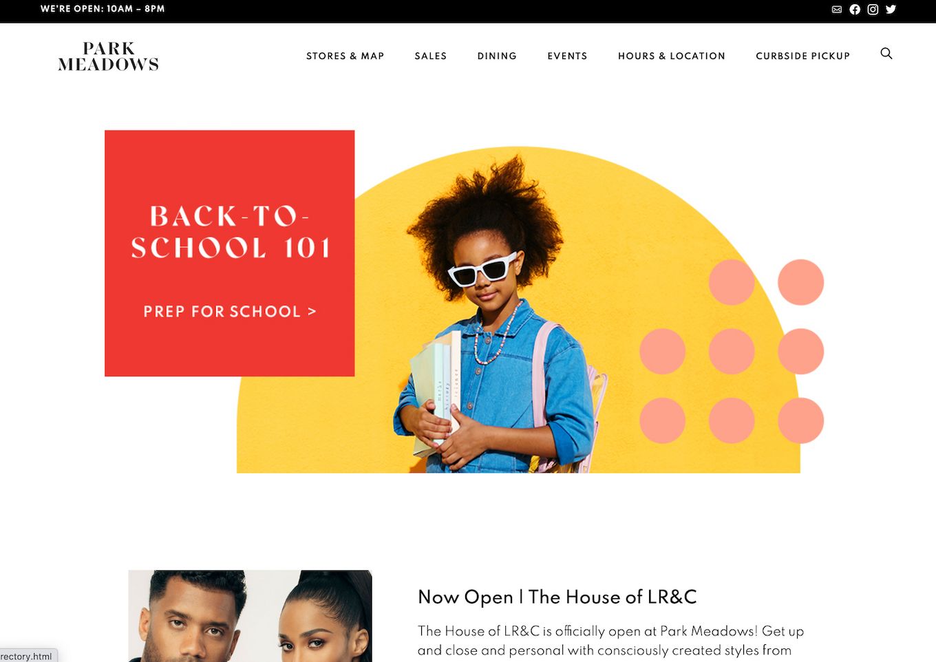
Many things can make a website interesting and attractive, and one of those things is a fun design. All of the colorful squiggles and patterns on the website’s home page draw your eyes in different directions, forcing you to take in the entire page of the website.
Moreover, the good quality focus of the products is also something this website does beautifully.
Everything is laid out on the website for the customers, visitors, or potential clients.
There is a detailed description of the site, parking, and other necessary things without having to ask for it. All these things on one page make a great impression on a first-time visitor without using many words!
5. Tyson’s Corner Centre Website Design
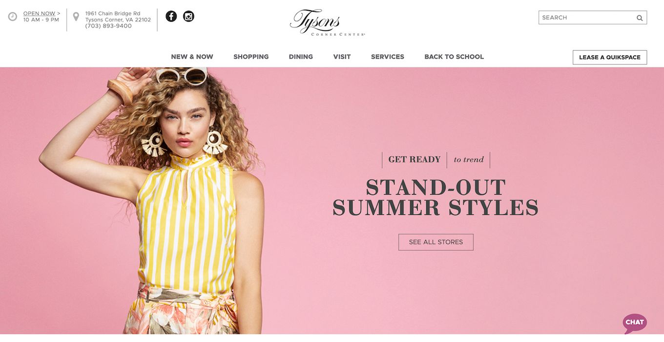
There are multiple kinds of shopping experiences, and one of the best experiences is online shopping. But this experience can only be created when the website design is user-friendly, charming, and straightforward. A bold color, catchy phrase, and bold font is a good start for the top of the web page.
Color psychology can be used to attract the right kind of customers to your shopping mall website.
For example, beauty, shopping, and clothing for women are generally associated with poppy colors like pink, orange, and blue. Whereas yellow is used to create joy, red is used as an intriguing color and pastel for natural products.
This website design teaches us that the most important messages for the visitors of the website are placed at the top to make communication easy.
Every detail about shipping, sales, and free stuff must be placed at the forefront so that the visitors are intrigued to look through your products.
6. The Grove LA
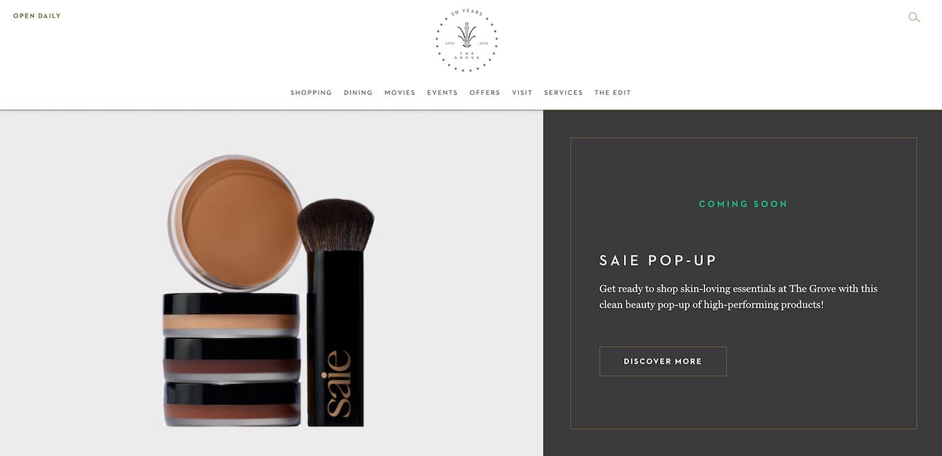
This website design is proof that you don’t have to be over-the-top with the website design to make it look appealing or attractive.
All you need for a great website design is a good basic font that goes with your brand logo, nicely curated photographs that show the aesthetic of the brand, and easy navigation of products.
The beauty of this website is in its simplicity: the beautiful photograph gives enough character to the website page that the rest of the website must be kept comparatively plain in complement. This is the perfect balance of aesthetic and tasteful website design.
7. The Mall at Millenia
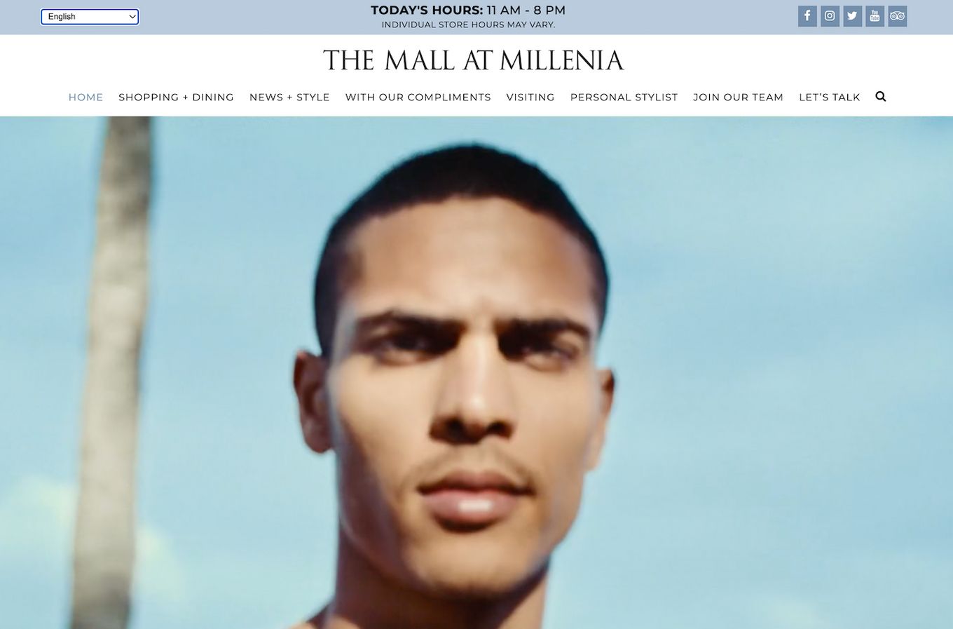
The one thing I like best about the website design of The mall of Millenia is its lightness and playfulness.
The video on the main website page is intriguing, captivating, and modern. It makes you want to keep looking to catch a glimpse of the beautiful model, cinematography, and scenic routes.
The warm color of the photography backgrounds takes most of the home page and brings playful attributes to the website. Further down the page, the easy navigation and fun, neutral photography are what make this website attractive to the normal user.
8. Aventura Mall
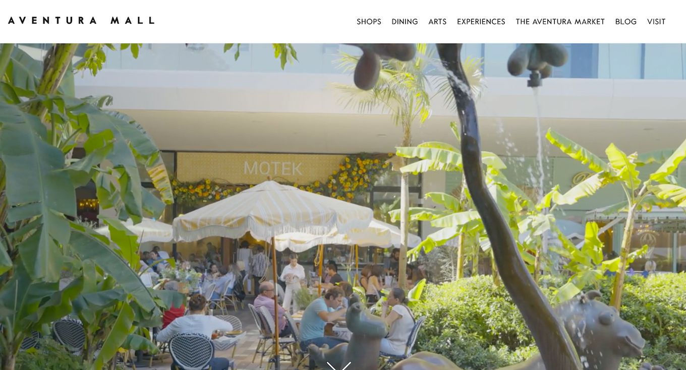
The website design for Aventura Mall is done so well that as soon as you visit the site, the subtle colors and the strategic photographs give off a ‘pure’ and simple vibe. This website is proof that a website design does not have to be dramatic for it to be impactful or beautiful.
It is okay to start with a simple website as long as it is as easy to navigate as this website. It is only an added benefit that the website displays the ideology and intent behind the brand, which makes the website design not only visually beautiful but also makes the customer happy to make a purchase.
Components of The Best Shopping Center Website Design For Success
All of these websites are great for website design inspiration if you are a brand, designer, or marketing manager of a shopping center. These websites all tell you that simplicity, and minimalism is the key to a great website design.
But since all the websites are different from one another, how do you use the best website design to follow for your shopping mall?
- Simple user interface. The user should be confused as to where to click and how to buy your product.
- Work on every kind of screen. Especially mobile phones, because most people tend to use their phones for quick online shopping.
- Be user-friendly. Make the user comfortable so that it’s not a task to open and order from your website.
- Load faster than other web pages. This will help retain the interest of the customer.
- An attractive appearance. The reason is that the better the visual is, the longer people would want to stay and peruse.
- Easy-to-access information. Especially about sales or discounts so that people are tempted to purchase from your website.
- More pictures than words. There is a simple reason for this: the brain intercepts visuals faster than text.
- Secure payment procedures. People should not be scared to enter their personal details and put their trust in your website.
- Social media buttons. They make it easier for your clients to find you and keep themselves updated through social media.
If you follow these steps, your website design will automatically be a hit with customers and then you can continue to tweak things until you find a design that you love.


