Lash businesses have dramatically grown over the last few years, particularly with the invention of lash extensions, lash curling, and lash tinting treatments. But just as the number of businesses offering these services has increased, so has the number of websites.
A website nowadays doesn’t just have to look pretty; it must also have a robust and easy-to-navigate user interference. If you want your website to stand out amongst these already established lash business websites, you must do your research and come up with a few ideas so that you can create the perfect lash website.
To help you along this journey, here is a list of 10 lash business websites and ideas from which you can take inspiration.
1. House of Lashes
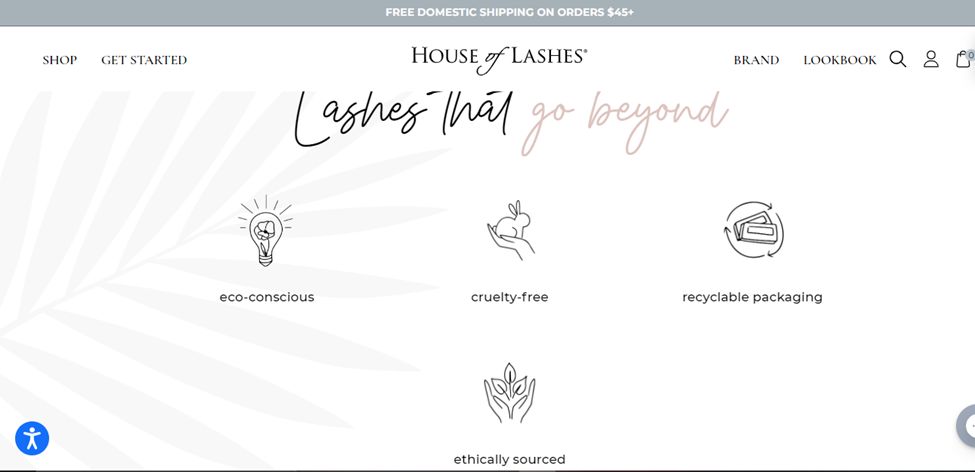
This lash business website certainly gives you a few ideas that you can incorporate into your own website. The sliding display on the homepage, coupled with a snappy user interference and pastel colors, really gives this website an extremely unique appeal.
This sliding display is called “hero slider” design. If you like it, we recommend that you check these amazing hero slider designs.
There are quite a few things that this website does right, one of them being the incorporation of cursive writing. As you scroll down, you see illustrations of the brand’s ethical practices. And if you scroll down further, you will not only see the best sellers but also another set of illustrations. These illustrations help you find lashes for specific occasions and settings.
This section is definitely a very unique feature, and more websites should incorporate it. Aside from that, navigating this website is pretty simple since there are only a couple of options on the menu bar.
2. Envious Lash
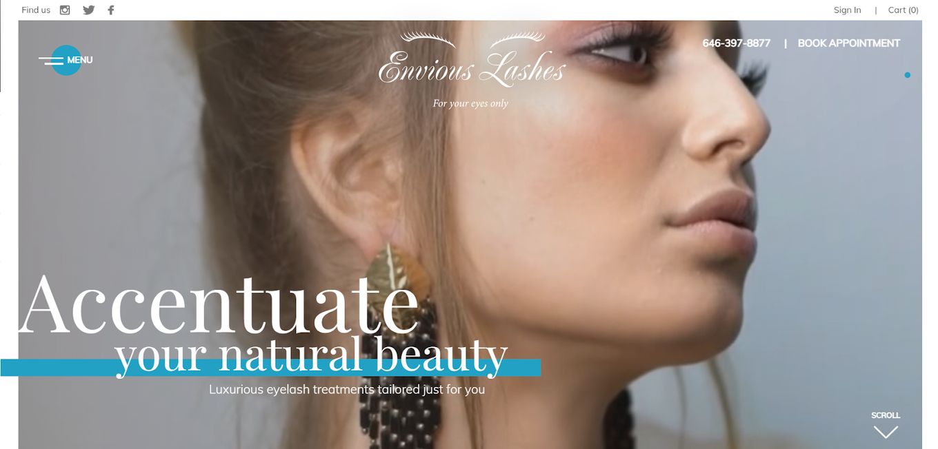
Unlike other lash websites that feature a gallery menu, this lash website uses a background video to capture the attention of the customers. Instead of having stagnant images and text, the whole website is highly responsive, and things come into view as you scroll down.
Did you know you can easily copy this background video effect? Learn how to do it in this article that explains how to create a YouTube video background with just CSS.
Not only does the whole website look incredibly professional and aesthetically pleasing, but it is also super simple to navigate. The blue and gold color scheme only serves to add more personality to the website.
The website is definitely worth a visit, so do stop by to get some unique ideas to add to your own lash website.
3. Lashbase
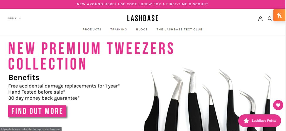
When you first open this site, the one thing that instantly stands out is the combination of hot pink, black, and white used to create the homepage. Instead of being a gallery style, the picture display feels more like a slideshow, with the pictures seamlessly fading in and out on one another.
As you scroll down, you see a little bit about their website and what they do. And below that, there are a couple of picture links that outline different products and take you to them. Below that is recent news, and finally, there’s a new section.
The best thing about this website is the fact that their products are also boxes in hot pink, black and white boxes which ties in very well with the whole website. Also, this might be one of the only websites that have a blog section, which could come in handy while doing digital marketing. All in all, this lash website can give you quite a few ideas you can utilize.
4. The Lash Loft
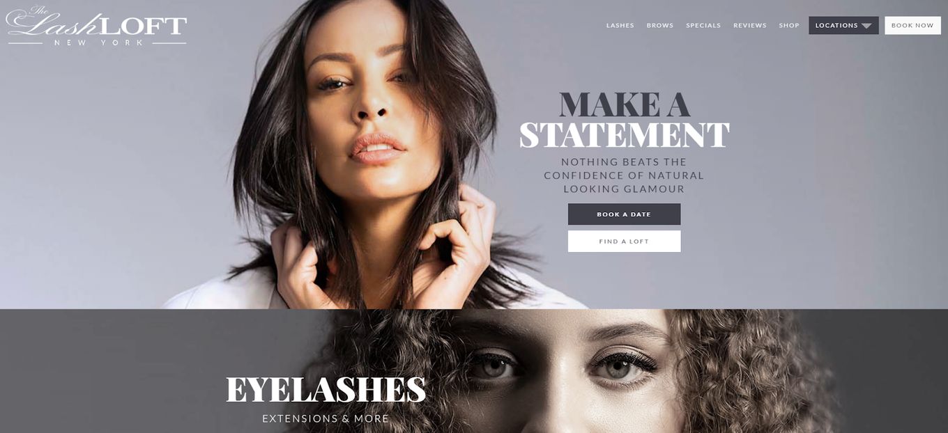
The construction of this website is pretty unique because not only does it feature a gallery style homepage, but as you scroll down, you see different images that almost look like they should also be a gallery. But surprisingly, they aren’t, despite being virtually constructed the same as the gallery homepage.
Another interesting thing about the website is that at first glance, the whole website looks like it’s black and white, but as you scroll down, the pictures that are at the center of the screen start to fill with color.
There are very limited colors on the homepage, which adds to the minimalistic beauty of the website. Truly a good website to take some inspiration from.
5. Velour
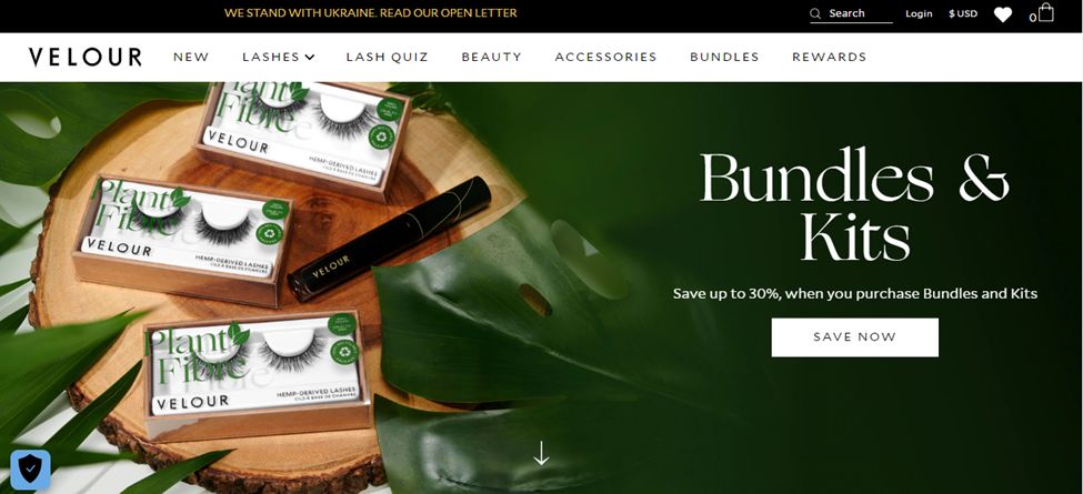
There are a very limited number of websites that look as professional and polished as this one. Instead of bombarding you with bright colors or no color at all, this website utilizes a soft natural green color. Perhaps that’s a nod to their green beliefs, but no one can deny that it is calming and gives the website a unique appeal.
Related article: Best Wellness Websites For Inspiration
The interference is simple, easy to navigate, and takes you exactly where you want to go. As you scroll, you are taken to their best seller page, and finally, at the end of the page, there are a few illustrated icons that outline what they stand for. This is a very unique addition and ups the appeal of the whole page instantly.
If you want a few ideas for your own lash website, then you should definitely get some inspiration from here.
6. Lash Dreamer Lounge
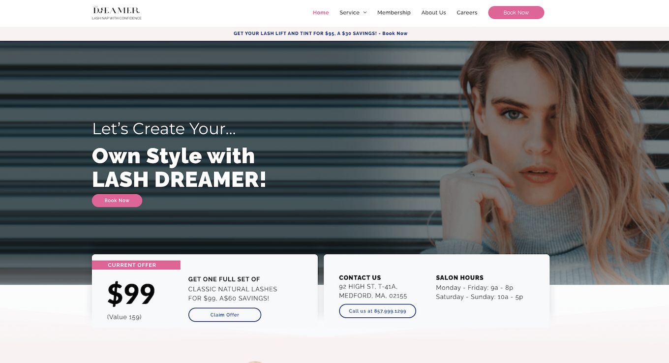
There are some amazing features this lash website has that can definitely give you a few ideas for your website. from the pastel pink colors to the picture on the homepage that stays in the same place while the test boxes move around; this website holds a lot of appeals.
All their services are outlined in rectangular boxes that fade into the background, giving this website a professional look. And ‘why clients choose us’ section is another unique addition to the homepage and adds a lot of character.
7. Extensions By Lindy
Aside from the sliding gallery display, the rest of the website keeps a simple design. However, there is one thing that instantly stands out about this website, and that is the amazing sea green and white theme the website follows. The best part is that the colors tie in with some of their products and create an incredibly appealing website.
Check these 12 Slider Website Designs that may also inspire you to create a sliding display on your lash website.
As you go down, you end up at a few clickable picture tabs that take you to specific parts of the website. Aside from that, the website seems pretty simple.
8. BL Lashes
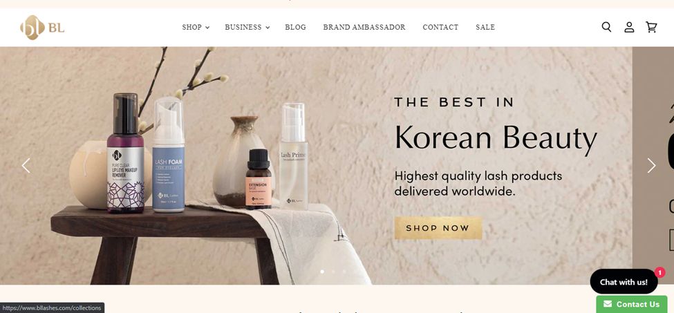
The overall aesthetics of the website are incredible because it looks professional and clean. The sliding display on the homepage lags a lot, but aside from that, the rest of the website seems to function fine.
As you go down, you see clickable pictures that take you to different product pages. The picture themselves tie in with the color scheme of the whole website, which is soft, warm neutrals.
Aside from that, the website doesn’t seem complicated or complex, which is great for new users. All in all, you can definitely pick up a few lash website ideas from this site.
9. Dr. Lash
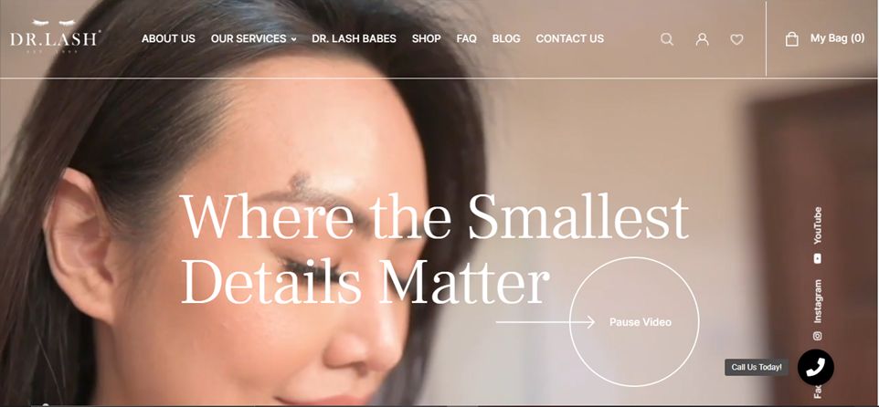
Diverging from the traditional gallery style website that is particularly popular for lash websites, this website also opens with a very high definition and expertly shot video. The great thing about the site is that the text placed on top of the video only serves to add value to the site and doesn’t take away from the aesthetics.
Again, the website is highly responsive, and things slide into place as you scroll down to look at different aspects of the homepage. The menu bar is also fairly simple and well laid out. Aside from the occasional pops of color, the website only utilizes natural tones, which makes it seem more authentic than other websites.
10. Ooh’lah Lash Website Idea
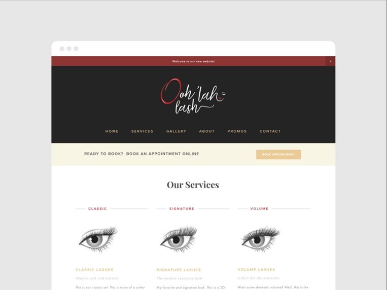
This lash website idea isn’t an actual website but rather an example of what a lash website could potentially look like. The simple, clean and minimalistic website, paired with a red, black, and white color scheme, adds a lot of depth to the website.
On their service page, there is not only a description of the products but also an illustration of what different eyelashes look like on the eye. This serves as a great guide for people looking to get lashes.
What Should I Post on My Lash Page?
- Homepage. This is the landing page of almost all websites which means the majority of your customers will either continue or leave after seeing this page. So, this page is an essential part of any website, and your website must have one too.
- Lash details. While the details of the lashes you add to your website will change depending on whether you are selling lash extension services or selling false lashes, you should still provide a decent amount of information.
- Book an appointment. If you are selling lash services, you might want to add an option so that customers can easily look at the empty slots and book an appointment. This will save you the hassle of scheduling the appointments.
- Cart. If you are selling false lashes, then you obviously want to include a cart option so people can buy everything in one go.
- Ethical beliefs. If your packaging is recycled or vegan and cruelty-free, it might be a great idea to mention that on your website.


