There are so many companies in today’s world, and it is an ever-growing goal to have a glowing online presence – the benefits of social media and SEO marketing are just too promising to ignore if you run a business.
Each company wants its website to be unique and convey a powerful message about its brand, and that is where StoryBranding comes in. A marketing technique that gives you a framework to follow when structuring and styling your main website to make a StoryBrand website.

The reason StoryBranding is so important is that every company is competing for clients or users. They want their website to be fun and impressive and StoryBranding websites help simplify the experience for the user and improve conversion rates.
In this article, we will understand what StoryBranding is all about and look at some inspiring StoryBrand website examples.
What Is A StoryBrand Website?
A StoryBrand website is a website that uses a story to effectively connect with the audience and market a product or a service. It tends to use the main formula of any good story (characters, emotions, problem, guide, plan, solution) as a way to show visitors why they need the product.
“StoryBrand” is a methodology or a framework explained by Donald Miller’s in his best-selling book “Building a StoryBrand”.
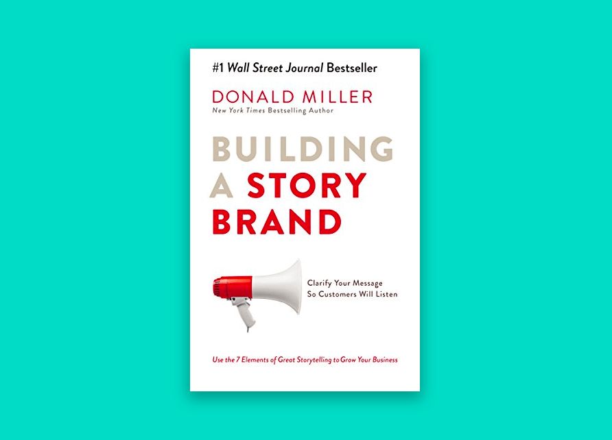
This methodology has been widely adopted by many brands all around the world and has been used way before someone put a name to it. It’s a great way to communicate the value proposition of a business and a very natural way to connect with potential customers.
If you are considering using a template, check out our list of the best storybrand templates.
15 Inspiring StoryBrand Website Examples
StoryBranding is all about getting the message across to your clients as quickly as possible, without any confusion. In these StoryBrand website examples, you will be able to see real-world usage and how other companies have pulled off an amazing StoryBranding design.
1. Paradouwines
The first on our list is a Wine brand. The website tells us the story of the founders, how they decided to work with wines, their relationships with them, and what makes it different from others.
The website makes use of the storybrand framework to really get into details about the main characters of this story and, although this story won’t have a problem, it really touches the emotional aspect of it getting us closer to the brand by focusing on the characters of the story.
The full-screen effect is just perfect for this storybrand website, it provides a very simple navigation so we can focus entirely on the story, while at the same time, adding an original touch to it and putting special emphasis on the chronological order with its horizontal scrolling effect.
Their website makes use of fullPage.js, a JavaScript component also available for WordPress builders like Gutenberg, Divi, and Elementor
2. Dunshire Productions
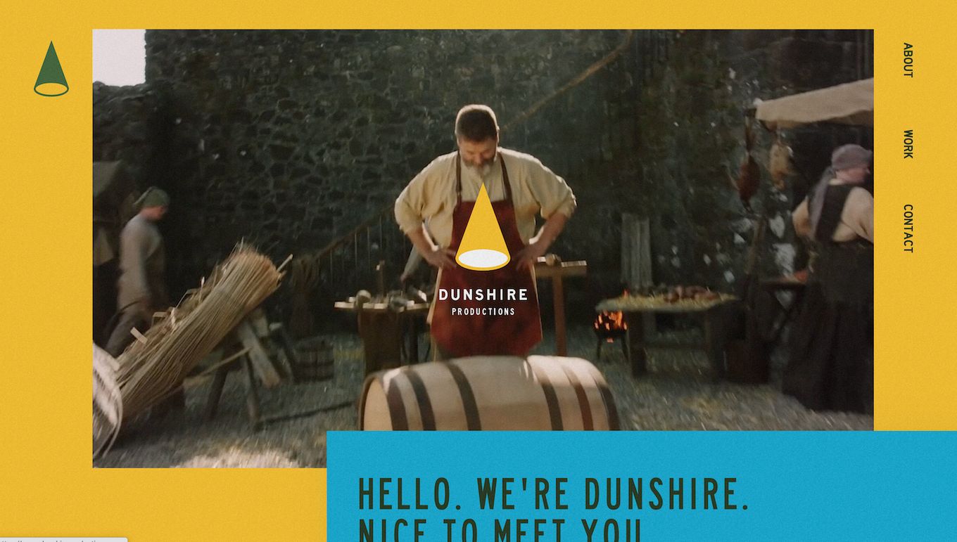
This website uses traditional storybranding techniques to grab the user’s attention and quickly explain what they do and what the visitor can expect.
It explains to us in a very friendly way, who they are, their values, what they do, and how they do it. It’s kind of a solo narrative that explains to us what they do as if we were their friend.
They make use of fun and colloquial language and they mix it with fun videos and bright colors to tell us how they are and try to get closer to their ideal customer persona.
3. BetterUp
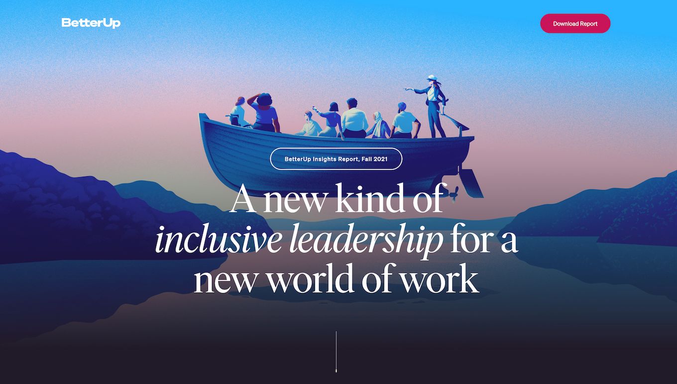
BetterUp is a company that focuses on improving individual resilience, adaptability, and effectiveness to create a better workspace within companies.
On this website, they make great use of the story branding framework to showcase the main problems people face at many organizations and as a result, the issues organizations struggle with.
They make use of graphics, animations, charts, and small texts to guide the visitor through the website.
It’s a great example of the problem + solution framework used in story branding. First, the visitor gets the problem explained in detail, and later on, they get introduced to what can be the solution for them.
4. BetaKids
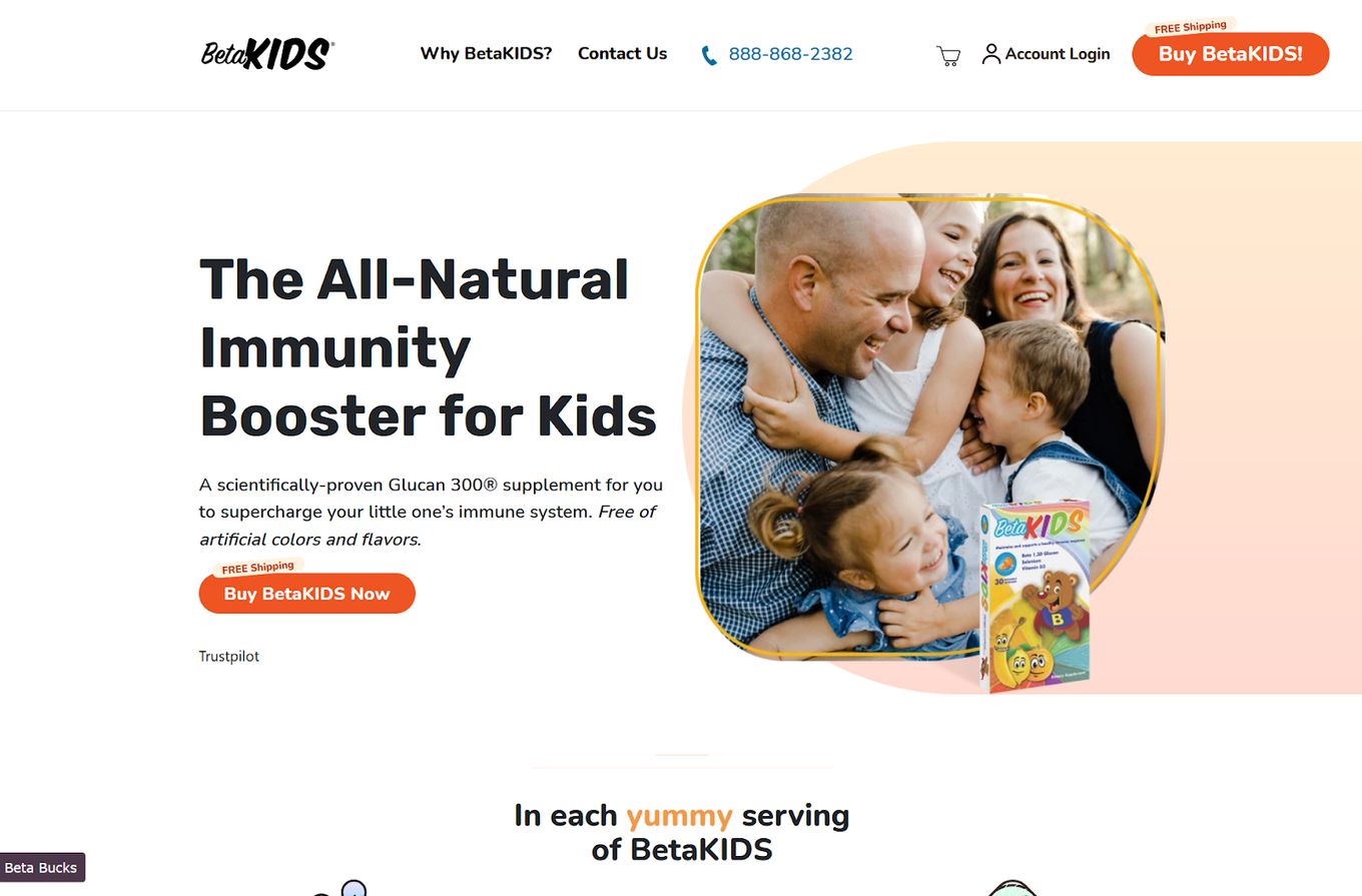
The left side is all text and the right side is an engaging image with some nice graphical touches to make it seem more interesting and less sharp on the edges.
The clever split between left and right helps present information and link the text to the image, creating a StoryBrand website design. These are the great ideas we can get from looking at these StoryBrand website examples.
5. Dana Rayburn

This design checks a lot of boxes for StoryBranding features, number one is the famous title, explaining in a short sentence what the company does and who it is for. The second title is emphasized to make the target audience feel welcomed and important, they know it is for them.
With StoryBranding it is essential to tell a story and create a story-driven design, sharing a significant message with your audience about why they should use your fantastic company.
The simple yet effective section with the tick marks helps explain the service even more, and we can tell without confusion this is what is supported.
6. Amory Realty
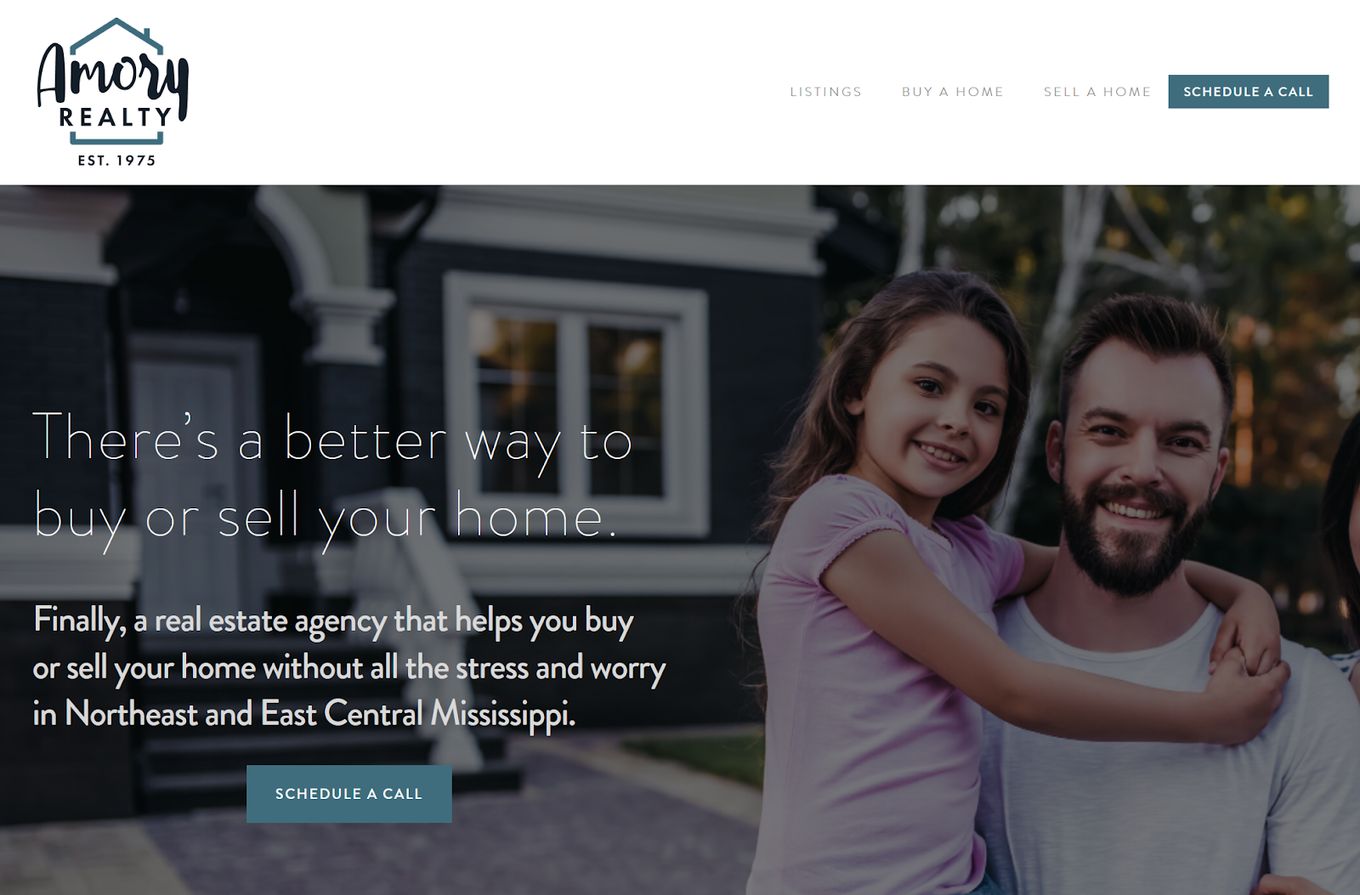
A massive full-scale image to link the text to the user and the house in the background, the main title and sub-text, explain in a compelling way what services are offered.
The navigation bar is purely just the services offered and how to quickly get in contact, effective and simple to use, with just the essential links.
A clear CTA button to help get the user to schedule a call and discuss further.
7. Fluro Automation
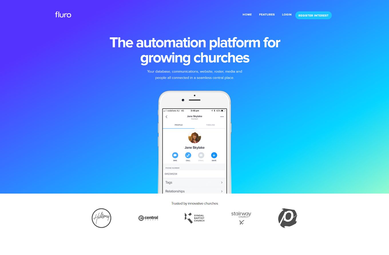
This company literally just says what they do in their first title, there is no confusion, and we can see they work with mobile devices without having to guess. A key feature of a StoryBrand website.
We can read the hero section and get to grips with what the site is about, any confusion is eradicated with this simple design and its clear message. Without complicated header navigation, all the focus is in the middle.
8. Vanbrugh Physio
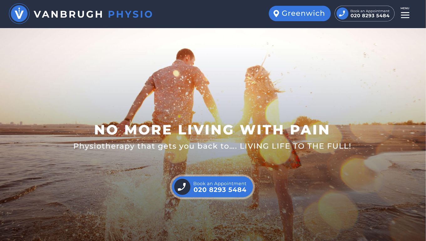
The image in this StoryBrand website focuses on movement, linking to the company and what they can provide someone in need of the treatment they offer. A key feature of a StoryBrand website design.
The user is probably going to want to quickly understand the service and hop on a call, so the easy-to-access CTA is right in the middle after the initial text, which helps introduce them first.
The “LIVING LIFE TO THE FULL” is a powerful message and gives the impression that is what they provide.
Interested in how other medical websites look? We have created some amazing website designs that medical web pages use, check them out.
9. Colorado Youth Sports Foundation
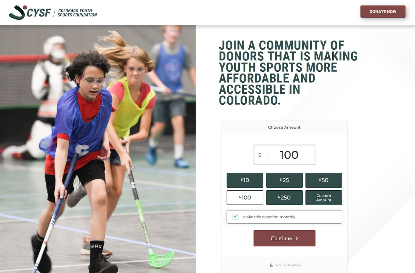
A more interactive StoryBrand website now, from this one the user can easily tell by the name and the powerful image with what they do.
The interactive element with the donation area shows us they are a non-profit foundation, just like in the name. This hero section uses a left-to-right split structure to help make sections easier to understand and feel less cluttered.
10. TCHEM Services
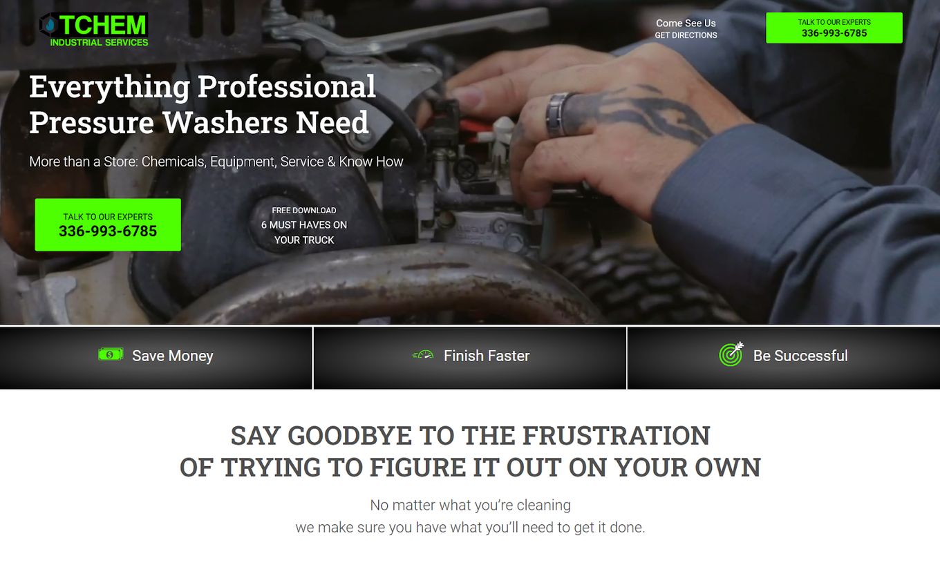
Just like large images, a video can also be a fantastic choice for a StoryBrand website and in this example, it helps engage with the user, along with simple text to let the user know what the company does further.
In this StoryBrand website, the video does most of the speaking as it switches through all the different services that are offered. But the user quickly gets access to contact information and a string of 3 major keywords in highlighted boxes.
11. Fysio Affiliates
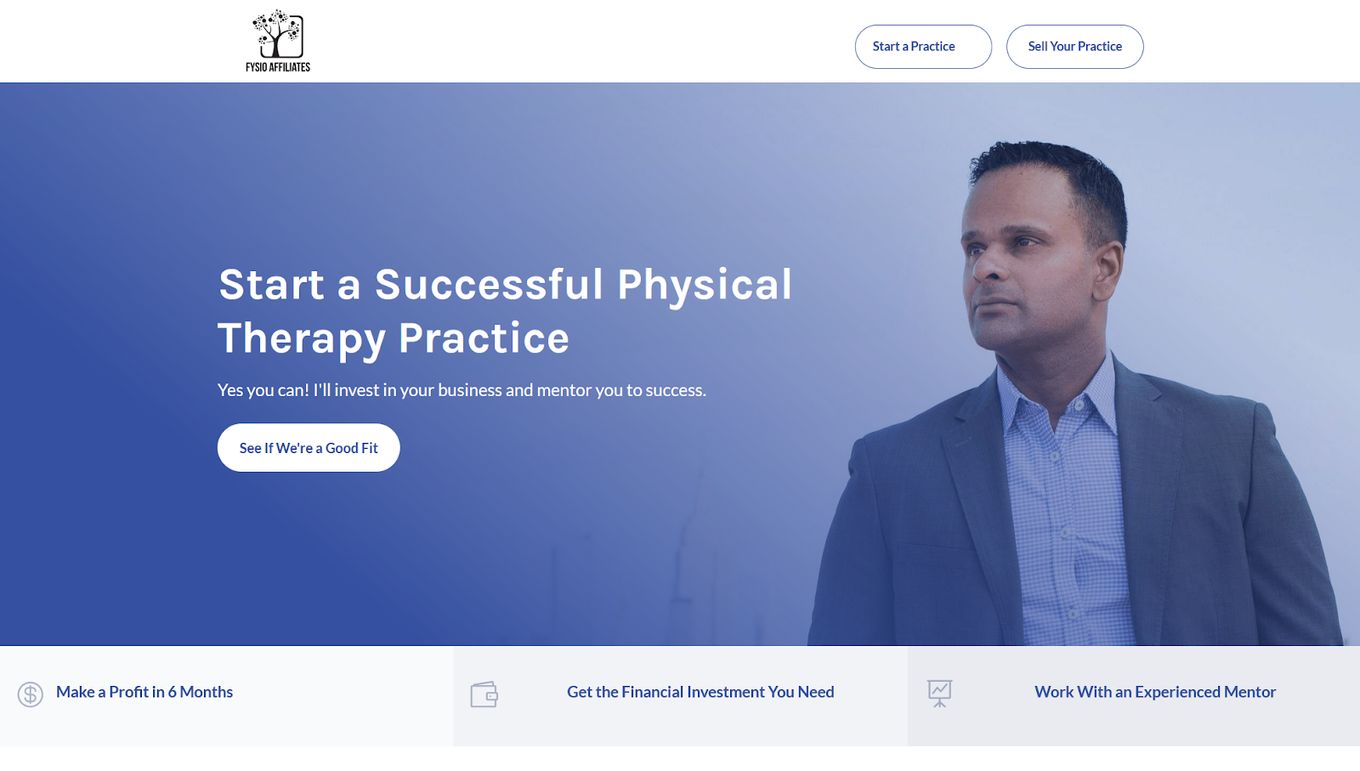
This design starts off with a very simple hero section, we have a large image of the person who we may work with, clear CTA text, and a button to help the viewer understand what is going on.
The big title text is such a clear way of letting the visitor know what you do, subtitle text can be used to further elaborate, but as you can see, just one small sentence is enough to be powerful here.
StoryBranding is all about clear messages and text copy, the 3 evenly spread sections at the bottom help highlight 3 major key points a user might need to know, this is a great StoryBranding design with icons to help engage the user.
12. High Voltage Coaching
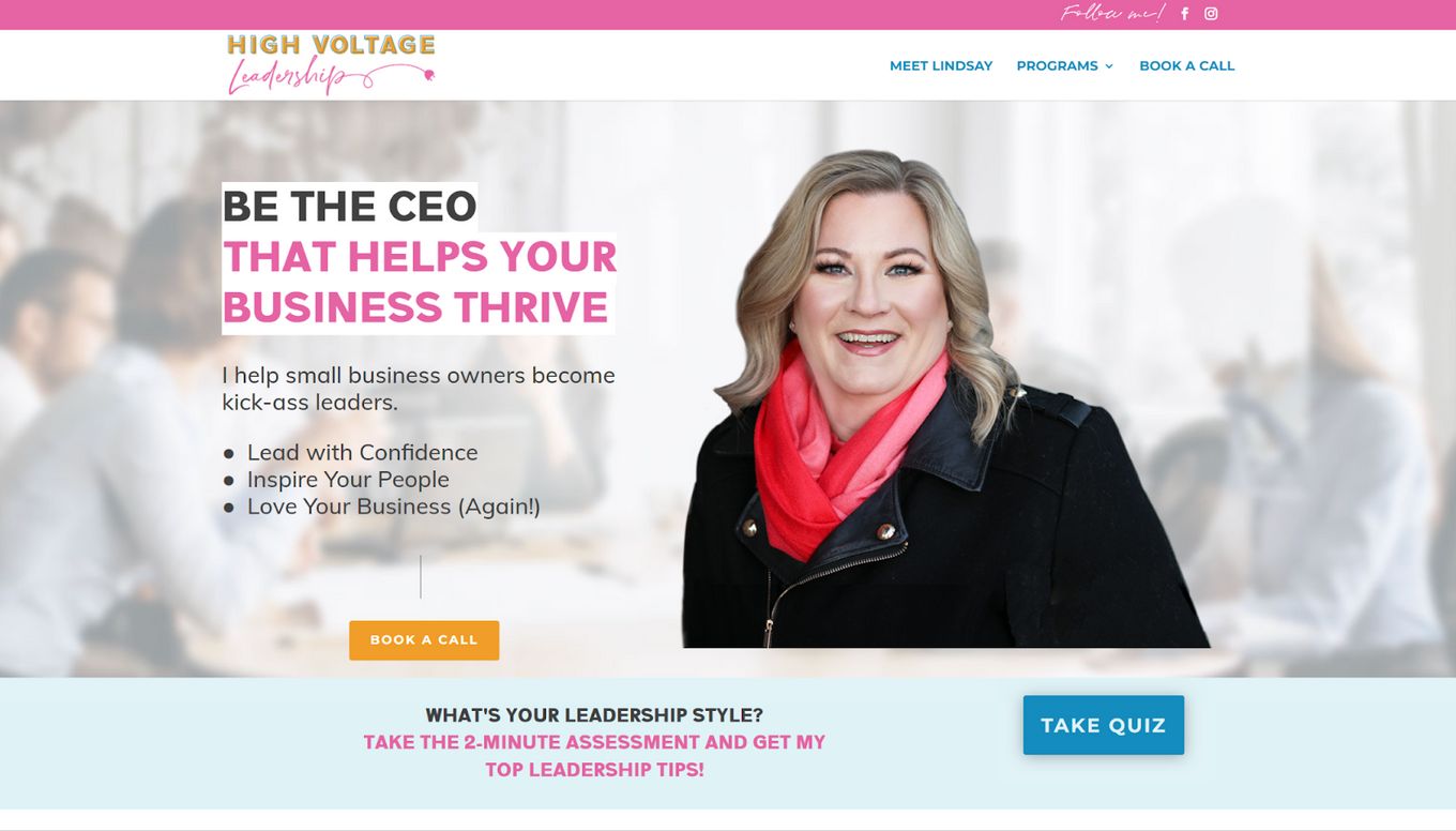
You may have noticed that a lot of StoryBranding designs will use an image of the person who runs the company, this is great because it adds a personal touch and makes it feel like they are talking with you.
And this is what this design does so well, we have the large title that quickly tells us what they do, check, then we have a few key points to help us understand further the services that are offered. Simple!
This is why minimalist designs and themes are so great at StoryBranding, they give you the look and feel you need to keep sections simple, so it does not look confusing or complex to the user.
13. Shultz Photo School
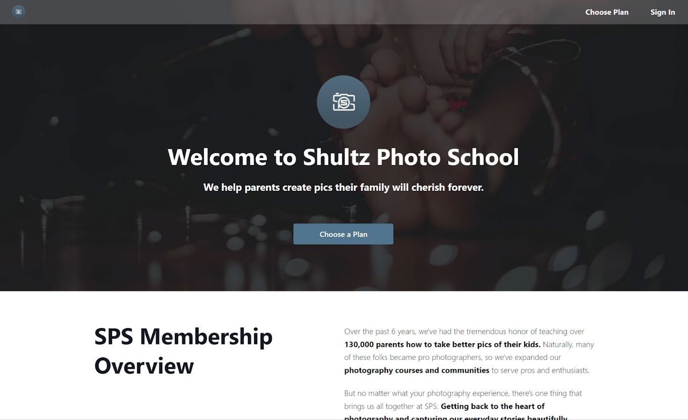
A clear title and message about what the photography company does and where their focus is, only needing a few words. Really great for a photography portfolio design, simple, clean, and effective.
The interactive “Choose a Plan” CTA button is great because it takes the user directly to the services, no marketing fluff, the user has quick access to the items being sold.
Bold text which highlights keywords and points of interest help the reader quickly jump to different sections they may be keener on. The design is simple and easy to follow, does not feel complicated, and has no clutter.
14. The Restore Network
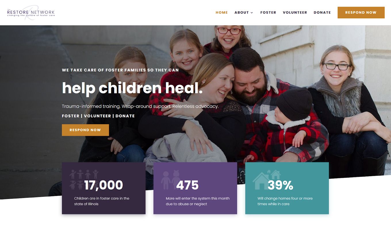
A powerful image linking to the direct cause of the foundation’s work and what it results in.
The main title doesn’t even start with a capital letter, giving the impression of how vital it is, their service just explains in a few words what they do and why it is important, conveying that all-important StoryBrand website message.
The key statistics are presented in an easy format with different colors and simple text, helping the user to understand the importance of the service.
15. Jaxakvoda

Guiding the user through the story of their branded water, it uses animation, parallax effects and full screen scrolling.
The whole experience is very immersive and makes fantastic use of the whole screen. Past each screen, the main line down the middle acts as a timeline and takes the user through a journey and story of their water and why it is different.
How Do I create a StoryBrand Website?
Let’s go over some key points to create a good StoryBrand website:
- Keep your design simple. Creativity can be confusing. It is better to keep your design simple and text clear, you need to help the user understand as quickly as possible, what your brand does
- Use simple words. Long or complicated word choices will put users off, it makes your copy text difficult to understand and hard to grasp quickly
- Don’t clutter your design. Go for minimal structure and a minimalistic design, this will help focus the user in the right areas
- Focus on your words, not the design. Help the user understand your product or service with just a few simple keywords instead of a fancy design
- It is all about the message. You can’t just tell the user what problem your company solves, you need to tell them how you are going to solve it and how amazing your product/service is.
Our StoryBrand website examples have shown a lot of these characteristics. By now, you should have an idea of what makes an amazing StoryBrand website design.
![Storybrand Website Template [Top 10] storybrand website template share](https://alvarotrigo.com/blog/wp-content/uploads/2023/08/storybrand-website-template-share-300x150.png)
![30+ Best Church Website Templates [WordPress & HTML] church website templates share](https://alvarotrigo.com/blog/wp-content/uploads/2023/08/church-website-templates-share-300x150.png)
![15 Best Portfolio Website Builders in 2024 [Reviewed & Ranked] portfolio website builders share](https://alvarotrigo.com/blog/wp-content/uploads/2023/08/portfolio-website-builders-share-300x150.png)
![9+ Best Contact Pages To Get Inspired [+ 15 Free Contact Forms] contact page examples share](https://alvarotrigo.com/blog/wp-content/uploads/2023/08/contact-page-examples-share-300x150.png)
![21 Top Examples of Digital Storytelling [Make Powerful Stories] examples digital storytelling share](https://alvarotrigo.com/blog/wp-content/uploads/2023/08/examples-digital-storytelling-share-300x150.png)