With the growth of online businesses in recent years, B2B eCommerce websites have become increasingly popular. However, to survive as an eCommerce business, having a website is not enough; you’ll need to have a great B2B eCommerce website if you want to get improve your conversions.
A staggering 90% of B2B buyers will switch to a competitor if their supplier’s digital channel is unable to meet their needs.
This serves to show that the best B2B websites are no longer a nice-to-have luxury but a necessity. First, let’s review the basics.
What Is A B2B eCommerce Website?
A B2B (business-to-business) eCommerce website is a marketing tool used by a company to sell products or services to other businesses online. 2023 will see about 65% of B2B companies transacting entirely online.
A business-to-business (B2B) transaction occurs when you, as a business owner or representative, reach out to another business to market and sell your products to them.
When such transactions are brought to the internet, then that is B2B eCommerce.
What’s The Difference Between B2C And B2B eCommerce Websites?
While B2C websites target end consumers, B2B websites target businesses. For instance, a B2C eCommerce would be accessing movies, documentaries, or TV shows for a fee via Netflix. While a B2B eCommerce would be the use of Amazon as an Amazon Business Seller to sell in bulk with bulk pricing to other businesses.
Now let’s get down to “business”!
10 Best B2B eCommerce Websites in 2023
1.Overpass
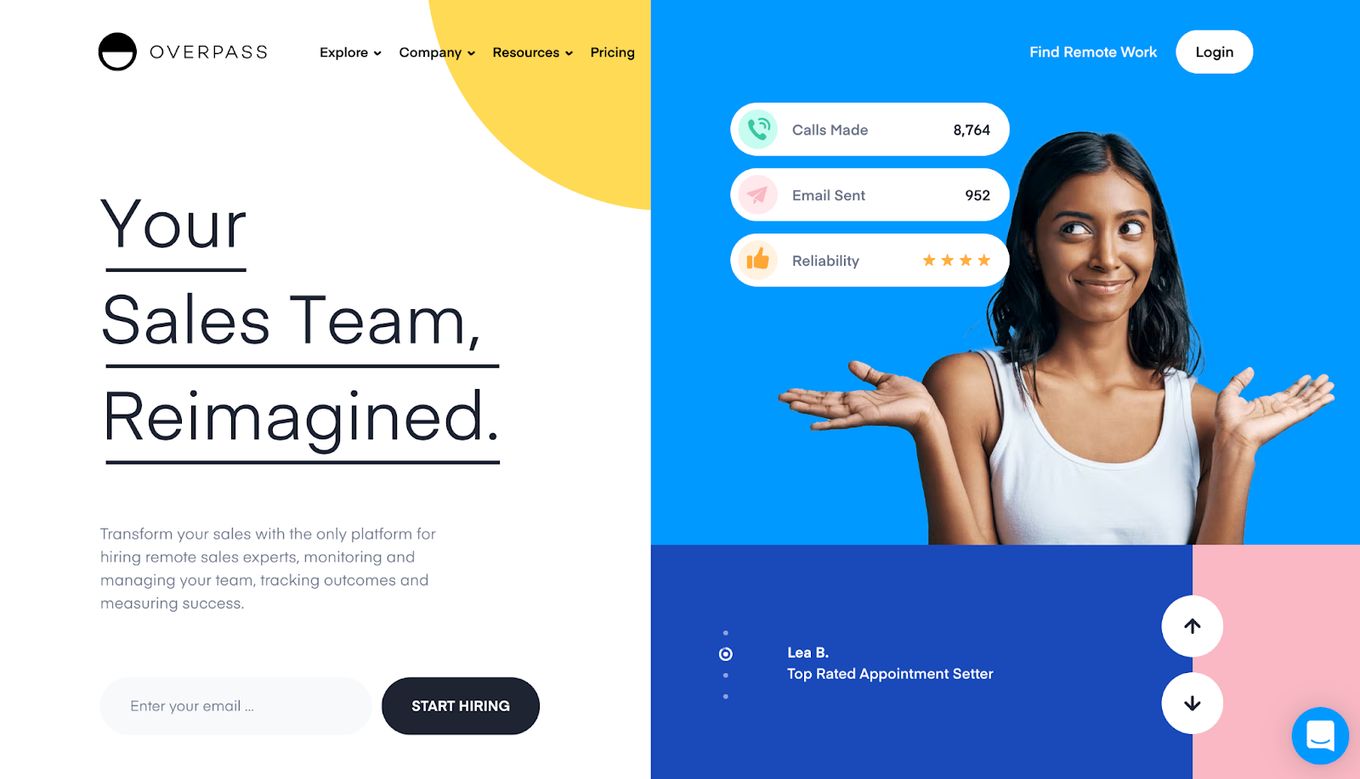
Overpass clearly knows the importance of a website, and their B2B eCommerce website reflects that. Their landing page is interesting enough to grab any visitor’s attention. At first glance, you get an idea of what they are about and their brand’s value proposition.
And if you’re talking aesthetics, Overpass clearly knows its color blocking. That’s why we have considered it as one of the best b2b websites.
2.Frontline
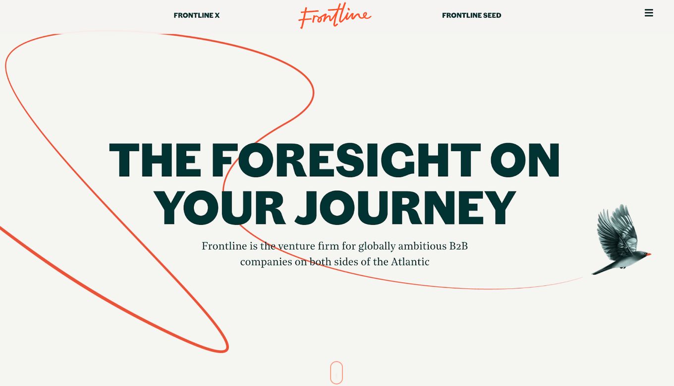
Frontline, unlike Overpass, has kept its use of colors to a minimum, focusing more on its clear message above the fold.
Frontline understands the need to build a connection with visitors as it starts off with a promise on its hero section, which builds a connection with the visitor. It then uses the rest of the landing page to explain how it intends to deliver on that promise. That’s Building Trust 101 right there.
3.Forethought
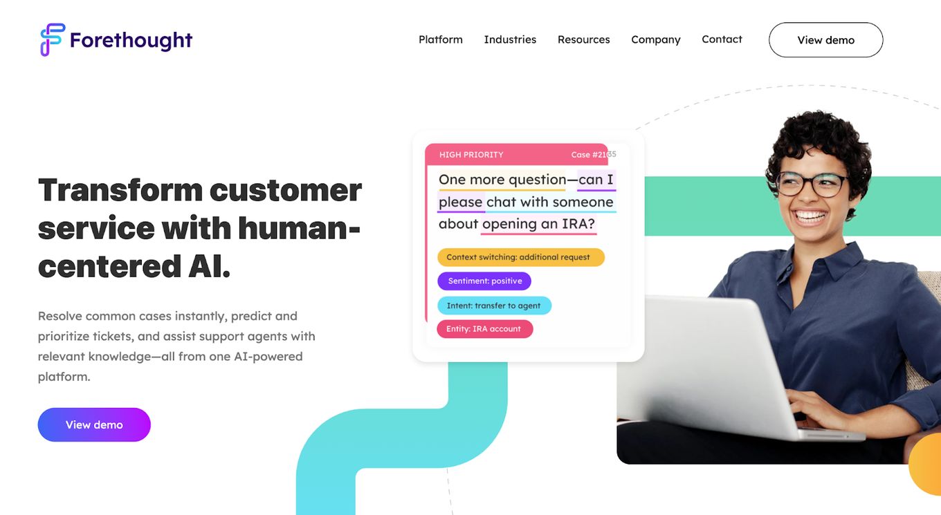
ForeThought is far from just riding the AI wave in the tech industry. Its human-centered approach has seen notable success, including being named to the Forbes AI 50 List for the second time in a row. And this approach is evident in the website design.
Similar to Overpass, Forethought eCommerce website also maximizes its use of the color palette. It combines engaging content with a terrific layout to maximize the user interface and the user experience.
The chat box demo on their homepage is also a great addition as it is both functional and attractive, providing a live sample of how its AI works right away.
4.Emergence
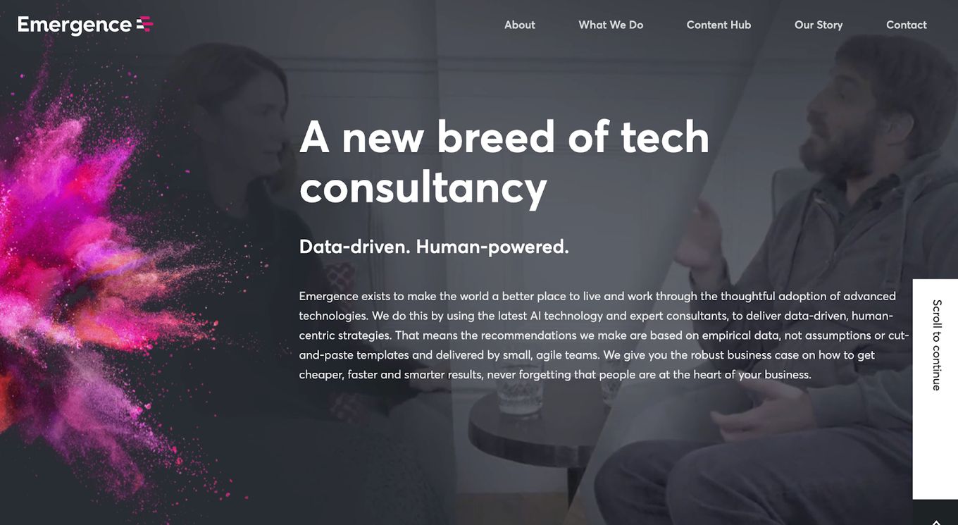
The effect of page navigation on a visitor’s experience is often overlooked, but this cannot be said for the Emergence website as it is easy to navigate with its progressive layout.
Emergence’s literal splash of color on its B2B website also adds to the aesthetic appeal of the website’s user interface. You cannot help but notice the absence of excess white space on the Emergence website, especially on its landing page. Yet, somehow, they have made this work to their advantage.
One would think the background media on the website’s homepage would distract from the text, but similar to the other sites mentioned above, they have recognized what works for them and have built on that.
5.Interfolio

In the fourth position of our best b2b websites, it appears Interfolio. Interfolio is an excellent example of when less is more, with its ability to blend precisely the appropriate amount of text and media and complement it with just the right amount of white space.
Interfolio has shown that even with B2B websites, simplicity can make you stand out.
6. Alibaba
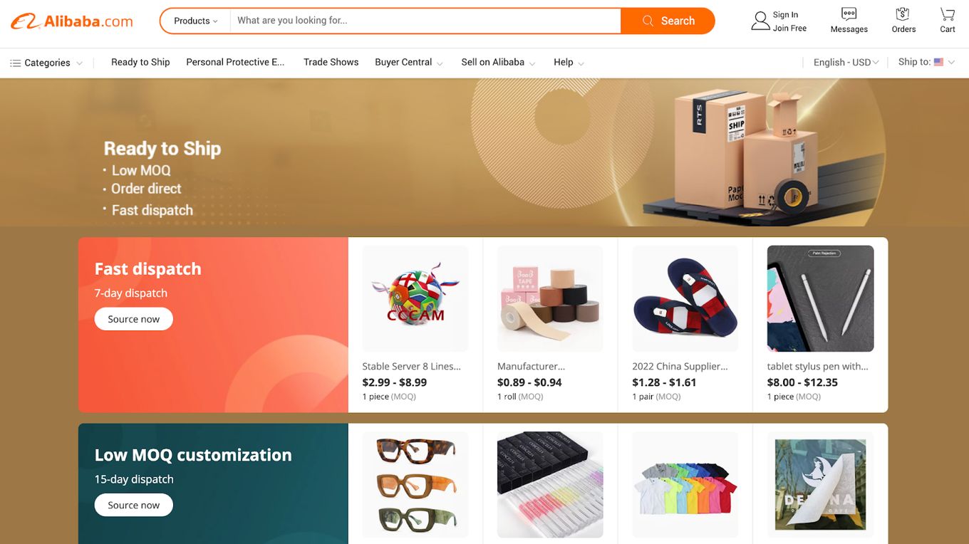
Similar to the previous website, Alibaba also has a busy landing page, but that doesn’t diminish the website’s engaging, comprehensive, and easy-to-use features. It is relatively easy for Alibaba to convert anonymous visitors into paying customers with these features.
With its strong, captivating, and expertly built website, Alibaba has demonstrated that it got the memo about the fundamentals of excellent eCommerce website design.
7.Amazon
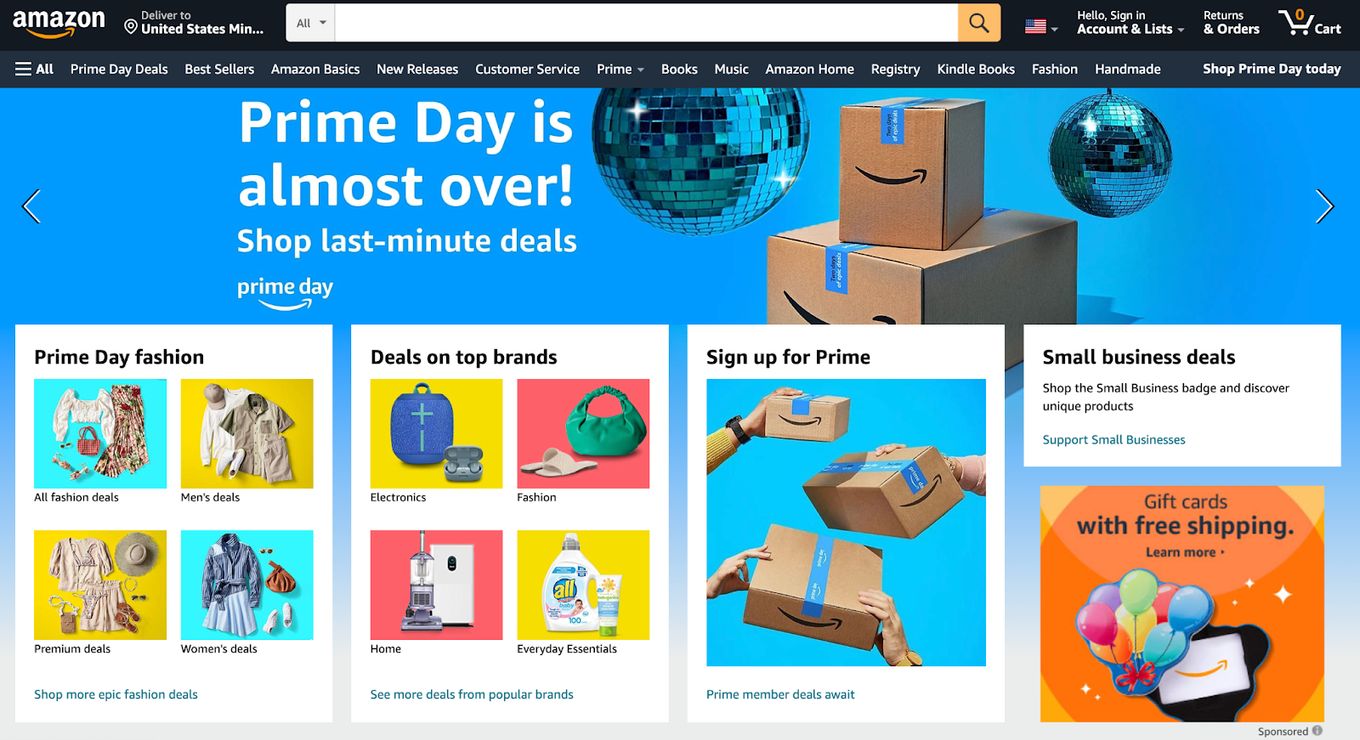
Like Alibaba and eWorldTrade, Amazon also boasts a bustling landing page. However, one thing Amazon has accomplished with its B2B site is effectively differentiating itself from competitors.
For instance, Amazon places its call to action towards the bottom of its page, putting products at the center of the page. Besides sending a subliminal psychological message that Amazon streamlines its operations for customers, it also optimizes its operations for the end goal: maximizing sales.
Combined with a passion for invention, these practices have made Amazon synonymous with eCommerce.
8.BigCommerce
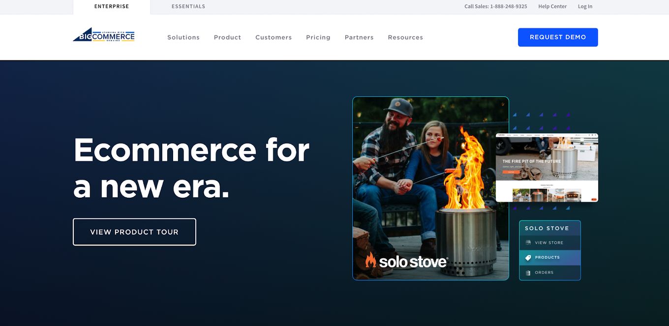
The homepage header section of BigCommerce’s B2B site was developed with new visitors in mind.
BigCommerce B2B webpage understands visitor psychology and went all out in creating their landing page, incorporating clear brand messages in the form of listicles and case studies on their website. Indeed, BigCommerce is for a new era.
9.eWorldTrade – B2B eCommerce Website
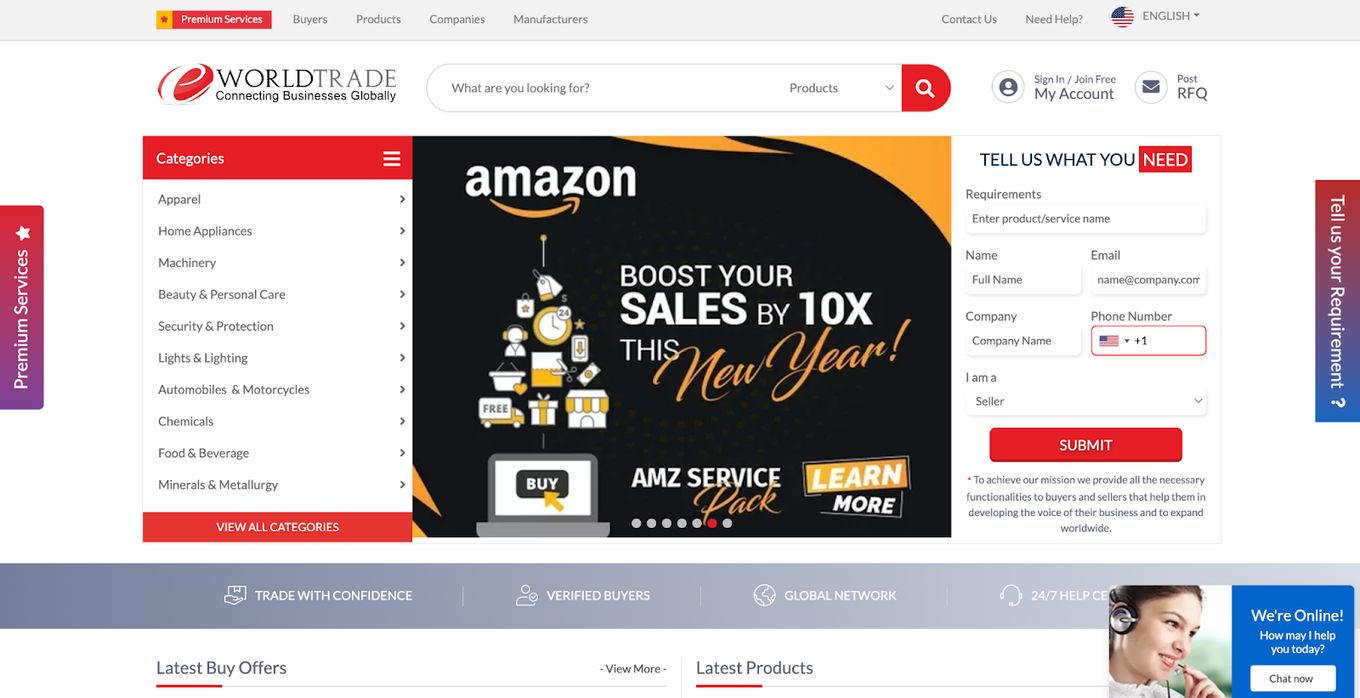
eWorldTrade B2B site loads quickly, making it easy to navigate not just on a personal computer but also on a mobile device. As busy as their landing page is, eWorldTrade has been able to make use of whitespace and visual hierarchy somehow to render their content scannable.
eWorldTrade B2B website’s intuitive layout makes it efficient and user-friendly. Although given how frequently their sign-up page pops up, it appears that eWorldTrade does not want to take chances with their visitors leaving without a promise to return.
10.United Capital Markets

Although United Capital Markets is the last on our best b2b websites list, its site clearly recognizes that business is a game of numbers. The power of numbers—the effect of quantifying the value you are delivering and the results you are promising—is one that most B2B websites often overlook. Its style falls into the minimal design category of our list.
With both their words and numbers, Comrade utilizes the power of visual hierarchy to explain the services they provide and the outcomes they guarantee.
With an elegant aesthetic, the United Capital Market B2B site’s design and the professionalism with which it conveys its content will go a long way toward persuading a visitor that becoming a customer is in their best interest.
What Elements You Must Consider While Making A B2B Website.
- Design elements that convey a clear brand message, vision, or mission.
- Fast loading and mobile-friendly design.
- An Aesthetic design to engage the viewers.
- An easy-to-use interface.
- Technics that optimize its performance.
- Convert visitors into buyers to generate profits.
- Showcase all the vital information and services/products.
Top 5 B2B Websites Best Practices You Must Adopt!
Does your website generate traffic? Does it engage visitors? And does it convert visitors? If your website doesn’t generate organic traffic, engage visitors, and convert visitors, then you must adopt the following B2B website best practices:
- Define the value proposition for your brand. A brand value proposition is a commitment made specifically to a target audience. This commitment includes concrete reasons why customers should use your service.
- Understand your customers first. You can design a comprehensive customer experience and convert visitors into customers by getting to know your target audience.
- Have clear CTAʼs (Call to action) to convert visitors. When a visitor isn’t clear on how to move forward on your eCommerce website, the visitor simply leaves. Your CTA should stand out on your page, making the process easy and straightforward.
- Showcase quality content with a professional tone. Prospective clients are likely to trust a B2B eCommerce website with a professional tone because professionalism lends credibility to your brand.
- Optimize it for Search Engines (SEO). An optimized website is essential for ensuring organic traffic and brand exposure. Using specific keywords related to your business is part of optimizing your eCommerce website for search engines.
Why Should You Choose The Best Website Design In 2023?
Because the way your audience perceives your brand is directly influenced by your website design. Having a great website design is crucial to the success of your business. The best website design for you should tell your brand story and help visitors get to know you. It’s your digital appearance.
Take a look at Apple:
Apple’s slick use of full-screen layout and stunning scrolling experience is sure to impress any visitor as it gives an immersive experience. You can achieve this for your website with the fullpage.js plugin.
If the above isn’t enough reason to convince you as to the importance of having a great website design for your B2B eCommerce website, below are a few other reasons:
- Usually, Your Prospective Client Meets Your Website Before They Meet You. Having an attractive website boosts your chances of converting a potential client into an actual client.
- Your Audience Can Access Your Website 24/7. An effective website design will attract traffic, which will help grow your business and improve profit-making.
- Your Website Enhances Your Visibility. When combined with SEO, your B2B website enhances your brand awareness and provides long-term, low-cost advertisement.
- The Internet Is Considered A Global Market. You do your business a serious disservice by not having an online presence or when your online presence is subpar.
Final Tips for Building Your B2B Website
As shown in the above analysis of different B2B websites, various factors contribute to creating an excellent and effective B2B site; professionalism, layout, aesthetics, building trust, and understanding of your target audience are all crucial.
When building your B2B webpage, it is essential to identify and maximize what works for your brand. As you might have noticed, the solutions that worked for each of the mentioned eCommerce websites differed.
It is also worth repeating that the way your audience perceives your brand is directly influenced by your website design. Therefore, you need to strike a balance between the design and the information contained on the website.
Always remember that your website’s User Interface and User Experience form the basis of a potential client’s initial impression, which heavily impacts whether that user becomes a customer or, even more, a returning customer.
![What Is a Digital Story? [All You Need To Know] digital story share](https://alvarotrigo.com/blog/wp-content/uploads/2023/08/digital-story-share-300x150.png)
![21 Top Examples of Digital Storytelling [Make Powerful Stories] examples digital storytelling share](https://alvarotrigo.com/blog/wp-content/uploads/2023/08/examples-digital-storytelling-share-300x150.png)
![9+ Great Website Ideas for 2024 [Show Off Your Skills] website ideas share](https://alvarotrigo.com/blog/wp-content/uploads/2023/08/website-ideas-share-300x150.png)
![15 Best Portfolio Website Builders in 2024 [Reviewed & Ranked] portfolio website builders share](https://alvarotrigo.com/blog/wp-content/uploads/2023/08/portfolio-website-builders-share-300x150.png)

![Website Terminology [Terms You Need To Learn] website terminology share](https://alvarotrigo.com/blog/wp-content/uploads/2023/08/website-terminology-share-300x150.png)