A business’s online presence can have a massive impact on its success. Most businesses are still unaware that people don’t just buy things on a whim. They thoroughly investigate a website before buying a product or service because most of them have had a bad scam experience on the internet.
One of the main reasons you should invest in a website is to build your credibility. But you should also invest in a website to stand out from your competition. This is particularly important when we are talking about websites that sell handmade products or products made in small batches, such as candles and soaps.
If you are looking not only for inspiration but also for ready-made websites, check out these amazing candle templates for your website.
In this article, we will explore what a good candle website looks like and look at 10 candle website ideas, then read on!
1. Candle Nightfall
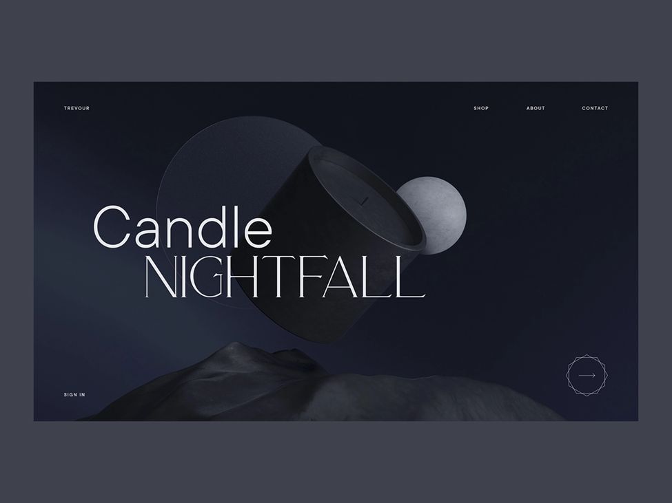
While this website isn’t really a functional website but rather a project exploring a candle website idea, it is worth mentioning because of how spectacular it looks.
The whole website is fairly simple, with minimal options on the top and a very dark theme. But there is just something very dark and mysterious about the website. If you want a similar website, then you can reach out to Oliver Gareis since he is the creator of the website design.
2. Sensory Secrets
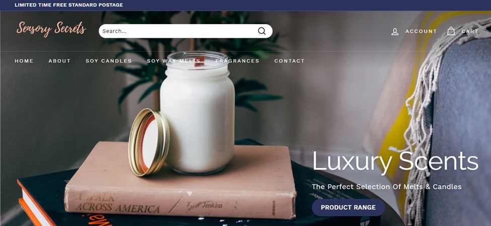
This candle website is pretty unique in its construction. The website only has a homepage, contact us, shop, and a blog section most of the time. But because they sell scented candles, they have created a completely separate page for scents, helping people better navigate the scents they want to buy.
This website uses a sticky header menu. If you like it, we recommend that you read our article on how to create a sticky navbar
Aside from this, the website follows a theme of warm and dark colors like navy, brown, and caramel, which instantly relaxes the person visiting the website. If you want a candle website similar to this, then you should at least visit it once to get a better idea.
3. Candles
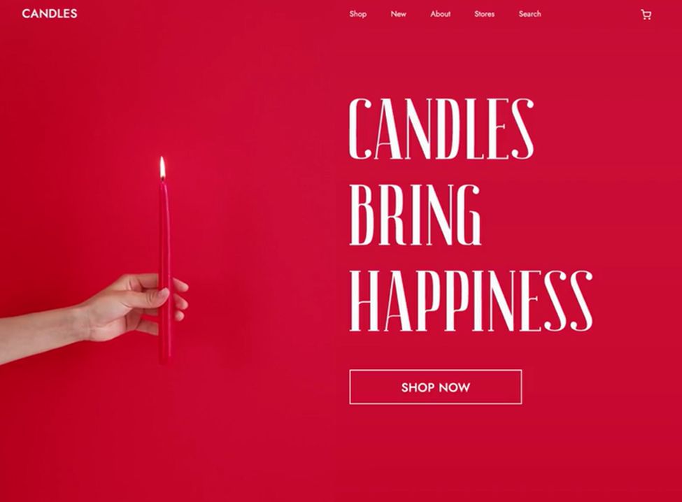
Similar to Candle Nightfall, Candle is also an experimental candle website idea. At first, the only difference may seem like the color of the website because it is pretty distracting. But once you get behind that, you realize that the homepage isn’t just a simple picture. But it is, in fact, a video of a person holding a candle. And that instantly transforms how we view the website.
It seems fairly simple to navigate, and the limited options on the menu bar make it much easier for the customers to find what they want. All in all, this is a great example of what a website can look like with simple tools.
4. Homesick
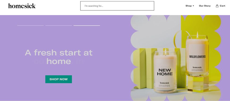
While this candle website may seem like a very normal one, it utilizes a few different ideas and elements which make it work successfully. The white background with the pastel colors is very soothing to the eye and immediately intrigues the visitor.
The slideshow at the top of the homepage is simple, yet it utilizes quite a few different frames to showcase its products. In addition, you will meet with an automatic sliding bar or best sellers if you scroll just a little. There are only two options: shop and our story, but the website comes equipped with a search bar which makes it much easier to navigate.
5. Gold + Ivy
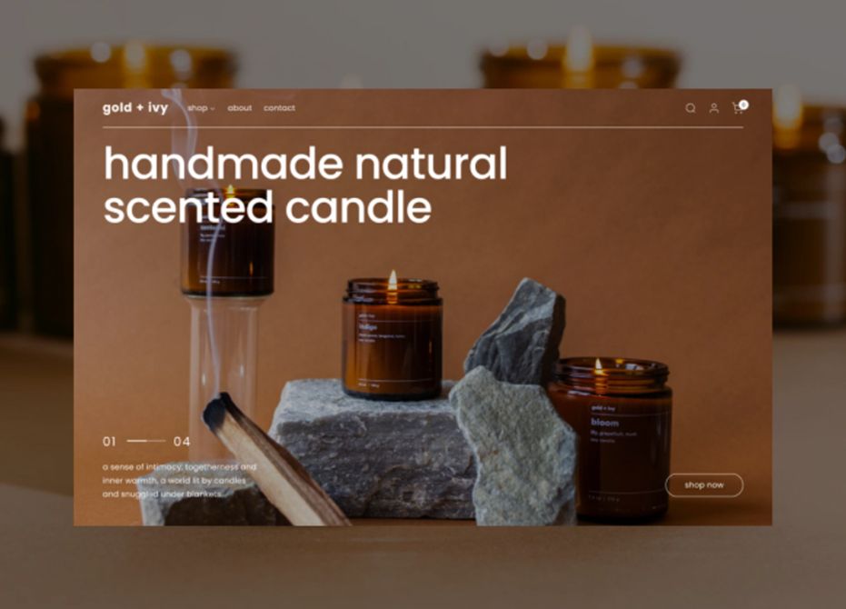
This is another idea of what a candle website could look like. The whole website is in warm tones, and the white and black text complements the whole setup. The best part is that the website also utilizes the amber and brown color of the jars in its theme, which brings the whole website together.
The menu card is also pretty simple. There are only three options, which makes navigating the website easy since there aren’t any options that can distract or confuse the visitors.
6. Quick Candles
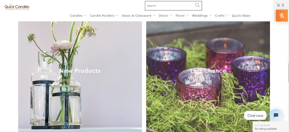
This website is pretty weird because it almost looks like you are reading a website when you open the homepage. The white background coupled with the sliding picture gallery creates a very professional field. Perhaps that is why they seem credible.
The design of the website itself is fairly simple, and it is easy to navigate as everything is divided into categories and is present on the menu bar. In addition, when you first visit the website, there is a small pop-up chat menu that can help you find what you are looking for.
If you are looking for ideas and inspiration for your candle website, then this is definitely worth checking out.
7. The Candle Library
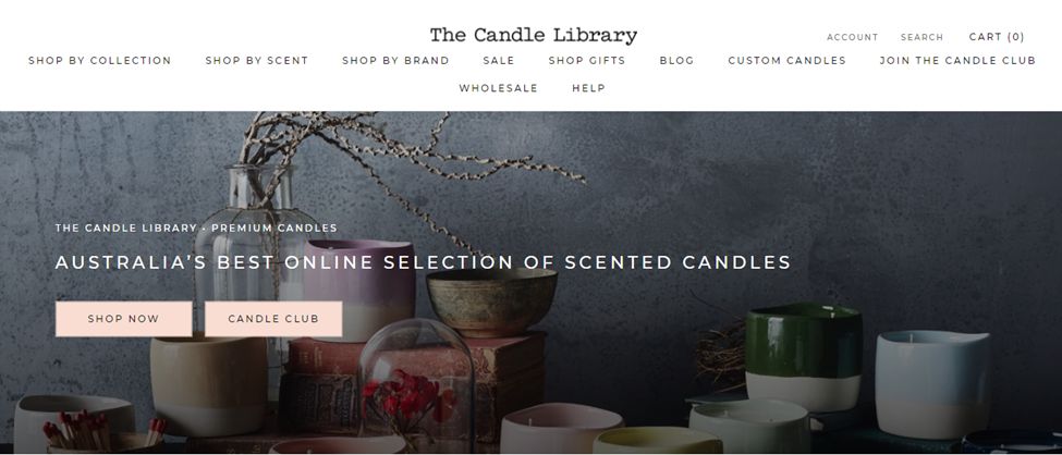
Just like other candle website ideas, candle library also uses muted colors and soft aesthetics to highlight its products. Because they sell candle sources from different brands all over Australia, the multitude of options on their menu actually makes it much easier for the customer to navigate.
It facilitates the search because it can not only search by brand but also show by collection and by scent. You get a little bit of information about the brand as you scroll down, which is helpful since they highlight the different brands they sell just below that text.
8. Let’s Jam
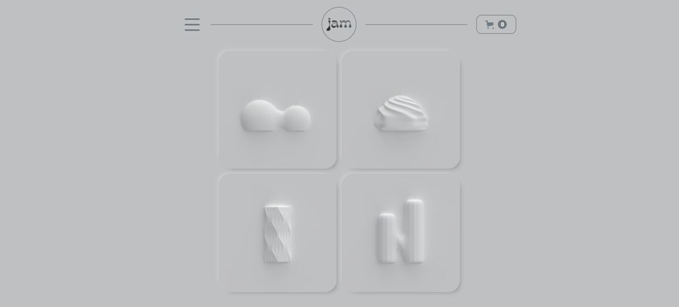
When it comes to weird candle website ideas, Jam is pretty up there. The home page is anything but easy to navigate and all you see is a gray background with a bunch of vague shapes inside squares. When you click on them, you are taken to a separate page that sells the candle of the shape you picked.
The design of these individual dedicated candle pages is pretty unique because the text slides over the background picture as you scroll down. Another odd thing is the burger menu bar which opens to reveal three options that are all in bright green. The color is completely off but gives off an old game or futuristic vibe.
9. Kamasu Studio
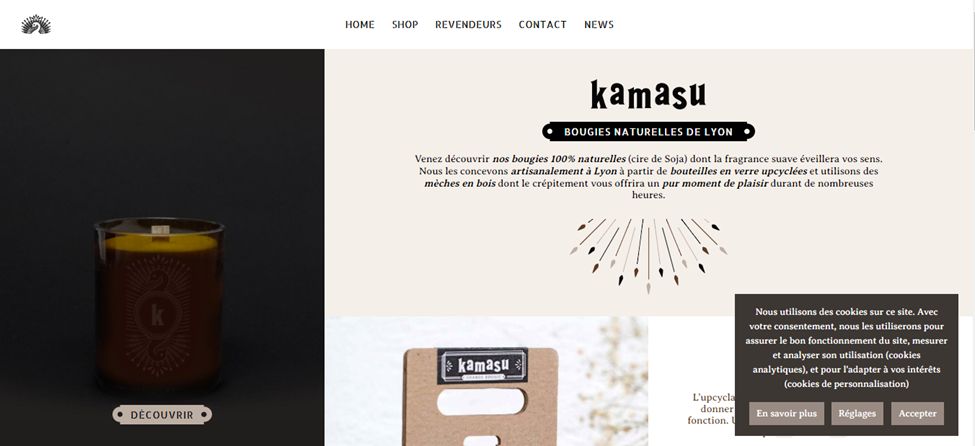
This candle website is pretty different in construction, and while it’s not the most visually appealing, it does utilize a lot of interesting elements. When you arrive at the homepage, you are greeted with two panels.
The left side of the panel has an animation – fired on scrolling – of a person lighting a candle, and the right side features text and pictures. As you scroll down, text bars keep popping up, which is a nice touch that visually stimulates customers. In addition, the shop seems pretty simple to navigate and has a clear and concise menu bar.
10. Haven Candle
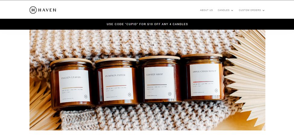
This website is fairly simple in construction, but it doesn’t have flashy colors or weird designs, but it still works as a candle website because of how it utilizes warm colors. The only thing that is particularly special is the homepage.
When you open it, it looks like a gray page with white detailing, but as you move down, the menu bar separates and becomes a white block.
What Should I Put On My Candle Website?
Well, there are quite a few things you can put on your candle websites.
- Home. Home is the main page of any website and often displays the products and services people offer. There is a homepage on every website so, yours should also have one.
- Cart. When you are selling something, you obviously want to include a cart option so that people can add things they want to buy and buy them all in one go. Plus, customers will be able to see what they bought.
- Scents. It would also be a good idea to add scents to the candles’ website since some people are allergic to certain scents.
- Weight. The weight and height of the candle so people can know how exactly it will look in their setup.
- Wax. The type of candle wax could also be mentioned since people can also be allergic to candle wax.
- About. This page has information about the website itself, what they sell, who the owners are, and what its philosophy is. About is a really good way to connect with your customers.
- Contact information. Mention contact information on the website so customers can contact you if they need more information.
Is A Candle Business Profitable?
A candle business can be extremely profitable since it is cheap and easy to make while still letting you be incredibly creative. It has a low-cost entry, and there is no shortage of people looking to buy candles, whether it’s because of the design or because of how relaxing they are.
![13 Best Candle Website Templates [You'll love them] candle website templates share](https://alvarotrigo.com/blog/wp-content/uploads/2023/08/candle-website-templates-share-300x150.png)
![30+ Best Church Website Templates [WordPress & HTML] church website templates share](https://alvarotrigo.com/blog/wp-content/uploads/2023/08/church-website-templates-share-300x150.png)
![7 Bad Website Designs [Examples & Tips To Fix Them] bad website design share](https://alvarotrigo.com/blog/wp-content/uploads/2023/08/bad-website-design-share-300x150.png)
![9+ Delicious Bakery Website Ideas And Examples [Get Inspired!] bakery websites share](https://alvarotrigo.com/blog/wp-content/uploads/2023/08/bakery-websites-share-300x150.png)
![9+ Beautiful Lash Websites Ideas [Get inspiration] lash website ideas share](https://alvarotrigo.com/blog/wp-content/uploads/2023/08/lash-website-ideas-share-300x150.png)
![9+ Amazing Massage Websites You'll Love [Ideas & inspiration] massage websites share](https://alvarotrigo.com/blog/wp-content/uploads/2023/08/massage-websites-share-300x150.png)