An exhibition website is a sort of online billboard, except you can do more than show one picture. As such, the website design needs to be all about showing off the best artwork in the best possible way. These sites are an example of how to approach the idea.
1. Loewentheil China Photography Collection
Utilizing a full-screen format to introduce itself in edge-to-edge video and dark colors to contrast with the text blocks and images, Loewentheil’s collection immediately stands out.
From the smooth transitions to the fully responsive elements, the site hooks a visitor in and takes them on a journey. There is no time wasted between arriving on the site and seeing something cool.
At the bottom, visitors can navigate to virtual exhibitions, the about page, news, historical process, and contact page.
If you like the full-screen effect, this website uses an amazing scrolling JavaScript component called fullPage.js to create full-screen websites with a deep impact! Check it out!
2. Bruegel
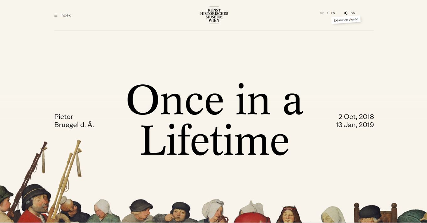
Bruegel knows its strength- it’s a museum. As such, it puts some of its prominent art front and center on the home page. Scrolling down, we see even more of that, with responsive tiles for displaying colorful images or leading visitors to other parts of the page with links.
It utilizes video and audio to introduce what it wants to show, offering an experience that feels like being in a museum.
3. Kunst Museum Brandts
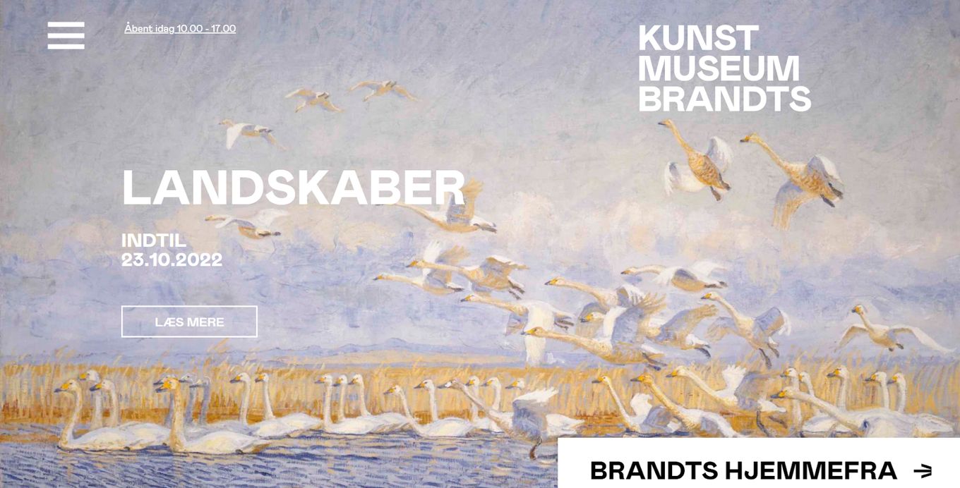
Right on the homepage, front and center, the site opens with an image from its ongoing exhibit, with a date for how long it will be on. Other exhibitions are shown below, one in each tile, with the name of the artist, the exhibit’s name, and its end date. Any visitor can quickly choose between one or the other and receive information on the best time to see it.
You also have to check some great artist website portfolios to get some other ideas. They look great!
4. Barkli Gallery
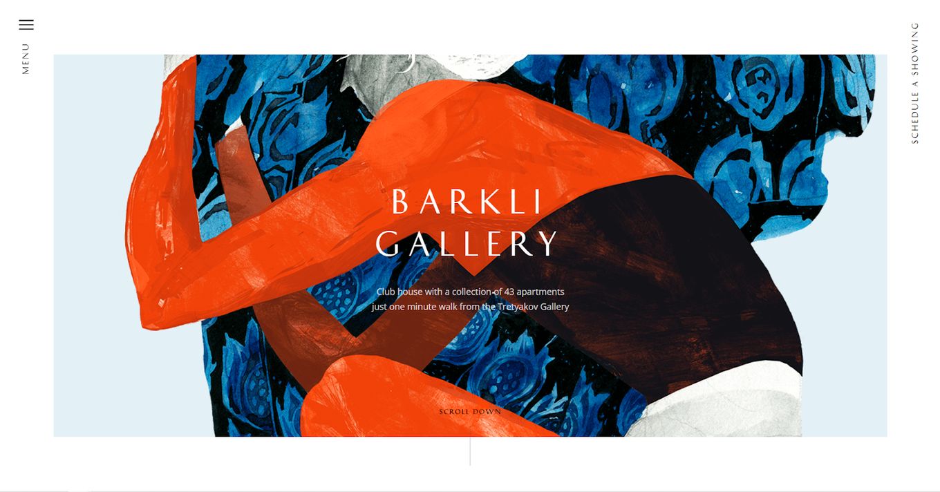
This gallery opts for a different layout, placing a hamburger menu and an option to schedule a showing of the apartments for any visitor. The menu easily allows one to choose an apartment, check out the environment, get technical information, receive documentation, check out the news, download a presentation, get in touch or simply receive news.
The website is a combination of artistic elements working elegantly with sales elements.
5. Foam
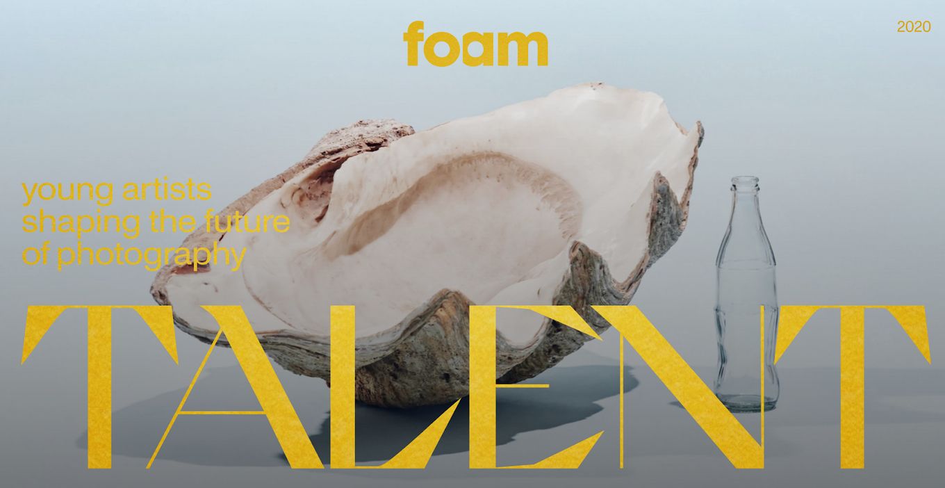
Foam wastes no time in showing off what it has. The design opts for tiled transitions that move one panel out of the way to make room for the next. The typography is used carefully with apt background colors and a slideshow of pictures teasing what each exhibit holds. In one glance, a visitor can find out the name, date, and title of an exhibit before viewing.
6. The Originals Museum
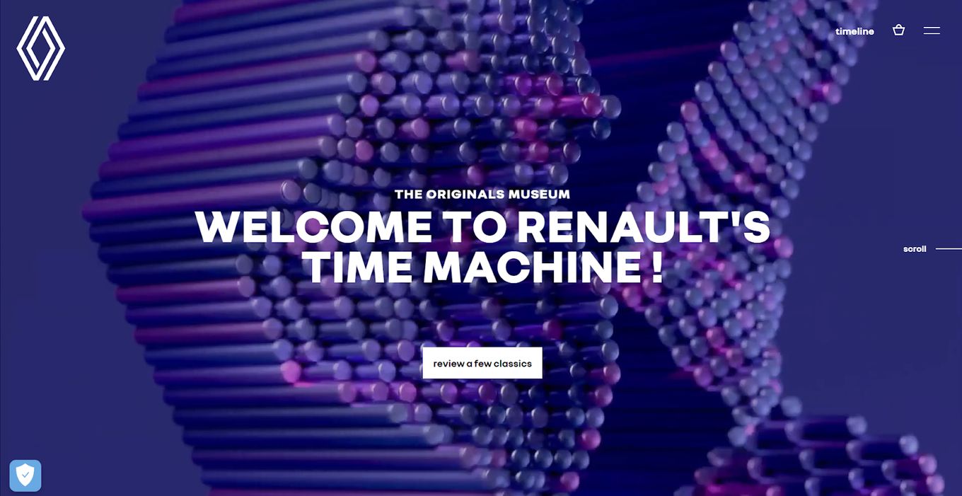
For carmaker Renault, an exhibition website only seems natural. The site opens with prominent white typography on the background of the sleekest slideshow, taking us back in time to see some of the best Renault machines to ever grace the asphalt.
We get tidbits of information while scrolling through, conveying a rich history. At the end of the page, one can select which year they want to go to and see what was cool from Renault back then.
7. Chequeado
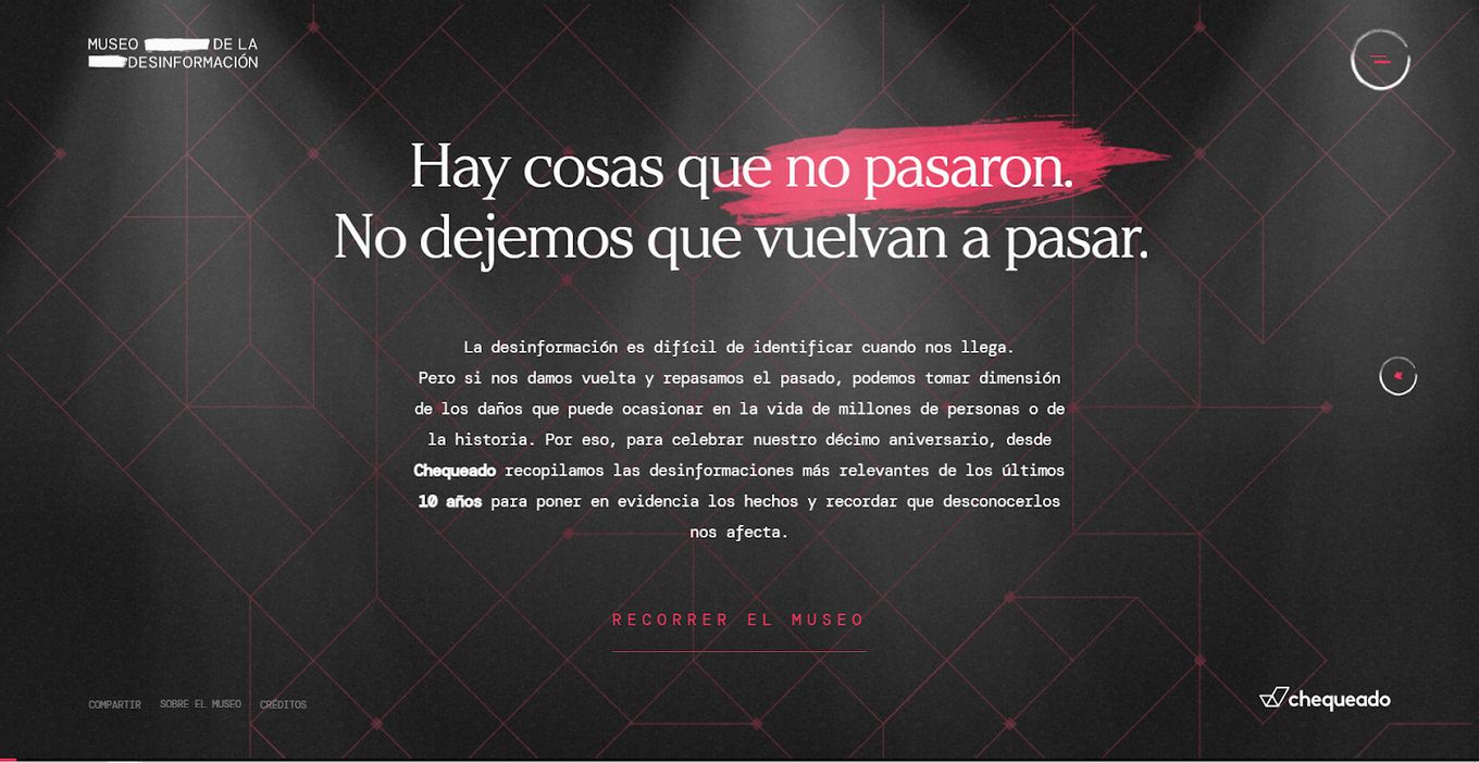
Chequeado is a fact-checking gallery that opts for sideways scrolling. It showcases its most important work, which involves finding and exposing disinformation, with effective transitions, well-placed photos, and great typography.
Serving this vision is a background that, while a bit static, feels responsive and complements the overall design choices made. There are navigation elements easily within reach to go anywhere else on the site.
This exhibition website forces the user to scroll horizontally. If you like this effect for your web, you might be interested in this article about CSS Snap scroll horizontally.
8. Witness to History
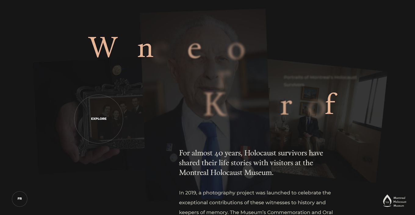
Using a responsive screen with easy-to-use navigation elements, Witness to History guides a visitor through a journey where they get to see the exhibits, view details about each, listen to stories, and more.
Floating around following the cursor is an eye element that shows a site visitor when they are hovering over viewable exhibits. It uses a static but elegant background, as well as impeccable typography.
9. Sage Culture
This exhibition’s one-page website stands out as a masterclass in allowing a website’s best elements to work for you. Sage Culture uses the image slideshow transitions to introduce us to its biggest exhibition sets.
Replicate this full-screen website by learning how to create websites with fullscreen sections in HTML & CSS.
The menu floats to the side for easy navigation, with a custom cursor that doesn’t intrude into the beautiful canvas this website has been turned into. Upon reaching the bottom of any page, site visitors can rocket themselves back up with one click.
10. Daniel Lauri
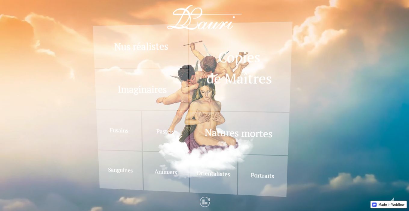
The entire exhibition website opens in the sky with plenty of clouds. Floating in the middle of it is a translucent, multi-panel navigation prompt. It moves with each move of the cursor. The clouds in and sky don’t stay still either.
Everything always feels in motion. It is an environment that lends itself to an exhibition, given that it already heavily relies on artistic design choices to drive its message.
11. History Virtual Museum
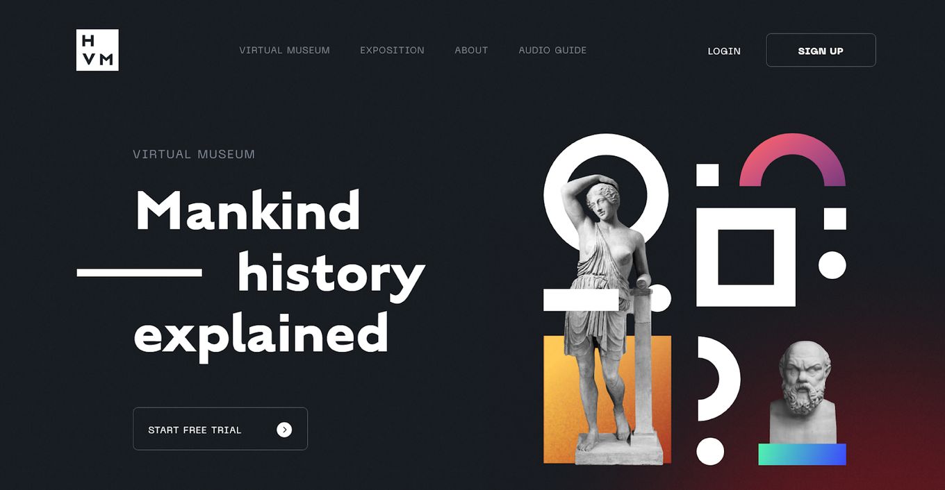
Combining exposition, visual and audio elements, HVM manages to deliver a tour experience that feels very well put together. The images do not feel flat or one-dimensional but like a diorama. With the careful use of a dark background and consistent white typography, the level of legibility and elegance within the site is elevated.
The site uses plenty of calls to action and divides the homepage into distinct sections, each playing to its own strength.
12. Neon Door Lit
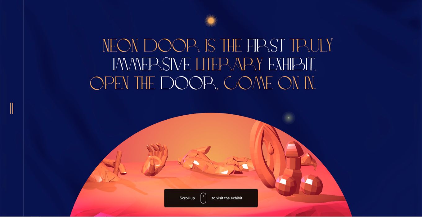
As an exhibition website, Neon Door Lit tries its best to create an audio-visual experience, even recommending headphones at the beginning. Visitors are greeted by a doorway that appears to be approaching but never gets close.
Neon Door seeks to open doors, conjure up worlds and evoke a feeling of transcendence in a viewer, something it managed to communicate well with trippy art and impeccable audio effects.
13. Orto
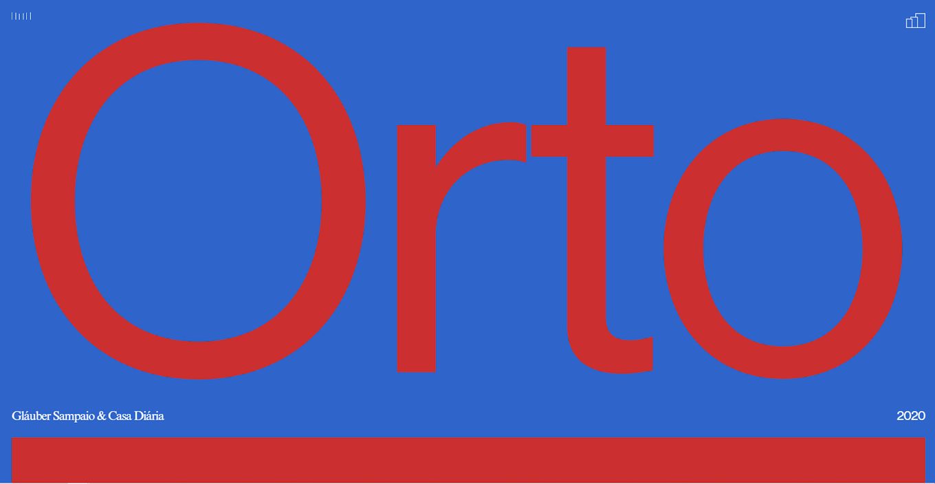
Orto is as good at displaying the art it showcases as it is in showcasing its own brand. The colors are nothing special but blend in with the transition choices.
Using large typography at the top of the homepage communicates the boldness of the brand, as well as its artistic bend. To cap it all off, the site can play ethereal-sounding music in the background to provide the exhibit with a soundtrack.
14. Moon Exhibition
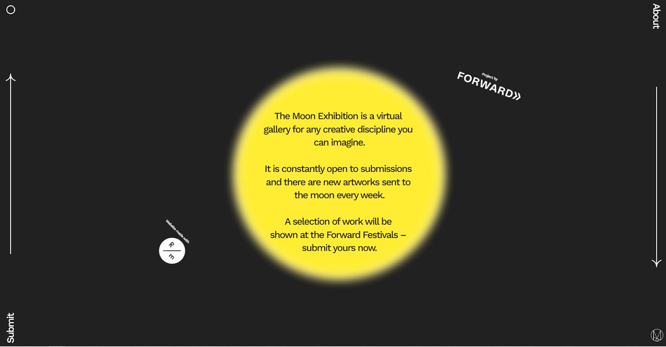
The Moon Exhibition’s style is minimalist and quirky. It is a virtual gallery where artists submit their work for display. One can easily submit what they want, learn what the exhibition is about, and navigate around to view the gallery.
The exhibition website itself uses the concept of a moon at its brightest and what we assume is empty space to draw attention to its message and purpose.
15. MooM
MooM is an information-rich website that tells us everything we need to know about what it does. Its hero slider gives the user immediate information about the events. The menu also helps navigate to the museum, exhibitions, events, collections, the gallery, the blog, and a contact page. It also has Facebook, Instagram, Twitter, and Dribble icons for easy sharing.
Though it feels basic in a stylistic sense, the site retains a quiet dignity, enhanced by its prominent display of some of its best pieces.
16. Union Station
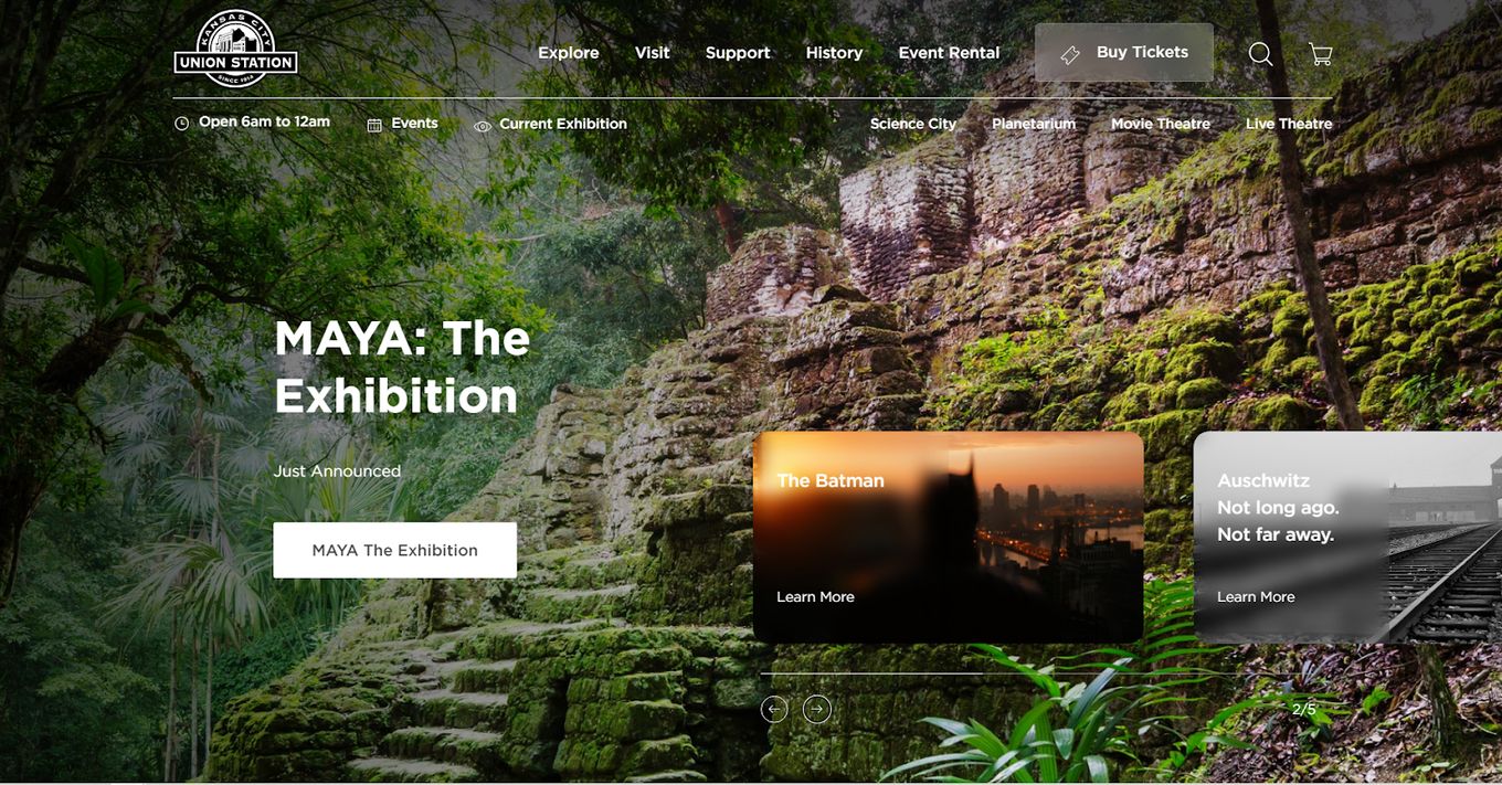
Union Station lines up its best exhibit on the homepage, automatically transitioning from one tile to the next. Each tile leads into the exhibit indicated and displays images once the visitor starts scrolling down.
Each exhibit comes up with its own call to action to either get tickets or learn more about it. Opening an exhibit and scrolling through shows just how well transition styles work for exhibitions.
17. The Field Museum
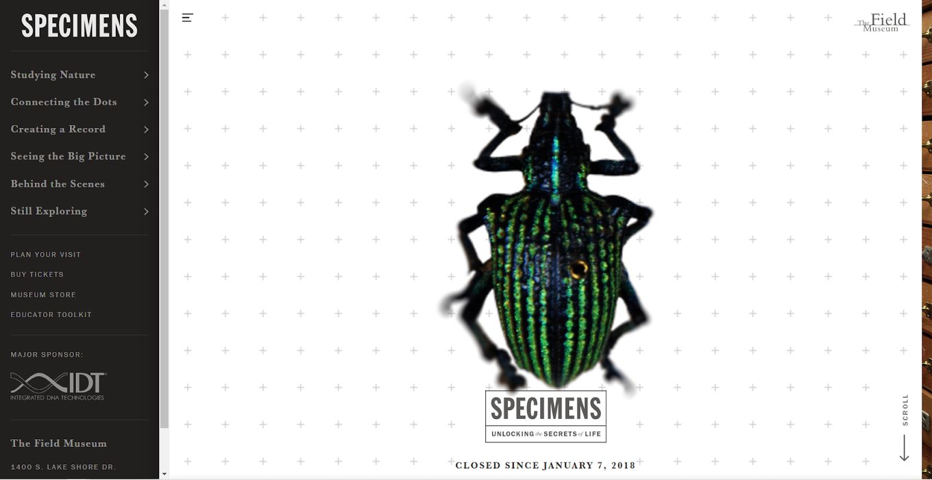
Embodying its name, this exhibition website starts off with an impressive image of a specimen. Curious about it? Well, scrolling down reveals where it was found and when it was cataloged.
Learn how to create CSS animations on Scroll to imitate the scrolling effect of this website.
Scrolling a bit more zooms out of the image and settles on a much grander collection of beetles at the Field Museum, part of an even larger collection. This site is memorable and effective, largely due to its masterful transitions and use of responsiveness.
18. Stoyan Kutsev
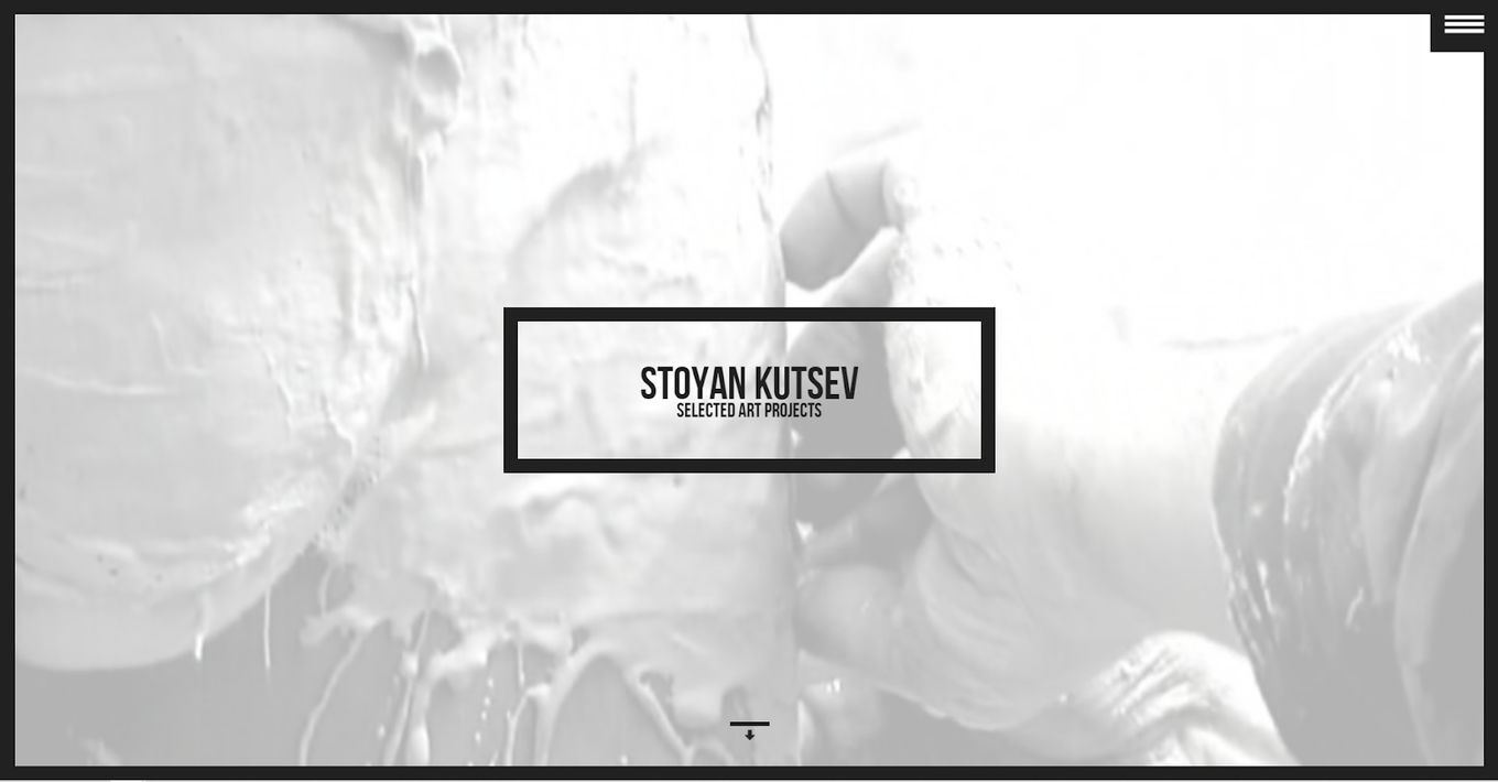
The exhibition website we see here is about Stoyan Kutsev and his selected art projects. The homepage opens with a background video behind the homepage typography, showing Kutsev at work, with a heavy focus on displaying the artistic process. Then a parallax effect shows us the rest of the information.
Using responsive tiles, the website shows dates and what’s expected during that time, before introducing the man of the hour. The menu icon is always in sight for fast page hopping.
19. The Met
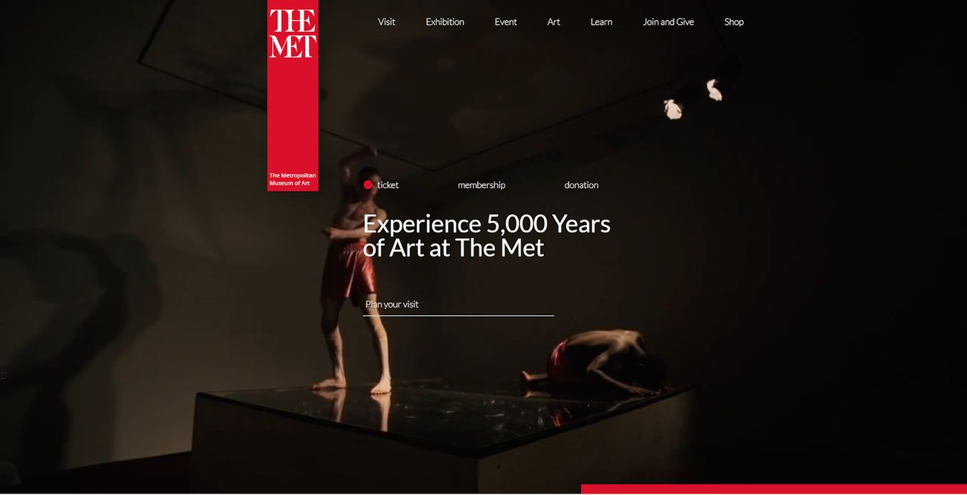
As one of the most revered museums in the world, The Met’s exhibition website feels just as curated as its walk-in museums.
The museum’s website primarily advertises its locations, invites members of the public to join on 5,000 years of art history, and showcases collections from the site with one simple click. The familiar color and tone theme of The Met is present throughout, enhancing the brand further.
20. Fisheye Gallery
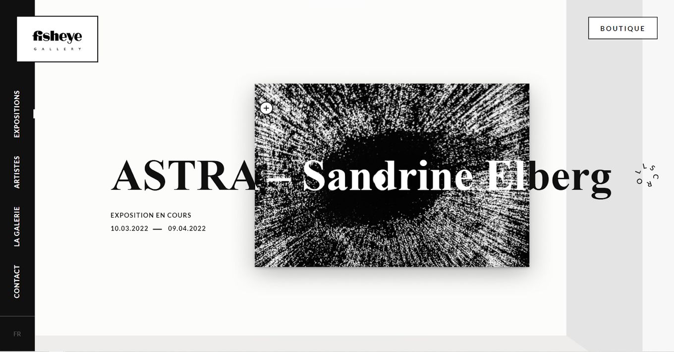
Utilizing a simple homepage that scrolls right to left, the Fisheye Gallery makes it easy for anyone to know what the exhibition website is about. From the homepage to the left, site visitors can move between exposition, boutique, artists, gallery, and contact pages. It utilizes a contrast of a greyish dark color and white to display images and lend cohesiveness to the overall design.
Final Thoughts
Some of the most interesting exhibition website design inspirations come from museums. We attribute this to the need to focus on using visual cues – such as images of your best or most notable exhibit – but also details about what visitors can anticipate from their museum experience.
This includes important details like how to get to see a live exhibit as well as opening hours, and possibly some background on some of the collections.
As a result, you could find yourself opting for a design that allows you to mix appealing aesthetics with organized information provided in a consumer-friendly and accessible method.


