It is almost universally accepted that going to the dentist can be quite the experience. It is useful as much as it is hated. However, some of the experiences can be improved and even create a welcoming feel to the potential visitors.
These days, hardly anyone goes to an establishment without checking the online presence. As website designers, we crawl the internet to find out what the best dental websites look like. Here are 14 amazing examples of the best dentist website design that spark inspiration.
1. Wright Dental Center
Right off the bat, Wright Dental Center dentist website design, the best dental website on our list. What makes this website stand out from the rest is the unique scrolling effect that it uses and the navigation it creates.
The full-screen design provides a great way to display videos and images and create a uniquely immersive experience like no other design.
Navigation is super simple and very intuitive and it works perfectly on mobile devices too.
The website is making use of the fullPage.js snap scrolling effect. A Javascript component that is also avaialble for WordPress for the Elementor, Divi, and Gutenberg builders.
2. Grand Street Dental
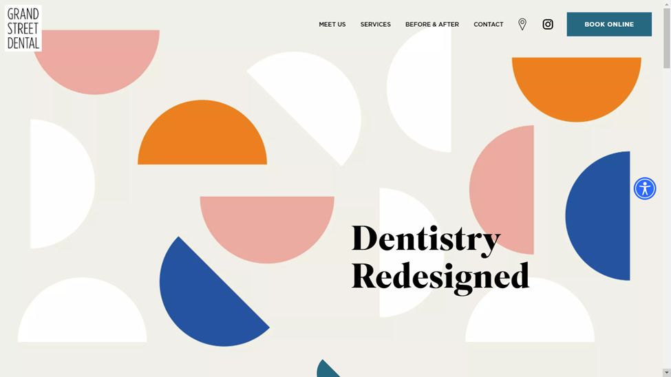
It is not hard to tell what modern art looks like. Logging into Grand Street Dental feels like a visit to a modern art gallery. For a second there, your only clue this is not some fashion website will be the words ‘Grand Street Dental.’
If this dentist website design doesn’t make you calm down about going to the dentist, nothing else will. This is one of the best dental websites: is not just pretty but functional too, allowing customers to book appointments, see recent press coverage and navigate to services offered and insurance.
3. Grand Ridge Dental
Grand Ridge Dental is another site using the a full-screen navigation to simultaneously introduce visitors to the dentists’ website with impressive background video looks inside the establishment. The approach is minimalist, too, allowing the customer to take in what the dental practice is about on the homepage.
Imitate this “immersion effect” on your website by adding a full-screen background video with just CSS or by using fullPage.js for the snap scrolling effect.
To navigate to another part of the site, a hamburger menu button sits in the top right corner. Clicking on it brings up information on various things like what to expect, treatments offered, and more. It deserves the 3rd position on our list of the best dentist website designs.
4. Downtown Dental
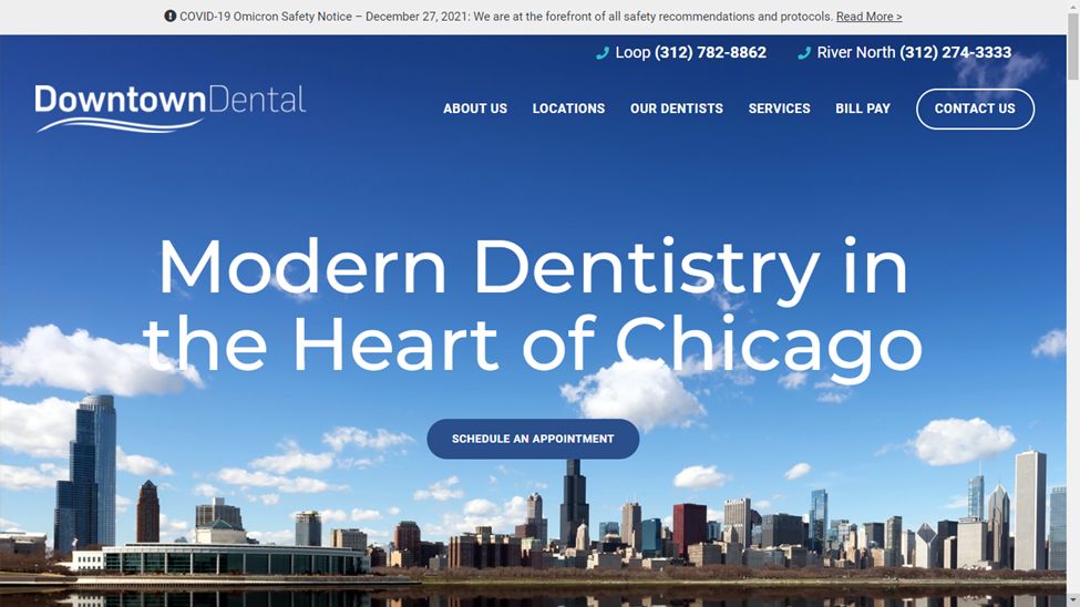
Downtown Dental dentist’s website design stands out because of the clear typography used. The bold text sits on top of a background of a sprawling shot of Chicago.
The call-to-action buttons are placed at the top and make it easy for anyone to access information about Downtown Dental, its locations, dentists on staff, services offered, the blog, and contact information.
Business hours are shown clearly with a button to ‘Schedule An Appointment.’ Further down, each location is listed with visiting hours every day of the week with information about accepted insurance providers. Overall, the color scheme is a calming professional blue that fits a medical practice.
5. Mint Dentistry
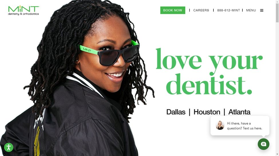
Arriving on the Mint dental website gives you the sense that the dentistry practice behind it has branding down pat. Mint markets itself, the services, the staff, and the founder across the perfectly colored pages. Navigation is a breeze across every page on the site.
A green color scheme across every page evokes a herbal feel elevated to the height of modern dentistry and orthodontics by glossy photos of the establishment, the founder, and happy smiling faces. The services offered are on interactive tiles that take you straight to the area of interest you click on.
The site displays booking, career opportunities, and contact information at the very top. For me, one of the best dentist website designs.
6. Tend
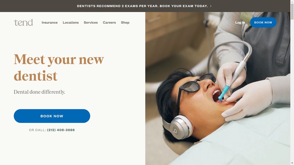
New York is a huge place with many dentists, which may make it difficult to be noticed. Tend dentist website design seems to have beaten that problem with a combination of fun and enthusiasm. The color scheme is not too shouty or noticeable but feels warm, professional, and rounded around the edges.
Tend leans on minimalist dentist website design, an easy-to-read typeface, engaging images, and clean lines. The placement of call-to-action buttons means visitors can be guided to make an appointment or learn more about the practice.
7. Swish Dental
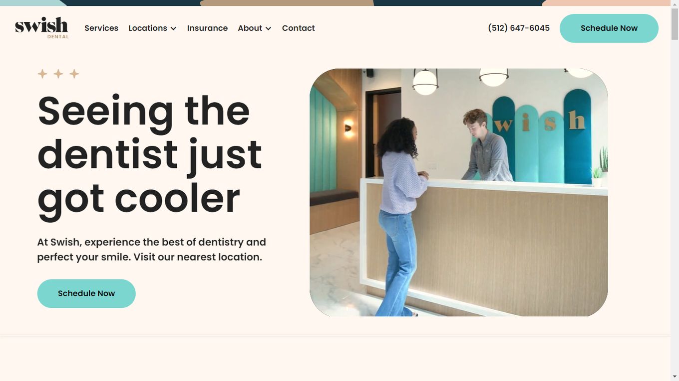
Here’s a dentist website design that has figured out how to attract the Gen Z crowd. Sleek modern energy in the site’s visuals makes it stand out, compounded by the artistic influences. For instance, the site calls the dentist offices ‘studios’ and the dentists on staff ‘artists.’
Swish offers to book online and even more intriguing virtual consultations in keeping with the ultra-modern theme and speaking to the audience targeted. Virtual appointments have become commonplace since 2020 but haven’t picked up everywhere yet. Swish seems to be ready to adopt what works for the modern generation.
8. Zen Dental Studio
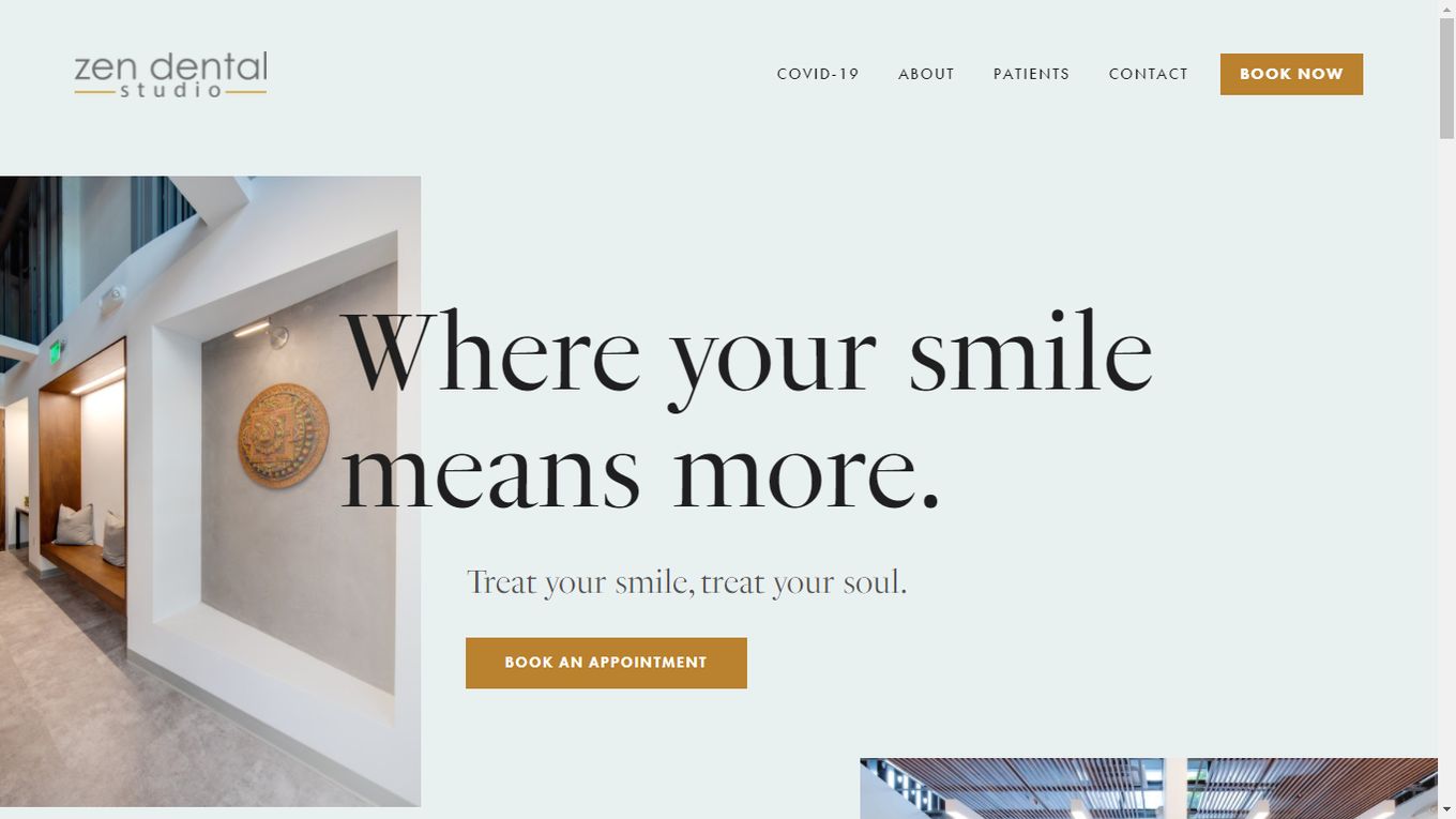
Zen Dental dentist website design seems to embody its theme. Right on the home page, it says, ‘Treat your smile, treat your soul.’ Zen Dental communicates that it is a calming experience without even being there in person, using lovely pictures and brown accents across its color scheme.
Visitors can find information about making payments, financing options, insurance, and more. Taking the mystery out of the cost of a dental care session makes the patients feel at ease. Truly, this website does embody the zen experience. It takes advantage of online booking technology, which gives it an edge over the competition.
9. Studio Dental
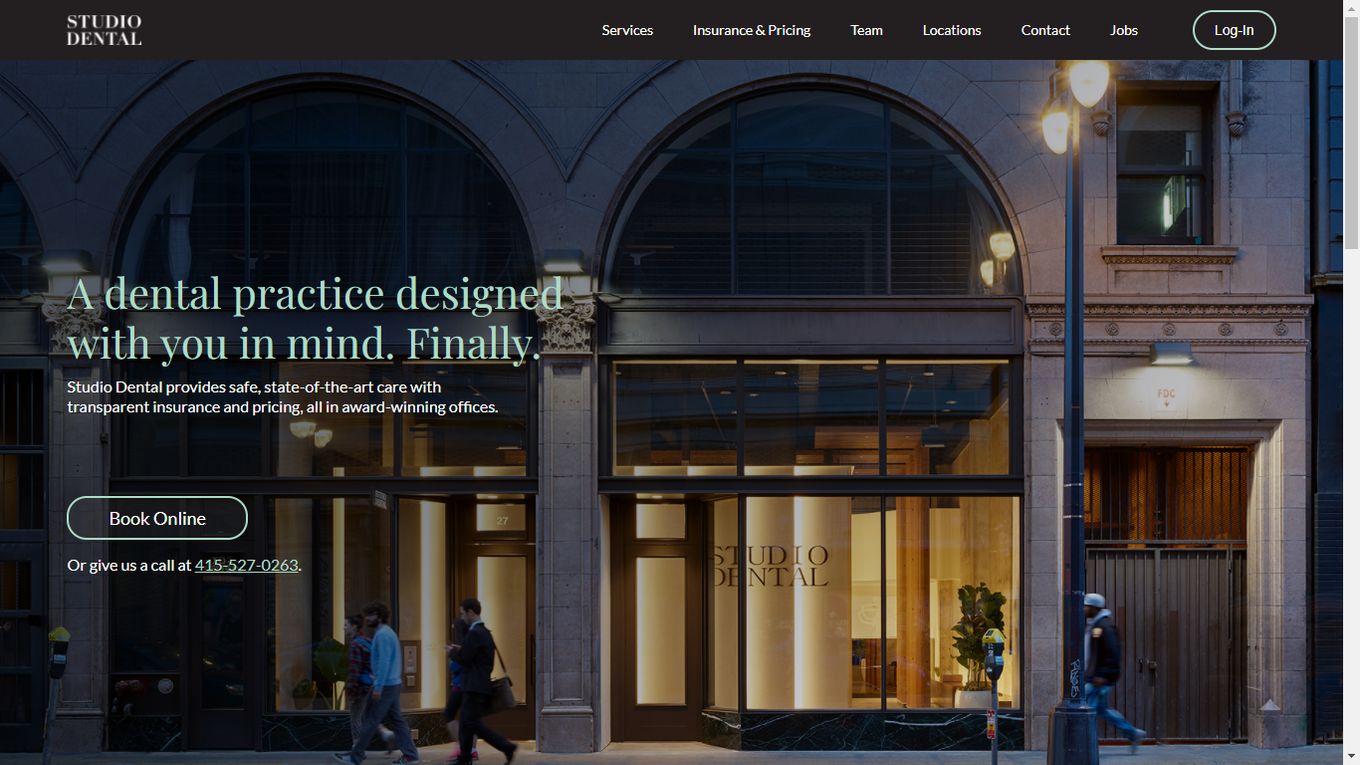
It looks like Swish Dental isn’t the only practice that took inspiration from a studio design. The Studio Dental page has the dentist’s website design and looks of an architectural magazine or a website showing off houses. However, the typeface stands out, making it clear that you are looking at a reimagined concept of what a dentist’s office could be.
The images and visuals combine to deliver a vision of elegance and sophistication. You can book your appointment online or call from the number provided below the booking button. The layout makes it easy for the eyes to find their way to the core message this website offers for dentists catering to a modern era.
10. Glo Modern Dental
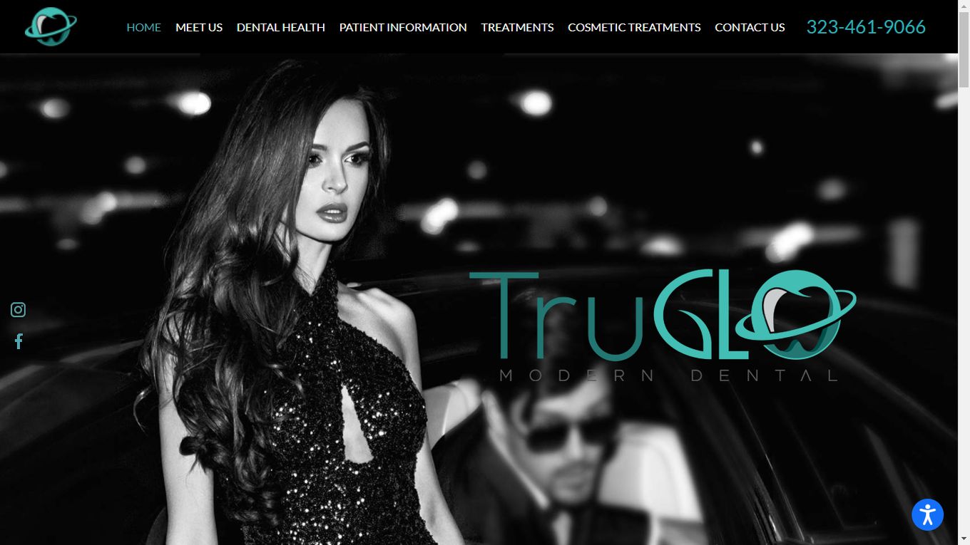
Glo Modern Dental feels like it is designed for the modern generation, especially the visuals-driven one you might find on Instagram, Snapchat, or other platforms of that kind. It has a quiet, almost-noir feel to it that is complemented by its name- Glo.
There is a heavy tilt toward giving the teeth the best possible look. Glo Modern Dental has a heavy Hollywood influence like cosmetic adjustments and other treatments for looking prettier and even markets itself as Hollywood’s best-rated cosmetic dentist.
Visitors can access information about dental health, treatments, cosmetic treatments, and more from the home page. Definitely, a really good dental website.
11. The Little Royals – Dentistry for Kids
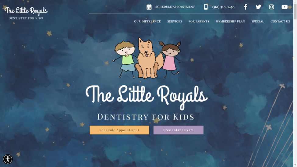
Dentists have tried all sorts of things to keep kids’ attention and draw away the fear from the appointments. They have toys and other distractions in their offices, but few have translated that kid-friendly vibe to their dentists’ website design.
The Little Royals is the answer to ‘what do we have to do on our website to make kids feel at home?’ the color scheme evokes memories of childhood book illustrations, with three mascots, a name that endears itself to children, as well as a calming look into the excitement awaiting kids at the establishment.
12. Cox Bond Dental
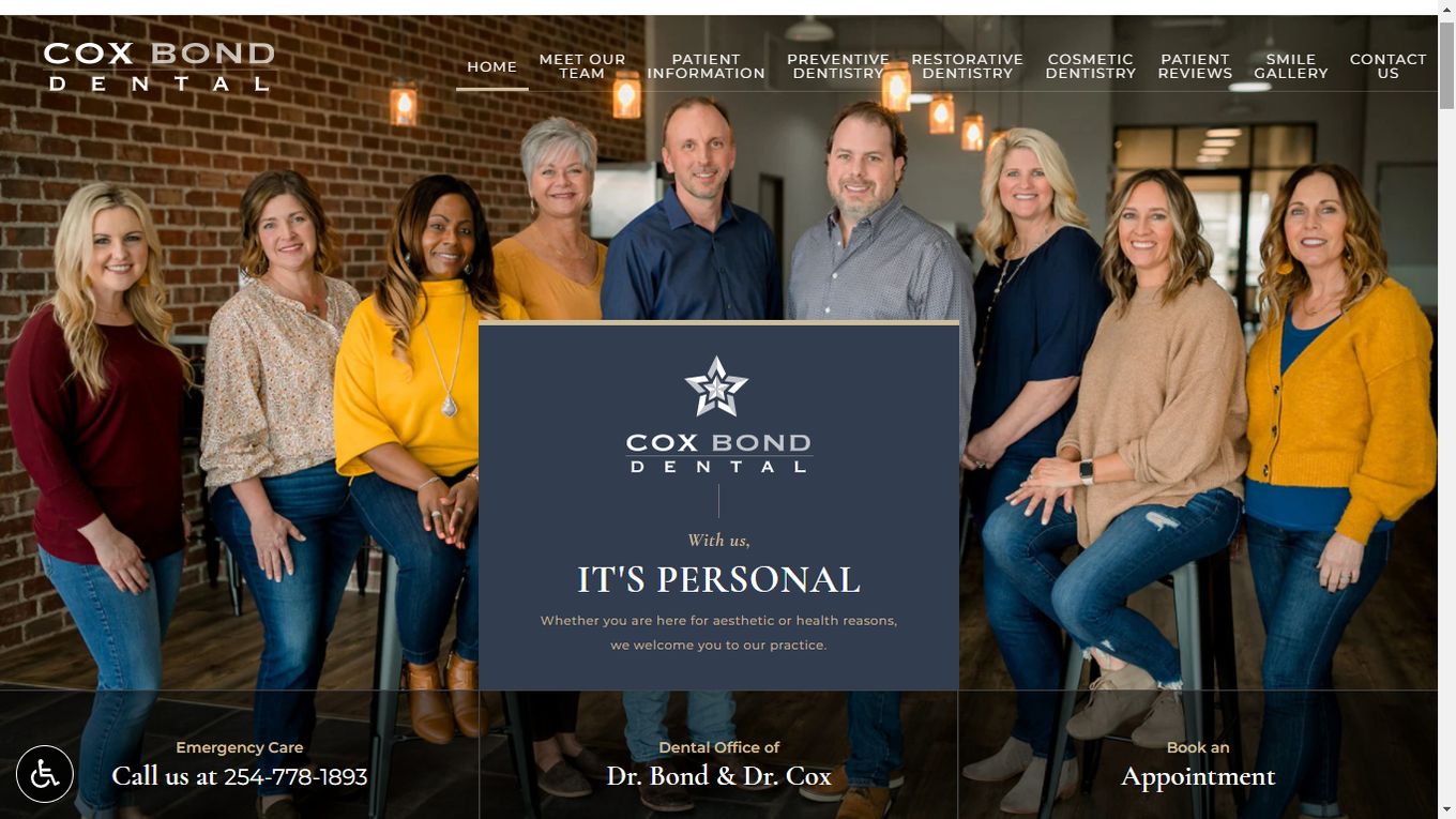
After looking at the dentist website design of The Little Royals, Cox Bond Dental may seem a little too professional, and that’s because it is. Sometimes, you want your dentists to stand in a row wearing a smile that says, ‘it will hurt a little, but you could not be in safer hands.’
From the layout to the font, the site reminds you of a state-of-the-art establishment with clean lines, straightforward language, and access to every part of the site’s homepage. The visual design leans towards an elegant look that appeals to millennials, especially boomers.
13. Toothpick
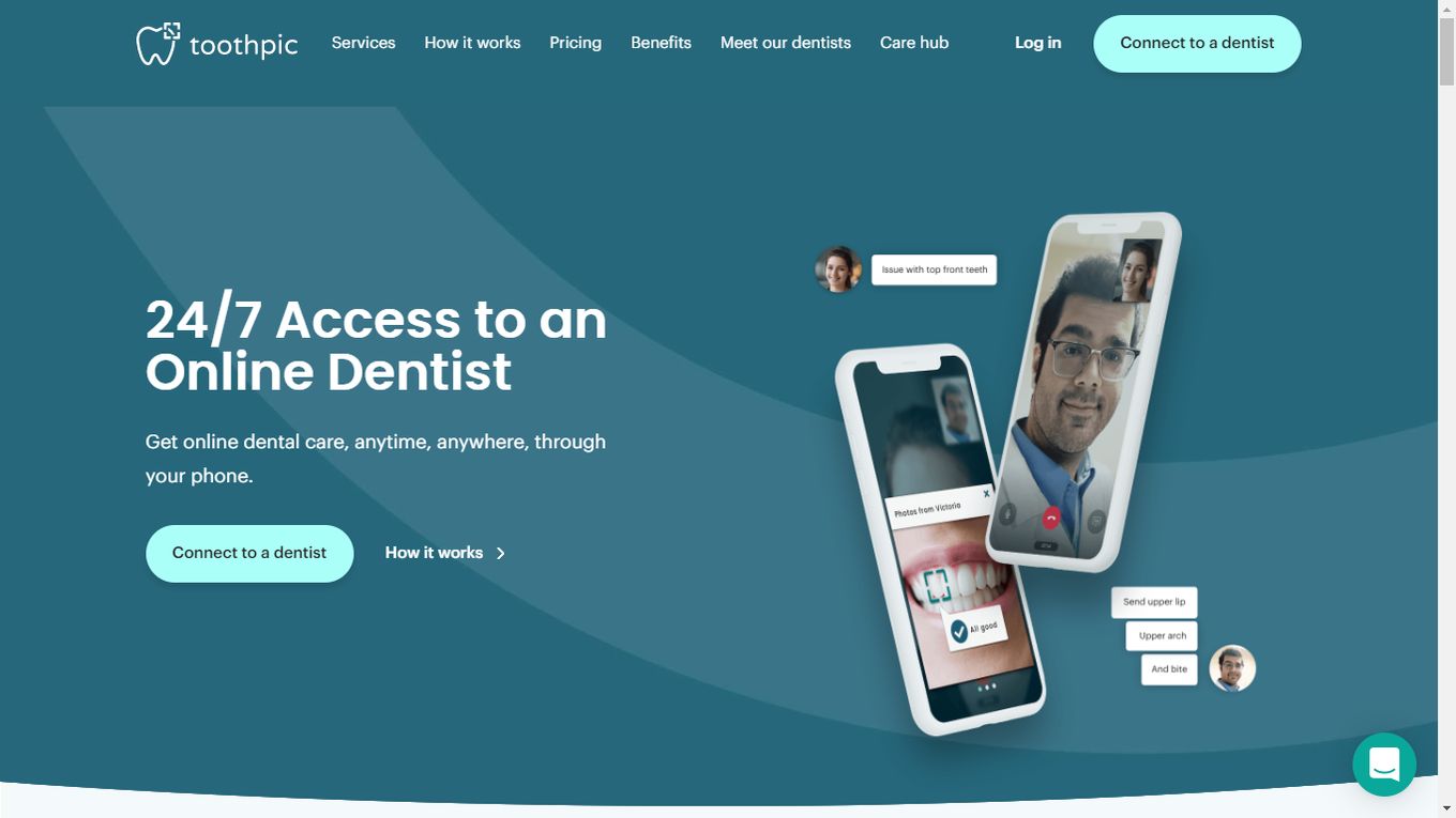
Most things are going virtual, and so is dental care. Few have done online dental care services better than Toothpick, which provides users with a service that uses technology and data to deliver care, more favorable outcomes, and a personalized experience.
On every page that you navigate to, Toothpick maintains a consistent tone and look that is not only easy to absorb but generally very calming to look at. Navigating to various elements on the website is easy with just one click from the menu.
15. ABC Dental
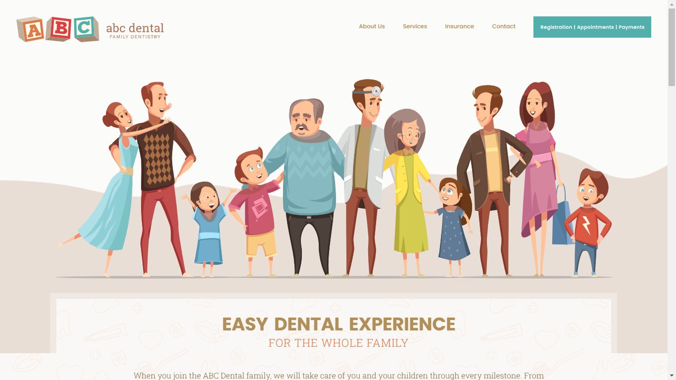
ABC Dental makes everything look and sound so easy. It is a message that is mirrored in the design language chosen. Instead of still images or videos, ABC goes for a playful look by drawing every graphic on the homepage in a unified animation style.
It is very simple to find out what this dentist is about because the value of time is emphasized, scheduling is easy, and payment options are listed. Websites for dentists don’t tend to cater to the younger audience, which is why seeing this is a relief for parents with kids spooked about their next appointment.
![30+ Best Church Website Templates [WordPress & HTML] church website templates share](https://alvarotrigo.com/blog/wp-content/uploads/2023/08/church-website-templates-share-300x150.png)
![9+ Best Contact Pages To Get Inspired [+ 15 Free Contact Forms] contact page examples share](https://alvarotrigo.com/blog/wp-content/uploads/2023/08/contact-page-examples-share-300x150.png)
![15 Portfolio Websites For Graphic Designers [Build Yours Now] websites graphic design portfolios share](https://alvarotrigo.com/blog/wp-content/uploads/2023/08/websites-graphic-design-portfolios-share-300x150.png)
![12 Amazing Slider Website Designs [Examples & When to use] slider website design examples share](https://alvarotrigo.com/blog/wp-content/uploads/2023/08/slider-website-design-examples-share-300x150.png)
![10 Best Medical Website Design [Examples] medical website design share](https://alvarotrigo.com/blog/wp-content/uploads/2023/08/medical-website-design-share-300x150.png)
![20 Amazing animated Sliders [ Inspirations & Examples ] animated slider share](https://alvarotrigo.com/blog/wp-content/uploads/2023/08/animated-slider-share-300x150.png)