Animated sliders are one of the most commonly used UI elements. Generally, sliders are used for various purposes, including but not limited to image galleries, app selections, volume controls, lock screens, etc.
Check out what is a slider? if you still need some more clarification on this.
Effectively implemented animation sliders enhance user experiences, making the user interface even more attractive, unique, engaging, and memorable. Thankfully, slider animations can be added to all web pages, including landing pages, the home page, blog page, hero sliders websites, or just anywhere you want on your website.
Do you want to add a slider animation to your website and need inspiration? This article comprehensively examines the best 20 animated slider examples you can draw inspiration from.
Without any further ado, let’s get straight into it!
Best 20 Slider Animation Examples
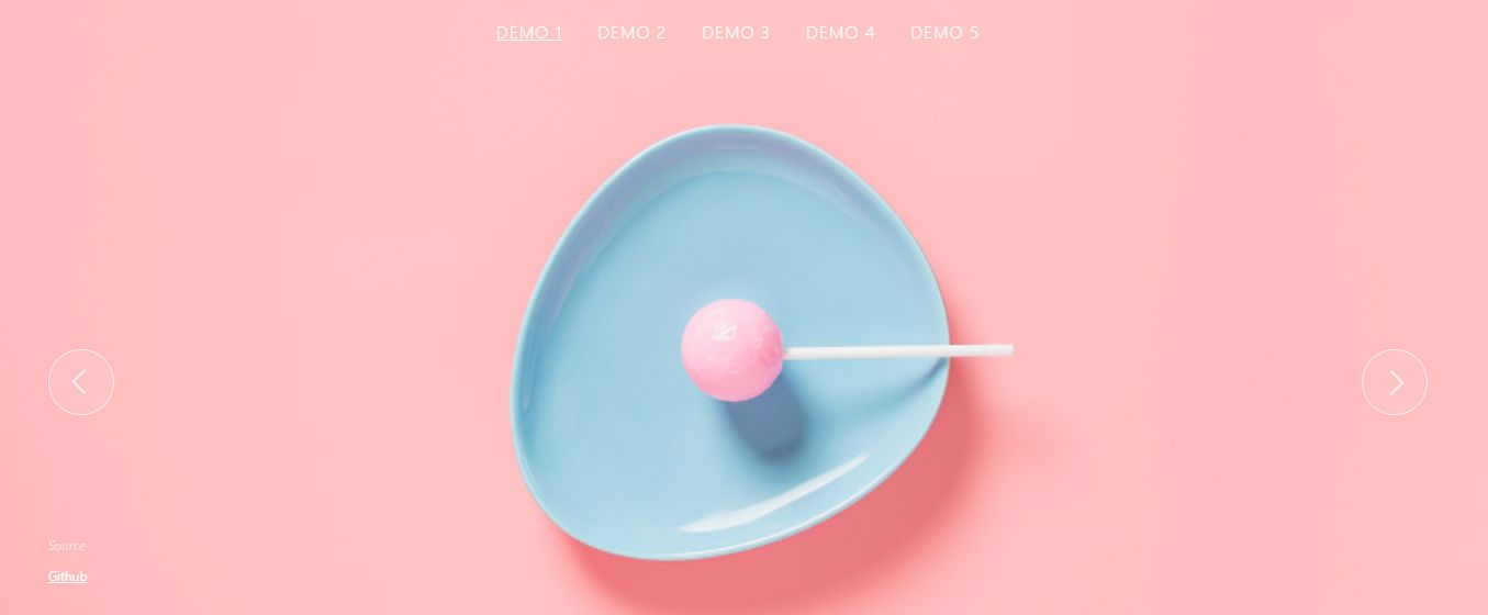
1.FullPage.Js
- Last commit:3 months ago
- GitHub Stars:35,427
- License:GPL-3.0
The FullPage.js website uses a beautiful full screen slider that will for sure create an impression on any visitor.
The slider works by scrolling the whole page at once and snapping to the next section when the user scrolls down. This is something that will make your page truly unique as very few sliders work this way.
Perfect for websites with eye-catching visuals and a few texts, storytelling, marketing, and almost any kind of portfolio.
Looking for a horizontal scroll? No problem! This component also provides a Scroll Horizontally extension to create a beautiful horizontal animated effect.
2.Patagonia
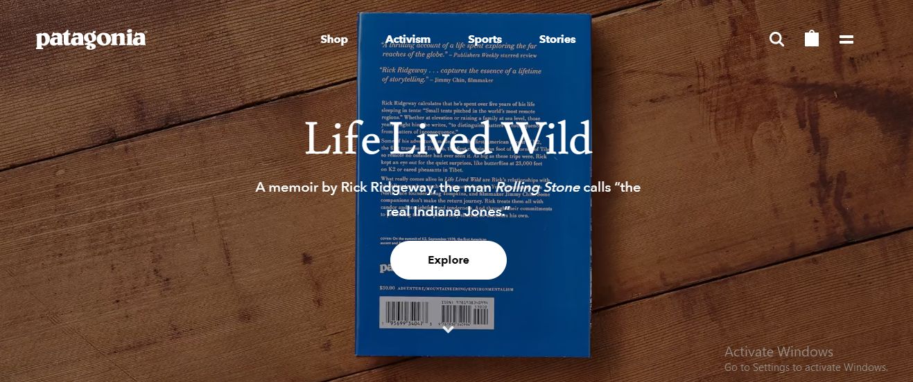
Patagonia’s homepage features a dedicated animated slider with a seamlessly integrated Call to Action. It’s a brilliant way to let your visitors know what they’re getting as quickly as possible. The simple-designed animated sliders also feature a white or black button, contrasting with the background, consequently enhancing the visibility of the CTAs. This slider animation sample is recommended if you’re designing a product page.
3.Weima
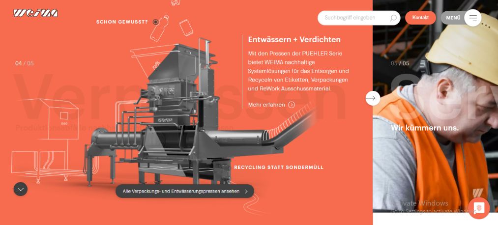
This animated slider takes visitors on an adventure: it’s typically challenging to know what to expect next as you slide. This full-screen slider is just filled with various animated effects, whether a smartphone conversation popping to the top or a 3D sketch dropping from the top to bottom. Do you want to keep your visitors amused as they land on your page? You can find inspiration from Meila’s homepage.
4.Artistide
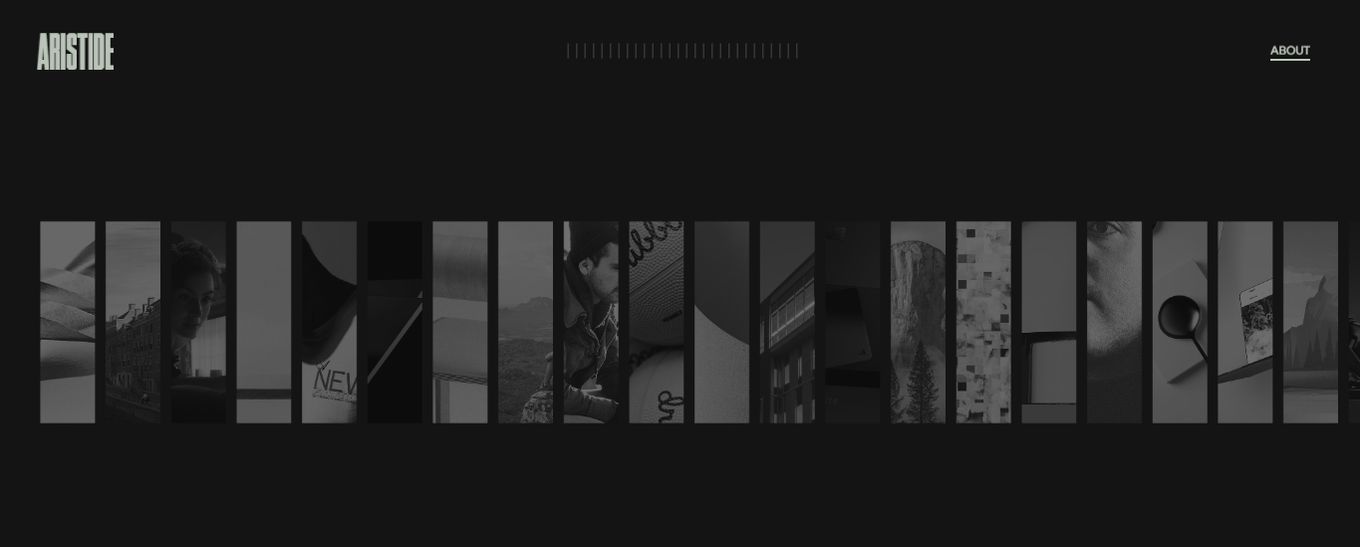
Artistide is “just perfect” for websites with lots of media content. The website features a summary-like collection of photos that expands when clicked on. You can use the mouse scroll to navigate each slider: the solid black background plus the brilliant use of fonts and color blend employed contributes significantly to the site’s aesthetics.
5.Designory
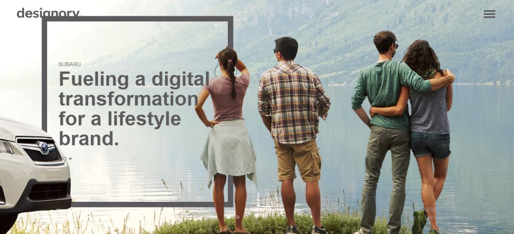
Designory’s homepage features a solid background, a gallery of stock photos, and animated texts that pop at the side of the page as each slider loads. The animated sliders pass to each other in effortless harmony, making navigation very easy. Despite its simplicity and fewer animation effects, it is an excellent way to welcome your visitors and let them know what your website is about as quickly as possible.
6.MotleyCrowd
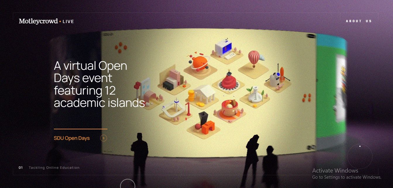
Ideal for entertainment and websites with news sliders, the MotleyCrowd website features a cycle-like slider that rolls when navigated. The background slider animations alongside the stylish cursor significantly improve the aesthetics of the website, consequently engaging visitors in the best way possible.
7.Sal Parasuco
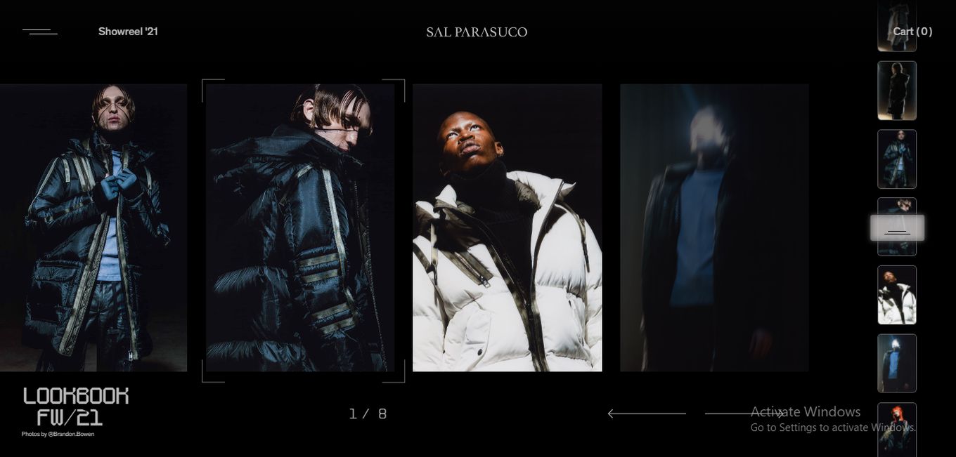
The most prominent feature of Sal Parasuco’s website is its excellent aesthetics and stylish navigation/pagination. The website features a gallery of photos over a solid black background: two arrows are at the bottom corner of the website for navigation across each slider; you can also use the vertical scroll at the right. It’s a brilliant design model for fashion website designs or photography portfolio websites.
8.Gabriel Cuallado
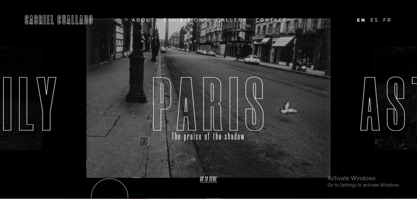
This website features a black and white-themed design. The animated sliders disappear stylishly in a way that would amuse any visitor when navigated. The bold font employed in its design also portrays confidence and originality; a cursor hovers across the page as you move your mouse, making it easy for users to navigate the website.
9.Harcome
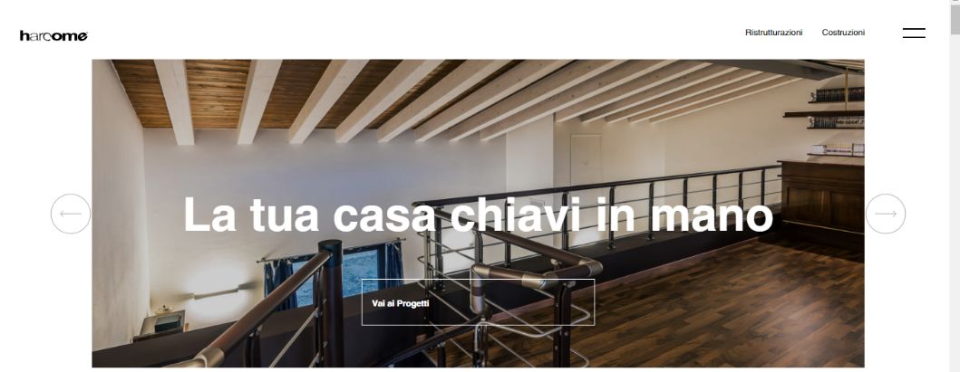
Harcome’s homepage explores a fancy animated transition effect that improves user experience. It’s a horizontal slider with classic sliding effects and block reveal animation, giving visitors a stylish and refreshing feeling as they scroll through the sliders. This animated slider sample is excellent for use in product landing pages.
10.Yuri Artiukh (webflow)
Relatively simple yet artistically designed sliders should also suffice for websites with more media content. Yuri’s animated slider design features solid images that dissolve into one another as users navigate. The website is also intuitively paginated with arrows on both sides of the page, making it easy for visitors to move around.
11.Talia
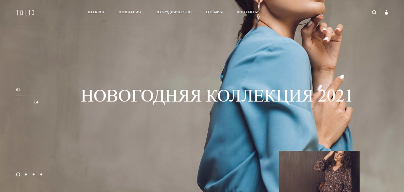
Talia’s website is ideal for fashion stores with plenty of designs to showcase to visitors as soon as they land on the website. The sliders contain solid photos as the background while some texts occupy the center of each slide. A small rectangular box hovers across the page in the mouse’s direction, showing a snippet of the image in the next slide. This keeps visitors curious to see the full photo thereby making them spend a long time on the website.
12.Skal
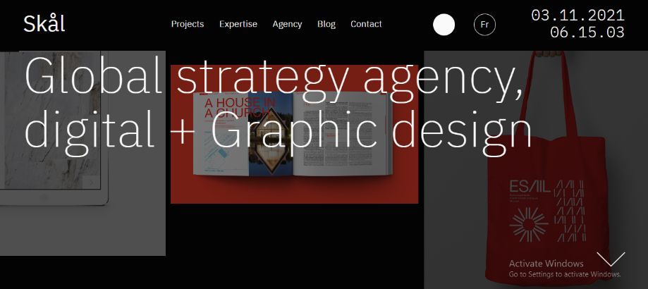
Skal displays content in small portions. The sliders are incorporated into the background, making the main tagline shine. Also, you can navigate the slides by hovering your mouse on the page. It’s an obvious slider animation effect that eliminates possible confusion.
13.Goodfight

The sliders on Goodfight’s website are somewhat similar to those on Artistide: a solid black background plus a gallery minimized to show as many photos as possible at a time. However, unlike Artistide, the slides are always in motion. You can also make the sliders fullscreen using the command located at the bottom of the page. Goodfight’s slider animations are ideal for fashion brands.
14.Kelly Milligan
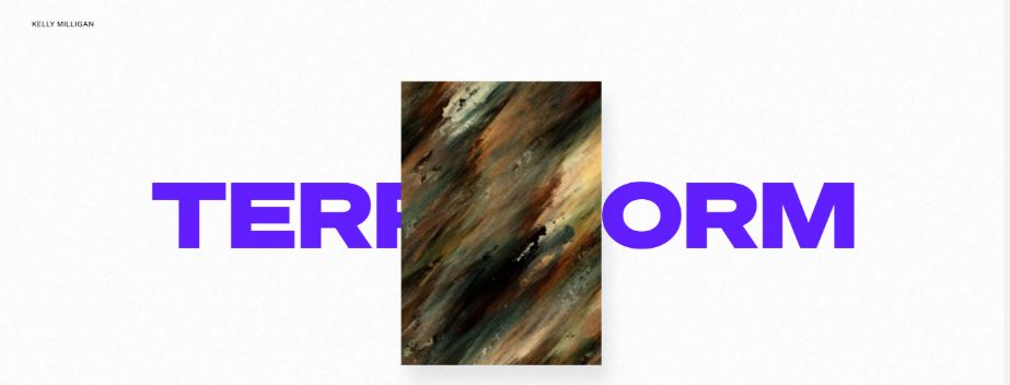
These sliders explore a clever use of whitespace. It’s a simple design that features only a small animated rectangle just at the center of the page. It’s an approach to easily catch users’ attention, making them wonder what you are all about. The mouse interactions and transition effect are also a delight to explore.
15.Philadelphia
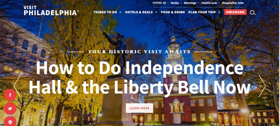
Philadelphia uses a responsive, animated slider with the content right at the center of the page. Also, the content is supported by videos and solid backgrounds to ensure easy readability (if you want to see how they added the first background video, you can read how to create a video background with just CSS).
Each slide also has a CTA to lead the user to the right destination on the website. Its slider animations are ideal for websites with service offerings.
16.Jasper Landerberg
Hovering your mouse over each slider creates an amusing ripple-like effect, enough just to keep visitors engaged. It also features a brilliant navigation scheme: as you progress into each animated slider, the text for the previous slide fades into the background while a new one comes up. Click and drag your mouse to scroll through each slide.
17.BigEye Creative

The BigEye Creative website features slow-loading slides that fade into full-screen as it loads. The sliders seamlessly complement the website’s overall design and feeling: ****two (2) navigation arrows ****are included on both sides of the sliders ****to help users move around the website comfortably. This design is ideal for websites with visually appealing media (photos).
18.Bilt (webflow)

Top-quality images, seamless vertical transitions between slides, and brilliant pagination are the major elements of the animated sliders on the Bilt website. . Do you have a gallery of artistic photos to show your visitors in the most appealing way? You can get ideas from the slider animations on the Bilt website.
19.Garden Eight
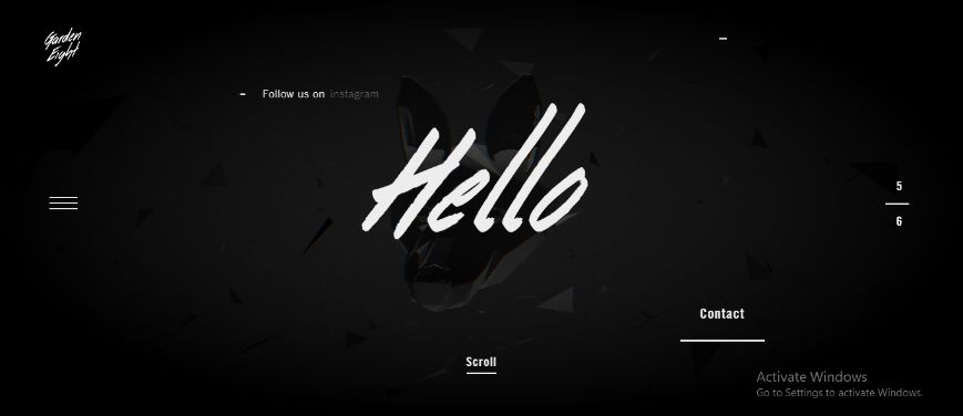
The Garden Eight website employs an animation technique whereby texts appear to fade into the page – like they’re written out. This is achievable with FullPage.js. The website also has a 3D background image that tilts and turns as you scroll through the animated sliders. This creates some sort of amusement in users, engaging them in the best possible way.
20.Only Once Shop
Only Once Shop uses a lightweight, simple-designed, and powerful slide animation. Each slide transitions into another seamlessly, telling a story, one slide at a time. This flexible slide animation design is recommended for websites with plenty of media content.
Time To Create Your Own Animated Slider!
Undoubtedly, adding animated sliders to your website is a brilliant way to highlight your offerings and grab the attention of your visitors very quickly. The best 20 slider animation examples outlined in this article are great pointers to help you create animated sliders that best suit’s your website’s design.
Should you still have any questions, do not hesitate to share them with us via the comment section below.
And if you are looking for more specific kinds of sliders, consider checking this list with great testimonials slider examples for WordPress


")
