A good wireframe is the foundation of a successful website. Website wireframe examples can help designers anticipate issues with website features, such as the user interface.
For example, a well-designed homepage wireframe sketch can help a designer distinguish between primary and secondary buttons, thereby improving the end user’s experience.
In this article, you will discover what a website wireframe is, why it is so important, and how to create your wireframes. You will also find a sufficient number of wireframe examples for websites to draw inspiration from.

If you still don’t have it clear what a wireflow is and how it’s used, check out what’s a wireflow first.
What is a Website Wireframe?
A website wireframe is a mockup or sketch that represents the planned layout of a web page. Wireframes help organize the web design process, from conception to realization. They also focus on the behavior of a website, user flow, and responsiveness.
Most wireframes provide a basic layout that you can build on. For example, some web design website wireframe examples will include a header, a logo section, and a menu. These three components will create the outline that most people want to cover on their website.
Why Are Web Wireframes Important?
Web wireframes are important because they refine the user experience and save time and costs during the development process. They foster brainstorming and allow early feedback from clients before full implementation.
Here are the five reasons why web wireframes are important:
- Improve User experience. They refine the user experience by helping refine the product design before its development.
- Save Money and Time. Wireframes reduce costs and time that can be used in future stages of website development.
- Encourage Brainstorming. The design process of the wireframe generates multiple design ideas and solutions for your web design project.
- Provide Pre-Feedback. They help developers get feedback from clients before committing to a project.
- Help Identify Priorities. They assist the development team in recognizing what is essential to the client.
It’s now time to get down to the real deal.
17 Website Wireframes Examples
Discover wireframe examples you can use as inspiration for your next web design project.
1. e-Commerce Website Wireframing
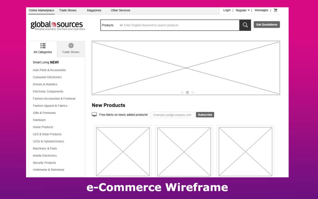
Global Sources’ business showcases the typical e-commerce wireframe example. Products can be readily displayed in the center of the product page and loaded with information in the description entry.
Its setup enables flexible and user-friendly navigation. This well-designed wireframe sketch includes the home, category, message, and login pages.
2. Low-Fidelity Wireframe
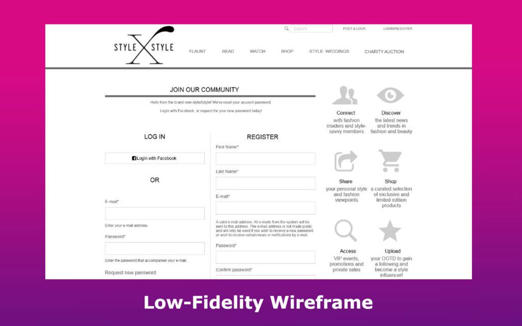
This is a good example of what a fashion website’s low-fidelity wireframe should entail.
StyleXstyle has several basic pages, including a charity auction, login, details, and a profile. Every page in this wireframe is carefully thought out, and each interactive element is strategically placed to boost UX.
Related article: All about low-fidelity wireframes
3. Detailed Website Wireframe Example
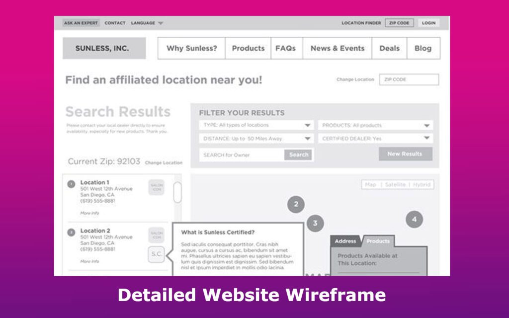
Chris Decatur, author, shares some work from his client portfolio to help inspire others. His samples showcase the importance of planning and building a layout with the end user in mind.
The design process of this sketch led to a well-structured wireframe that clearly outlines the essential elements of a school and spa business website.
Chris’s final designs have achieved good workflow and strategic interactive element placement to optimize the UX. For instance, the University of Miami website homepage wireframe includes everything a user might be looking for, including the contact and announcements sections.
4. Desktop Homepage Wireframe
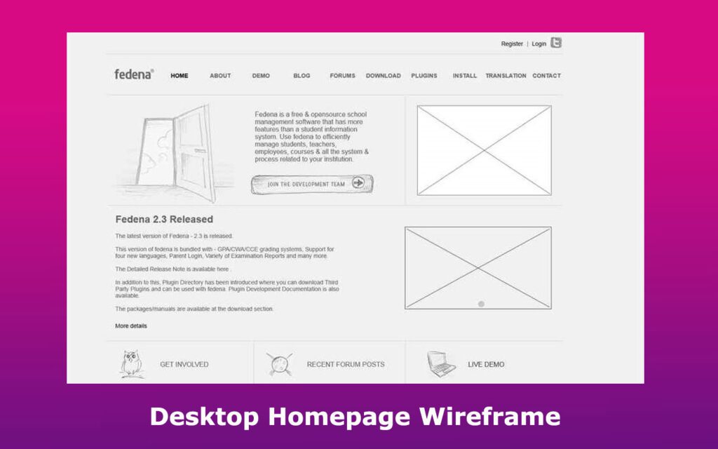
Fedena is a prime example that showcases the features a design developer should include in a school management homepage website mockup. It includes elements such as the teacher-parent-students communication system, attendance, timetable, and more.
The prototype design features various sections, including the register, forums, downloads, about, and plugin pages.
5. Responsive Wireframe
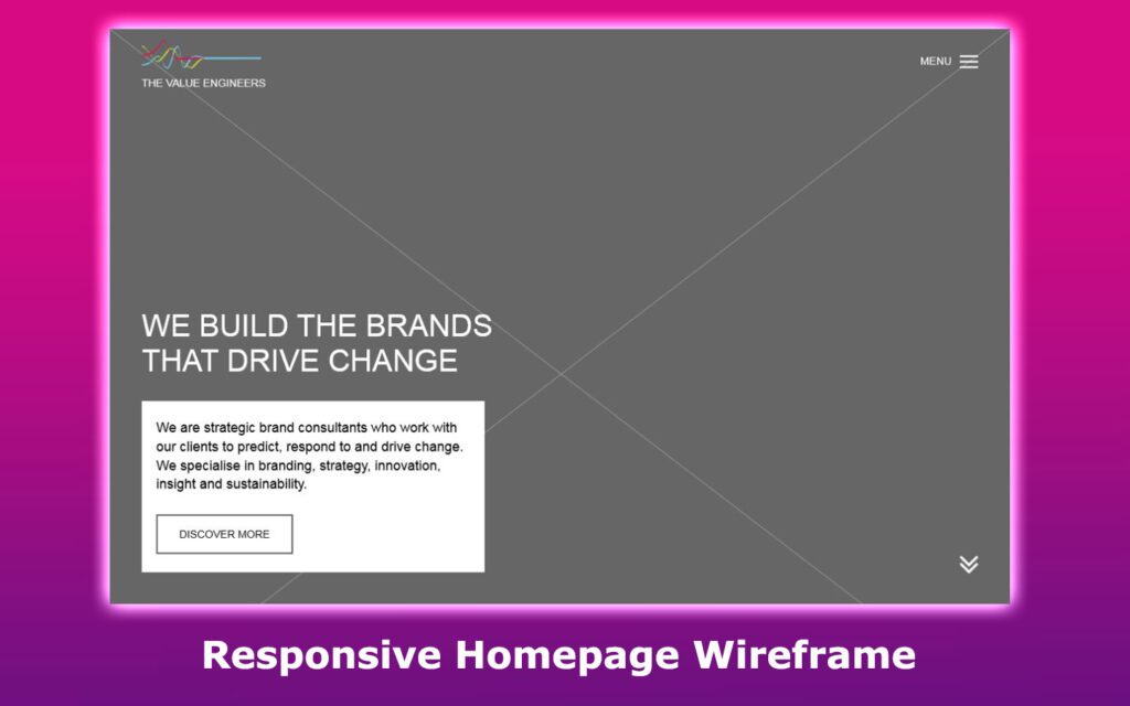
The Value Engineers is a brand consulting company with expertise in strategy, innovation, and branding. Their website’s responsive homepage wireframe features the main information of the consultancy, including the contact, details, home, and about us pages. You can access it through the call-to-action button or the hamburger menu.
6. User Journey Wireframe
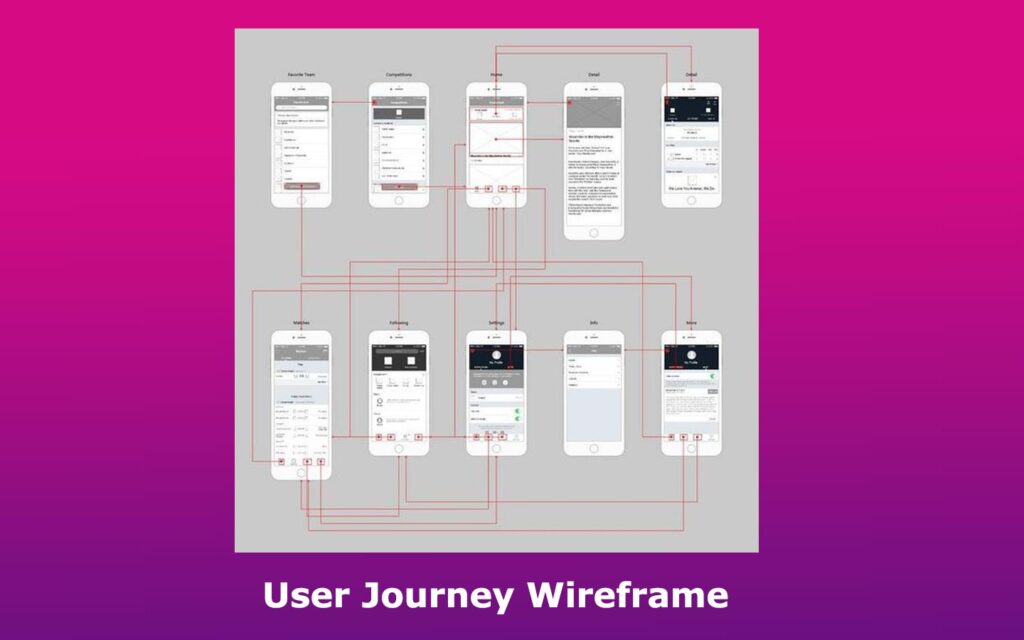
This user journey mockup is a detailed, mid-fidelity wireframe that helps clients and stakeholders understand the user flow. It demonstrates how the interactive elements will assist the user in browsing the finished product.
This web layout wireframe serves as a general website design blueprint that can be applied across multiple industries. It is ideal for use in the later stages of website development, as it presents a solid design plan.
Related article: User flow examples.
7. Hand-Drawn Wireframe for Website
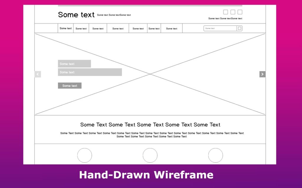
This mockup is among the many wireframes made by Patel. It is almost like a hand-drawn wireframe. This wireframe example uses a low-fidelity design and can be applied for various purposes, including newspapers and promotional websites.
8. Website Form Wireframe Mockup
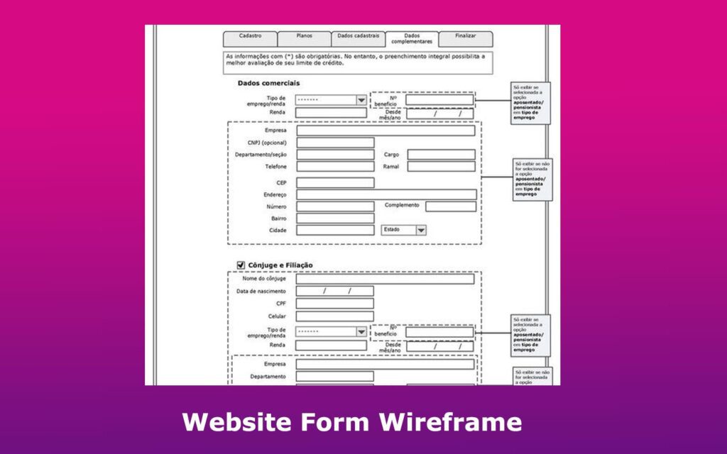
Thanks to creators like Fabio Sardinha, bank credit can now be done seamlessly. The Brazilian web designer developed this mid-fidelity wireframe with efficiency in mind, as everything can be accessed or filled in within a single page.
If you’re working on a bank credit page or banking website as a whole, there might be some ideas you could use from Fabio’s form design.
9. Call-to-Action Wireframe
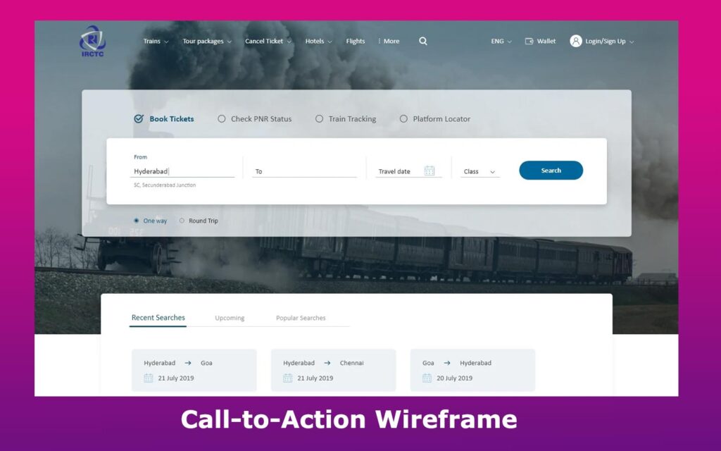
This blueprint template is designed to suit booking websites. In a single wireframe, it features various functions, including booking tickets and meals.
The creator of this high-fidelity wireframe ensured the information design is straightforward to facilitate easier booking. That’s why it has a clear call to action: searching tickets.
10. Mobile Website Wireframe
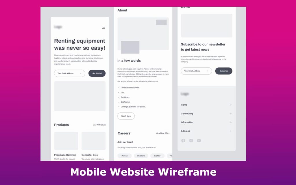
Designers ensure their wireframes are responsive to various screen sizes, accommodating all users. Some might even prioritize mobile wireframing since most people will try to access a website on their phones.
This mobile wireframe shows different pages relevant to the user journey, including the subscription and product pages. It displays the general layout a creator might use when designing a rent-related website.
Note that the design is user-focused because of its straightforward and convenient element layout.
11. Dashboard Wireframe
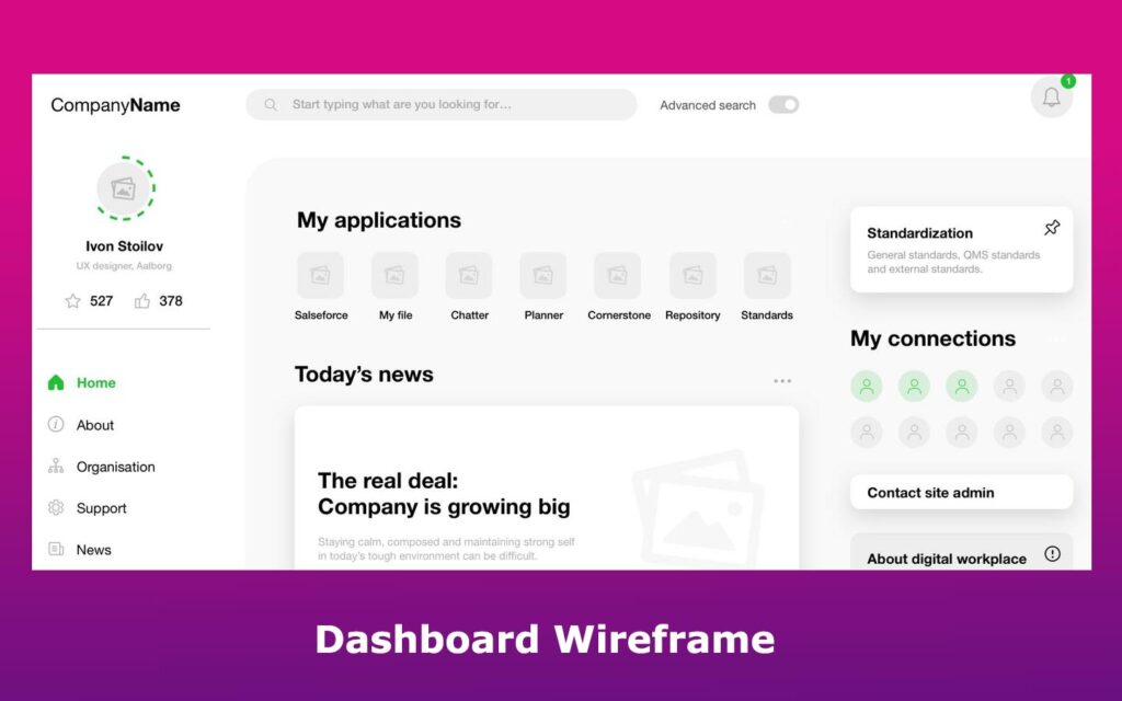
Dashboards are a type of UI design that provides several interactive elements relevant to a website. They help users access their profile, support, contact, and home page in a single window.
In this sketch, users can find everything they need with a simple glance. And that’s not something easy to do. If you need a clear and compelling dashboard design, this wireframe is for you.
12. Landing Page Wireframe Example
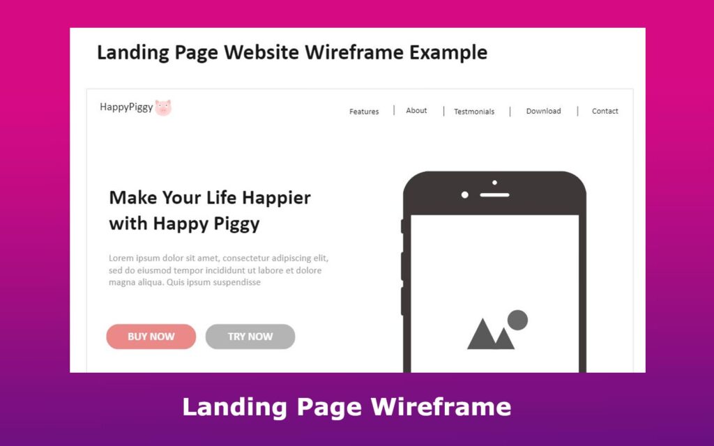
Designers use landing page wireframes to create a structure of how the landing page will look in the finished website.
This landing page design features a banner and other key elements that can be used to highlight a topic effectively. It also features some interactive elements, including buttons that redirect to other web pages, such as testimonials, about us, features, contact, and download pages.
13. UX Web Design Wireframe

Karol Woźniak created this sketch for his Voom website project. The wireframe uses adequate typographic spacing, establishing a good visual hierarchy of the components. Its zigzag layout makes it easier for users to skim the website’s content with minimum effort. It is an example of a good UX design.
14. High-Fidelity Wireframe
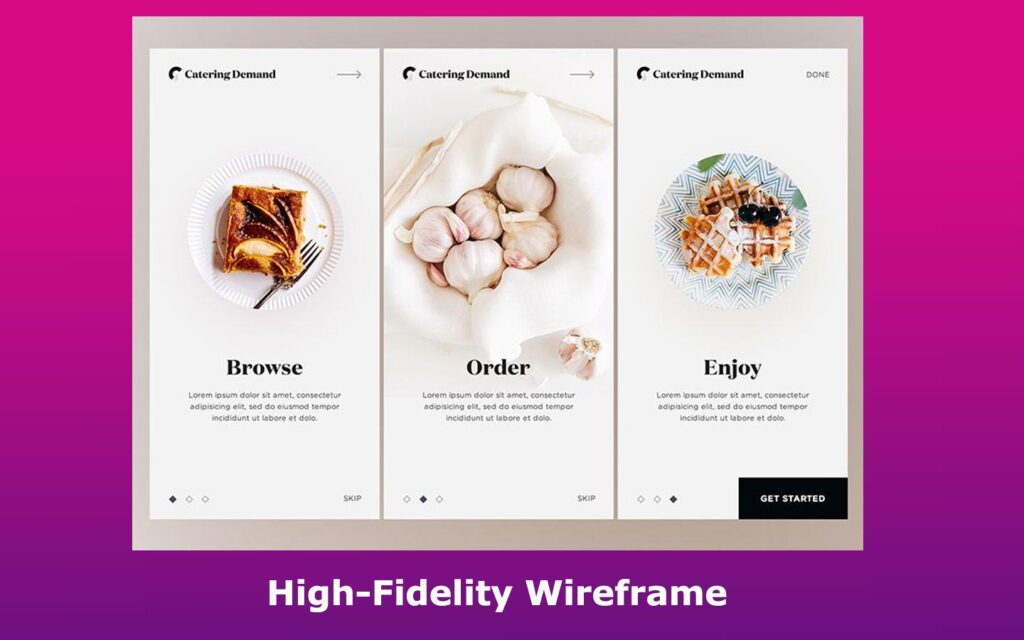
Masadur Rahman created this high-fidelity wireframe example specifically for catering, but its components are adaptable for most service-based websites. The design shows the power behind white space and simplicity.
If your client runs a service-based business, then this detailed design might be the right inspiration for you.
15. Blog Homepage Wireframe
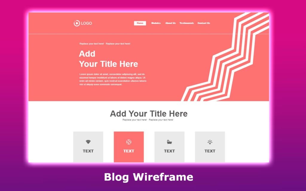
This wireframe example illustrates the potential of a blog homepage with proper planning and design. It consists of content related to basic information, plans, and website functions. The sketch includes elements that allow users to visit product and service pages.
16. Blog Post Wireframe Template
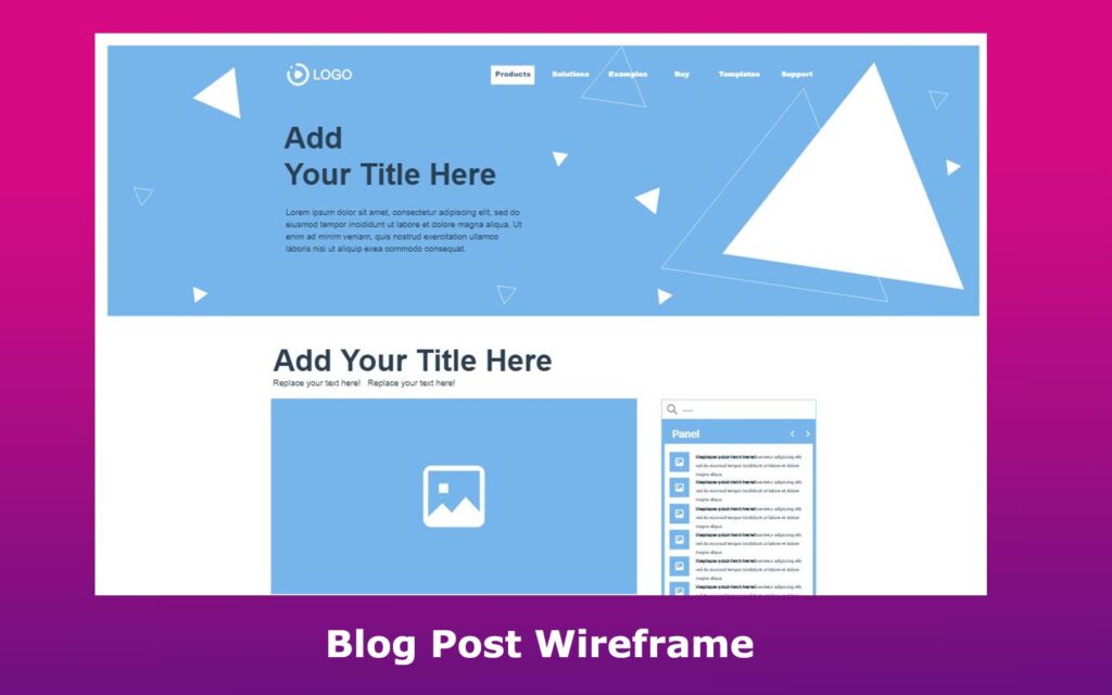
This detailed blog design is a high-fidelity wireframe example that showcases various sections you should include in your blog website. It outlines a section for the brand name and logo.
The wireframe also features several blog post entries that enable users to insert descriptions and media content, such as videos or images. The bottom of this wireframe sketch also shows how users should organize their work, including the author’s details, and more.
17. Mobile and Desktop Wireframe
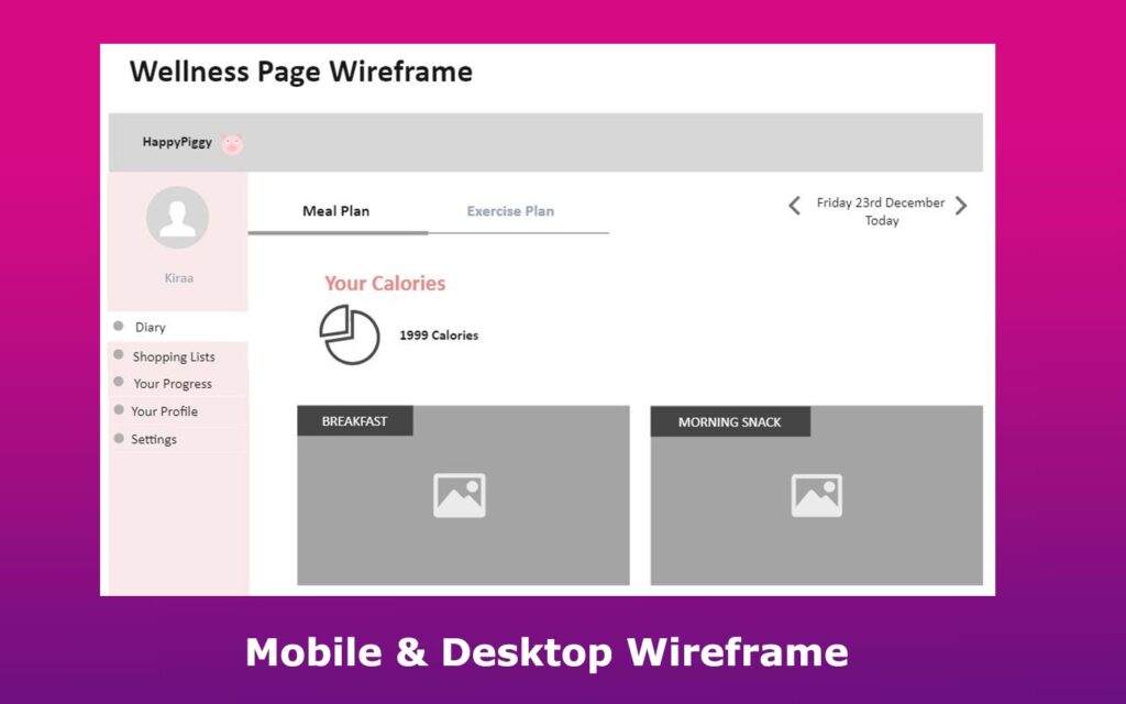
This wireframe example is specially designed for mobile devices or desktop websites. It is intended for fitness-related businesses. It focuses on providing users with a personalized touch through record-keeping.
The wireframe shows how to store records, including body weight, meal plans, and shopping lists. There is also a webpage for tracking calorie count and user progress. This wellness product wireframe is designed to appear visually simple while maintaining its functionality.
How to Create a Wireframe for Your Website?
Wireframing is the core of your web design. The designer must make informed decisions when developing a website to minimize the need for future changes.
Here are the steps to create a good wireframe for your site:
- Identify the Client’s Goals. Understand the key metrics that impact online traffic flow. With that purpose in mind, they can provide what the customer needs.
- Do UX research. This will help the designer understand a user’s journey. The feedback will allow them to optimize some features, including interactive buttons.
- Determine the Wireframe Size. Since users will access the information through different gadgets, the wireframe should be responsive to multiple screen sizes. After ensuring the wireframe is adaptive to various devices, the designer should start designing different web pages, including the About page.
- Add Components and Gather Feedback. This will further optimize the wireframes for the clients. For instance, you can use a different font for the “forgot password” text on your homepage sketch and gather feedback from stakeholders or clients.
Getting started with wireframes can be as simple as using pen and paper or as advanced as exploring professional wireframing tools. The critical step is deciding to start wireframing.
Get Inspired by Wireframe Templates for Your Web Design
These templates have shown how even the simplest low-fidelity sketches can evolve into high-fidelity wireframes that bring your website vision to life.
By studying real examples and applying the proper techniques, you’ll be better equipped to design user-friendly layouts. Use these ideas to launch your next project with clarity, confidence, and a clear creative direction.
![Low Fidelity Wireframes [What are they + Examples] low fidelity wireframes share](https://alvarotrigo.com/blog/wp-content/uploads/2023/08/low-fidelity-wireframes-share-300x150.png)
![What is a Wireflow in UX Design? [Examples] wireflows share](https://alvarotrigo.com/blog/wp-content/uploads/2023/08/wireflows-share-300x150.png)
![How to Become A Web Designer in 2024 [With No Degree] become web designer share](https://alvarotrigo.com/blog/wp-content/uploads/2023/08/become-web-designer-share-300x150.png)
![15 Portfolio Websites For Graphic Designers [Build Yours Now] websites graphic design portfolios share](https://alvarotrigo.com/blog/wp-content/uploads/2023/08/websites-graphic-design-portfolios-share-300x150.png)
![10+ Amazing Flat Design Websites [for Inspiration] flat design website share](https://alvarotrigo.com/blog/wp-content/uploads/2023/08/flat-design-website-share-300x150.png)
![6 Steps of Web Design Process [All You Need For Good Designs] web design process share](https://alvarotrigo.com/blog/wp-content/uploads/2023/08/web-design-process-share-300x150.png)