If you have a normal scrolling website on mobile or tablet and fullPage snap scroll on desktop, you just have to activate the Responsive Mode.
You can find this option under Settings > fullPage > Design.
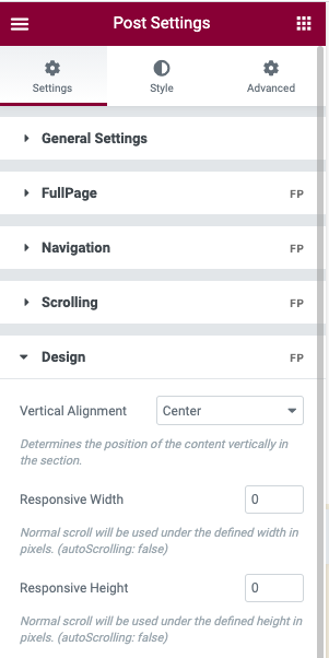
For example, you can set it to 767. This means that for the screens with a viewport of less than 767px, a normal scrolling website will be shown. And when I mean a normal scroll website I mean a website with normal scroll instead of the fullPage.js snap scroll (called autoScrolling on fullPage.js terms).
Changing CSS styles on responsive mode
When you use this Responsive mode the class fp-responsive is added to the body tag in case you want to use it for your own responsive CSS. You might want to change the color of the background on responsive mode, then you can easily use conditional CSS styles tod so, for example:
body{
   background: black;
}

body.fp-resonsive{
  background: white;
}
And you can go a bit further and even use this class in child elements. Let's say that you want to change the nav menu font size on responsive mode. You could do this:
nav{
   font-size: 12px;
}

/* On Responsive Mode */
.fp-responsive nav{
  font-size: 20px;
}
Removing full-height restriction on responsive mode
You need to allow sections to be bigger than the viewport height when on a small screen device? No problem! FullPage has you covered too!
You can make use of the Responsive Auto-Height option for the sections.
In order to use it, click on one of your sections to see the options and you'll find the Responsive Auto Height option on the fullPage menu:
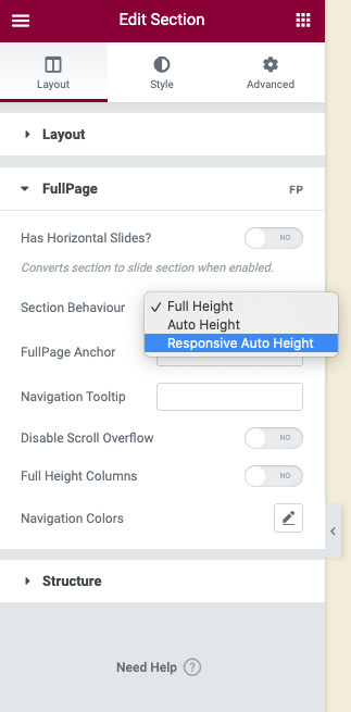 Now, as long as you define the Responsive Width or Responsive Height options mentioned above, your sections will become as big (or small) as your content needs. They won't be forced to be full-height anymore and you'll enjoy a fully responsive experience!
Turning horizontal sliders into vertical sections
The responsive mode won't touch your horizontal sliders. They will still work the same way.
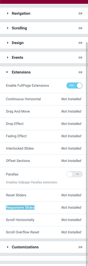
However, if you need them to become vertical sections you can do this by using the Responsive Slides extension for that (Also included in the bundle with all extensions). This extension will convert those horizontal slides into vertical sections so you can scroll them normally too. Ideal if you don't want your visitors to miss any piece of valuable information.
You can turn the extension on on Settings > fullPage > Extensionsand you are ready to go!
You might also find these articles relevant: