If you want to create a full-screen website in Webflow to scroll through multiple fullscreen sections when using the mouse wheel or trackpad, then using fullPage.js is the solution for it. This way you’ll be able to create a full-page slidehow in a matter of minutes!
Creating the layout
fullPage.js is a Javascript library that requires us to follow certain structure in order to use it. More precisely the following one:
<div id="fullpage">
<div class="section">Some section</div>
<div class="section">Some section</div>
<div class="section">Some section</div>
<div class="section">Some section</div>
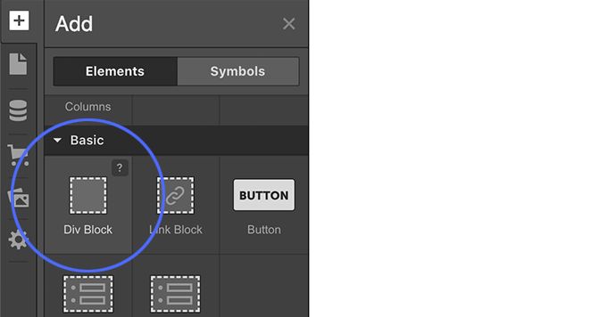
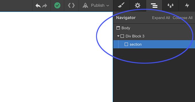
</div>Code language: HTML, XML (xml)To replicate the necessary structure, we will start by adding a div block that will be the container for all our full-screen sections on the site.
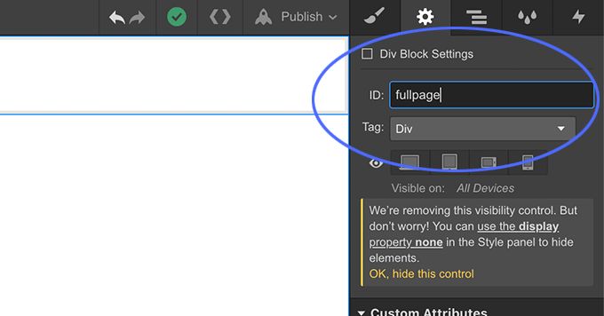
We will give it the id fullpage.
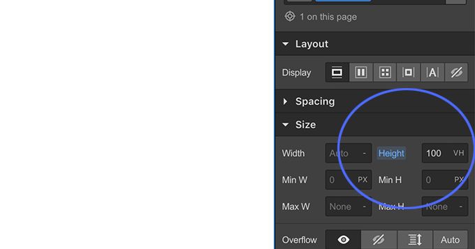
And we will set its height to 100vh.
Inside that container we will be adding more div blocks, each of them will be a fullscreen section on our site.
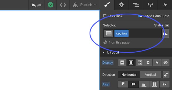
We can add one and copy and paste the others. Each of them will have to use the class section.
fullPage.js creates part of the magic once the page has loaded, such as creating the full-width and full-height sections behind the scenes. But because we are now working with the Webflow editor, we will need to do those same tasks in our editor first so we can see the site as it would look like when applying fullpag.js.
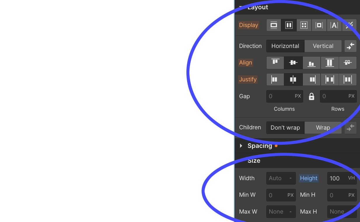
To do so, we will set the properties width and height of our sections to 100%. Additionally, if we want to have centered content, then we can set the display options to flex with a center align and justify layout options.
And that’s it! Now we have the main layout!
Our structure should look like this in our navigator tab:
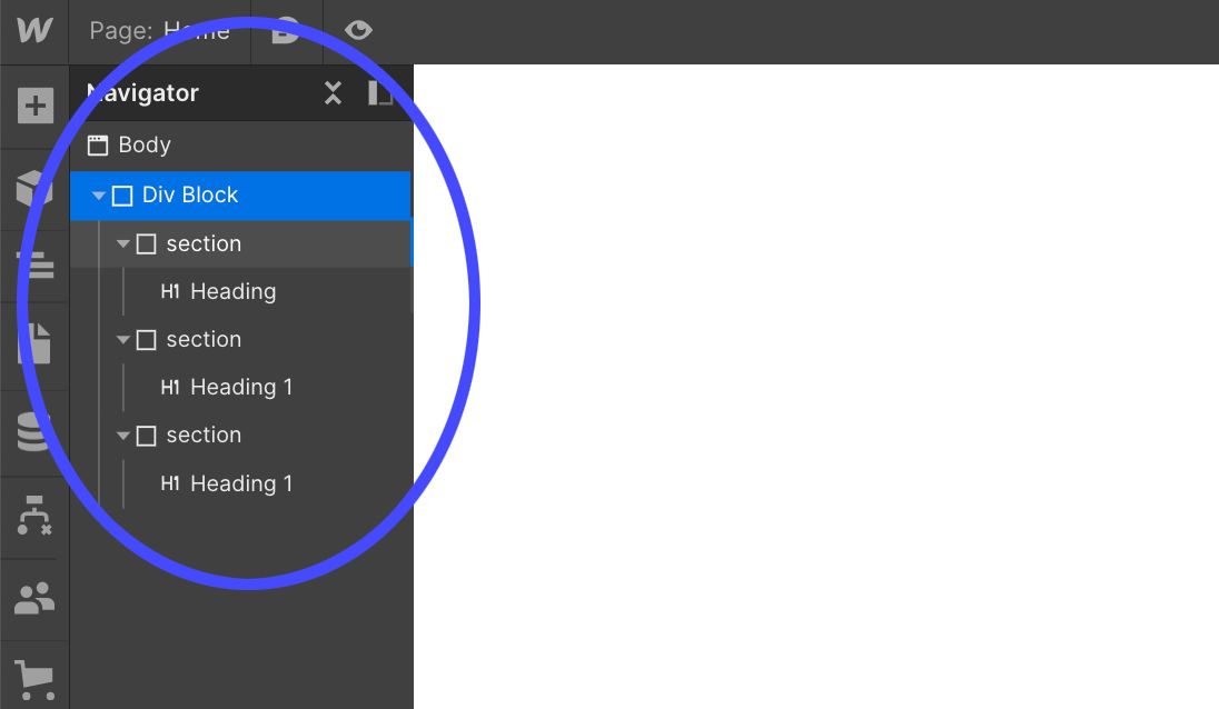
We can now add a background color by clicking on each of our sections and adding a different class to each section such as “section-1”, “section-2” and “section-3” and then changing each section’s background color.
Adding the fullpage.js component
When using any of the paid plans that Webflow provides, you can make use of what they call “custom code“. (The previous link is an affiliate link, so if you want to get a payed plan, please consider using that link, I’ll appreciate it!)
With these options, we will be able to:
- Import the files that the fullpage.js component requires.
- Initialize fullpage.js and customize its behavior.
In order to do so, we will have to go the the Pages menu on the left. Under our Home page settings, we’ll see the Custom Code menu element.
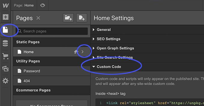
In it, we will add the following in the <head> tag:
<link rel="stylesheet" type="text/css" href="https://unpkg.com/fullpage.js/dist/fullpage.min.css" />
Code language: HTML, XML (xml)
And the following code in the </body> tag:
<script type="text/javascript" src="https://unpkg.com/fullpage.js/dist/fullpage.min.js"></script>

<script>
// fullpage.js initialization
new fullpage('#fullpage', {
	licenseKey: 'YOUR_KEY_HERE',
	scrollingSpeed: 1000,
	verticalCentered: false
});
</script>
Code language: HTML, XML (xml)
That will do the magic!
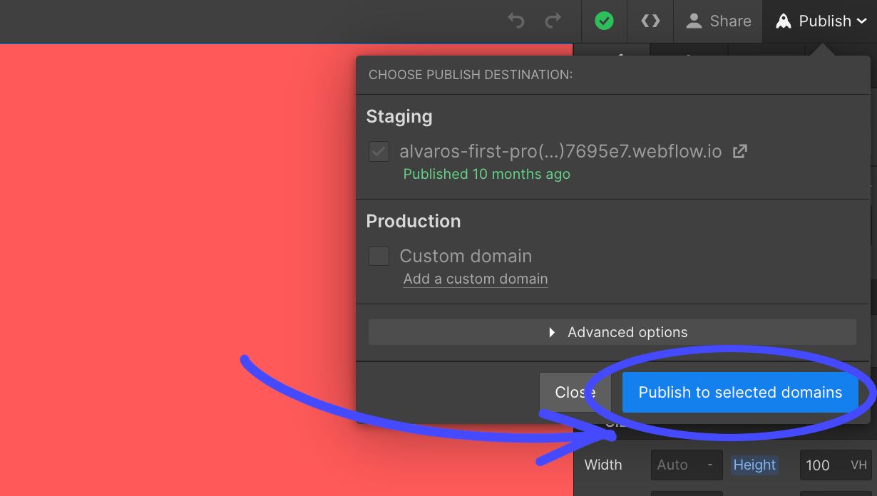
Now if we click on “Save”, and then on the top right on “Publish” > “Publish to selected domains”, we will bea ble to see the result.
Making the slider responsive
Now, what if we want to desactivate fullpage.js and its auto scrolling behaviour for small screen devices such as mobile phones and tablets?
Luckily for us, fullpage.js makes it easy. It is as simple as adding a new option in our fullpage.js initialization. Fullpage.js provides a few responsive options we can check in the documentation and one of them is responsiveWidth.
With this option we can set a value in pixels so whenever the viewport is smaller than that value, fullpage.js will get disabled.
Going back to Pages > Home > Custom Code, we edit our fullpage initialization on the </body> tag to make it look like the following:
   new fullpage('#fullpage', {
   	  licenseKey: 'YOUR_KEY_HERE',
   	  scrollingSpeed: 1000,
   	  verticalCentered: false,
   	  responsiveWidth: 950
   });
Code language: JavaScript (javascript)
Now, if the viewport width is smaller than 950 pixels we will have a normal scrolling website.
If we want to apply it also with a height limit, we can add the responsiveHeight option to it:
   new fullpage('#fullpage', {
   	  licenseKey: 'YOUR_KEY_HERE',
   	  scrollingSpeed: 1000,
   	  verticalCentered: false,
   	  responsiveWidth: 950,
   	  responsiveHeight: 500
   });
Code language: JavaScript (javascript)
So now whenever the viewport size is less than 950 pixels widht OR less than 500 pixels height, fullpage will turn off autoscrolling.
Video tutorial
I’ve created a video tutorial about it too, so if you prefer videos rather than text, here you have it!


