Drawing customers with just your bakery isn’t as easy as it sounds. Nowadays, hundreds of cafes offer baked goods to people with a cup of coffee, tea, or juice. And people much prefer that over having to come into a bakery to buy something sweet.
If you don’t have a website, you might also miss out on custom orders from people that don’t frequent your bakery. So, if you want to increase your business revenue and branch out so more people can see you, you need to invest in a bakery website.

But finding a good bakery website design that can be difficult. That’s why, in this article, we will be discussing 10 bakery website ideas and examples you can take inspiration from.
1. LA Baking
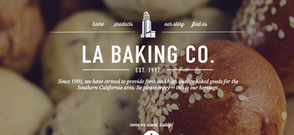
If this bakery website example is anything, it’s visually striking. The homepage features an incredibly appetizing picture of baked goods created by the company, making the white text stand out. On the homepage, you get an option that prompts you to scroll downwards, giving you a glimpse of some of their bestsellers.
The website is pretty easy to navigate since there are only a couple of options. To make it even easier to navigate, the website also comes equipped with small illustrations of the different things they offer, taking you straight to them.
2. Wildwood Bakery
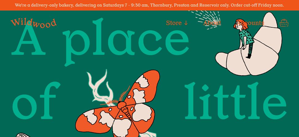
When you arrive at the homepage, you can instantly tell how much work and money has gone into creating this website. However, at first glance, you aren’t really able to figure out what exactly the website is about.
As you scroll down, you see more information about the website, pictures of their delicious goods, and different options for pre-ordering. There are only 4 options on the menu bar, and they further open into different options. The problem is that the website doesn’t have a scroll bar when you open it on a computer, which could be a bit trickier to access.
So, if you want something similar-looking, you can get an idea from this bakery website and then fix the problems this site may pose for visitors.
3. Breadtop
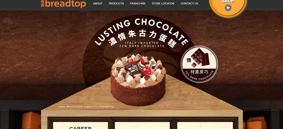
The construction of this website is ingenious because the cakes on the homepage look as if they were presented to you on a counter of an actual shop. The warm browns of the website compliment the cakes and bring the website together.
Something different about this bakery website example is that as you scroll down, you find not only the information about the website but also information on career opportunities, location, and franchise.
On most websites, usually, the text moves on top of the pictures. But on the Breadtop website, the text stays in one location, and the pictures move around or behind them. If you are looking for a bakery design idea, this website is definitely worth taking inspiration from.
4. Sugarfire Pie
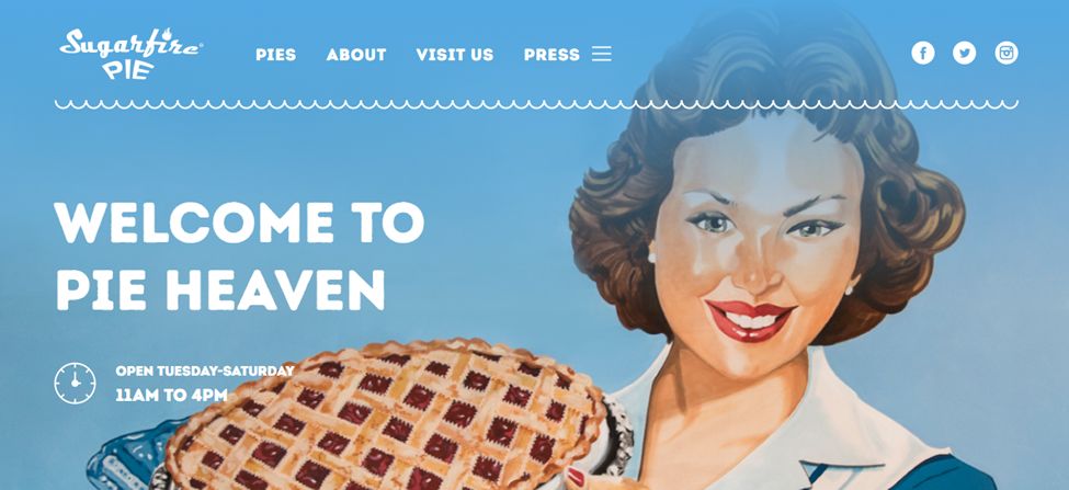
If you are looking for an idea for a bakery website that has an old-time feel, then this is it. Something about this website reminds me of the 80s; perhaps this is because of the illustration of a woman wearing 80’s fashion and holding a pie or because of the soft blue and white scheme that was popular. Either way, it gives the whole website a certain appeal.
As you scroll down, you see two clickable options, one displaying their menu and the other displaying their seasonal menu. Below that, you can also get details about custom orders.
Plus, the website is pretty easy and straightforward and poses no problems for people while navigating, especially because a sticky navbar follows the user everywhere. Definitely a great bakery website idea!
Add your own sticky menu on your website by reading how to create a sticky navbar with CSS and JS.
5. Emporium Pies
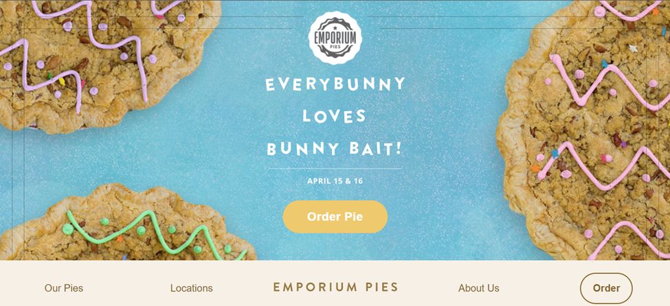
This bakery website example may seem similar to others when you first visit it, but there are quite a few things that are different, particularly the menu bar. Instead of being at the top of the website where it’s traditionally placed, the menu bar is at the bottom of the homepage and has a small wavy edge.
When you place the cursor on top of any option on the menu bar, a bouquet of flowers pops above the option. While this may seem like an incredibly small detail, and it is, it enhances the appeal of the website.
Aside from its parallax effect, the website is quite simple and easy to navigate. Plus, the pastel pinks, blues, and floral detailing add a nice touch.
Learn how to create a parallax effect for your website with only CSS.
6. Bakery Makel
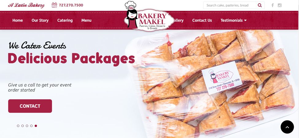
Bakery Makel is exactly what you imagine a traditional bakery website to look like. The sliding picture display on the homepage adds an extra element to the website. And as you slide downwards, you can find more information about their store, their products, particularly their Latin-inspired deserts, and their testimonials.
The site isn’t particularly difficult to navigate. When you click the menu option, it takes you to a pdf version of the menu. This might be because they don’t have a shop option on their website, and to order from them, you have to either order through door dash or call them, which can be a little frustrating. But this website design can give you a few ideas of what to add to your own bakery website which is why it is worth a visit.
7. Cannella Shop
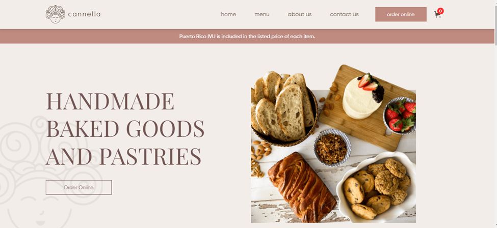
This website is a little similar to the emporium pies website, but the bakery’s website design is completely different. The whole website is in pastel pinks, faded blacks, and photos with lower saturation.
The first thing you see is a picture of their delicious-looking goods and an option to order online. As you scroll more, you can see that their menu is divided into cakes, cookies, bread, and miscellaneous, making it much easier to find and order what you are looking for.
The menu bar is also pretty simple and to the point, with only a couple of necessary options. If you are looking for simple but effective ideas for your bakery website, definitely give this site a visit.
8. Carlo’s Bakery
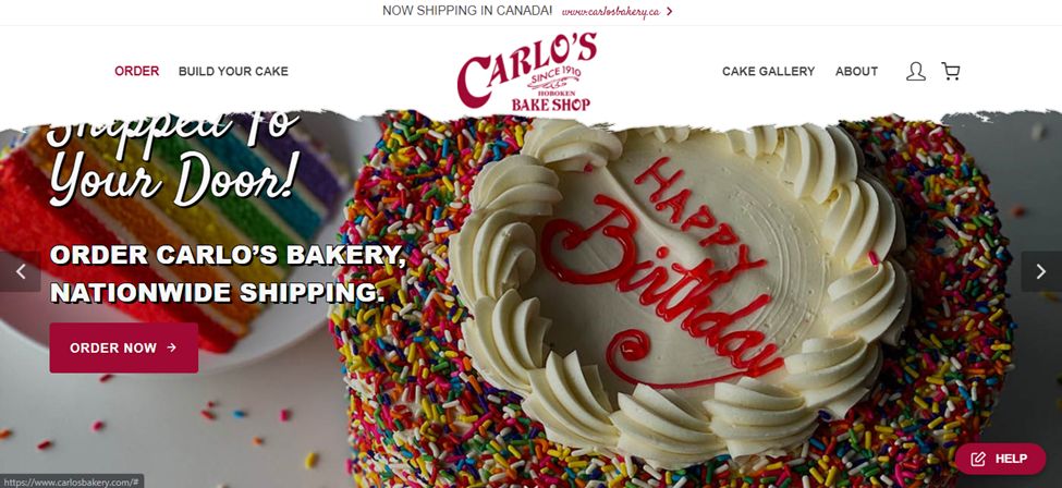
This bakery website example looks like a collage of different websites. The menu bar looks like a strip of paper that has been torn. The homepage has a sliding display that shows you different options, and as you scroll down, you can see different locations, bestsellers, and even check their menu.
Aside from that, the show also has incorporated moving graphics into the website. All of it together does seem a little overwhelming to the eye, but if you structure your website a little bit differently, then you can definitely take inspiration from this website.
9. Susie Cakes
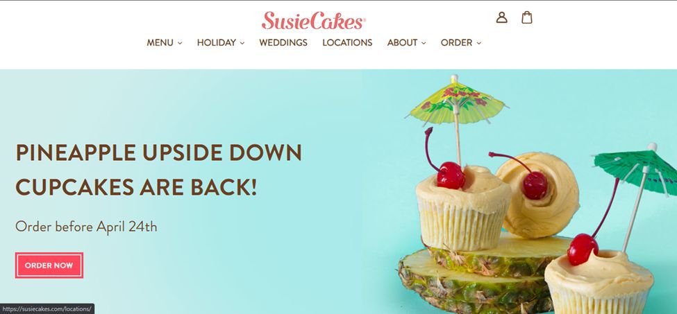
This website is simple but incredibly effective. A big hero slider provides the essential information the clients could be asking themselves.
The text and the pictures are clean, easy to view, and pleasing to the eye. You can see more about the bakery and career opportunities and even find a few discounts as you scroll downwards. The red, blue, and white theme almost reminds you of visiting a candy shop.
The menu bar is very simple and divides the categories into a couple of different ones, making it much easier for people to find what they want. Visiting this bakery website can give you a good idea of how you can construct your own website.
10. Hoffman’s Fine Cakes
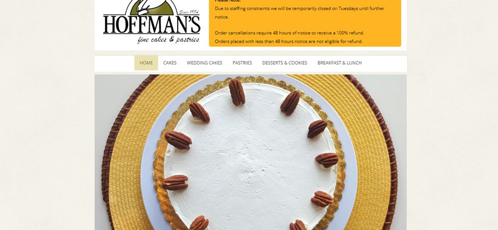
Hoffman’s fine cakes is a website that looks much better in mobile format than in web format. There is a huge gap on both sides of the screens, which isn’t that attractive, but it is memorable.
As you go down, you see information about the company and a dedicated section for the cake of the month, which is pretty particular to this site.
The website is also simple in construction, so if you have a limited budget, you can take a few ideas from this simple cake website.
What Should a Bakery Website Contain?
If you want to make sure to create a quality bakery website you should include:
-
Menu: if you are planning on creating an online website that sells food, a menu is a must. You can either divide the menu into a few different categories and create different sections or you could create one big menu that allows people to get to certain parts of the menu.
-
Products & Pictures: add a detailed list of the kind of products you work with. Cakes, pastries, bread, desserts… Add images of those and make them easy to identify by name.
-
Ingredients: you should always mention what exactly you are using in your cakes because some people are allergic to gluten, others are allergic to eggs and many want to go the healthy way.
-
Shopping Cart: there are quite a few websites that have menus and sell items but don’t have a cart option, making it much harder for people to order. If you don’t plan on selling for the website, then it might be better to not make a website.
-
Location & Contact: cakes or desserts are probably not something you can send very far away. Add the location of your shop/s so people can know if they can order from your shop/s. Don’t forget to add an easy way for visitors to contact you too.
-
About Us: add a little touch to your page by creating a more direct connection with the visitor. Let them know the story of your shop or your recipes and add a couple of photos of the main people behind the scenes (or should I say, “behind the pies”?). This will provide your visitors with the trust they seek.
-
Rewards: if your bakery has obtained any rewards make sure to name them somewhere on the website. It’s a great way to provide social validation and show your visitors that you sell quality products.
-
Press: have your pies, cakes, or products have been named in any press release, newspaper, or online website? If the answer is yes, then make sure to add a link, picture, or reference to those. It’s another easy way to show off and catch more clients.
-
Customizable orders: if you are selling custom cakes, then it might be a good idea to include a separate option for it. It will not only make it easier for people to order, but you will also have an easier time organizing your orders.
How do I make my bakery unique?
You can do a few things to make your bakery unique and attract more customers:
-
Experiment with new recipes: this is probably the main factor that will differentiate your bakery from others. Create different products by experimenting with less traditional recipes. Don’t be afraid of trying new things. People like trying new things and the word about your bakery will spread way quicker.
-
Find a niche: traditionally, this is another great way of making a difference. If you are able to focus on a very specific customer profile, then you will automatically become more unique. For example, you can do “Cakes for healthy people” or “Cakes to gain muscle with proteins”.
-
Have small details: small details make the difference. Find a way to surprise your customers and make them smile or share your name. You can give them small things for free after purchase, personalize their cakes or run promotions of some kind. Surprise them and they’ll surprise you with their word of mouth.
-
Do special recipes for events: it can be a football match, a movie release, Christmas, easer, Santa Claus, or the 4th of July. Whatever it is, if you create special products for those special occasions you’ll stand out from the rest. (Check out some great Christmas websites)
-
Provide catering: you can provide catering services for weddings, baptisms, birthday parties, bachelor parties, etc. This will help your brand and also make you stand out from the other bakeries that don’t provide this kind of service.
![30+ Best Church Website Templates [WordPress & HTML] church website templates share](https://alvarotrigo.com/blog/wp-content/uploads/2023/08/church-website-templates-share-300x150.png)
![10+ Amazing Flat Design Websites [for Inspiration] flat design website share](https://alvarotrigo.com/blog/wp-content/uploads/2023/08/flat-design-website-share-300x150.png)
![15 Best Portfolio Website Builders in 2024 [Reviewed & Ranked] portfolio website builders share](https://alvarotrigo.com/blog/wp-content/uploads/2023/08/portfolio-website-builders-share-300x150.png)
![9+ Beautiful Boutique Website Designs [Get Good Ideas] boutique website designs share](https://alvarotrigo.com/blog/wp-content/uploads/2023/08/boutique-website-designs-share-300x150.png)
![9+ Beautiful Lash Websites Ideas [Get inspiration] lash website ideas share](https://alvarotrigo.com/blog/wp-content/uploads/2023/08/lash-website-ideas-share-300x150.png)