Nowadays, having a website is essential for people looking to grow their businesses. This is not only because our world is becoming more digitized, but it is always because it allows us to reach a wider audience. And that is immensely important because of how the world has changed because of lockdown and Covid-19.
In times like these, powerful website builders like Kajabi are helping people establish their own websites. Not only are their templates incredibly diverse and high-quality, but they also help connect every aspect of your business.
But if you don’t know how exactly you should go about building a website, then there is no need to worry! Here are 10 examples of the best Kajabi websites you can take inspiration from.
1. Pualena

This Kajabi website example is one of the best in our list. It is instantly striking, and that is probably because of its highly interactive interface.
As soon as you open the homepage, very high quality and expertly shot video plays on the screen, with the majority of the text overlaying on the video. Even though the text is on top of the video, it is expertly placed, so you have no trouble seeing what is happening in it.
As you scroll down, pictures, texts, and different options move in and out of place, which is what makes it so visually appealing. The splashes of bring pinks only serve to add more appeal to the website. The user interference also seems pretty straightforward and easy to figure out.
If you like these scrolling animation effects you can get more inspiration from these Scrolling Animation Website Examples and then learn how to create them with CSS.
2. Aligned Yoga

There is something similar yet so different about this Kajabi website example. The white background against the floral feature photo really elevates the look of the website, making it more elegant. The simple color palette with a seamless interference makes the site easy to navigate.
The different use of fonts couples perfectly with the neutral theme of the website and makes it look really professional and well-constructed.
3. Functional Lawyer – Kajabi Website

While there is nothing jaw-dropping about the website, it is still highly professional-looking and well-executed.
The website is a little interactive, so the options and pictures slightly move in and out of place as you scroll, which only adds to the beauty of the site.
Check out the best Kajabi templates and speed up your website creation.
Their website uses natural colors and photos, which is probably why it looks so trustworthy and clean.
The website is also pretty easy to navigate, and the options are laid out pretty well on the menu bar – this Kajabi website is definitely worth taking inspiration from.
4. Tracy Otsuka

Even though this is another podcast website, it is constructed very differently than the first one. The first thing you notice when you land on the homepage is not only the lack of a menu bar but also the lack of any information about the host and also the podcast itself.
While there are a few words on the feature image, they don’t add a lot of depth or meaning to the website. This Kajabi website also used a very unconventional color: orange. As you scroll down, all you see is a list-like gallery of all the podcasts with a feature photo on the left side of every podcast.
5. Betsy Jordyn
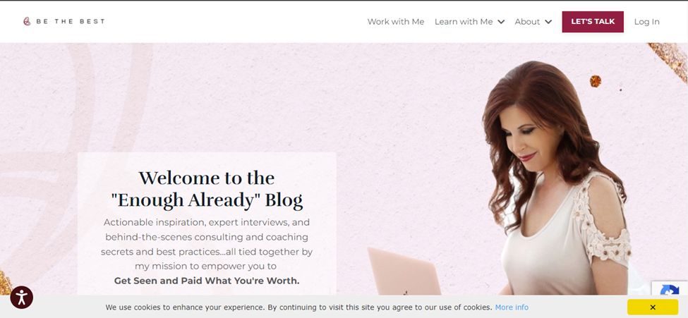
Because this is a podcast website, it is fundamentally constructed differently than other sites. For example, the pretty pink background of the feature photo is textured, which adds a lot of personality and interest to the site. The menu bar is also different from most because the website logo that is often featured on the top left corner constantly changes to say a few different quotes.
As you scroll down, you see a pink banner on the right side of the screen, and the podcast videos are lined up in the middle and on the left side of the screen. On the menu bar, there are a couple of different options that take you to different parts of the website. All in all, visiting this Kajabi website may help you figure out how to construct unconventional websites.
6. The Novelry
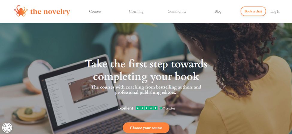
As far as websites go, this Kajabi website example isn’t anything particularly special, but it is still extremely well-constructed and smooth. The website is a little interactive, so as you scroll down, the text moves into place, or text boxes spin into place.
Because the text is well spaced, and far apart, it makes it easier and convenient for people to read, making the website even easier to navigate.
7. Yoga with Adriene
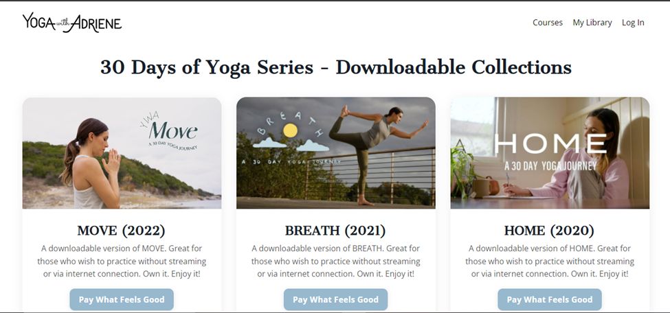
This is another unusual example of a Kajabi website because, again, this website doesn’t have a homepage and goes straight into the tutorials. So, aside from the courses themselves, you don’t see any personal information about the yoga trainer.
Another great website made with Kajabi builder. It is visually appealing and well constructed; each exercise is laid out in its own bubble, and the picture and text that accompany it also add a lot of visual focus.
Aside from that, there isn’t much to the website itself, so it should pose no navigation problems.
8. Wife Mother Leader
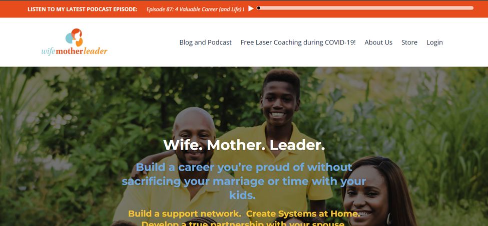
This is another podcast website example, and again, it is constructed a little differently. The website does have a menu bar but above the menu bar, there is another smaller bar that plays the website’s latest podcast. Aside from that, the rest of the website is fairly simple. However, there is a small two-page sliding gallery at the bottom of the page that features testimonials.
9. WN – Made With Kajabi
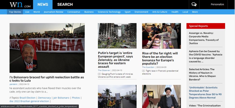
This is a new website, so there is no surprise that it is pretty crowded, and at first glance, it seems like a lot of visual stimulation. But as you keep looking, you realize there is a method to the madness. The right side of the screen has a special reports banner, the middle of the screen is divided into a couple of different trending articles, and the left side has a sliding gallery again of trending topics around the world.
As you go down, you see a list-like layout for top stories, and the right side of the screen again has a banner that addresses something called open minds worldwide. Finally, at the end of the page, there are journalism reviews and featured sections, all laid out with corresponding pictures and descriptions.
The website can be a little hard to navigate since there are so many sections and subsections, but because everything is laid out, it shouldn’t be that difficult.
10. Fully Raw
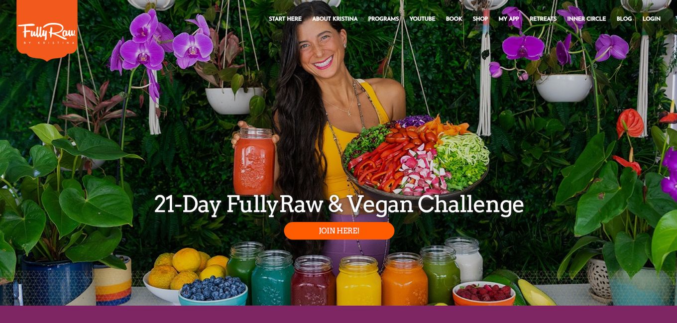
The weirdest thing about this website is the color scheme that is used for the majority of the site. Unlike the other Kajabi websites, this website doesn’t hold back on using color and is filled with colorful pictures of different fruits, juices, and smoothies.
The menu bar is flush with the homepage in the beginning, but as you move past the initial page, the menu bar becomes a typical menu bar that is often common on other websites. The website can be a little difficult to get around just because it offers so many products and challenges. The website is extremely well constructed.
Is Kajabi Good For Websites?
Yes, Kajabi is a great tool to create websites! Kajabi is an all-in-one website builder, and it helps you create and sell different types of courses.
The best part about this website builder is that everything is included in the initial fee you pay, so you don’t have to keep paying more for email marketing or marketing automation.
Kajabi is no average builder because aside from the online course and mini-programs, you can create an evergreen training program, membership platform, and a community or a coaching program.
In fact, when you first open the Kajabi dashboard, you might get a little overwhelmed because it comes equipped with almost everything! It even has email marketing tools, training content, and access to the Kajabi support team.
Is Kajabi Good For Landing Pages?
Yes! You can easily use the Kajabi landing page creation tool to create visually appealing and incredibly stunning landing pages that will not only help you capture leads but also help convert visitors into paying customers.
In addition, everything is pre-existing inside the Kajabi website itself, so the marketing possibilities are endless.
One thing Kajabi understands very well is the fact that homepage, also called landing pages, are fundamentally different from other pages and serve a completely different purpose. This is probably why all the tools available on Kajabi help optimize and customize the homepage.
With Kajabi, you can easily add graphics to any homepage, and… who doesn’t love a good interactive video or picture gallery? Having graphics will break up bigger chunks of text and help the visitors stomach everything one at a time, which will keep them on the site longer.
![15 Best Kajabi Templates You Must Know [Ranked] kajabi templates share](https://alvarotrigo.com/blog/wp-content/uploads/2023/08/kajabi-templates-share-300x150.png)
![15 Best Portfolio Website Builders in 2024 [Reviewed & Ranked] portfolio website builders share](https://alvarotrigo.com/blog/wp-content/uploads/2023/08/portfolio-website-builders-share-300x150.png)
![30+ Best Church Website Templates [WordPress & HTML] church website templates share](https://alvarotrigo.com/blog/wp-content/uploads/2023/08/church-website-templates-share-300x150.png)
![11+ Beautiful Small Business Website Design [Get Inspired] small business website design share](https://alvarotrigo.com/blog/wp-content/uploads/2023/08/small-business-website-design-share-300x150.png)
![Top 17 Squarespace Real Estate Templates [Free & Paid] squarespace real estate templates share](https://alvarotrigo.com/blog/wp-content/uploads/2023/08/squarespace-real-estate-templates-share-300x150.png)
![20 Best Squarespace Blog Templates in 2024 [Free & Premium] squarespace blog templates share](https://alvarotrigo.com/blog/wp-content/uploads/2023/08/squarespace-blog-templates-share-300x150.png)