More and more hair salons have started investing in creating fully integrated and highly functional websites in order to increase their customer base. Unfortunately, most people only go to well-known salons or salons that are present in their area, which is bad for businesses that aren’t located in a well-off neighborhood. And this is exactly why people are constructing hair salon websites.
The salon websites are incredibly diverse in design and construction, which is great if you are looking for hair website ideas. So, here are the 15 best hair salon website ideas you can take inspiration from.
1. Pastels Salon
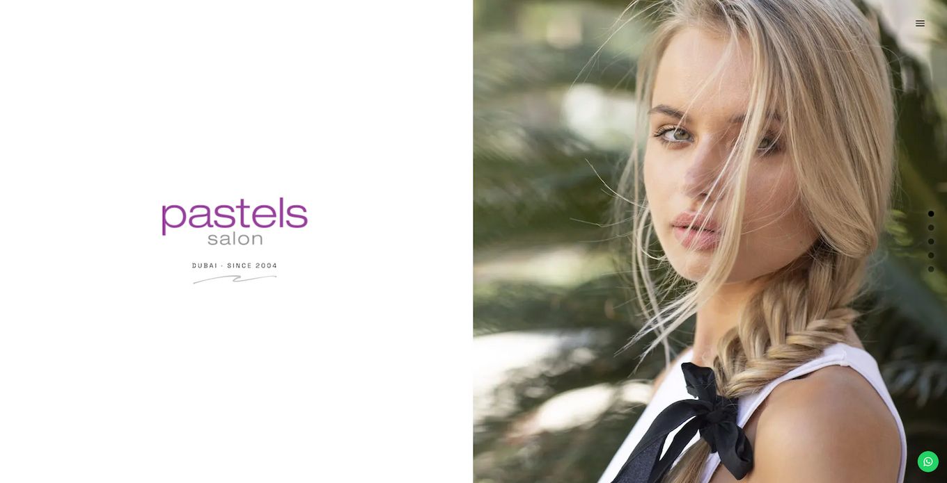
This hair salon website is incredibly unique because it uses a divided multi-scrolling page design. The website literally looks like a gallery screen. Instead of scrolling down to read more of the site, the multipage system doesn’t change the screen at all. As an alternative, the screen changes to a complete picture and text.
Even the sliding system implemented by this website isn’t as simple as it sounds because one part of the screen moves up while the other moves down. There is also a burger menu on the right side of the screen, which can be opened to reveal more options.
If you want a similar-looking website, you can create it using multiScroll.js. It is very easy to use and the final result is impressive! Check it out!
2. Marco Ambrosi Hair Salon website
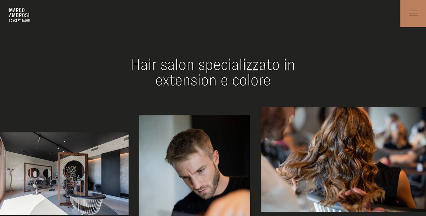
Not only is this hair salon website flawlessly constructed, but it is also highly interactive because pictures, text, and other elements on the website constantly move and engage with each other. This creates an absolutely phenomenal user experience. The movement is so subtle that people don’t notice it at first glance, but what this movement actually does is make the website more seamless and smoother.
There is a gallery of haircuts at the very bottom of the website. The completely black background is another feature most websites don’t have. And it is a great choice for this salon website because it makes the colored hair stand out from the background, particularly platinum and blond colored hair.
3. Camerino Alzira
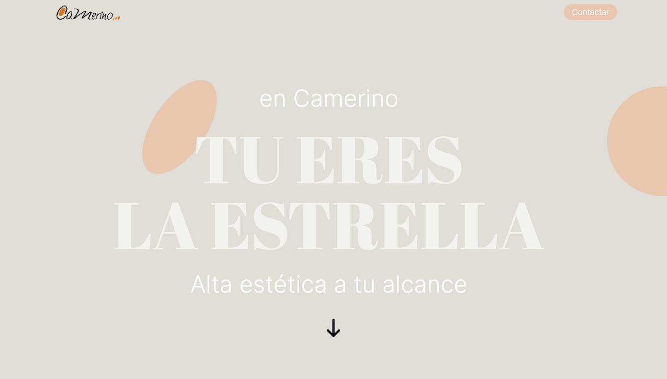
This is another highly interactive hair salon website that utilizes a bunch of clever imagery and moving components to make the site interesting. The neutral color palette adds a lot of personality to the website and makes the text and the images stand out. And even though there are splashes of bringing colors while orange throughout the website, it isn’t too jarring to the eye.
There is no menu bar on the website, which makes it easy to navigate because all the information is on the homepage.
4. Soho Hair Salon
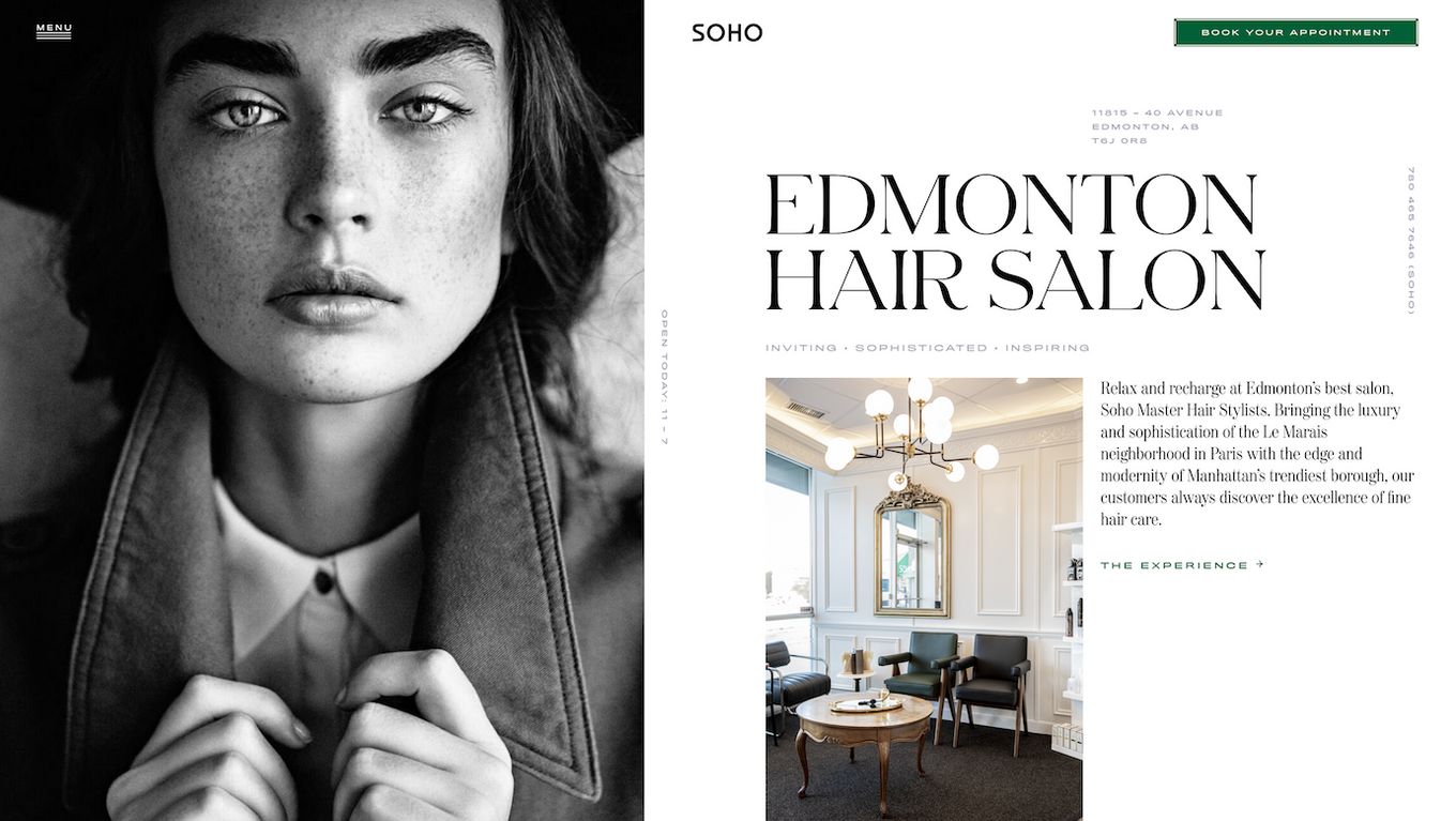
This website almost looks like a black and white magazine and is also slightly interactive. The left side of the website doesn’t move for a bit, while the right-side rolls down to reveal more text. Then once you reach the end of the text, both the sides open to reveal even more text. The whole website is in black and white with occasional bits of natural color, which adds a unique element to the website.
5. Luis Neto Hair Design
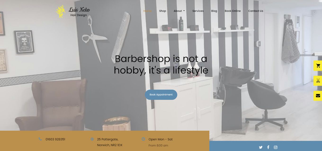
If you are looking for a more traditional-looking hair website idea to take inspiration from, then this is it. It comes equipped with a gallery-style homepage, and instead of the text moving with the pictures, the text moves on top of the gallery.
The pastel theme makes the other things on the website stand out. The website is also fairly easy to get around because everything is clearly laid out on the website.
6. Suki
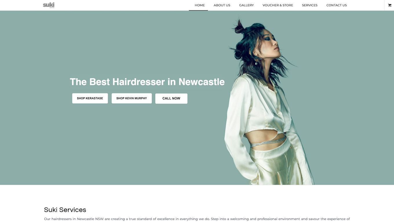
One thing about this hair salon website that instantly standouts is the amazing color grading of the website. The blue tinge on the photos matches incredibly well with the rest of the colors used on the website. And even though the website is constructed almost traditionally, no one can deny how professional it looks.
7. Hairsoda Salon
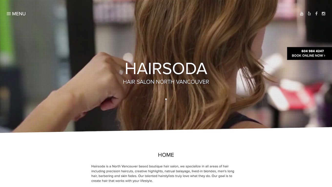
If you are looking for some inspiration for a site with a little bit of everything, this website definitely comes on top as a winner. The homepage has a high-quality and fully saturated video that shows the different hairstylists cutting and coloring hair. There is a small information section on the homepage, and you can easily check out the services and salon hours.
One very interesting addition to the website is the portfolio section which allows the customers to view the previous work of the stylist before booking any appointments. The whole website is a single page which is incredibly easy to navigate.
8. Platinum Hair Studio
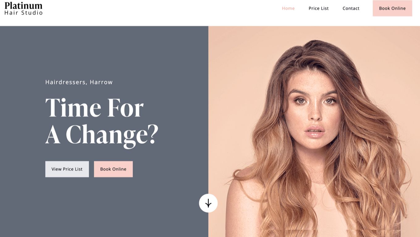
This hair salon website looks incredibly professional and polished. Not only does it use an incredible color scheme, but the structure of the website is also a little unique. You can immediately see all the services offered by the salon and view the price list of those particular services by clicking on the pictures.
When you get to their covid safety section, the background of the website slowly fades from white to light pink and then to white again once you are past that section. While it isn’t obvious why this section, in particular, is separate color, it definitely adds an additional element to the website.
9. Hair And Spa
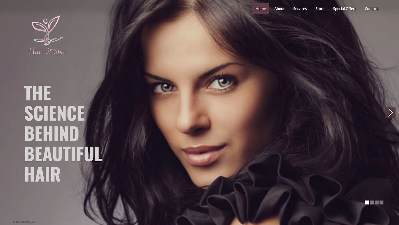
Hair and spa is another interesting website because the homepage only has a gallery section with a bunch of pictures and text. The rest of the information can be found by accessing other pages from the menu bar. Because of its limited options, the website is pretty easy to get around, and it definitely leaves a lasting impression on your mind.
Check out these amazing spa website designs if you are more into Spas!
10. The Charlee Salon
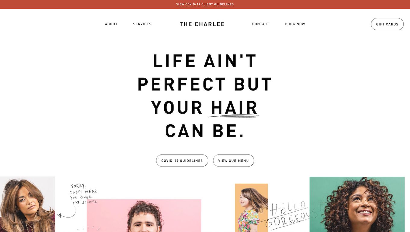
If you are looking for a website that is sort of minimalistic but still has a pop of color or something that catches the eye, this is the website for you! The initial setup of the website is very simple because it uses simple text, picture, and menu bar features that all websites have but it also has a collage of different hairstyles that gives the website a focal point.
11. Leo’s Hair
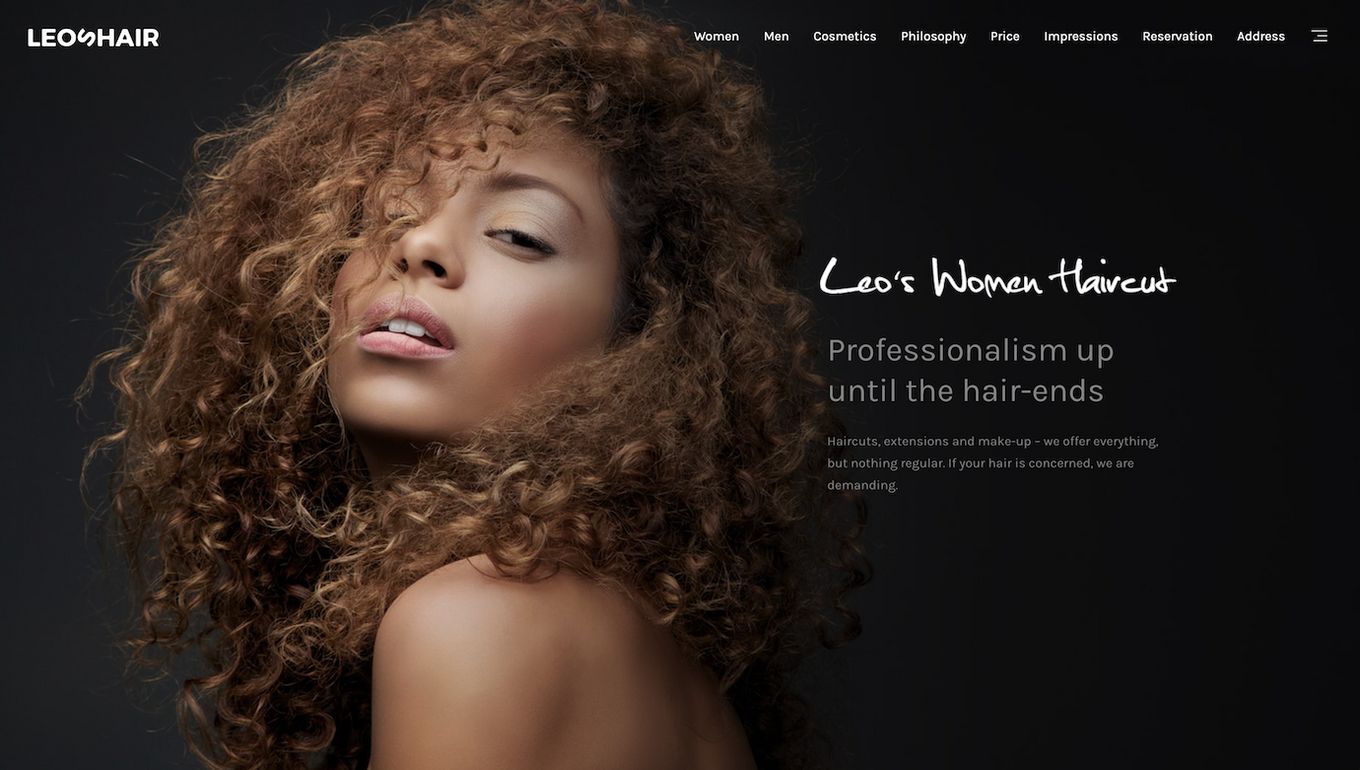
The website is very simple in construction, and the entire homepage is just a bunch of alternating boxes of text and pictures. There are a bunch of options on the website that don’t really seem relevant and can be confusing to the users.
Again, the website has a black background, making the pops of color stand out even more. This is definitely the hair salon website to visit if you are looking for a simpler website.
12. New York Hair
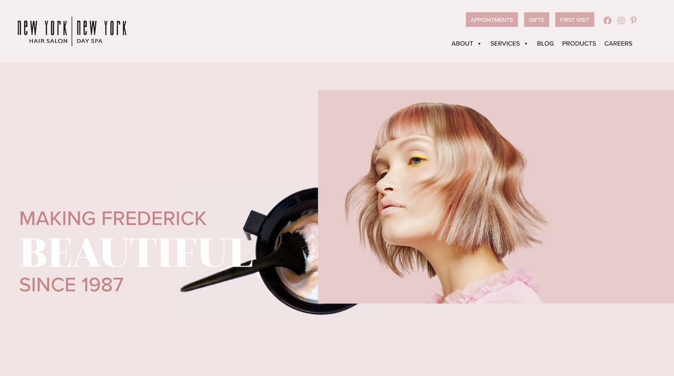
New York hair utilizes a lot of modern features like the interactive elements on the screen and moving pictures to make the site interesting. The pale pink and mauve theme used is not only unique but also complements the pictures and the other aesthetics of the site. It is very well integrated with social media, especially Instagram. This adds extra value to the website.
13. Fabio Scalia
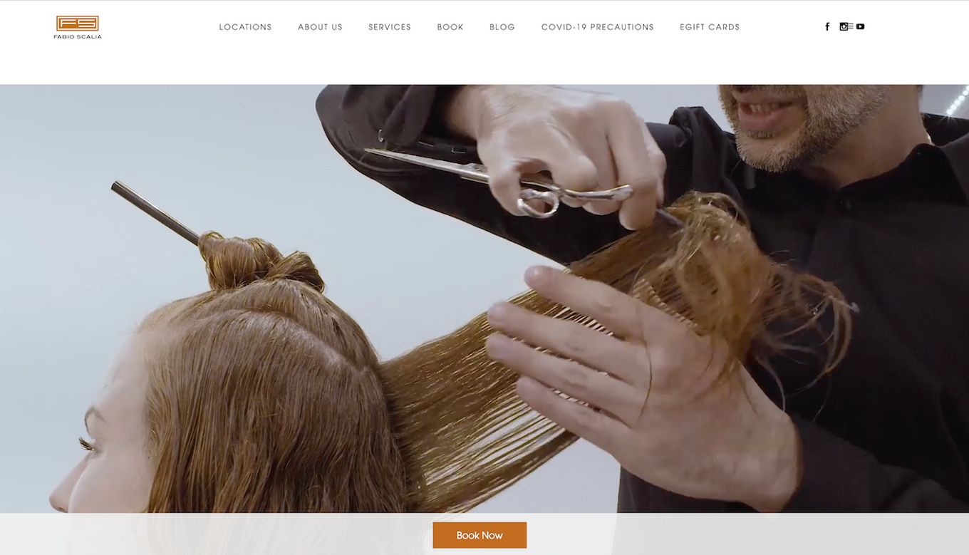
This website opens with a high-quality video that shows what the experience will be like when you visit the shop. You can easily book appointments, learn more about the owner, and read blogs – all thanks to the simple but effective user interface. The fixed “Book Now” CTA button is very well positioned and it urges the user to click on it.
14. 23rd Street Hair Salon
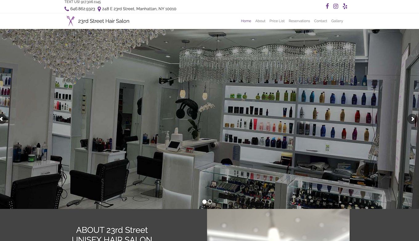
The website features a gallery-style homepage. After you scroll past the gallery, you just see a list of different services and their prices which makes it easy to book appointments because you know everything beforehand. At the bottom of the page is a photo gallery, making it easy for the clients to figure out what they are looking for.
15. Fringe NY
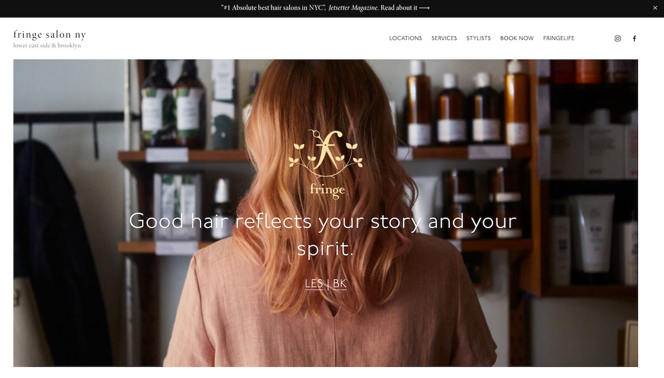
This hair salon website is simple but incredibly effective because it effortlessly shows the hair services provided by the salon. It is easy to check out different stylists and their services and their specialties. So, if you are looking for a website that does the job and doesn’t require a lot of features, then this is it.
What Should I Put on My Salon Website?
- Book Appointments. This is one of the best things you can include on your salon website because this will not only enable the customers to choose a slot that is available for them, but it will also solve the problem of over or under-booking.
- Gallery. The gallery is also a great addition to the site because it will give the clients a glimpse of your work. Plus, it will help clients sort of figure out the kind of hairstyle or color they want.
- Stylists. Listing stylists on your site with their descriptions and areas of specialty will allow the client to book with the stylist that they prefer. It might also be a good idea to add a couple of hairstyles and coloring done by that specific stylist below their descriptions.
- Cart. If you are selling any products on your website, then you should also include a cart section. This will help people buy a couple of different products in one go.
- Social media. Adding your social media to your website will make you seem credible. It will also help your customers see what other customers think about the salon experience you provide, which will increase your customer base.
- Location. Location is another essential thing you should add to your website. This is because you don’t want people to book your services only to realize that you aren’t located in their area and cancel at the last minute.
![7 Bad Website Designs [Examples & Tips To Fix Them] bad website design share](https://alvarotrigo.com/blog/wp-content/uploads/2023/08/bad-website-design-share-300x150.png)
![30+ Best Church Website Templates [WordPress & HTML] church website templates share](https://alvarotrigo.com/blog/wp-content/uploads/2023/08/church-website-templates-share-300x150.png)
![10+ Amazing Flat Design Websites [for Inspiration] flat design website share](https://alvarotrigo.com/blog/wp-content/uploads/2023/08/flat-design-website-share-300x150.png)
![15 Portfolio Websites For Graphic Designers [Build Yours Now] websites graphic design portfolios share](https://alvarotrigo.com/blog/wp-content/uploads/2023/08/websites-graphic-design-portfolios-share-300x150.png)
![9+ Amazing Massage Websites You'll Love [Ideas & inspiration] massage websites share](https://alvarotrigo.com/blog/wp-content/uploads/2023/08/massage-websites-share-300x150.png)