What constitutes an excellent construction website design is debatable. An informative ‘about us’ section is critical. A diverse portfolio of stunning, sharp photography from various projects should be presented.
Information should be updated regularly, and, most importantly, your construction website should be search engine optimized and straightforward to use. It should also be responsive to smartphones and tablets.
We will look at some of the best construction websites and how they are presented, to gain some inspiration.
1. Millbrook Construction
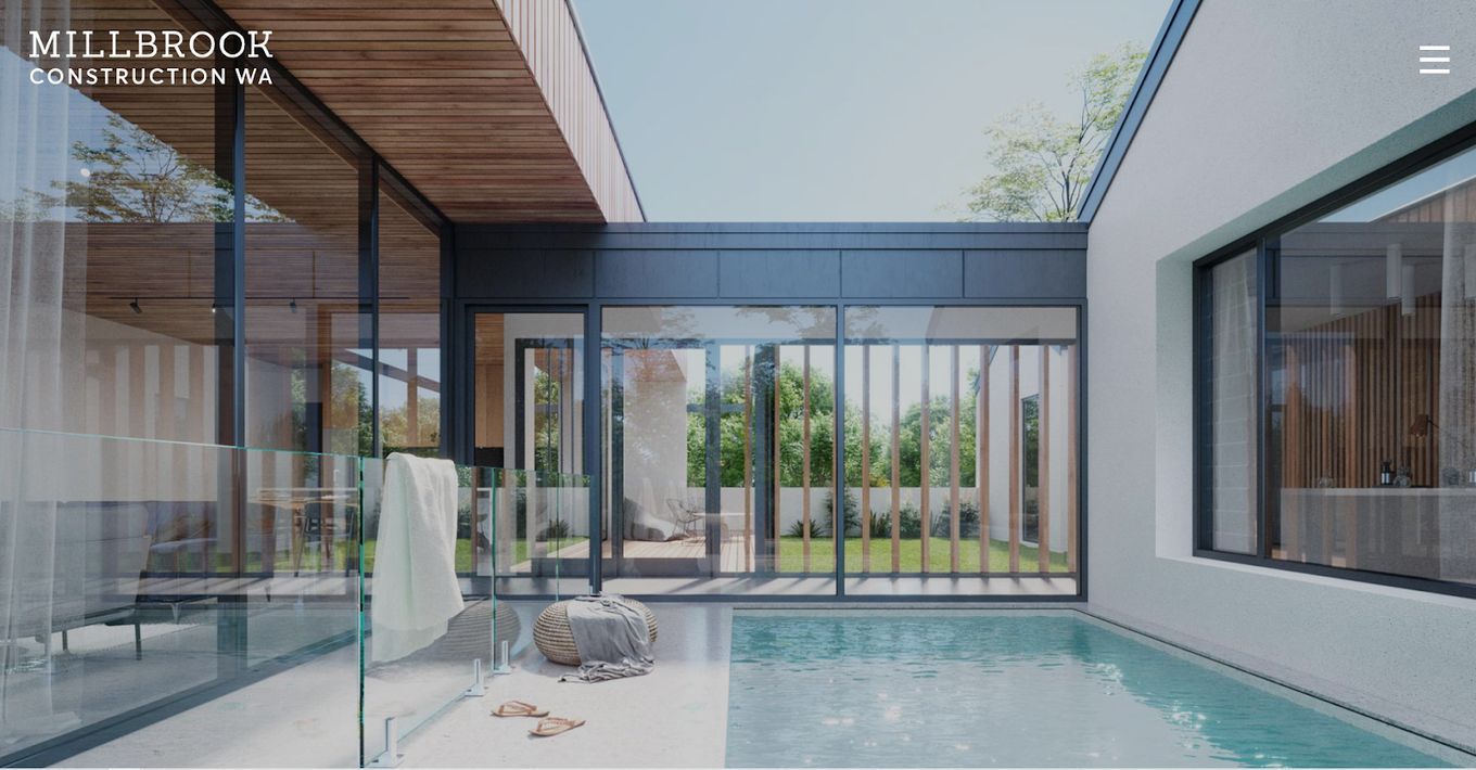
Millbrook feels like a glossy magazine. The approach here utilizes the amazing full-screen space to showcase the best work done by this construction company. The navigation is simple, as the menu can take you to the home, about, projects, work in progress, and contact pages quickly.
To ensure that none of the stunning images are missed by the viewer, scrolling doesn’t send everything flying up. Instead, it moves as if from one full panel to the next.
If you like the full-screen effect on Millbrook Construction you can create it with a fantastic scrolling JavaScript component called fullPage.js. With it, you can build a full-screen website that makes an instant impression. It is available for Gutenberg, Divi, and Elementor WordPress editors!
2. Hyperframe
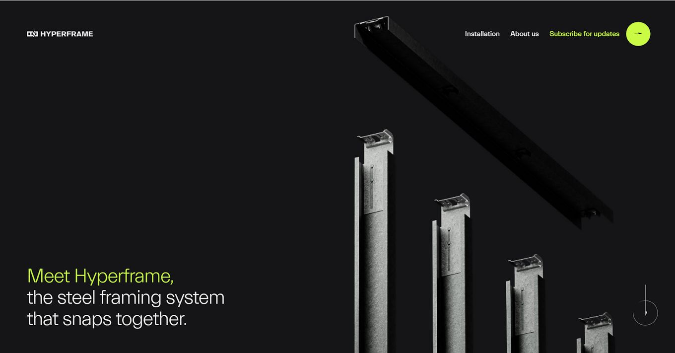
Even though Hyperframe has to reimagine steel framing from the ground up, we don’t have to. Using parallax viewing and animation effects, every scroll that sends up the text blocks, calls to action, and most impactful words the company has to say, the steel framing in the background snaps into place gradually.
By the time it is all connected into a frame, the visitor has been taken through a journey that shows what it offers and gives us a reason to care.
If you are looking for an architect portfolio, then you should definitely check out these great architecture portfolio websites too in case you are more into those!
3. VEC
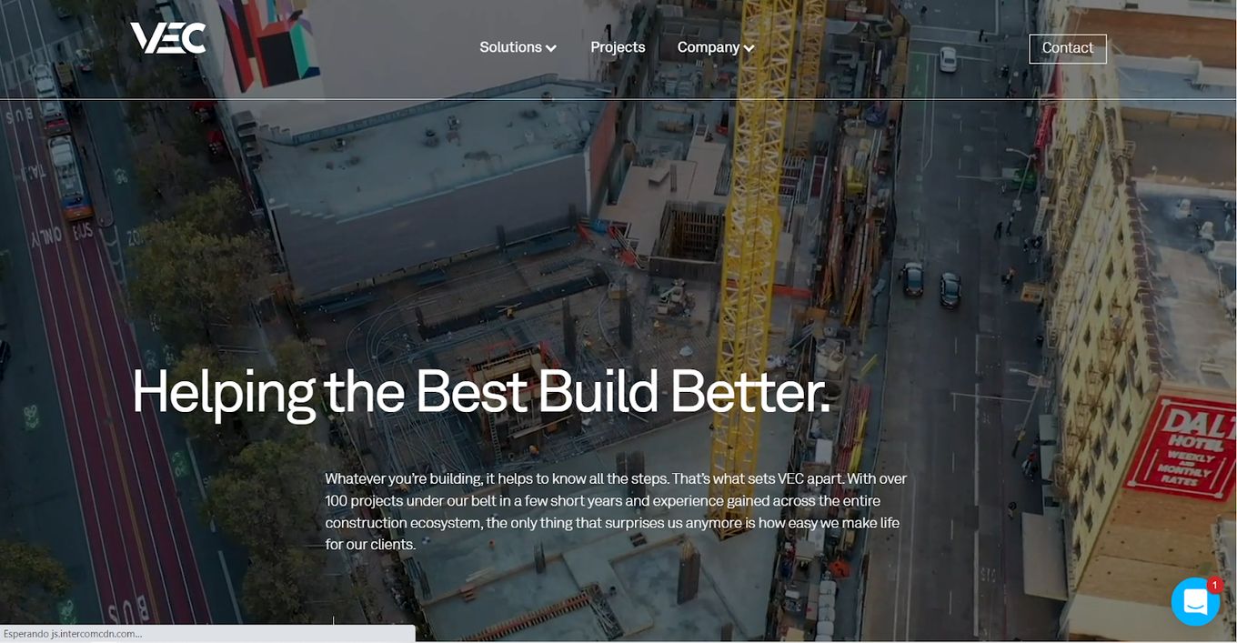
The choices of the best construction website designs lean heavily on the visual medium.
VEC understands why this is because it opens with a beautiful sweeping background video that takes us from a view of the street to a view of the concrete jungle landscape before looping back smoothly again.
Learn how to create a video background with just CSS on your website!
Scrolling down, we see what the company is about but also are treated to a cross-section of a building that feels like something out of the matrix, shaping reality. Simply enticing!
4. Rockmaster
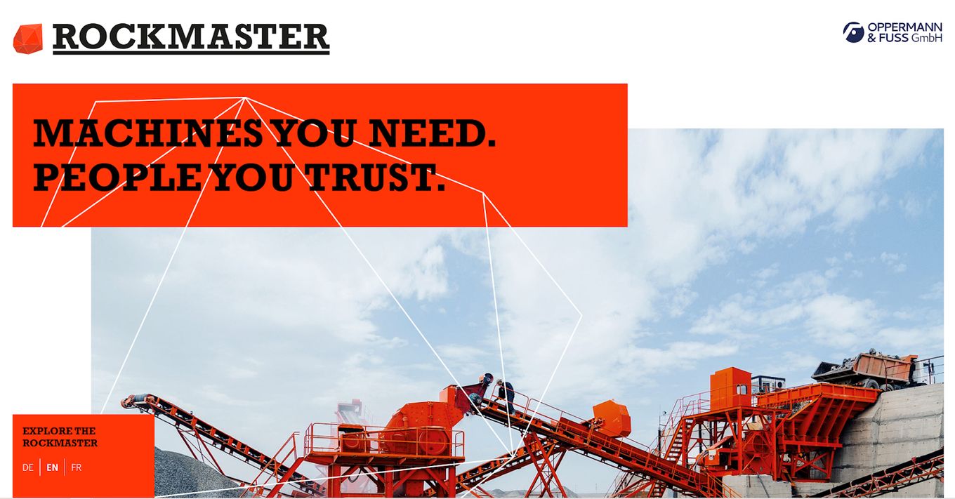
Rockmaster is an engineering company that immediately plays to its strengths. The company’s primary color can be seen on its banners throughout the site, mirroring its machines. The website makes it clear what they do here.
Using banners for main titles draws the viewer’s attention to the construction website design and, thus, the message.
Although it may seem like a one-page site, there’s a floating menu to take visitors to the analysis & consulting, financing & procurement, setup & training, support & service, and contact pages.
5. CJS
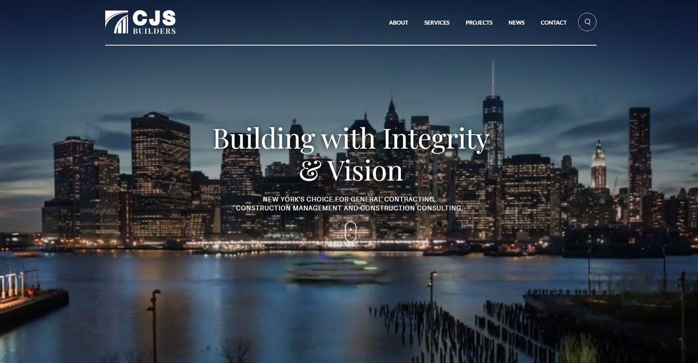
CJS is another stunner that opens with a beautiful, full-screen time-lapse of a New York in the background. Right off the bat, the website design of this construction company tells us what it’s about, in a mix of fonts that do not clash with each other’s design.
The calls to action invite us to check out the story behind the company, with icons below to learn more about construction phases. The menu is always visible, as is the handy search button.
6. Keating
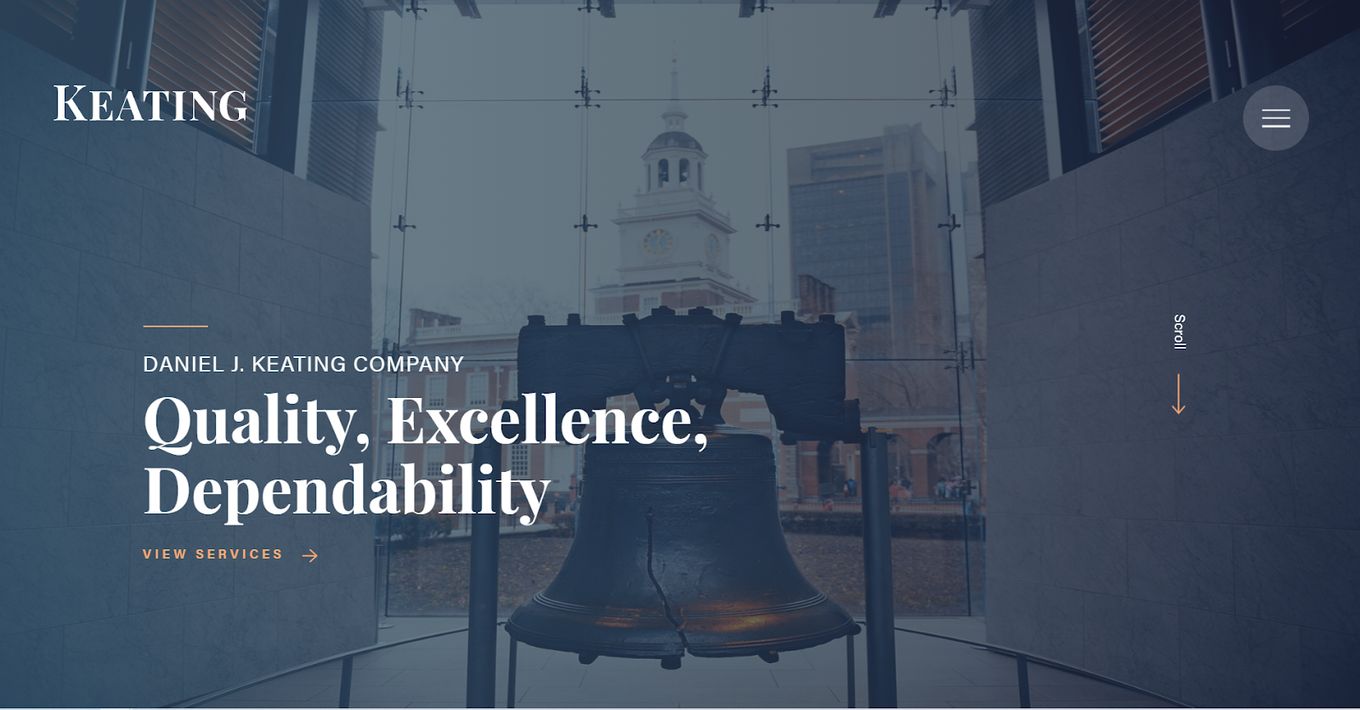
Keating attaches its brand value to the history of storied Philadelphia. For over 100 years, Keating has been a mainstay in Philly, which the construction website design reminds us of, implying experience and trustworthiness.
The company introduction is a brief paragraph that invites us to learn more. We are treated to an old-school photo from earlier days, before the portfolio of impressive work on beautiful locations. The fonts appear very professional, like something a government agency might use, to add an air of elegant seriousness.
7. Martini Prefabbricati S.P.A.
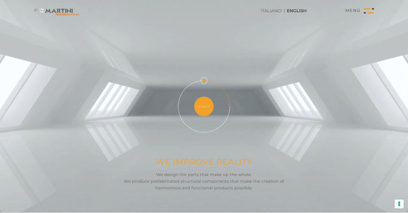
Martini’s construction website design opens with a moving background structure that evokes architecture. There’s a lovely orange icon in the center which, when clicked, launches into the kinds of projects the company works on.
The overall design uses the same accent of orange, interspersed on titles, calls to action, navigation buttons, and titles. The cohesiveness reminds visitors of the clean lines we associate with construction and precision. The site keeps it simple but very informative.
8. Cworks
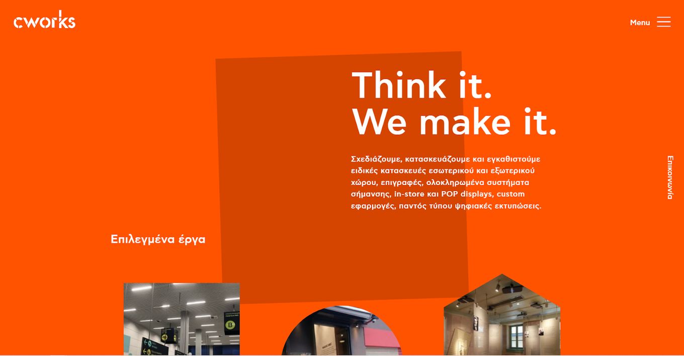
Cworks deals with construction projects of a specialized kind, especially signage, which may explain why the construction website design has impressive transitions. With each move up or down, geometric shapes in the background shift from one form to another.
Using differently shaped icons, the site introduces us to every aspect of the business, with samples to check out and photos of various projects in the company’s portfolio. The menu is always accessible to navigate to other pages with ease.
9. Hitachi
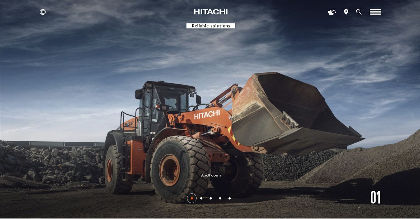
Hitachi’s construction company site speaks to its legacy and status as a world-renowned brand. It opens with a hero slider of dramatic shots of its best machinery in action. The site’s completeness means navigation is smooth, and finding details is a breeze.
On the site, visitors can find the perfect Hitachi for them, access parts, check out the support system to yield more productivity, see the magazine, legacy, management, and careers available, without struggling.
10. O’Neill Brennan
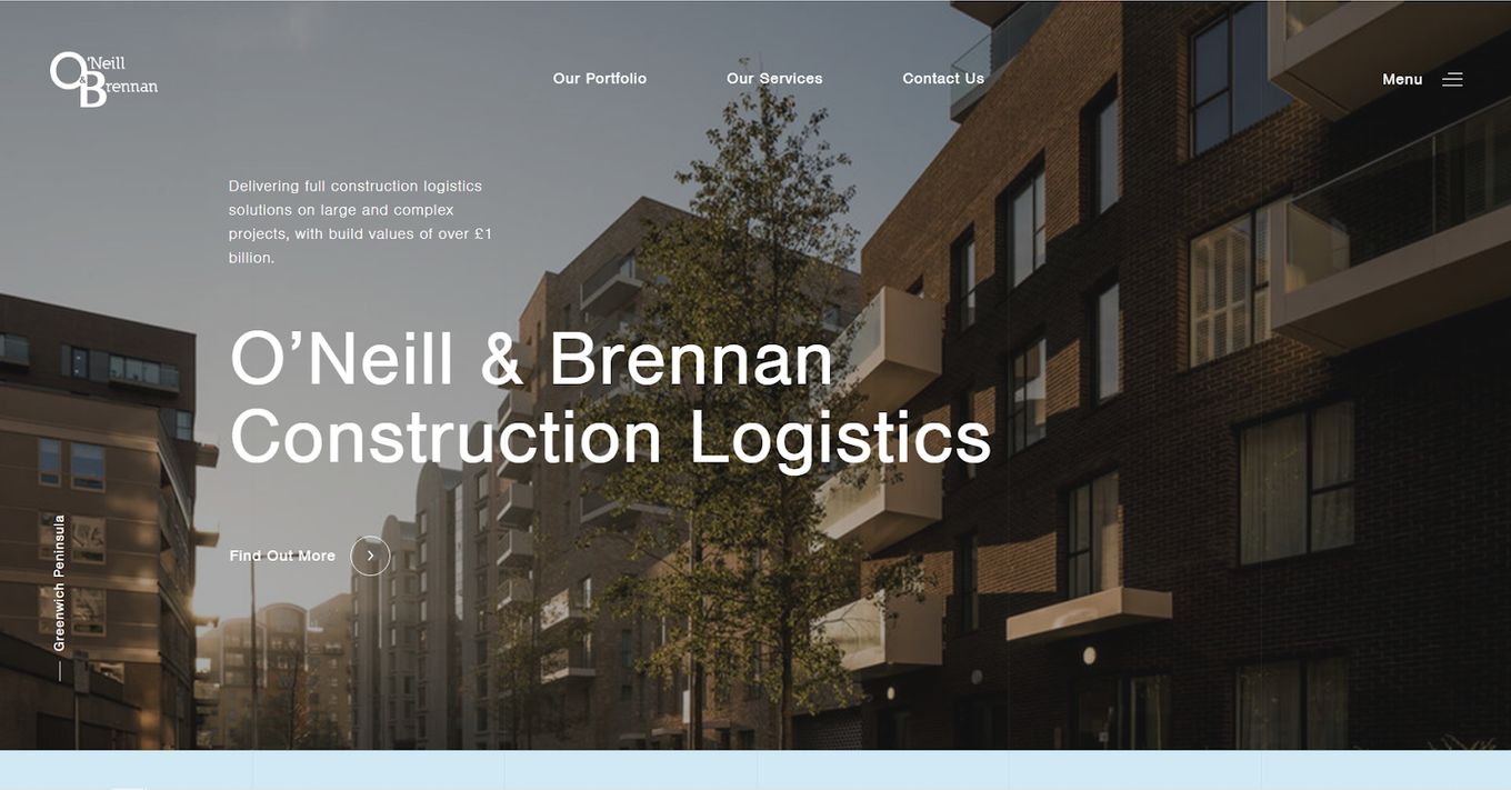
The construction website design features several images of large impressive projects, with taglines letting you know what the company is about and why they are a good choice when you need logistics. The copy is concise, and the website is easy to navigate.
If you need some tips on how to create taglines, check out our article on how to create the perfect tagline for your website.
Using the full display to its advantage, the logistics company can showcase its work and place calls to action alongside that to engage the site visitors.
11. GM
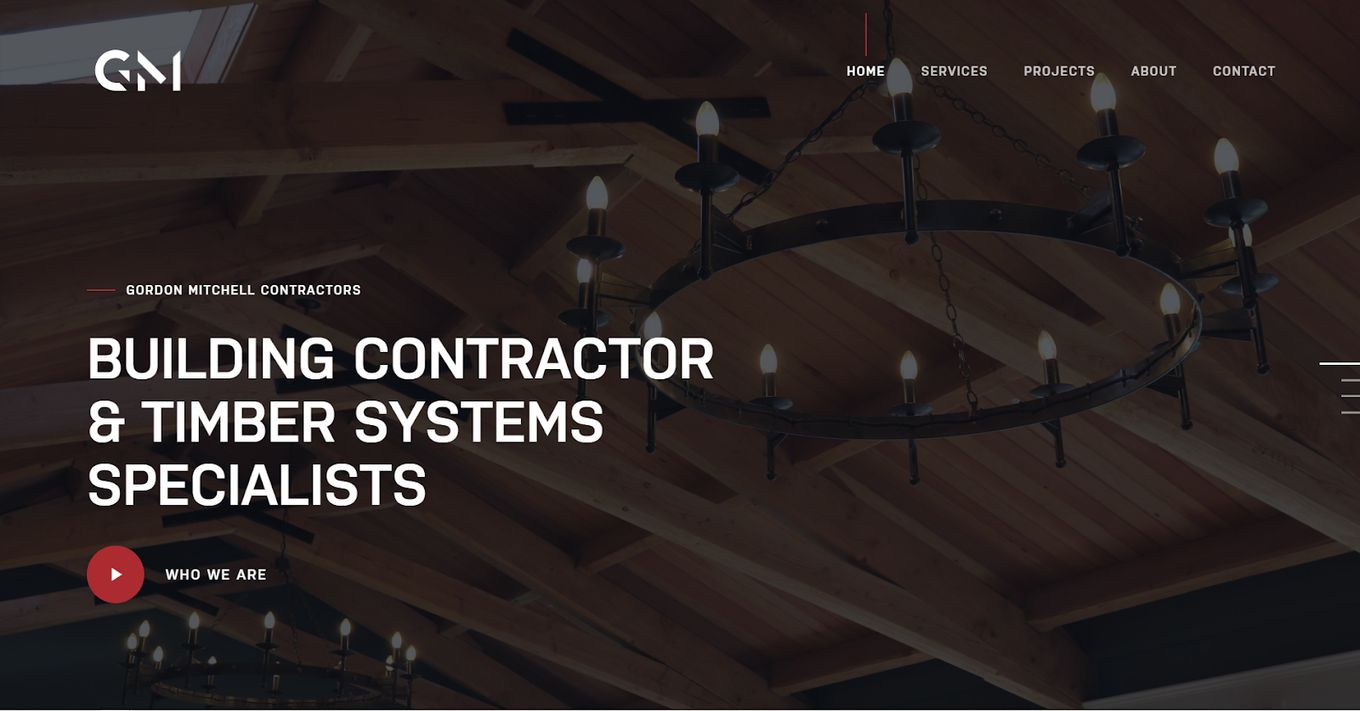
GM’s construction website design feels like the glossiest pamphlet. It is a simple design that emphasizes what the building contractor & timber system specialists can do for you. There is a nod to its history, which alludes to plenty of experience.
Related article: Beautiful Interior Design Websites
After showing off the services GM provides, we are treated to a portfolio of their best renovations, new builds, and so much more. There’s a call to action to engage the users and convenient links to see other pages.
12. Lightning
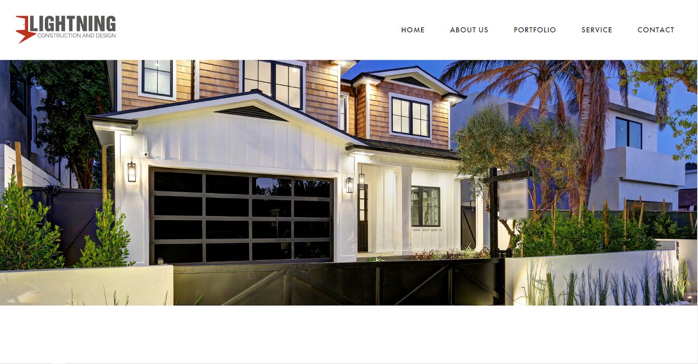
The web design choices of this construction company have been bold, alluring, attention-grabbing, and so much more. Lightning goes for the more straightforward look. It opens on a grand residential home filling the screen before launching into what the company is all about.
Wasting no time, it moves on to projects and a call to action to view them. There’s plenty of white space here, drawing the visitor’s attention to the projects and text blocks. At the bottom-banner, there are links leading to various sites that showcase more.
13. SBUD/PRO
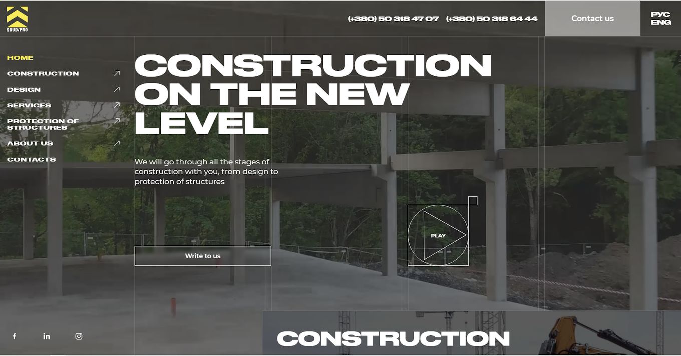
Emphasizing geometry, SBUD/PRO has one of the best construction website designs we have seen. It is bold, arranged unlike anything else on this list, with reviews at the bottom to give visitors some of that sweet social proof needed to engage.
The contacts are at the bottom, alongside the map and appointment hours. The menu leads to the construction, design, services, protection of structures, about, blog, our work, reviews, and contact pages.
14. Acecon
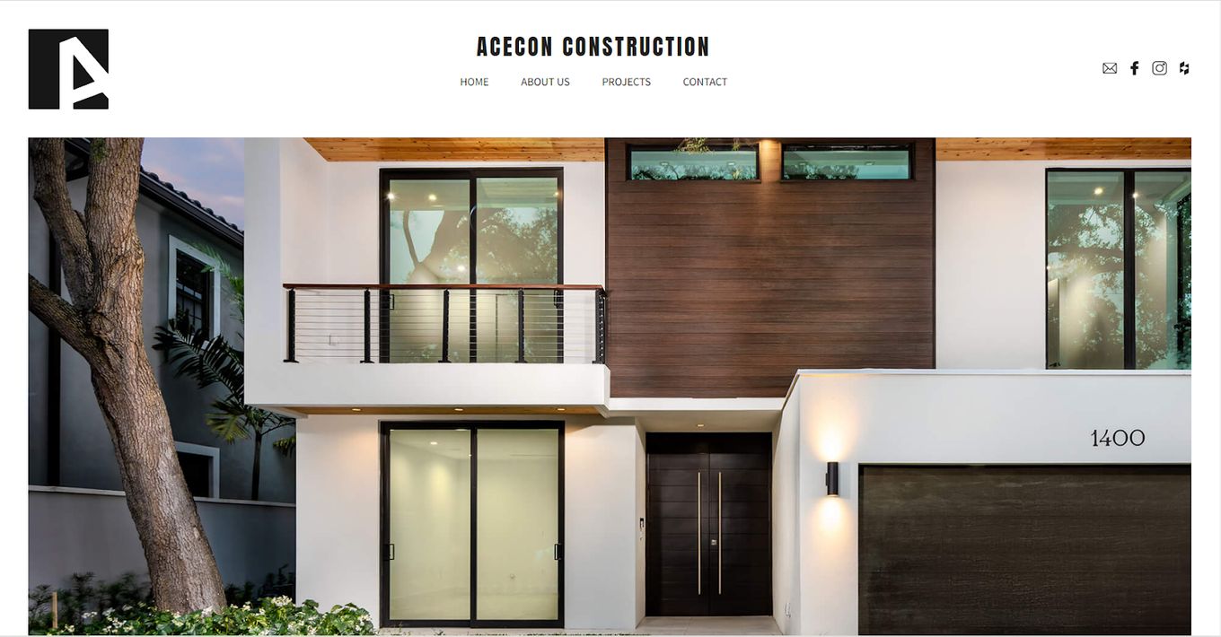
Acecon is yet another example of how a site can use white space to its advantage, making the design elements stand out even more. With concise copy, images that slide up as you scroll down, and a simple layout, this construction website design proves that less can be more.
To see more, the menu up top leads to the about us page, the portfolios section, contacts, and has social media buttons.
15. Obra Tenerife
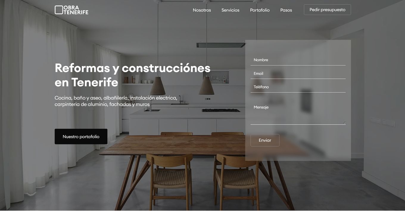
Obra Tenerife opts for a clean, minimalist construction website design. It is one of the most visually simple layouts, making the displayed content stand out even more. The clean lines, neat boxes, and rounded edges on images all serve to make the visual journey an interesting one.
Obra Tenerife is very simple, a theme that seems to be consistent across the best construction website design choices on our list.
16. W. S. Cumby
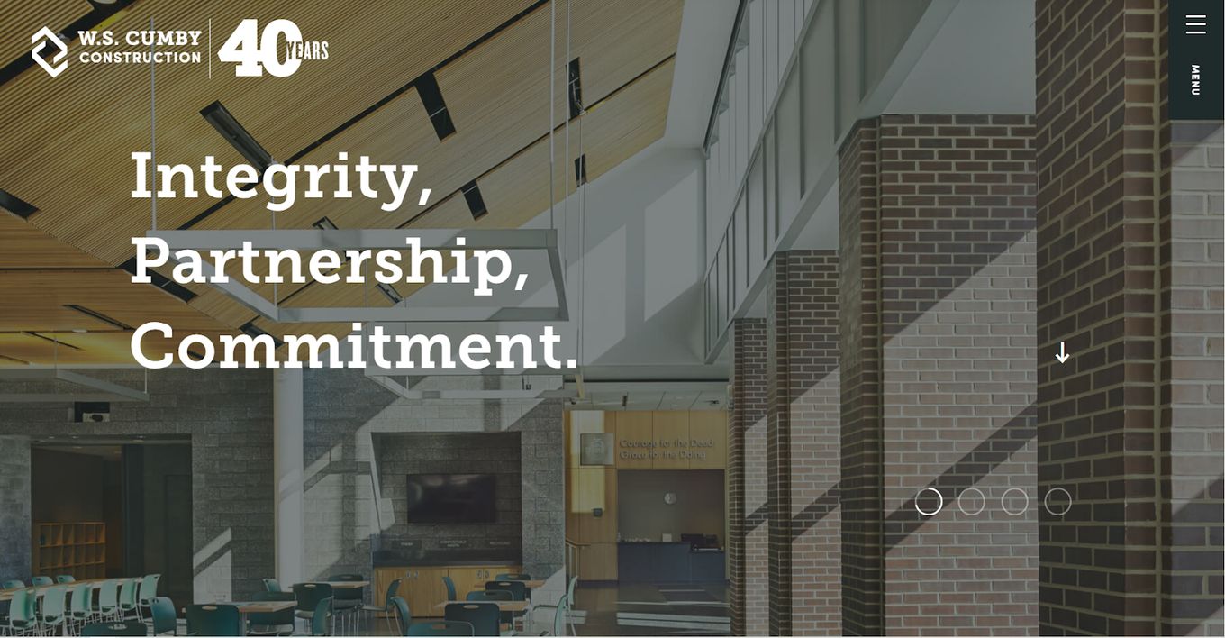
From the very opening line of the site, this construction company website design oozes class. There’s a huge 40 at the top to indicate how long it has been in the business. Experience is always appreciated when looking to build anything.
What have they built, apart from integrity, partnerships, and commitment? Well, a ton of projects, including family buildings, renovations, historical building restorations, and more. The services are well explained in disparate blocks of text and photos.


