Most business owners aren’t even aware that constructing or investing in a website can have tons of benefits. Some of these include wider reach, more customers, easier booking, and flexibility when introducing new products or services to the customers.
But even though websites have now become an essential part of growing a business, people are still unaware of how to construct a website, and this is often what leads them to construct an unappealing and clunky website.
If you are looking to create a website for massage services, you don’t need to worry! Here are some massage website ideas that can help you figure out your own website.
1. Tangan
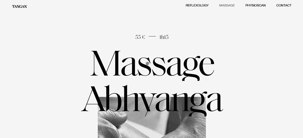
We start our list of massage websites with Tangan. There is just so much to see on this website that it might be difficult to describe it in words. The one thing you instantly notice about this massage website is the designer’s original idea of choosing a black and white color scheme, which is consistent throughout the website. Even the pictures on the website are all in black and white.
When you first arrive at the homepage, you see a small glimpse of the main picture, but the whole picture is revealed as you go down. The screen is divided into three sections; the left panel describes the main theme, and it stops while the rest of the panels continue opening. The middle prompts you to make an appointment, and the last section details the main theme.
This is a scrolling animated website in which the information shows up as you scroll down. Learn How to Create CSS Animations on Scroll to add this effect to your site!
The website even has its own snowflake-shaped cursor. One would say that there is too much on the website, which can make it difficult to figure out at first. But all of it is done so well that it instantly captures the attention of the visitors.
2. Peng’s Spa Massage
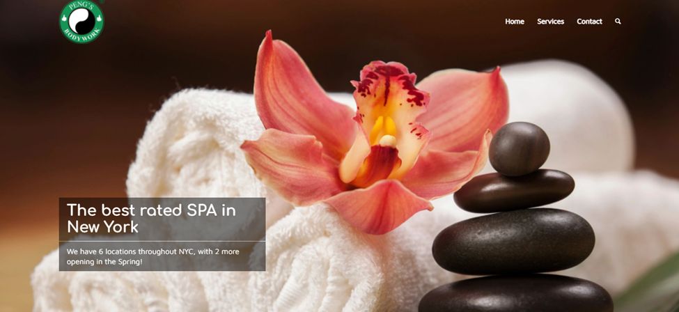
This website can be easily described in one single word: elegant. The gorgeous picture on the home screen welcomes visitors to the site. And as you move down, you can see some information about the website and the different benefits of their services.
There isn’t much else to this massage webpage, which is why it is considered among minimalistic websites. But it definitely gets the job done because it doesn’t skimp out on the important sections such as the service page, homepage, and contact us.
If you want to create a website for a SPA, then you’ll love these beautiful spa website designs
3. Mauri Oranga
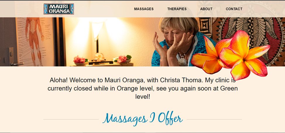
When you visit this website for massage services, you are instantly enamored with the gorgeous coloring of the whole website. The website almost seems to follow a sort of Hawaiian theme because it has pops of bright blues, pale pinks, and bright yellows.
There is a multitude of different kinds of fonts used on this website, which adds to the tropical aesthetic. Some sections on the website even have illustrated and colorful flowers on top of them, which again adds a very tropical vibe to the whole thing. One of the best massage websites on our list.
4. Wish Me Studio
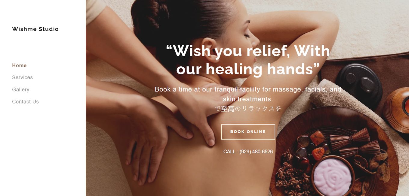
This is another website that stands out from other massage websites because of its unique construction and coloring. The website is divided into two sections, the left side being the menu which isn’t present at the top of the homepage. The right side can be scrolled down to reveal more information about the website.
The rest of the homepage is filled with information about different massages, details about the services and the prices per hour. No matter what section of the site you visit, the left side of the website is fixed in one place.
5. Patrick Mansell
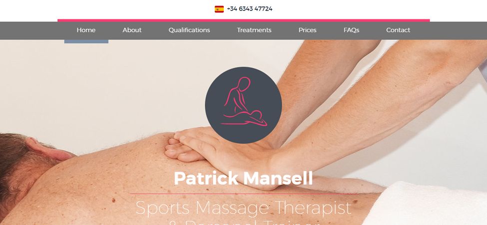
Patrick Mansell website instantly stands out among the rest of the massage websites because of its impeccable design and color scheme. The entire website is interactive but not in a way that it’s overwhelming for the user rather, the interactive elements are so subtle that they barely stand out. And give the website that oomph it needs just by being subtle.
Black and bright pink are often paired together in clothes and other items, but they are rarely ever used on websites. Perhaps this is why the color scheme works for the website. You can see different therapists’ qualifications on the homepage, which is necessary because massages often impact the body quite deeply.
The treatments, prices, and FAQs are also all explicitly mentioned on the homepage.
6. The Now Massage Website
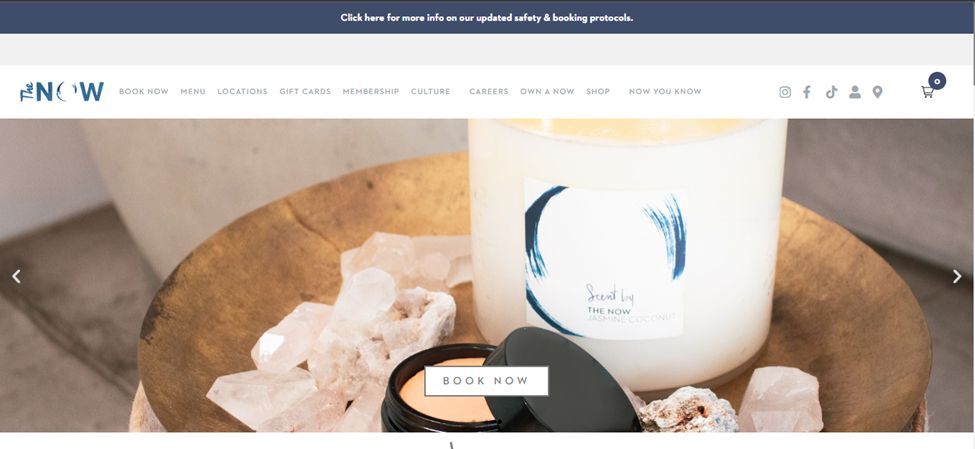
Featuring a traditional-looking gallery-style homepage, this website won’t disappoint you. And aside from the main picture gallery, there aren’t any other pictures on the homepage. Instead, you get a bunch of text under the heading “the menu” which contains all the different massages and prices.
At the very bottom of the home page, you get another gallery-style sliding menu, but this menu outlines the different locations of the massage parlor. You also get information about their membership program on the homepage. The color scheme isn’t that special but works with the minimal aesthetic of the website.
7. Barstow Massage and Bodywork
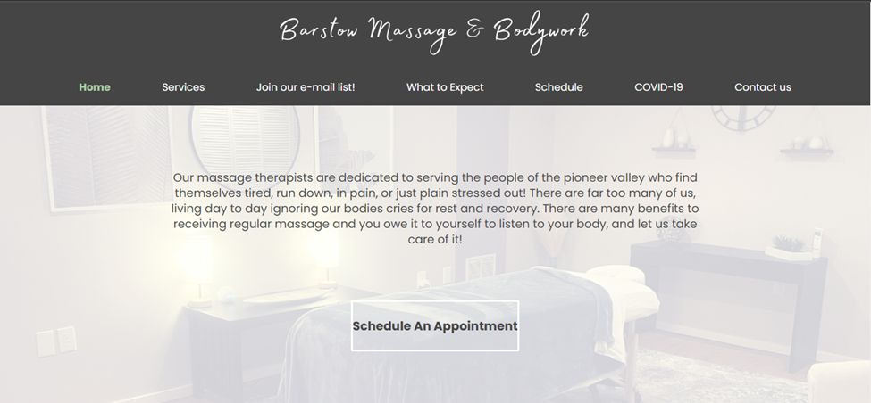
There aren’t a lot of interesting things on this massage website, but that doesn’t mean we can get some good ideas from it. If it has anything going for itself, then it’s probably how well constructed the whole thing is. The user interference is smooth, the mixture of fonts adds interest to the website, and the simple color scheme works with the minimalism of the website.
The only thing on the homepage is a faded-out picture of a massage parlor with some information about massages and a bunch of buttons that prompt you to make an appointment. There is also a customer review section at the bottom of the page.
8. Rama Thai Massage
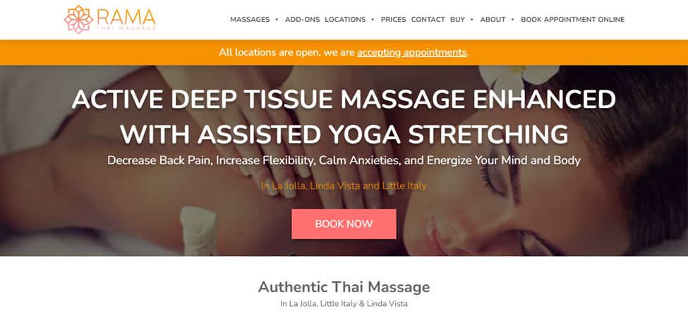
This website for massage services uses bursts of bright pinks and oranges, which compliment all the pictures on the website as well as the logo. The homepage is quite busy but not in an overwhelming way; rather, it explains a lot to the visitors all in one go. You can explore the different massages, as well as learn about the difference between Thai and Swedish massages.
On the homepage, there is a pricing list and also a section that tells you about additional services you can add to your massage service. Lastly, the website also has a detailed FAQ section that comes equipped with a search bar to make it easier for the client to find what they are looking for. This is something most massage websites should include.
9. Donelson Massage Centre
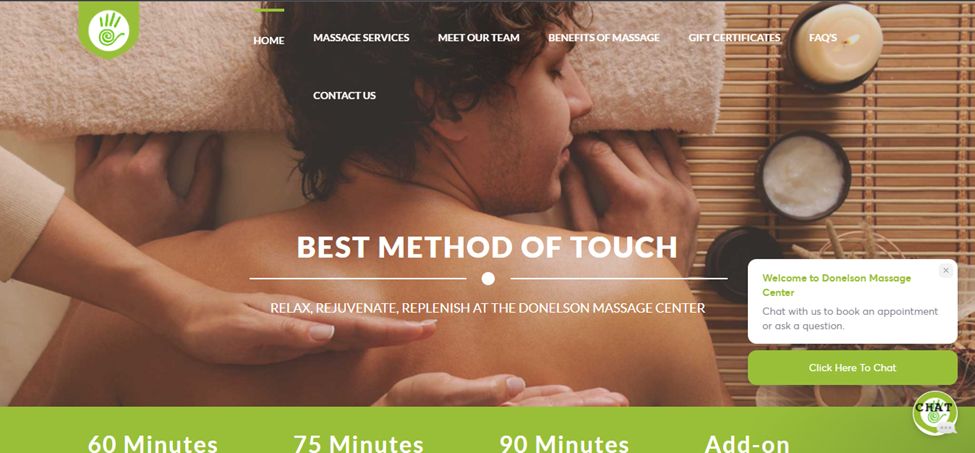
This website is incredibly smooth. The main picture main the gallery becomes the background as you scroll down, and the text boxes glide on top of the picture. The website is slighting interactive since the different sections move when you place the cursor on top of them.
The lime green, black, and white color scheme looks amazing paired with the massage and candle pictures. At the end of the website, you can learn about their membership program and how it works, as well as its benefits. All in all, this is a website, and you can take many massage ideas for your website from it.
10. Soothe
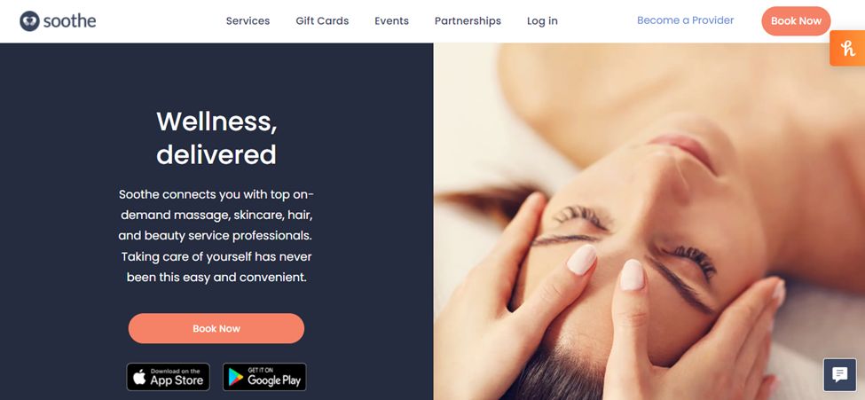
Even though this website seems pretty common amongst other massage websites, it gets the job done. The navy, white, and peach color scheme is incredibly unique. All the pictures on the site are accompanied by some sort of text and a “book now” button.
The homepage has a section that explains how to utilize their app, a section that details how other customers feel about their services, and lastly, there is a soothe shop section that outlines a couple of their popular products.
How Do I Create a Massage Website?
- Think Carefully about Your Homepage Design. The homepage is without a doubt the most important part of any website because it is the landing page, and if it’s not interesting enough, then you might have a hard time keeping people around. You need to decide what you will add to the homepage and how you will build the homepage.
- Design Your Massage Website Logo. You have probably realized that every website has a logo that helps distinguish them from other websites with a similar name and aesthetic. Plus, the logo will come in handy when you finally decide to sell products on your website or expand your business.
- Select Color Scheme or Theme. Both of these things help you stand out from the rest of the massage websites. Plus, unique colors draw the attention of the visitor, which can often prompt them to stay and explore for an extended period.
- Figure Out the Menu. The first thing you need to do when constructing any kind of massage website is to figure out what exactly you want to display on the website. Do you want it to be more straightforward and only list the services? Or do you want to add an about us section, a product section, a customer review section, and a location section, among others? Thinking all of this out beforehand will help you with the whole construction process.
- Get Massage Pictures or Videos. You can either choose to use high-definition pictures or a video on your website to give it that oomph most people are looking for. And if you don’t want to spend a ton of money on hiring photographers or videographers, then you can simply use stock photos. A lot of sites utilize them and succeed in creating amazing websites. Another option is obviously to take them yourself, and if you take a couple of photos, you can probably get one that looks acceptable.
![9+ Beautiful Boutique Website Designs [Get Good Ideas] boutique website designs share](https://alvarotrigo.com/blog/wp-content/uploads/2023/08/boutique-website-designs-share-300x150.png)
![15 Beautiful Hair Salon Websites [Ideas & Inspiration] hair salon websites share](https://alvarotrigo.com/blog/wp-content/uploads/2023/08/hair-salon-websites-share-300x150.png)
![9+ Delicious Bakery Website Ideas And Examples [Get Inspired!] bakery websites share](https://alvarotrigo.com/blog/wp-content/uploads/2023/08/bakery-websites-share-300x150.png)
![15 Best Portfolio Website Builders in 2024 [Reviewed & Ranked] portfolio website builders share](https://alvarotrigo.com/blog/wp-content/uploads/2023/08/portfolio-website-builders-share-300x150.png)
![9+ Beautiful Lash Websites Ideas [Get inspiration] lash website ideas share](https://alvarotrigo.com/blog/wp-content/uploads/2023/08/lash-website-ideas-share-300x150.png)
![9 Sites to Find Font Inspiration [Trends, Ideas and more] font inspiration share](https://alvarotrigo.com/blog/wp-content/uploads/2023/08/font-inspiration-share-300x150.png)