Have you ever looked at a layout, a photograph, or even an artwork and found it immensely pleasing to the eye?
It’s often not just the quality of the pictures, the object in the photos, or even the colors in them. But more often than not, it is a good composition and strategic placement of elements to make it more appealing to the eye.
This layout technique is probably the oldest trick in the book and is known as the Rule of Thirds in design, although various art majors use this principle to make their work attractive to the human gaze.
If you have ever attended art school, done a course in graphic or web design, or gone through photography courses, you must be well aware of the principle of the rule of thirds in graphic design.
What is The Rule of Thirds?
The Rule of Thirds in design is a composition or layout type in which a photo, artwork, design presentation, or web page, is divided equally in an imaginary (or literal for beginners) 3×3 grid of nine segments.
In an ideal situation, the subject of your layout is strategically placed on the four points of interest (intersecting points) but can be changed according to the vision of the designer.
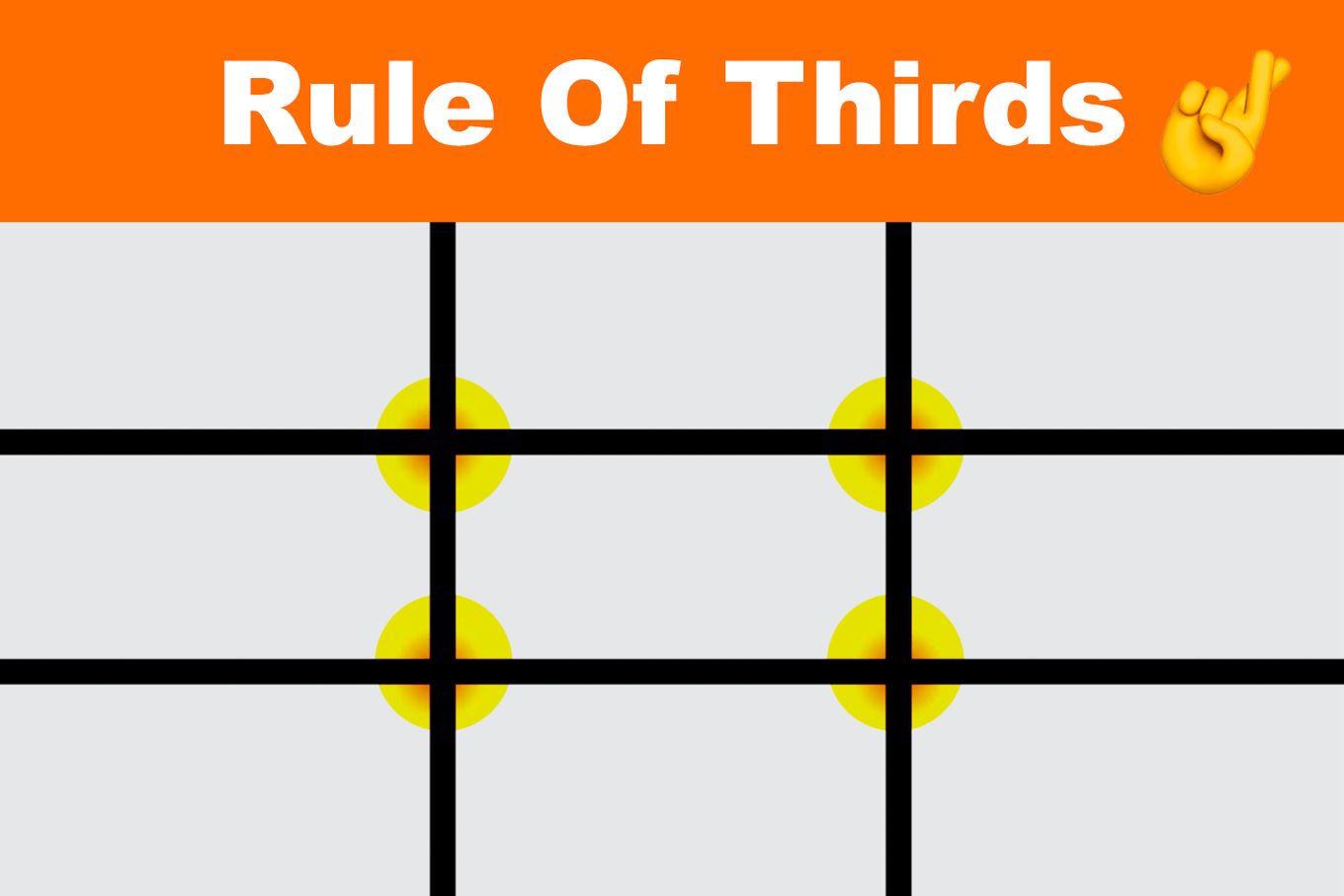
This use of a 3×3 grid to divide the hypothetical sheet into 9 columns with 3 vertical and 3 horizontal lines creates enough tension to bring a fun dynamic into your piece and retain the movement of the human eye, keeping it constantly engaged.
Although this principle is known as the rule of thirds, you must treat it more like a guideline than a stringent rule. But many designers swear by the rule of the third method to help them keep the frame balanced, symmetrical, and proportionate.
Learn more about web design and check what are the steps of the web design process.
The grid pattern for the rule of thirds is based on a very old design element known as the Golden Ratio. The Golden ratio is a geometric ratio that ensures beautiful proportionality wherever it is applied.
The most common instance of the golden ratio that we know is of the pyramids of Egypt, the Parthenon in Athens, and many gothic cathedrals and churches.
The Golden ratio applies mostly to rectangles meaning it is perfect for our phones, tablets, and desktop screens. This Golden ratio creates a seamless distribution when applied to any rectangle and can be used for web design as a guide for element placement. It works as an effective base from where the vertical and horizontal lines of the grid appear.
How is The Rule of Thirds Used in Design?
Rule of Thirds is used in design by taking advantage of the grid intersections, also known as sweet spots, which are the best guide for object/logo/text placement. This is because when the eye falls on a screen, sheet, or image, it is subconsciously and constantly moving over the page.
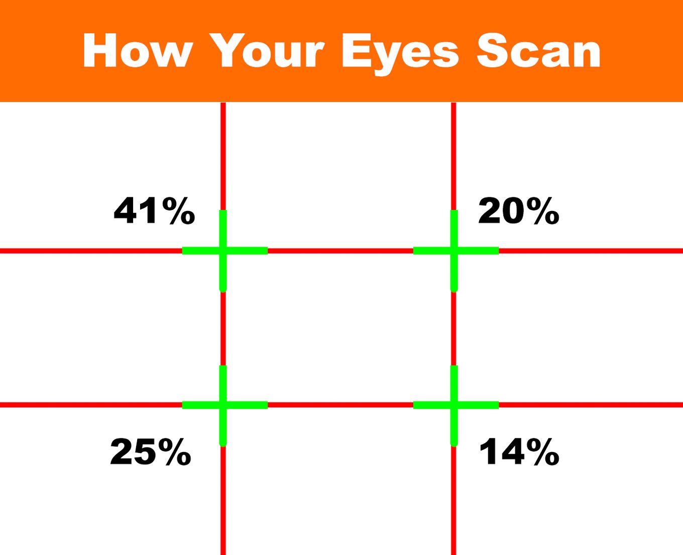
By training your eye and design mind to place your key elements on these sweet spots, you are making sure that your user focuses on the intended focal point set by you as a designer.
It doesn’t matter if this grid is placed in a portrait or landscape format, the same rules apply to both as long as you have 9 intersecting lines and a 3×3 grid.
Whether you want to become a web designer, a photographer, an architect, or any artist, the rule of thirds will be your close friend.
Rule of Thirds in Web Design
Web design is all about attracting the audience, narrating your story, and making a point with your statement while keeping the overall layout cluster-free.
This type of layout is generally achieved better through the use of the rule of thirds rather than centralized symmetry. This is because, in a centrally focused layout, the sense of symmetry is strong but also quite rigid. Whereas, the rule of thirds, invites the gaze to slowly move over the entire design taking in the elements one at a time.
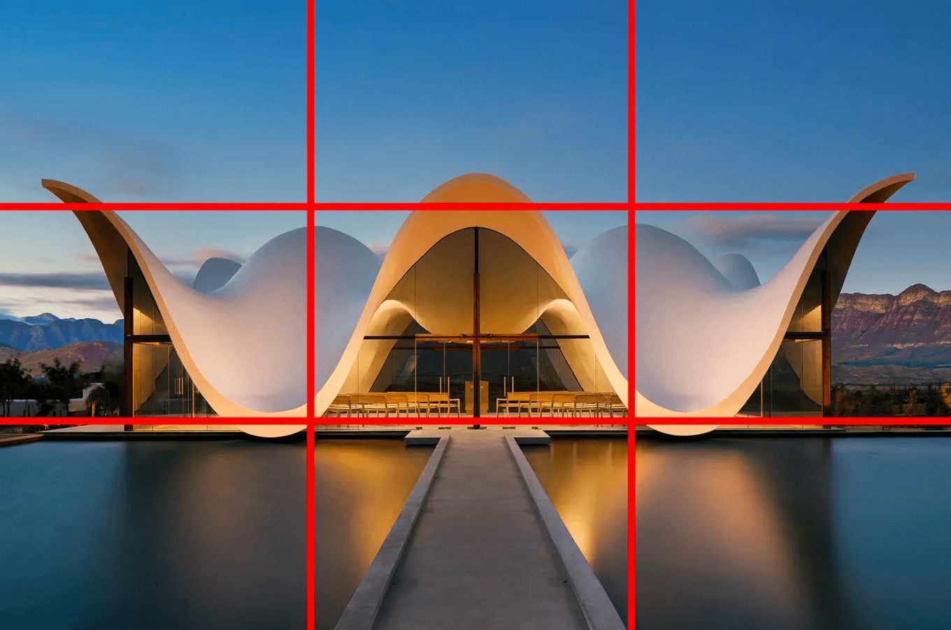
In this image, the object (the building) has been centralized to achieve a strong sense of symmetry. Although quite beautiful, this image feels dead, empty, and stagnant. There is no place for the eye to move because the center of the photo retains a strong focus.
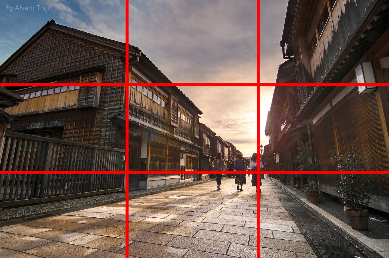
On the other hand, this image feels more dynamic and the more you run your gaze through it, the more details you tend to find. This is a classic example of creating dynamic frames in photography, web design, or graphic design using the rule of thirds.
The rule of thirds in web design is important and effective. It takes all the guesswork and hardship of creating a dynamic composition and layout by giving you a tried-and-tested grid to work with.
This is great because once you have a base template to work with, you can focus all of your energy on your design and content. The “sweet spots” in the rule of thirds can be used for text or image placement, yes, but can also be used as guides to make a calculated statement on your website.
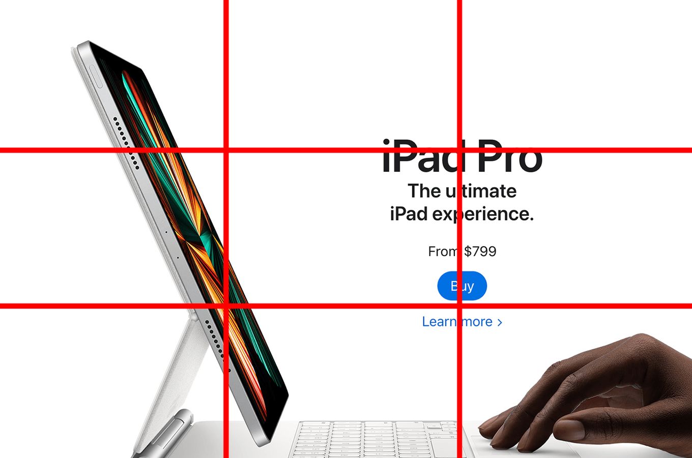
The top left intersection point becomes extremely important in web design or graphics because people tend to scan the website page in what is known as a Z pattern (left to right and then top to bottom) or an F pattern (top to bottom). Therefore, the top left corner gets the maximum user view as depicted in the image above.
You can use the rule of thirds in design and place the important message like a call for action in one of the sweet spots which is the upper left corner.
The rest of the major elements can also be placed at other intersections to create a beautiful, balanced, and dynamic image that propels the eye to move and take in the information provided with ease.
Rule of Thirds Web Design Examples
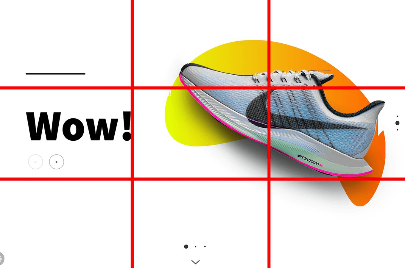
For example, in this web design, the main focus is on the shoes. When you perceive this image at first, your eyes immediately fall to the call to action placed on one of the top right sweet spots. The focus of the call to action is enhanced by using contrasting text and bold typography.
Moreover, the browse button which leads you to the site in detail is the next thing placed on the intersection point making a statement.
This excellent example of web page design using the rule of thirds is proof that it takes the simplest decisions to create the strongest visuals.
This rule can be used with the principles and elements of design like color, shape, size, contrast, hierarchy, and typography, to create a juxtaposition between the elements on the web page for a seamless, powerful, and beautiful design.
The same approach can be taken to design a web page for phones, making presentations, or in the field of graphic design.
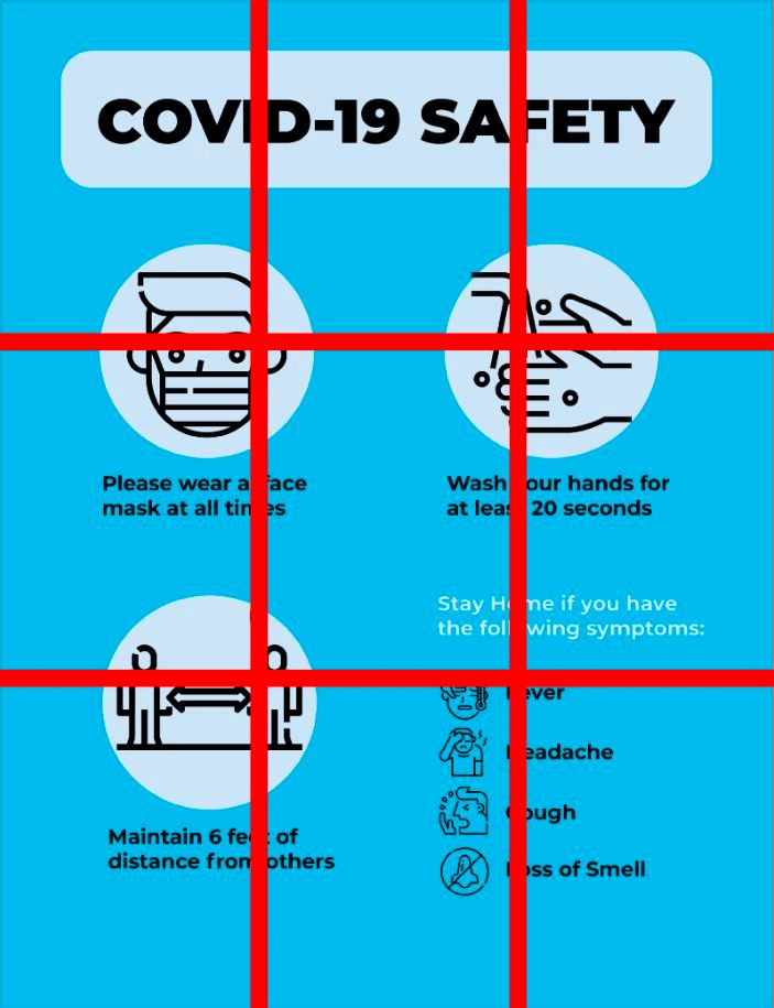
For example, in this image, the infographics for the SOPs have been placed on each intersecting point. This is because the visual aid is much more important to send a message to the public and hence they are given the prime spot.
Within these infographics, the most important one, “Please wear a face mask at all times” has been given the top left corner where the eye moves for the longest period.
These are some great examples of simple yet powerful graphic design created through the effective use of the rule of thirds.
So, if you are a rookie, professional, or a student trying to learn ways to create powerful web designs, learn from precedent and see how the masters before you have used this simple grid to their advantage. You don’t want to create a bad website design!
The Take-Away: Use Rule of Thirds in Design
Rule of thirds has been helping designers for over 100 years and it continues to do so.
Everything about web and graphic design is based on composition and layout. Composition is so crucial to web design that even the most enticing images and the catchiest text will not work together if the overall composition doesn’t follow a guide, grid, or template.
If you are looking for a simple, clean, yet strong design, the use of the rule of thirds in graphic design will not only guide you on where to place the images, text, or logo but will also enable you to see and determine the negative space.
Negative space is the ‘breathing’ space around the images and text in a composition where no text, image, or pattern is placed. Establishing the negative space in a web layout can increase the readability factor and create a pleasant user experience.
There are multiple ways of using this rule in web and graphic design and the more you experiment with it, the better you will be able to gauge the proper placement of elements on a web page.


