Whether you need to finish a project or were hired to create a salon and spa website, these medical spa website designs can provide you with enough inspiration to get started.
To appeal to women, who are the most likely to visit, most spa websites use a pink accent or feminine imagery. A girl model is also a regular component on their welcome page. Here are some of the best spa website examples we have seen to inspire you.
1. Shevet Hammam & Spa
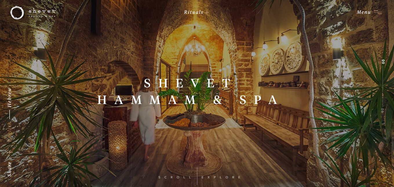
Combining the brilliance of a full-page design and stunning photos of the spa, this spa website design dazzles right from the homepage. Scrolling through the site is a joy, because of the parallax effect which forms beautiful transitions. The fullscreen design is not just smoothly animated, but also immersive, pulling in the visitor with impressive layouts.
This spa website is cleverly designed as a vertical slider, where the information on the page is split into multiple full-screen sections. Each full section has the purpose of separating the information of the website so it is easier to the user to digest it. In addition, in the top right corner, we have the menu, which helps visitors shuttle between the different sections of the website.
This website uses fullpage.js, a javascript component to create astonishing full-page scrolling websites. You can even use it on WordPress with its Elementor, Divi, and Gutenberg Plugin.
2. Bio Medical Spa Website
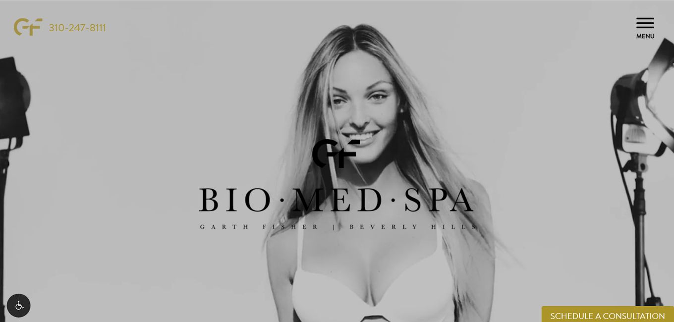
Landing on the homepage for this site can be summed up as immediately arresting. The background video is sleek, black and white, played in smooth slow motion, and expertly shot for maximum impact. From the menu, one can go to the BioMed Spa, Services, Conditions, Signature Treatments, Gallery, and Contact pages.
From the homepage, one can access the products offered by the establishment, schedule a consultation, learn more about the spa, in summary, view the beautiful gallery, and more. It definitely deserves to be at the top of our list of best medical spa website designs.
3. The Spa at West Ashle
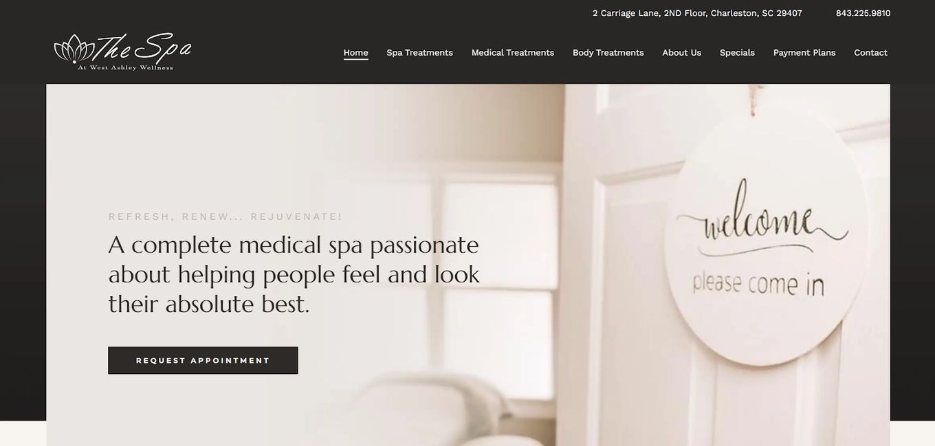
The Medical Spa at West Ashley goes with a very toned-down look, compared to the websites we have already looked at. It opens, not with a video or smooth parallax motion, but with a simple picture that doesn’t cover the entire screen and some text telling you the name and address of the business.
But do not mistake the understated look for a lack of functionality. Visitors on the site can use the menu to access the spa treatments, medical treatments, body treatments, about us, specials, payment plans, and contact pages, in addition to social media links.
4. Destination Aesthetics Med Spa
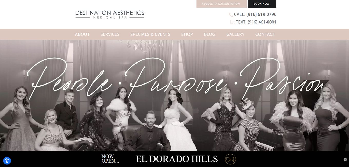
Destination Aesthetics is another great example of a simple but functional med spa website design. It is not as simple as the previous example though, preferring to convey warmth and an inviting atmosphere. After welcoming visitors to the spa, it goes on to introduce the team that works there.
After the team, we see a slew of treatments one can get at the spa, before a playable video that is linked on YouTube talks more about the business. It is a smooth way to invite visitors in, and talk to them about what you offer, what you have done for others, and where you are found.
If your SPA includes massages, get ideas for your website from these massage websites too!
5. Calabasas Med Spa
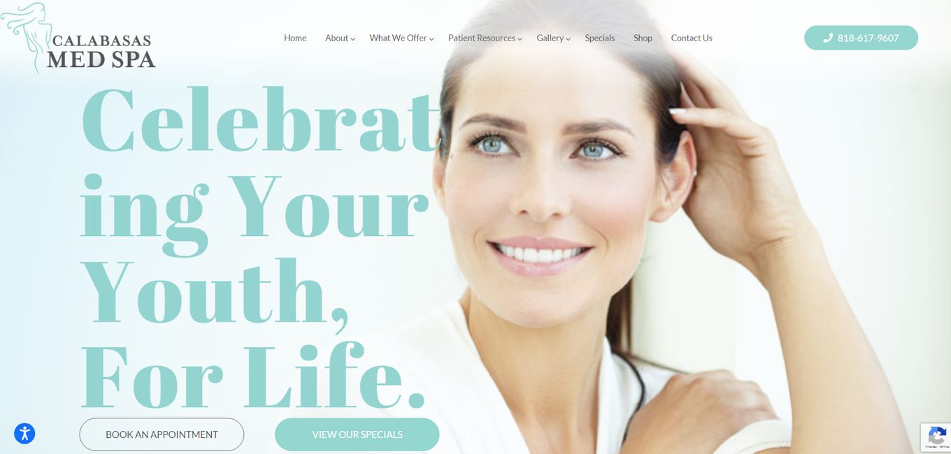
Calabasas med spa website has a design that uses color theming throughout the page, covering everything from banners to fonts. There are plenty of calls to action, which include the ‘Book an Appointment’ and ‘View our Specials’ buttons.
Further below, there are details on the treatments offered, what they entail, and more. the site owner makes good use of testimonials to boost the website’s standing. At the bottom of the page is a neat way to get in touch that has space for questions and comments, as well as a map.
6. Urban Nirvana
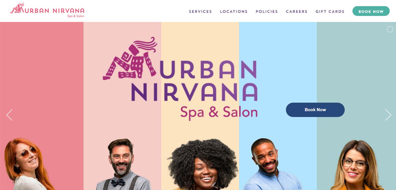
With a name like that, you expect super contemporary with some quirks, and this spa website design delivers. It uses a blend of uniquely contoured images, smooth transitions, creative and funny imagery, and a simple navigation journey.
From the menu, one can go to services and locations to find what they need. There is a section for careers, gift cards, and booking. At the very bottom of the page are the social media links, which make it easy to engage your audience with shareable content.
7. Beauty Boost Spa
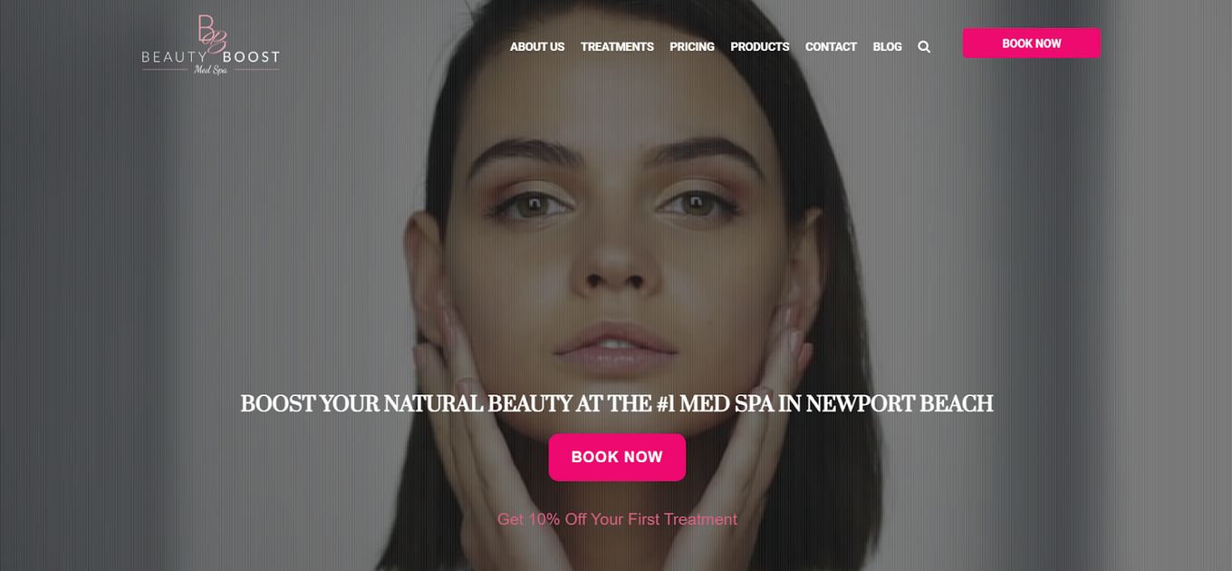
The website for the Beauty Boost Med Spa is colorful, with a beautiful video in the backdrop. The menu items are prominently displayed in the header, inviting visitors to check out the site’s other pages.
They’ve also included “Book Now” and information about a significant offer to get visitors in the door. Other CTAs are highlighted with distinct colors on the rest of the page. On their website, they chose to use the brand’s colors to create a unique style that is uniform throughout the site.
8. Dermalase Medical Spa
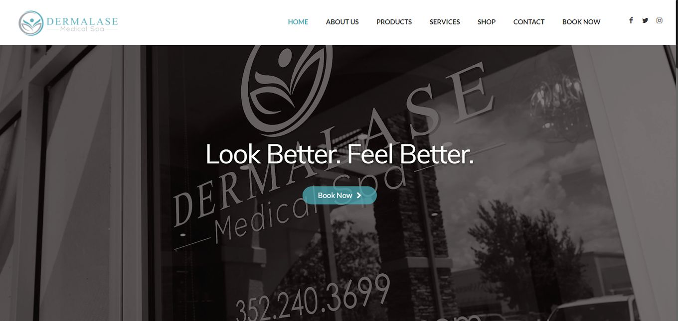
Dermalase med spa website is very well designed: it opens with a motto, a backdrop of the actual establishment, and a call-to-action to ‘Book Now.’ It then moves on to an ‘about us’ section and a playable video linked from YouTube. It then details the procedures and treatments offered, with calls to action for each to ‘Learn More.’
There are plenty of logos near the bottom of the page, mentioning all the cool brands that Dermalase works with, which boosts its reputation to visitors who can recognize the brands and the cache they carry. The office hours, address, map, and contact space are at the bottom of the page.
9. Nuansa Spa
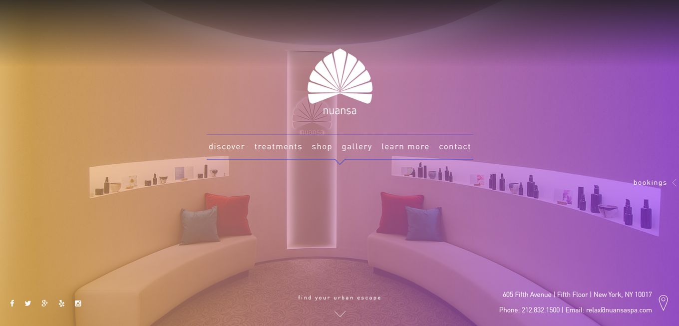
Nuansa is a warm, inviting site that uses a static image in the background that at first appears not to change. But then, a few seconds later, you can swear the colors in the background room just changed. It is so subtle and nuanced compared to the other spa website design examples that you might not catch on immediately.
The font used is also simple and understated, in keeping with the nuanced nature of its design. Navigation is made easy, and booking is a breeze, using the contact form and a comprehensive list of prices for each procedure.
10. Skincare Paris
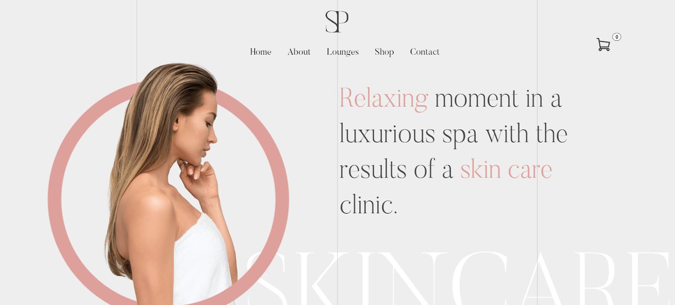
Skincare Paris utilizes animations well. When you land on the homepage, the words are not already there. They only show up once you do, in a smooth upward cascade motion, as a nuanced circle forms around the woman on the screen. It does not feel like video or a fullscreen effect, but a transposition of elements.
There is a shopping cart at the top with a menu that leads to the about, lounge, shop, and contact pages. From the homepage of this spa website design, one can learn about the treatments, the products, and the experience.
11. Exhale Spa
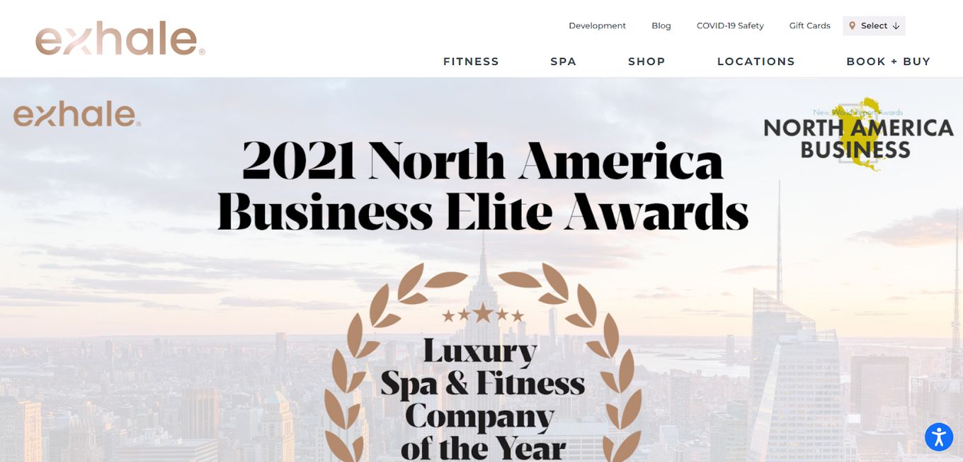
Exhale Spa was the Luxury Spa & Fitness Company of the Year at the North America Business Elite Awards. How do we know? It is right on the website homepage, which also tells us more about the treatments and services offered by the spa.
The website design is contemporary and makes a point to tell visitors all about the cool things it offers. One of those things is a virtual class and a library of workouts and tutorials that are geared to provide its users with some of what they need when they’re at home.
12. Bloom Spa
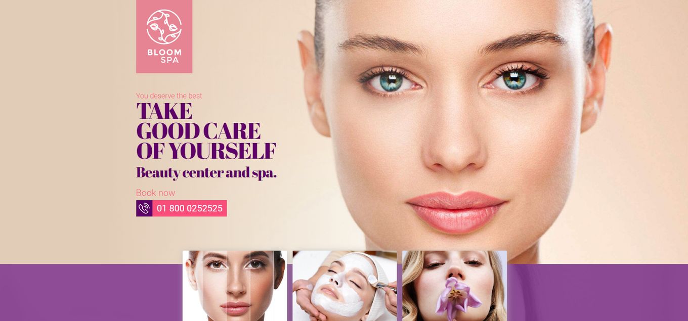
Bloom Spa is a great example of what to do with branding and colors. Using a recognizable pink hue, the branding starts on the logo, which has the same hue. There is a stunning photo of a woman with piercing eyes to get the attention of anyone who lands on the site.
Related article: Beautiful Wellness Website Examples
Other photos show off flawless skin, promising to do the same for anyone who visits. There are also creams and other products offered to help with self-care routines, with the same careful branding, captivating visuals, and useful call-to-action buttons.
13. Juniper Natural Spa
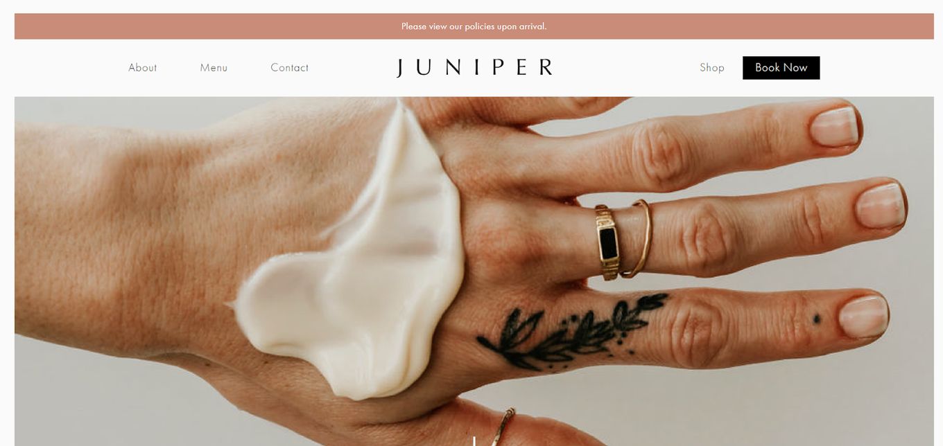
Juniper opens on an image of a hand. It has to be one of the cleanest, most well-manicured hands we have ever seen. It immediately captures the viewer’s attention. The color scheme is maintained throughout the site, with lovely tiles to show off what it specializes in.
There are also testimonials from the clients who have frequented the establishment about its incredible service. The menu takes visitors to the about, menu, contact, shop, and book pages. Everything about this spa’s website design is quite relaxed, including the invitation to follow them on social media.
14. Wellbeing
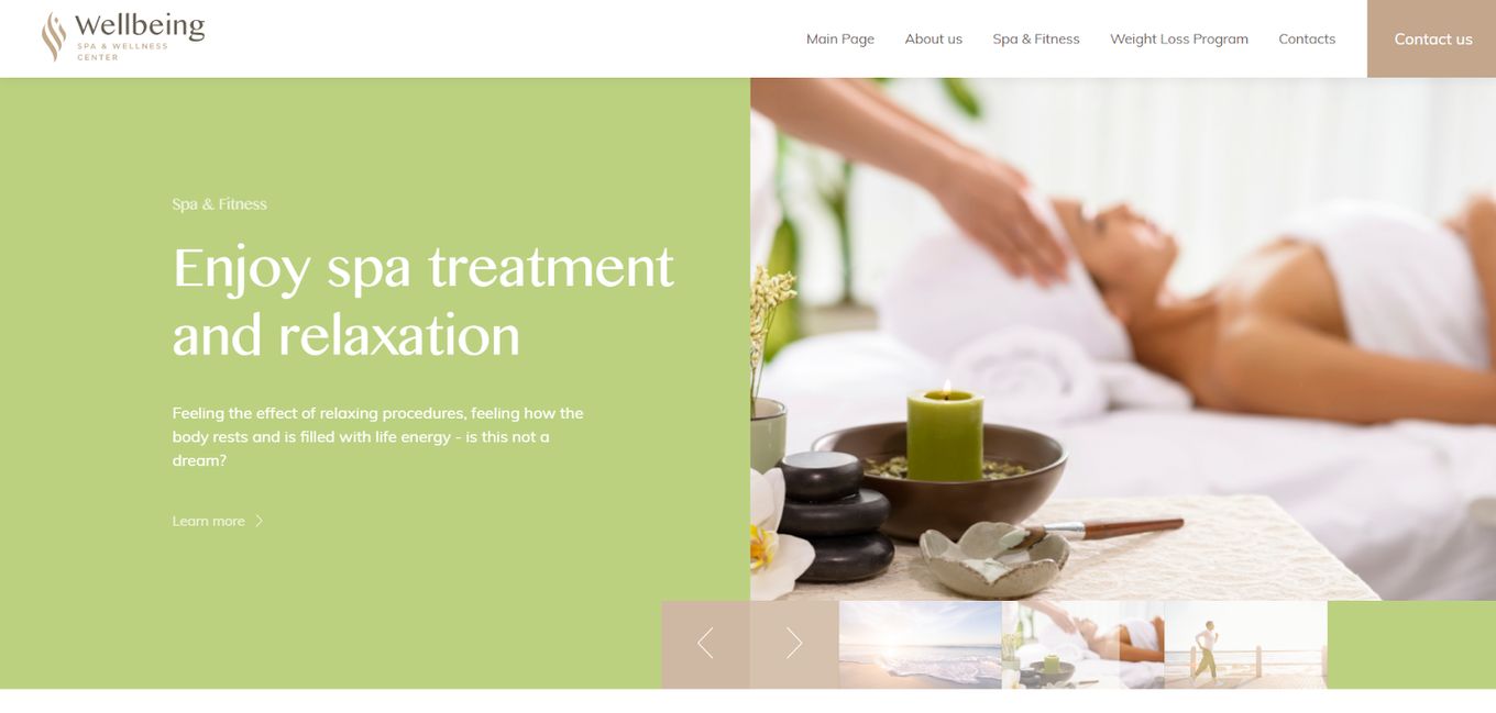
Wellbeing feels more like a complete website than it does a functional one meant to just advertise the business. It makes use of plenty of text to explain what the spa and wellness center offers, with calls to action to learn more.
Right on the homepage, you will find the ‘about us’ section, which serves as an introduction to what the spa is all about. After that, there are sections talking about the spa & fitness, weight loss program, locations where the services are found, and an invitation to tour Egypt while at it.
15. Skin Clinics
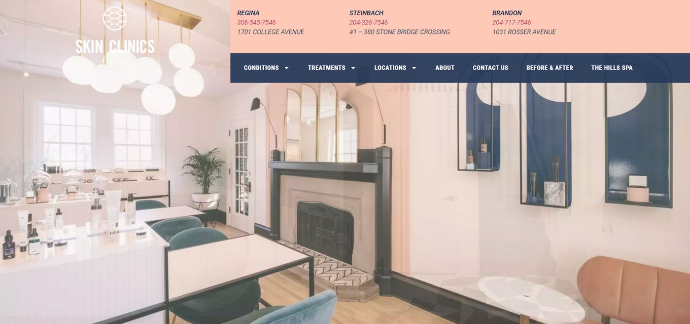
Skin Clinics is incredibly well laid out. It utilizes a color palette matching the one in the physical establishment seen in the photos. The font is uniformly used on tiles and in-text blocks, with an emphasis on informing site visitors what they can expect to get.
The treatments are all laid out in nicely partitioned blocks that can be clicked on to learn more about each procedure and what it entails. The menu leads to the conditions, treatments, locations, about, contact us, before & after, and The Hills Spa pages.
Final Thoughts
If you own a salon or spa, your website may be the first point of contact for potential customers. You can miss out on business chances if your website doesn’t captivate users within the first few minutes.
Keep your medical spa website design simple, legible, mobile-friendly, thorough, and accessible when creating a website. Your design should be unique and appealing, standing out from the crowd without being overbearing.
![15 Beautiful Hair Salon Websites [Ideas & Inspiration] hair salon websites share](https://alvarotrigo.com/blog/wp-content/uploads/2023/08/hair-salon-websites-share-300x150.png)
![10 Best Medical Website Design [Examples] medical website design share](https://alvarotrigo.com/blog/wp-content/uploads/2023/08/medical-website-design-share-300x150.png)
![9+ Best Contact Pages To Get Inspired [+ 15 Free Contact Forms] contact page examples share](https://alvarotrigo.com/blog/wp-content/uploads/2023/08/contact-page-examples-share-300x150.png)
![9+ Beautiful Boutique Website Designs [Get Good Ideas] boutique website designs share](https://alvarotrigo.com/blog/wp-content/uploads/2023/08/boutique-website-designs-share-300x150.png)
![15 Portfolio Websites For Graphic Designers [Build Yours Now] websites graphic design portfolios share](https://alvarotrigo.com/blog/wp-content/uploads/2023/08/websites-graphic-design-portfolios-share-300x150.png)